The Human Interface

Alan Dix alan@hcibook.com

This article appeared as:
A. J. Dix (1994). The Human Interface. Assembly Automation, 14(3): 9-13.

Introduction

The news headlines: an aircrash claims a hundred lives, an industrial accident causes millions of pounds worth of damage, discovery of systematic mistreatment leads to thousands of patients being recalled to hospital. Some months later the public enquiry concludes: human error in the operation of technical instruments. The phrase 'human error' is taken to mean 'operator error', but more often than not the disaster is inherent in the design or installation of the human interface. Bad interfaces are slow or error prone to use. Bad interfaces cost money and cost lives.

On the other hand, effective interface design or analysis can save money. A few years ago the US telephone company NYNEX was intending to install a new computer system to support their operators. Before installation a detailed analysis was performed taking into account the cognitive and physical processes involved in dealing with a call. It was discovered that rather than speeding up operations, the new system would take longer to process each call. The new system was abandoned before installation, leading to a saving of many millions of dollars.

Not all systems can benefit from this level of analysis. The telephone operator's task is very repetitive and even a small difference in performance has enormous financial implications; in a one-off system a more cut-price approach must be used. There are a large range of techniques which can be employed during the design of the human interface and, as in any discipline, part of the professional's skill is in knowing when it is appropriate and cost-effective to apply which technique. This article attempts to give you a taste of some of the issues surrounding the design of an effective human interface. I won't go into all aspects in the same detail, but dip into a few areas.

The article will be addressed particularly to those designing interfaces, but I hope it will also prove valuable if you have to select or evaluate an off-the-shelf product. Also remember that when several pieces of equipment are brought together this effectively creates a new combined interface for the operator. Similarly, when you allocate duties, you effectively create an interface for each worker. If two machines have similar, but slightly different interfaces, then allocating them to the same worker may be inviting a future problem. You may have been a human interface designer and never realised it!

What makes a good interface?

Unfortunately, there is no easy answer to this question! However, we can find some partial answers. If an interface is effective the operators must be able to:

  1. achieve their purposes with acceptable speed and effort, and must do so:
  2. accurately and with an acceptable level of error.

The first goal demands a clear idea of what jobs are to be done and the second requires an understanding of the ways errors happen. Both require that the designer has some knowledge of the way human minds and bodies work. In addition to these two goals, the interface should be able to be learnt in an acceptable time, be cost-effective to produce and be satisfying to use. Notice the repetition of the word 'acceptable'. It is hard to satisfy all these goals, and different situations call for different trade-offs; for example, accuracy is clearly most important in a nuclear reprocessing plant, but in a less critical area multiple interlocks to prevent errors would be too slow. Similarly, easy to learn systems are often inefficient for practiced users; indeed, it is a constant challenge to design interfaces which are usable by both expert and novice.

Why are most interfaces so bad?

One reason for the parlous state of many interfaces is that they are marginalised in the design process. Designing the interface often seems almost an afterthought. Even if a human factors expert is used it is often too late: all the major decisions have been taken and all that is left is the layout of the control panel and choosing the colour of the buttons. But it is clear that an unusable system is a useless system. The human interface runs deeper than the surface and must be considered throughout the design process. For example, early consideration of the tasks which need to be performed may influence not only the interface itself, but the choice of sensors installed in the equipment.

Furthermore, those who are asked to design an interface will frequently have no training or special knowledge of interface design. This would be unthinkable for the mechanical or electronic parts of a design. It is a frightening thought that the vast majority of computing graduates have never during their studies had to consider the people who use the systems they design, and I would imagine that the data for engineering graduates is similar - the newspaper headlines suddenly become less surprising!

Mistakes will happen

People make mistakes. This is not 'human error', an excuse to hide behind in accident reports, it is human nature. We are not infallible consistent creatures, but often make slips, errors and omissions. A concrete lintel breaks and a building collapses. Do the headlines read 'lintel error'? No. It is the nature of concrete lintels to break if they are put under stress and the responsibility of architect and engineer to ensure that a building only puts acceptable stress on the lintel. Similarly it is the nature of humans to make mistakes and systems should be designed to reduce the likelihood of those mistakes and to minimise the consequences when mistakes happen.

Often when an aspect of an interface is obscure and unclear, the response is to add another line in the manual. People are remarkably adaptable and, unlike concrete lintels, can get 'stronger', but better training and documentation (although necessary) are not a panacea. Under stress, arcane or inconsistent interfaces will lead to errors. During the Second World War a new cockpit design was introduced for Spitfires. The pilots were trained and flew successfully during training, but would unaccountably bail out when engaged in dog fights. The new design had exchanged the positions of the gun trigger and ejector controls. In the heat of battle the old responses resurfaced and the pilots ejected. Human error, yes, but the designer's error, not the pilot's.

Quick fixes

You should expect to spend both time and money on interface design, just as you would with other parts of a system. So in one sense there are no quick fixes. However, a few simple steps can make a dramatic improvement.

Think 'user'
Probably 90% of the value of any interface design technique is in that it forces the designer to remember that someone (and in particular someone else) will use the system under construction.

Try it out
Of course, many designers will build a system that they find easy and pleasant to use, and they find it incomprehensible that anyone else could have trouble with it. Simply sitting someone down with an early version of an interface (without the designer prompting them at each step!) is enormously valuable. Professional usability laboratories will have video equipment, one-way mirrors and other sophisticated monitors, but a notebook and pencil and a home-video camera will suffice.

Involve the users
Where possible, the eventual users should be involved in the design process. They have vital knowledge and will soon find flaws. A mechanical syringe was once being developed and a prototype was demonstrated to hospital staff. Happily they quickly noticed the potentially fatal flaw in its interface. The doses were entered by a numeric keypad: an accidental keypress and the dose could be out by a factor of 10! The production version had individual increment/decrement buttons for each digit (see Figure 1).

Figure 1. Automatic syringe: setting the dose to 1372. The effect of one key slip before and after user involvement.

Iterate
People are complicated, so you won't get it right first time. Programming an interface can be a very difficult and time-consuming business. So, the result becomes precious and the builder will want to defend it and minimise changes. Making early prototypes less precious and easier to throw away is crucial. Happily there are now many interface builder tools which aid this process. For example, mock-ups can be quickly constructed using HyperCard on the Apple Macintosh or Visual Basic on the PC. For visual and layout decisions, paper designs and simple models can be used.

IBM supplied the computerised information and messaging booths for the Barcelona Olympics. These booths were to be used by the many thousands of residents in the Olympic village who would have to use them with no prior training (extensive instructions in several hundred languages would be impractical). During the design process, IBM's engineers built a series of full-size models with all the surface bits, but no electronics behind them. The booths were left in public corridors at IBM's laboratories and passers by were encouraged to attempt to use their facilities. Although these were not 'typical Olympic villagers' they were at least not members of the development team itself and the quick and dirty nature of the prototypes encouraged frequent and dramatic changes. In this project, the user interface investment was high (not a quick fix!), but at least these techniques translate easily to lower budget projects.

There is a substantial body of knowledge about the readability of text, both on screen and on paper. The use of capitals, cited in the text, is a good example. WORDS WRITTEN IN BLOCK CAPITALS take longer to read than those in lower case. This is largely because of the clues given by word shapes and this is the principle behind 'look and say' methods of teaching children to read. However, as with many interface design guidelines there are caveats. Although lower case words are easier to read, individual letters and nonsense words are clearer in upper case. For example, one writes flight numbers as 'BA793' rather than 'ba793'. This is particularly important when naming keys to press (e.g., 'Press Q to quit') as keyboards have upper case legends.

Box 1. Plain Text

Getting it right

In a substantial project a variety of human factors knowledge and interface design techniques ought to be employed. We'll quickly look at three areas.

Understand the user
Humans have limited physical, perceptual and mental powers. Some of these are known by common sense; some have only been discovered as a result of psychological experiment or practical experience. An MSc student recently visited a local software company and, on being shown some of their systems, remarked on the fact that they were using upper case throughout their displays. At that stage she had only completed part of an HCI course but she already knew that words in upper case are normally harder and slower to read than lower case (see Box 1). Although the company instantly recognised the value of the advice, it was clearly not common sense. There is extensive knowledge about the human visual system and this can be brought to bear in practical design. Another example is the small angle over which we can see in detail: our ability to read or distinguish falls off inversely as the distance from our point of focus (see Figure 2). This sets limits on the amount that can be seen or read without moving one's eyes. Fitts' law is another example. This says that the time it takes to move a pointer or a finger to a target is proportional to the log of the distance moved.

Figure 2. Visual discrimination is inversely proportional to distance.
Fixate on the dot in the centre. The letters on the left should all be equally readable, those on the right all equally harder.

As introspection is notoriously flawed, we have even less common sense knowledge about the way we think, but some simple facts have direct design implications. An example of this is closure. This describes the 'done it' feeling we have as we complete some part of a task. At this point our mind has a tendency to flush short-term memory in order to get on with the next job. Early automatic teller machines gave the customer money before returning their bank card. On receiving the money the customer would reach closure and hence often forget to take the card. Modern ATMs return the card first! Happily you do not need to be an expert psychologist to design effective interfaces. A reasonably small collection of facts like those above, combined with a good pinch of common sense, will suffice in most situations.

Investigate the context
As well as general psychological properties of users, we need to know what sort of people are using the system. For example, a shop-floor worker is unlikely to have extensive typing skills! We also need to look very closely at the tasks which the user will perform with the system. There are a range of methods for examining the user needs to do and know in order to accomplish a task. These are called task analysis methods. Figure 3 shows an example of hierarchical task analysis which concentrates on the breakdown of high level tasks (like 'boil water') into lower level tasks (such as 'fill kettle'). The task may cut across several systems and involve both manual and electronic operations. Other forms of task analysis focus on the knowledge required for different parts of a task. One example of the use of task analysis is in the grouping of controls: those frequently needed for the same task can be placed together.

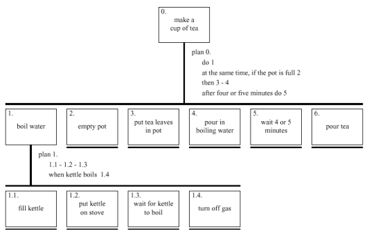
Figure 3. Hierarchical task analysis of tea making (from [1])

It is also important to look at the ways workers interact with one another. Detailed studies of the London Underground control room revealed how controllers unconsciously interpret subtle signs of one another's activity: a controller may prepare to perform some procedure before being asked to do so, based only on another's orientation towards a particular part of the control panel. Redesigning or installing new equipment may easily disrupt these undocumented working practices.

Analyse the interface
Probably the most obvious aspect of an interface is the visual appearance of the control panels or screens. The design of these can be guided by some of the user and task knowledge described above combined with some general rules such as those governing columns of numbers (see Figure 4).

  532.56       627.865
   179.3         1.005763
 256.317       382.583
      15      2502.56
  73.948       432.935
    1035         2.0175
   3.142       652.87
497.6256        56.34

Figure 4. Alignment and layout are important: find the biggest figure in each column

Remember that a pretty interface is not necessarily a good interface. Ideally, as with any well-designed item, an interface should be aesthetically pleasing. Indeed, good graphic design and attractive displays can increase users' satisfaction and thus improve productivity. However, beauty and utility may sometimes be at odds. For example, an industrial control panel may be built up of the individual controls of several subsystems, some designed by different teams, some bought in. The resulting inconsistency in appearance may look a mess and suggest tidying up. Certainly some of this inconsistency may cause problems. For example, there may be a mix of telephone style and calculator style numeric keypads. Under stress it would be easy to miskey when swapping between these. However, the diversity of controls can also help the operator keep track of which controls refer to which subsystem - any redesign must preserve this advantage.

One must also look at the order in which screens appear and operations can be invoked. Various dialogue description notations can be used to record this order. For example, Figure 5 shows the way a single button on a digital watch moves it between states. One can analyse a diagram like this and check properties of the interface. For example, one can look for 'black holes' actions which lead one into parts of the interface from which it is difficult to escape. One can also see how easy or difficult it is to perform potentially harmful (but occasionally necessary) operations. Sometimes small slips in frequently performed sequences of actions will get into just such dangerous states.

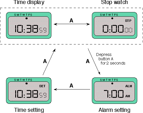
Figure 5 State transitions of a digital watch (from [1])

Industrial interfaces

The interfaces to office systems have changed dramatically over the last decade. However, some care is needed in transferring the idioms of office-based systems into the industrial domain. Office information is primarily textual and slow varying, whereas industrial interfaces may require the rapid assimilation of multiple numeric displays, each of which is varying in response to the environment. Furthermore, the environmental conditions may rule out certain interaction styles (e.g., the oil soaked mouse). Consequently, industrial interfaces raise some additional design issues rarely encountered in the office.

Glass interfaces vs. dials and knobs

The traditional machine interface consists of dials and knobs directly wired or piped to the equipment. Increasingly, some or all of the controls are replaced with a glass interface, a computer screen through which the equipment is monitored and controlled. Many of the issues are similar for the two kinds of interface, but glass interfaces do have some special advantages and problems. For a complex system, a glass interface can be both cheaper and more flexible, and it is easy to show the same information in multiple forms (Figure 6). For example, a data value might be given both in a precise numeric field and also in a quick to assimilate graphical form. In addition, the same information can be shown on several screens. However, the information is not located in physical space and so vital clues to context are missing - it is easy to get lost navigating complex menu systems. Also, limited display resolution often means that an electronic representation of a dial is harder to read than its physical counterpart; in some circumstances both may be necessary as is the case on the flight deck of a modern aeroplane.

Figure 6. Multiple representations of the same information.

Indirect manipulation

The phrase 'direct manipulation' dominates office system design. There are arguments as to its meaning and appropriateness even there, but it is certainly dependent on the user being in primary control of the changes in the interface. The autonomous nature of industrial processes makes this an inappropriate model. In a direct manipulation system, the user interacts with an artificial world inside the computer (for example, the electronic desktop).

Figure 7. Office system - direct manipulation

In contrast, an industrial interface is merely an intermediary between the operator and the real world. One implication of this indirectness is that the interface must provide feedback at two levels. At one level, the user must receive immediate feedback, generated by the interface, that keystrokes and other actions have been received. In addition, the user's actions will have some effect on the equipment controlled by the interface and adequate monitoring must be provided for this.

Figure 8. Indirect manipulation - two kinds of feedback

The indirectness also causes problems with simple monitoring tasks. The delays due to periodic sampling, communication delays and digital processing often mean that the data displayed is somewhat out of date. If the operator is not aware of these delays, diagnoses of system state may be wrong. These problems are compounded if the interface produces summary information displays. If the data comprising such a display is of different timeliness the result may be misleading.

Finding out more

There are several textbooks some addressing particular aspects of interface design and some with a wider scope. My own (coauthored) book [1] provides a broad introduction to the techniques available for interface analysis and design. Hix and Hartson's book [2] describes a specific design method based around a task analysis notation called UAN (user action notation). Thimbleby and Norman's books [5,6] both give more eclectic views of design from the point of view of a computer scientist and a psychologist respectively. Monk et al. [4] addresses the evaluation of interfaces offering a 'budget' approach. Lists of detailed interface guidelines have been produced as part of several civil and military standards (e.g., ISO 9241, DIN 66 234, MIL-STD-1472C). Mayhew's book [3] is one up to date collection of such guidelines and manufacturer's style guides (e.g., Apple's style guide for Macintosh applications) are another source of advice.

Tutorials are offered at several national and international conferences, for example, before the annual British HCI and the US CHI conferences, but care must be taken in selecting such tutorials as the level varies from introductory treatments to research level information. Short courses are also offered by many universities and commercial firms.

In summary

Bad interfaces cost money and can be dangerous. Furthermore, in the European Community, this has become a health and safety matter: employers have a legal duty to ensure that their employee's systems have usable interfaces. In a low budget project, a few measures combined with a 'user oriented' attitude can prevent the worst errors in interface design. However, the human interface should attract at least the same level of resources as any other major part of system design. This might involve training existing staff or bringing in an interface consultant. Remember, whether you are considering a single item of equipment or a whole factory, no matter how well engineered it is, if the operators cannot use it, it is useless.

References

  1. Dix, A., Finlay, J., Abowd, G. and Beale, R., Human-Computer Interaction, Prentice Hall, 1993. (now in second edition, 1998)
  2. Hix. D. and Hartson, H., Developing User Interfaces, Wiley, 1993.
  3. Mayhew, D., Principles and Guidelines in Software and User Interface Design, Prentice Hall, 1992.
  4. Monk, A., Wright, P., Haber, J., and Davenport, L., Improving Your User Interface: A Practical Approach, Prentice Hall, 1993.
  5. Norman, D., The Psychology of Everyday Things, Basic Books, 1988. (Republished as The Design of Everyday Things by Penguin, 1991.)
  6. Thimbleby, H., User Interface Design, Addison-Wesley, 1990.

http://www.hcibook.com/alan/papers/HCI-intro-94/ Alan Dix