Diagram 1
| Edward Gould | Irina Verenikina |
| Department of Business Systems University of Wollongong Northfields Ave.,Wollongong NSW, 2522, Australia |
Institute of Psychology Russian Academy of Sciences 129366, RUSSIA Moscow, Yaroslavskaya, 13-438 |
| email: e.gould@uow.edu.au | email: iver@irina.msk.ru |
KEYWORDS
visualization, interface design, color cognition, human-computer interaction, visual interactive modeling, population modeling.
ABSTRACT
An interface has been designed based on the results of an experiment into the use of color to cater for the unique characteristics of population projection in small geographical areas. The required interface was for the visual presentation of a mass of relevant data from a school population prediction model made available to demographers to manipulate on the screen in the form of colored maps. The basis for the design of the interface was visual interactive modeling and the results of a psychological experiment into aspects of color cognition.
1. INTRODUCTION
A population projection flow model has been developed (Gould 1993) to estimate numbers of school children for a period of five years into the future. The model is part of an information system for educational administration to be used both by middle management and executives in decision making and strategic planning. Using the model effectively involves comparing amalgamated population figures from small school districts with populations projections at a state and national level in order to obtain a "balance" of the two. The balance is necessary because populations projection in small areas cannot take into account variations in population due to immigration and mobility between areas. In order to obtain this balance it is necessary for demographers to be able to adjust the output of the model interactively for known variations in school enrollments and to see the results of the adjustments immediately. However the overwhelming mass of relevant data output by the mathematical flow model is in the form of tables making it difficult for demographers to see patterns of change and well nigh impossible to perform anything more than simple adjustments. This has restricted the use of these models and reduced their effectiveness.
2. INTERFACE DESIGN
To overcome this problem it was necessary to design an interface between the output of the model and the user which combined a number of different visual interface techniques in order to display all relevant data concurrently and at the same time provide demographers with a means of adjusting the data to achieve the "balance". More specifically, the required interface had to provide for a map display of a large amount of relevant data and make it available to demographers in a way that could be manipulated on the screen. This involves maps showing different levels of amalgamation of populations from individual school districts to regions and state totals along with tools with the population can be varied.
3. VISUAL INTERACTIVE MODELING
The interface design has been based on the three modeling primitives that support visual interactive modeling (VIM) namely objects, relations and constraints (Angehrn & Luthi, 1990) and we have related these to the population projection model in the following way.
Objects are concrete or abstract entities such as geographical areas with a set of attributes such as population.
Relations are objects describing structural or functional dependencies between other objects such as immigration and flow rates.
Constraints are the rules governing the allowable attribute values such as maximum gross population figures above which no totals are to rise.
Using these modeling primitives the demographer can incrementally describe different situations and design alternatives by manipulating on the screen the concrete objects associated with different problem entities. In this way the users activity is complemented with suitable feedback.
4. REPRESENTATION OF DATA CHARACTERISTICS USING COLOR
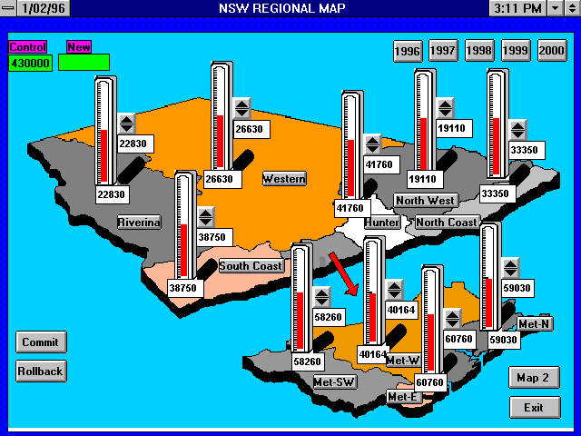
Given that the use of color in screen displays provides many opportunities for the coding and structuring of data (Preece, 1994) the above interactive modeling primitives were combined with the use of color to provide a solution to the interactive display of school population in such a way as to provide a means of manipulating the totals output by the population flow model. An interface has been designed which converts the output of the model to a visual form where the color of the various sections of the geographical map indicate the characteristics of the population. Changes to the values in each area are effected by use of a guage and spin button with the startup value of the population for an individulal area in a box below the guage and the present value in a box on the right (see diagram 1).
Diagram 1
Maps of the areas under study are displayed in colors to represent the notions of increasing, decreasing and stable populations within each of the areas shown on the map. Modifications can be tracked visually without recourse to tables. Adjustments can be made as the need arises until the demographer is satisfied that the best result has been achieved. In order to discover the proper colors to represent population characteristics the following experiment was devised.
5. THE EXPERIMENT
5.1 Method
The experiment had two objectives:
(1) to discover which colors and in what combinations could be used as the optimal means of representing the commonsense notions of increasing, decreasing and stable populations (Tasks 1,2 and 3)
(2) to discover the effect of varying the luminance (different shades of color) on the most popular colors for the same notions of increasing, decreasing and stable (Task 4).
Participants were individually tested on a series of tasks. In the first task they were presented with the 15 colored cards and asked to arrange them into groups representing three notions: that of "increasing" ("growing", "developing"), "stable" ("neutral", "constant"), "decreasing" ("reducing", "diminishing") without any reference to population. In the second task, groups of three colors were arranged together in shapes representing populations on maps and participants were asked to point to zones of increasing, decreasing and neutral populations. As well as providing a link between tasks one and three by introducing the participants to the idea of maps representing three population zones, the purpose of this task was to test whether a combination of three colors on the same map had any influence on color association. The third task consisted of asking participants to choose the best representation of the three population zones from amongst the fifteen colors displayed on the cards. The fourth task was based on the results of the previous three tasks and was conducted one week later on a color monitor. Diagrams in the shape of maps were displayed showing different shades (luminance) of the three most popular colors grouped together on two maps each containing seven zones. Colors and luminance used were orange in light (lum = 50142), medium (lum=42120) and dark (lum = 36102), gray in dark (lum = 37213), medium (lum = 46800) and light (lum = 52939) and white. The same seven zones were used on each of the maps but their positions relative to one another were changed. Participants were asked first to choose which zones represented the same three notions and second to indicate the degree of increasing or decreasing for the different saturations of the three colors.
5.2 Results
Task 1: The most commonly chosen colors without reference to population were: orange and red to represent the notion of increasing, white to represent stable and dark gray and black to represent decreasing.
Task 2: The results of this task confirmed the hypothesis that combinations of colors on a map did not deteriorate the association of the most popular colors (from task one) with the three notions of increasing, decreasing and stable but in fact reinforced the association.
Task 3: When given a free choice of color to represent changing population, the participants choices confirmed the results in task one with white, dark gray/black and orange/red chosen to represent stable, decreasing and increasing populations respectively.
Task 4: Results show that luminance doesn't interfere with the population/color associations of the three most popular colors. In this respect color is useful in being able to convey two aspects of complex data on the screen thus freeing up other tools for use in manipulating numbers.
6. CONCLUSION
Based on these experimental results and VIM primitives a workable prototype interface to the population projection model has been produced. It has proved highly successful and will fulfill a much needed gap between the model and user. Another development arising from the success of the color experiment is the use of this medium such that its saturation is used as the controlling factor in the manipulation of the populations. Modifications along these lines are planned after suitable experiments have been devised to determine the optimal method for doing this. As well as this work is progressing on a conceptual framework for VIM using the Russian developed Activity Theory as psychological platform.
REFERENCES
Gould, E., 1993, An Interactive Flow Model For Projecting School Enrolments, International Review of Education, 39:4, 319-332, Kluwer Academic, Netherlands.
Hasan H and Gould E., 1995, The Evolution of an Information System for Managerial Use: A Longitudinal Study, Australian Journal of Information Systems, Vol 2 No 2, pp 88-93.
Gould, E. and Verenikina, I., 1995, Population Modelling Design Based on an Activity Theory, 6th Congress on Activity Theory, Moscow, pp 134-138.
Gould, E. and Verenikina, I., 1995, Visualization Of Complex Data Displays: An Application To Interactive School Population Modelling, OZCHI'95 Conference, Wollongong, pp 99-112.
Hasan H and Gould E., 1995, EIS In The Australian Public Sector, Journal of Decision Systems, Vol 3 No 4, pp 301-319. The following binary file has been uuencoded to ensure successful transmission. Use UUDECODE to extract.