So What (making sense of statistics) – 4 – What have you really shown?

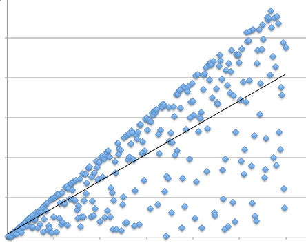
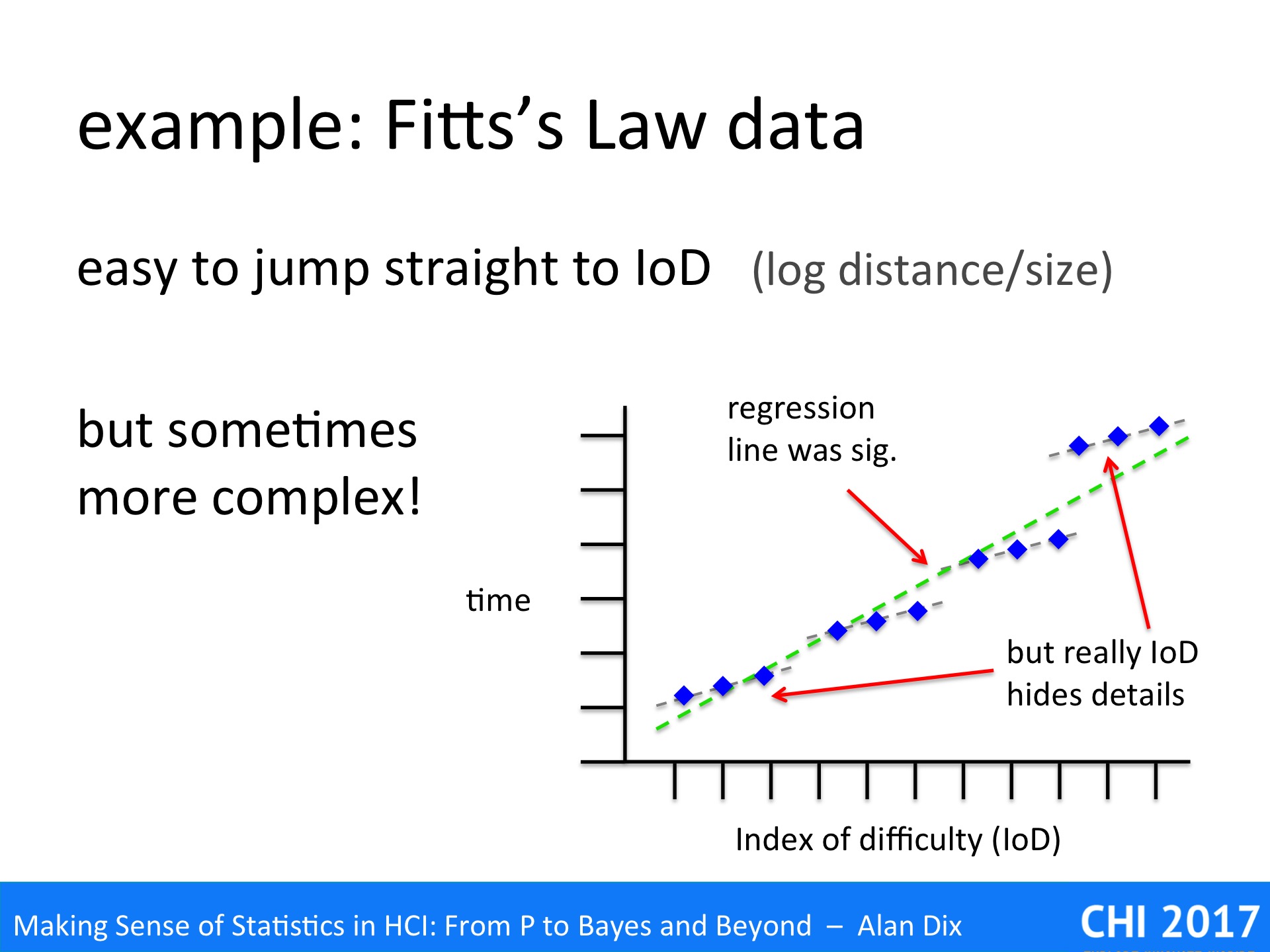
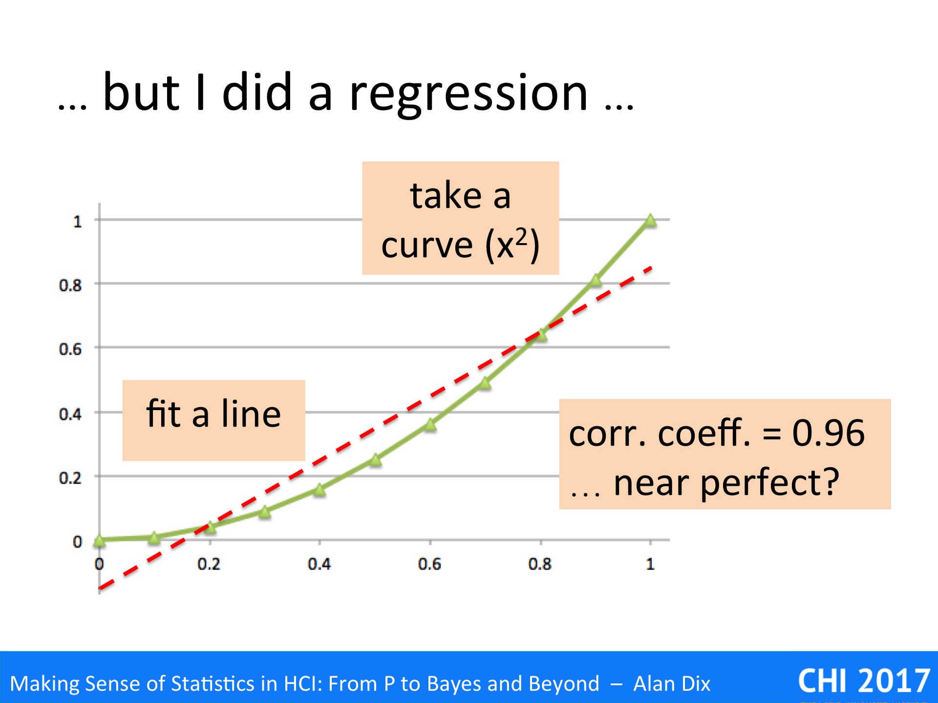
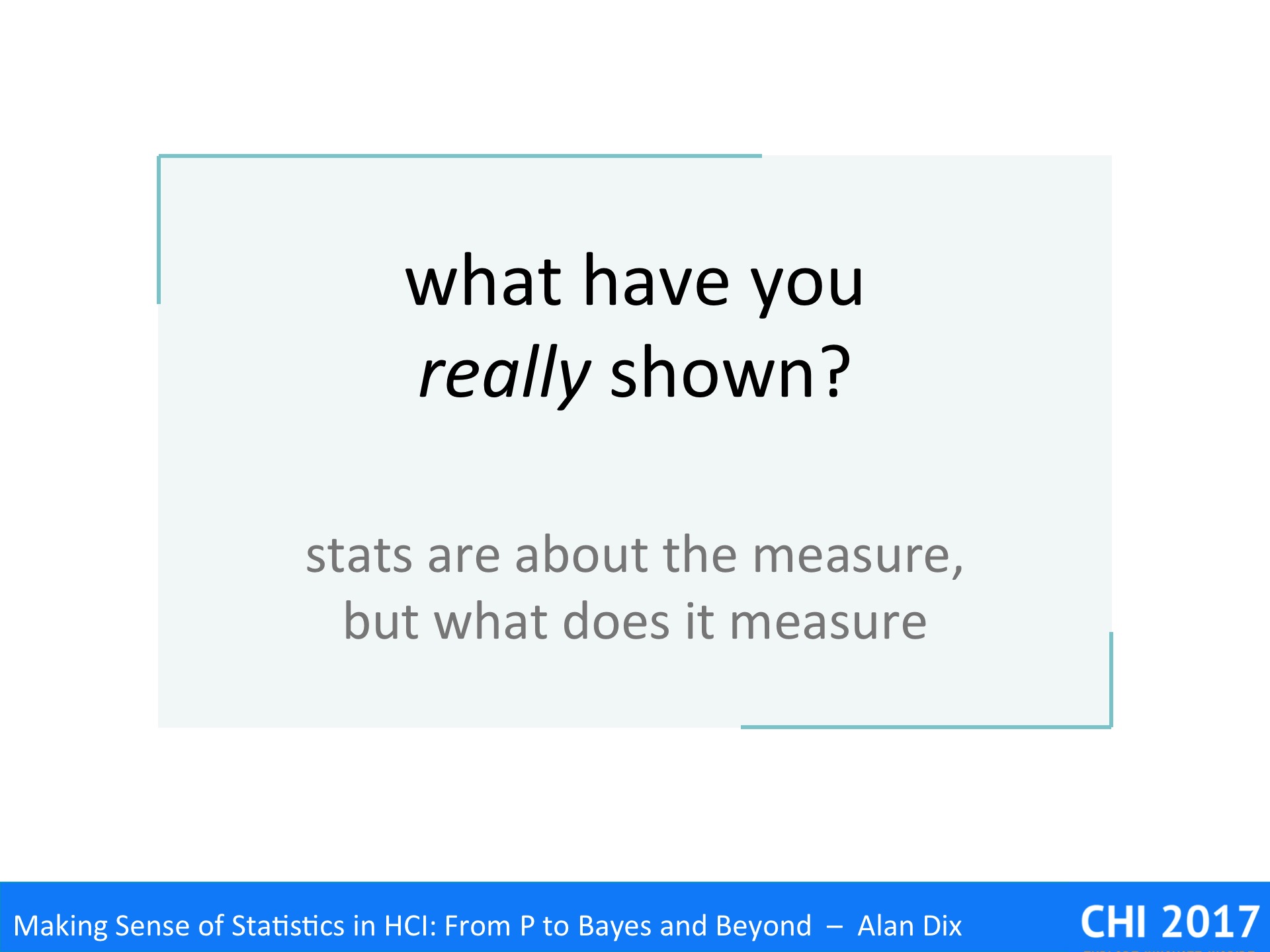
Statistics is largely about assessing and validating measured values, but what do they actually measure?

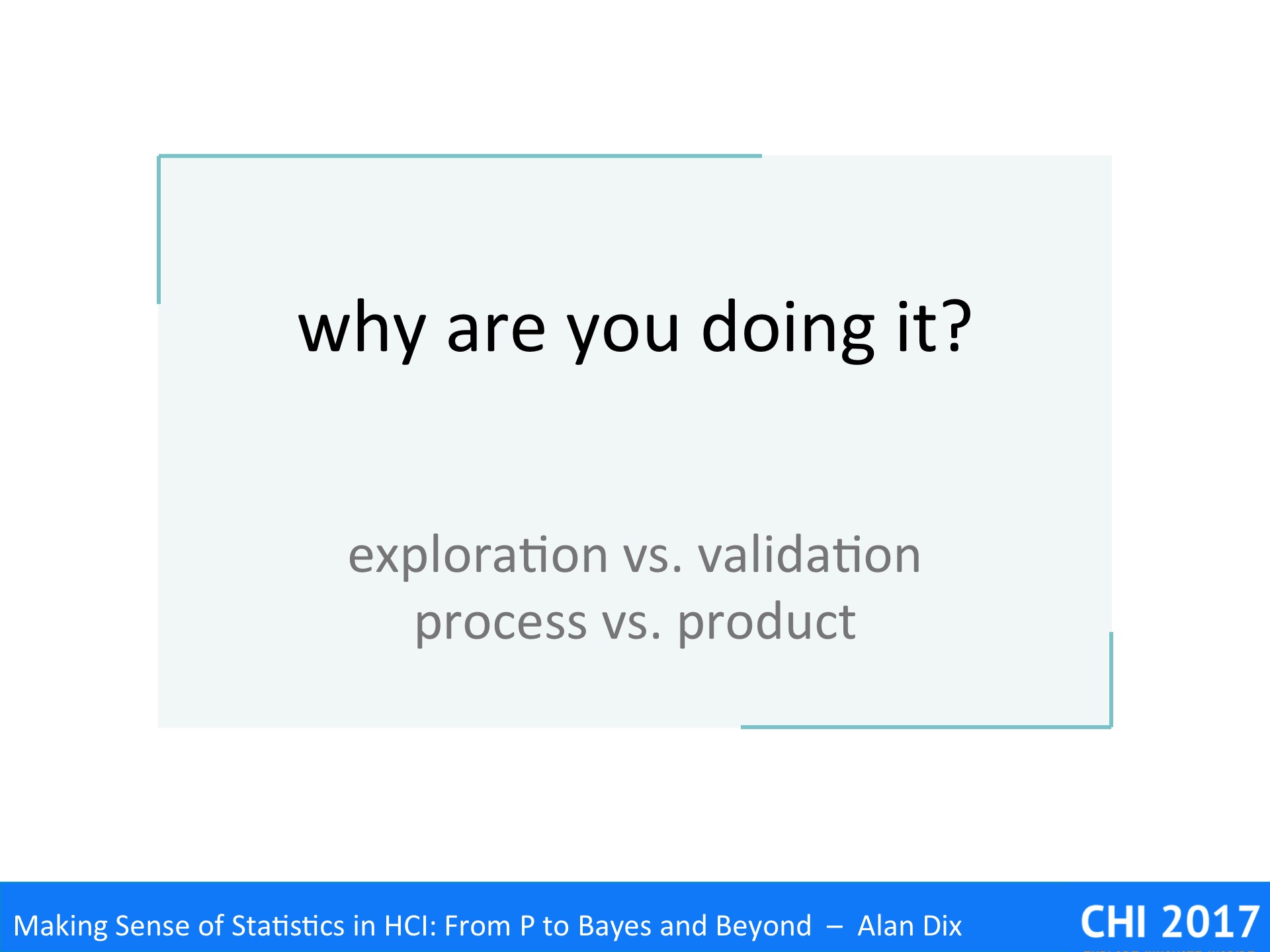
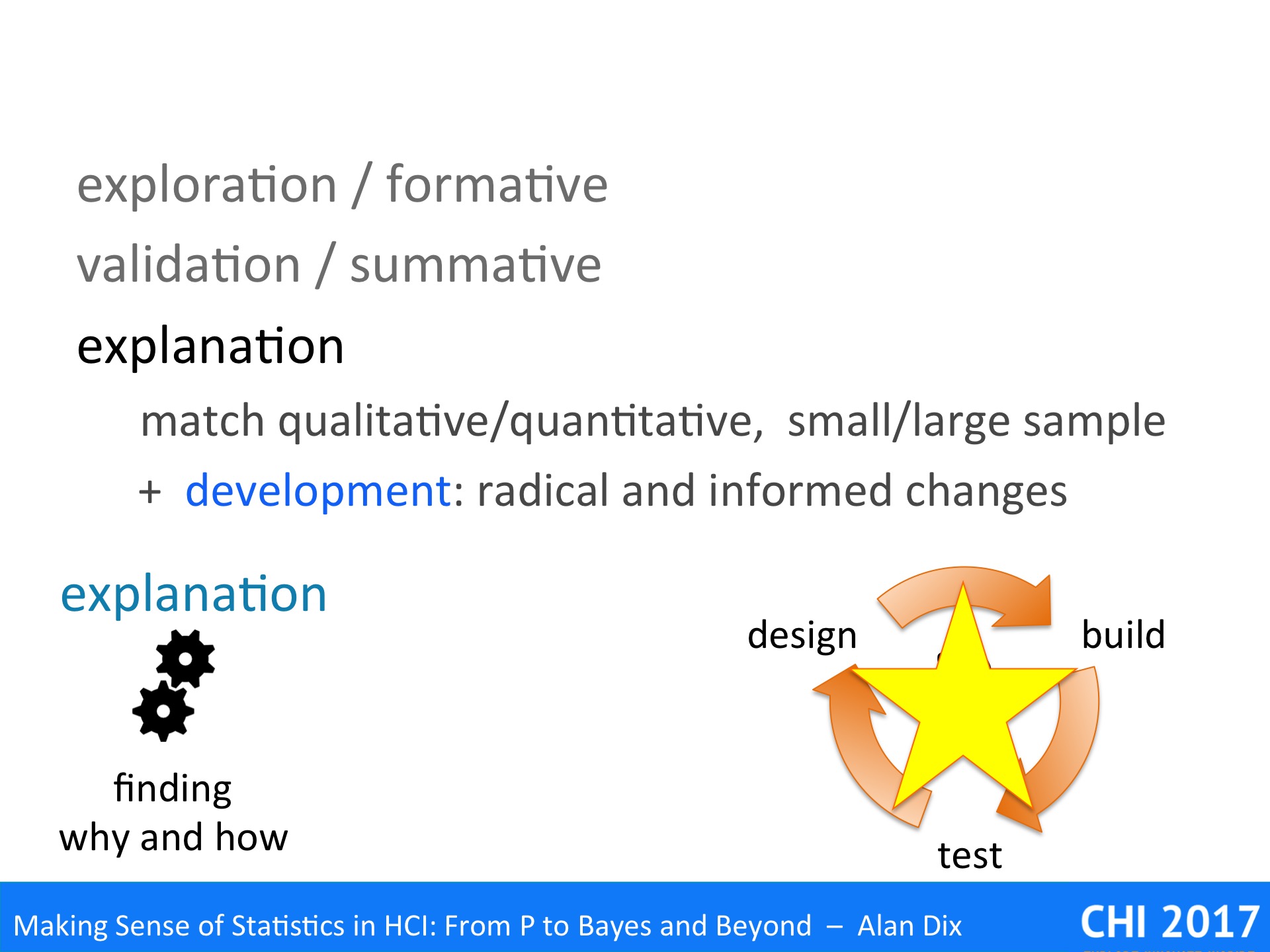
Thinking about the conditions – what have you really shown – some general result or simply that one system or group of users is better than another?

In an example we will look at how a paper published at a major ACM conference appeared to be demonstrating the value of a particular kind of interaction style for a particular problem, but may simply be that they chose a particularly bad system as one of their experimental conditions.

Imagine you have got good data and a gold standard p-value. You are about to rite in your conclusions that using reverse alphabetic menus leads to faster access times than other layouts. However, before you commit, ask yourself “what else might have cased this result”. Maybe the tasks you used tended to include a lot of items starting with x, y and z?

If you find alternative explanations you might be able to look at your data in a different way to tease out the difference between your original hypothesis and the alternatives.   Can’t this would be an opportunity to plan a new experiment that exposes the difference.

It is easy to get confused between things that are true about your subjects and things that are true generally. Imagine you have a mobile phone app for amusement parks that offers games for families to play together while they wait in the queue for a ride.   You give the app to four families who have new app and also have a small clicker device where they are asked at intervals whether or not they are happy. The families visit many rides during the day and you analyse the data to see whether they are more happy while waiting in queues that have a game compared with those that don’t. Again you get a gold standard p-value and feel you are ready to publish.

However, if you had a small number of families, and a lot of data per family, what your statistics have probably told you is that you can accurately say for those four families, that they are, on average, happier when they play the app games. However, this is a reliable result about a few families, not a general result about all families; for that you would need far more families and different statistical analysis.

Perhaps even harder to spot because it is so common is to confuse results about specific systems with results about the properties they embody.

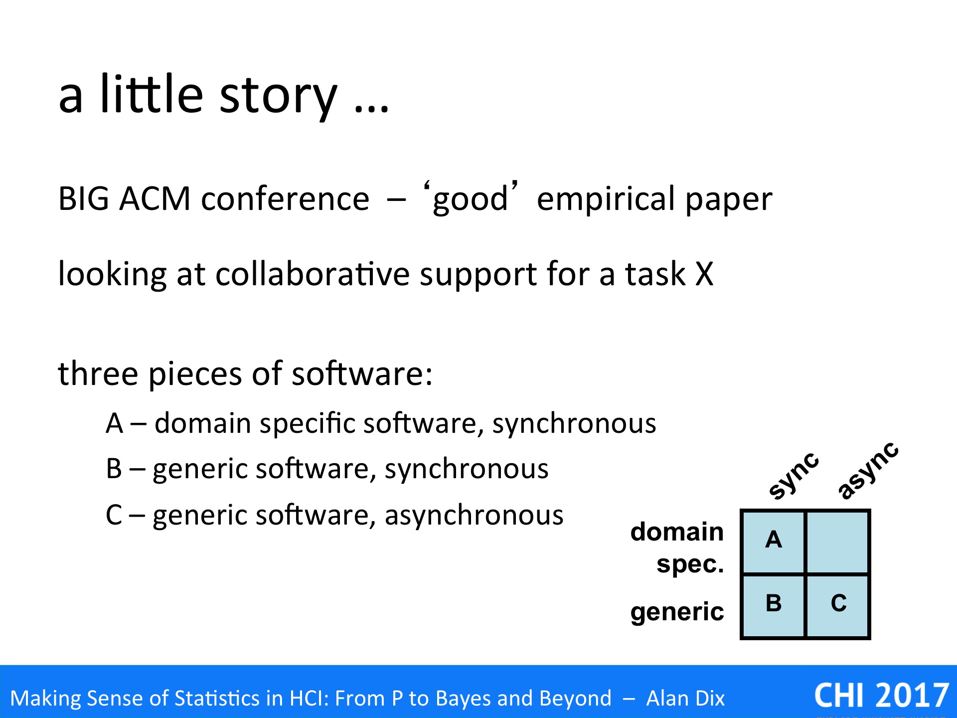
To illustrate this we’ll look at a little story from a few years ago.

It was a major ACM conference and the presentation of, what appeared to be, a good empirical paper. The topic was tools to support a collaborative task which we’ll call ‘X’.

The researchers were interested in two main factors:

  • domain specific for task X vs more generic software
  • synchronous vs asynchronous collaboration

They found three pieces of existibg siftware that covered three of the four slots’ in the design space:

  • A – domain specific software, synchronous
  • B – generic software, synchronous
  • C – generic software, asynchronous

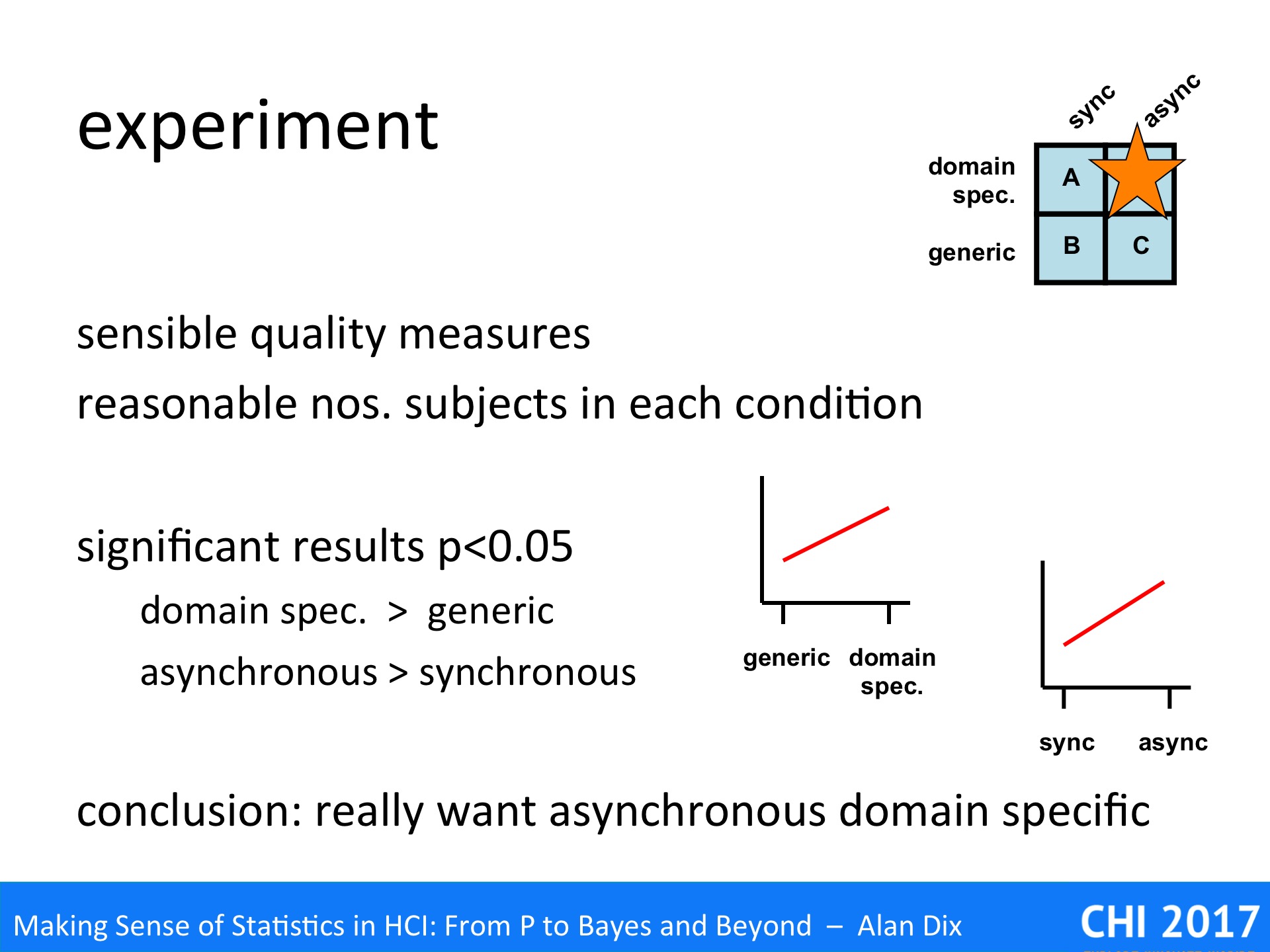
The experiment used sensible measures of quality for the task and had a reasonable number of subjects in each condition. Overall it seemed to be well conducted and, it had statistically significant results.

The results showed that:

  • domain specific was better than generic
  • asynchronous was better than synchronous

The authors concluded that what was really needed was the missing gap in the deisgn space, asynchronous domain specific software for X. One assume that in the next year’s conference they may have a paper on just such a piece of software,.

There are some problems with this due to interaction effects, there may be some aspect to the task that means that while domain specific synchronous software is was better than generic software and also asynchronous generic software was better for task X than than synchronous generic software, still it could be that asynchronous domain specific software is worse. However, this is still a good place to look.

Much more important is that if you blinked at the wrong moment in the presentation, you could easily miss that the whole research results are potentially completely wrong.

Although the presentation discussed the experiment mostly in terms of the properties, and certainly the paper’s conclusions did this. In fact these were not independently varied. Instead three systems were used that happened to embody the relevant properties,

Say system B just happened to be a badly designed piece of software, nothing to do with the articular properties. In comparisons System B was would be worse than system A, which would be interpreted as domain specific is better than generic. Similarly system B would be worse than system C, being interpreted as asynchronous is better than synchronous … bit really system B just happens to be bad!

Weirdly most experimenters would realise that this was an issue if there were only three users, but having a small number of pieces of software often goes unnoticed.

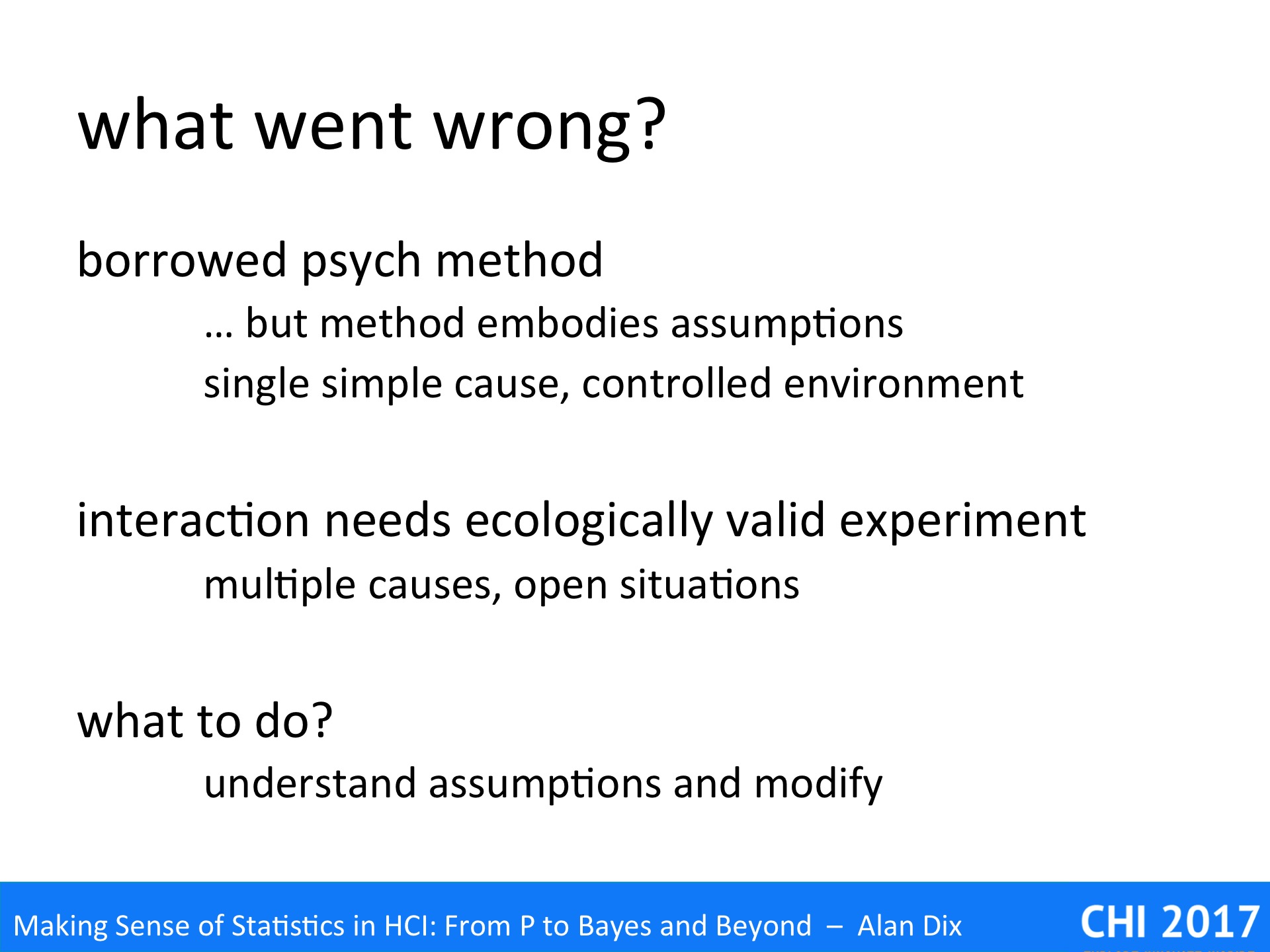
So, what went wrong?

The experiment as run with borrowed methods from psychology, where the controlled experiments typically have a single cause and are in highly controlled environments, so that only the particular aspect being studied is varied between trials. The task X experiment appears in the guise of just such a controlled experiment, varying a single quality: bespoke vs. generic, synchronous vs. asynchronous.

However, interaction, even in lab settings, needs some level of ecological validity and indeed the systems used in the experiment were real software, with all their complexities.   However, the nature of such ecologically valid experiments is that there are always multiple causes and open situations. Indeed, Carroll and Rosson’s claims analysis [CR92] embraces the alterative and possibly multiple causes of the success (or failure!) of systems.

The obvious way to address this would be to have lots and lots of systems embodying each property, just as you have lots and lots of users. However, this is typically impractical, so that I have previous declared that:

the evaluation of generative artefacts is methodologically unsound [Dx08]

However, this does not mean that it is not possible to validate principles.

You can use rich data, for example, collecting logs or video, using think aloud protocols, or post-task interviews. This could be analysed looking for incidents that make it clear whether the poor performance of system B is due to the properties being studied or other factors (such as general poor design).

In general when you use any form of research methodology borrowed from another area, make sure you understand the assumptions behind it and modify it appropriately when you use it for yourself.


References

[CR92] John M. Carroll and Mary Beth Rosson. 1992. Getting around the task-artifact cycle: how to make claims and design by scenario. ACM Trans. Inf. Syst. 10, 2 (April 1992), 181-212. DOI=http://dx.doi.org/10.1145/146802.146834

[Dx08] A. Dix (2008). Theoretical analysis and theory creation, Chapter 9 in Research Methods for Human-Computer Interaction, P. Cairns and A. Cox (eds). Cambridge University Press, pp.175–195. ISBN-13: 9780521690317 http://www.alandix.com/academic/papers/theory-chapter-2008/

So What (making sense of statistics) – 3 – Visualise carefully

Visualisation is a powerful tool that can help you highlight the important features in your data, but is also dangerous and can be misleading.

Visualisation is a huge topic in its own right, but for initial eyeballing of raw data one is most often using quite simple scatter plots, line graphs or histograms, so here we will deal with two choices you make about these: the baseline and the basepoint.

The first, the baseline, is about where you start place the bottom of your graph at zero or some other value, a ‘false’ baselines. The second, the basepoint, is about the left-to-right start.

Mathematically speaking, the x and y axes are no different, you can graph data either way, but conventionally they are used differently. Typically the x (horizontal) axis shows the independent variable, the thing that you choose to vary experimentally (e.g. distance to target), or given by the world (e.g. date), the vertical, y, axis is usually the dependent variable, what you measure, for example response time or error rate.


As noted, the baseline is about where you start, whether you place the bottom of your graph at zero or some other value: the former is arguably more ‘truthful’, but the latter can help reveal differences that might get lost of the base effect is already large – think of climbing ‘small’ peaks near the top of Everest.

In the graph on the top right there is a clear change of slope. However, look more carefully at the vertical scale (you may need to zoom in!). The scale starts at 57.92 and the total range of the values plotted is just 0.02. This is a false baseline, instead of starting the scale at zero, it has started at anther value (in this case 57.92).

The utility of this is clear. If the data had been plotted on a full scale of, say, 0-60, then even the slope would be hard to see, let alone the change in slope. Whether these small changes are important depends on the application.

Scientists use a Kelvin scale for temperature, starting at absolute zero (-273 C), but if you used this as a full scale for day-to-day measurements, even the difference between a hot summer’s day and midwinter would only be about 10%, the ‘false’ baseline of the centigrade and Fahrenheit scales are far more useful.

This is even more important in a hospital: the difference between normal temperature and high fever, would be imperceptible (less than 1%) on a Kelvin scale, and medical thermometers do not even show a full centigrade range, but instead range from mid 30s to low 40s.

Of course, a false baseline can also be misleading if the reader is not aware of it, making insignificant differences appear large. This may happen by accident, or may be deliberate!

Many years ago there used to be a TV advert for a brand of painkiller, let’s call it Aspradine. The TV advert showed a laboratory with impressive scientific figures in white lab coats. On the laboratory bench was a rack of four test-tubes, each part filled with white powder all at the same height.   The camera zoomed into a view of the top portion of the test-tubes, and to the words “Aspradine has 25% more active ingredient than other brands”, additional powder was poured into one, which rose impressively.

Of course the words were perfectly accurate, and I’m sure they were careful to actually only add a quarter extra to the tube, but the impression given was of a much larger difference.

The photographs of President Trump’s inauguration are a high profile (and highly controversial!) example of this effect. Looking at photos from the front of the crowd, it is very hard to tell the difference between different inaugurations – all look full at the front, just like if the advert had just sown the bottom half of the test-tubes. However, the image from the back clearly shows the quite substantial, and not unexpected, differences between different inaugurations. The downside to this is that, just like the Aspradine advert’s image of the top of the test-tubes or the slope in the graph, it gave the impression that the 2017 crowd was in fact very small … and reported by at least one news outlet at only a quarter of a million, which then Trump heard, responded to in his CIA speech … and, as they say, the rest is history.

Hopefully your research will not be as controversial, but beware, whether or not this sort of rhetoric is acceptable in the marketing or political arena, be very careful in your academic publications!

The graph at the top of this slide shows UK public sector borrowing over a 20-year period. Imagine you want to quote a 10-year change figure. One choice might be to look at the lowest point in 2007 and compare to the highest point in 2017 (the green line). Alternatively you might choose the highest point in 2007 and compare with the lowest in 2017. The first would suggest that there had been a massive increase in public sector borrowing; the latter would suggest a massive decrease. Both would be misleading!

In this case the data is clearly seasonal, related, one assumes, to varying tax revenues through the year, and perhaps differing costs. Often such data is compared at like-time’s each year (say Jan-Jan), which would give a fairer comparison.

If the data simply varies a lot then some form of average is often better. The lower graph shows precisely the same UK public borrowing data, but averaged over 12 month periods.   Now the long-term trends are far more clear, not least the huge hike at the start of the global recession when there were large-scale bank bailouts followed by a crash in tax revenues.

For a real example of this see my blog “the educational divide – do numbers matter?“.

https://alandix.com/blog/2016/12/24/the-educational-divide-do-numbers-matter/

Finally, you may think that unless one were deliberately intending to deceive, no-one could make the mistake of using either of the two initial lines as both are so clearly misleading. However, imagine you had never plotted the data and instead it was simply a large spreadsheet full of numbers. It would be easy to pick and arbitrary start and end dates not realising the choice was so critical.

So another reminder – look at the data!

So What (making sense of statistics) – 2 – Look at the data

Look at the data, don’t just add up the numbers.

It seems an obvious message, but so easy to forget when you have that huge spreadsheet and just want to throw it into SPSS or R and see whether all your hard work was worthwhile.

But before you jump to work out your T-test, regression analysis or ANOVA, just stop and look.

Eyeball the raw data, as numbers, but probably in a simple graph- but don’t just plot averages, initially do scatter plots of all the data points, so you can get a feel for the way it spreads. If the data is in several clumps what do they mean?

Are there anomalies, or extreme values?

If so these may be a sign of a fault in the experiment, maybe a sensor went wrong; or it might be something more interesting, a new or unusual phenomenon you haven’t thought about.

Does it match your model. If you are expecting linear data does it vaguely look like that? If you are expecting the variability to stay similar (an assumption of many tests, including regression and ANOVA).

The graph above is based on one I once saw in a paper (recreated here), where the authors had fitted a regression line.

However, look at the data – it is not data scattered along a line, but rather data scattered below a line. The fitted line is below the max line, but the data clearly does not fit a standard model of linear fit data.

A particular example in the HCI literature where researchers often forget to eyeball the data is in Fitts’ Law experiments. Recall that in Fitts’ original work [Fi54] he found that the time taken to complete tasks was proportional to the Index of Difficulty (IoD), which is the logarithm of the distance to target divided by the target size (with various minor tweeks!):

IoD = log2 ( distance to target / target size )

Fitts’ law has been found to be true for many different kinds of pointing tasks, with a wide variety of devices, and even over multiple orders of magnitude. Given this, many performing Fitts’ Law related work do not bother to separately report distance and target size effects, but instead instantly jump to calculating the IoD assuming that Fitts’ Law holds. Often the assumption proves correct …but not always.

The graph above is based on a Fitts’ Law related paper I once read.

The paper was about the effects of adding noise to the pointer, as if you had a slightly dodgy mouse. Crucially the noise was of a fixed size (in pixels) not related to the speed or distance of mouse movement.

The dots on the graph show the averages of multiple trials on the same parameters: size, distance and the magnitude of the noise were varied. However, size and distance are not separately plotted, just the time to target against IoD.

If you understand the mechanism (that magic word again) of Fitts’ Law [Dx03,BB06], then you would expect anomalies’ to occur with fixed magnitude noise. In particular if the noise is bigger than the target size you would expect to have an initial Fitts Movement to the general vicinity of the target, but then a Monte Carlo (utterly random) period where the noise dominates and its pure chance when you manage to click the target.

Sure enough if you look at the graph you see small triads of points in roughly straight lines, but then the cluster of points following a slight curve. The regression line is drawn, but this is clearly not simply data scattered around the line.

In fact, given the understanding of mechanism, this is not surprising, but even without that knowledge the graph clearly shows something is wrong – and yet the authors never mentioned the problem.

One reason for this is probably because they had performed a regression analysis and it had come out statistically significant. That is they had jumped straight for the numbers (IoD + regression), and not properly looked at the data!

They will have reasoned that if the regression is significant and correlation coefficient strong, then the data is linear. In fact this is NOT what regression says.

To see why, look at the data above. This is not random simply an x squared curve. The straight line is a fitted regression line, which turns out to have a correlation coefficient of 0.96, which sounds near perfect.

There is a trend there, and the line does do a pretty good job of describing some of the change – indeed many algorithms depend on approximating curves with straight lines for precisely this reason. However, the underlying data is clearly not linear.

So next time you read about a correlation, or do one yourself, or indeed any other sort of statistical or algorithmic analysis, please, Please, remember to look at the data.

References

[BB06] Beamish, D., Bhatti, S. A., MacKenzie, I. S., & Wu, J. (2006). Fifty years later: a neurodynamic explanation of Fitts’ law. Journal of the Royal Society Interface, 3(10), 649–654. http://doi.org/10.1098/rsif.2006.0123

[Dx03] Dix, A. (2003/2005) A Cybernetic Understanding of Fitts’ Law. HCI book online! http://www.hcibook.com/e3/online/fitts-cybernetic/

[Fi54] Fitts, Paul M. (1954) The information capacity of the human motor system in controlling the amplitude of movement. Journal of Experimental Psychology, 47(6): 381-391, Jun 1954,. http://dx.doi.org/10.1037/h0055392


So What (making sense of statistics) – 1 – why are you doing it?

You have done your experiment or study and have your data, maybe you have even done some preliminary statistics – what next, how do you make sense of the results?

This part of will looks at a number of issues and questions:

  • Why are you doing it the work in the first place? Is it research or development, exploratory work, or summative evaluation?
  • Eyeballing and visualising your data – finding odd cases, checking you model makes sense, and avoiding misleading diagrams.
  • Understanding what you have really found – is it a deep result, or merely an artefact of an experimental choice?
  • Accepting the diversity of people and purposes – trying to understand not whether your system or idea is good, but who or what it is good for.
  • Building for the future – ensuring your work builds the discipline, sharing data, allowing replication or meta-analysis.

Although these are questions you can ask when you are about to start data analysis, they are also ones you should consider far earlier. One of the best ways to design a study is to imagine this situation before you start!.

When you think you are ready to start recruiting participants, ask yourself, “if I have finished my study, and the results are as good as I can imagine, so what? What do I know?” – it is amazing how often this leads to a complete rewriting of a survey or experimental redesign.

Are you doing empirical work because you are an academic addressing a research question, or a practitioner trying to design a better system? Is your work intended to test an existing hypothesis (validation) or to find out what you should be looking for (exploration)? Is it a one-off study, or part of a process (e.g. ‘5 users’ for iterative development)?

These seem like obvious questions, but, in the midst of performing and analysing your study, it is surprisingly easy it is to lose track of your initial reasons for doing it. Indeed, it is common to read a research paper where the authors have performed evaluations that are more appropriate for user interface development, reporting issues such as wording on menus rather than addressing the principles that prompted their study.

This is partly because there are similarities, in the empirical methods used, and also parallels between stages of each. Furthermore, your goals may shift – you might be in the midst of work to verify a prior research hypothesis, and then notice and anomaly in the data, which suggests a new phenomenon to study or a potential idea for a product.

We’ll start out by looking at the research and software-development processes separately, and then explore the parallels.

There are three main uses of empirical work during research, which often relate to the stages of a research project:

exploration – This is principally about identifying the questions you want to ask. Techniques for exploration are often open-ended. They may be qualitative: ethnography, in-depth interviews, or detailed observation of behaviour whether in the lab or on the wild.   However, this is also a stage that might involve (relatively) big data, for example, if you have deployed software with logging, or have conducted a large scale, but open ended, survey. Data analysis may then be used to uncover patterns, which may suggest research questions. Note, you may not need this as a stage of research if you come with an existing hypothesis, perhaps from previous phases of your own research, questions arising form other published work, or based on your own experiences.

validation – This is predominantly about answering questions or verifying hypotheses. This is often the stage that involves most quantitative work: including experiments or large-scale surveys. This is the stage that one most often publishes, especially in terms of statistical results, but that does not mean it is the most important. In order to validate, you must establish what you want to study (explorative) and what it means (explanation).

explanation – While the validation phase confirms that an observation is true, or a behaviour is prevalent, this stage is about working out why it is true, and how it happens in detail. Work at this stage often returns to more qualitative or observational methods, but with a tighter focus. However, it may also me more theory based, using existing models, or developing new ones in order to explain a phenomenon. Crucially it is about establishing mechanism, uncovering detailed step-by-step behaviours … a topic we shall return to later.

Of course these stages may often overlap and data gathered for one purpose may turn out to be useful for another. For example, work intended for validation or explanation may reveal anomalous behaviours that lead to fresh questions and new hypothesis. However, it is important to know which you were intending to do, and if you change when and why you are looking at the data differently … and if so whether this matters.

During iterative software development and user experience design, we are used to two different kinds of evaluation:

formative evaluation – This is about making the system better. This is performed on prototypes or experimental systems during the cycles of design–build–test. The primary purpose of formative evaluation is to uncover usability or experience problems for the next cycle.

summative evaluation – This is about checking that the systems works and is good enough. It is performed at the end of the software development process on a pre-release product. IT may be related to contractual obligations: “95% of users will be able to use the product for purpose X after 20 minutes training”; or may be comparative: “the new software outperforms competitor Y on both performance and user satisfaction”.

In web applications, the boundaries can become a little less clear as changes and testing may happen on the live system as part of perpetual-beta releases or A–B testing.

Although research and software development have different overall goals, we can see some obvious parallels between the two. There are clear links between explorative research and formative evaluations, and between validation and summative evaluations. Although, it is perhaps less clear immediately how explanatory research connects with development.

We will look at each in turn.

During the exploration stage of research or during formative evaluation of a product, you are interested in finding any interesting issue. For research this is about something that you may then go on to study in depth and, hopefully, publish papers about. In software development tis is about finding usability problems to fix or identifying opportunities for improvements or enhancements.

It does not matter whether you have fond the most important issue, or the most debilitating bug, so long as you have found sufficient for the next cycle of development.

Statistics are less important at this stage, but may help you establish priorities. If costs or time is short, you may need to decide out of the issues you have uncovered, which is most interesting to study further, or fix first.

One of the most well known (albeit misunderstood ) myths of interaction design is the idea that five users are enough.

The source of this was Nielsen and Landaur’s original paper [NL93], nearly twenty-five years ago. However, this was crucially about formative evaluation during iterative evaluation.

I emphasise it was NOT about either summative evaluation, not about sufficient numbers for statistics!

Nielsen and Landaur combined a simple theoretical model based on software bug detection with empirical data from a small number of substantial software projects to establish the optimum number of users to test per iteration.

Their notion of ‘optimum’ was based on cost-benefit analysis: each cycle of development cost a certain amount, each user test cost a certain amount. If you uncover too few user problems in each cycle you end up with lots of development cycles, which is expensive in terms of developer time. However, if you perform too many user tests you end up finding the same problems, thus wasting user-testing effort.

The optimum value depended on the size and complexity of the project, with the number higher for more complex projects, where redevelopment cycles were more costly, and the figure of five was a rough average.

Now-a-days, with better tool support, redevelopment cycles are far less expensive than any of the projects in the original study, and there are arguments that the optimal value now may even be just testing one user [MT05]   – especially if it is obvious that the issues uncovered are ones that appear likely to be common.

However, whether one, five or twenty user, there will be more users on the next iteration – this is not about the total number of users tested during development. In particular, at later stages of development, when the most glaring problems have been sorted, it will become more important to ensure you have covered a sufficient range of the

For more on this see Jakob Neilsen’s more recent and nuanced advice [Ni12] and my own analyses of “Are five users enough?” [Dx11].

In both validation in research and summative evaluation during development, the focus is much more exhaustive: you want to find all problems, or issues (hopefully not many left during summative evaluation!).

The answers you need are definitive, you are not so much interested in new directions (although this may be an accidental outcome), but instead verifying that your precise hypothesis is true, or that the system works as intended. For this you may need statistical test, whether traditional (p value) or Baysian (odds ratio).

You may also be after numbers: how good is it (e.g., “nine out of ten owners say their cats prefer …”), how prevalent is an issue (e.g., “95% of users successfully use the auto-grow feature”). For this the size of effects are important, so you may me more interested in confidence intervals, or pretty graphs with error bars on them.

While validation establishes that a phenomenon occurs, what is true, explanation tries to work out why it happens and how it works – deep understanding.

As noted this will often involve more qualitative work on small samples of people, but often connecting with quantitative studies of large samples.

For example, you might have a small number of rich in-depth interviews, but match the participants against the demographics of large-scale surveys. Say that a particular pattern of response is evident in the large study. If your in-depth interviewee has a similar response, then it is often a reasonable assumption their their reasons will be similar to the large sample. Of course they could be just saying the same thing, but for completely different reasons, but often commons sense, or prior knowledge means that the reliability is evident. Of course, if you are uncertain f the reliability of the explanation, this could always drive targeted questions in a further round of large-scale survey.

Similarly, if you have noticed a particular behaviour in logging data from a deployed experimental application, and a user has the same behaviour during a think aloud session or eye-tracking session, then it is reasonable to assume that the deliberations, cognitive or perceptual behaviours may well be the same as in the users of the deployed application.

We noted that the parallel with software development was less obvious, however the last example, starts to point towards this.

During the development process, often user testing reveals many minor problems. It iterates towards a good-enough solution … but rarely makes large scale changes. Furthermore, at worst, the changes you perform at each cycle may create new problems. This is a common problem with software bugs, code becomes fragile, but also with user interfaces, where each change in the interface creates further confusion, and may not even solve the problem that gave rise to it. After a while you may lose track of why each feature is there at all.

Rich understanding the underlying human processes: perceptual, cognitive, social, can both make sure that ‘bug fixes’ actually solve the problem, Furthermore, it allows more radical, but informed redesign that may make whole rafts of problems simply disappear.

References

[Dx11] Dix, A. (2011) Are five users enough? HCIbook online! http://www.hcibook.com/e3/online/are-five-users-enough/

[MT05] Marty, P.F. & Twidale, M.B. (2005). Extreme Discount Usability Engineering. Technical Report ISRN UIUCLIS–2005/1+CSCW. http://citeseerx.ist.psu.edu/viewdoc/summary?doi=10.1.1.74.3702

[NL93] Nielsen, J. and Landauer, T. (1993). A mathematical model of the finding of usability problems. INTERACT/CHI ’93. ACM, 206–213.

[Ni12] Nielsen, J (2012). How Many Test Users in a Usability Study? NN/g Norman–Nielsen Group, June 4, 2012. https://www.nngroup.com/articles/how-many-test-users/