|

FireFly - one thousand computers on a Christmas tree
Abstract
In this talk I will give a personal view of the state of HCI as a design discipline and as a scientific discipline and how this is changing in the face of new technological and social situations. Going back 20 years a frequent topic of discussion was whether HCI was a 'discipline'. It is unclear whether this was ever a fruitful topic, but academic disciplines are effectively about academic communities and the establishment of SIGCHI Ireland is yet another sign of the long-term stability of the international HCI/CHI community. However, as in computer 'science', the central scientific core of HCI is perhaps still unclear. A strength of HCI is the closeness between theory and practice, but the corresponding danger is that the two are often confused.
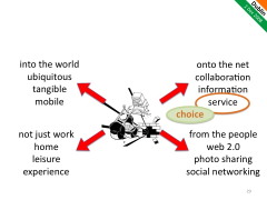
For twenty years the desktop GUI interface has been dominant, but in recent years the computer has 'escaped' the office desktop into the physical world of ubiquitous computing, into the virtual world of the internet, into our homes and our social lives. I will discuss one such change the move from a small number of applications used by many people to a 'long tail' of large numbers of applications used by small numbers of people. This change calls for different practical design strategies; focusing on the peak experience of a few rather than acceptable performance for many ... or as I sometimes refer to it 'Mars Bar vs. baked bean design'.
These changes are a challenge and an opportunity for new research and novel designs. However, as we see more diversity both in terms of types of systems and kinds of concerns, this may also be an opportunity to reflect on what is core across these; potential fragmentation becoming a locus to understand more clearly what defines HCI, not just for the things we see now, but for the future that we cannot see.
Overview
Given this is the Inaugural Lecture of SIGCHI Ireland, it seemed a suitable occasion for a sort of 'state of the nation', giving a personal view of where HCI stands as a discipline and how it can develop and grow [[0]]. However, also I will describe a little of the work of one of my PhD students, which exemplifies some of the broader issues covered.
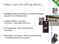
In choosing what to talk about, of course that means there are may things I am leaving out and in particular lots of interesting work with colleagues at Lancaster and elsewhere. So I'm not talking about intelligent Internet interfaces, which has been an interest certainly since dot.com-ing days at aQtive and vfridge, and more recently with the Snip!t web application, work on fuzzy reasoning over personal ontologies and extracting structure from folksonomies [[1]] (I always love playing with opposites). Also not talking about situated displays and phone-base interaction with large displays [[2]], nor about fun and games [[3]], formal modelling of artistic performance [[4]], or slow time [[5]] (not enough time). Nor am I talking about understanding the rôle of physicality in product design [[6]], methods for creativity and innovation [[7]], and modelling dreams and regret [[8]].
And despite the run-up to Christmas, not even talking about FireFly [[9]] and the new medium of digital light . . . but if you are in Lancaster City Centre you can see more computers at one time than you have probably ever seen before as we have been putting micro-processors behind individual LEDs to make 'intelligent' lighting that knows where it is and can produce 2D and 3D displays from lights hung anywhere . . . fancy a Christmas tree with 1000 computers on it!
HCI discipline and science
Although SIGCHI Ireland is new, the roots of HCI go back at least 40 years, with Brian Shackel's paper on ergonomics of displays in 1959 [[10]]. However, the real beginnings of HCI as an emerging discipline are more like 25 years back with the founding of early conferences: CHI, Interact, and British HCI.
My first international conference was Interact'87 in Stuttgart. I recall Brian Shackel giving a plenary. Checking back it was not one of the keynotes, so I assume he was giving some sort of welcome on behalf of IFIP TC13. A key question he posed was whether HCI was a discipline, or merely a meeting between other disciplines. Now this seems rather like navel gazing, but, at the time when HCI was developing coherence, it was a significant question.
ASIDE: I really enjoyed attending Interact'87, but I am afraid it was also one of the worst organised conferences I have ever attended; the conference proceedings did not even arrive until part way through the conference. I mention this because it carries a design lesson.
Although it is a cultural stereotype, one might have expected a conference in Germany to be very efficient . . . and in fact I am sure the German organisers were; it is just that they did not take into account that much of the rest of the world is not: the fact that reviews will be late, final versions of papers not quite on time, etc. Because the organisers expected things to work as planned, the overall plan was fragile. As a general lesson, designs that expect parts to fail and cope with that failure tend to be robust and work when deployed in less than perfect situations. [[11]]
Looking back now we can easily say "of course it is an academic discipline", because what is an academic discipline if it is not an academic community; and with 25 years of SIGCHI, other national societies, IFIP TC 13 .... and now SIGCHI Ireland . . . clearly there is a community!
But that is a little too glib. Science, using the word in the broadest sense, goes beyond community; to be an academic discipline also requires a coherent basis for knowledge. Mere acceptance of knowledge by a group is not sufficient, we need some assurance of the truth or validity of our knowledge. When I flew from Edinburgh to Dublin, I would not have been happy to be merely relying on the opinion of aerospace engineers . . . I want to know that they have a basis for their designs beyond accepted practice.
This brings to mind the discussion in the late '80s initiated by John Long and others, about whether HCI was a craft, engineering or science. Arguably craft really is more about individual experience, but craftsmanship is not what I would want in an aeroplane, nor in Internet banking. Whether we call it science, engineering or simply being academic, we need to be able to give away knowledge to others who should then be able to apply it with surety. However un-PC it is to use this sort of language . . . yes we do want truth and fact sometimes!
So, are we getting there; are we developing this coherent basis for knowledge?
The Irish HCI community is perhaps a little younger (with exceptions) than in some countries, but certainly in the UK there are an increasing number of 'second generation' HCI people - that is people who have done PhDs , masters and maybe even undergraduate courses with a strong HCI element and have now become the teachers and senior researchers themselves. I would describe myself as originally a mathematician who moved into HCI, others have roots on psychology, computer science, sociology, . . . but an increasing number are straight HCI people.
As a sign of community this is very powerful; no longing for a half-remembered homeland elsewhere (yes I still dream of mathematics), but an academic generation who own HCI as their home.
However, this also has given me concern for a number of years. As we gradually lose those strong connections with our old disciplinary roots, have we developed equally strong ones within HCI?
Indeed, there are signs that this is not yet the case. One key example is the relationship between HCI research and practice. One of the great strengths of HCI is that the two are close. To some extent this is true of computing also, but even more so in HCI. There are few fields where the practitioners and researchers can so freely attend the same events, present work to one another and hold discussions. Again this is powerful for HCI as a community and good news for funders looking for industrial relevance; indeed, in many countries, it has been commercial pressure that has driven often reluctant computing departments to take HCI seriously. However, the danger if this is it is easy to confuse the two. Nowhere is this more evident than in usability evaluation.
We all know that evaluation is the sine qua non of HCI. Professionally, often the key rôle of the usability practitioner; and, academically, try getting a paper published without that evaluation box being ticked! The techniques and tools for evaluation are often the same for usability practice and HCI research, whether formal experiments, usability labs, ethnography, prototyping, or maybe even cultural probes or technology probes. However, whilst the techniques are similar, the goals are different. For the usability professional, the ultimate aim is to improve the product, whereas the goal of research is to gain new understanding. In fact, even these goals are interlinked: research systems often need to be designed well enough for effective experimentation or deployment; and effective design will be based on a thorough understanding of the context and technology (interestingly some seem to have only just discovered this [[12]]). However, for the researcher this formative creation of an experimental prototype is NOT the research itself, but merely the preparation for the research; and for the practitioner the understanding they gain is primarily in order to design better systems now, not establish fundamental knowledge for 10 or 20 years time.
So here we have a great strength of our community, but one that needs a clear understanding of purpose in order to contribute to a well-founded academic discipline. Reading any conference or journal it is evident that this clarity of purpose is not yet there. We clearly have work still to do.
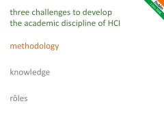
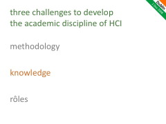
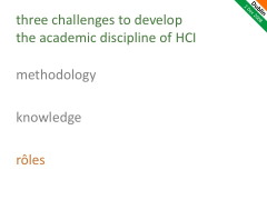
Considering this, I propose three challenges we need to address in order to develop the academic discipline of HCI: challenges of methodology, knowledge and rôles. I am sure there are others, but let these be at least a starter.
Three Challenges
Methodology
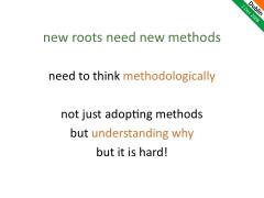
New disciplinary roots require new methods. We have loads of methods in our HCI toolkit, so this does not seem to be a problem. However, these methods are often 'borrowed' from other disciplines. Within an established discipline one can use accepted methods without a great deal of thought as to whether they are appropriate because you are using them in the same way that others have before. But if we simply adopt these methods in a new context without considering the desiderata that made them appropriate in the original context, they may be misleading or lead us to conclusions that are downright wrong.
To adopt methods in a new discipline means we have to understand why the methods work - that is we have to think methodologically. Now here I am not using methodology I the way which has become common in computing and in HCI, that is simply to mean method! When I say we need to think methodologically I mean we need to think about our methods.
The frequent confusion between usability evaluation and evaluation in research is just such a failing - adopting methods without understanding methodologically why they are appropriate and what they are for. But to be fair this is because thinking methodologically is hard! Many established disciplines have been around hundreds of years and so have had time to develop or evolve appropriate methods, but if we look to newer disciplines or sub-disciplines we often see methodological problems.
As an example, and at the risk of alienating a community . . . some years ago I was evaluating some work that was on the boundaries between HCI and distributed artificial intelligence (DAI). The work seemed to be fundamentally flawed as the researcher had performed single runs of a stochastic simulation with different conditions. In a HCI setting this might be like running an experiment with a single user in each condition! Now because of the nature of simulations there are times when a single run is sufficient; when certain conditions hold a long enough run will exhibit all possible behaviours and so one long run is effectively like doing lots of short ones. Unfortunately in this case, the runs were too short due to memory problems. I was worried that I was going to have to send the researcher back to do repeat runs of everything! Happily there was a second reviewer who came from the DAI community and so I was able to ask him about this . . . what was the accepted practice in the community. Again happily the other reviewer was not just from the community, but also had a deep methodologicalunderstanding of the history of the area. Early in the development of DAI a key figure had shown that single runs were acceptable so long as the relevant conditions applied . . . unfortunately the 'single run' part got remembered, but the conditions had been forgotten. The research we were evaluating was simply following accepted practice in its discipline . . . it is just that the accepted practice was flawed!
Now before you judge DAI too harshly think how often have you read papers (or written them yourself) that quote "five users are enough" [[13]] or Miller's 7+/-2 [[14]] without really checking that they are valid in the context?
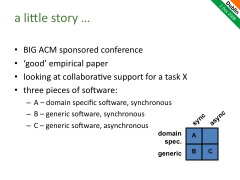
So, returning to HCI and the importance to us of methodological thinking, a little story [[15]]. It is about a paper published at a major ACM sponsored conference in HCI a few years ago. You may recognise the paper or even think "gosh that was me", because it is typical of many papers.
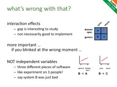
The particular paper was in fact a 'good' solid empirical paper: experiment, design, evaluation. It was considering collaborative support for a task; we'll call the task X. The work began by considering three pieces of software, we'll call them A, B and C:
- domain-specific software, synchronous group interaction
- generic software, synchronous
- generic software, asynchronous
The three systems were placed in a 2x2 matrix: domain-specific vs. generic on one axis and synchronous vs. asynchronous on the other. Incidentally, these 2x2 matrices are ubiquitous in many areas and are indeed extremely powerful analytic tools [[16]].
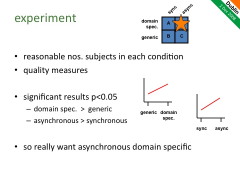
The paper then went on to describe the experiment comparing these conditions. There were a reasonable number of subjects in each condition (not just 5!) and sensible quality measures were used for assessing the outcomes of the task. Furthermore the experiment revealed statistically significant results . . . well certainly p < 0.05. There were two main effects:
- domain-specific software was better than generic software, and
- asynchronous was better synchronous.
The paper then concluded that what was clearly required was the missing gap: domain-specific asynchronous software, and then went on to describe the design and evaluation of an application in this area.
This all sounds exemplary, so what's wrong with it?
First of all the paper was a little strong in its suggestion that (i) and (ii) meant that domain-specific asynchronous software would be best of all. Interaction effects are very common in HCI, and there was no argument as to why we shouldn't expect an interaction in this case. However, that said certainly the results would suggest that it is a good case to investigate further.
However, the big problem is harder to see, indeed if you blinked at the wrong moment when reading the paper it was easy to miss entirely. The paper started off with three systems and quite properly analysed them along dimensions. However, it then went on to conduct the experiment as if there were two independent variables being manipulated, when in fact we had precisely one piece of software for each condition. This is analogous to having an experiment with precisely one user in each condition - clearly wrong, and yet we often do this for pieces of software, just as in this case, and never notice!
In case it is not obvious why this is so bad; these were three completely different pieces of software that happened to have the relevant properties. Suppose application B just happened to have been poorly designed, so that it performed worse than application A (giving rise to the apparent effect that domain-specific was better than generic) and worse than application C (giving rise to the apparent effect that asynchronous was better than synchronous). That is the effect may have been due to entirely extraneous factors, and nothing to do with the actual properties being studied.
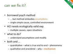
The problem here is that the paper (and many in HCI) has 'borrowed' controlled experimental methods from psychology, but these methods embody assumptions, which often do not hold in HCI. In particular, controlled psychological experiments are designed so there is a single simple cause or manipulation between conditions. However, when used in HCI, as above, there are many uncontrolled causes. Often we want experiments that have some form of ecological validity, which makes this worse.
However, just imagine trying to run the above study as if it were really heavily controlled psychological experiment: we take a single piece of generic synchronous software B, first tweak it so it becomes domain-specific (call it A) and then tweak it again to make it still generic but asynchronous (call it C). This sounds stronger, and sometimes can work. However, in this case (and many) you would need to take a piece of software that is well designed for a particular situation (task generic and synchronous) then change to 'just' make it domain specific or 'just' make or asynchronous; and furthermore you would need to do this without changing anything else and furthermore have it equally 'good' in all other respects after the tweak . . . clearly not possible.
Does this mean no experiments are possible in HCI? Far from it, by understanding the assumptions underlying controlled experiment and the way in which HCI experiments do not meet these assumptions, we are in a position to alter the practice of the experiment and the methods of analysis to make more reliable interpretations of the outcomes.
In this case, we could collect additional qualitative data (video, logs, audio) as is common in HCI, but then use these in order to help interpret the quantitative measures. Based on our knowledge of human interaction and the data that was collected the researchers might have been able to come to some judgement as to whether the effect seen was to do with the difference between synchronous and asynchronous interaction, or due simply to specific features of application B or C.
In general I tend to find that quantitative end-to-end measures are good at telling you whether there is an effect, and how strong it is, but it is the qualitative data that helps you to understand why you are seeing the phenomenon. Furthermore, richer data can help reveal the mechanisms [[17]] underlying the observed phenomena: that is the particular patterns of interaction that make up the overall picture. If you understand this mechanism then you may be able to add new measures or interventions to study finer aspects of the overall interaction.
Knowledge
To be a strong discipline, we need ways of gathering sound knowledge, ways of knowing what is true, and ways of establishing validity.
As we've noted, evaluation is central within HCI, the extent that if one wanted to point to a touchstone for what is accepted by the community to be the sign of valid research, surely evaluation would be it. The major exception is pure studies of existing work-practices in domains where technology is already present or expected to be introduced. Otherwise whatever kind of 'thing' you have produced as an outcome of your research, be it a concept, a method, a toolkit, or an application, what the reviewers of your paper want to see is some level of evaluation and typically evaluation with real users.
Of course seeking some form of validation of your work is critical - after all I have said that we are after truth not mere opinion. However, it is wrong to assume that evaluation is the only means to verify validity. In mathematics, you do not evaluate a theorem to see if it is true, you prove it, that is provide a justification of why it should be true. Mathematics is unusual in being able to put all of its trust in justification, the particular closed nature of mathematical argument makes this possible. In general, academic disciplines vary as to the relative importance of evaluation; in particular, evaluation is more important where the phenomena being studied is complex or hard to predict or ability to reason may be limited. For example, in medicine one might establish based on theory or prior art that a particular family of compounds is likely to be effective in treating a condition (justification), but the complexity of the human body and pharmaceutical chemistry means you need laboratory studies and eventual clinical trials to find out which actually works (evaluation).
Arguably if our work is only validated through evaluation it is pure invention not academic research at all - after all we should have some reason for what we do, not just randomly trying what occurred to us in the bath one morning (although that may be based on previous reasoning and experience, so often a good start point for work).
Evaluation is especially problematic for generative artefacts - that is things that in some way make other things or can be instantiated in different ways. This includes theories, methods, guidelines, tools, architectures ... indeed just about anything we produce as research outputs in HCI! The problem is that evaluation cannot exhaust all possible uses or instantiations of a generative artefact, so can never validate it fully. Indeed, as an easy to remember catch phrase (;-)):
the evaluation of generative artefacts is methodologically unsound [[18]]
Even a single piece of software is a generate artefact as it is only in the specific moments of use that it becomes grounded. We cope with this in usability testing by trying to use sufficient users working on a sufficient range of tasks in order to sample the space of potential use. However, once we get to design notations or guidelines sampling becomes all but impossible. To say we have reasonably covered the space we would need to get many different designers with many different briefs and then usability test each outcome with many different users . . . and that is just to answer the simple question "does it work?", let alone "why?" and "how can we improve it?".
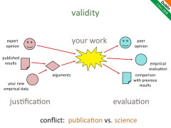
Within HCI we have a gamut of techniques available for both justification and evaluation, including for justification:
- existing published results of experiments and analysis
- our own empirical data from experiments, studies, etc.
- expert opinion (published or otherwise) and common sense
- arguments based on the above
. . . and for evaluation:
- empirical evaluation, user studies, timing data,. etc.
- peer reviews of our work (other people agree it is a good idea)
- comparison with previous work (do the parts that should behave the same actually do so)
In any field, the powerful thing is how these work together to establish validity. Even in mathematics, the domain of pure justification, it is common to try out a potential theorem against example data either to look for counter examples (Popperian falsification is evaluation based!) or to suggest how a proof might proceed: anyone who has done geometry on school will have experienced this using sketched triangles and circles at the beginning of a proof. Here the evaluation is guiding the process of justification. This can be the case in HCI as you notice patterns in empirical data you think "of course, that must be because . . ."
Equally important as you construct the justification of why something should work, the argument will not be watertight in the way that a mathematical argument can be. The data on which we build our justification has been obtained under particular circumstances that may different from our own, we may be bringing things together in new ways and making uncertain extrapolations or deductions. Some parts of our argument may be strong and we would be very surprised if actual use came out otherwise, but some parts of the argument may involve more uncertain data, a greater degree of extrapolation or even pure guesswork. These weaker parts of the argument are the ideal candidates for focusing our efforts in evaluation. Why waste effort on the things we know anyway, instead use those precious empirical resources (our own time and those of our participants) in examining the things we understand least well.
![]() This is precisely the approach that the designers of the Xerox Star took. Where aspects of the design were problematic or unclear, only there did they perform user studies. One example of this was the direction of scroll buttons should pressing the 'up' button make the text go up (moving the page), or the text go down (moving the view). If there were only one interpretation it would not be a problem, but because there was not a clear justification this was one of the places where the Star team did empirical evaluation . . . it is a pity that the wrong answer was used in subsequent Lisa design and carried forward to this day, but that is a different story! [[19]]
This is precisely the approach that the designers of the Xerox Star took. Where aspects of the design were problematic or unclear, only there did they perform user studies. One example of this was the direction of scroll buttons should pressing the 'up' button make the text go up (moving the page), or the text go down (moving the view). If there were only one interpretation it would not be a problem, but because there was not a clear justification this was one of the places where the Star team did empirical evaluation . . . it is a pity that the wrong answer was used in subsequent Lisa design and carried forward to this day, but that is a different story! [[19]]
So ideally, for good science, we will focus our evaluation where our justification is weakest, thus obtaining maximum information from our work and pushing forward the field. Of course, we should certainly be aware, while we probe these areas of greatest uncertainty, that our assumptions may be wrong, that the obvious may in fact turn out to be false; but not make the obvious our focus. Also there is a place, albeit largely absent in HCI research, for reproducing previous studies as a basis for further work, especially when the earlier work was promising but inconclusive. However, the overarching aim should be to increase systematically the knowledge of the field
Sadly when advising students I have to tell them that there is a conflict between this recommendation for good science, and what is best to get published. The easiest way to get a publication is to choose something that you have a pretty strong argument for and then run some sort of experiment on it. With such and experiment you know what to expect and so you can frame a clear experimental hypothesis, and are very likely to get a result that will be statistically significant. However, this gives least new knowledge. In contrast, experiments focused on the weak points in the justification will have unknown answers, may yield inconclusive results and are least likely to have statistical power - while they have the potential to add knowledge to the discipline they are risky for the individual.
As a discipline we should not find ourselves in a position where good science and publication are at odds. This is bad for new researchers entering the discipline and it is bad for the discipline itself. So when reviewing work we should seek (a) reasons why the issue/feature is as it is - that is, rational not just random ideas, systematic growth of the field; and equally important (b) reasons why the issue/feature not be as it is - that is, not obvious, adding information to the field.
Rôles
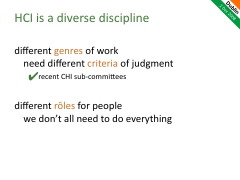
The discussion has moved to criteria for good work, but within HCI there are many genres of work, so we need different criteria of judgement depending on the genre. Again this can be a real problem during reviewing of papers. A couple of years ago as a meta-reviewer I had to explicitly say that I was entirely discounting one of the reviews, because the review was effectively criticising the genre of work within HCI, not assessing it with respect to criteria within the genre. Often it is not so clear and it is easy to let one's own general opinions about the most appropriate approach (experimental, ethnographic, formal) colour the judgement of a particular piece of work.
In the UK, we have noticed this as particularly problematic when it comes to reviews for projects and grants within HCI. It is very hard to get across-the-board support form reviewers to say a piece of work is of the best quality; someone will have something negative to say. If a HCI project is then viewed amongst those from different areas where the reviewing is more consistent (whether positive or negative), the best HCI ones will lose out compared to the best from those other areas. Now this is partly because the valid criteria within HCI are soft and less clear than in some areas, but partly because at least one of the reviewers will not like the general approach/genre.
There is a certainly need for discussion of the value of particular approaches and establishing new ones, but that should be a separate discussion. Furthermore, we need to think explicitly about these different approaches, techniques or genres and the criteria appropriate for each. This makes it easier to assign appropriate people to review work - and the recent CHI subcommittees are an excellent move in this direction. Furthermore, if we are aware of these different criteria we can more easily say "personally I don't like this style of work, but within its genre it is strong".
Just as there are different genres of work, there are different rôles that we may take within HCI research.
Imagine a physics paper that started off with some experiments at CERN, then performed group-theoretic analysis of superstring theory, and finally applied the results to the design of a vacuum cleaner. This is clearly risible. But HCI papers are often like this - a little bit of theory, build a toy system, run some experiments, analyse the results, give implications for design. [[20]] Now this can sometimes be done well, so it is not that we should never have work like this, but surely it should be more common to have different aspects of this work performed by those that do them best, rather than expecting every paper to have a bit of everything?
HCI as an academic discipline (and maybe science) will develop most strongly if we can understand how different parts fit together and allow people and teams to focus where their core strengths lie.
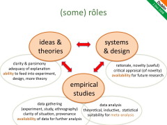
I can think of three broad rôles (although I am sure there are more): generating ideas and theories, developing systems and designs, performing empirical studies. The table below lists some of the different criteria for each ... although in even doing this empirical studies became split in two as the actual gathering of data may need different expertise from its analysis. This was certainly part of the origins of ethnography - report with as little interpretation as possible in order that someone else can do this later. Also, the parlous state of statistics in HCI is no doubt in part due to the 'do it all' methods. In medicine there are special medical statisticians who are not medics themselves but do the statistics, because the medics themselves do not expect to be able to do this.
| some criteria | |
|---|---|
| ideas & theories | clarity & parsimony adequacy of explanation ability to feed into experiment, design, more theory |
| systems and designs | rationale, novelty (useful) critical appraisal (of novelty) availability for future research |
| empirical studies - data gathering (experiment, study, ethnography) |
clarity of situation, provenance availability of data for further analysis |
| empirical studies - data analysis (theoretical, inductive, statistical) |
soundness, lack of bias suitability for meta-analysis |
Within each there are criteria that are more to do with internal coherence of the work, but at least as important there need to be criteria about making sure the work contributes to the bigger picture of the discipline as a whole.
- If I have a new theory or framework; is it expressed clearly enough so that someone else can apply it to their new design, or analysis of experimental results?
- If I have constructed a new system that embodies some idea; is it available so that other researchers can deploy it for long-term study, or use it in an experiment?
- If I have gathered some ethnographic data; have I obtained sufficient consents and described my data gathering techniques well enough so that the raw data can be made available so that others can study it in different ways?
- If I have performed some statistical analysis on an experiment; have I presented the results in a way that others can interpret and possibly perform meta-analysis?
The web was developed so that physicists could share data. We need to develop HCI so that we share data, systems and results equally easily, so that we can properly use each individual's expertise and skills to build a coherent discipline that is greater than any of us.
The changing face of HCI
Of course HCI is changing as computer technology changes.
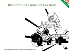
The birth of HCI as a discipline was pretty much at the same time as the introduction of the desktop computer, and it became hard to consider interfaces that were not WIMP-based GUIs. This was to some extent a breaking free from the computer in the machine room, but it only got as far as the desktop, and there it stayed for nearly 20 years. However, over the last 5 to 10 years (with plenty of preliminary research work before), we have seen the rôle of the computer change dramatically in society.
With mobile and ubiquitous computing and tangible interfaces, the computer physically escapes the desktop into the outside world. This is not just the subject of research for the future, but day-to-day reality for all of us. I often ask people "how many computers in your hose" and most still say 2 or 3 or maybe if they are nerdy more, but rarely do people remember their microwaves and HiFi, central heating and washing machines. Even our body load of computation is substantial. A few years ago I emptied my pockets during a masters seminar and found four clear computers without anything particularly nerdy: (1) a mobile phone; (2) car keys, which will include some form of coding processing for the remote locking; (3) a film camera, but with LCD screen etc.; and (4) the now ubiquitous chip in a credit card.
The Internet has also seen the computer escape the desktop virtually. While the growth of corporate networking lead to the development of CSCW as an area, the Internet has been crucial in establishing collaboration cutting across organisational boundaries and into the home. It is hard also to believe that 10 years ago there was no Google. Equally it is easy to forget how un-ubiquitous universal Internet access is. In the 1998 business plan for aQtive one of the dot.com companies I was involved with, we talked about designing products ready for the coming PopuNet [[21]] - the network for everyone, everywhere and everywhen. At the time this was just beginning to be a reality when at the office desk, but in the home a slow and expensive dial-up connection was the best one could hope for. The 'everywhen' was particularly critical - continuous not just continual, not just available (anytime), but always there; what is now termed "always on". For those with the iPhone in western cities this now appears to be the reality, but move a little out into rural areas even of Ireland and the UK, out to the islands, amongst the mountains and connectivity becomes more broken. Now move further afield to developing countries and we can see how easy it is to overestimate the universality of the Internet and correspondingly unwittingly design to divide.
Amongst many things that have changed with the growth of the web is that much software that was a product has become a service. Although I still use an email client installed on my computer (because, whilst travelling a lot, I am not 'always on'), many only use web-based email services. Now we have online word-processing, spreadsheets and more. If you buy an expensive hair styling kit, then you will continue to use it, but if you visit a hairdresser and do not like the service or style, then the next week you go to a different one. Shrink-wrapped products allow you one choice point maybe every few years, but services allow near continuous choice. From a business perspective for shrink wrapped software you can 'get away' with bad usability and poor user experience, so long as you have good marketing - they have already paid their money by the time they find out it is rubbish! In a service-based world, usability and user-experience become key to success.
As we can see these technological changes lead to changes in the environment within which HCI works, not just because we have different hardware to play with, but because recent technological change has had a major impact at a commercial and social level. Sometimes technology is servant to social change, perhaps ignored or resisted. However, at various points technological changes have made radical difference to social order. For example, I was recently reading how the invention and adoption of the stirrup not only revolutionised mounted warfare, but also was a driver for the whole feudal system. While wanting to avoid simplistic technological determinism, it is also clear that there are major societal, cultural and even cognitive changes that we need to recognise for their impact on research and practice in HCI as well as for their broader political and ethical import.
One of the aspects that is obvious is the increasing focus within HCI on user experience. The physical movement of computers out of the office into the home and into our hands as well as the domestication of the web means that the old utilitarian 'efficiency and effectiveness' now have to pay second fiddle to 'satisfaction'. One of the amazing things about the numerous ethnographies of the home and of leisure (which are both methodologically harder than work ethnographies) is just how complex day-to-day life is. The industrial revolution, Taylorism, and the continuing need to deal with staff turnover, has led to a largely controlled and 'normalised' workplace with personal differences minimised. Of course workplace studies constantly show how much fluid working depends on various adaptations, but always set against and located within a framework of order. In contrast the home has never needed the same levels of uniformity except those established externally by work and society.
The domestication of technology is nowhere more apparent than in Web2.0 with its focus on user-contributed context and social networking. Again it is interesting to look back to the dot.com days, less than a decade back. In 1999, when working on a new product/service vfridge we articulated the idea of the web sharer [[22]]. At the time many were saying that there would be a shake-up in the web world with DIY-home pages withering and all the traffic going to a tiny handful of sites (Yahoo!, AOL, Amazon) principally operating in a publication or broadcast manner, like the TV except with easier ways to buy things. Now this seems laughable, similar to the (misquoted) early predictions that five computers would be enough for the whole world [[23]], but at the time was becoming accepted wisdom. In contrast we sought to design products for the 'websharer': ordinary people sharing with one another.
Everyone may be a web sharer - not a publisher of formal public 'content', but personal or semi-private sharing of informal 'bits and pieces' with family, friends, local community and virtual communities such as fan clubs.
This is not just a future for the cognoscenti, but for anyone who chats in the pub or wants to show granny in Scunthorpe the baby's first photos.
the websharer vision, 1999 [[22]]
A single person study
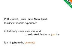
Within this setting of changes in HCI I'll focus on one piece of work, which formed the PhD of Fariza Hanis Abdul Razak [[24]].
Fariza started out interested in mobile user experience and in particular looking towards mobile learning. As a preliminary exercise she conducted a small study asking a handful of people about their use of mobile technology. As anyone who has done this sort of study knows, it is very hard to get beyond the banal - learning what you knew before you start. You ask questions and people tell you the answers you could have predicted, the difficulty is finding the questions to ask that are less obvious as questions and will lead to new knowledge - really growing the field.
In the initial study one of the participants stood out as unusual. She said she rarely used her mobile phone and yet other answers seemed to suggest the opposite - for example referring to use of time organisation features that others hardly mentioned. Clearly, her initial answer was about the 'normal' use of the phone as voice communication, but it was more to her than that.
Because this subject was unusual and different I suggested Fariza spent some time investigating her in more detail. Little did either of us know at that time that this would become the key focus of Fariza's PhD work.
Note that the subject was chosen because she was in one respect an extreme, an outlier, outside of the average. As an academic I always find extremes valuable. Partly because the abnormal, or extra-ordinary (strange how the words have different connotations) are just more interesting in themselves, but also because they cast light back into the ordinary, showing us things that are often tacit and unnoticed.
I find that comedians are particularly good at this, seeing the oddness in the everyday, highlighting things that we recognise in ourselves that are slightly embarrassing or just strange when we look at them. Indeed I have often suggested that students look up humorous books about their domain of study as a way of learning more than many an academic study. Although to be fair ethnographers act very like the comedian in this respect.
Anyway, this simple decisions started Fariza down the route of pursuing a single person study as the central focus of her work and her thesis became not one about mobile experience or mobile learning, but a methodological account of the issues surrounding the use of a single person for research and design. [[25]]
The first text
One of the first steps along this path was a diary study of Fariza's subject. When we first discussed the results of this I recall that the words of the very first entry leapt out of the page.
The first text read
Dear God Don't need lots of frens! As long
as real ones stay with me, so bless them all,
especially the sweetest one reading this.
and the subject's comment (her emphasis):
this SMS MADE MY DAY!
Now I knew of research on SMS behaviour that discussed its use for intimate communications "thinking of you", "love you" [[26]]. However this was something slightly, but significantly, different; the message here was in a way slightly less personal. The messages it was representative of were often small quotes of a devotional or otherwise encouraging nature, from friends, but not necessarily from her husband, or close family. John Rooksby described them as messages that need no reply. Sent to encourage but not to establish communication in any interactive sense and certainly not 'communicate' in an information sense - more gifts of thought.
Perhaps the closest thing in the physical world are those little cards or bookmarks that have poems, sayings or prayers written on them, often surrounded by flowers ... a world away from the design studio with its austere black-robed occupants.
This single text message and the reaction it caused fundamentally changed our view of the use of the mobile phone.
But can studying a single user in this way contribute to theoretical HCI research or practical interaction design?
Research from single-user studies
At first the idea of using a single user runs counter to common academic sense. Surely we need to study many users to be able to stand any chance of generalising results? However, it turns out that this is not so uncommon in other disciplines such as special education or studies of neurological deficit. Even in HCI ethnographies are typically of a single situation (even if it includes several people) and experiments often use a single application or piece of software (even though they have many subjects).
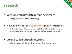
Furthermore, the study of a single user brings particular benefits. As often found in ethnographic studies, rich empirical data reveals new issues ... in this case the very first text! Furthermore, studying a single user in depth allows the researcher to build up a deep personal rapport with the subject and hence make sense of what would otherwise be irrelevant or meaningless aspects of the data.
In fact discovering novelty only needs one example, like a botanist discovering a new flower, a single specimen shows that the new species exists. Of course a different person at a different time in a different place would find a different flower. Studying a single person is not the way to find all the important issues, or establish how common a particular issue is, but the depth may be a good way to find new usage phenomenon.
However, this still leaves us with the question - having found a new phenomenon, how common and critical is it? In other words how do we generalise? In an empirical study if the spread of users is wide enough (not just psychology or CS students!), then we assume that if an issue is common in the sample it is common in the population. Of course, we can use new insights form any method, including those form studying a single user, to drive empirical work of this kind. However, in the case of the initial text message this was not necessary for us to recognise that this was something that we would expect to see elsewhere, not for everyone (and maybe least for UK CS undergraduates who we might have studied in a larger scale survey), bit at least for particular kinds of people and communities. That is we were able to generalise by reasoning based on the data we had seen, knowledge of other research work, our own personal experience and not least (albeit much undervalued in academia) common sense!
Generalisation through reasoning is again common in other areas, for example semiotics and mathematics, and is typically based in deduction or abduction rather than induction as used in reasoning from voluminous empirical data.
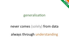
In fact generalisation never comes (solely) from data, but always through understanding. Even when we have copious data, the knowledge that we have chosen representative groups, the level of extrapolation we choose to make from the experimental tasks, or the belief are all matters of judgement. We generalise with our heads not our senses.
Designing for a single user
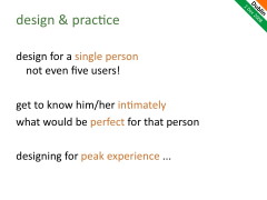
Akin to the research question of how we obtain knowledge form a single user is the practical one of whether we can use a single user in design. We all know that 'five users is enough' ... but one!
So as an experiment Fariza attempted to design an application especially for that single user. Having got to know this individual intimately, what would be perfect for that single person? With a single user it is possible to spend sufficient time to collaboratively co-design in a way that is tuned for the specific lifestyle, abilities and personality of the user. Having done this one can then ask whether this application would work for others and maybe do more traditional user testing. Maybe this hyper-tuned application may form the start of a slightly more generalised application that is of more general appeal.
We do not expect such a perfectly tuned application to be liked by everyone, indeed often the opposite. In the case of Fariza's subject the application periodically texted uplifting messages, and one test user clearly found some of the messages simply annoying. However, a surprising number of other users did find it engaging.
Again, like single-user studies in other disciplines, one does not have to go far to find areas where taking 100, 20 or even 5 users would seem like overkill ... indeed many designers find no users sufficient (although sometimes this is apparent!)
This form of single-user designing would not be good for all kinds of application of product, but is particularly useful when designing for peak experience.
Baked bean vs. Mars bar design
Imagine you have a group of children and want to give them lunch. In the UK (and I assume also Ireland) you might well choose baked beans. Not the most exciting choice, but few children actively dislike baked beans; it is acceptable to everyone. However, give each of those children a euro (or maybe two) in a sweet shop ... they will all come away with a different chocolate bar, the chocolate bar that is 'OK' for everyone gets chosen by none. Or imagine choosing a menu for a wedding dinner ... maybe chicken with a bland sauce ... something nearly everyone will eat, but few people would choose for themselves in a restaurant.
Much of traditional HCI design is like baked beans - a word processor installed for the whole company, a mail programme used by every student, good enough for everyone. However, increasing personal choice, especially for web-based services, makes design more like that of the chocolate bar, different people make different choices, but what matters is that the product chosen is not 'good enough' but best for them - peak experience.
Designing for Peak Experience
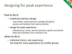
Traditional user-centred interface design may use user profiles, or personas chosen to be representative of a group as a whole, with a focus on the typical or the average - good for all. We typically move from identified user needs to interaction solutions with an emphasis on method and processes that ensure usability.
In contrast, designing for peak experience may need a stringer focus on the individual user, possibly extreme personas, focusing on the specific and eclectic - best for some. Often the move is from concept to use with and emphasis on novel ideas and inspiration.
Some years ago I was on a panel at ECCE with Jon Sykes from the group at Glasgow Caledonian studying games and emotion. He was asked about the processes video games designers used and many in the audience were shocked that apparently ad hoc and non-user-centred way in which the designers had ideas, discussed it amongst themselves and only very late in the process submit it to user testing ... but this is exactly what one would expect in order to design for peak experience ... a good enough video game will be bought by no-one.
Similarly, many the most successful Web2.0 sites such as Facebook and del.icio.us started out being for the designers and their friends. They were tuned to a small group or even a single individual ... and we would normally castigate designers who design for themselves ... but somehow ins spite of that ... or maybe because of that ... they are successful. Interestingly, even the computer language of choice of many of these sites is PHP originally developed by one person for his own home page [[27]].
Now this is not to say that there is no rôle for traditional HCI practice there are many products that do need to be used by everyone (e.g. bank web sites) and even in Web2.0 web sites such as YouTube, there are some aspects where traditional usability breaks down and experience dominates, but other parts, such as the uploading of videos where standard usability is crucial [[28]].
However, where individual choice and user experience dominate, we need to look increasingly at peak experience. Mash-ups, widgets and open-data allow large numbers of applications designed for smaller groups of intended users, the long tail of user interaction. HCI for the long tail may need to consider more how to build necessary aspects of usability into platforms or maybe even popularise HCI - the equivalent of 'house makeover' programs on daytime TV!
Bringing it together
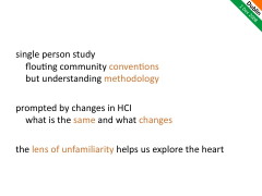
The single person study at first appears to flout the community conventions for effective HCI. However, by understanding methodology we were able to see how it could be used effectively as part of research and design. Note that this is not to promote single-user studies above other techniques, but if it and other methods can be understood methodologically they can be applied where they are appropriate and give value depending on the context.
Note too that the adoption of the single user study was because we were addressing an issue at the changing boundaries of HCI. As a textbook writer I am always interested in what changes and what does not change between revisions. The things that have hardly changed in 15 years are likely to still be of value in another 15 years, but the things that changed in the last revision are likely to change again. Looking at the new areas helps us see the things of lasting value as well as highlighting the new.
Just as taking the extreme user helps us understand the 'normal' use, so also as we look at new areas of technology, they help us understand afresh the old. Often the lens of unfamiliarity helps us explore the heart of things.
Thanks
Many thanks to Aaron, Gavin and Liam for inviting me to share this inaugural celebration of SIGCHI Ireland; and to everyone who attended the presentation and chatted after and before.
Special thanks also to Fariza whose work I have referred to extensively and to Matt Oppenheim (hardware monkey) for his wonderful cartoons of the computer breaking free.
Notes
[0] Note that this is a personal account; I am not trying to give an impartial account of current HCI opinion or concerns, but instead of issues I believe we should take seriously. There are various other articles that either analyse the past or give visions of the future, for example, the recent HCI 2020 report (see note [12]). It is interesting too to see what past visions of the future look like! Some of these:
Dan Diaper and Colston Sanger (2006). Tasks for and tasks in human–computer interaction. Interacting with Computers 18:117–138
Yvonne Rogers (2004). New theoretical approaches for human-computer interaction. Annual Review of Information Science and Technology, 38(1): 87–143. http://dx.doi.org/10.1002/aris.1440380103
Brad Myers, Jim Hollan, Isabel Cruz, et al. (1996). Strategic directions in human–computer interaction. ACM Computer Surveys. 28(4):794–809. http://doi.acm.org/10.1145/242223.246855
Brad Myers (1998). A brief history of human–computer interaction technology. interactions 5(2):44–54. http://doi.acm.org/10.1145/274430.274436
[1] Web interaction, personal ontologies and folksonomies working with colleagues in Lancaster, Rome, Athens and Madrid. Good summary in:
A. Dix (2008). Tasks = data + action + context: automated task assistance through data-oriented analysis. keynote at Engineering Interactive Systems 2008 , (incorporating HCSE2008 & TAMODIA 2008), Pisa Italy, 25–26 Sept. 2008
http://www.hcibook.com/alan/papers/EIS-Tamodia2008/
[2] Situated displays and phone-based interaction with large displays:
A. Dix and C. Sas (2008) Public displays and private devices: A design space analysis. In: Workshop on Designing and evaluating mobile phone-based interaction with public displays. CHI2008, Florence, 5th April 2008
http://www.hcibook.com/alan/papers/Dix-Sas-PDPD-2008/
A. Dix (2005). Small meets Large: research issues for using personal devices to interact with public displays. (unpublished) internal discussion paper, Lancaster University, January 2005.
http://www.hcibook.com/alan/papers/Small-meets-Large-2005/
[3] Fun and games - various work on experience design and Kiel Gilleade's PhD work on physiological gaming:
A. Dix (2003). Deconstructing Experience - pulling crackers apart In Funology: From Usability to Enjoyment. M. Blythe, K. Overbeeke, A. Monk and P. Wright (eds.) Dordrecht, the Netherlands: Kluwer, 2003. pp. 165–178
http://www.hcibook.com/alan/papers/deconstruct2003
K. Gilleade, A. Dix and J. Allanson (2005). Affective Videogames and Modes of Affective Gaming: Assist Me, Challenge Me, Emote Me Proceedings of DIGRA'2005.
http://www.hcibook.com/alan/papers/DIGRA2005/
[4] Formal modelling of artistic performance:
A. Dix, J. Sheridan, S. Reeves, S. Benford and C. O'Malley (2005). Formalising Performative Interaction. Proceedings of DSVIS'2005. (Newcastle, UK, 13–15 July 2005). Springer, LNCS 3941, pub. 2006. pp 15–25.
http://www.hcibook.com/alan/papers/DSVIS2005-performance/
[5] Slow Time - helping people reflect on the slow rhythms of life:
Slow Time: project vision. http://www.hcibook.com/alan/projects/slow-time/
[6] Physicality in product design:
Physicality.org web site and DEPtH project: http://www.physicality.org/
A. Dix, M. Ghazali, S. Gill, J. Hare and D. Ramduny-Ellis (2009). Physigrams: Modelling Devices for Natural Interaction Formal Aspects of Computing , Springer (in press)
http://www.hcibook.com/alan/papers/FAC-physical-2009/
Ramduny-Ellis, D., Hare, J. Dix, A. and Gill, S. (2008) Exploring Physicality in the Design Process. Proceedings of the 2008 Design Research Society International Conference, (16–19 Jul. 2008), Sheffield, UK.
http://uwic.academia.edu/JoHare/Papers/73584/Exploring-Physicality-in-the-Design-Process
My Research and Innovation Techniques pages (need updating!)
http://www.hcibook.com/alan/topics/res-tech/
A. Dix, T. Ormerod, M. Twidale, C. Sas, P. Gomes da Silva, L. McKnight (2006). Why bad ideas are a good idea. in Proceedings of HCIEd.2006-1 inventivity, Ballina/Killaloe, Ireland. 23–24 March 2006
http://www.hcibook.com/alan/papers/HCIed2006-badideas/
[8] Modelling dreams and regret ...
My Essays page including dreams and regret. http://www.hcibook.com/alan/essays/
[9] FireFly intelligent lighting allowing a new medium of digital light:
FireFly Project Page. http://www.hcibook.com/alan/projects/firefly/
[10] Shackel, B., 1959. Ergonomics for a Computer. Design 120, 36–39.
[11] Designing for failure - a general principle, some examples:
Strength in Weakness - Judo Design. Alan's blog. November 21, 2008
http://www.alandix.com/blog/2008/11/21/strength-in-weakness-judo-design/
Appropriate Intelligence. http://www.hcibook.com/alan/topics/appropriate-intelligence/
[12] In the recent Being Human 2020 Microsoft report, 'Understanding' is proposed as an important additional stage in the HCI lifecycle ... what were designers supposed to be doing before! To be fair the meaning of 'understanding' is about understanding human values, so really the report is talking about an extra thread or concern during the whole evaluation-analysis-redesign part of the design cycle in parallel with other concerns. However, the fact that 'understanding' can, however accidentally, apparently be assumed to be absent from normal interaction design is surely symptomatic of a deep issue to be addressed within HCI.
R. Harper, T. Rodden, Y. Rogers, A. Sellen (2008) Being Human: Human-Computer Interaction in the Year 2020. Microsoft Research.
http://research.microsoft.com/en-us/um/cambridge/projects/hci2020/
[13] In particular, the figure of five users: (i) is about the optimal cost/benefit point within an iterative development cycle, considerably more users are required for summative evaluation or where there is only the opportunity for a single formative evaluation stage; (ii) is an average one over a number of projects and needs to be assessed on a system by system basis; (iii) is based on a number of assumptions, in particular, independence of faults, that are more reasonable for more fully developed systems than for early prototypes, where one fault may mask another. Just as in the DAI example, Nielsen and Landaur's original paper outlines many of these limitations, but the finding is typically used without similar care.
Nielsen, J. and Landauer, T. K. 1993. A mathematical model of the finding of usability problems. In Proceedings of the INTERACT '93 and CHI '93 Conference on Human Factors in Computing Systems (Amsterdam, The Netherlands, April 24–29, 1993). CHI '93. ACM, New York, NY, 206–213.
http://doi.acm.org/10.1145/169059.169166
Jakob Nielsen's Alertbox, March 19, 2000: Why You Only Need to Test With 5 Users
http://www.useit.com/alertbox/20000319.html
[14] Miller's 7+/-2 is about working memory, but is frequently applied where other cognitive or visual processes are important, for example, the length of menus. See my own example of back-of-the-envelope optimal menu size calculations and also Eisenberg's critique form a designer's viewpoint (although I don't think he realised that the poor uses of it are actually misuses).
George A. Miller (1956) The Magical Number Seven, Plus or Minus Two: Some Limits on Our Capacity for Processing Information. The Psychological Review, 1956, vol. 63, pp. 81-97.
http://www.musanim.com/miller1956/
A. Dix (2003). Upside down As and algorithms - computational formalisms and theory Chapter 14 in HCI Models, Theories, and Frameworks: Toward a Mulitdisciplinary Science. John Carroll (ed.) San Francisco, USA: Morgan Kaufmann. ISBN 1-55860-808-7). pp. 381-429.
http://www.hcibook.com/alan/papers/theory-formal-2003
Bryan Eisenberg (2004). Debunking Miller's Magic 7. ClickZ, Oct 29, 2004.
http://www.clickz.com/3427631
[15] I have referred to this story a few times before in talks and keynotes:
A. Dix (2004). Controversy and Provocation. (Keynote) In Proceedings of HCIE2004, The 7th Educators Workshop: Effective Teaching and Training in HCI, (Preston, UK 1st and 2nd April 2004). ISBN 0-9541927-5-3
http://www.hcibook.com/alan/papers/HCIE2004/
A. Dix (2004). European HCI Theory - a uniquely disparate perspective. Invited talk at European HCI Research special area CHI 2004, Vienna, Austria, 24–29 April 2004.
http://www.hcibook.com/alan/papers/chi2004-euro-theory/
[16] I discuss the analytic uses of cross-tabulation in a number of places including my Research and Innovation pages (see note [[7]]) and recent chapter in Cairns and Cox (note [[17]]). The slides below have a summary of the main modes of use.
A. Dix (2002). Teaching Innovation. keynote at Excellence in Education and Training convention. Singapore Polytechnic, 17th May 2002. http://www.hcibook.com/alan/talks/singapore2002/
[17] By 'mechanism' I mean understanding the details of how a person engages in some form of activity or task including, where appropriate, observable phenomena, social and cognitive aspects. That is a detailed account not just of what happens end-to-end, but the steps and things that are necessary between. When you understand mechanism it is easier to see whether an overall result is likely to generalise to new situation and in general more analytically understand empirical or observational data.
A. Dix (2008). Theoretical analysis and theory creation, Chapter 9 in Research Methods for Human-Computer Interaction, P. Cairns and A. Cox (eds). Cambridge University Press, ISBN-13: 9780521690317
http://www.cambridge.org/uk/catalogue/catalogue.asp?isbn=9780521690317
[18] The term "generative artefact" and the problems of analysing them are explored in a number of talks and papers including the chapter in Cairns and Cox (above) and applied to visualisation in:
G. Ellis and A. Dix (2006). An explorative analysis of user evaluation studies in information visualisation. In Proceedings of the 2006 Conference on Beyond Time and Errors: Novel Evaluation Methods For information Visualization (Venice, Italy, May 23, 2006). BELIV '06. ACM Press, New York, NY, 1–7.
http://www.hcibook.com/alan/papers/beliv06-evaluation/
[19] The development and principled design of the Star is described in detail in " The Xerox Star: A Retrospective". However, it took me a while to uncover the story of the scrollbar and how we ended up with the wring design for the up/down arrows!
Johnson, J., Roberts, T. L., Verplank, W., Smith, D. C., Irby, C. H., Beard, M., and Mackey, K. 1989. The Xerox Star: A Retrospective. Computer 22, 9 (Sep. 1989), 11–26, 28–29.
http://dx.doi.org/10.1109/2.35211
A. Dix (1998). Hands Across the Screen – why scrollbars are on the right and other stories. Interfaces, 37 pp. 19–22. Spring 1998.
http:// www.hcibook.com/alan/papers/scrollbar/
A. Dix (1998). Sinister Scrollbar in the Xerox Star Xplained. Interfaces, 38 pp. 11. Summer 1998. (short update to the above article)
http://www.hcibook.com/alan/papers/scrollbar/scrollbar2.html
[20] see Dourish's article for why 'implications for design' is not the ultimate measure of and effective paper!
Dourish, P. 2006. Implications for design. In Proceedings of the SIGCHI Conference on Human Factors in Computing Systems (Montréal, Québec, Canada, April 22–27, 2006). R. Grinter, T. Rodden, P. Aoki, E. Cutrell, R. Jeffries, and G. Olson, Eds. CHI '06. ACM, New York, NY, 541–550.
http://doi.acm.org/10.1145/1124772.1124855
[21] A. Dix. (1998). PopuNET: pervasive, permanent access to the Internet. eBulletin. aQtive ltd. July 1998.
http://www.hiraeth.com/alan/ebulletin/PopuNET/
[22] A. Dix. (1999). The Web Sharer Vision. eBulletin. aQtive ltd. November 1999.
http://www.hiraeth.com/alan/ebulletin/websharer/
[23] The "five computers are enough" quote is almost certainly a misquote. I managed to find the following QA on an IBM FAQ dated April 10, 2007, but cannot find it again on the web (although the FAQ text is quoted). Whether or not Watson said it, it is certainly the case that no-one in the early days of the computer industry foresaw a future for computers outside very large corporations and government.
Q. Did Thomas Watson say in the 1950s that he foresaw a market potential for only five electronic computers?
A. We believe the statement that you attribute to Thomas Watson is a misunderstanding of remarks made at IBM's annual stockholders meeting on April 28, 1953. In referring specifically and only to the IBM 701 Electronic Data Processing Machine – which had been introduced the year before as the company's first production computer designed for scientific calculations – Thomas Watson, Jr., told stockholders that "IBM had developed a paper plan for such a machine and took this paper plan across the country to some 20 concerns that we thought could use such a machine. I would like to tell you that the machine rents for between $12,000 and $18,000 a month, so it was not the type of thing that could be sold from place to place. But, as a result of our trip, on which we expected to get orders for five machines, we came home with orders for 18."
[24] Fariza Hanis Abdul Razak (2008). Single Person Study: Methodological Issues. PhD Thesis. Computing Department, Lancaster University, UK. February 2008.
http://www.hcibook.net/people/Fariza/
[25] See also Mike Twidale and Paul Marty's work on single person evaluation:
Extreme Evaluation. http://people.lis.uiuc.edu/~twidale/research/xe/
[26] I recall a lovely talk about the analysis of SMS messages by Luciano Gamberini and Anna Spagnolli at the CHI 2004 Time Design Workshop. The workshop web page seems to be no longer online :-) However, they appear to have published the results in more detail in the British Journal of Social Psychology.
Gamberini L., Spagnolli A., Pretto P. (2004). Temporal structure of SMS-mediated conversation. CHI2004, Time Design Workgroup. Wien, April 25
Spagnolli A., Gamberini L. (2007). Interacting via SMS: Practises of social closeness and reciprocation. British Journal of Social Psychology pp. 343–364 (22)
[27] PHP Manual: A History of PHP. http://gtk.php.net/manual1/en/html/intro.whatis.php.history.html
[28] As part of her PhD work, Paula Silva analysed apparent usability problems with YouTube (assessed using Heuristic Evaluation). For some of these the breaking of the standard usability guideline was obviously the 'right' thing to do to achieve wider user experience and also commercial goals. However, there are also parts of the site where traditional suability is being followed and, as mentioned in the text, the image uploader is one of those which is often praised by users for its ease of use.
P. Silva and A. Dix (2006). Usability – Not as we know it! In Proceedings of BCS HCI 2007, People and Computers XXI, BCS eWiC. http://www.hcibook.com/alan/papers/HCI2007-YouTube/
