Full results of citation analysis are in REF-citation-vs-score-analysis-v5.0.xlsx
The spreadsheet includes a description of the process used and a key of columns in the main results worksheets.
There are seven separate variants of the analyses:
- Scopus all years
- Scopus 2008–2011
- normalised 2008–2011
- Google scholar all years with no citations as missing value
- as (4) for 2008–2011
- as (4) but with no citations treated as present and zero
- as (6) for 2008–2011.
The choice of 2008–2011 is because outputs in 2012 and 2013 have relatively few citations, and hence 2008–2011 represents more reliable data.
Highlights — sub-area comparisons
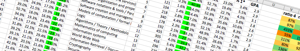
This is the first of the analysis tables. Columns G–J are the quartile profile based on citations, with the upper quartile (best) in column J. Columns P–S are the REF profile form Sloman’s analysis (4* best). Column V shows the ratio of the REF 4* column compared with what would be predicted from citations.
Some topics (such as Real Time Systems) have small numbers of outputs so that citation analysis will be less reliable. However, ignoring these it can be seen that some topics (e.g. Logic) have many more 4* outputs than citation analysis would predict, whereas others (e.g. World Wide Web) have far fewer. The differences are extreme, up to 10:1.
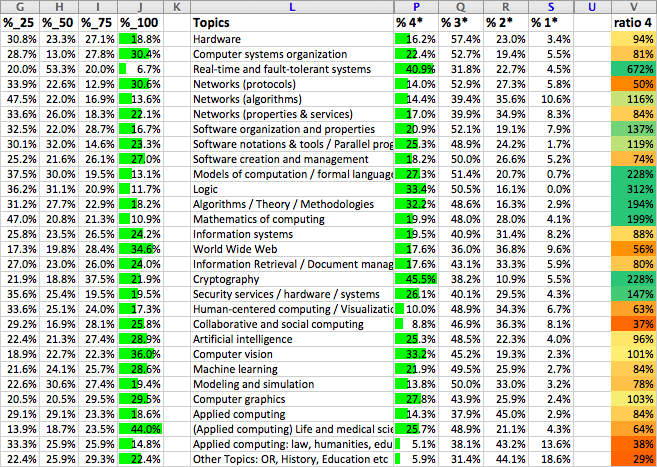
Visualised in another way, the following diagram (prepared by Andrew Howes, who replicated the analysis using R), rank orders the topics using % of REF 4* outputs for vertical axis and % of upper quartile outputs for horizontal scale.

It can be seen that there is effectively no correspondence between REF score and citations. The topics to the top left are those that are ranked more highly by REF than by citations, those on the lower right are ranked low by REF. The split between more formal areas and more applied areas is evident.
Highlights — institutional (UoA) comparisons
The following graph shows research power calculated both using REF profiles and citation data. Research power is the GPA (average score) times the FTE of staff submitted. For the citation data GPA is calculated using predicted REF start scores.
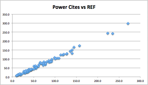
It initially appears that there is a strong relationship between citations and REF scores at an institutional level, suggesting at first that the potential sub-area bias has ‘averaged out’ at the level of UoAs, many of which will contain a mix of research areas.
However, in the HEFCE funding model, funding is not allocated based on GPA, but heavily weighted towards 4* outputs with 2* and 1* outputs receiving no funding at all. To emulate this a revised measure based on a 7:3:0:0 weighting, called GPA# in reports, has been used. The following graph shows the ‘power’ roughly proportional to amount of money received, for this measure computed using actual REF profile and citation predictions.
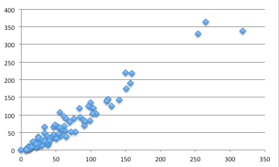
While there is still a rough correlation, some of the larger institutions appear to sit well above the line, and the spread in the lower group is quite large.
As an alternative view, the following shows just GPA# (not FTE weighted) using REF scores and citations.
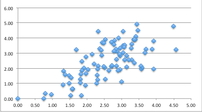
Many institutions have a relatively small number of outputs (around 100 is typical), so each point is not reliable. However, the general trends are.
Of 27 institutions getting 25% or less than might be expected from citation analysis, 22 are post-1992 universities; and of 18 institutions getting 25% or more above the citation prediction, 17 are pre-1992 universities.
There may be other effects, but as newer universities often have a more applied focus, this discrepancy may well be due to the sub-area differences. This impression is reinforced by the fact that the two large institutions which appear as outliers on the GPA# power graph both have strong formal/theoretical strands.