 Look at the data, don’t just add up the numbers.
It seems an obvious message, but so easy to forget when you have that huge spreadsheet and just want to throw it into SPSS or R and see whether all your hard work was worthwhile.
But before you jump to work out your T-test, regression analysis or ANOVA, just stop and look.
Eyeball the raw data, as numbers, but probably in a simple graph- but don’t just plot averages, initially do scatter plots of all the data points, so you can get a feel for the way it spreads. If the data is in several clumps what do they mean?
Are there anomalies, or extreme values?
If so these may be a sign of a fault in the experiment, maybe a sensor went wrong; or it might be something more interesting, a new or unusual phenomenon you haven’t thought about.
Does it match your model. If you are expecting linear data does it vaguely look like that? If you are expecting the variability to stay similar (an assumption of many tests, including regression and ANOVA).
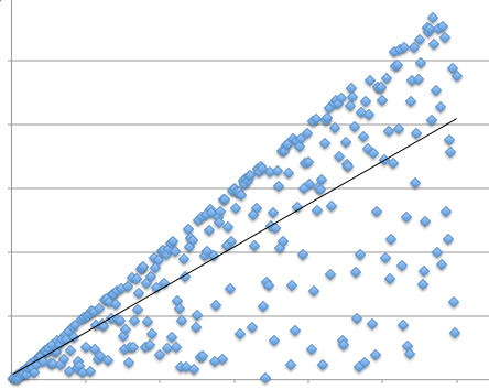
The graph above is based on one I once saw in a paper (recreated here), where the authors had fitted a regression line.
However, look at the data – it is not data scattered along a line, but rather data scattered below a line. The fitted line is below the max line, but the data clearly does not fit a standard model of linear fit data.
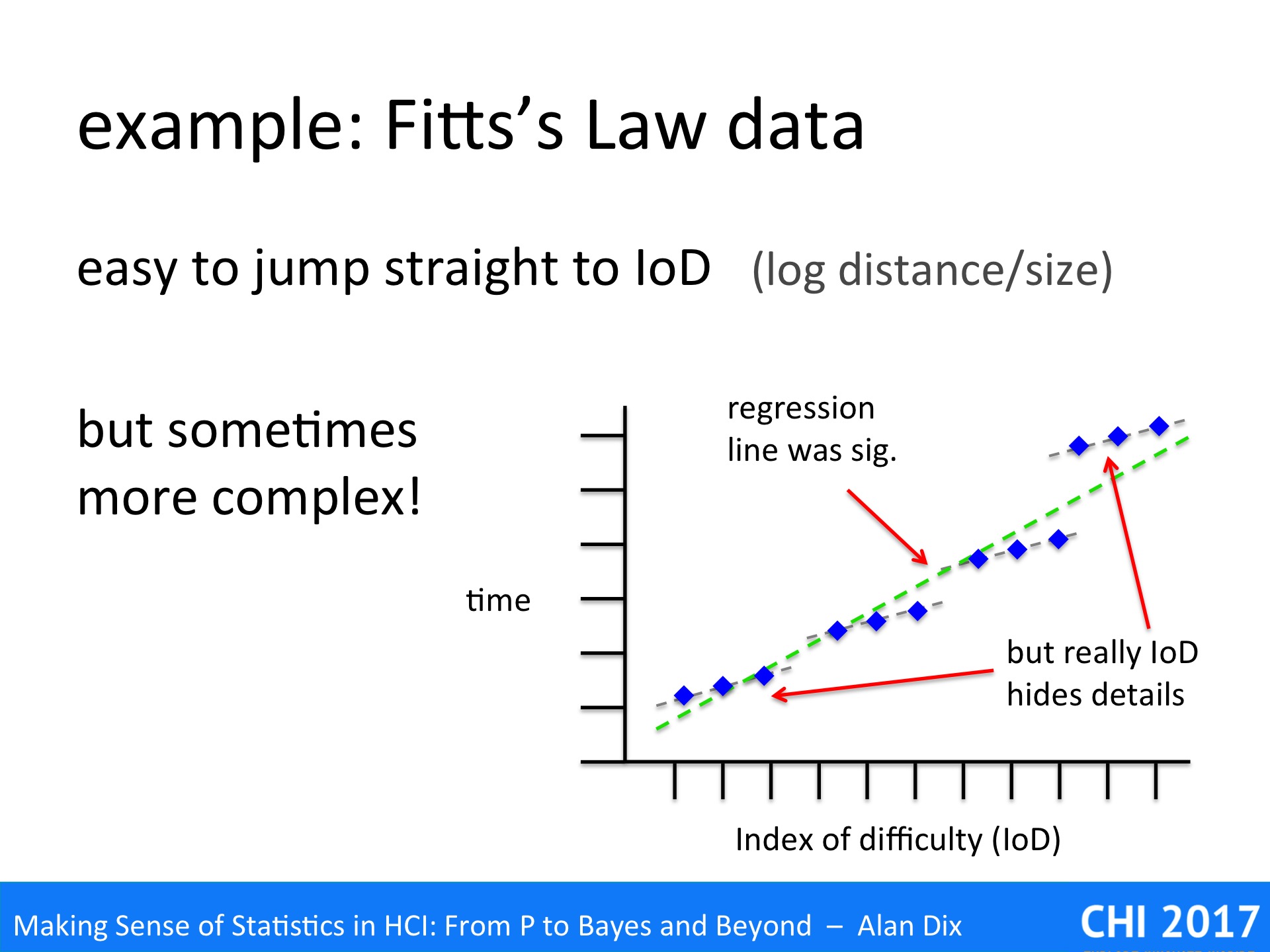
A particular example in the HCI literature where researchers often forget to eyeball the data is in Fitts’ Law experiments. Recall that in Fitts’ original work [Fi54] he found that the time taken to complete tasks was proportional to the Index of Difficulty (IoD), which is the logarithm of the distance to target divided by the target size (with various minor tweeks!):
IoD = log2 ( distance to target / target size )
Fitts’ law has been found to be true for many different kinds of pointing tasks, with a wide variety of devices, and even over multiple orders of magnitude. Given this, many performing Fitts’ Law related work do not bother to separately report distance and target size effects, but instead instantly jump to calculating the IoD assuming that Fitts’ Law holds. Often the assumption proves correct …but not always.
The graph above is based on a Fitts’ Law related paper I once read.
The paper was about the effects of adding noise to the pointer, as if you had a slightly dodgy mouse. Crucially the noise was of a fixed size (in pixels) not related to the speed or distance of mouse movement.
The dots on the graph show the averages of multiple trials on the same parameters: size, distance and the magnitude of the noise were varied. However, size and distance are not separately plotted, just the time to target against IoD.
If you understand the mechanism (that magic word again) of Fitts’ Law [Dx03,BB06], then you would expect anomalies’ to occur with fixed magnitude noise. In particular if the noise is bigger than the target size you would expect to have an initial Fitts Movement to the general vicinity of the target, but then a Monte Carlo (utterly random) period where the noise dominates and its pure chance when you manage to click the target.
Sure enough if you look at the graph you see small triads of points in roughly straight lines, but then the cluster of points following a slight curve. The regression line is drawn, but this is clearly not simply data scattered around the line.
In fact, given the understanding of mechanism, this is not surprising, but even without that knowledge the graph clearly shows something is wrong – and yet the authors never mentioned the problem.
One reason for this is probably because they had performed a regression analysis and it had come out statistically significant. That is they had jumped straight for the numbers (IoD + regression), and not properly looked at the data!
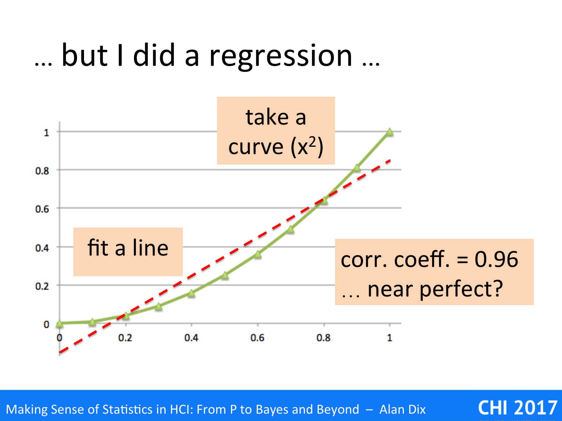
They will have reasoned that if the regression is significant and correlation coefficient strong, then the data is linear. In fact this is NOT what regression says.
To see why, look at the data above. This is not random simply an x squared curve. The straight line is a fitted regression line, which turns out to have a correlation coefficient of 0.96, which sounds near perfect.
There is a trend there, and the line does do a pretty good job of describing some of the change – indeed many algorithms depend on approximating curves with straight lines for precisely this reason. However, the underlying data is clearly not linear.
So next time you read about a correlation, or do one yourself, or indeed any other sort of statistical or algorithmic analysis, please, Please, remember to look at the data.
References
[BB06] Beamish, D., Bhatti, S. A., MacKenzie, I. S., & Wu, J. (2006). Fifty years later: a neurodynamic explanation of Fitts’ law. Journal of the Royal Society Interface, 3(10), 649–654. http://doi.org/10.1098/rsif.2006.0123
[Dx03] Dix, A. (2003/2005) A Cybernetic Understanding of Fitts’ Law. HCI book online! http://www.hcibook.com/e3/online/fitts-cybernetic/
[Fi54] Fitts, Paul M. (1954) The information capacity of the human motor system in controlling the amplitude of movement. Journal of Experimental Psychology, 47(6): 381-391, Jun 1954,. http://dx.doi.org/10.1037/h0055392