the job of statistics

from the real world to measurement and back again

If you want to use statistics you need to learn how to do statistics, in the sense of working out what tests to use, maybe a stats package such as SPSS or R.

But why do this at all? What does statistics actually do?

Fundamentally statistics is about trying to learn dependable things about the real world based on measurements of it.

However, what we mean by ‘real’ is itself a little complicated, from the actual users you have tested to the hypothetical idea of a ‘typical user’ of your system.

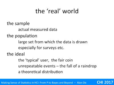
We’ll start with the real world, but what is it?

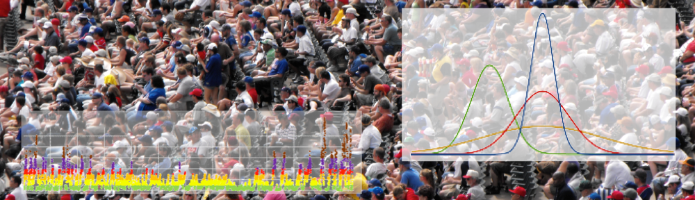
the sample – First of all there is the actual data you have: results from an experiment, responses from a survey, log data form a deployed application. This is the real world. The user you tested at 3pm on a rainy day in March, after a slightly overfilling lunch, did make precisely three errors and finished the task in 17 mins and 23 seconds. However, while this measured data is real, it is typically not what you meant to know. Would the same user on a different day, under different conditions have made the same errors? What about other users?

the population – Another idea of real, and one that may be what you really want to know, is when there is a larger group of people you want to now about, say all the people in your company, or all users of product A. What would be the average (and variation in) error arte if all of them sat down and used the software you are testing. Or as a more concrete kind of measurement, what is their average height?

The sample that you actually look at measure the heights of is real data, but yu are using to find out about the population as a whole.

the ideal – However, while this idea of the actual population is very concrete, often the real word you actually are interested in is slightly more nebulous. Even for the current uses of product A, you are not interested in the error rate if they tried your new software today, but if they did multiple times (maybe with the occasional memory wiping pill administered occasionally) over a period – that is a sort of ‘typical’ error rate when each uses the software.

Furthermore, it is not so much the actual set of users (not that you don’t care about them), but perhaps the typical user, especially for a new piece of software where you have no ‘real’ users yet.

Similarly, when you toss a coin you have an idea of the behaviour fair coin, that s not simply the complete collection of every coin in circulation. Even when you have tossed the coin, you can still think about the different ways it could have fallen, somehow reasoning about all possible past and present for an unrepeatable event.

Finally, this hypothetical ‘real’ event may be represented in a mathematically in a theoretical distribution such as the Normal distribution (for heights) or Binomial distribution (for coin tosses).

In practice you rarely need to voice these things explicitly, but occasionally you do need to think carefully about it. If you have done a series of consistent blood tests you may know something very important about a particular individual, but not patients in general. If you are analysing big data you may know something very precise about your current users, and how they behave given a particular social context, and particular algorithms in your system, but not necessarily about potential users and how they may behave if your algorithms and environment change.

Once you know what the ‘real’ world you want to know about is, the job of statistics becomes clear.

You have taken some measurement, often of some sample of people and situations, and you want to use the measurements to understand the real world.

Given a sample of 20 heights of random people from your organisation, what can you infer about the heights of everyone? Given the error rates of 20 people on an artificial task in a lab, what can you tell about the behaviour of a typical user in their everyday situation?

As is evident, answering these questions requires a combination of probability and common sense – and this is the job of statistics.

why are probability and statistics so hard?

Do you find probability and statistics hard? If so, don’t worry, it’s not just you; it’s basic human psychology.

We have two systems of thought (i) subconscious reactions that are based on semi-probabilistic associations, and (ii) conscious thinking that likes to have one model of the world and is really bad at probability. This is why we need to use mathematics and other explicit techniques to help us deal with probabilities.

Statistics both needs this mathematics of probability and an understanding of what it means in the real world. Understanding this means you don’t have to feel bad about finding stats hard (!), but also helps to find ways to make it easier.

Skinner’s famous experiments with pigeons showed how certain kinds of learning could be studied in terms of associations between stimuli and rewards. If you present a reward enough times with the behaviour you want, the pigeon will learn to do it even when the original reward no longer happens.

This low-level learning is semi-probabilistic in the sense that if rewards are more common the learning is faster or if rewards and penalties both happen at different frequencies, then you get a level of trade-off in the learning. At a cognitive level one can think of strengths of association being built up with rewards strengthening them and penalties inhibiting them.

This kind of learning is not quite a weighted sum of past experience: for example negative experiences typically count more than positive ones, and once a pattern is established it takes a lot to shift it. However, it is not so far from a probability estimate.

We humans share this subconscious learning processes with other animals, and at some periods this has been used explicitly in education. It is powerful and leads to very rapid reactions, but needs very large numbers of exposures to similar situations to establish memories.

Of course we are not just our subconscious! In addition we have conscious thinking and reasoning. This is powerful in that, amongst other things, we are able to learn from a single experience. Retrospectively we are able to retrieve even a single relevant past experience, compare it to what we are encountering now, and work what to do based on it.

This is very powerful, but unlike our more unconscious sea of overlapping memories and associations, our conscious mind is linear and is normally locked into a single model of the world1.

Because of this single model of the world this form of thinking is not so good at intuitively grasping probabilities, as is repeatedly evidenced by gambling behaviour and more broadly our assessment of risk.

One experiment uses cards with different coloured backs, red and blue2.  In the experiment the cards are initially dealt to the subject face down and then turned over. Some cards have a rewards, “you have won £5”, other a penalty, “sorry you’ve lost half your winnings”. The cards differ in that one colour, let’s say blue, has more penalties, and the other a better balance of rewards.

After playing a while the subjects realise that the packs are different and can tell you which s better.

However, the subjects are also wired up to a skin conductivity sensor as used in a lie detector. Well before they are able to say that one of the card colours is worse then the other they show a response on the sensor – that is subconsciously they know it is a bad card.

Although our conscious mind is not naturally good at dealing with probabilities , we are able to reason explicitly about them using mathematics. For example, if the subjects in the experiment had kept a tally of good and bad cards, they would have seen, in the numbers, that the red cards were better.

Some years ago, when I first was doing some statistical teaching I remember learning that statistics teaching was known to be particularly difficult. This is in part because it requires a combination of maths and real world thinking.

In statistics we use the explicit tallying of data and mathematical reasoning about probabilities to let is do quite complex reasoning from effects (measurements) back to causes (the real word phenomena that are being measured).

So you do need to feel reasonably comfortable with this mathematics.

However, even if you are a whizz at maths, if you can’t relate this back to understanding about the real world, you are also stuck. It is a bit like the applied maths problems where people get so lost in the maths that they forget the units: “the answer is 42” – but 42 what? 42 degrees centigrade, 42 metres, or 42 bananas?

On the whole those good at mathematics are not always good at relating their thinking back to the real world, and those of a more practical disposition not always best at maths – no wonder statistics is hard!

However, knowing this we can try to make things better.

In the “making sense of statistics” I am focusing more on those who have a reasonable sense of the practical issues and will try to explain some of the concepts that necessary without getting deep into the mathematics of how they are calculated … leave that to the computer!


  1. There are exceptions to the conscious mind’s single model of the world including when we tell each other stories or write; see my essay “writing as third order experience“. []
  2. Malcolm Gladwell describes this experiment in ‘The Second Mind‘, an online excerpt of his book Blink []

So What (making sense of statistics) – 7 – Building for the future

adding to the discipline

  • repeatability/replication – comparisons more robust than measures
  • meta analysis – reporting the details
  • data publishing – enabling open science

The touchstone of valuable research is the extent to which it builds the discipline, so that sum of knowledge after you have done your work is greater than it was before. How can you ensure this happens?

One part of this is repeatability, ensuring that you or others could replicate your study or experiment and get the same, or at least similar, results. At the CHI conference the RepliCHI initiative had a series of workshops and led to the addition of a “Validation and refutation” category in some subsequent conferences.

However, true replication is hard in HCI as it is difficult to precisely replicate the full context of even the most controlled experimental studies. The pool of subjects will differ even if university students, but form different institutions. The experimenter usually reads some sort of protocol, or greets subjects, so slight differences in the behavior could alter the mood of subjects. Similarly, the decoration of the room or lack of it , light levels, etc. all may alter behaviour.

Replication can even difficult even in apparently ‘physical’ situations. Many years ago I worked on agricultural sprayer research. We often used a apparatus that used a laser beam to measure the sizes of spray droplets. In one two-day series of experiments we carefully varied water temperature, quantity of surfactant, and variety of other factors, largely to see how carefully these needed to be controlled in other kinds of experiments. When we analysed the results there were some small but statistically significant effects that were surprising. After some time one of my colleagues suggested that as we had run the experiments over two days we should try adding a ‘dy effect’. We did this and sure enough all the anomalous effects disappeared, it just seemed that the runs one day were in some way different form the other, despite all out efforts to control the situation. Maybe this was some atmospheric effect, or slight difference in the equipment, we never knew.

Replication is, of course, even harder in more ecologically valid or in-the-wild studies.

This does not mean one should not try to replicate, just one should have an awareness of the difficulties.   There are things that can improve this situation.

  • First is to ensure that you are careful to fully describe your methods including, for example, any instructions given to participants, or data used in trials, as well as the tests used, numbers of participants etc.
  • The second is to focus on differences or comparisons more than absolute values. The fact that one condition is 10% faster than another in one experiment is more likely to be replicable than the exact speed of the base condition.

Understanding mechanism will help with both of these.

Meta-analysis is about using multiple studies by different groups in order to cross-validate and find emerging patterns. Like replication, ensuring your work is amenable to meta-analysis requires you to be careful to report method and results clearly and completely.

One way to achieve this is to simply put everything into the public domain: making all materials you used, instructions, software (if applicable), and of course the raw study data whether survey reports, video, or keystroke logging as well as derived data all the way to the data that lies behind the graphs in your published papers.

Having this data available means that those seeking to replicate can compare different points in their process, and those seeking to do meta-analysis can calculate common statistics across different data sets, or combine the datasets as a whole. However, making your data open also means that other people can analysis it in totally unexpected ways, testing alternative models or theories, or mining it for emergent patterns.

There are ethical problems in HCI at very least you will usually need to anonymise the data. However, crucially you need to ensure that participants are fully aware that data may be sued for purposes other than your own experiments. Often, by the time researchers come to consider publishing their data it is too late to obtain these permissions, so openness needs to be a consideration form the very start of your research design processes.

There are also practical problems to document your data well enough. During my 1000 mile walk around Wales in 2013 I collected copious data from bio-data to blogs. When I had finished the walk and wanted make this data available as a public open science resource I found I had to learn a whole new skill of documenting the data: ensuring that those using it could do so without necessarily consulting me. Part of this is technical documentation: each field had to be described carefully, and part is about making sure that the user of the data knows exactly how it was collected. Happily, the care has paid off and I often get to ear of people using the data who have never been in touch with me to ask questions abut it.

There are also broader cultural issues. The UK has a periodic research assessment exercise, which graded every subject and institution’s research. During the last such exercise, REF2014, the humanities panel included curated datasets as one of their categories of research output, but the science and engineering panel did not. It is not that STEM researchers do not think that data is valuable, but it is not valued, in the sense that careers, promotion andf esteem are attached to the analysis and implications of data, not the meticulous work of data collection itself.

Happily this is changing, many journals now mandate that data be provided for any publication and many universities are establishing data repositories alongside those for publications themselves.

However, despite these barriers, making your data available to the world is of immense value. You have often expended great effort in gathering it, it is surely worthwhile to see it reused by others … and, of course, by doing so you are doing your small part in building a stronger, greater and more robust discipline.

So What (making sense of statistics) – 6 – Mechanism

from what happens to how and why – when quantitative and qualitative meet

It is important not just to know that something occurs, but how and why.   Mechanism is about understanding the steps and processes, which buttons were pressed, what screens viewed, what information was looked at and how this all comes together to create a larger phenomenon.

Crucially understanding mechanism makes it possible to draw lessons and make predictions beyond the data available and the particular situations you have studied.

Typically quantitative data and statistical analysis helps you understand what happens as an end-to-end phenomenon and what is true of it as a whole. However, it often reveals little of the processes and mechanisms by which it occurs: what, but not how and why.

In contrast, qualitative methods such as rich observations, ethnography or post-experiment interviews are better suited to exploratory research (see “Why are you doing it?”) and answering these how and why questions. For example, one may determine the most common ways to achieve a task by content analysis of videos or key-stroke trace data.

Theoretical understanding may help here. This may include cognitive and psychological understanding, for example, if a user is selecting a small target with an on-screen pointer, then they have to be looking at it as human peripheral vision is not accurate enough for fine positioning tasks. Alternatively it may be related to unpacking device or application interaction characteristics, for example, if someone is choosing an item from a long menu, they need to decide if the item is in the visible portion, and if not scroll the menu, etc.

Once we have a model of how the user is behaving, we may be able to use that directly or we may use it to plan more in-depth analyses or investigations into each phase of activity.

When you have numerical empirical data one often attempts to interpolate between measured values. For example, if one found that reading speed was 10% faster with 12-point font than with 10-point font, then there is a good chance that 11-point font will sit in between, maybe of the order of 4%, to 6% faster. Even this may be problematic, for example, it just may be that 11-point font pixelates badly on the particular screen resolution of the devices you are experimenting with. However, it is a reasonable heuristic.

However, extrapolation is usually far harder: what about reading 8-point font or 32 point font or 3-point font?

However, if you understand the mechanism you can deconstruct the overall behaviour into arts that may be simple enough for you to be able to work out whether extrapolation is possible, or which can be put together in different ways to predict performance or behaviour in other contexts.

As an example, we will consider an early paper on font sizes on mobile devices, which included what appeared to have been a well conducted experiment, with statistically significant results, which concluded that a particular font size, let’s say 12 point, was best.

This sounds like a very useful piece fo design advice except for two things.

First, the result was almost certainly related to detailed device characteristics such as screen resolution: was this a 12-point font that was best, or a 12-pixel one, or simply one that did not render badly on the particular screen?

Second, the result will have been influenced by the particle task used. This involved finding items in a menu that could be paged (hence the earlier example). Would the result hold or other tasks?

In this case it was relatively easily to work out the mechanism, the detailed steps the user would need to perform in order to complete the menu selection task.

  1. visual search of the screen to see if the target item appears
  2. if not move to next screen and try step 1 again
  3. when it is found select the target item

Looking through these it seem very likely that step 1 will be easier with larger fonts until the point at which item names get too long to fit on the screen. Step 2 however is likely to occur more frequently with larger font sizes, as there will be fewer lines and hence fewer items per screen-full, so for this step smaller fonts are bond to reduce the number of cycles. Finally, step 3 is again likely to have been easier and faster with larger font sizes, whether on a touch device (larger target) or cursor key-based one (less items to move cursor through)

In summary:

  • Step 1 – speed of visual search – large font better
  • Step 2 – number of pages to scroll through – small font better
  • Step 3 – speed of item selection – large font better

The optimal font size will have been a trade-off between these factors, and changes in the tasks would almost certainly have changed this figure. For example, if the search were within a very large menu, then it is likely that scrolling through pages of menu items would dominate and hence the optimal choice would be the smallest readable font. In contrast if the number of items was always small I larger be better to have larger items so longa s they all fitted within the first screen.

As well as being able to make predictions before experimentation starts, unpacking the mechanism in this way would have allowed the experimenters to produce better analyses. Indeed, they had used some form of low-level logs to produce their end-to-end times and break these down into empirical timings for steps 1 and 3. For step 3, the number of pages that needed to be scrolled through to find the target item can be calculated precisely with empirical data being used to determine the time taken to press the page down key.

Wit these more detailed timings, the authors could have replaced their misleading single ‘optimal’ figure and replace this with a formula, that given an average menu length told you the best font size.

Furthermore, other kinds of mobile task would involve steps that resemble those for the menu selection task, enabling predictions to me made in entirely new contexts.


So What (making sense of statistics) – 5 – Diversity: individual and task

good for not just good

It is easy, especially when promoting one’s own idea, to want to show that it is better than everyone else’s!

However, users and tasks differ from one another. Typically a system or design property may be useful for a particular purpose or group of users, but not for others. If you understand this, you are in a better position to improve your research or market your system.

In general, it is more important to know who or what something is good for.

Imagine you have run a head to head comparison between two potential systems designs A and B, with 40 users. The user error rates are:

system A   5.2%

system B   6.2%

In fact they are not that different, System A is marginally better as people have slightly less errors, but is that 1% difference going to change the world. Anyway, it is a difference, so you go ahead and deploy system A.

However, it just so happens that of the 40 users 10 are novices and 10 experts. Sure enough the novices have a lower error rate with system A, and indeed by a wide margin (half the error rate), but look at the expert error rates:

expert – system A   9.6%

expert – system B   2.7%   !!!!

In fact, system A is considerably worse than system B for the experts.

If this were a research setting, then just looking at the averages means you have a fairly marginal result to report – yep, you might have a good p-value, but an effect size that will leave your readers yawning in their seats.

However, if you look at the way this differentially affects the different groups (a) you have larger effects to report; which are also (b) far more interesting.   Why do you get the different behaviour for novices and experts? What further research does this prompt?

The issue is perhaps even more critical for the usability professional.

It is often easier to user test novices when dealing with systems for rather than professionals; for example, you might test a financial planning application with economics students, or a diagnostic system with medical students. Novices are easier to access, and their time less costly.

However, it is likely that when you deploy the larger user group are expert.

You deployed the wrong system … and it is worse by a large margin!

If instead of simply asking, “is my system better?”, you ask, “who is my system better for?”, then you are able to ensue that you deliver the right solution to the right people.

This is also true for tasks. Typically a system or interaction method is good for some purposes, but less good for others.

The slide shows some stills of the PieTree visualisation [OD06] . Like a TreeMap, the PieTeee is a constant area visualisation for hierarchical data, in that the area of each part reflects the number or size of the items it represents. A PiTree starts as a normal pie chart of the top level categories, but you can explode any segment showing the next level in each as smaller and smaller segments. At the top right is a fully expanded PieTree, whereas the image n the centre is unexpanded. In real use only some segments may be expanded at any particular time depending on where the user has drilled down. The screen shot in the middle has the PieTree on the left and classic file tree-style visualisation on the left.

In evaluating this several tasks were used. The tasks included extreme ones following the advice on careful choice of tasks from “Gaining Power – tasks“. One was focused on finding the largest items, and was deliberately designed to highlight the advantages of the PieTree between the file-tree style visualisation; there was an obvious strategy for the former starting by drilling down into the biggest segment. However there was also a task to find the smallest, where there was no obvious search heuristic and everything had to be opened. When it was it is actually easier to san the text version of the smallest number than it is trying to work out which of the slightly different shaped small elements was actually smallest.

The results were exactly as we expected, that is the PieTree visualisation was good for some kinds of tasks and the file-tree style for others. Having both available, as in the image in the centre, was never best for any task, but was always a good second best no matter which of the visualisations ‘won’.

In general, it is usually far more important to know who or what something is good for, than some overall averaged measure. For researchers knowing this is far more informative allowing you to start to ask further questions about why certain features or properties are better. For practitioners, this is crucial for targeting solutions at the right people and the right problems.

Reference

[OD06] R. O’Donnell, A. Dix and L. Ball (2006). Exploring the PieTree for Representing Numerical Hierarchical Data. Proceedings of Proceedings of HCI2006, People and Conputers XX – Engage. Springer. pp. 239-254. http://www.alandix.com/academic/papers/HCI2006-PieTree/