 from what happens to how and why – when quantitative and qualitative meet
It is important not just to know that something occurs, but how and why. Mechanism is about understanding the steps and processes, which buttons were pressed, what screens viewed, what information was looked at and how this all comes together to create a larger phenomenon.
Crucially understanding mechanism makes it possible to draw lessons and make predictions beyond the data available and the particular situations you have studied.

Typically quantitative data and statistical analysis helps you understand what happens as an end-to-end phenomenon and what is true of it as a whole. However, it often reveals little of the processes and mechanisms by which it occurs: what, but not how and why.
In contrast, qualitative methods such as rich observations, ethnography or post-experiment interviews are better suited to exploratory research (see “Why are you doing it?”) and answering these how and why questions. For example, one may determine the most common ways to achieve a task by content analysis of videos or key-stroke trace data.
Theoretical understanding may help here. This may include cognitive and psychological understanding, for example, if a user is selecting a small target with an on-screen pointer, then they have to be looking at it as human peripheral vision is not accurate enough for fine positioning tasks. Alternatively it may be related to unpacking device or application interaction characteristics, for example, if someone is choosing an item from a long menu, they need to decide if the item is in the visible portion, and if not scroll the menu, etc.
Once we have a model of how the user is behaving, we may be able to use that directly or we may use it to plan more in-depth analyses or investigations into each phase of activity.
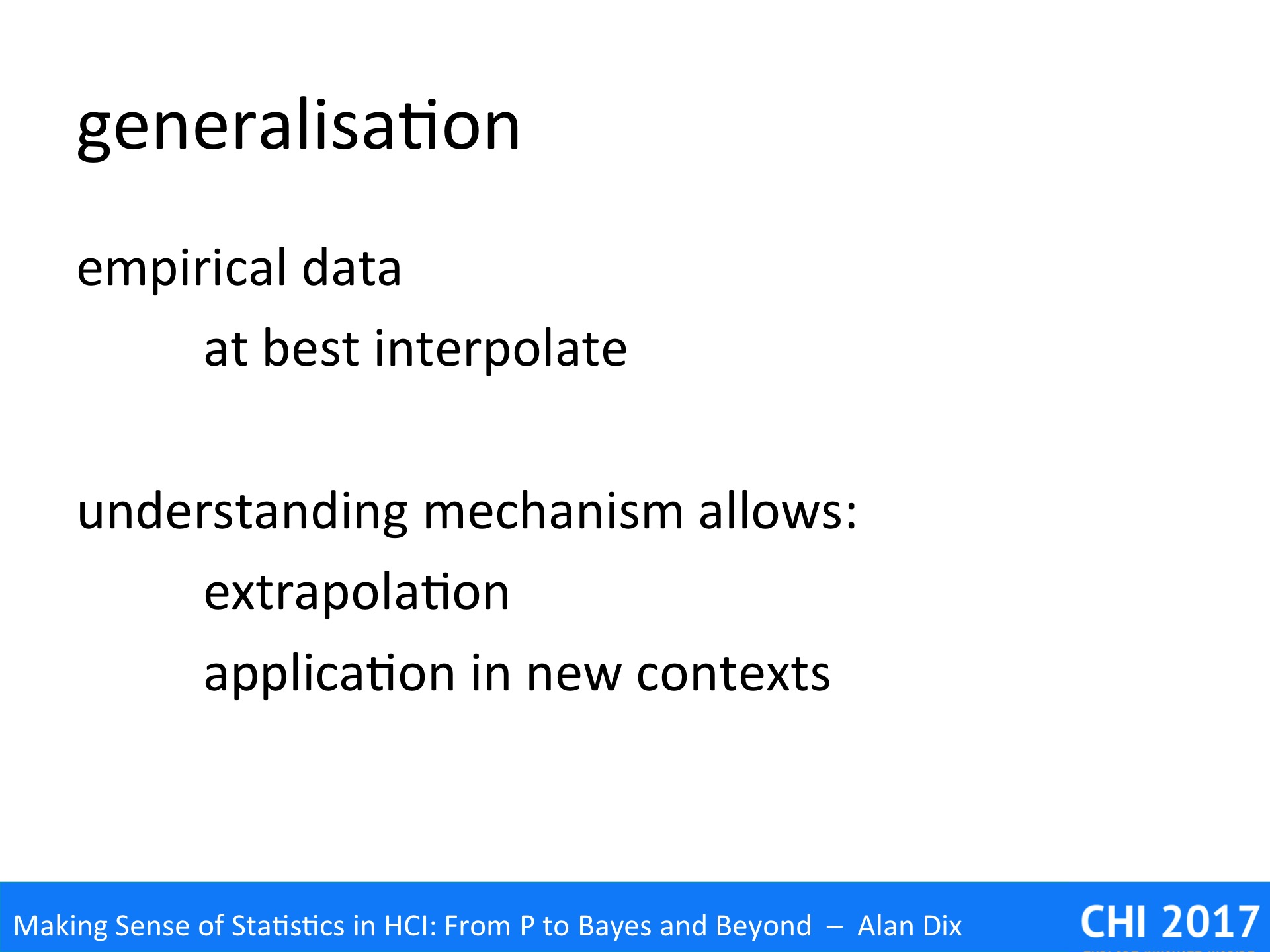
When you have numerical empirical data one often attempts to interpolate between measured values. For example, if one found that reading speed was 10% faster with 12-point font than with 10-point font, then there is a good chance that 11-point font will sit in between, maybe of the order of 4%, to 6% faster. Even this may be problematic, for example, it just may be that 11-point font pixelates badly on the particular screen resolution of the devices you are experimenting with. However, it is a reasonable heuristic.
However, extrapolation is usually far harder: what about reading 8-point font or 32 point font or 3-point font?
However, if you understand the mechanism you can deconstruct the overall behaviour into arts that may be simple enough for you to be able to work out whether extrapolation is possible, or which can be put together in different ways to predict performance or behaviour in other contexts.

As an example, we will consider an early paper on font sizes on mobile devices, which included what appeared to have been a well conducted experiment, with statistically significant results, which concluded that a particular font size, let’s say 12 point, was best.
This sounds like a very useful piece fo design advice except for two things.
First, the result was almost certainly related to detailed device characteristics such as screen resolution: was this a 12-point font that was best, or a 12-pixel one, or simply one that did not render badly on the particular screen?
Second, the result will have been influenced by the particle task used. This involved finding items in a menu that could be paged (hence the earlier example). Would the result hold or other tasks?
In this case it was relatively easily to work out the mechanism, the detailed steps the user would need to perform in order to complete the menu selection task.
- visual search of the screen to see if the target item appears
- if not move to next screen and try step 1 again
- when it is found select the target item
Looking through these it seem very likely that step 1 will be easier with larger fonts until the point at which item names get too long to fit on the screen. Step 2 however is likely to occur more frequently with larger font sizes, as there will be fewer lines and hence fewer items per screen-full, so for this step smaller fonts are bond to reduce the number of cycles. Finally, step 3 is again likely to have been easier and faster with larger font sizes, whether on a touch device (larger target) or cursor key-based one (less items to move cursor through)
In summary:
- Step 1 – speed of visual search – large font better
- Step 2 – number of pages to scroll through – small font better
- Step 3 – speed of item selection – large font better
The optimal font size will have been a trade-off between these factors, and changes in the tasks would almost certainly have changed this figure. For example, if the search were within a very large menu, then it is likely that scrolling through pages of menu items would dominate and hence the optimal choice would be the smallest readable font. In contrast if the number of items was always small I larger be better to have larger items so longa s they all fitted within the first screen.
As well as being able to make predictions before experimentation starts, unpacking the mechanism in this way would have allowed the experimenters to produce better analyses. Indeed, they had used some form of low-level logs to produce their end-to-end times and break these down into empirical timings for steps 1 and 3. For step 3, the number of pages that needed to be scrolled through to find the target item can be calculated precisely with empirical data being used to determine the time taken to press the page down key.
Wit these more detailed timings, the authors could have replaced their misleading single ‘optimal’ figure and replace this with a formula, that given an average menu length told you the best font size.
Furthermore, other kinds of mobile task would involve steps that resemble those for the menu selection task, enabling predictions to me made in entirely new contexts.