 Visualisation is a powerful tool that can help you highlight the important features in your data, but is also dangerous and can be misleading.
Visualisation is a huge topic in its own right, but for initial eyeballing of raw data one is most often using quite simple scatter plots, line graphs or histograms, so here we will deal with two choices you make about these: the baseline and the basepoint.
The first, the baseline, is about where you start place the bottom of your graph at zero or some other value, a ‘false’ baselines. The second, the basepoint, is about the left-to-right start.
Mathematically speaking, the x and y axes are no different, you can graph data either way, but conventionally they are used differently. Typically the x (horizontal) axis shows the independent variable, the thing that you choose to vary experimentally (e.g. distance to target), or given by the world (e.g. date), the vertical, y, axis is usually the dependent variable, what you measure, for example response time or error rate.
As noted, the baseline is about where you start, whether you place the bottom of your graph at zero or some other value: the former is arguably more ‘truthful’, but the latter can help reveal differences that might get lost of the base effect is already large – think of climbing ‘small’ peaks near the top of Everest.
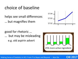
In the graph on the top right there is a clear change of slope. However, look more carefully at the vertical scale (you may need to zoom in!). The scale starts at 57.92 and the total range of the values plotted is just 0.02. This is a false baseline, instead of starting the scale at zero, it has started at anther value (in this case 57.92).
The utility of this is clear. If the data had been plotted on a full scale of, say, 0-60, then even the slope would be hard to see, let alone the change in slope. Whether these small changes are important depends on the application.
Scientists use a Kelvin scale for temperature, starting at absolute zero (-273 C), but if you used this as a full scale for day-to-day measurements, even the difference between a hot summer’s day and midwinter would only be about 10%, the ‘false’ baseline of the centigrade and Fahrenheit scales are far more useful.
This is even more important in a hospital: the difference between normal temperature and high fever, would be imperceptible (less than 1%) on a Kelvin scale, and medical thermometers do not even show a full centigrade range, but instead range from mid 30s to low 40s.
Of course, a false baseline can also be misleading if the reader is not aware of it, making insignificant differences appear large. This may happen by accident, or may be deliberate!
Many years ago there used to be a TV advert for a brand of painkiller, let’s call it Aspradine. The TV advert showed a laboratory with impressive scientific figures in white lab coats. On the laboratory bench was a rack of four test-tubes, each part filled with white powder all at the same height. The camera zoomed into a view of the top portion of the test-tubes, and to the words “Aspradine has 25% more active ingredient than other brands”, additional powder was poured into one, which rose impressively.
Of course the words were perfectly accurate, and I’m sure they were careful to actually only add a quarter extra to the tube, but the impression given was of a much larger difference.
The photographs of President Trump’s inauguration are a high profile (and highly controversial!) example of this effect. Looking at photos from the front of the crowd, it is very hard to tell the difference between different inaugurations – all look full at the front, just like if the advert had just sown the bottom half of the test-tubes. However, the image from the back clearly shows the quite substantial, and not unexpected, differences between different inaugurations. The downside to this is that, just like the Aspradine advert’s image of the top of the test-tubes or the slope in the graph, it gave the impression that the 2017 crowd was in fact very small … and reported by at least one news outlet at only a quarter of a million, which then Trump heard, responded to in his CIA speech … and, as they say, the rest is history.
Hopefully your research will not be as controversial, but beware, whether or not this sort of rhetoric is acceptable in the marketing or political arena, be very careful in your academic publications!
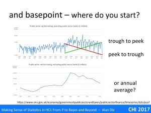
The graph at the top of this slide shows UK public sector borrowing over a 20-year period. Imagine you want to quote a 10-year change figure. One choice might be to look at the lowest point in 2007 and compare to the highest point in 2017 (the green line). Alternatively you might choose the highest point in 2007 and compare with the lowest in 2017. The first would suggest that there had been a massive increase in public sector borrowing; the latter would suggest a massive decrease. Both would be misleading!
In this case the data is clearly seasonal, related, one assumes, to varying tax revenues through the year, and perhaps differing costs. Often such data is compared at like-time’s each year (say Jan-Jan), which would give a fairer comparison.
If the data simply varies a lot then some form of average is often better. The lower graph shows precisely the same UK public borrowing data, but averaged over 12 month periods. Now the long-term trends are far more clear, not least the huge hike at the start of the global recession when there were large-scale bank bailouts followed by a crash in tax revenues.
For a real example of this see my blog “the educational divide – do numbers matter?“.
Finally, you may think that unless one were deliberately intending to deceive, no-one could make the mistake of using either of the two initial lines as both are so clearly misleading. However, imagine you had never plotted the data and instead it was simply a large spreadsheet full of numbers. It would be easy to pick and arbitrary start and end dates not realising the choice was so critical.
So another reminder – look at the data!


