It is easy, especially when promoting one’s own idea, to want to show that it is better than everyone else’s!
However, users and tasks differ from one another. Typically a system or design property may be useful for a particular purpose or group of users, but not for others. If you understand this, you are in a better position to improve your research or market your system.
In general, it is more important to know who or what something is good for.
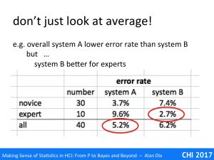
Imagine you have run a head to head comparison between two potential systems designs A and B, with 40 users. The user error rates are:
system A 5.2%
system B 6.2%
In fact they are not that different, System A is marginally better as people have slightly less errors, but is that 1% difference going to change the world. Anyway, it is a difference, so you go ahead and deploy system A.
However, it just so happens that of the 40 users 10 are novices and 10 experts. Sure enough the novices have a lower error rate with system A, and indeed by a wide margin (half the error rate), but look at the expert error rates:
expert – system A 9.6%
expert – system B 2.7% !!!!
In fact, system A is considerably worse than system B for the experts.
If this were a research setting, then just looking at the averages means you have a fairly marginal result to report – yep, you might have a good p-value, but an effect size that will leave your readers yawning in their seats.
However, if you look at the way this differentially affects the different groups (a) you have larger effects to report; which are also (b) far more interesting. Why do you get the different behaviour for novices and experts? What further research does this prompt?
The issue is perhaps even more critical for the usability professional.
It is often easier to user test novices when dealing with systems for rather than professionals; for example, you might test a financial planning application with economics students, or a diagnostic system with medical students. Novices are easier to access, and their time less costly.
However, it is likely that when you deploy the larger user group are expert.
You deployed the wrong system … and it is worse by a large margin!
If instead of simply asking, “is my system better?”, you ask, “who is my system better for?”, then you are able to ensue that you deliver the right solution to the right people.
This is also true for tasks. Typically a system or interaction method is good for some purposes, but less good for others.
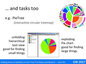
The slide shows some stills of the PieTree visualisation [OD06] . Like a TreeMap, the PieTeee is a constant area visualisation for hierarchical data, in that the area of each part reflects the number or size of the items it represents. A PiTree starts as a normal pie chart of the top level categories, but you can explode any segment showing the next level in each as smaller and smaller segments. At the top right is a fully expanded PieTree, whereas the image n the centre is unexpanded. In real use only some segments may be expanded at any particular time depending on where the user has drilled down. The screen shot in the middle has the PieTree on the left and classic file tree-style visualisation on the left.
In evaluating this several tasks were used. The tasks included extreme ones following the advice on careful choice of tasks from “Gaining Power – tasks“. One was focused on finding the largest items, and was deliberately designed to highlight the advantages of the PieTree between the file-tree style visualisation; there was an obvious strategy for the former starting by drilling down into the biggest segment. However there was also a task to find the smallest, where there was no obvious search heuristic and everything had to be opened. When it was it is actually easier to san the text version of the smallest number than it is trying to work out which of the slightly different shaped small elements was actually smallest.
The results were exactly as we expected, that is the PieTree visualisation was good for some kinds of tasks and the file-tree style for others. Having both available, as in the image in the centre, was never best for any task, but was always a good second best no matter which of the visualisations ‘won’.
In general, it is usually far more important to know who or what something is good for, than some overall averaged measure. For researchers knowing this is far more informative allowing you to start to ask further questions about why certain features or properties are better. For practitioners, this is crucial for targeting solutions at the right people and the right problems.
Reference
[OD06] R. O’Donnell, A. Dix and L. Ball (2006). Exploring the PieTree for Representing Numerical Hierarchical Data. Proceedings of Proceedings of HCI2006, People and Conputers XX – Engage. Springer. pp. 239-254. http://www.alandix.com/academic/papers/HCI2006-PieTree/


