 discrete or continuous, bounds and tails
We now look at some of the different properties of data and ‘distributions’, another key word of statistics.
We discuss the different kinds of continuous and discrete data and the way they may be bounded within some finite range, or be unbounded.
In particular we’ll see how some kinds of data, such as income distributions, may have a very long tail, small number of very large values (yep that 1%!).
Some of this is a brief reprise if you have previously done some sort of statistics course.
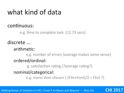
One of the first things to consider, before you start any statistical analysis, is the kind of data you are dealing with.
A key difference is between continuous and discrete data. Think about an experiment where you have measured time to compete a particular sub- task and also the number of errors during the session. The first of these, completion time, is continuous, it might be 12 seconds or 13 seconds, but could also be 12.73 seconds or anything in between. However, while a single user might have 12 or13 errors, they cannot have 12.5 errors.
Discrete values also come in a number of flavours.
The number of errors is arithmetic. Although a single user cannot get 12.5 errors, it makes sense to average them, so you could find that the average error rate is 12.73 errors per user. Although one often jokes about the mythical family with 2.2 children, it is meaningful, if you have 100 families you expect, on average 220 children.
In contrast nominal or categorical data has discrete values that cannot easily be compared, added or averaged. For example, if when presented with a menu half your users choose ‘File’ and half choose ‘Font’, it does not make sense to say that they have on average selected ‘Flml’!
In between are ordinal values, such as the degrees of agreement or satisfaction in a Likert scale. To add a little confusion these are often coded as numbers, so that 1 might be the left-most point and 5 the right-most point in a simple five point Likert scale. While 5 may be represent better than 4 and 3 better than 1, it is not necessarily the case that 4 is twice as good as 2. The points are ordered, but do not represent any precise values. Strictly you cannot simply add up and average ordinal values … however, in practice and if you have enough data, you can sometimes ‘get away’ with it, especially if you just want an indicative idea or quick overview of data … but don’t tell any purists I said so 😉
A special case of discrete data is binary data such as yes/no answers, or present/not present. Indeed one way of dealing with ordinal data, that avoids frowned upon averaging, is to choose some critical value and turn the values into simple big/small. For example, you might say that 4 and 5 are generally ‘satisfied’, so you convert 4 and 5 into ‘Yes’ and 1, 2 and 3 into ‘No’. The downside of this is that it loses information, but can be an easy way to present data.

Another question about data is whether the values are finite or potentially unbounded.
Let’s look at some examples.
number of heads in 6 tosses – This is a discrete value and bounded. The valid responses can only be 0, 1, 2, 3, 4, 5 or 6. You cannot have 3.5 heads, nor can you have -3 heads, nor 7 heads.
number of heads until first tail – still discrete, and still bounded below, but this time unbounded above. Although unlikely you could have to wait for a hundred or a thousand heads before you get a tail, there is no absolute maximum. Although, once I got to 20 heads I might start to believe I’m in the Matrix.
wait before next bus – This is now a continuous value, it could be 1 minute, 20 minutes, or 12 minutes 17.36 seconds. It is bounded below (no negative wait times), but not above, you could wait an hour, or even forever if they have cancelled the service.
difference between heights – say if you had two buildings the Abbot Tower (lets say height A) and Burton Heights (height B), you could subtract A-B. If Abbot Tower is taller, then this would be positive, if Burton Height is taller, the difference would be negative. There are probably some physical limits on building height (if it were too tall the top part might be essentially in orbit and float away!). However, for most purposes the difference is effectively unbounded, either building could be arbitrarily bigger than the other.
Now for our first distribution.
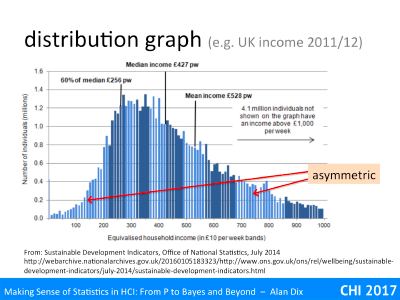
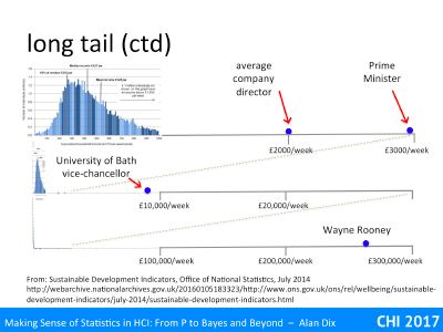
The histogram is taken from UK Office for National Statistics data on weekly income during 2012. This is continuous data, but to plot it the ONS has put people into £10 ‘bins’: 0-£9.99 in the first bin, £10–£29.9 in the next bin, etc., and then the histogram height is the number of people who earn in that range.
Note that this is an empirical distribution, it is the actual number of people in each category, rather than a theoretical distribution based on mathematical calculations of probabilities.
You can easily see that mid-range weekly wages are around £300–£400, but with a lot of spread. Each bar in this mid-range represents a million people or so. Remembering my quick and dirty rule for count data, the variability of each column is probably only +/-2000, that is 0.2% of the column height. The little sticky-out columns are probably a real effect, not just random noise (yes really an omen, at this scale, things should be more uniform and smooth). I don’t know the explanation, but I wonder if it is a small tendency for jobs to have weekly, monthly or annual salaries that are round numbers.
You can also see that tis is not a symmetric distribution, it rises quite rapidly from zero, but then tails off a lot more slowly.
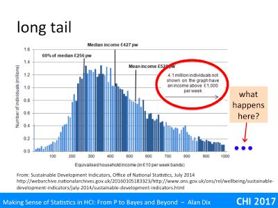
In fact, the rate of tailing off is so slow that then ONS have decided to cut it off at £1000 per week, even though it says that 4.1 million people earn more than this. In plotting the data they have chosen a cut off that avoids making the lower part getting too squashed.
But how far out does the ‘tail’ go?
I’ve not got the full data, but assume the tail, the long spread of low frequency values, decays reasonably smoothly at first.
However, I have found a few examples to populate a zoomed out view.
At the top is the range expanded by 3 to go up to £3000 a week. On this I’ve put the average UK company director’s salary of £2000 a week (£100K per annum) and the Prime Minister at about £3000 a week (£150K pa). UK professorial salaries fall roughly in the middle of this range.
Now lets zoom out by a factor of ten. The range is now up to £30,000 a week. About 1/3 of the way along is the vice-chancellor of the University of Bath (effectively CEO), who is currently the highest paid university vice-chancellor in the UK at £450K pa, around three times that of the Prime Minister.
However, we can’t stop here, we haven’t got everyone yet, let’s zoom out by another factor of ten and now we can see Wayne Rooney, who is one of the highest paid footballers in the UK at £260,000 per week. Of course this is before we even get to the tech and property company super-rich who can earn (or at least amass) millions per week.
At this scale, now look at the far left, can you just see a very thin spike of the mass of ordinary wage earners? This is why the ONS did not draw their histogram at this scale. This is a long-tail distribution, one where there are very high values but with very low frequency.
N.B. I got this slide wrong in the video because I lost a whole ‘order of magnitude’ between the vice-chancellor of Bath and Wayne Rooney!
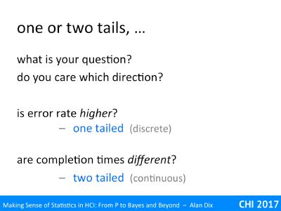
There is another use of the term ‘tail’ in statistics – you may have seen mention of one- or two-tailed tests. This is referring to the same thing, the ‘tail’ of values at either end of a distribution, but in a slightly different way.
For a moment forget the distribution of the values, and think about the question you want to ask. Crucially do you care about direction?
Imagine you are about to introduce a new system that has some additional functionality. However, you are worried that its additional complexity will make it more error prone. Before you deploy it you want to check this.
Here your question is, “is the error rate higher?”.
If it is actually lower that is nice, but you don’t really care so long as it hasn’t made things worse.
This is a one-tailed test; you only care about one direction.
In contrast, imagine you are trying to decode between two systems, A and B. Before you make your decision you want to know whether the choice will effect performance. So you do a user test and measure completion times.
This time your question is, “are the completion times different?”.
This is a two-tailed test; you care in both directions, if A is better than B or if B is better than A.