 approximations, central limit theorem and power laws
Some phenomena, such as tossing coins, have well understood distributions – in the case of coin tossing the Binomial distribution. This means one can work out precisely how likely every outcome is. At other times we need to use an approximate distribution that is close enough.
A special case is the Normal Distribution, the well-known bell-shaped curve. Some phenomena such as heights seem to naturally follow this distribution, whist others, such as coin-toss scores, end up looking approximately Normal for sufficiently many tosses.
However, there are special reasons why this works and some phenomena, in particular income distributions and social network data, are definitely NOT Normal!
Often in statistics, and also in engineering and forms of applied mathematics, one approximates one thing with another. For example, when working out the deflection of a beam under small loads, it is common to assume it takes on a circular arc shape, when in fact the actual shape is a somewhat more complex.
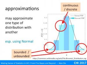
The slide shows a histogram. It is a theoretical distribution, the Binomial Distribution for n=6. This is what you’d expect for the number of heads if you tossed a fair coin six times. The histogram has been worked out from the maths: for n=1 (one toss) it would have been 50:50 for 0 and 1. If it was n=2 (two tosses), the histogram would have been ¼, ½, ¼ for 0,1,2,. For n=6, the probabilities are 1/64, 6/64, 15/64, 20/64, 15/64, 6/64, 1/64 for 0–6. However, if you tossed six coins, then did it again and again and again, thousands of times and kept tally of the number you got, you would end up getting closer and closer to this theoretical distribution.
It is discrete and bounded, but overlaid on it is a line representing the Normal distribution with mean and standard deviation chosen to match the binomial. The Normal distribution is a continuous distribution and unbounded (the tails go on for ever), but actually is not a bad fit, and for some purposes may be good enough.
In fact, if you looked at the same curves against a binomial for 20, 50 or 100 tosses, the match gets better and better. As many statistical tests (such as Students t-test, linear regression, and ANOVA) are based around the Normal, this is good as it means that you can often use these even with something such as coin tossing data!
Although doing statistics on coin tosses is not that helpful except in exercises, it is not the only thing that comes out approximately normal, so many things from people’s heights to exam results seem to follow the Normal curve.
Why is that?
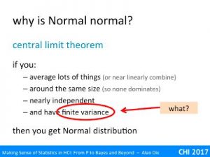
A mathematical result, the central limit theorem explains why this is the case. This says that if you take lots of things and:
- average them or add them up (or do something close to linear)
- they are around the same size (so no single value dominates)
- they are nearly independent
- they have finite variance (we’ll come back to this!)
Then the average (or sum of lots of very small things) behaves more and more like a Normal distribution as the number of small items gets larger.
Your height is based on many genes and many environmental factors. Occasionally, for some individuals, there may be single rare gene condition, traumatic event, or illness that stunts growth or cause gigantism. However, for the majority of the population it is the cumulative effect (near sum) of all those small effects that lead to our ultimate height, and hence why height is Normally distributed.
Indeed this pattern of large numbers of small things is so common that we find Normal distributions everywhere.
So if this set of conditions is so common, is everything Normal so long as you average enough of them?
Well if you look through the conditions various things can go wrong.
Condition (2), not having a single overwhelming value, is fairly obvious, and you can see when it is likely to fail.
The independence condition (3) is actually not as demanding as first appears. In the virtual coin demonstrator, setting a high correlation between coin tosses meant you got long runs of heads or tails, but eventually you get a swop and then a run of the other side. Although ‘enough of them’ ends up being even more, you still get Normal distributions. Here the non-independence is local and fades; all that matters is that there are not long distance effects so that one value does not affect so many of the others to dominate.
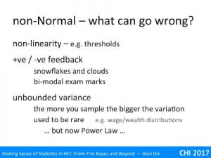
The linearity condition (1) is more interesting. There are various things that can cause non-linearity. One is some sort of threshold effect, for example, if plants are growing near an electric fence, those that reach certain height may simply be electrocuted leading to a chopped off Normal distribution!
Feedback effects also cause non-linearity as some initial change can make huge differences, the well-known butterfly effect. Snowflake growth is a good example of positive feedback, ice forms more easily on sharp tips, so any small growth grows further and ends up being a long spike. In contrast kids-picture-book bumpy clouds suggest a negative feedback process that smoothens out any protuberance.
In education in some subjects, particularly mathematical or more theoretical computer science, the results end up not as a Normal-like bell curve, but bi-modal as if there were two groups of students. There are various reasons for this, not least the tendency for many subjects like this to have questions with an ‘easy bit’ and then a ‘sting in the tail’! However, this also may well represent a true split in the student population. In the humanities if you have trouble with one week’s lectures, you can still understand the next week. With mathematical topics, often once you lose track everything else seems incomprehensible – that is a positive feedback process, one small failure leads to a bigger failure, and so on.
However, condition (4), the finite variance is oddest. Variance is a measure of the spread of a distribution. You find the variance by first finding the arithmetic mean of your data, then working out the differences from this (called the residuals), square those differences and then find the average of those squares.
For any real set of data this is bound to be a finite number, so what does it mean to not have a finite variance?
Normally, if you take larger and larger samples, this variance figure settles down and gets closer and closer to a single value. Try this with the virtual coin tossing application, increase the number of rows and watch the figure for the standard deviation (square root of variance) gradually settle down to a stable (and finite) value.
However, there are some phenomena where if you did this, took larger and larger samples, the standard deviation wouldn’t settle down to a final value, but in fact typically get larger and larger as the sample size grows (although as it is random sometimes larger samples might have small spread). Although the variance and standard deviation are finite for any single finite sample, they are unboundedly large as samples get larger.
Whether this happens or not is all about the tail. It is only possible at all with an unbounded tail, where there are occasional very large values, but on its own this is not sufficient.
Take the example of the number of heads before you get a tail (called a Negative Binomial). This is unbounded, you could get any number of heads, but the likelihood of getting lots of heads falls off very rapidly (one in a million for 20 heads), which leads to a finite mean of 1 and a finite variance of exactly 2.
Similarly the Normal distribution itself has potentially unbounded values, arbitrarily large in positive and or negative directions, but they are very unlikely resulting in a finite variance.
Indeed, in my early career, distributions without finite variance seemed relatively rare, a curiosity. One of the few common examples were income distributions in economics. For income he few super rich are often not enough to skew the arithmetic average income; Wayne Rooney’s wages averaged over the entire UK working population is less than a penny each. However, these few very well paid are enough to affect variance. Of course, for any set of people at any time, the variance is still finite, but the shape of it means that in practice if you take, say, lots of samples of first 100, then 1000, and so on larger and larger, the variance would keep on going up. For wealth (rather than income) this is also true for the average!
I said ‘in my early career’, as this was before the realisation of how common power law distributions were in human and natural phenomena.
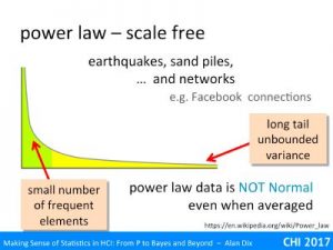
You may have heard of the phrase ‘power law’ or maybe ‘scale free’ distributions, particularly related to web phenomena. Do note that the use of the term ‘power’ here is different from statistical ‘power’, and for that matter the Power Rangers.
Some years ago it became clear that number of physical phenomena, for example earthquakes, have behaviours that are very different from the normal distribution or other distributions that were commonly dealt with in statistics at that time.
An example that you can observe for yourself is in a simple egg timer. Watch the sand grains as they dribble through the hole and land in a pile below. The pile initially grows, the little pile gets steeper and steeper, and then there is a little landslide and the top of the pile levels a little, then grows again, another little landslide. If you kept track of the landslides, some would be small, just levelling off the very tip of the pile, some larger, and sometimes the whole side of the pile cleaves away.
There is a largest size for the biggest landslide due to small size of the egg timer, but if you imagine the same slow stream of sand falling onto a larger pile, you can imagine even larger landslides.
If you keep track of the size of landslides, there are fewer large landslides than smaller ones, but the fall off is not nearly as dramatic as, say, the likelihood of getting lots and lots of heads in a row when tossing a coin. Like the income distribution, the distribution is ‘tail heavy’; there are enough low frequency but very high value events to effect the variance.
For sand piles and for earthquakes, this is due to positive feedback effects. Think of dropping a single grain of sand on the pile. Sometimes it just lands and stays. The sand pile is quite shallow this happens most of the time and the pile gets higher … and steeper. However, when the pile is of a size and steepens, when the slope is only just stable, sometimes the single grain knocks another out of place, these may both roll a little and then stop, but they may knock another, the little landslide has enough speed to create a larger one.
Earthquakes are just the same. Tension builds up in the rocks, and at some stage a part of the fault that is either a little loose, or under slightly more tension gives – a minor quake. However, sometimes that small amount of release means the bit of fault next to it is also pushed over its limit and also gives, the quake gets bigger, and so on.
Well, user interface and user experience testing doesn’t often involve earthquakes, nor for that matter sand piles. However, network phenomena such as web page links, paper citations and social media connections follow a very similar pattern. The reason for this is again positive feedback effects; if a web page has lots of links to it or a paper is heavily cited, others are more likely to find it and so link to it or cite it further. Small differences in the engagement or quality of the source, or simply some random initial spark of interest, leads to large differences in the final link/cite count. Similarly if you have lots of Twitter followers, more people see your tweets and choose to follow you.
Crucially this means that of you take the number of cites of a paper, the number of social media connections of a person, these do NOT behave like a Normal distribution even when averaged.
If you use statistical test and tools, such as t-tests, ANOVA or linear regression that assume Normal data, your analysis will be utterly meaningless and quite likely misleading.
As this sort of data becomes more common this of growing importance to know.
This does not mean you cannot use this sort of data, you can use special tests for it, or process the data to make it amenable to standard tests.
For example, you can take citation or social network connection data and code each as ‘low’ (bottom quartile of cites/connections) medium (middle 50%) or high (top quartile of cites/connections). If you turn these into a 0, 1, 2 scale, these have relative probability 0.25, 0.5, 0.25 – just like the number of heads when tossing two coins. This transformation of the data means that it is now suitable for use with standard tests so long as you have sufficient measurements – which is usually not a problem with this kind of data!

