CSS and JavaScript based sites have undoubtedly enabled experiences far richer than the grey-backgrounded days of the early web in the 1990s (and recall, the backgrounds really were grey!). However, the power and flexibility of CSS, in particular the use of floats, has led to a whole new set of usability problems on what appear to be beautifully designed sites.
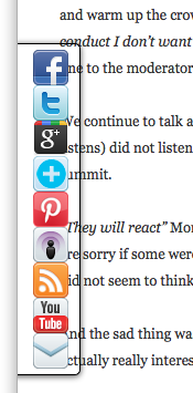 I was reading a quite disturbing article on a misogynistic Dell event by Sophie Catherina Løhr at elektronista.dk. However, I was finding it frustrating as a line of media icons on the left of the page meant only the top few lines were unobstructed.
I was clearly not the only one with this problem as one of the comments on the page read:
That social media widget on the left made me stop reading an otherwise interesting article. Very irritating.
To be fair on the page designer, it was just on Firefox that the page rendered like this, on other browsers the left-hand page margin was wider. Probably Firefox is strictly ‘right’ in a sense as it sticks very close to standards, but whoever is to blame, it is not helpful to readers of the blog.
For those wishing to make cross-browser styles, it is usually possible now-a-days, but you often have to reset everything at the beginning of your style files — even if CSS is standard, default styles are not:
body {
    margin: 0;
    padding 0;
    /*  etc. */
}
Sadly this is just one example of an increasingly common problem.
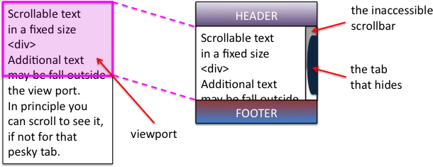
A short while ago I was on a site that had a large right-hand side tab. I forget the function, maybe for comments, or a table of contents. The problem was the tab obscured and prevented access to most of the scroll bar making navigation of the middle portion of the page virtually impossible. Normally it is not possible to obscure the scroll bar as it is ‘outside’ the page. However this site, like many, had chosen to put the main content of the site in a fixed size scrolling <div>. This meant that the header and footer were always visible, and the content scrolled in the middle. Of course the scroll bar of the <div> is then part of the page and could be obscured. I assume it was another cross-browser formatting difference that meant the designer did not notice the problem, or perhaps (not unlikely), only ever tested the style of pages with small amounts of non-scrolling text.
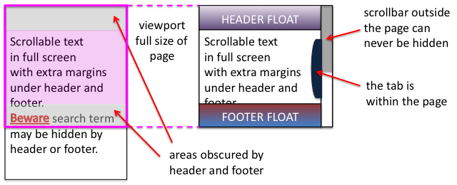
Some sites adopt a different strategy for providing fixed headers. Rather than putting the main content in a fixed <div>, instead the header and footer are set to float above the main content and margins added to it to mean that the page renders correctly at top and bottom. This means that the scrollbar for the content is the main scroll bar, and therefore cannot be hidden or otherwise mangled 🙂
Unfortunately, the web page search function does not ‘know’ about these floating elements and so when you type in a search term, will happily scroll the page to ”reveal’ the searched for word, but may do so in a way that it is underneath either header or footer and so invisible.
This is not made easier to deal with in the new MacOS Lion were the line up/down scroll arrows have been removed. Not only can you not fine-adjust the page to reveal those hidden searched-for terms, but also, whilst reading the page, the page-up/page-down scroll does not ‘know’ about the hidden parts and so scrolls a full screen-sized page missing half the text 🙁
Visibility problems are not confined to the web, there has been a long history of modal dialogue boxes being lost behind other windows (which then often refuse to interact due to the modal dialogue box), windows happily resizing themselves to be partly obscured by the Apple Dock, or even disappearing onto non-existent secondary displays.
It may be that some better model of visibility could be built into both CSS/DOM/JavaScript and desktop window managers. And it may even be that CSS will fix it’s slightly odd model of floats and layout. However, I would not want to discourage the use of overlays, transparencies, and other floating elements until this happens.
In the mean time, some thoughts:
- restraint — Recall the early days of DTP when every newsletter sported 20 fonts. No self respecting designer would do this now-a-days, so use floats, lightboxes and the like with consideration … and if you must have popups or tabs that open on hover rather than when clicked, do make sure it is possible to move your mouse across the page without it feeling like walking a minefield.
- resizing — Do check your page with different window sizes, although desktop screens are now almost all at least 1024 x 768, think laptops and pads, as this is increasingly the major form of access.
- defaults — Be aware that, W3C not withstanding, browsers are different. At very minimum reset all the margins and padding as a first step, so that you are not relying on browser defaults.
- testing — Do test (and here I mean technical testing, do user test as well!) with realistic pages, not just a paragraph of lorem ipsum.
And do my sites do this well … ?
With CSS as in all things, with great power …
![]()
P.S. Computer scientists will recognise the pun on Dijkstra’s “go to statement considered harmful“, the manifesto of structured programming. The use of gotos in early programming langauges was incredibly flexible and powerful, but just like CSS with many concomitant potential dangers for the careless or unwary. Strangely computer scientists have had little worry about other equally powerful yet dangerous techniques, not least macro languages (anyone for a spot of TeX debugging?), and Scheme programmers throw around continuations as if they were tennis balls. It seemed as though the humble goto became the scapegoat for a discipline’s sins. It was interesting when the goto statement was introduced as a ‘new’ feature in PHP5.3, an otherwise post-goto C-style language; very retro.
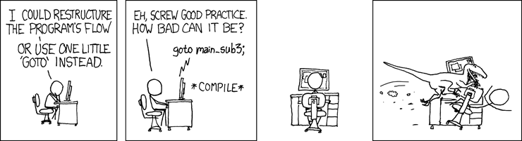
image xkcd.com
My favourite issue that I came across fairly recently was of Google whom failed to realise (I think, somewhere along the line – and has since been fixed) that minimising the browser window of their main .com page would force all their header tabs to collapse on themselves and pretty much obscure everything. Not sure what was going on there, might have just been a bug in whatever browser I was using but it made me laugh either way.