principles vs guidelines

I was recently asked to clarify the difference between usability principles and guidelines.  Having written a page-full of answer, I thought it was worth popping on the blog.

As with many things the boundary between the two is not absolute … and also the term ‘guidelines’ tends to get used differently at different times!

However, as a general rule of thumb:

  • Principles tend to be very general and would apply pretty much across different technologies and systems.
  • Guidelines tend to be more specific to a device or system.

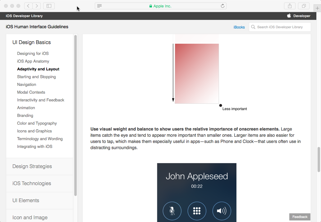
As an example of the latter, look at the iOS Human Interface Guidelines on “Adaptivity and Layout”   It starts with a general principle:

“People generally want to use their favorite apps on all their devices and in multiple contexts”,

but then rapidly turns that into more mobile specific, and then iOS specific guidelines, talking first about different screen orientations, and then about specific iOS screen size classes.

I note that the definition on page 259 of Chapter 7 of the HCI textbook is slightly ambiguous.  When it says that guidelines are less authoritative and more general in application, it means in comparison to standards … although I’d now add a few caveats for the latter too!

Basically in terms of ‘authority’, from low to high:

lowest principles agreed by community, but not mandated
guidelines proposed by manufacture, but rarely enforced
highest standards mandated by standards authority

In terms of general applicability, high to low:

highest principles very broad e.g. ‘observability’
guidelines more specific, but still allowing interpretation
lowest standards very tight

This ‘generality of application’ dimension is a little more complex as guidelines are often manufacturer specific so arguably less ‘generally applicable’ than standards, but the range of situations that standard apply to is usually much tighter.

On the whole the more specific the rules, the easier they are to apply.  For example, the general principle of observability requires that the designer think about how it applies in each new application and situation. In contrast, a more specific rule that says, “always show the current editing state in the top right of the screen” is easy to apply, but tells you nothing about other aspects of system state.

Scopus vs Google Scholar in Computer Science

In response to a Facebook thread about my recent LSE Impact Blog, “Evaluating research assessment: Metrics-based analysis exposes implicit bias in REF2014 results“, Joe Marshall commented,

“Citation databases are a pain, because you can’t standardise across fields. For computer science, Google scholar is the most comprehensive, although you could argue that it overestimates because it uses theses etc as sources. Scopus, web of knowledge etc. all miss out some key publications which is annoying”


My answer was getting a little too complicated for a Facebook reply; hence a short blog post.

While for any individual paper, you get a lot of variation between Scopus and Google Scholar, from my experience with the data, I would say they are not badly correlated if you look at big enough units.  There are a few exceptions, notably bio-tech papers which tend to get more highly placed under Scopus than GS.

Crucial for REF is how this works at the level of whole institution data.  I took a quick peek at the REF institution data, comparing top quartile counts for Scopus and Google Scholar. That is, the proportion of papers submitted from each institution that were in top 25% of papers when ranked by citation counts.  Top quartile is chosen as it should be a reasonably predictor of 4* (about 22% of papers).

The first of these graphs shows Scopus (x-axis) vs Google Scolar (y-axis) for whole institutions.  The red line is at 45 degree, representing an exact match.  Note that, many institutions are relatively small, so we would expect a level of spread.

inst-scopus-vs-google-top-quartile-with-line

While far from perfect, there is clustering around the line and crucially for all types of institution.  The major outlier (green triangle to the right) is Plymouth which does have a large number of biomed papers. In short, while one citation metric might be better than the other, they do give roughly similar outcomes.

This is very different from what happens in you compare either with actual REF 4* results:

inst-scopus-top-quartile-vs-REF-4star-with-line   inst-google-top-quartile-vs-REF-4star-with-line

In both cases not only is there far less agreement, but also there are systematic effects.  In particular, the post-1992 institutions largely sit below the red line; that is they are scored far less highly by REF panel than by either Scopus or Google Scholar.  This is a slightly different metric, but precisely the result I previously found looking at institutional bias in REF.

Note that all of these graphs look far tighter if you measure GPA rather than 4* results, but of course it is 4* that is largely what is funded.

hope and despair

I have spent a good part of the day drafting my personal response to Lord Stern’s review of the Research Excellence Framework; trying to add some positive suggestions to an otherwise gloomy view of the REF process.

My LSE impact blog “Evaluating research assessment: Metrics-based analysis exposes implicit bias in REF2014 results” also came out today, good to see and important to get the message out, but hardly positive; my final words were:

“despite the best efforts of all involved, the REF output assessment process is not fit for purpose”,

and this on a process that consumed a good part of a year of my life … depressing.

However, then on Facebook I saw the announcement:

Professor Tom Rodden announced as EPSRC's Deputy CEO

Yay, a sensible voice near the heart of UK research … a glimmer of light flicker’s on the horizon.