Software for 2050

New Year’s resolutions are for a year ahead, but with the start of a new decade it is worth looking a bit further.
How many of the software systems we use today will be around in 2050 — or even 2030?
Story 1.  This morning the BBC reported that NHS staff need up to 15 different logins to manage ‘outdated’ IT systems and I have seen exactly this in a video produced by a local hospital consultant. Another major health organisation I talked to mentioned that their key systems are written in FoxBase Pro, which has not been supported by Microsoft for 10 years.
Story 2.  Nearly all worldwide ATM transactions are routed through systems that include COBOL code (‘natural language’ programming of the 1960s) … happily IBM still do support CICS, but there is concern that COBOL expertise is literally dying out.
Story 3.  Good millennial tech typically involves an assemblage of cloud-based services: why try to deal with images when you have Flickr … except Flickr is struggling to survive financially; why have your own version control system when you can use Google Code, except Google Code shut down in 2016 after 10 years.
Story 3a.  Google have a particularly bad history of starting or buying services and then dropping them: Freebase (sigh), Revolv Hub home automation, too many to list. They are doing their best with AngularJS, which has a massive uptake in hi-tech, and is being put into long-term maintenance mode — however, ‘long-term’ here will not mean COBOL long-term, just a few years of critical security updates.
Story 4.  Success at last. Berners-Lee did NOT build the web on cutting edge technology (an edge of sadness here as hypertext research, including external linkage, pretty much died in 1994), and because of this it has survived and probably will still be functioning in 2050.
Story 5.  I’m working with David Frohlich and others who have been developing slow, meaningful social media for the elderly and their families. This could potentially contribute to very long term domestic memories, which may help as people suffer dementia and families grieve after death. However, alongside the design issues for such long-term interaction, what technical infrastructure will survive a current person’s lifetime?
You can see the challenge here.  Start-ups are about creating something that will grow rapidly in 2–5 years, but then be sold, thrown away or re-engineered from scratch.  Government and health systems need to run for 30 years or more … as do our personal lives.
What practical advice do we give to people designing now for systems that are likely to still be in use in 2050?

Solr Rocks!

After struggling with large FULLTEXT indexes in MySQL, Solr comes to the rescue, 16 million records ingested in 20 minutes – wow!

One small Gotcha was the security classes, which have obviously moved since the documentation was written (see fix at end of the post).

For web apps I live off MySQL, albeit now-a-days often wrapped with my own NoSQLite libraries to do Mongo-style databases over the LAMP stack. I’d also recently had a successful experience using MySQL FULLTEXT indices with a smaller database (10s of thousands of records) for the HCI Book search.  So when I wanted to index 16 million the book titles with their author names from OpenLibrary I thought I might as well have a go.

For some MySQL table types, the normal recommendation used to be to insert records without an index and add the index later.  However, in the past I have had a very bad experience with this approach as there doesn’t appear to be a way to tell MySQL to go easy with this process – I recall the disk being absolutely thrashed and Fiona having to restart the web server 🙁

Happily, Ernie Souhrada  reports that for MyISAM tables incremental inserts with an index are no worse than bulk insert followed by adding the index.  So I went ahead and set off a script adding batches of a 10,000 records at a time, with small gaps ‘just in case’.  The just in case was definitely the case and 16 hours later I’d barely managed a million records and MySQL was getting slower and slower.

I cut my losses, tried an upload without the FULLTEXT index and 20 minutes later, that was fine … but no way could I dare doing that ‘CREATE FULLTEXT’!

In my heart I knew that lucene/Solr was the right way to go.  These are designed for search engine performance, but I dreaded the pain of trying to install and come up to speed with yet a different system that might not end up any better in the end.

However, I bit the bullet, and my dread was utterly unfounded.  Fiona got the right version of Java running and then within half an hour of downloading Solr I had it up and running with one of the examples.  I then tried experimental ingests with small chunks of the data: 1000 records, 10,000 records, 100,000 records, a million records … Solr lapped it up, utterly painless.  The only fix I needed was because my tab-separated records had quote characters that needed mangling.

So,  a quick split into million record chunks (I couldn’t bring myself to do a single multi-gigabyte POST …but maybe that would have been OK!), set the ingest going and 20 minutes later – hey presto 16 million full text indexed records 🙂  I then realised I’d forgotten to give fieldnames, so the ingest had taken the first record values as a header line.  No problems, just clear the database and re-ingest … at 20 minutes for the whole thing, who cares!

As noted there was one slight gotcha.  In the Securing Solr section of the Solr Reference guide, it explains how to set up the security.json file.  This kept failing until I realised it was failing to find the classes solr.BasicAuthPlugin and solr.RuleBasedAuthorizationPlugin (solr.log is your friend!).  After a bit of listing of contents of jars, I found tat these are now in org.apache.solr.security.  I also found that the JSON parser struggled a little with indents … I think maybe tab characters, but after explicitly selecting and then re-typing spaces yay! – I have a fully secured Solr instance with 16 million book titles – wow 🙂

This is my final security.json file (actual credentials obscured of course!

{
  "authentication":{
    "blockUnknown": true,
    "class":"org.apache.solr.security.BasicAuthPlugin",
    "credentials":{
      "tom":"blabbityblabbityblabbityblabbityblabbityblo= blabbityblabbityblabbityblabbityblabbityblo=",
      "dick":"blabbityblabbityblabbityblabbityblabbityblo= blabbityblabbityblabbityblabbityblabbityblo=",
      "harry":"blabbityblabbityblabbityblabbityblabbityblo= blabbityblabbityblabbityblabbityblabbityblo="},
     },

  "authorization":{"class":"org.apache.solr.security.RuleBasedAuthorizationPlugin"}
}

the internet laws of the jungle

firefox-copyright-1Where are the boundaries between freedom, license and exploitation, between fair use and theft?

I found myself getting increasingly angry today as Mozilla Foundation stepped firmly beyond those limits, and moreover with Trump-esque rhetoric attempts to dupe others into following them.

It all started with a small text add below the Firefox default screen search box:

firefox-copyright-2

Partly because of my ignorance of web-speak ‘TFW‘ (I know showing my age!), I clicked through to a petition page on Mozilla Foundation (PDF archive copy here).

It starts off fine, with stories of some of the silliness of current copyright law across Europe (can’t share photos of the Eiffel tower at night) and problems for use in education (which does in fact have quite a lot of copyright exemptions in many countries).  It offers a petition to sign.

This sounds all good, partly due to rapid change, partly due to knee jerk reactions, internet law does seem to be a bit of a mess.

If you blink you might miss one or two odd parts:

“This means that if you live in or visit a country like Italy or France, you’re not permitted to take pictures of certain buildings, cityscapes, graffiti, and art, and share them online through Instagram, Twitter, or Facebook.”

Read this carefully, a tourist forbidden from photographing cityscapes – silly!  But a few words on “… and art” …  So if I visit an exhibition of an artist or maybe even photographer, and share a high definition (Nokia Lumia 1020 has 40 Mega pixel camera) is that OK? Perhaps a thumbnail in the background of a selfie, but does Mozilla object to any rules to prevent copying of artworks?

mozilla-dont-break-the-internet

However, it is at the end, in a section labelled “don’t break the internet”, the cyber fundamentalism really starts.

“A key part of what makes the internet awesome is the principle of innovation without permission — that anyone, anywhere, can create and reach an audience without anyone standing in the way.”

Again at first this sounds like a cry for self expression, except if you happen to be an artist or writer and would like to make a living from that self-expression?

Again, it is clear that current laws have not kept up with change and in areas are unreasonably restrictive.  We need to be ale to distinguish between a fair reference to something and seriously infringing its IP.  Likewise, we could distinguish the aspects of social media that are more like looking at holiday snaps over a coffee, compared to pirate copies for commercial profit.

However, in so many areas it is the other way round, our laws are struggling to restrict the excesses of the internet.

Just a few weeks ago a 14 year old girl was given permission to sue Facebook.  Multiple times over a 2 year period nude pictures of her were posted and reposted.  Facebook hides behind the argument that it is user content, it takes down the images when they are pointed out, and yet a massive technology company, which is able to recognise faces is not able to identify the same photo being repeatedly posted. Back to Mozilla: “anyone, anywhere, can create and reach an audience without anyone standing in the way” – really?

Of course this vision of the internet without boundaries is not just about self expression, but freedom of speech:

“We need to defend the principle of innovation without permission in copyright law. Abandoning it by holding platforms liable for everything that happens online would have an immense chilling effect on speech, and would take away one of the best parts of the internet — the ability to innovate and breathe new meaning into old content.”

Of course, the petition is signalling out EU law, which inconveniently includes various provisions to protect the privacy and rights of individuals, not dictatorships or centrally controlled countries.

So, who benefits from such an open and unlicensed world?  Clearly not the small artist or the victim of cyber-bullying.

Laissez-faire has always been an aim for big business, but without constraint it is the law of the jungle and always ends up benefiting the powerful.

In the 19th century it was child labour in the mills only curtailed after long battles.

In the age of the internet, it is the vast US social media giants who hold sway, and of course the search engines, who just happen to account for $300 million of revenue for Mozilla Foundation annually, 90% of its income.


Of academic communication: overload, homeostatsis and nostalgia

open-mailbox-silhouetteRevisiting on an old paper on early email use and reflecting on scholarly communication now.

About 30 years ago, I was at a meeting in London and heard a presentation about a study of early email use in Xerox and the Open University. At Xerox the use of email was already part of their normal culture, but it was still new at OU. I’d thought they had done a before and after study of one of the departments, but remembered clearly their conclusions: email acted in addition to other forms of communication (face to face, phone, paper), but did not substitute.

Gilbert-Cockton-from-IDF
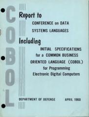
It was one of those pieces of work that I could recall, but didn’t have a reference too. Facebook to the rescue! I posted about it and in no time had a series of helpful suggestions including Gilbert Cockton who nailed it, finding the meeting, the “IEE Colloquium on Human Factors in Electronic Mail and Conferencing Systems” (3 Feb 1989) and the precise paper:

Fung , T. O’Shea , S. Bly. Electronic mail viewed as a communications catalyst. IEE Colloquium on Human Factors in Electronic Mail and Conferencing Systems, , pp.1/1–1/3. INSPEC: 3381096 http://ieeexplore.ieee.org/xpl/articleDetails.jsp?arnumber=197821

In some extraordinary investigative journalism, Gilbert also noted that the first author, Pat Fung, went on to fresh territory after retirement, qualifying as a scuba-diving instructor at the age of 75.

The details of the paper were not exactly as I remembered. Rather than a before and after study, it was a comparison of computing departments at Xerox (mature use of email) and OU’s (email less ingrained, but already well used). Maybe I had simply embroidered the memory over the years, or maybe they presented newer work at the colloquium, than was in the 3 page extended abstract.   In those days this was common as researchers did not feel they needed to milk every last result in a formal ‘publication’. However, the conclusions were just as I remembered:

“An exciting finding is its indication that the use of sophisticated electronic communications media is not seen by users as replacing existing methods of communicating. On the contrary, the use of such media is seen as a way of establishing new interactions and collaboration whilst catalysing the role of more traditional methods of communication.”

As part of this process following various leads by other Facebook friends, I spent some time looking at early CSCW conference proceedings, some at Saul Greenburg’s early CSCW bibliography [1] and Ducheneaut and Watts (15 years on) review of email research [2] in the 2005 HCI special issue on ‘reinventing email’ [3] (both notably missing the Fung et al. paper). I downloaded and skimmed several early papers including Wendy McKay’s lovely early (1988) study [4] that exposed the wide variety of ways in which people used email over and above simple ‘communication’. So much to learn from this work when the field was still fresh,

This all led me to reflect both on the Fung et al. paper, the process of finding it, and the lessons for email and other ‘communication’ media today.

Communication for new purposes

A key finding was that “the use of such media is seen as a way of establishing new interactions and collaboration“. Of course, the authors and their subjects could not have envisaged current social media, but the finding if this paper was exactly an example of this. In 1989 if I had been trying to find a paper, I would have scoured my own filing cabinet and bookshelves, those of my colleagues, and perhaps asked people when I met them. Nowadays I pop the question into Facebook and within minutes the advice starts to appear, and not long after I have a scanned copy of the paper I was after.

Communication as a good thing

In the paper abstract, the authors say that an “exciting finding” of the paper is that “the use of sophisticated electronic communications media is not seen by users as replacing existing methods of communicating.” Within paper, this is phrased even more strongly:

“The majority of subjects (nineteen) also saw no likelihood of a decrease in personal interactions due to an increase in sophisticated technological communications support and many felt that such a shift in communication patterns would be undesirable.”

Effectively, email was seen as potentially damaging if it replaced other more human means of communication, and the good outcome of this report was that this did not appear to be happening (or strictly subjects believed it was not happening).

However, by the mid-1990s, papers discussing ’email overload’ started to appear [5].

I recall a morning radio discussion of email overload about ten years ago. The presenter asked someone else in the studio if they thought this was a problem. Quite un-ironically, they answered, “no, I only spend a couple of hours a day”. I have found my own pattern of email change when I switched from highly structured Eudora (with over 2000 email folders), to Gmail (mail is like a Facebook feed, if it isn’t on the first page it doesn’t exist). I was recently talking to another academic who explained that two years ago he had deliberately taken “email as stream” as a policy to control unmanageable volumes.

If only they had known …

Communication as substitute

While Fung et al.’s respondents reported that they did not foresee a reduction in other forms of non-electronic communication, in fact even in the paper the signs of this shift to digital are evident.

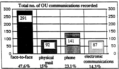
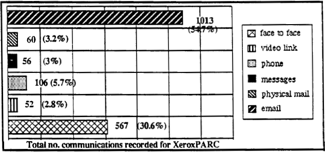
Here are the graphs of communication frequency for the Open University (30 people, more recent use of email) and Xerox (36 people, more established use) respectively.

( from Fung et al., 1989)

( from Fung et al., 1989)

( from Fung et al., 1989)

( from Fung et al., 1989)

It is hard to draw exact comparisons as it appears there may have been a higher overall volume of communication at Xerox (because of email?).  Certainly, at that point, face-to-face communication remains strong at Xerox, but it appears that not only the proportion, but total volume of non-digital non-face-to-face communications is lower than at OU.  That is sub substitution has already happened.

Again, this is obvious nowadays, although the volume of electronic communications would have been untenable in paper (I’ve sometimes imagined printing out a day’s email and trying to cram it in a pigeon-hole), the volume of paper communications has diminished markedly. A report in 2013 for Royal Mail recorded 3-6% pa reduction in letters over recent years and projected a further 4% pa for the foreseeable future [6].

academic communication and national meetungs

However, this also made me think about the IEE Colloquium itself. Back in the late 1980s and 1990s it was common to attend small national or local meetings to meet with others and present work, often early stage, for discussion. In other fields this still happens, but in HCI it has all but disappeared. Maybe I have is a little nostalgia, but this does seem a real loss as it was a great way for new PhD students to present their work and meet with the leaders in their field. Of course, this can happen if you get your CHI paper accepted, but the barriers are higher, particularly for those in smaller and less well-resourced departments.

Some of this is because international travel is cheaper and faster, and so national meetings have reduced in importance – everyone goes to the big global (largely US) conferences. Many years ago research on day-to-day time use suggested that we have a travel ‘time budget’ reactively constant across counties and across different kinds of areas within the same country [7]. The same is clearly true of academic travel time; we have a certain budget and if we travel more internationally then we do correspondingly less nationally.
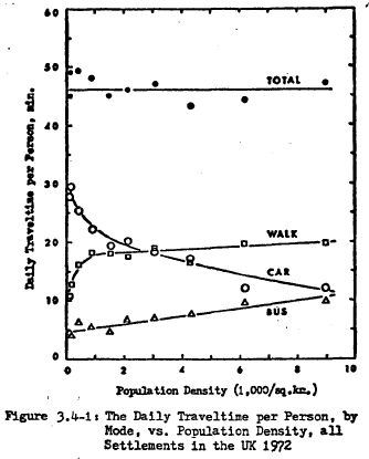
(from Zahavi, 1979)

(from Zahavi, 1979)

However, I wonder if digital communication also had a part to play. I knew about the Fung et al. paper, even though it was not in the large reviews of CSCW and email, because I had been there. Indeed, the reason that the Fung et al.paper was not cited in relevant reviews would have been because it was in a small venue and only available as paper copy, and only if you know it existed. Indeed, it was presumably also below the digital radar until it was, I assume, scanned by IEE archivists and deposited in IEEE digital library.

However, despite the advantages of this easy access to one another and scholarly communication, I wonder if we have also lost something.

In the 1980s, physical presence and co-presence at an event was crucial for academic communication. Proceedings were paper and precious, I would at least skim read all of the proceedings of any event I had been to, even those of large conferences, because they were rare and because they were available. Reference lists at the end of my papers were shorter than now, but possibly more diverse and more in-depth, as compared to more directed ‘search for the relevant terms’ literature reviews of the digital age.

And looking back at some of those early papers, in days when publish-or-perish was not so extreme, when cardiac failure was not an occupational hazard for academics (except maybe due to the Cambridge sherry allowance), at the way this crucial piece of early research was not dressed up with an extra 6000 words of window dressing to make a ‘high impact’ publication, but simply shared. Were things more fun?


[1] Saul Greenberg (1991) “An annotated bibliography of computer supported cooperative work.” ACM SIGCHI Bulletin, 23(3), pp. 29-62. July. Reprinted in Greenberg, S. ed. (1991) “Computer Supported Cooperative Work and Groupware”, pp. 359-413, Academic Press. DOI: http://dx.doi.org/10.1145/126505.126508
https://pdfs.semanticscholar.org/52b4/d0bb76fcd628c00c71e0dfbf511505ae8a30.pdf

[2] Nicolas Ducheneaut and Leon A. Watts (2005). In search of coherence: a review of e-mail research. Hum.-Comput. Interact. 20, 1 (June 2005), 11-48. DOI= 10.1080/07370024.2005.9667360
http://www2.parc.com/csl/members/nicolas/documents/HCIJ-Coherence.pdf

[3] Steve Whittaker, Victoria Bellotti, and Paul Moody (2005). Introduction to this special issue on revisiting and reinventing e-mail. Hum.-Comput. Interact. 20, 1 (June 2005), 1-9.
http://www.tandfonline.com/doi/abs/10.1080/07370024.2005.9667359

[4] Wendy E. Mackay. 1988. More than just a communication system: diversity in the use of electronic mail. In Proceedings of the 1988 ACM conference on Computer-supported cooperative work (CSCW ’88). ACM, New York, NY, USA, 344-353. DOI=http://dx.doi.org/10.1145/62266.62293
https://www.lri.fr/~mackay/pdffiles/TOIS88.Diversity.pdf

[5] Steve Whittaker and Candace Sidner (1996). Email overload: exploring personal information management of email. In Proceedings of the SIGCHI Conference on Human Factors in Computing Systems (CHI ’96), Michael J. Tauber (Ed.). ACM, New York, NY, USA, 276-283. DOI=http://dx.doi.org/10.1145/238386.238530
https://www.ischool.utexas.edu/~i385q/readings/Whittaker_Sidner-1996-Email.pdf

[6] The outlook for UK mail volumes to 2023. PwC prepared for Royal Mail Group, 15 July 2013
http://www.royalmailgroup.com/sites/default/files/ The%20outlook%20for%20UK%20mail%20volumes%20to%202023.pdf

[7] Yacov Zahavi (1979). The ‘UMOT’ Project. Prepared For U.S. Department Of Transportation Ministry Of Transport and Fed. Rep. Of Germany.
http://www.surveyarchive.org/Zahavi/UMOT_79.pdf

principles vs guidelines

I was recently asked to clarify the difference between usability principles and guidelines.  Having written a page-full of answer, I thought it was worth popping on the blog.

As with many things the boundary between the two is not absolute … and also the term ‘guidelines’ tends to get used differently at different times!

However, as a general rule of thumb:

  • Principles tend to be very general and would apply pretty much across different technologies and systems.
  • Guidelines tend to be more specific to a device or system.

As an example of the latter, look at the iOS Human Interface Guidelines on “Adaptivity and Layout”   It starts with a general principle:

“People generally want to use their favorite apps on all their devices and in multiple contexts”,

but then rapidly turns that into more mobile specific, and then iOS specific guidelines, talking first about different screen orientations, and then about specific iOS screen size classes.

I note that the definition on page 259 of Chapter 7 of the HCI textbook is slightly ambiguous.  When it says that guidelines are less authoritative and more general in application, it means in comparison to standards … although I’d now add a few caveats for the latter too!

Basically in terms of ‘authority’, from low to high:

lowest principles agreed by community, but not mandated
guidelines proposed by manufacture, but rarely enforced
highest standards mandated by standards authority

In terms of general applicability, high to low:

highest principles very broad e.g. ‘observability’
guidelines more specific, but still allowing interpretation
lowest standards very tight

This ‘generality of application’ dimension is a little more complex as guidelines are often manufacturer specific so arguably less ‘generally applicable’ than standards, but the range of situations that standard apply to is usually much tighter.

On the whole the more specific the rules, the easier they are to apply.  For example, the general principle of observability requires that the designer think about how it applies in each new application and situation. In contrast, a more specific rule that says, “always show the current editing state in the top right of the screen” is easy to apply, but tells you nothing about other aspects of system state.

level of detail – scale matters

We get used to being able to zoom into every document picture and map, but part of the cartographer’s skill is putting the right information at the right level of detail.  If you took area maps and then scaled them down, they would not make a good road atlas, the main motorways would hardly be visible, and the rest would look like a spider had walked all over it.  Similarly if you zoom into a road atlas you would discover the narrow blue line of each motorway is in fact half a mile wide on the ground.

Nowadays we all use online maps that try to do this automatically.  Sometimes this works … and sometimes it doesn’t.

Here are three successive views of Google maps focused on Bournemouth on the south coast of England.

On the first view we see Bournemouth clearly marked, and on the next, zooming in a little Poole, Christchurch and some smaller places also appear.  So far, so good, as we zoom in more local names are shown as well as the larger place.

bournemouth-1  bournemouth-2

However, zoom in one more level and something weird happens, Bournemouth disappears.  Poole and Christchurch are there, but no  Bournemouth.

bournemouth-3

However, looking at the same level scale on another browser, Bournemouth is there still:

bournemouth-4

The difference between the two is the Hotel Miramar.  On the first browser I am logged into Google mail, and so Google ‘knows’ I am booked to stay in the Hotel Miramar (presumably by scanning my email), and decides to display this also.   The labels for Bournemouth and the hotel label overlap, so Google simply omitted the Bournemouth one as less important than the hotel I am due to stay in.

A human map maker would undoubtedly have simply shifted the name ‘Bournemouth’ up a bit, knowing that it refers to the whole town.  In principle, Google maps could do the same, but typically geocoding (e.g. Geonames) simply gives a point for each location rather than an area, so it is not easy for the software to make adjustments … except Google clearly knows it is ‘big’ as it is displayed on the first, zoomed out, view; so maybe it could have done better.

This problem of overlapping legends will be familiar to anyone involved in visualisation whether map based or more abstract.

cone-trees

The image above is the original Cone Tree hierarchy browser developed by Xerox PARC in the early 1990s1.  This was the early days of interactive 3D visualisation, and the Cone Tree exploited many of the advantages such as a larger effective ‘space’ to place objects, and shadows giving both depth perception, but also a level of overview.  However, there was no room for text labels without them all running over each other.

Enter the Cam Tree:

cam-tree

The Cam Tree is identical to the cone tree, except because it is on its side it is easier to place labels without them overlapping 🙂

Of course, with the Cam Tree the regularity of the layout makes it easy to have a single solution.  The problem with maps is that labels can appear anywhere.

This is an image of a particularly cluttered part of the Frasan mobile heritage app developed for the An Iodhlann archive on Tiree.  Multiple labels overlap making them unreadable.  I should note that the large number of names only appear when the map is zoomed in, but when they do appear, there are clearly too many.

frasan-overlap

It is far from clear how to deal with this best.  The Google solution was simply to not show some things, but as we’ve seen that can be confusing.

Another option would be to make the level of detail that appears depend not just on the zoom, but also the local density.  In the Frasan map the locations of artefacts are not shown when zoomed out and only appear when zoomed in; it would be possible for them to appear, at first, only in the less cluttered areas, and appear in more busy areas only when the map is zoomed in sufficiently for them to space out.   This would trade clutter for inconsistency, but might be worthwhile.  The bigger problem would be knowing whether there were more things to see.

Another solution is to group things in busy areas.  The two maps below are from house listing sites.  The first is Rightmove which uses a Google map in its map view.  Note how the house icons all overlap one another.  Of course, the nature of houses means that if you zoom in sufficiently they start to separate, but the initial view is very cluttered.  The second is daft.ie; note how some houses are shown individually, but when they get too close they are grouped together and just the number of houses in the group shown.

rightmove-houses  daft-ie-house-site

A few years ago, Geoff Ellis and I reviewed a number of clutter reduction techniques2, each with advantages and disadvantages, there is no single ‘best’ answer. The daft.ie grouping solution is for icons, which are fixed size and small, the text label layout problem is far harder!

Maybe someday these automatic tools will be able to cope with the full variety of layout problems that arise, but for the time being this is one area where human cartographers still know best.

  1. Robertson, G. G. ; Mackinlay, J. D. ; Card, S. K. Cone Trees: animated 3D visualizations of hierarchical informationProceedings of the ACM Conference on Human Factors in Computing Systems (CHI ’91); 1991 April 27 – May 2; New Orleans; LA. NY: ACM; 1991; 189-194.[back]
  2. Geoffrey Ellis and Alan Dix. 2007. A Taxonomy of Clutter Reduction for Information VisualisationIEEE Transactions on Visualization and Computer Graphics 13, 6 (November 2007), 1216-1223. DOI=10.1109/TVCG.2007.70535[back]

If you do accessibility, please do it properly

I was looking at Coke Cola’s Rugby World Cup site1,

On the all-red web page the tooltip stood out, with the uninformative text, “headimg”.

coke-rugby-web-site-zoom

Peeking in the HTML, this is in both the title and alt attributes of the image.

<img title="headimg" alt="headimg" class="cq-dd-image" 
     src="/content/promotions/nwen/....png">

I am guessing that the web designer was aware of the need for an alt tag for accessibility, and may even have had been prompted to fill in the alt tag by the design software (Dreamweaver does this).  However, perhaps they just couldn’t think of an alternative text and so put anything in (although as the image consists of text, this does betray a certain lack of imagination!); they probably planned to come back later to do it properly.

As the micro-site is predominantly targeted at the UK, Coke Cola are legally bound to make it accessible and so may well have run it through WCAG accessibility checking software.  As the alt tag was present it will have passed W3C validation, even though the text is meaningless.  Indeed the web designer might have added the unhelpful text just to get the page to validate.

The eventual page is worse than useless, a blank alt tag would have meant it was just skipped, and at least the text “header image” would have been read as words, whereas “headimg” will be spelt out letter by letter.

Perhaps I am being unfair,  I’m sure many of my own pages are worse than this … but then again I don’t have the budget of Coke Cola!

More seriously there are important lessons for process.  In particular it is very likely that at the point the designer uploads an image they are prompted for the alt tag — this certainly happens with Dreamweaver.  However, at this point your focus is in getting the page looking right as the client looking at the initial designs is unlikely to be using a screen reader.

Good design software should not just prompt for the right information, but at the right time.  It would be far better to make it easy to say “ask me later” and build up a to do list, rather than demand the information when the system wants it, and risk the user entering anything to ‘keep the system quiet’.

I call this the Micawber principle2 and it is a good general principle for any notifications requiring user action.  Always allow the user to put things off, but also have the application keep track of pending work, and then make it easy for the user see what needs to be done at a more suitable time.

  1. Largely because I was fascinated by the semantically questionable statement “Win one of up to 1 million exclusive Gilbert rugby balls.” (my emphasis).[back]
  2. From Dicken’s Mr Micawber, who was an arch procrastinator.  See Learning Analytics for the Academic:
    An Action Perspective where I discuss this principle in the context of academic use of learning analytics.[back]

WebSci 2015 – WebSci and IoT panel

Sunshine on Keble quad, brings back memories of undergraduate days at Trinity, looking out toward the Wren Library.

Yesterday was first day of WebSci 2015.  I’m here largely as I’m giving my work on comparing REF outcomes with citation measures, “Citations and Sub-Area Bias in the UK Research Assessment Process”, at the workshop on “Quantifying and Analysing Scholarly Communication on the Web” on Tuesday.

However, yesterday I was also on a panel on “Web Science & the Internet of Things”.

These are some of the points I made in my initial positioning remarks.  I talked partly about a few things sorting round the edge of Internet of Things (IoT) and then some concerts examples of IoT related rings I;ve been involved with personally and use these to mention  few themes that emerge.

Not quite IoT

Talis

Many at WebSci will remember Talis from its SemWeb work.  The SemWeb side of the business has now closed, but the education side, particularly Reading List software with relationships between who read what and how they are related definitely still clear WebSci.  However, the URIs (still RDF) of reading items are often books, items in libraries each marked with bar codes.

Years ago I wrote about barcodes as one of the earliest and most pervasive CSCW technologies (“CSCW — a framework“), the same could be said for IoT.  It is interesting to look at the continuities and discontinuities between current IoT and these older computer-connected things.

The Walk

In 2013 I walked all around Wales, over 1000 miles.  I would *love* to talk about the IoT aspects of this, especially as I was wired up with biosensors the whole way.  I would love to do this, but can’t , because the idea of the Internet in West Wales and many rural areas is a bad joke.  I could not even Tweet.  When we talk about the IoT currently, and indeed anything with ‘Web’ or ‘Internet’ in its name, we have just excluded a substantial part of the UK population, let alone the world.

REF

Last year I was on the UK REF Computer Science and Informatics Sub-Panel.  This is part of the UK process for assessing university research.  According to the results it appears that web research in the UK is pretty poor.   In the case of the computing sub-panel, the final result was the outcome of a mixed human and automated process, certainly interesting HCI case study of socio-technical systems and not far from WeSci concerns.

This has very real effects on departmental funding and on hiring and investment decisions within universities. From the first printed cheque, computer systems have affected the real world, while there are differences in granularity and scale, some aspects of IoT are not new.

Later in the conference I will talk about citation-based analysis of the results, so you can see if web science really is weak science 😉

Clearly IoT

Three concrete IoT things I’ve been involved with:

Firefly

While at Lancaster Jo Finney and I developed tiny intelligent lights. After more than ten years these are coming into commercial production.

Imagine a Christmas tree, and put a computer behind each and every light – that is Firefly.  Each light becomes a single-pixel network computer, which seems like technological overkill, but because the digital technology is commoditised, suddenly the physical structures of wires and switches is simplified – saving money and time and allowing flexible and integrated lighting.

Even early prototypes had thousands of computers in a few square metres.  Crucially too the higher level networking is all IP.  This is solid IoT territory.  However, like a lot of smart-dust, and sensing technology based around homogeneous devices and still, despite computational autonomy, largely centrally controlled.

While it may be another 10 years before it makes the transition from large-scale display lighting to domestic scale; we always imagined domestic scenarios.  Picture the road, each house with a Christmas tree in its window, all Firefly and all connected to the internet, light patterns more form house to hose in waves, coordinate twinkling from window to window glistening in the snow.  Even in tis technology issues of social interaction and trust begin to emerge.

FitBit

My wife has a FitBit.  Clearly both and IoT technology and WebSci phenomena with millions of people connecting their devices into FitBit’s data sharing and social connection platform.

The week before WebSci we were on holiday, and we were struggling to get her iPad’s mobile data working.  The Vodafone website is designed around phones, and still (how many iPads!) misses crucial information essential for data-only devices.

The FitBit’s alarm had been set for an early hour to wake us ready to catch the ferry.  However, while the FitBit app on the iPad and the FitBit talk to one another via Bluetooth, the app will not control the alarm unless it is Internet connected.  For the first few mornings of our holiday at 6am each morning …

Like my experience on the Wales walk the software assumes constant access to the web and fails when this is not present.

Tiree Tech Wave

I run a twice a year making, talking and thinking event, Tiree Tech Wave, on the Isle of Tiree.  A wide range of things happen, but some are connected with the island itself and a number of island/rural based projects have emerged.

One of these projects, OnSupply looked at awareness of renewable power as the island has a community wind turbine, Tilly, and the emergence of SmartGrid technology.  A large proportion of the houses on the island are not on modern SmartGrid technology, but do have storage heating controlled remotely, for power demand balancing.  However, this is controlled using radio signals, and switched as large areas.  So at 4am each morning all the storage heating goes on and there is a peak.  When, as happens occasionally, there are problems with the cable between the island and the mainland, the Island’s backup generator has to deal with this surge, it cannot be controlled locally.  Again issuss of connectivity deeply embedded in the system design.

We also have a small but growing infrastructure of displays and sensing.

We have, I believe, the worlds first internet-enabled shop open sign.  When the café is open, the sign is on, this is broadcast to a web service, which can then be displayed in various ways.  It is very important in a rural area to know what is open, as you might have to drive many miles to get to a café or shop.

We also use various data feeds from the ferry company, weather station, etc., to feed into public and web displays (e.g. TireeDashboard).  That is we have heterogeneous networks of devices and displays communicating through web apis and services – good Iot and WebSCi!

This is part of a broader vision of Open Data Islands and Communities, exploring how open data can be of value to small communities.  On their own open environments tend to be most easily used by the knowledgeable, wealthy and powerful, reinforcing rather than challenging existing power structures.  We have to work explicitly to create structures and methods that make both IoT and the potential of the web truly of benefit to all.


toys for Tech Wave – MicroView

I’m always on the lookout for interesting things to add to the Tiree Tech Wave boxes to join Arduinos, Pis, conductive fabric, Lilypad, Lego Technic, etc., and I had  chance to play with a new bit of kit at Christmas ready for the next TTW in March.

Last year I saw a Kickstarter campaign for MicroView by GeekAmmo, tiny ‘chip-sized’ Arduinos with a built in OLED display.  So I ordered a ‘Learning Kit’ for Tiree Tech Wave, which includes two MicroViews and various components for starter projects.

Initially, the MicroView was ahead of schedule and I hoped they would arrive in time for TTW 8 last October, but they hit a snag in the summer.  The MicroViews are manufactured by Sparkfun who are very experienced in the maker space, but the production volume was larger than they were previously used to and a fault (missing boot loader) was missed by the test regime, leading to several thousands of faulty units being delivered.

Things go wrong and it was impressive to see the way both GeekAmmo and Sparkfun responded to the fault, analysed their quality processes and, particularly important, keeping everyone informed.

So, no MicroViews for TTW8, but they arrived before Christmas, and so one afternoon over Christmas I had a play 🙂

DSC09196 DSC09200

When you power up the MicroView (I used a USB from the computer as power source, but it can be battery powered also) the OLED screen first of all shows a welcome and then takes you through a mini tutorial, connecting up jumpers on the breadboard, and culminating with a flashing LED.  It is amazing that you can do a full tutorial, even a starter one, on a 64×48 OLED!

Although it is possible to program the MicroView from a download IDE, the online tutorials suggest using codebender.cc, which allows you to program the Micriview ‘from the cloud’ and share code (sketches).

The results of my first effort are on the left above 🙂

Can you think of any projects for two tiny Ardunos?  Come to Tiree Tech Wave in March and have a go!

codebender-code


big brother Is watching … but doing it so, so badly

I followed a link to an article on Forbes’ web site1.  After a few moments the computer fan started to spin like a merry-go-round and the page, and the browser in general became virtually unresponsive.

I copied the url, closed the browser tab (Firefox) and pasted the link into Chrome, as Chrome is often billed for its stability and resilience to badly behaving web pages.  After a  few moments the same thing happened, roaring fan, and, when I peeked at the Activity Monitor, Chrome was eating more than a core worth of the machine’s CPU.

I dug a little deeper and peeked at the web inspector.  Network activity was haywire hundreds and hundreds of downloads, most were small, some just a  few hundred bytes, others a few Kb, but loads of them.  I watched mesmerised.  Eventually it began to level off after about 10 minutes when the total number of downloads was nearing 1700 and 8Mb total download.


It is clear that the majority of these are ‘beacons’, ‘web bugs’, ‘trackers’, tiny single pixel images used by various advertising, trend analysis and web analytics companies.  The early beacons were simple gifs, so would download once and simply tell the company what page you were on, and hence using this to tune future advertising, etc.

However, rather than simply images that download once, clearly many of the current beacons are small scripts that then go on to download larger scripts.  The scripts they download then periodically poll back to the server.  Not only can they tell their originating server that you visited the page, but also how long you stayed there.  The last url on the screenshot above is one of these report backs rather than the initial download; notice it telling the server what the url of the current page is.

Some years ago I recall seeing a graphic showing how many of these beacons common ‘quality’ sites contained – note this is Forbes.  I recall several had between one and two hundred on a single page.  I’m not sure the actual count here as each beacon seems to create very many hits, but certainly enough to create 1700 downloads in 10 minutes.  The chief culprits, in terms of volume, seemed to be two companies I’d not heard of before SimpleReach2 and Realtime3, but I also saw Google, Doubleclick and others.

While I was not surprised that these existed, the sheer volume of activity did shock me, consuming more bandwidth than the original web page – no wonder your data allowance disappears so fast on a mobile!

In addition the size of the JavaScript downloads suggests that there are doing more than merely report “page active”, I’m guessing tracking scroll location, mouse movement, hover time … enough to eat a whole core of CPU.

I left the browser window and when I returned, around an hour later, the activity had slowed down, and only a couple of the sites were still actively polling.  The total bandwidth had climbed another 700Kb, so around 10Kb/minute – again think about mobile data allowance, this is a web page that is just sitting there.

When I peeked at the activity monitor Chrome had three highly active processes, between them consuming 2 cores worth of CPU!  Again all on a web page that is just sitting there.  Not only are these web beacons spying on your every move, but they are badly written to boot, costuming vast amounts of CPU when there is nothing happening.

I tried to scroll the page and then, surprise, surprise:

So, I will avoid links to Forbes in future, not because I respect my privacy; I already know I am tracked and tracked; who needed Snowdon to tell you that?  I won’t go because the beacons make the site unusable.

I’m guessing this is partly because the network here on Tiree is slow.  It does not take 10 minutes to download 8Mb, but the vast numbers of small requests interact badly with the network characteristics.  However, this is merely exposing what would otherwise be hidden: the vast ratio between useful web page and tracking software, and just how badly written the latter is.

Come on Forbes, if you are going to allow spies to pay to use your web site, at least ask them to employ some competent coders.

  1. The page I was after was this one, but I’d guess any news page would be the same. http://www.forbes.com/sites/richardbehar/2014/08/21/the-media-intifada-bad-math-ugly-truths-about-new-york-times-in-israel-hamas-war/[back]
  2. http://www.simplereach.com/[back]
  3. http://www.realtime.co/[back]