This final post recaps what we’ve learnt about the runaway nature of the AI industry, how it undermines free markets, and how we can make a difference. The core question is not what can AI do, but what should AI do?
This is the last of the series of blogs based on my keynote “The abomination of AI” at ICoSCI 2026. Each has an accompanying segment of the video and slides from the talk as well as detailed notes and references. Section numbers refer to the full report which will be released in the final blog. The slide thumbnails in the text correspond to the slides in the navigation panel below. The presentation can be played below, or opened full screen. The full length video, complete slides and further information can be found at: https://alandix.com/academic/talks/ICOSCI-2026-abomination-of-AI/
Previously …
§1. Every industry is driven by profits and power, but there is something about the nature of AI itself, which interacts with the nature of market forces in the world that is problematic and is different from other technologies.
§2. Can any technology be neutral? AI can be used for good purposes, such as advances in healthcare. It can also have bad outcomes such as bias in the criminal justice system or online exploitative pornography. Perhaps most often it is creating the frivolous or even ugly.
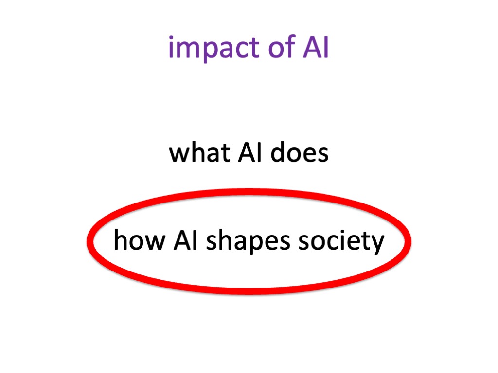
§3. The obvious impact of AI is in the things it does directly. Some technologies also change the very nature of society, affecting even those who do not use them. Cars are an obvious example. AI is also such a technology.
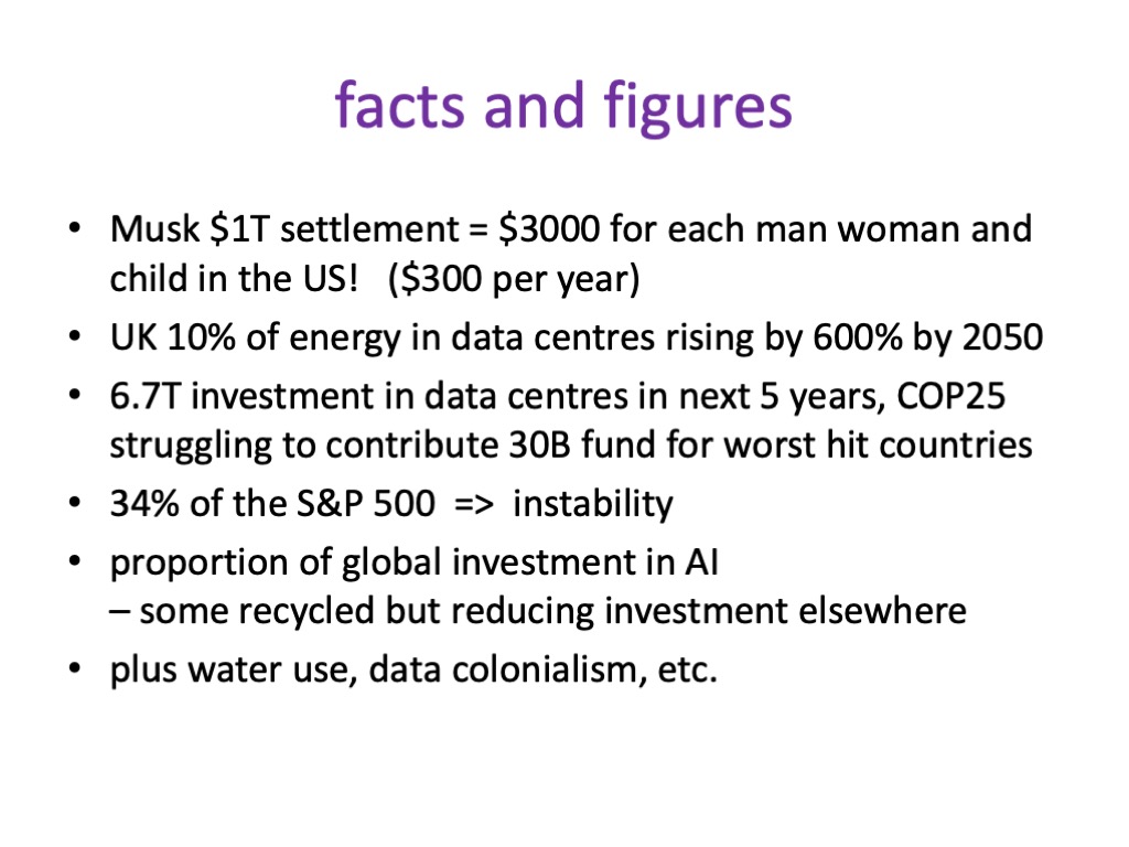
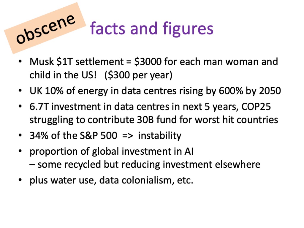
§4. Doomsayers worry about the point when AI becomes sentient, outgrowing its creators. The real danger is more insidious: the massive financial and human impacts of AI seem almost obscene.
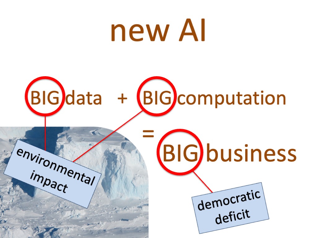
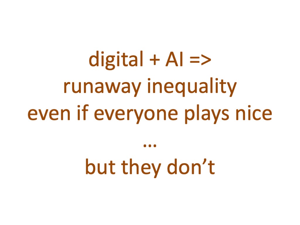
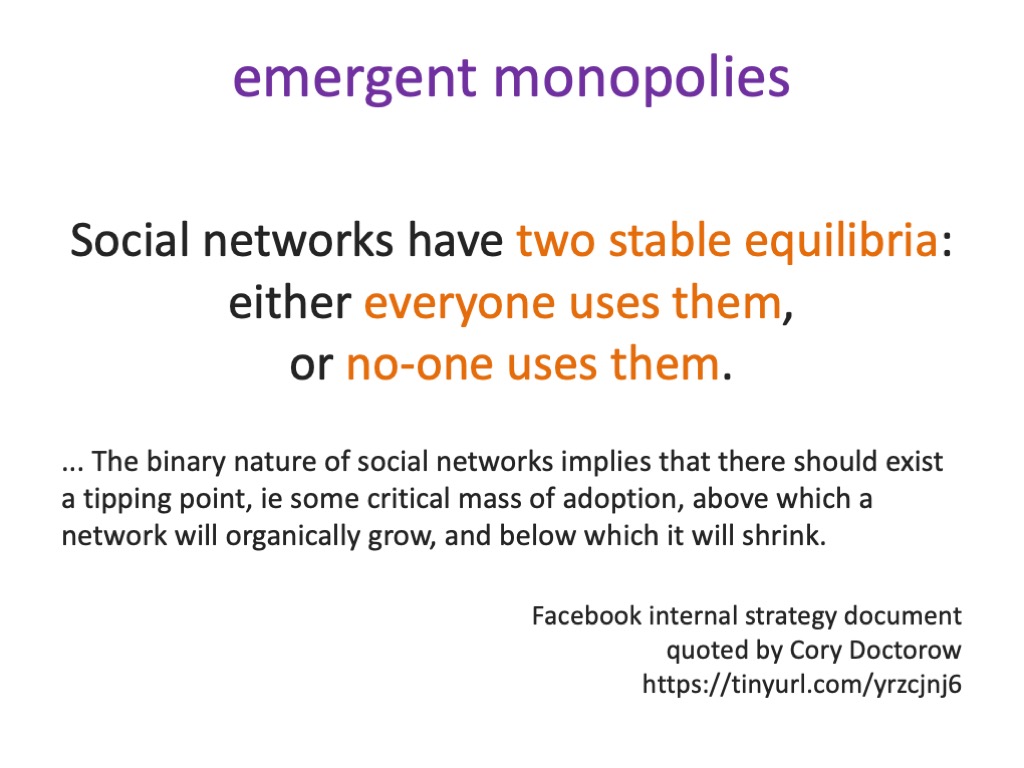
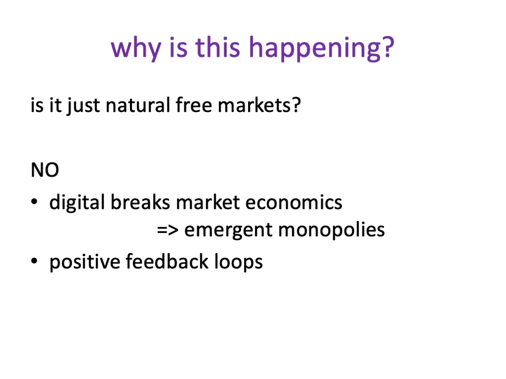
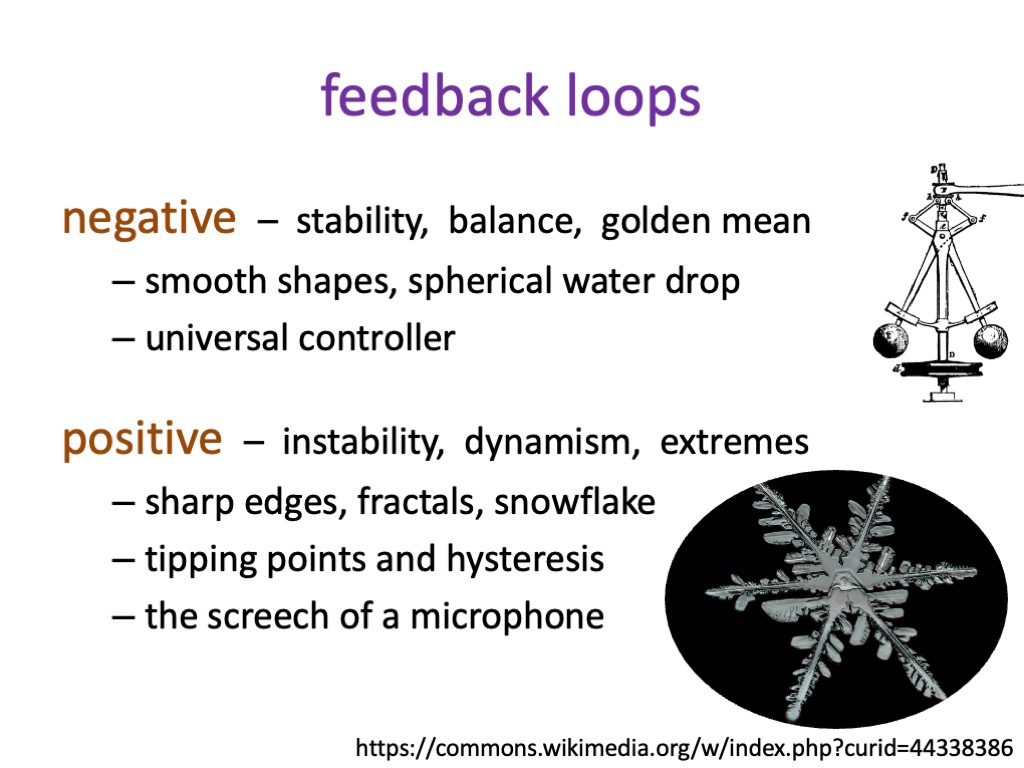
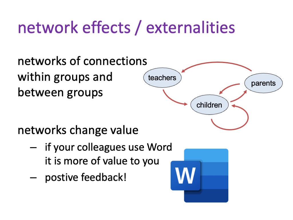
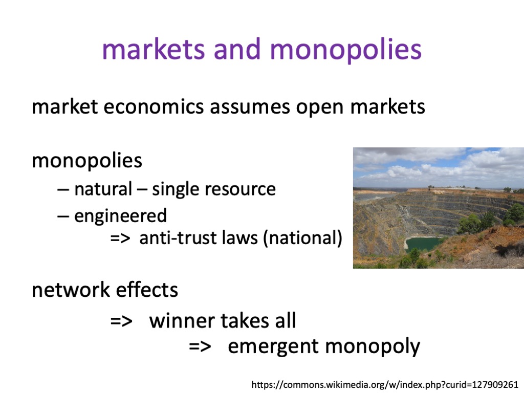
§5. Network externalities, the way one person’s use of AI and digital tech changes its value for others, creates positive feedback loops, leading to runaway growth and emergent monopolies, the nemesis of free markets. This the very nature of digital technology and AI breaks free markets leading to runaway inequality, even with the best intentions of industry … but some tech companies further exploit these effects.
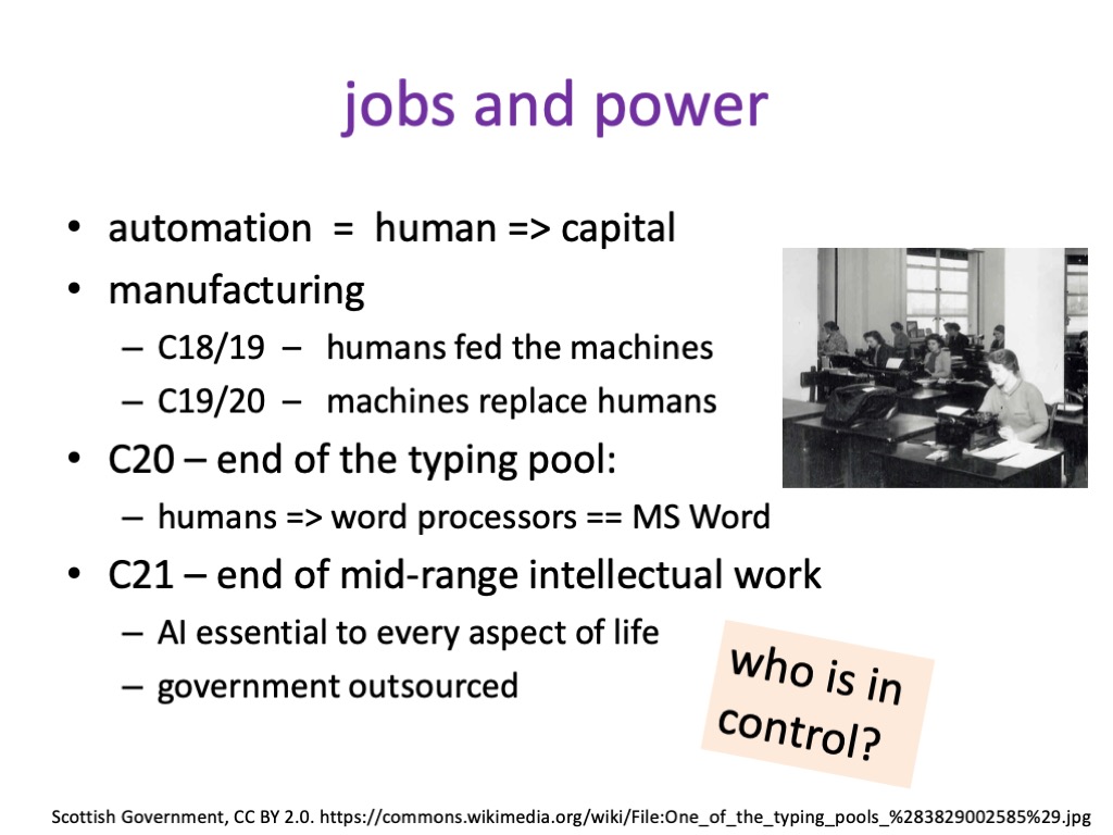
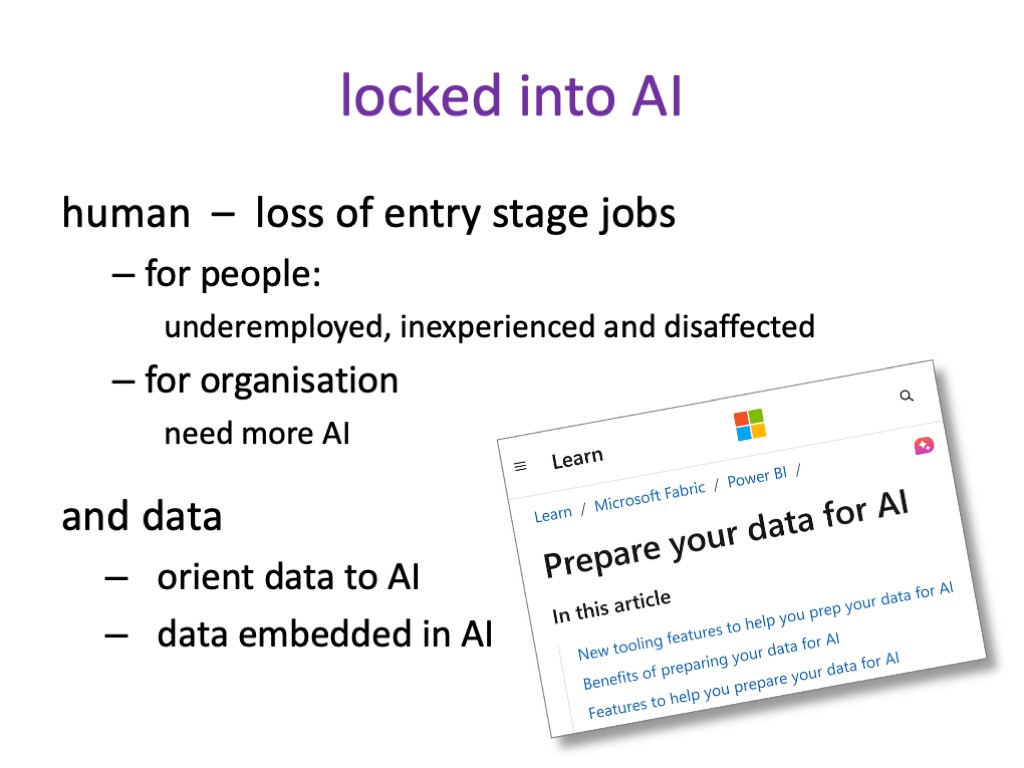
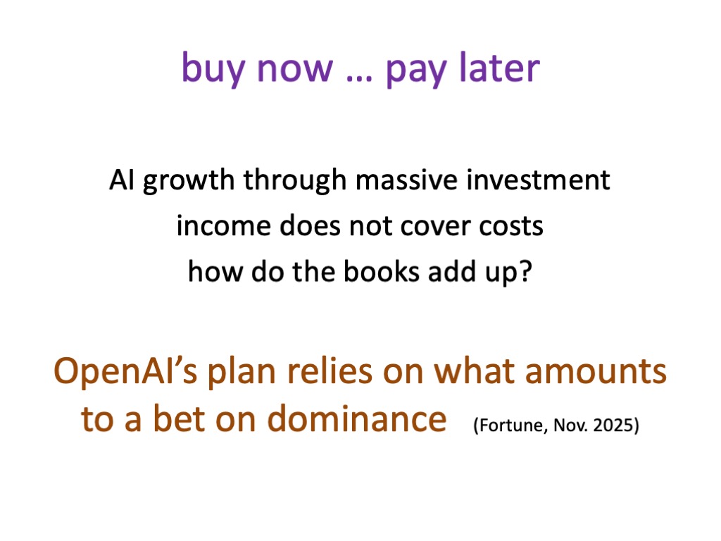
§6. Runaway growth of AI is not painless – opportunity costs of investment and human costs of lost jobs. Gains may be transitory – buy-now-pay-later tech risk tying users into spiralling costs.
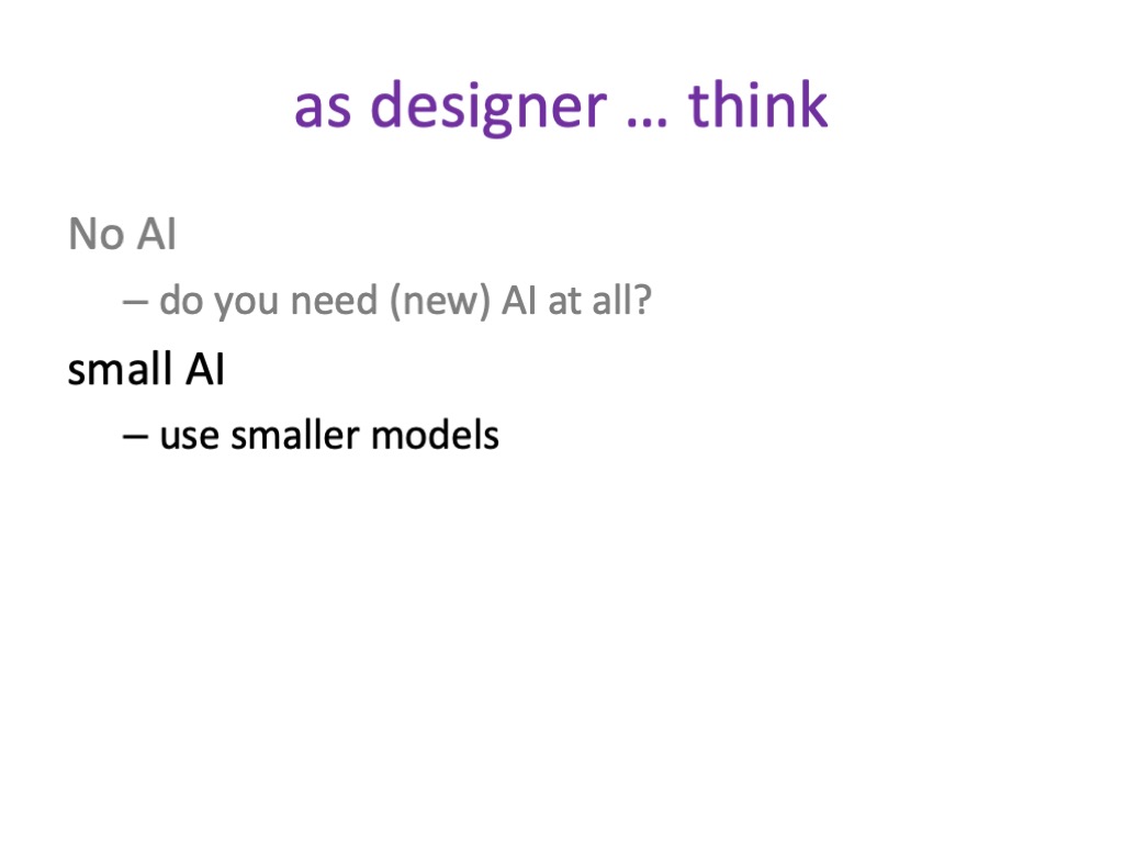
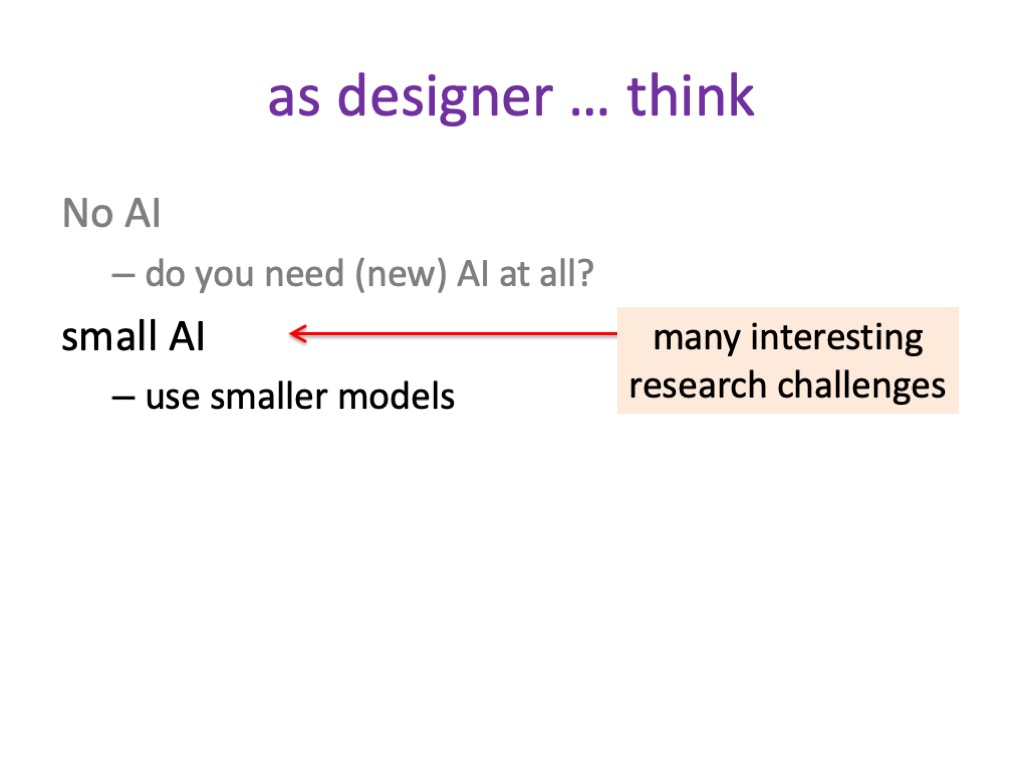
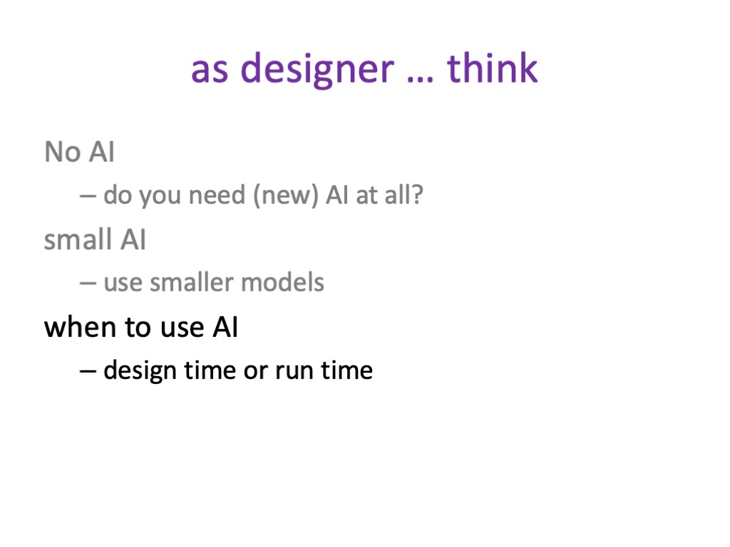
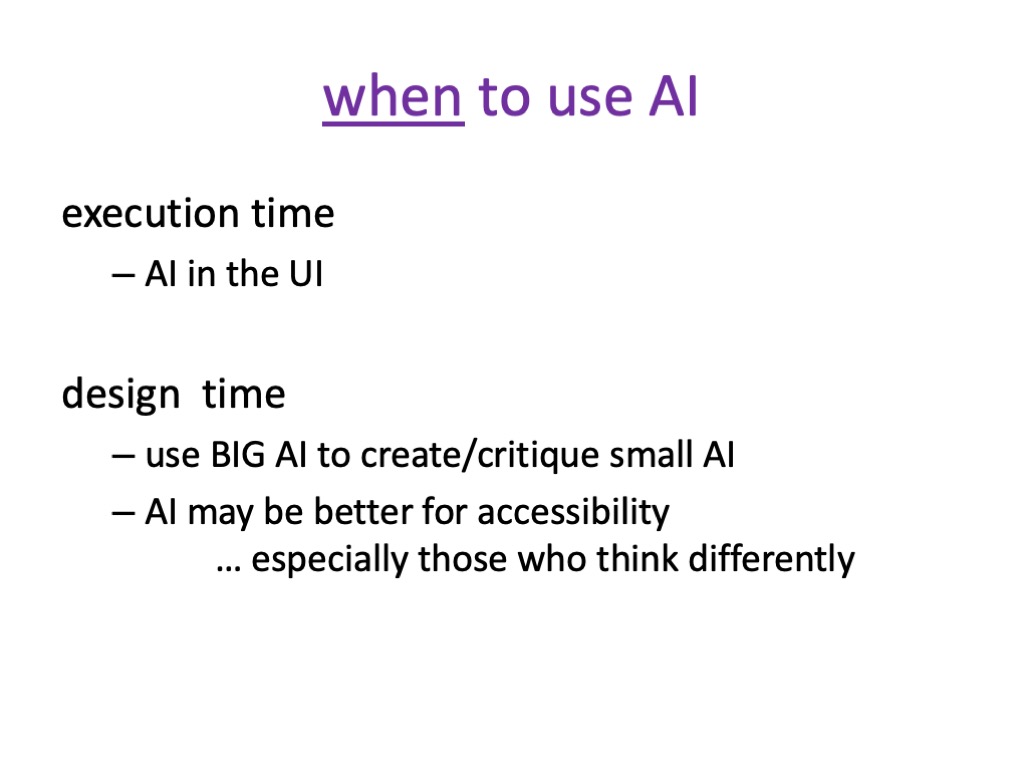
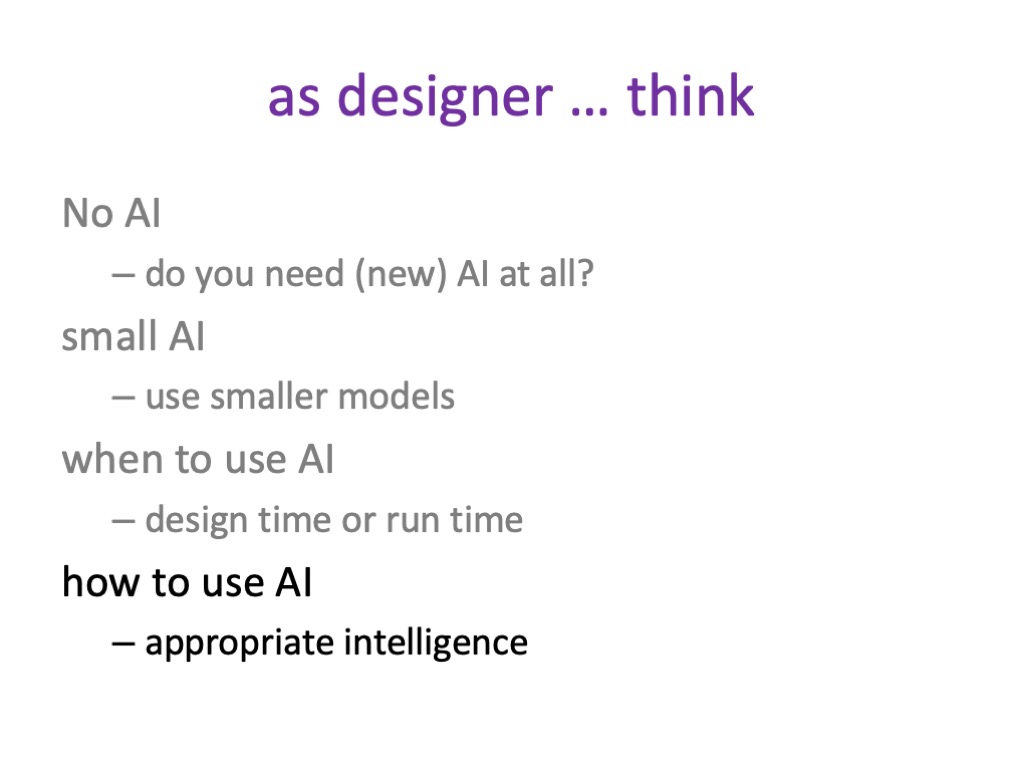
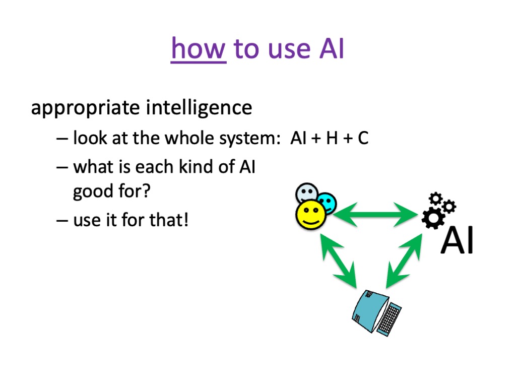
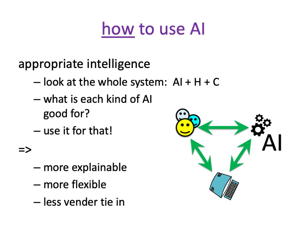
§7. It all seems too big, requiring national and international responses. But we can make a difference using appropriately chosen small AI (including none). Plus, this good use of AI is good for business too.
8. In summary
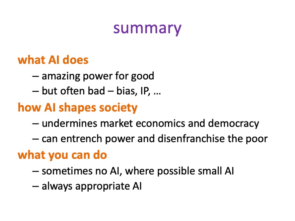
So, in summary, AI can do amazing good things, but often also bad things.
More crucial is how AI is shaping society. We have to think explicitly about this, because AI has its own dynamic. That dynamic is not good by its nature, so we have to control it to make it serve society. Some of this needs action at a governmental and intergovernmental level, because this is so big compared to most countries.
However there are things you can do. You can choose to sometimes not use AI or use small AI, but always to try to use AI appropriately rather than just throwing it at a problem and wiping your hands of the wider impact.
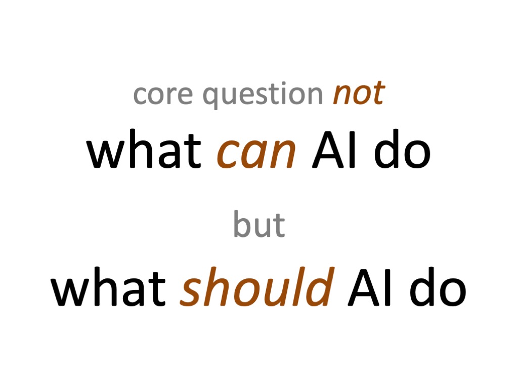
The core question is not to think solely about what can AI do? While it still does some things frighteningly badly, AI is getting better and better at doing more and more.
But the big question, the Big, BIG question is what should AI do?
And that’s the question we need to ask ourselves continually both in our individual work and at societal level.
AI will be an abomination, but only if we let it be.
Updates
It is now four months since I gave the talk at ICoSCI 2026 on which this blog series has been based. In that short time there have been many changes, some strengthening the arguments and some challenging them. In addition, I’ve had helpful feedback from several people, especially extensive comments by Mark Bernstein; so many thanks to Mark and others who have engaged with this series.
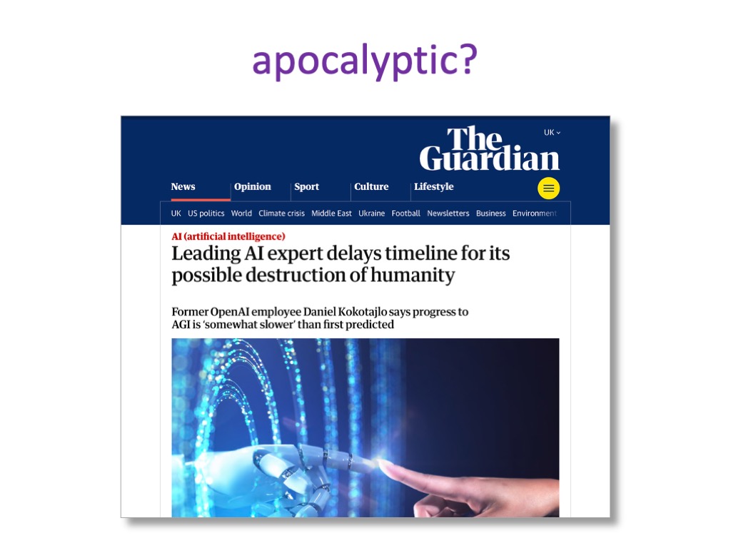
I’ve written updates at the end of several blogs. In part 3 “A different kind of apocalypse” recent reports of agentic AI ignoring guardrails make Terminator-style AI devastation, seem less distant. Of course, since those updates the publicity around Claude Mythos’ ability to find bugs in established codebases meant that Anthropic deemed it too dangerous to release without allowing selected partners to use it first to check their own security [An26a]. While this may be in part a PR exercise, it is being taken seriously by government and pan-government organisations [AISI26,Go26]. Furthermore, as well as these external threats, Anthropic are also monitoring for the potential of AI ‘sabotage’, that is:
“when an AI model with access to powerful affordances within an organization uses its affordances to autonomously exploit, manipulate, or tamper with that organization’s systems or decision-making in a way that raises the risk of future catastrophic outcomes” [An26b]
Updates at the end of part 6 “should we worry?“ reinforce the difficulty of switching AI models and the way OpenClaw has emphasised the under-pricing of AI use plans, and hence the way that these might adjust (upwards!) over time, just as we’ve seen with other forms of digital technology. At the end of part 7 “what can we do?” there is a lovely example of really smart AI, combining AI and plain old computing to achieve better and cheaper outcomes.
In addition to these updates, recent developments (since the updates!) and comments have raised a couple of issues that I’d like to address.
Size matters
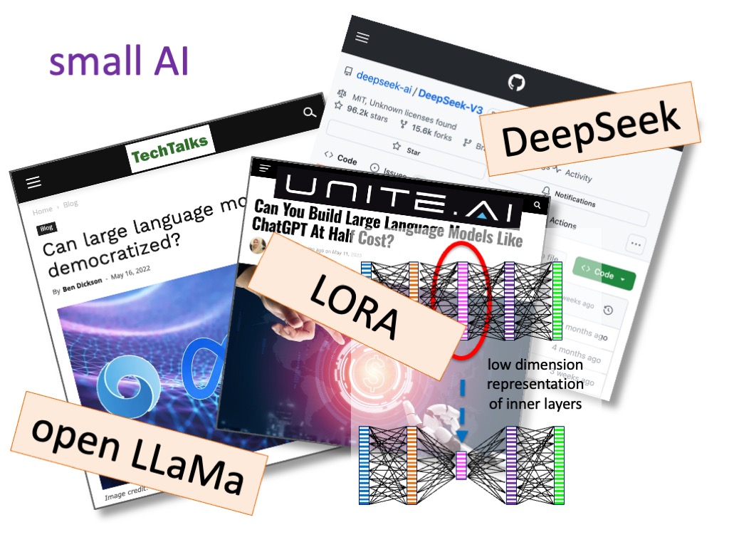
Since giving the talk in January, there have been further developments in reducing the costs of AI, not least DeepSeek’s V4 release, which has focused on making model training and execution more efficient [DS26]. Nvidia have released open source models designed to run on local small-scale (as in not more than a few $1000 Nvidia chips) installations [Ca26,Br26], some of these are designed for specialised applications, but some more general purpose; it could be that they are positioning themselves to spread their market beyond the small number of AI software mega-corporations, but in the process may weaken the emergent monopolies of these software players. However Nvidia’s own near monopoly AI hardware position is being challenged by DeepSeek’s use of Huawei chips [CC26].
This seems to suggest several potential scenarios:
- The big players (OpenAI, Anthropic) see off the cheaper, but less powerful alternatives, maybe using market dominance to retain near monopoly positions as discussed in section 5 (blog part 4 and part 5)
- The lean, mean models become powerful enough to open up the market fully, so that the current mega companies and their investors lose their ‘bet’ on market dominance, leading to massive drops in their market values, and potentially a major stock exchange crash.
- The cheaper models become viable alternatives, but do not immediately compete on sheer power and corporate commitment leaving the mega AI corporations strong, but less all encompassing, and making the individual solution strategies in part 7 easier.
The impact of (2) on the global economy would be pretty disastrous, especially following the massive hits of US-Israel/Iran and Ukraine/Russia wars, so, on balance, the softer movement of scenario (3) feels like the best outcome.
Perversely, the big AI companies would be likely to weather the storm of (2) as the investment already committed provides a cash buffer. This was certainly the case during the dot-com period in which tech companies with second/third round investment before the crash often survived, including Lastminute.com, the IPO of which triggered the market re-evaluation of tech in 2000. The founders and early funders will see paper devaluations, but otherwise still be in control of huge businesses; the smaller, more recent investors will lose however, including many global pension funds.
Cats and Consummate Consumerism
Section 3 (blog part 2) is, in part, quite dismissive of the vast volume of ‘frivolous’ use of generative AI. Later, I hope that is clarified (e.g. the example of the Doctor’s Kitchen app) that this does not mean criticising all personal use of AI — appropriate use of AI in can be very beneficial, in particular allowing far more individualised access to digital technology. Indeed, LLMs are already democratising access to many forms of professional advice that are beyond the reach of individuals and small businesses [Fu26].
However, that does leave the cats. If that is what people want to create and view, surely that is their business?
In some ways these uses of AI are the ultimate form of consumerism — like the boxfuls of unused plastic toys, kitchen appliances that lie in the dark recess of cupboards, the 1.6 billion items of clothing in UK wardrobes that have never been worn [BBC22] — but now all digital, thrust before us by the relentless algorithms of social media. Items we never knew we wanted instantly become essential, produced apparently for free and provided in precisely the quantity and kind that makes us want more.
Is this a choice, when the algorithms know how to nudge and channel us [HS26], when LLMs have learnt the lessons of the confidence trickster, and when the content itself is addictive [KK25]? Is this a free market equivalent of Opium Wars?
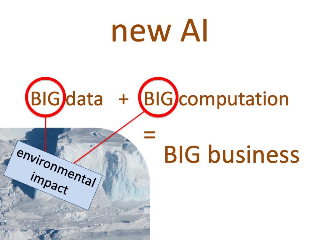
For individuals many of the costs are effectively hidden, especially at the point of use. Just as no fleece wearer or takeaway coffee drinker deliberately chooses to put microplastics in breast milk, the environmental and social impacts of digital and AI products are often physically and temporally distant and in many cases suffered by others [Ma24].
This distancing is in part due to digital communication and in part the diffuse relationship between the loci of production and use, especially when a large proportion of cost is in training. However, the distancing is in part deliberate, not least the under-pricing of services to build reliance, a trick that has been part of digital products almost since their onset and very much in the playbook of the neighbourhood drug dealer.
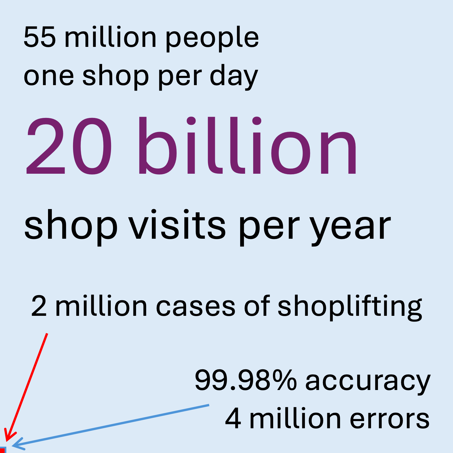
One reason for listing the almost unbelievable facts and figures of AI growth in part 3 (§4,2) is to force us to face these choices explicitly.
The speed of change …
As is evident things are moving rapidly. This said although the details are changing, many of the large-scale impacts of AI on society and economics outlined in this series build on longer term trends in digital technology that have been evident at least since the turn of the Millennium.
With so many technologies in the past the societal impacts have only become apparent in hindsight. With AI there are surprises, especially in terms of its spurts of almost unimaginably rapid progress, but also we are increasingly aware of the dangers and pitfalls. The issues describe here are part of this conversation, aiming to ensure that we enter this exciting and dangerous time with eyes wide open.
Coming soon …
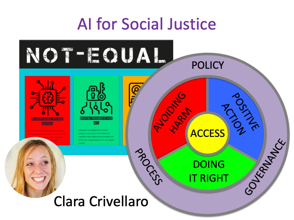
If you are interested in these issues, look out for the book AI or Social Justice, which Clara Crivellaro and I are currently working on. The book website already includes a growing collection of resources including case studies and videos. .
References
[AISI26] AI Security Institute (2026) Our evaluation of Claude Mythos Preview’s cyber capabilities. AI Security Institute, Department of Science, Innovation and Technology. Apr 13, 2026. https://www.aisi.gov.uk/blog/our-evaluation-of-claude-mythos-previews-cyber-capabilities
[An26a] Anthropic (2026). Project Glasswing: Securing critical software for the AI era. Accessed 4th May 2026. https://www.anthropic.com/glasswing
[An26b] Anthropic (2026). Sabotage Risk Report: Claude Opus 4.6. Accessed 4th May 2026. https://anthropic.com/claude-opus-4-6-risk-report
[BBC22] BBC News (2022). UK wardrobes stuffed with unworn clothes, study shows. BBC News, 7 October 2022. https://www.bbc.co.uk/news/science-environment-63170952
[Br26] Kari Briski (2026). NVIDIA Launches Nemotron 3 Nano Omni Model, Unifying Vision, Audio and Language for up to 9x More Efficient AI Agents. Nvidia blog. April 28, 2026. https://blogs.nvidia.com/blog/nemotron-3-nano-omni-multimodal-ai-agents/
[CC26] Caiwei Chen (2026). Three reasons why DeepSeek’s new model matters: The long-awaited V4 is more efficient and a win for Chinese chipmakers. MIT Technology Review, April 24, 2026 https://www.technologyreview.com/2026/04/24/1136422/why-deepseeks-v4-matters/
[Ca26] Bryan Catanzaro (2026). NVIDIA Launches Open Models and Data to Accelerate AI Innovation Across Language, Biology and Robotics. NVIDAI Blog, October 28, 2025. https://blogs.nvidia.com/blog/open-models-data-ai/
[DS26] DeepSeek-AI (2026). DeepSeek-V4:Towards Highly Efficient Million-Token Context Intelligence. Accessed 29th April 2026. https://huggingface.co/deepseek-ai/DeepSeek-V4-Pro/blob/main/DeepSeek_V4.pdf
[Fu26] Maria Ines Fuenmayor (2026). The Privilege of Refusing AI. Codified, Medum, Apr 22, 2026. https://codifiedai.substack.com/p/the-privilege-of-refusing-ai
[Go26] Gordon M. Goldstein (2026). Six Reasons Claude Mythos Is an Inflection Point for AI—and Global Security. Council on Foreign Relations, April 15, 2026. https://www.cfr.org/articles/six-reasons-claude-mythos-is-an-inflection-point-for-ai-and-global-security
[HS26] Kali Hays, Nardine Saad and Regan Morris, (2026). Campaigners welcome Meta and YouTube’s defeat in landmark social media addiction trial. BBC News, 25 March 2026. https://www.bbc.co.uk/news/articles/c747x7gz249o
[KK25] Kooli, Chokri, Youssef Kooli, and Eya Kooli (2025). Generative artificial intelligence addiction syndrome: A new behavioral disorder?. Asian Journal of Psychiatry 107:104476. https://doi.org/10.1016/j.ajp.2025.104476
[Ma24] Murgia, Madhumita (2024). Code Dependent: How AI Is Changing Our Lives. Picador.