If you spend all your time with elephants, you might think that all animals are huge. In any experiment, survey or study, the results we see depend critically on the choice of people or things we consider or measure.
Three recent Covid-19 news stories show the serious (and in one case less serious) impact of sampling bias, potentially creating misleading or invalid results.
- Story 1 – 99.9% of deaths are unvaccinated – An ONS report in mid-September was widely misinterpreted and led to the mistaken impression that virtually all UK deaths were amongst those who were unvaccinated. This is not true: whilst vaccination has massively reduced deaths and serious illness, Covid-19 is still a serious illness even for those who are fully jabbed.
- Story 2 – Lateral flow tests work – They do! False positives are known to be rare (if it says you’ve got it you probably have), but data appears to suggest that false negatives (you get a negative result, but actually have Covid) are much higher. Researchers at UCL argue that this is due to a form of sampling bias and attempt to work out the true figure … although in the process they slightly overshoot the mark!
- Story 3 – Leos get their jabs – Analysis of vaccination data in Utah found that those with a Leo star sign were more than twice as likely to be vaccinated than Libras or Scorpios. While I’d like to believe that Leos are innately more generous of spirit, does your star sign really influence your likelihood of getting a jab?
In the last story we also get a bit of confirmation bias and the file-drawer effect to add to the sampling bias theme!
Let’s look at each story in more detail.
Story 1 – 99.9% of deaths are unvaccinated
I became aware of the first story when a politician on the radio said that 99.9% of deaths in the UK were of unvaccinated people. This was said I think partly to encourage vaccination and partly to justify not requiring tougher prevention measures.
The figure surprised me for two reasons:
- I was sure I’d seen figures suggesting that there were still a substantial number of ‘breakthrough infections’ and deaths, even though the vaccinations were on average reducing severity.
- As a rule of thumb, whenever you hear anything like “99% of people …” or “99.9% of times …”, then 99% of the time (sic) the person just means “a lot”.
Checking online newspapers when I got home I found the story that had broken that morning (13th Sept 2021) based on a report by the Office of National Statistics, “Deaths involving COVID-19 by vaccination status, England: deaths occurring between 2 January and 2 July 2021“. The first summary finding reads:
In England, between 2 January and 2 July 2021, there were 51,281 deaths involving coronavirus (COVID-19); 640 occurred in people who were fully vaccinated, which includes people who had been infected before they were vaccinated.
Now 640 fully vaccinated deaths out of 51,281 is a small proportion leading to newspaper headlines and reports such as “Fully vaccinated people account for 1.2% of England’s Covid-19 deaths” (Guardian) or “Around 99pc of victims had not had two doses” (Telegraph).
In fact in this case the 99% figure does reflect the approximate value from the data, the politician had simply added an extra point nine for good measure!
So, ignoring a little hyperbole, at first glance it does appear that nearly all deaths are of unvaccinated people, which then suggests that Covid is pretty much a done deal and those who are fully vaccinated need not worry anymore. What could be wrong with that?
The clue is in the title of the report “between 2 January and 2 July 2021“. The start of this period includes the second wave of Covid in the UK. Critically while the first few people who received the Pfizer vaccine around Christmas-time were given a second dose 14 days later, vaccination policy quickly changed to leave several months between first and second vaccine doses. The vast majority of deaths due to Covid during this period happened before mid-February, at which point fewer than half a million people had received second doses.
That is, there were very few deaths amongst the fully vaccinated, in large part because there were very few people doubly vaccinated. Imagine the equivalent report for January to July 2020, of 50 thousand deaths there would have been none at all of the fully vaccinated.
This is a classic example of sampling bias, the sample during the times of peak infection was heavily biased towards the unvaccinated, making it appear that the ongoing risk for the vaccinated was near zero.
The ONS report does make the full data available. By the end of the period the number who were fully vaccinated had grown to over 20 million. The second wave had long passed and both the Euros and England’s ‘Freedom Day’ had not yet triggered rises in cases. Looking below, we can see the last five weeks of the data, zooming into the relevant parts of the ONS spreadsheet.
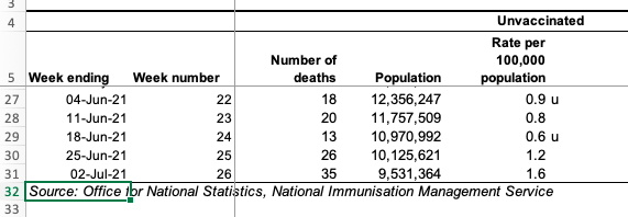
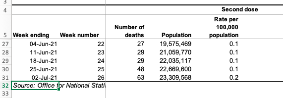
Notice that the numbers of deaths amongst the fully vaccinated (27, 29, 29, 48, 63) are between one-and-a-half and twice as high as those amongst the unvaccinated (18, 20, 13, 26, 35 ). Note that this is not because the vaccine is not working; by this point the vaccinated population is around twice as high as the unvaccinated (20 million to 10 million). Also, as vaccines were rolled out first to the most vulnerable, these are not comparing similar populations (more sampling bias!).
The ONS do their best to correct for the latter sampling bias and the column (slightly confusingly) labelled “Rate per 100,000 population“, uses the different demographics to estimate the death rate if everyone were in that vaccination bracket. That is, in the week ending 2nd July (last line of the table) if everyone were unvaccinated one would expect 1.6 deaths per 100,000 whereas if everyone were vaccinated, we would expect 0.2 deaths per 100,000.
It is this (buried and complex) figure which is actually the real headline – vaccination is making a ten-fold improvement. (This is consonant with more recent data suggesting a ten-fold improvement for most groups and a lower, but still substantial four-fold improvement for the over-80s.) However, most media picked up the easier to express – but totally misleading – total numbers of deaths figures, leading to the misapprehension amongst some that it is “all over”.
To be fair the ONS report includes the caveat:
Vaccinations were being offered according to priority groups set out by the JCVI, therefore the characteristics of the vaccinated and unvaccinated populations are changing over time, which limits the usefulness of comparing counts between the groups.
However, it is somewhat buried and the executive summary does not emphasise the predictably misleading nature of the headline figures.
Take-aways:
- for Covid – Vaccination does make things a lot better, but the rate of death and serious illness is still significant
- for statistics – Even if you understand or have corrected for sampling bias or other statistical anomalies, think about how your results may be (mis)interpreted by others
Story 2 – Lateral flow tests work
Lateral flow tests are the quick-and-dirty weapon in the anti-Covid armoury They can be applied instantly, even at home; in comparison the ‘gold standard’ PCR test can take several days to return.
The ‘accuracy’ of lateral flow tests can be assessed by comparing with PCR tests. I’ve put ‘accuracy’ in scare quotes as there are multiple formal measures.
A test can fail in two ways:
- False Positive – the test says you have Covid, but you haven’t. – These are believed to be quite rare, partly because the tests are tuned not to give false alarms too often, especially when prevalence is low.
- False Negative – the test says you don’t have Covid, but you really do. – There is a trade-off in all tests: by calibrating the test not to give too many false alarms, this means that inevitably there will be times when you actually have the disease, but test negative on a lateral flow test. Data comparing lateral flow with PCR suggests that if you have Covid-19, there is still about a 50:50 chance that the test will be negative.
Note that the main purpose of the lateral flow test is to reduce the transmission of the virus in the population. If it catches only a fraction of cases this is enough to cut the R number. However, if there were too many false positive results this could lead to large numbers of people needlessly self-isolating and potentially putting additional load on the health service as they verify the Covid status of people who are clear.
So the apparent high chance of false negatives doesn’t actually matter so much except insofar as it may give people a false sense of security. However, researchers at University College London took another look at the data and argue that the lateral flow tests might actually be better than first thought.
In a paper describing their analysis, they note that a person goes through several stages during the illness; critically, you may test positive on a PCR if:
- You actively have the illness and are potentially infectious (called D2 in the paper).
- You have recently had the illness and still have a remnant of the virus in your system, but are no longer infectious (called D3 in the paper).
The virus remnants detected during the latter of these (D3) would not trigger a lateral flow test and so people tested with both during this period would appear to be a false negative, but in fact the lateral flow test would accurately predict that they are not infectious. While the PCR test is treated as ‘gold standard’, the crucial issue is whether someone has Covid and is infectious – effectively PCR tests give false positives for a period after the disease has run its course.
The impact of this is that the accuracy of lateral flow tests (in terms of the number of false negatives), may be better than previously estimated, because this second period effectively pollutes the results. There was a systematic sampling bias in the original estimates.
The UCL researchers attempt to correct the bias by using the relative proportion of positive PCR tests in the two stages D2/(D2+D3); they call this ratio π (not sure why). They use a figure of 0.5 for this (50:50 D2:D3) and use it to estimate that the true positive rate (specificity) for lateral flow tests is about 80%, rather than 40%, and correspondingly the false negative rate only about 20%, rather than 60%. If this is right, then this is very good news: if you are infectious with Covid-19, then there is an 80% chance that lateral flow will detect it.
The reporting of the paper is actually pretty good (why am I so surprised?), although the BBC report (and I’m sure others) does seem to confuse the different forms of test accuracy.
However, there is a slight caveat here, as this all depends on the D2:D3 ratio.
The UCL researchers use of 0.5 for π is based on published estimates of the period of detectable virus (D2+D3) and infectiousness (D2). They also correctly note that the effective ratio will depend on whether the disease is growing or decaying in the population (another form of sampling bias similar to the issues in measuring the serial interval for the virus discussed in my ICTAC keynote). Given that the Liverpool study on which they based their own estimates had been during a time of decay, they note that the results may be even better than they suggest.
However, there is yet another sampling bias at work! The low specificity figures for lateral flow are always on asymptomatic individuals. The test is known to be more accurate when the patient is already showing symptoms. This means that lateral flow tests would only ever be applied in stage D3 if the individual had never been symptomatic during the entire infectious period of the virus (D2). Early on it was believed that a large proportion of people may have been entirely asymptomatic; this was perhaps wishful thinking as it would have made early herd immunity more likely. However a systematic review suggested that only between a quarter and a third of cases are never symptomatic, so that the impact of negative lateral flow tests during stage D3 will be a lot smaller than the paper suggests.
In summary there are three kinds of sampling effects at work:
- inclusion in prior studies of tests during stage D3 when we would not expect nor need lateral flow tests to give positive results
- relative changes in the effective number of people in stages D2 and D3 depending on whether the virus is growing or decaying in the population
- asymptomatic testing regimes that make it less likely that stage D3 tests are performed
Earlier work ignored (1) and so may under-estimate lateral flow sensitivity. The UCL work corrects for (1), suggesting a far higher accuracy for lateral flow, and discusses (2), which means it might be even better. However, it misses (3), so overstates the improvement substantially!
Take-aways:
- for Covid – Lateral flow tests may be more accurate than first believed, but a negative test result does not mean ‘safe’, just less likely to be infected.
- for statistics – (i) Be aware of time-based sampling issues when populations or other aspects are changing. (ii) Even when you spot one potential source of sampling bias, do dig deeper; there may be more.
Story 3 – Leos get their jabs
Health department officials in Salt Lake County, Utah decided to look at their data on vaccination take-up. An unexpected result was that there appeared to be a substantial difference between citizens with different birth signs. Leos topped the league table with a 70% vaccination rate whilst Scorpios trailed with less than half vaccinated.
Now that Mercury is not in retrograde, we're just going to leave this here…
(and yes, this is based on data) pic.twitter.com/fOxBHaDPvY
— Salt Lake Health (@SaltLakeHealth) October 19, 2021
Although I’d hate to argue with the obvious implication that Leos are naturally more caring and considerate, maybe the data is not quite so cut and dried.
The first thing I wonder when I see data like this is whether it is simply a random fluke. By definition the largest element in any data set tends to be a bit extreme, and this is a county, so maybe the numbers involved are quite large. However, Salt Lake County is the largest county in Utah with around 1.2 million residents according to the US Census; so, even ignoring children or others not eligible, still around 900,000 people.
Looking at the full list of percentages, it looks like the average take-up is between 55% and 60%, with around 75,000 people per star sign (900,000/12). Using my quick and dirty rule for this kind of data: look at the number of people in the smaller side (30,000 = 40% of 75,000); take its square root (about 170); and as it is near the middle multiply by 1.5 (~250). This is the sort of variation one might expect to see in the data. However 250 out of 75,000 people is only about 0.3%, so these variations of +/-10% look far more than a random fluke.
The Guardian article about this digs a little deeper into the data.
The Utah officials knew the birth dates of those who had been vaccinated, but not the overall date-of-birth data for the county as a whole. If this were not uniform by star sign, then it could introduce a sampling bias. To counteract this, they used national US population data to estimate the numbers in each star sign in the county and then divided their own vaccination figure by these estimated figures.
That is, they combined two sets of data:
- their own data on birth dates and vaccination
- data provided (according to the Guardian article) by University of Texas-Austin on overall US population birth dates
The Guardian suggests that in attempting to counteract sampling bias in the former, the use of the latter may have introduced a new bias. The Guardian uses two pieces of evidence for this.
- First an article in the journal Public Health Report that showed that seasonal variation in births varied markedly between states, so that comparing individiual states or counties with national data could be flawed.
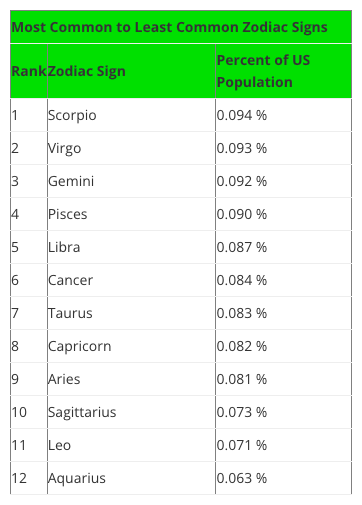
- Second a blog post by Swint Friday of the College of Business Texas A&M University-Corpus Christi, which includes a table (see below) of overall US star sign prevalence that (in the Guardian’s words) “is a near-exact inverse of the vaccination one“, thus potentially creating the apparent vaccination effect.
Variations in birth rates through the year are often assumed to be in part due to seasonal bedtime activity: hunkering down as the winter draws in vs. short sweaty summer nights; while the Guardian, cites a third source, The Daily Viz, to suggest that “Americans like to procreate around the holiday period“. More seriously, the Public Health Report article also links this to seasonal impact on pre- and post-natal mortality, especially in boys.
Having sorted the data in their own minds, the Guardian reporting shifts to the human interest angle, interviewing the Salt Lake health officials and their reasons for tweeting this in the first place.
But … yes, there is always a but … the Guardian fails to check the various sources in a little more detail.
The Swint Friday blog has figures for Leo at 0.063% of the US population whilst Scorpio tops it at 0.094%, with the rest in between. Together the figures add up to around 1% … what happened to the other 99% of the population … do they not have a star sign? Clearly something is wrong, I’m guessing the figures are proportions not percentages, but it does leave me slightly worried about the reliability of the source.
Furthermore, the Public Health Report article (below) shows July-Aug (Leo period) slightly higher rather than lower in terms of birth date frequency, as does more recent US data on births.
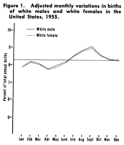
from PASAMANICK B, DINITZ S, KNOBLOCH H. Geographic and seasonal variations in births. Public Health Rep. 1959 Apr;74(4):285-8. PMID: 13645872; PMCID: PMC1929236
Also, the ratio between largest and smallest figures in the Swint Friday table is about a half of the smaller figure (~1.5:1), whereas in the figure above it is about an eighth and in the recent data less than a tenth.
The observant reader might also notice the date on the graph above, 1955, and that it only refers to white males and females. Note that this comes from an article published in 1959, focused on infant mortality and exemplifies the widespread structural racism in the availability of historic health data. This is itself another form of sampling bias and the reasons for the selection are not described in the paper, perhaps it was just commonly accepted at the time.
Returning to the date, as well as describing state-to-state variation, the paper also surmises that some of this difference may be due to socio-economic factors and that:
The increased access of many persons in our society to the means of reducing the stress associated with semitropical summer climates might make a very real difference in infant and maternal mortality and morbidity.
Indeed, roll on fifty years, and looking at the graph at Daily Viz based on more recent US government birth data produced at Daily Viz, the variation is indeed far smaller now than it was in 1955.
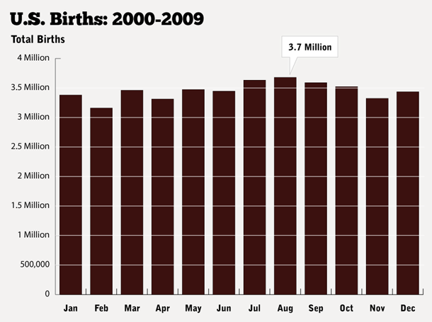
from How Common Is Your Birthday? Pt. 2., the Daily Viz, Matt Stiles, May 18, 2012
As noted the data in Swint Friday’s blog is not consistent with either of these sources, and is clearly intended simply as a light-hearted set of tables of quick facts about the Zodiac. The original data for this comes from Statistics Brain, but this requires a paid account to access, and given the apparent quality of the resulting data, I don’t really want to pay to check! So, the ultimate origins of thsi table remains a mystery, but it appears to be simply wrong.
Given it is “a near-exact inverse” of the Utah star sign data, I’m inclined to believe that this is the source that Utah health officials used, that is data from the Texas A&M University, not Texas University Austin. So in the end I agree with the Guardian’s overall assessment, even if their reasoning is somewhat flawed.
How is it that the Guardian did not notice these quite marked discrepancies in the data. I think the answer is confirmation bias, they found evidence that agreed with their belief (that Zodiac signs can’t affect vaccination status) and therefore did not look any further.
Finally, we only heard about this because it was odd enough for Utah officials to tweet about it. How many other things did the Utah officials consider that did not end up interesting? How many of the other 3000 counties in the USA looked at their star sign data and found nothing. This is a version of the file-drawer effect for scientific papers, where only the results that ‘work’ get published. With so many counties and so many possible things to look at, even a 10,000 to 1 event would happen sometimes, but if only the 10,000 to one event gets reported, it would seem significant and yet be pure chance.
Take-aways:
- for Covid – Get vaccinated whatever your star sign.
- for statistics – (i) Take especial care when combining data from different sources to correct sampling bias, you might just create a new bias. (ii) Cross check sources for consistency, and if they are not why not? (iii) Beware confirmation bias, when the data agrees with what you believe, still check it! (iv) Remember that historical data and its availability may reflect other forms of human bias. (v) The file-drawer effect – are you only seeing the selected apparently unusual data?