Making the most of stakeholder interviews

Recently, I was asked for any tips or suggestions for stakeholder interviews.   I realised it was going to be more than would fit in the response to an IM message!

I’ll assume that this is purely for requirements gathering. For participatory or co-design, many of the same things hold, but there would be additional activities.

See also HCI book chapter 5: interaction design basics and chapter 13: socio-organizational issues and stakeholder requirements.

Kinds of knowing

First remember:

  • what they know – Whether the cleaner of a public lavatory or the CEO of a multi-national, they have rich experience in their area. Respect even the most apparently trivial comments.
  • what they don’t know they know – Much of our knowledge is tacit, things they know in the sense that they apply in their day to day activities, but are not explicitly aware of knowing. Part of your job as interviewer is to bring this latent knowledge to the surface.
  • what they don’t know – You are there because you bring expertise and knowledge, most critically in what is possible; it is often hard for someone who has spent years in a job to see that it could be different.

People also find it easier to articulate ‘what’ compared with ‘why’ knowledge:

  • whatobjects, things, and people involved in their job, also the actions they perform, but even the latter can be difficult if they are too familiar
  • why – the underlying criteria, motivations and values that underpin their everyday activities

Be concrete

Most of us think best when we have concrete examples or situations to draw on, even if we are using these to describe more abstract concepts.

  • in their natural situation – People often find it easier to remember things if they are in the place and amongst the tools where they normally do them.
  • printer-detail
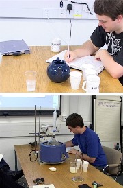
show you what they do – Being in their workplace also makes it easy for them to show you what they do – see “case study: Pensions printout“, for an example of this, the pensions manager was only able to articulate how a computer listing was used when he could demonstrate using the card files in his office. Note this applies to physical things, and also digital ones (e.g. talking through files on computer desktop)
  • watch what they do – If circumstances allow directly observe – often people omit the most obvious things, either because they assume it is known, or because it is too familiar and hence tacit. In “Early lessons – It’s not all about technology“, the (1960s!) system analyst realised that it was the operators’ fear of getting their clothes dirty that was slowing down the printing machine; this was not because of anything any of the operators said, but what they were observed doing.
  • seek stories of past incidents – Humans are born story tellers (listen to a toddler). If asked to give abstract instructions or information we often struggle.
  • normal and exceptional storiesboth are important. Often if asked about a process or procedure the interviewee will give the normative or official version of what they do. This may be because they don’t want to admit to unofficial methods, or maybe that they think of the task in normative terms even though they actually never do it that way. Ask for ‘war stories’ of unusual, exceptional or problematic situations.
  • technology probes or envisioned scenarios – Although it may be hard to envisage new situations, if potential futures are presented in an engaging and concrete manner, then we are much more able to see ourselves in them, maybe using a new system, and say “but no that wouldn’t work.”  (see more at hcibook online! “technology probes“)

Estrangement

As noted the stakeholder’s tacit knowledge may be the most important. By seeking out or deliberately creating odd or unusual situations, we may be able to break out of this blindness to the normal.

  • ask about other people’s jobs – As well as asking a stakeholder about what they do, ask them about other people; they may notice things about others better then the other person does themselves.
  • strangers / new folk / outsiders – Seek out the new person, the temporary visitor from another site, or even the cleaner; all see the situation with fresh eyes.
  • technology probes or envisioned scenarios (again!) – As well as being able to say “but no that wouldn’t work”, we can sometimes say “but no that wouldn’t work, because …”
  • making-teafantasy – When the aim is to establish requirements and gain understanding, there is no reason why an envisaged scenario need be realistic or even possible. Think SciFi and magic 🙂 For an extended example of this look at ‘Making Tea‘, which asked chemists to make tea as if it were a laboratory procedure!

Of course some of these, notably fantasy scenarios, may work better in some organisations than others!

Analyse

You need to make sense of all that interview data!

  • the big picture – Much of what you learn will be about what happens to individuals. You need to see how this all fits together (e.g. Checkland/ Soft System Methodology ‘Rich Picture’, or process diagrams). Dig beyond the surface to make sense of the underlying organisational goals … and how they may conflict with those of individuals or other organisations.
  • the details – Look for inconsistencies, gaps, etc. both within an individual’s own accounts and between different people’s viewpoints. This may highlight the differences between what people believe happens and what actually happens, or part of that uncovering the tacit
  • the deep values – As noted it is often hard for people to articulate the criteria and motivations that determine their actions. You could look for ‘why’ vocabulary in what they say or written documentation, or attempt to ‘reverse engineer’ process to find purposes. Unearthing values helps to uncover potential conflicts (above), but also is important when considering radical changes. New processes, methods or systems might completely change existing practices, but should still be consonant with the underlying drivers for those original practices. See work on transforming musicological archival practice in the InConcert project for an example.

If possible you may wish to present these back to those involved, even if people are unaware of certain things they do or think, once presented to them, the flood gates open!   If your stakeholders are hard to interview, maybe because they are senior, or far away, or because you only have limited access, then if possible do some level of analysis mid-way so that you can adjust future interviews based on past ones.

Prioritise

Neither you nor your interviewees have unlimited time; you need to have a clear idea of the most important things to learn – whilst of course keeping an open ear for things that are unexpected!

If possible plan time for a second round of some or all the interviewees after you have had a chance to analyse the first round. This is especially important as you may not know what is important until this stage!

Privacy, respect and honesty

You may not have total freedom in who you see, what you ask or how it is reported, but in so far as is possible (and maybe refuse unless it is) respect the privacy and personhood of those with whom you interact.

This is partly about good professional practice, but also efficacy – if interviewees know that what they say will only be reported anonymously they are more likely to tell you about the unofficial as well as the official practices! If you need to argue for good practice, the latter argument may hold more sway than the former!

In your reporting, do try to make sure that any accounts you give of individuals are ones they would be happy to hear. There may be humorous or strange stories, but make sure you laugh with not at your subjects. Even if no one else recognises them, they may well recognise themselves.

Of course do ensure that you are totally honest before you start in explaining what will and will not be related to management, colleagues, external publication, etc. Depending on the circumstances, you may allow interviewees to redact parts of an interview transcript, and/or to review and approve parts of a report pertaining to them.

REF Redux 4 – institutional effects

This fourth post in my REF analysis series compares computing sub-panel results across different types of institution.

Spoiler: new universities appear to have been disadvantaged in funding by at least 50%

When I first started analysing the REF results I expected a level of bias between areas; it is a human process and we all bring our own expectations, and ways of doing things. It was not the presence of bias that was shocking, but the size of the effect.

I had assumed that any bias between areas would have largely ‘averaged out’ at the level of Units of Assessment (or UoA, REF-speak typically corresponding to a department), as these would typically include a mix of areas. However, this had been assuming maybe a 10-20% difference between areas; once it became clear this was a huge 5-10 fold difference, the ‘averaging out’ argument was less certain.

The inter-area differences are crucially important, as emphasised in previous posts, for the careers of those in the disadvantaged areas, and for the health of computing research in the UK. However, so long as the effects averaged out, they would not affect the funding coming to institutions when algorithmic formulae are applied (including all English universities, where HEFCE allocate so called ‘QR’ funding based on weighted REF scores).

Realising how controversial this could be, I avoided looking at institutions for a long time, but it eventually became clear that it could not be ignored. In particular, as post-1992 universities (or ‘new universities’) often focus on more applied areas, I feared that they might have been consequentially affected by the sub-area bias.

It turns out that while this was right to an extent, in fact the picture is worse than I expected.

As each output is assigned to an institution it is possible to work out profiles for each institution based on the same measures as sub-areas (as described in the second and third posts in this series): using various types of Scopos and Google scholar raw citations and the ‘world rankings’ adjustments using the REF contextual data tables.  Just as with the sub-areas, the different kinds of metrics all yield roughly similar results.

The main difference when looking at institutions compared to the sub-areas is that, of the 30 or so sub-areas, many are large enough (many hundreds of outputs) to examine individually with confidence that the numbers are statistically robust.  In contrast, there were around 90 institutions with UoA submissions in computing, many with less than 50 outputs assessed (10-15 people), so getting towards the point were one would expect that citation measures to be imprecise for each one alone.

However, while, with a few exceptions such as UCL, Edinburgh and Imperial, the numbers for a single institution make it hard to say anything definitive, we can reliably look for overall trends.

One of the simplest single measures is the GPA for each institution (weighed sum with 4 for a 4*, 3 for a 3*, etc.) as this is a measure used in many league tables.  The REF GPA can be compared to the predicted GPA based on citations.

GPA-cites-vs-REF

While there is some scatter, which is to be expected given the size of each institution, there is also a clear tendency towards the diagonal.

Another measure frequently used is the ‘research power’, the GPA multiplied by the number of people in the submission.

power-cites-vs-REF

This ‘stretches’ out the institutions and in particular makes the larger submissions (where the metrics are more reliable) stand out more.  It is not surprising that this is more linear as, the points are equally scaled by size irrespective of the metric.  However, the fact that it clusters quite closely to the diagonal at first seems to suggest that, at the level of institutions, the computing REF results are robust.

However, while GPA is used in many league tables, funding is not based on GPA.  Where funding is formulaic (as it is with HEFCE for English universities), the combined measure is very heavily weighted towards 4*, with no money at all being allocated to 2* and 1*.

For RAE2008, the HEFCE weighting was approximately 3:1 between 4* and 3*, for REF2014 funding is weighted even more highly towards 4* at 4:1.

The next figure shows the equivalent of ‘power’ using a 4:1 ratio – roughly proportional to the amount of money under the HEFCE formula (although some of the institutions are not English, so will have different formula applied).  Like the previous graphs this plots the actual REF money-related power compared the one predicted by citations.

weighted-power-cites-vs-REF-with-line

Again the data is very spread out with three very large institutions (UCL, Edinburgh and Imperial) on the upper right and the rest in more of a pack in the lower left.  UCL is dead on line, but the next two institutions look like outliers, doing substantially better under REF than citations would predict, and then further down there is more of a spread, with some below, some above the line.

This massed group is hard to see clearly because of the stretching, so the following graph shows the non-volume weighted results, that is simple 4:1 ratio (I have dubbed GPA #).  This is roughly proportional to money per member of staff, and again citation-based prediction along the lower axis, actual REF values vertical axis.

weighted-GPA-cites-vs-REF-with-line

The red line shows the prediction line.  There is a rough correlation, but also a lot of spread.  Given remarks earlier about the sizes of individual institutions this is to be expected.  The crucial issue is whether there are any systematic effects, or whether this is purely random spread.

The two green lines show those UoAs with REF money-related scores 25% or more than expected, the ‘winners’ (above top left) and those with REF score 25% or more below prediction, the ‘losers’ (lower right).

Of 17 winners 16 are pre-1992 (‘old’) universities with just one post-1992 (‘new’) university.  Furthermore of the 16 old university winners, 10 of these come from the 24 Russell Group universities.

Of the 35 losers, 25 are post-1992 (‘new’) universities and of the 10 ‘old’ university losers, there is just 1 Russell Group institution.

contingency-table

The exact numbers change depending on which precise metric one uses and whether one uses a 4:1, or 3:1 ratio, but the general pattern is the same.

Note this is not to do with who gets more or less money in total, whatever metric one uses, on average, the new universities tend to be lower, the old ones (on average) higher and Russell Group (on average) higher still.  The issue here is about an additional benefit of reputation over and above this raw quality effect. For works that by external measures are of equal value, there appears to be at least 50-100% added benefit if they are submitted from a more ‘august’ institution.

To get a feel for this, let’s look at a specific example: one of the big ‘winners’, YYYYYYYY, a Russell Group university, compared with one of the ‘losers’, XXXXXXXX, a new university.

As noted one has to look at individual institutions with some caution as the numbers involved can be small, but XXXXXXXX is one of the larger (in terms of submission FTE) institutions in the ‘loser’ category; with 24.7 FTE and nearly 100 outputs.  It also happened (by chance) to sit only one row above YYYYYYYY on the spreadsheet, so easy to compare.  YYYYYYYY is even larger, nearly 50 FTE, 200 outputs.

At 100 and 200 outputs, these are still, in size, towards the smaller end of the sub-area groups we were looking at in the previous two posts, so this should be taken as more illustrative of the overall trend, not a specific comment on these institutional submissions.

This time we’ll first look at the citation profiles for the two.

The spreadsheet fragment below shows the profiles using raw Scopos citation measures.  Note in this table, the right hand column, the upper quartile is the ‘best’ column.

X-vs-Y-raw-cite-quartiles

The two institutions look comparable, XXXXXXXX is slightly higher in the very highest cited papers, but effectively differences within the noise.

Similarly, we can look at the ‘world ranks’ as used in the second post.  Here the left hand side is ‘best, corresponding to the percentage of outputs that are within the best 1% of their area worldwide.

X-vs-Y-world-ranks

Again XXXXXXXX is slightly above YYYYYYYY, but basically within noise.

If you look at other measures: citations for ‘relable years’ (2011 and older, where there has been more time to gather cites), XXXXXXXX looks a bit stronger, for Google-based citations YYYYYYYY looks a bit stronger.

So, except for small variations, these two institutions, one a new university, one a Russell Group one, look comparable in terms external measures.

However, the REF scores paint a vastly different picture.  The respective profiles are below:

X-vs-Y-REF

Critically, the Russell Group YYYYYYYY has more than three times as many 4* outputs as the new university XXXXXXXX, despite being comparable in terms of external metrics.  As the 4* are heavily weighted the effect is that the GPA # measure (roughly money per member of staff) is more than twice as large.

Comparing using the world rankings table: for the new university XXXXXXXX only just over half of their outputs in the top 1% worldwide are likely to be ranked a 4*, whereas for YYYYYYYY nearly all outputs in the top 5% are likely to rank 4*.

As noted it is not generally reliable to do point comparisons on institutions as the output counts are low, and also XXXXXXXX and YYYYYYYY are amongst the more extreme winners and losers (although not the most extreme!).  However, they highlight the overall pattern.

At first I thought this institutional difference was due to the sub-area bias, but even when this was taken into account large institutional effects remained; there does appear to be an additional institutional bias.

The sub-area discrepancies will be partly due to experts from one area not understanding the methodologies and quality criteria of other areas. However, the institutional discrepancy is most likely simply a halo effect.

As emphasised in previous posts the computing sub-panels and indeed everyone involved with the REF process worked as hard as possible to ensure that the process was as fair, and, insofar as it was compatible with privacy, as transparent as possible.  However, we are human and it is inevitable that to some extent when we see a paper from a ‘good’ institution we are expecting it to be good and visa versa.

These effects may actually be relatively small individually, but the heavy weighting of 4* is likely to exacerbate even small bias.  In most statistical distributions, relatively small shifts of the mean can make large changes at the extremity.

By focusing on 4*, in order to be more ‘selective’ in funding, it is likely that the eventual funding metric is more noisy and more susceptible to emergent bias.  Note how the GPA measure seemed far more robust, with REF results close to the citation predictions.

While HEFCE has shifted REF2014 funding more heavily towards 4*, the Scottish Funding Council has shifted slightly the other way from 3.11:1 for RAE2008, to 3:1 for REF2014 (see THES: Edinburgh and other research-intensives lose out in funding reshuffle).  This has led to complaints that it is ‘defunding research excellence‘.  To be honest, this shift will only marginally reduce institutional bias, but at least appears more reliable than the English formula.

Finally, it should be noted that while there appear to be overall trends favouring Russell Group and old universities compared with post-1992 (new) universities; this is not uniform.  For example, UCL, with the largest ‘power’ rating and large enough that it is sensible to look at individually, is dead on the overall prediction line.

REF Redux 3 – plain citations

This third post in my series on the results of REF 2014, the UK periodic research assessment exercise, is still looking at subarea differences.  Following posts will look at institutional (new vs old universities) and gender issues.

The last post looked at world rankings based on citations normalised using the REF ‘contextual data’.  In this post we’ll look at plain unnormalised data.  To some extent this should be ‘unfair’ to more applied areas as citation counts tend to be lower, as one mechanical engineer put it, “applied work doesn’t gather citations, it builds bridges”.  However, it is a very direct measure.

The shocking things is that while raw citation measures are likely to bias against applied work, the REF results turn out to be worse.

There were a number of factors that pushed me towards analysing REF results using bibliometrics.  One was the fact that HEFCE were using this for comparison between sub-panels, another was that Morris Sloman’s analysis of the computing sub-panel results, used Scopos and Google Scholar citations.

We’ll first look at the two relevant tables in Morris’ slides, one based on Scopos citations:

Sloman-scopos-citation-table

and one based on Google Scholar citations:

Sloman-google-scholar-citation-table

Both tables rank all outputs based on citations, divide these into quartiles, and then look at the percentage of 1*/2*/3*/4* outputs in each quartile.  For example, looking at the Scopos table, 53.3% of 4* outputs have citation counts in the top (4th) quartile.

Both tables are roughy clustered towards the diagonal; that is there is an overall correlation between citation and REF score, apparently validating the REF process.

There are, however, also off-diagonal counts.  At the top left are outputs that score well in REF, but have low citations.  This is be expected; non-article outputs such as books, software, patents may be important but typically attract fewer citations, also good papers may have been published in a poor choice of venue leading to low citations.

More problematic is the lower right, outputs that have high citations, but low REF score.  There are occasional reasons why this might be the case, for example, papers that are widely cited for being wrong, however, these cases are rare (I do not recall any in those I assessed).  In general this areas represent outputs that the respective communities have judged strong, but the REF panel regard as weak.  The numbers need care in interpreting as only there are only around 30% of outputs were scored 1* and 2* combined; however, it still means that around 10% of outputs in the top quartile were scored in the lower two categories and thus would not attract funding.

We cannot produce a table like the above for each sub-area as the individual scores for each output are not available in the public domain, and have been destroyed by HEFCE (for privacy reasons).

However, we can create quartile profiles for each area based on citations, which can then be compared with the REF 1*/2*/3*/4* profiles.  These can be found on the results page of my REF analysis micro-site.  Like the world rank lists in the previous post, there is a marked difference between the citation quartile profiles for each area and the REF star profiles.

One way to get a handle on the scale of the differences, is to divide the proportion of REF 4* by the proportion of top quartile outputs for each area.  Given the proportion of 4* outputs is just over 22% overall, the top quartile results in an area should be a good predictor of the proportion of 4* results in that area.

The following shows an extract of the full results spreadsheet:

quartile-vs-REF

The left hand column shows the percentage of outputs in the top quartile of citations; the column to the right of the area title is the proportion of REF 4*; and the right hand column is the ratio.  The green entries are those where the REF 4* results exceed those you would expect based on citations; the red those that get less REF 4* than would be expected.

While there’re some areas (AI, Vision) for which the citations are an almost perfect predictor, there are others which obtain two to three times more 4*s under REF than one would expect based on their citation scores, ‘the winners’, and some where REF gives two to three times fewer 4*s that would be expected, ‘the losers’.  As is evident, the winners are the more formal areas, the losers the more applied and human centric areas.  Remember again that if anything one would expect the citation measures to favour more theoretical areas, which makes this difference more shocking.

Andrew Howes replicated the citation analysis independently using R and produced the following graphic, which makes the differences very clear.

scatter-citation-vs-REF-rank

The vertical axis has areas ranked by proportion of REF 4*, higher up means more highly rated by REF.  the horizontal axis shows areas ranked by proportion of citations in top quartile.  If REF scores were roughly in line with citation measures, one would expect the points to lie close to the line of equal ranks; instead the areas are scattered widely.

That is, there seems little if any relation between quality as measured externally by citations and the quality measures of REF.

The contrast with the tables at the top of this post is dramatic.  If you look at outputs as a whole, there is a reasonable correspondence, outputs that rank higher in terms officiations, rank higher in REF star score, apparently validating the REF results.  However, when we compare areas, this correspondence disappears.  This apparent contradiction is probably due to the correlation being very strong within area, just that the areas themselves are scattered.

Looking at Andrew’s graph, it is clear that it is not a random scatter, but systematic; the winners are precisely the theoretical areas, and the losers the applied and human centred areas.

Not only is the bias against applied areas critical for the individuals and research groups affected, but it has the potential to skew the future of UK computing. Institutions with more applied work will be disadvantaged, and based on the REF results it is clear that institutions are already skewing their recruitment policies to match the areas which are likely to give them better scores in the next exercise.

The economic future of the country is likely to become increasingly interwoven with digital developments and related creative industries and computing research is funded more generously than areas such as mathematics, precisely because it is expected to contribute to this development — or as a buzzword ‘impact’.  However, the funding under REF within computing is precisely weighted against the very areas that are likely to contribute to digital and creative industries.

Unless there is rapid action the impact of REF2014 may well be to destroy the UK’s research base in the areas essential for its digital future, and ultimately weaken the economic life of the country as a whole.

If you do accessibility, please do it properly

I was looking at Coke Cola’s Rugby World Cup site1,

On the all-red web page the tooltip stood out, with the uninformative text, “headimg”.

coke-rugby-web-site-zoom

Peeking in the HTML, this is in both the title and alt attributes of the image.

<img title="headimg" alt="headimg" class="cq-dd-image" 
     src="/content/promotions/nwen/....png">

I am guessing that the web designer was aware of the need for an alt tag for accessibility, and may even have had been prompted to fill in the alt tag by the design software (Dreamweaver does this).  However, perhaps they just couldn’t think of an alternative text and so put anything in (although as the image consists of text, this does betray a certain lack of imagination!); they probably planned to come back later to do it properly.

As the micro-site is predominantly targeted at the UK, Coke Cola are legally bound to make it accessible and so may well have run it through WCAG accessibility checking software.  As the alt tag was present it will have passed W3C validation, even though the text is meaningless.  Indeed the web designer might have added the unhelpful text just to get the page to validate.

The eventual page is worse than useless, a blank alt tag would have meant it was just skipped, and at least the text “header image” would have been read as words, whereas “headimg” will be spelt out letter by letter.

Perhaps I am being unfair,  I’m sure many of my own pages are worse than this … but then again I don’t have the budget of Coke Cola!

More seriously there are important lessons for process.  In particular it is very likely that at the point the designer uploads an image they are prompted for the alt tag — this certainly happens with Dreamweaver.  However, at this point your focus is in getting the page looking right as the client looking at the initial designs is unlikely to be using a screen reader.

Good design software should not just prompt for the right information, but at the right time.  It would be far better to make it easy to say “ask me later” and build up a to do list, rather than demand the information when the system wants it, and risk the user entering anything to ‘keep the system quiet’.

I call this the Micawber principle2 and it is a good general principle for any notifications requiring user action.  Always allow the user to put things off, but also have the application keep track of pending work, and then make it easy for the user see what needs to be done at a more suitable time.

  1. Largely because I was fascinated by the semantically questionable statement “Win one of up to 1 million exclusive Gilbert rugby balls.” (my emphasis).[back]
  2. From Dicken’s Mr Micawber, who was an arch procrastinator.  See Learning Analytics for the Academic:
    An Action Perspective where I discuss this principle in the context of academic use of learning analytics.[back]

REF Redux 2 – world ranking of UK computing

This is the second of my posts on the citation-based analysis of REF, the UK research assessment process in computer science. The first post set the scene and explained why citations are a valid means for validating (as opposed generating) research assessment scores.

Spoiler:  for outputs of similar international standing it is ten times harder to get 4* in applied areas than more theoretical areas

As explained in the previous post amongst the public domain data available is the complete list of all outputs (except a very small number of confidential reports), this does NOT include the actual REF 4*/3*/2*/1* score, but does include Scopus citation data from late 2013 and Google scholar citation data from late 2014.

From this seven variations of citation metrics were used in my comparative analysis, but essentially all give the same results.

For this post I will focus on one of them, which is perhaps the clearest, effectively turning citation data into world ranking data.

As part of the pre-submission materials, the REF team distributed a spreadsheet, prepared by Scopus, which lists for different subject areas the number of citations for the best 1%, 5%, 10% and 25% of papers in each area. These vary between areas, in particular more theoretical areas tend to have more Scopus counted citations than more applied areas. The spreadsheet allows one to normalise the citation data and for each output see whether it is in the top 1%, 5%, 10% or 25% of papers within its own area.

The overall figure across REF outputs in computing is as follows:

Top 1%      16.9%
Top 1-5%:   27.9%
Top 6-10%:  18.0%
Top 11-25%: 23.8%
Lower 75%:  13.4%

The first thing to note is that about 1 in 6 of the submitted outputs are in the top 1% worldwide and not far short of a half (45%) in the top 5%.   Of course this is the top publications, so one would expect the REF submissions to score well, but still this feels like a strong indication of the quality of UK research in computer science and informatics.

According to the REF2014 Assessment criteria and level definitions, the definition of 4* is “quality that is world-leading in terms of originality, significance and rigour“, and so these world citation rankings correspond very closely to “world leading”. In computing we allocated 22% of papers as 4*, that is, roughly, if a paper is in the top 1.5% of papers world wide in its area it is ‘world leading’, which sounds reasonable.

The next level 3* “internationally excellent” covers a further 47% of outputs, so approximately top 11% of papers world wide, which again sounds a reasonable definition of “internationally excellent”. Validating the overall quality criteria of the panel.

As the outputs include a sub-area tag, we can create similar world ‘league tables’ for each sub-area of computing, that is ranking the REF submitted outputs in each area amongst their own area worldwide:

Cite-ranks

As is evident there is a lot of variation, with some top areas (applications in life sciences and computer vision) with nearly a third of outputs in the top 1% worldwide, whilst other areas trail (mathematics of computing and logic), with only around 1 in 20 papers in top 1%.

Human computer interaction (my area) is split between two headings “human-centered computing” and “collaborative and social computing” between them just above mid point; AI also in the middle and Web in top half of the table.

Just as with the REF profile data, this table should be read with circumspection – it is about the health of the sub-area overall in the UK, not about a particular individual or group which may be at the stronger or weaker end.

The long-tail argument (that weaker researchers and those in less research intensive institutions are more likely to choose applied and human-centric areas) of course does not apply to logic, mathematics and formal methods at the bottom of the table. However, these areas may be affected by a dilution effect as more discursive areas are perhaps less likely to be adopted by non-first-language English academics.

This said, the definition of 4* is “Quality that is world-leading in terms of originality, significance and rigour“, and so these world rankings seem as close as possible to an objective assessment of this.

It would therefore be reasonable to assume that this table would correlate closely to the actual REF outputs, but in fact this is far from the case.

Compare this to the REF sub-area profiles in the previous post:

REF-ranks

Some areas lie at similar points in both tables; for example, computer vision is near the top of both tables (ranks 2 and 4) and AI a bit above the middle in both (ranks 13 and 11). However, some areas that are near the middle in terms of world rankings (e.g. human-centred computing (rank 14) and even some near the top (e.g. network protocols at rank 3) come out very poorly in REF (ranks 26 and 24 respectively). On the other hand, some areas that rank very low in the world league table come very high in REF (e.g. logic rank 28 in ‘league table’ compared to rank 3 in REF).

On the whole, areas that are more applied or human focused tend to do a lot worse under REF than they appear to be when looked in terms of their world rankings, whereas more theoretical areas seem to have inflated REF rankings. Those that are traditional algorithmic computer science’ (e.g. vision, AI) are ranked similarly in REF and in the world rankings.

We will see other ways of looking at these differences in the next post, but one way to get a measure of the apparent bias is by looking at how high an output needs to be in world rankings to get a 4* depending on what area you are in.

We saw that on average, over all of computing, outputs that rank in the top 1.5% world-wide were getting 4* (world leading quality).

For some areas, for example, AI, this is precisely what we see, but for others the picture is very different.

In applied areas (e.g. web, HCI), an output needs to be in approximately the top 0.5% of papers worldwide to get a 4*, whereas in more theoretical areas (e.g. logic, formal, mathematics), a paper needs to only be in the top 5%.

That is looking at outputs equivalent in ‘world leading’-ness (which REF is trying to measure), it is 10 times easier to get a 4* in theoretical areas than applied ones.

REF Redux 1 – UK research assessment for computing; what it means and is it right?

REF is the 5 yearly exercise to assess the quality of UK university research, the results of which are crucial for both funding and prestige. In 2014, I served on the sub-panel that assessed computing submissions. Since, the publication of the results I have been using public domain data from the REF process in order to validate the results using citation data.

The results have been alarming suggesting that, despite the panel’s best efforts to be fair, in fact there was significant bias both in terms of areas of computer science and types of universities.  Furthermore the first of these is also likely to have led to unintentional emergent gender bias.

I’ve presented results of this at a bibliometrics workshop at WebSci 2015 and at a panel at the British HCI conference a couple of weeks ago. However, I am aware that the full data and spreadsheets can be hard to read, so in a couple of posts I’ll try to bring out the main issues. A report and mini-site describes the methods used in detail, so in these posts I will concentrate on the results, and implications, starting in this post by setting the scene seeing how REF ranked sub-areas of computing and the use of citations for validation of the process. The next post will look at how UK computing sits amongst world research, and whether this agrees with the REF assessment.

Few in UK computing departments will have not seen the ranking list produced as part of the final report of the computing REF panel.

REF-ranks

Here topic areas are ranked by the percentage of 4* outputs (the highest rank). Top of the list is Cryptography, with over 45% of outputs ranked 4*. The top of the list is dominated by theoretical computing areas, with 30-40% 4*, whilst the more applied and human areas are at the lower end with less than 20% 4*. Human-centred computing and collaborative computing, the areas where most HCI papers would be placed, are pretty much at the bottom of the list, with 10% and 8.8% of 4* papers respectively.

Even before this list was formally published I had a phone call from someone in an institution where the knowledge of it had obviously leaked. Their department was interviewing for a lectureship and the question being asked was whether they should be recruiting candidates from HCI as this will clearly not be good looking towards REF 2020.

Since then I have heard of numerous institutions who are questioning the value of supporting these more applied areas, due to their apparent poor showing under REF.

In fact, even taken at face value, the data says nothing at all about the value in particular departments., and the sub-panel report includes the warning “These data should be treated with circumspection“.

There are three possible reasons any, or all of which would give rise to the data:

  1. the best applied work is weak — including HCI :-/
  2. long tail — weak researchers choose applied areas
  3. latent bias — despite panel’s efforts to be fair

I realised that citation data could help disentangle these.

There has been understandable resistance against using metrics as part of research assessment. However, that is about their use to assess individuals or small groups. There is general agreement that citation-based metrics are a good measure of research quality en masse; indeed I believe HEFCE are using citations to verify between-panel differences in 4* allocations, and in Morris Sloman’s post REF analysis slides (where the table above first appeared), he also uses the overall correlation between citations and REF scores as a positive validation of the process.

The public domain REF data does not include the actual scores given to each output, but does include citations data provided by Scopus in 2013. In addition, for Morris’ analysis in late 2014, Richard Mortier (then at Nottingham, now at Cambridge) collected Google Scholar citations for all REF outputs.

Together, these allow detailed citation-based analysis to verify (or otherwise) the validity of the REF outputs for computer science.

I’ll go into details in following posts, but suffice to say the results were alarming and show that, whatever other effects may have played a part, and despite the very best efforts of all involved, very large latent bias clearly emerged during the progress.