value for money in research – excellence or diversity

Government research funding policy in many countries, including the UK, has focused on centres of excellence, putting more funding into a few institutions and research groups who are creating the most valuable outputs.

Is this the best policy, and does evidence support it?

From “Big Science vs. Little Science: How Scientific Impact Scales with Funding”

I’m prompted to write as Leonel Morgado (Facebook, web) shared a link to a 2013 PLOS ONE paper “Big Science vs. Little Science: How Scientific Impact Scales with Funding” by Jean-Michel Fortin and David Currie.  The paper analyses work funded by Natural Sciences and Engineering Research Council of Canada (NSERC), and looked at size of grant vs. research outcomes.  The paper demonstrates diminishing returns: large grants produce more research outcomes than smaller grants, but less per dollar spend.  That is concentrating research funding appears to reduce the overall research output.

Of course, those obtaining research grants have all been through a highly competitive process, so the NSERC results may simply be a factor of the fact that we are already looking at the very top level of the research projects.

However, a report many years ago reinforces this story, and suggests it holds more broadly.

Sometime in the mid-late 1990s HEFCE the UK higher education funding agency, did a study where they ranked all universities against every simple research output metrics1. One of the outputs was the number of PhD completions and another was industrial research income (arguably whether an output!), but I forget the third.

Not surprisingly Oxford and Cambridge came top of the list when ranked by aggregate research output.

However, the speadsheet also included the amount of research money HEFCE paid into the university and a value-for-money column.

When ranked against value-for-money, the table was near reversed, with Oxford and Cambridge at the very bottom and Northampton University (not typically known as the peak of the university excellence ratings) was the top. That is HEFCE got more research output for pound spent at Northampton than anywhere else in the UK.

The UK REF2014 used an extensive and time-consuming peer-review mechanism to rank the research quality of each discipline in each UK university-level institution, on a 1* to 4* scale (4* being best). Funding is heavily ramped towards 4* (in England the weighting is 10:3:0:0 for 4*:3*:2*:1*). As part of the process, comprehensive funding information was produced for each unit of assessment (typically a department), including UK government income, European projects, charity and industrial funding.

So, we have an officially accepted assessment of research outcomes (that is government funds against it!), and also of the income that generated it.

At a public meeting following the 2014 exercise, I asked a senior person at HEFCE whether they planned to take the two and create a value for money metric, for example, the cost per 4* output.

There was a distinct lack of enthusiasm for the idea!

Furthermore, my analysis of REF measures vs citation metrics suggested that this very focused official funding model was further concentrated by an almost unbelievably extreme bias towards elite institutions in the grading: apparently equal work in terms of external metrics was ranked nearly an order of magnitude higher for ‘better’ institutions, leading to funding being around 2.5 times higher for some elite universities than objective measures would suggest.

contingency-table

From “REF Redux 4 – institutional effects“: ‘winners’ are those with 25% or more than metrics would estimate, ‘losers’ those with 25% or more less.

In summary, the implications both from Fortin and Currie’s PLOS ONE paper and from the 1990s HEFCE report suggest spreading funding more widely would increase overall research outcomes, but both official policy and implicit review bias do the opposite.

  1. I recall reading this, but it was before the days when I rolled everything over on my computer, so can’t find the exact reference. If anyone recalls the name of the report, or has a copy, I would be very grateful.[back]

REF Redux 6 — Reasons and Remedies

This, the last of my series of posts on post-REF analysis, asks what went wrong and what could be done to improve things in future.

Spoiler: a classic socio-technical failure story: compromising the quality of human processes in order to feed an algorithm

As I’ve noted multiple times, the whole REF process and every panel member was focused around fairness and transparency, and yet still the evidence is that quite massive bias emerged. This is evident in my own analysis of sub-area and institutional differences, and also in HEFCE’s own report, which highlighted gender differences.

Summarising some of the effects we have seen in previous posts:

  1. sub-areas: When you rank outputs within their own areas worldwide: theoretical papers ranked in the top 5% (top 1 in 20) worldwide get a 4* of whereas those in more applied human/centric papers need to be in the top 0.5% (top 1 in 200) – a ten-fold difference (REF Redux 2)
  2. institutions: Outputs that appear equivalent in terms of citation are ranked more highly in Russell Group universities compared with other old (pre-1992) universities, and both higher than new (post-1992) universities.  If two institutions have similar citation profiles, the Russell Group one, on average, would receive 2-3 times more money per member of staff than the equivalent new university (REF Redux 4)
  3. gender: A male academic in computing is 33% more likely to get a 4* then a female academic, and this effect persists even when other factors considered (HEFCE report “The Metric Tide”). Rather than explicit bias, I believe this is likely to be an implicit bias due to the higher proportions of women in sub-areas disadvantaged by REF (REF Redux 5)

These are all quite shocking results, not so much that the differences are there, but because of the size.

Before being a computer scientist I was trained as a statistician.  In all my years both as a professional statistician, and subsequently as a HCI academic engaged in or reviewing empirical work, I have never seen effect sizes this vast.

What went wrong?

Note that this analysis is all for sub-panel 11 Computer Science and Informatics. Some of the effects (in particular institutional bias) are probably not confined to this panel; however, there are special factors in the processes we used in computing which are likely to have exacerbated latent bias in general and sub-area bias in particular.

As a computing panel, we of course used algorithms!

The original reason for asking submissions to include an ACM sub-area code was to automate reviewer allocation. This meant that while other panel chairs were still starting their allocation process, SP11 members already had their full allocations of a thousand or so outputs a piece. Something like 21,000 output allocations at the press of a button. Understandably this was the envy of other panels!

We also used algorithms for normalisation of panel members’ scores. Some people score high, some score low, some bunch towards the middle with few high and few low scores, and some score too much to the extremes.

This is also the envy of many other panel members. While we did discuss scores on outputs where we varied substantially, we did not spend the many hours debating whether a particular paper was 3* or 4*, or trying to calibrate ourselves precisely — the algorithm does the work. Furthermore the process is transparent (we could even open source the code) and defensible — it is all in the algorithm, no potentially partisan decisions.

Of course such an algorithm cannot simply compare each panel member with the average as some panel members might have happened to have better or worse set of outputs to review than others. In order to work there has to be sufficient overlap between panel members’ assessments so that they can be robustly compared. In order to achieve this overlap we needed to ‘spread our expertise’ for the assignment process, so that we reviewed more papers slightly further from our core area of competence.

Panels varies substantially in the way they allocated outputs to reviewers. In STEM areas the typical output was an article of, say, 8–10 pages; whereas in the humanities often books or portfolios; in performing arts there might even be a recording of a performance taking hours. Clearly the style of reviewing varied. However most panels tried to assign two expert panelists to each output. In computing we had three assessors per output, compared to two in many areas (and in one sub-panel a single assessor per output). However, because of the expertise spreading this meant typically one expert and two more broad assessors per output.

For example, my own areas of core competence (Human-centered computing / Visualization and Collaborative and social computing) had between them 700 outputs, and were two others assessors with strong knowledge in these areas. However, of over 1000 outputs I assessed, barely one in six (170) were in these areas, that is only 2/3 more than if the allocation had been entirely random.

Assessing a broad range of computer science was certainly interesting, and I feel I came away with an understanding of the current state of UK computing that I certainly did not have before. Also having a perspective from outside a core area is very valuable especially in assessing the significance of work more broadly within the discipline.

This said the downside is that the vast majority of assessments were outside our core areas, and it is thus not so surprising that default assessments (aka bias) become a larger aspect of the assessment. This is particularly problematic when there are differences in methodology; whereas it is easy to look at a paper with mathematical proofs in it and think “that looks rigorous”, it is hard for someone not used to interpretative methodologies to assess, for example, ethnography.

If the effects were not so important, it is amusing to imagine the mathematics panel with statisticians, applied and pure mathematicians assessing each others work, or indeed, if formal computer science were assessed by a pure mathematicians.

Note that the intentions were for the best trying to make the algorithm work as well as possible; but the side effect was to reduce the quality of the human process that fed the algorithm. I recall the first thing I ever learnt in computing was the mantra, “garbage in — garbage out”.

Furthermore, the assumption underlying the algorithm was that while assessors differed in their severity/generosity of marking and their ‘accuracy’ of marking, they were all equally good at all assessments. While this might be reasonable if we all were mainly marking within our own competence zone, this is clearly not valid given the breadth of assessment.  That is the fundamental assumptions of the algorithm were broken.

This is a classic socio-technical failure story: in an effort to ‘optimise’ the computational part of the system, the overall human–computer system was compromised. It is reasonable for those working in more purely computational areas to have missed this; however, in retrospect, those of us with a background in this sort of issue should have foreseen problems (John 9:41), mea culpa.  Indeed, I recall that I did have reservations, but had hoped that any bad effects would average out given so many points of assessment.  It was only seeing first Morris Sloman’s analysis and then the results of my own that I realised quite how bad the distortions had been.

I guess we fell prey to another classic systems failure: not trialling, testing or prototyping a critical system before using it live.

What could be done better?

Few academics are in favour of metrics-only systems for research assessment, and, rather like democracy, it may be that the human-focused processes of REF are the worst possible solution apart from all the alternatives.

I would certainly have been of that view until seeing in detail the results outlined in this series. However, knowing what I do now, if there were a simple choice for the next REF of what we did and a purely metrics-based approach, I would vote for the latter. In every way that a pure metrics based approach would be bad for the discipline, our actual process was worse.

However, the choice is not simply metrics vs human assessment.

In computing we used a particular combination of algorithm and human processes that amplified rather than diminished the effects of latent bias. This will have been particularly bad for sub-areas where differences in methodology lead to asymmetric biases. However, it is also likely to have amplified institution bias effects as when assessing areas far from one’s own expertise it is more likely that default cues, such as the ‘known’ quality of the institution, will weigh strongly.

Clearly we need to do this differently next time, and other panels definitely ought not to borrow SP11’s algorithms without substantial modification.

Maybe it is possible to use metrics-based approaches to feed into a human process in a way that is complimentary. A few ideas could be:

  1. metrics for some outputs — for example we could assess older journal and conference outputs using metrics, combined with human assessment for newer or non-standard outputs
  2. metrics as under-girding – we could give outputs an initial grade based on metrics, which is then altered after reading, but where there is a differential burden of proof — easy to raise a grade (e.g. because of badly chosen venue for strong paper), but hard to bring it down (more exceptional reasons such as citations saying “this paper is wrong”)
  3. metrics for in-process feedback — a purely human process as we had, but part way through calculate the kinds of profiles for sub-areas and institutions that I calculated in REF Redux 2, 3 and 4. At this point the panel would be able to decide what to do about anomalous trends, for example, individually examine examples of outputs.

There are almost certainly other approaches, the critical thing is that we must do better than last time.

REF Redux 5 – growing the gender gap

This fifth post in the REF Redux series looks at gender issue, in particular the likelihood that the apparent bias in computing REF results will disproportionately affect women in computing. While it is harder to find full data for this, a HEFCE post-REF report has already done a lot of the work.

Spoiler:   REF results are exacerbating implicit gender bias in computing

A few weeks ago a female computing academic shared how she had been rejected for a job; in informal feedback she heard that her research area was ‘shrinking’.  This seemed likely to be due to the REF sub-area profiles described in the first post of this series.

While this is a single example, I am aware that recruitment and investment decisions are already adjusting widely due to the REF results, so that any bias or unfairness in the results will have an impact ‘on the ground’.

Google image search for "computing professor"

Google image search “computing professor”

In fact gender and other equality issues were explicitly addressed in the REF process, with submissions explicitly asked what equality processes, such as Athena Swan, they had in place.

This is set in the context of a large gender gap in computing. Despite there being more women undergraduate entrants than men overall, only 17.4% of computing first degree graduates are female and this has declined since 2005 (Guardian datablog based on HESA data).  Similarly only about 20% of computing academics are female (“Equality in higher education: statistical report 2014“), and again this appears to be declining:

academic-CS-staff-female

from “Equality in higher education: statistical report 2014”, table 1.6 “SET academic staff by subject area and age group”

The misbalance in terms of application rates for research funding has also been issue that the European Commission has investigated in “The gender challenge in research funding: Assessing the European national scenes“.

HEFCE commissioned a post-REF report “The Metric Tide: Report of the Independent Review of the Role of Metrics in Research Assessment and Management“, which includes substantial statistics concerning the REF results and models of fit to various metrics (not just citations). Helpfully, Fran AmeryStephen Bates and Steve McKay used these to create a summary of “Gender & Early Career Researcher REF Gaps” in different academic areas.  While far from the largest, Computer Science and Informatics is in joint third place in terms of the gender gap as measured by the 4* outputs.

Their data comes from the HEFCE report’s supplement on “Correlation analysis of REF2014 scores and metrics“, and in particular table B4 (page 75):

table-b4-no-legend

Extract of “Table B4 Summary of submitting authors by UOA and additional characteristics” from “The Metric Tide : Correlation analysis of REF2014 scores and metrics”

This shows that while 24% of outputs submitted by males were ranked 4*, only 18% of those submitted by females received a 4*.  That is a male member of staff in computing is 33% more likely to get a 4* than a female.

Now this could be due to many factors, not least the relative dearth of female senior academics reported by HESA.(“Age and gender statistics for HE staff“).

HESA academic staff gender balance: profs vs senior vs other academic

extract of HESA graphic “Staff at UK HE providers by occupation, age and sex 2013/14” from “Age and gender statistics for HE staff”

However, the HEFCE report goes on to compare this result with metrics, in a similar way to my own analysis of subareas and institutional effects.  The report states (my emphasis) that:

Female authors in main panel B were significantly less likely to achieve a 4* output than male authors with the same metrics ratings. When considered in the UOA models, women were significantly less likely to have 4* outputs than men whilst controlling for metric scores in the following UOAs: Psychology, Psychiatry and Neuroscience; Computer Science and Informatics; Architecture, Built Environment and Planning; Economics and Econometrics.

That is, for outputs that look equally good from metrics, those submitted by men are more likely to obtain a 4* than the by women.

Having been on the computing panel, I never encountered any incidents that would suggest any explicit gender bias.  Personally speaking, although outputs were not anonymous, the only time I was aware of the gender of authors was when I already knew them professionally.

My belief is that these differences are more likely to have arisen from implicit bias, in terms of what is valued.  The The Royal Society of Edinburgh report “Tapping our Talents” warns of the danger that “concepts of what constitutes ‘merit’ are socially constructed” and the EU report “Structural change in research institutions” talks of “Unconscious bias in assessing excellence“.  In both cases the context is recruitment and promotion procedures, but the same may well be true of the way we asses the results of research.,

In previous posts I have outlined the way that the REF output ratings appear to selectively benefit theoretical areas compared with more applied and human-oriented ones, and old universities compared with new universities.

While I’ve not yet been able obtain numbers to estimate the effects, in my experience the areas disadvantaged by REF are precisely those which have a larger number of women.  Also, again based on personal experience, I believe there are more women in new university computing departments than old university departments.

It is possible that these factors alone may account for the male–female differences, although this does not preclude an additional gender bias.

Furthermore, if, as seems the be the case, the REF sub-area profiles are being used to skew recruiting and investment decisions, then this means that women will be selectively disadvantaged in future, exacerbating the existing gender divide.

Note that this is not suggesting that recruitment decisions will be explicitly biased against women, but by unfairly favouring traditionally more male-dominated sub-areas of computing this will create or exacerbate an implicit gender bias.

REF Redux 4 – institutional effects

This fourth post in my REF analysis series compares computing sub-panel results across different types of institution.

Spoiler: new universities appear to have been disadvantaged in funding by at least 50%

When I first started analysing the REF results I expected a level of bias between areas; it is a human process and we all bring our own expectations, and ways of doing things. It was not the presence of bias that was shocking, but the size of the effect.

I had assumed that any bias between areas would have largely ‘averaged out’ at the level of Units of Assessment (or UoA, REF-speak typically corresponding to a department), as these would typically include a mix of areas. However, this had been assuming maybe a 10-20% difference between areas; once it became clear this was a huge 5-10 fold difference, the ‘averaging out’ argument was less certain.

The inter-area differences are crucially important, as emphasised in previous posts, for the careers of those in the disadvantaged areas, and for the health of computing research in the UK. However, so long as the effects averaged out, they would not affect the funding coming to institutions when algorithmic formulae are applied (including all English universities, where HEFCE allocate so called ‘QR’ funding based on weighted REF scores).

Realising how controversial this could be, I avoided looking at institutions for a long time, but it eventually became clear that it could not be ignored. In particular, as post-1992 universities (or ‘new universities’) often focus on more applied areas, I feared that they might have been consequentially affected by the sub-area bias.

It turns out that while this was right to an extent, in fact the picture is worse than I expected.

As each output is assigned to an institution it is possible to work out profiles for each institution based on the same measures as sub-areas (as described in the second and third posts in this series): using various types of Scopos and Google scholar raw citations and the ‘world rankings’ adjustments using the REF contextual data tables.  Just as with the sub-areas, the different kinds of metrics all yield roughly similar results.

The main difference when looking at institutions compared to the sub-areas is that, of the 30 or so sub-areas, many are large enough (many hundreds of outputs) to examine individually with confidence that the numbers are statistically robust.  In contrast, there were around 90 institutions with UoA submissions in computing, many with less than 50 outputs assessed (10-15 people), so getting towards the point were one would expect that citation measures to be imprecise for each one alone.

However, while, with a few exceptions such as UCL, Edinburgh and Imperial, the numbers for a single institution make it hard to say anything definitive, we can reliably look for overall trends.

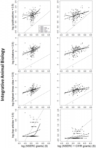
One of the simplest single measures is the GPA for each institution (weighed sum with 4 for a 4*, 3 for a 3*, etc.) as this is a measure used in many league tables.  The REF GPA can be compared to the predicted GPA based on citations.

GPA-cites-vs-REF

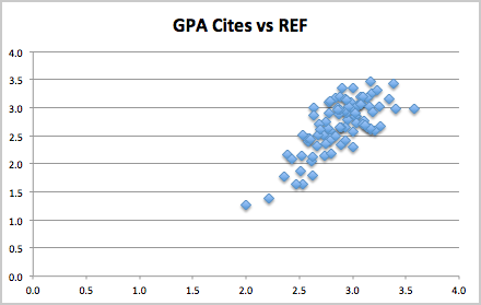
While there is some scatter, which is to be expected given the size of each institution, there is also a clear tendency towards the diagonal.

Another measure frequently used is the ‘research power’, the GPA multiplied by the number of people in the submission.

power-cites-vs-REF

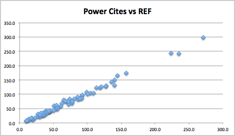
This ‘stretches’ out the institutions and in particular makes the larger submissions (where the metrics are more reliable) stand out more.  It is not surprising that this is more linear as, the points are equally scaled by size irrespective of the metric.  However, the fact that it clusters quite closely to the diagonal at first seems to suggest that, at the level of institutions, the computing REF results are robust.

However, while GPA is used in many league tables, funding is not based on GPA.  Where funding is formulaic (as it is with HEFCE for English universities), the combined measure is very heavily weighted towards 4*, with no money at all being allocated to 2* and 1*.

For RAE2008, the HEFCE weighting was approximately 3:1 between 4* and 3*, for REF2014 funding is weighted even more highly towards 4* at 4:1.

The next figure shows the equivalent of ‘power’ using a 4:1 ratio – roughly proportional to the amount of money under the HEFCE formula (although some of the institutions are not English, so will have different formula applied).  Like the previous graphs this plots the actual REF money-related power compared the one predicted by citations.

weighted-power-cites-vs-REF-with-line

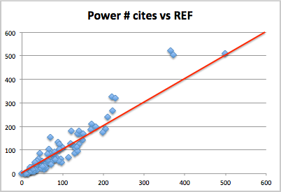
Again the data is very spread out with three very large institutions (UCL, Edinburgh and Imperial) on the upper right and the rest in more of a pack in the lower left.  UCL is dead on line, but the next two institutions look like outliers, doing substantially better under REF than citations would predict, and then further down there is more of a spread, with some below, some above the line.

This massed group is hard to see clearly because of the stretching, so the following graph shows the non-volume weighted results, that is simple 4:1 ratio (I have dubbed GPA #).  This is roughly proportional to money per member of staff, and again citation-based prediction along the lower axis, actual REF values vertical axis.

weighted-GPA-cites-vs-REF-with-line

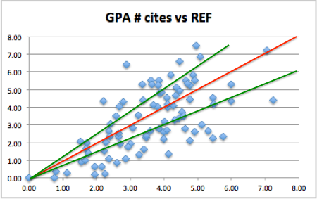
The red line shows the prediction line.  There is a rough correlation, but also a lot of spread.  Given remarks earlier about the sizes of individual institutions this is to be expected.  The crucial issue is whether there are any systematic effects, or whether this is purely random spread.

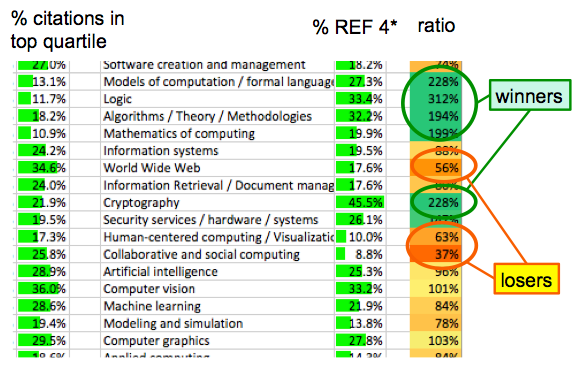
The two green lines show those UoAs with REF money-related scores 25% or more than expected, the ‘winners’ (above top left) and those with REF score 25% or more below prediction, the ‘losers’ (lower right).

Of 17 winners 16 are pre-1992 (‘old’) universities with just one post-1992 (‘new’) university.  Furthermore of the 16 old university winners, 10 of these come from the 24 Russell Group universities.

Of the 35 losers, 25 are post-1992 (‘new’) universities and of the 10 ‘old’ university losers, there is just 1 Russell Group institution.

contingency-table

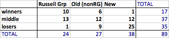
The exact numbers change depending on which precise metric one uses and whether one uses a 4:1, or 3:1 ratio, but the general pattern is the same.

Note this is not to do with who gets more or less money in total, whatever metric one uses, on average, the new universities tend to be lower, the old ones (on average) higher and Russell Group (on average) higher still.  The issue here is about an additional benefit of reputation over and above this raw quality effect. For works that by external measures are of equal value, there appears to be at least 50-100% added benefit if they are submitted from a more ‘august’ institution.

To get a feel for this, let’s look at a specific example: one of the big ‘winners’, YYYYYYYY, a Russell Group university, compared with one of the ‘losers’, XXXXXXXX, a new university.

As noted one has to look at individual institutions with some caution as the numbers involved can be small, but XXXXXXXX is one of the larger (in terms of submission FTE) institutions in the ‘loser’ category; with 24.7 FTE and nearly 100 outputs.  It also happened (by chance) to sit only one row above YYYYYYYY on the spreadsheet, so easy to compare.  YYYYYYYY is even larger, nearly 50 FTE, 200 outputs.

At 100 and 200 outputs, these are still, in size, towards the smaller end of the sub-area groups we were looking at in the previous two posts, so this should be taken as more illustrative of the overall trend, not a specific comment on these institutional submissions.

This time we’ll first look at the citation profiles for the two.

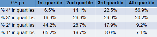
The spreadsheet fragment below shows the profiles using raw Scopos citation measures.  Note in this table, the right hand column, the upper quartile is the ‘best’ column.

X-vs-Y-raw-cite-quartiles

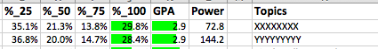
The two institutions look comparable, XXXXXXXX is slightly higher in the very highest cited papers, but effectively differences within the noise.

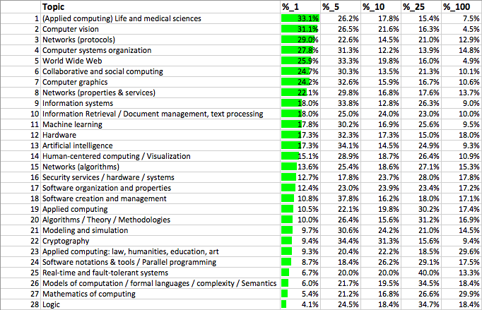
Similarly, we can look at the ‘world ranks’ as used in the second post.  Here the left hand side is ‘best, corresponding to the percentage of outputs that are within the best 1% of their area worldwide.

X-vs-Y-world-ranks

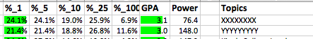
Again XXXXXXXX is slightly above YYYYYYYY, but basically within noise.

If you look at other measures: citations for ‘relable years’ (2011 and older, where there has been more time to gather cites), XXXXXXXX looks a bit stronger, for Google-based citations YYYYYYYY looks a bit stronger.

So, except for small variations, these two institutions, one a new university, one a Russell Group one, look comparable in terms external measures.

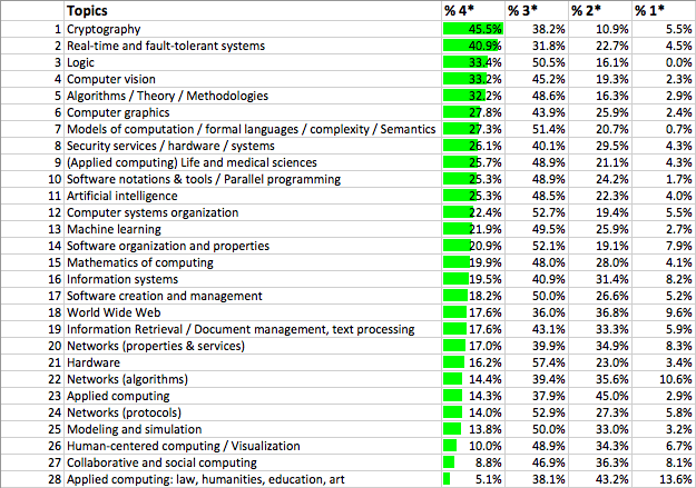
However, the REF scores paint a vastly different picture.  The respective profiles are below:

X-vs-Y-REF

Critically, the Russell Group YYYYYYYY has more than three times as many 4* outputs as the new university XXXXXXXX, despite being comparable in terms of external metrics.  As the 4* are heavily weighted the effect is that the GPA # measure (roughly money per member of staff) is more than twice as large.

Comparing using the world rankings table: for the new university XXXXXXXX only just over half of their outputs in the top 1% worldwide are likely to be ranked a 4*, whereas for YYYYYYYY nearly all outputs in the top 5% are likely to rank 4*.

As noted it is not generally reliable to do point comparisons on institutions as the output counts are low, and also XXXXXXXX and YYYYYYYY are amongst the more extreme winners and losers (although not the most extreme!).  However, they highlight the overall pattern.

At first I thought this institutional difference was due to the sub-area bias, but even when this was taken into account large institutional effects remained; there does appear to be an additional institutional bias.

The sub-area discrepancies will be partly due to experts from one area not understanding the methodologies and quality criteria of other areas. However, the institutional discrepancy is most likely simply a halo effect.

As emphasised in previous posts the computing sub-panels and indeed everyone involved with the REF process worked as hard as possible to ensure that the process was as fair, and, insofar as it was compatible with privacy, as transparent as possible.  However, we are human and it is inevitable that to some extent when we see a paper from a ‘good’ institution we are expecting it to be good and visa versa.

These effects may actually be relatively small individually, but the heavy weighting of 4* is likely to exacerbate even small bias.  In most statistical distributions, relatively small shifts of the mean can make large changes at the extremity.

By focusing on 4*, in order to be more ‘selective’ in funding, it is likely that the eventual funding metric is more noisy and more susceptible to emergent bias.  Note how the GPA measure seemed far more robust, with REF results close to the citation predictions.

While HEFCE has shifted REF2014 funding more heavily towards 4*, the Scottish Funding Council has shifted slightly the other way from 3.11:1 for RAE2008, to 3:1 for REF2014 (see THES: Edinburgh and other research-intensives lose out in funding reshuffle).  This has led to complaints that it is ‘defunding research excellence‘.  To be honest, this shift will only marginally reduce institutional bias, but at least appears more reliable than the English formula.

Finally, it should be noted that while there appear to be overall trends favouring Russell Group and old universities compared with post-1992 (new) universities; this is not uniform.  For example, UCL, with the largest ‘power’ rating and large enough that it is sensible to look at individually, is dead on the overall prediction line.

REF Redux 3 – plain citations

This third post in my series on the results of REF 2014, the UK periodic research assessment exercise, is still looking at subarea differences.  Following posts will look at institutional (new vs old universities) and gender issues.

The last post looked at world rankings based on citations normalised using the REF ‘contextual data’.  In this post we’ll look at plain unnormalised data.  To some extent this should be ‘unfair’ to more applied areas as citation counts tend to be lower, as one mechanical engineer put it, “applied work doesn’t gather citations, it builds bridges”.  However, it is a very direct measure.

The shocking things is that while raw citation measures are likely to bias against applied work, the REF results turn out to be worse.

There were a number of factors that pushed me towards analysing REF results using bibliometrics.  One was the fact that HEFCE were using this for comparison between sub-panels, another was that Morris Sloman’s analysis of the computing sub-panel results, used Scopos and Google Scholar citations.

We’ll first look at the two relevant tables in Morris’ slides, one based on Scopos citations:

Sloman-scopos-citation-table

and one based on Google Scholar citations:

Sloman-google-scholar-citation-table

Both tables rank all outputs based on citations, divide these into quartiles, and then look at the percentage of 1*/2*/3*/4* outputs in each quartile.  For example, looking at the Scopos table, 53.3% of 4* outputs have citation counts in the top (4th) quartile.

Both tables are roughy clustered towards the diagonal; that is there is an overall correlation between citation and REF score, apparently validating the REF process.

There are, however, also off-diagonal counts.  At the top left are outputs that score well in REF, but have low citations.  This is be expected; non-article outputs such as books, software, patents may be important but typically attract fewer citations, also good papers may have been published in a poor choice of venue leading to low citations.

More problematic is the lower right, outputs that have high citations, but low REF score.  There are occasional reasons why this might be the case, for example, papers that are widely cited for being wrong, however, these cases are rare (I do not recall any in those I assessed).  In general this areas represent outputs that the respective communities have judged strong, but the REF panel regard as weak.  The numbers need care in interpreting as only there are only around 30% of outputs were scored 1* and 2* combined; however, it still means that around 10% of outputs in the top quartile were scored in the lower two categories and thus would not attract funding.

We cannot produce a table like the above for each sub-area as the individual scores for each output are not available in the public domain, and have been destroyed by HEFCE (for privacy reasons).

However, we can create quartile profiles for each area based on citations, which can then be compared with the REF 1*/2*/3*/4* profiles.  These can be found on the results page of my REF analysis micro-site.  Like the world rank lists in the previous post, there is a marked difference between the citation quartile profiles for each area and the REF star profiles.

One way to get a handle on the scale of the differences, is to divide the proportion of REF 4* by the proportion of top quartile outputs for each area.  Given the proportion of 4* outputs is just over 22% overall, the top quartile results in an area should be a good predictor of the proportion of 4* results in that area.

The following shows an extract of the full results spreadsheet:

quartile-vs-REF

The left hand column shows the percentage of outputs in the top quartile of citations; the column to the right of the area title is the proportion of REF 4*; and the right hand column is the ratio.  The green entries are those where the REF 4* results exceed those you would expect based on citations; the red those that get less REF 4* than would be expected.

While there’re some areas (AI, Vision) for which the citations are an almost perfect predictor, there are others which obtain two to three times more 4*s under REF than one would expect based on their citation scores, ‘the winners’, and some where REF gives two to three times fewer 4*s that would be expected, ‘the losers’.  As is evident, the winners are the more formal areas, the losers the more applied and human centric areas.  Remember again that if anything one would expect the citation measures to favour more theoretical areas, which makes this difference more shocking.

Andrew Howes replicated the citation analysis independently using R and produced the following graphic, which makes the differences very clear.

scatter-citation-vs-REF-rank

The vertical axis has areas ranked by proportion of REF 4*, higher up means more highly rated by REF.  the horizontal axis shows areas ranked by proportion of citations in top quartile.  If REF scores were roughly in line with citation measures, one would expect the points to lie close to the line of equal ranks; instead the areas are scattered widely.

That is, there seems little if any relation between quality as measured externally by citations and the quality measures of REF.

The contrast with the tables at the top of this post is dramatic.  If you look at outputs as a whole, there is a reasonable correspondence, outputs that rank higher in terms officiations, rank higher in REF star score, apparently validating the REF results.  However, when we compare areas, this correspondence disappears.  This apparent contradiction is probably due to the correlation being very strong within area, just that the areas themselves are scattered.

Looking at Andrew’s graph, it is clear that it is not a random scatter, but systematic; the winners are precisely the theoretical areas, and the losers the applied and human centred areas.

Not only is the bias against applied areas critical for the individuals and research groups affected, but it has the potential to skew the future of UK computing. Institutions with more applied work will be disadvantaged, and based on the REF results it is clear that institutions are already skewing their recruitment policies to match the areas which are likely to give them better scores in the next exercise.

The economic future of the country is likely to become increasingly interwoven with digital developments and related creative industries and computing research is funded more generously than areas such as mathematics, precisely because it is expected to contribute to this development — or as a buzzword ‘impact’.  However, the funding under REF within computing is precisely weighted against the very areas that are likely to contribute to digital and creative industries.

Unless there is rapid action the impact of REF2014 may well be to destroy the UK’s research base in the areas essential for its digital future, and ultimately weaken the economic life of the country as a whole.

REF Redux 2 – world ranking of UK computing

This is the second of my posts on the citation-based analysis of REF, the UK research assessment process in computer science. The first post set the scene and explained why citations are a valid means for validating (as opposed generating) research assessment scores.

Spoiler:  for outputs of similar international standing it is ten times harder to get 4* in applied areas than more theoretical areas

As explained in the previous post amongst the public domain data available is the complete list of all outputs (except a very small number of confidential reports), this does NOT include the actual REF 4*/3*/2*/1* score, but does include Scopus citation data from late 2013 and Google scholar citation data from late 2014.

From this seven variations of citation metrics were used in my comparative analysis, but essentially all give the same results.

For this post I will focus on one of them, which is perhaps the clearest, effectively turning citation data into world ranking data.

As part of the pre-submission materials, the REF team distributed a spreadsheet, prepared by Scopus, which lists for different subject areas the number of citations for the best 1%, 5%, 10% and 25% of papers in each area. These vary between areas, in particular more theoretical areas tend to have more Scopus counted citations than more applied areas. The spreadsheet allows one to normalise the citation data and for each output see whether it is in the top 1%, 5%, 10% or 25% of papers within its own area.

The overall figure across REF outputs in computing is as follows:

Top 1%      16.9%
Top 1-5%:   27.9%
Top 6-10%:  18.0%
Top 11-25%: 23.8%
Lower 75%:  13.4%

The first thing to note is that about 1 in 6 of the submitted outputs are in the top 1% worldwide and not far short of a half (45%) in the top 5%.   Of course this is the top publications, so one would expect the REF submissions to score well, but still this feels like a strong indication of the quality of UK research in computer science and informatics.

According to the REF2014 Assessment criteria and level definitions, the definition of 4* is “quality that is world-leading in terms of originality, significance and rigour“, and so these world citation rankings correspond very closely to “world leading”. In computing we allocated 22% of papers as 4*, that is, roughly, if a paper is in the top 1.5% of papers world wide in its area it is ‘world leading’, which sounds reasonable.

The next level 3* “internationally excellent” covers a further 47% of outputs, so approximately top 11% of papers world wide, which again sounds a reasonable definition of “internationally excellent”. Validating the overall quality criteria of the panel.

As the outputs include a sub-area tag, we can create similar world ‘league tables’ for each sub-area of computing, that is ranking the REF submitted outputs in each area amongst their own area worldwide:

Cite-ranks

As is evident there is a lot of variation, with some top areas (applications in life sciences and computer vision) with nearly a third of outputs in the top 1% worldwide, whilst other areas trail (mathematics of computing and logic), with only around 1 in 20 papers in top 1%.

Human computer interaction (my area) is split between two headings “human-centered computing” and “collaborative and social computing” between them just above mid point; AI also in the middle and Web in top half of the table.

Just as with the REF profile data, this table should be read with circumspection – it is about the health of the sub-area overall in the UK, not about a particular individual or group which may be at the stronger or weaker end.

The long-tail argument (that weaker researchers and those in less research intensive institutions are more likely to choose applied and human-centric areas) of course does not apply to logic, mathematics and formal methods at the bottom of the table. However, these areas may be affected by a dilution effect as more discursive areas are perhaps less likely to be adopted by non-first-language English academics.

This said, the definition of 4* is “Quality that is world-leading in terms of originality, significance and rigour“, and so these world rankings seem as close as possible to an objective assessment of this.

It would therefore be reasonable to assume that this table would correlate closely to the actual REF outputs, but in fact this is far from the case.

Compare this to the REF sub-area profiles in the previous post:

REF-ranks

Some areas lie at similar points in both tables; for example, computer vision is near the top of both tables (ranks 2 and 4) and AI a bit above the middle in both (ranks 13 and 11). However, some areas that are near the middle in terms of world rankings (e.g. human-centred computing (rank 14) and even some near the top (e.g. network protocols at rank 3) come out very poorly in REF (ranks 26 and 24 respectively). On the other hand, some areas that rank very low in the world league table come very high in REF (e.g. logic rank 28 in ‘league table’ compared to rank 3 in REF).

On the whole, areas that are more applied or human focused tend to do a lot worse under REF than they appear to be when looked in terms of their world rankings, whereas more theoretical areas seem to have inflated REF rankings. Those that are traditional algorithmic computer science’ (e.g. vision, AI) are ranked similarly in REF and in the world rankings.

We will see other ways of looking at these differences in the next post, but one way to get a measure of the apparent bias is by looking at how high an output needs to be in world rankings to get a 4* depending on what area you are in.

We saw that on average, over all of computing, outputs that rank in the top 1.5% world-wide were getting 4* (world leading quality).

For some areas, for example, AI, this is precisely what we see, but for others the picture is very different.

In applied areas (e.g. web, HCI), an output needs to be in approximately the top 0.5% of papers worldwide to get a 4*, whereas in more theoretical areas (e.g. logic, formal, mathematics), a paper needs to only be in the top 5%.

That is looking at outputs equivalent in ‘world leading’-ness (which REF is trying to measure), it is 10 times easier to get a 4* in theoretical areas than applied ones.

REF Redux 1 – UK research assessment for computing; what it means and is it right?

REF is the 5 yearly exercise to assess the quality of UK university research, the results of which are crucial for both funding and prestige. In 2014, I served on the sub-panel that assessed computing submissions. Since, the publication of the results I have been using public domain data from the REF process in order to validate the results using citation data.

The results have been alarming suggesting that, despite the panel’s best efforts to be fair, in fact there was significant bias both in terms of areas of computer science and types of universities.  Furthermore the first of these is also likely to have led to unintentional emergent gender bias.

I’ve presented results of this at a bibliometrics workshop at WebSci 2015 and at a panel at the British HCI conference a couple of weeks ago. However, I am aware that the full data and spreadsheets can be hard to read, so in a couple of posts I’ll try to bring out the main issues. A report and mini-site describes the methods used in detail, so in these posts I will concentrate on the results, and implications, starting in this post by setting the scene seeing how REF ranked sub-areas of computing and the use of citations for validation of the process. The next post will look at how UK computing sits amongst world research, and whether this agrees with the REF assessment.

Few in UK computing departments will have not seen the ranking list produced as part of the final report of the computing REF panel.

REF-ranks

Here topic areas are ranked by the percentage of 4* outputs (the highest rank). Top of the list is Cryptography, with over 45% of outputs ranked 4*. The top of the list is dominated by theoretical computing areas, with 30-40% 4*, whilst the more applied and human areas are at the lower end with less than 20% 4*. Human-centred computing and collaborative computing, the areas where most HCI papers would be placed, are pretty much at the bottom of the list, with 10% and 8.8% of 4* papers respectively.

Even before this list was formally published I had a phone call from someone in an institution where the knowledge of it had obviously leaked. Their department was interviewing for a lectureship and the question being asked was whether they should be recruiting candidates from HCI as this will clearly not be good looking towards REF 2020.

Since then I have heard of numerous institutions who are questioning the value of supporting these more applied areas, due to their apparent poor showing under REF.

In fact, even taken at face value, the data says nothing at all about the value in particular departments., and the sub-panel report includes the warning “These data should be treated with circumspection“.

There are three possible reasons any, or all of which would give rise to the data:

  1. the best applied work is weak — including HCI :-/
  2. long tail — weak researchers choose applied areas
  3. latent bias — despite panel’s efforts to be fair

I realised that citation data could help disentangle these.

There has been understandable resistance against using metrics as part of research assessment. However, that is about their use to assess individuals or small groups. There is general agreement that citation-based metrics are a good measure of research quality en masse; indeed I believe HEFCE are using citations to verify between-panel differences in 4* allocations, and in Morris Sloman’s post REF analysis slides (where the table above first appeared), he also uses the overall correlation between citations and REF scores as a positive validation of the process.

The public domain REF data does not include the actual scores given to each output, but does include citations data provided by Scopus in 2013. In addition, for Morris’ analysis in late 2014, Richard Mortier (then at Nottingham, now at Cambridge) collected Google Scholar citations for all REF outputs.

Together, these allow detailed citation-based analysis to verify (or otherwise) the validity of the REF outputs for computer science.

I’ll go into details in following posts, but suffice to say the results were alarming and show that, whatever other effects may have played a part, and despite the very best efforts of all involved, very large latent bias clearly emerged during the progress.