Fact checking Full Fact

It is hard to create accurate stories about numerical data.

Note: Even as I wrote this blog events have overtaken us.  The blog is principally about analysing how fact checking can go wrong; this will continue to be an issue, so remains relevant.  But it is also about the specific issues with FullFact.org’s discussion of the community deaths that emerged from my own modelling of university returns.  Since Full Fact’s report a new Bristol model has been published which confirms the broad patterns of my work and university cases are already growing across the UK (e.g. LIverpool,Edinburgh) with lockdowns in an increasing number of student halls (e.g. Dundee)).
It is of course nice to be able to say “I was right all along“, but in this case I wish I had been wrong.

A problem I’ve been aware of for some time is how difficult many media organisations have in formulating evidence and arguments, especially those involving numerical data.  Sometimes this is due to deliberately ‘spinning’ an issue, that is the aim is distortion.  However, at other times, in particular fact checking sites, it is clear that the intention is offer the best information, but something goes wrong.

This is an important challenge for my own academic community, we clearly need to create better tools to help media and the general public understand numerical arguments.  This is particularly important for Covid and I’ve talked and written elsewhere about this challenge.

Normally I’ve written about this at a distance, looking at news items that concern other people, but over the last month I’ve found  myself on the wrong side of media misinterpretation or maybe misinformation.  The thing that is both most fascinating (with an academic hat on) and also most concerning is the failure in the fact-checking media’s ability to create reasoned argument.

This would merely be an interesting academic case study, were it not that the actions of the media put lives at risk.

I’ve tried to write succinctly, but what follows is still quite long.  To summarise I’m a great fan of fact checking sites such as Full Fact, but I wish that fact checking sites would:

  • clearly state what they are intending to check: a fact, data, statement, the implicit implications of the statement, or a particular interpretation of a statement.
  • where possible present concrete evidence or explicit arguments, rather than implicit statements or innuendo; or, if it is appropriate to express belief in one source rather than another do this explicitly with reasons.

However, I also realise how I need better ways to communicate my own work both numerical aspects, but also textually.  I realise that often behind every sentence, rather like an iceberg, there is substantial additional evidence or discussion points.

Context

I’d been contacted by Fullfact.org at the end of August in relation to the ‘50,000 deaths due to universities’ estimate that was analysed by WonkHE and then tweeted by UCU.  This was just before the work was briefly discussed on Radio 4’s More or Less … without any prior consultation or right of reply.  So full marks to Full Fact for actually contacting the primary source!

I gave the Full Fact journalist quite extensive answers including additional data.  However, he said that assessing the assumptions was “above his pay grade” and so, when I heard no more, I’d assumed that they had decided to abandon writing about it.

Last week on a whim, just before gong on holiday, I thought to check and discovered that Fullfact.org had indeed published the story on 4th September, indeed it still has pride of place on their home page!

Sadly, they had neglected to tell me when it was published.

Front page summary – the claim

First of all let’s look at the pull out quote on the home page (as of 22nd Sept).
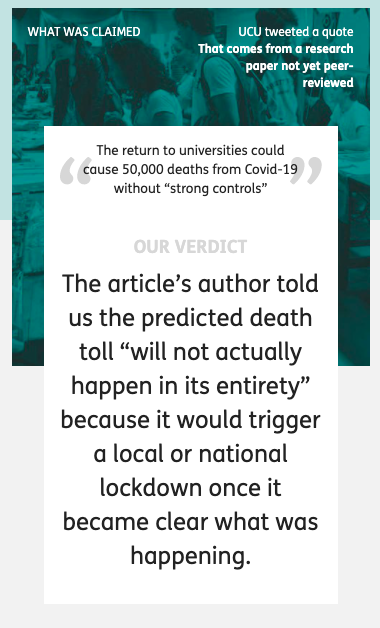
At the top the banner says “What was claimed”, appearing to quote from a UCU tweet and says (in quote marks):

The return to universities could cause 50,000 deaths from Covid-19 without “strong controls”

This is a slight (but critical) paraphrase of the actual UCU tweet which quoted my own paper::

“Without strong controls, the return to universities would cause a minimum of 50,000 deaths.”

The addition of “from Covid-19” is filling in context.  Pedantically (but important for a fact checking site), by normal convention this would be set in some way to make clear it is an insertion into the original text, for example [from Covid-19].  More critically, the paraphrase inverts the sentence, thus making the conditional less easy to read, replaces “would cause a minimum” with “could cause”. and sets “strong controls” in scare quotes.

While the inversion does not change the logic, it does change the emphasis.  In my own paper and UCU’s tweet the focus on the need for strong controls comes first, followed by the implications if this is not done; whereas in the rewritten quote the conditional “without strong controls” appears more like an afterthought.

On the full page this paraphrase is still set as the claim, but the text also includes the original quote.  I have no idea why they chose to rephrase what was a simple statement to start with.

Front page summary – the verdict

It appears that the large text labelled ‘OUR VERDICT’ is intended to be a partial refutation of the original quote:

The article’s author told us the predicted death toll “will not actually happen in its entirety” because it would trigger a local or national lockdown once it became clear what was happening.

This is indeed what I said!  But I am still struggling to understand by what stretch of the imagination a national lockdown could be considered anything but “strong controls“.  However, while this is not a rational argument, it is a rhetorical one, emotionally what appears to be negative statement “will not actually happenfeels as though it weakens the original statement, even though it is perfectly consonant with it.

One of the things psychologists have known for a long time is that as humans we find it hard to reason with conditional rules (if–then) if they are either abstract or disagree with one’s intuition.  This lies at the heart of many classic psychological experiments such as the Wason card test.   Fifty thousand deaths solely due to universities is hard to believe, just like the original Covid projections were back in January and February, and so we find it hard to reason clearly.

In a more day-to-day example this is clear.

Imagine a parent says to their child, “if you’re not careful you’ll break half the plates

The chid replies, “but I am being careful”.

While this is in a way a fair response to the implied rider “... and you’re not being careful enough“, it is not an argument against the parent’s original statement.

When you turn to the actual Full Fact article this difficulty of reasoning becomes even more clear.  There are various arguments posed, but none that actually challenge the basic facts, more statements that are of an emotional rhetorical nature … just like the child’s response.

In fact if Full Fact’s conclusion had been “yes this is true, but we believe the current controls are strong enough so it is irrelevant“, then one might disagree with their opinion , but it would be a coherent argument.  However, this is NOT what the site claims, certainly in its headline statements.

A lack of alternative facts

To be fair to Full Fact the most obvious way to check this estimated figure would have been to look at other models of university return and compare it with them.  It is clear such models exist as SAGE describes discussions involving such models, but neither SAGE nor indie-Sage‘s reports on university return include any estimated figure for overall impact.  My guess is that all such models end up with similar levels to those reported here and that the modellers feel that they are simply too large to be believable … as indeed I did when I first saw the outcomes of my own modelling..

Between my own first modelling in June and writing the preprint article there was a draft report from a three day virtual study group of mathematicians looking at University return, but other than this I was not aware of work in the public domain at the time. For this very reason, my paper ends with a call “for more detailed modelling“.

Happily, in the last two weeks two pre-print papers have come from the modelling group at Bristol, one with a rapid review of University Covid models and one on their own model.  Jim Dickinson has produced another of his clear summaries of them both.  The Bristol model is far more complex than those that I used including multiple types of teaching situation and many different kinds of students based on demographic and real social contact data.  It doesn’t include student–non-student infections, which I found critical in spread between households, but does include stronger effects for in-class contagion.  While very different types of modelling, the large-scale results of both suggest rapid spread within the student body.  The Bristol paper ends with a warning about potential spread to the local community, but does not attempt to quantify this, due the paucity of data on student–non-student interactions.

Crucially, the lack of systematic asymptomatic testing will also make it hard to assess the level of Covid spread within the student population during the coming autumn and also hard to retrospectively assess the extent to which this was a critical factor in the winter Covid spread in the wider population.  We may come to this point in January and still not have real data.

Full page headlines

Following through to the full page on Full Fact, the paraphrased ‘claim’ is repeated with Full Fact’s ‘conclusion’ … which is completely different from the front page ‘OUR VERDICT’.
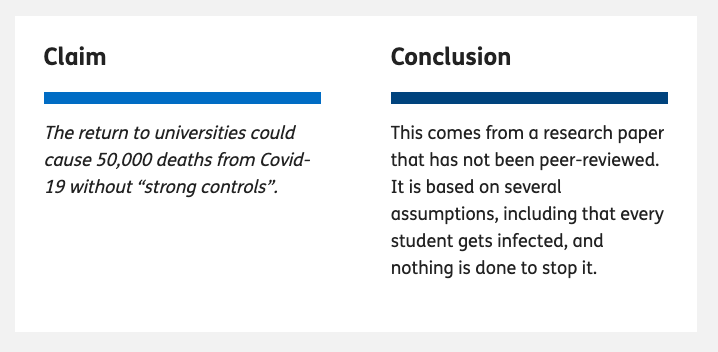
The ‘conclusion’ is carefully stated – rather like Boris Johnson’s careful use of the term ‘controlled by’ when describing the £350 million figure on the Brexit bus.  It does not say here whether Full Fact believes the (paraphrased) claim, but they merely make a statement relating to it.  In fact at the end of the article there is rather more direct conclusion berating UCU for tweeting the figure.  That is Full Fact do have a strong conclusion, and one that is far more directly related to the reason for fact checking this in the first place, but instead of stating this explicitly, the top of page headline ‘conclusion’ in some sense sits on the fence.

However, even this ‘sit on the fence’ statement is at very least grossly misleading and in reality manifestly false.

The first sentence:

This comes from a research paper that has not been peer-reviewed

is correct, and one of the first things I pointed out when Full Fact contacted me.  Although the basic mathematics was read by a colleague, the paper itself has not been through formal peer review, and given the pace of change will need to be changed to be retrospective before it will be.  This said, in my youth I was a medal winner in the International Mathematical Olympiad and I completed my Cambridge mathematics degree in two years; so I do feel somewhat confident in the mathematics itself!  However, one of the reasons for putting the paper on the preprint site arXiv was to make it available for critique and further examination.

The second statement is not correct.  The ‘conclusion’ states that

It is based on several assumptions, including that every student gets infected, and nothing is done to stop it.

IF you read the word “it” to refer to the specific calculation of 50,000 deaths then this is perhaps debatable.  However, the most natural reading is that “it” refers to the paper itself, and this interpretation is reinforced later in the Full Fact text, which says “the article [as in my paper] assumes …”.  This statement is manifestly false.

The paper as a whole models student bubbles of different sizes, and assumes precisely the opposite, that is assuming rapid spread only within bubbles.  That is it explicitly assumes that something (bubbles) is done to stop it. The outcome of the models, taking a wide range of scenarios, is that in most circumstances indirect infections (to the general population and back) led to all susceptible students being infected.  One can debate the utility or accuracy of the models, but crucially “every student gets infected” is a conclusion not an assumption of the models or the paper as a whole.

To be fair on Full Fact this confusion between the fundamental assumptions of the paper and the specific values used for this one calculation is echoing Kit Yates initial statements when he appeared on More or Less. I’m still not sure whether that was a fundamental misunderstanding or a slip of the tongue during the interview and my attempts to obtain clarification have failed.  However, I did explicitly point this distinction out to Full Fact.

The argument

The Full Fact text consists of two main parts.  One is labelled “Where did “50,000 deaths” come from?”, which is ostensibly a summary of my paper, but in reality seems to be where there are the clearest fact-check style statements.  The second is labelled “But will this happen?” which sounds as if this is the critique.  However, it is actually three short paragraphs the first two effectively setting me and Kit Yates head-to-head and the third is the real conclusion which says that UCU tweeted the quote without context.

Oddly I was never asked whether I believed that the UCU’s use of the statement was consistent with the way in which it was derived in my work.  This does seem a critical question given that Full Fact’s final conclusion is that UCU quoted it out of context. Indeed, while the Full Fact claims that UCU tweeted “the quote without context“, within the length of a tweet the UCU both included the full quote (not paraphrased!) and directly referenced Jim Dickinson’s summary of my paper on WonkHE, which itself links to my paper.  That is the UCU tweet backed up the statement with links that lead to primary data and sources.

As noted the actual reasoning is odd as the body of the argument, to the extent it exists, appears to be in the section that summarises the paper.

First section – summary of paper

The first section “Where did “50,000 deaths” come from?”, starts off by summarising the assumptions underlying the 50,000 figure being fact checked and is the only section that links to any additional external sources.  Given the slightly askance way it is framed, it is hard to be sure, but it appears that this description is intended to cast doubt on the calculations because of the extent of the assumptions.  This is critical as it is the assumptions which Kit Yates challenged.

In several cases the assumptions stated are not what is said in the paper.  For example, Full Fact says the paper “assumes no effect from other measures already in place, like the Test and Trace system or local lockdowns” whereas the paragraph directly above the crucial calculation explicitly says that (in order to obtain a conservative estimate) the initial calculation will optimistically assume “social distancing plus track and trace can keep the general population R below 1 during this period“.  The 50,000 figure does not include additional more extensive track and trace within the student community, but so far this is no sign of this happening beyond one or two universities adopting their own testing, and this is precisely one of the ‘strong controls’ that the paper explicitly suggests.

Ignoring these clear errors, the summary of assumptions made by the calculation of the 50,000 figure says that I “include the types of hygiene and social distancing measures already being planned, but not stronger controls” and then goes on to list the things not included. It does seem obvious and is axiomatic that a calculation of what will happen “without strong controls” must assume for the purposes of the calculation that there are no strong controls.

The summary section also spends time on the general population R value of 0.7used in the calculation and the implications of this.  The paragraph starts “In addition to this” and quotes that this is my “most optimistic” figure. This is perfectly accurate … but the wording seems to imply this is perhaps (another!) unreasonable assumption … and indeed it is crazily low.  At the time (soon after lockdown) it was still hoped that non-draconian measures (such as track and trace) could keep R below 1, but of course we have seen rises far beyond this and the best estimates for coming winter are now more like 1.2 to 1.5.

Note however the statement was “Without strong controls, the return to universities would cause a minimum of 50,000 deaths.”  That is the calculation was deliberately taking some mid-range estimates of things and some best case ones in order to yield a lower bound figure.  If one takes a more reasonable R the final figure would be a lot larger than 50,000.

Let’s think again of the child, but let’s make the child a stroppy teenager:

Parent, “if you’re not careful you’ll break half the plates

Child replies, throwing the pile of plates to the floor, “no I’ll break them all.”

The teenager might be making a point, but is not invalidating the parent’s statement.

Maybe I am misinterpreting the intent behind this section, but given the lack of any explicit fact-check evidence elsewhere, it seems reasonable to treat this as at least part of the argument for the final verdict.

Final section – critique of claim

As noted, the second section “But will this happen?”, which one would assume is the actual critique and mustering of evidence, consists of three paragraphs: one quoting me, one quoting Kit Yates of Bath, and one which appears to be the real verdict.

The first paragraph is the original statement that appeared as ‘OUR VERDICT’ on the first page where I say that 50,000 deaths will almost certainly not occur in full because the government will be forced to take some sort of action once general Covid growth and death rates rise.  As noted if this is not ‘strong controls‘ what is?

The second paragraph reports Kit Yates as saying there are some mistakes in my model and is quoted as generously saying that he’s “not completely damning the work,”.  While grateful for his restraint, some minimal detail or evidence would be useful to assess his assertion.  On More or Less he questioned some of the values used and I’ve addressed that previously;  it is not clear whether this is what is meant by ‘mistakes’ here.  I don’t know if he gave any more information to Full Fact, but if he has I have not seen it and Full Fact have not reported it.

A tale of three verdicts

As noted the ‘verdict’ on the Full Fact home page is different from the ‘conclusion’ at the top of the main fact-check page, and in reality it appears the very final paragraph of the article is the real ‘verdict’.

Given this confusion about what is actually being checked, it is no wonder the argument itself is somewhat confused.

The final paragraph, the Full Fact verdict itself has three elements:

  • that UCU did not tweet the quote in context – as noted perhaps a little unfair in a tweeted quote that links to its source
  • that the 50,000 “figure comes from a model that is open to question” – well clearly there is question in Kit Yates’ quote, but this would have more force if it were backed by evidence.
  • that it is based on “predictions that will almost certainly not play out in the real world

The last of these is the main thrust of the ‘verdict’ quote on the Full Fact home page.  Indeed there is always a counterfactual element to any actionable prediction.  Clearly if the action is taken the prediction will change.  This is on the one hand deep philosophy, but also common sense.

The Imperial Covid model that prompted (albeit late) action by government in March gave a projection of between a quarter and a half million deaths within the year if the government continued a policy of herd immunity.  Clearly any reasonable government that believes this prediction will abandon herd immunity as a policy and indeed this appears to have prompted a radical change of heart.  Given this, one could have argued that the Imperial predictions “will almost certainly not play out in the real world“.  This is both entirely true and entirely specious.

The calculations in my paper and the quote tweeted by UCU say:

Without strong controls, the return to universities would cause a minimum of 50,000 deaths.”

That is a conditional statement.

Going back to the child; the reason the parent says ““if you’re not careful you’ll break half the plates“, is not as a prediction that half the plates will break, but an encouragement to the child to be careful so that the plates will not break.  If the child is careful and the plates are not broken, that does not invalidate the parent’s warning.

Last words

Finally I want to reiterate how much I appreciate the role of fact checking sites including Full Fact and also fact checking parts of other news sites as as BBC’s Reality Check; and I am sure the journalist here wanted to produce a factual article. However, in order to be effective they need to be reliable.  We are all, and journalists especially, aware that an argument needs to be persuasive (rhetoric), but for fact checking and indeed academia, arguments also need to be accurate and analytic (reason).

There are specific issues here and I am angered at some of the misleading aspects of this story because of the importance of the issues; there are literally lives at stake.

However, putting this aside, the story raises the challenge for me as to how we can design tools and methods to help both those working on fact checking sites and the academic community, to create and communicate clear and correct argument.



More or Less: will 50,000 people really die if the universities reopen?

Last Wednesday morning I had mail from a colleague to say that my paper on student bubble modelling had just been mentioned on Radio 4 ‘More or Less’ [BBC1].    This was because UCU (the University and Colleges Union) had tweeted the headline figure of 50,000 deaths from my paper “Impact of a small number of large bubbles on Covid-19 transmission within universities” [Dx1] after it had been reviewed by Jim Dickinson on Wonkhe [DW].  The issue is continuing to run: on Friday a SAGE report [SAGE] was published also highlighting the need for vigilance around University reopening and a Today interview with Dame Anne Johnson this morning [BBC2], who warned of “a ‘critical moment’ in the coronavirus pandemic, as students prepare to return to universities.

I’m very happy that these issues are being discussed widely; that is the most important thing.   Unfortunately I was never contacted by the programme before transmission, so I am writing this to fill in details and correct misunderstandings.

I should first note that the 50,000 figure was a conditional one:

without strong controls, the return to universities would cause a minimum of 50,000 deaths

The SAGE report [SAGE] avoids putting any sort of estimate on the impact.  I can understand why! Like climate change one of the clear lessons of the Covid crisis is how difficult it is to frame arguments involving  uncertainty and ranges of outcomes in ways that allow meaningful discussion but also avoid ‘Swiss cheese’ counter-arguments that seek the one set of options that all together might give rise to a wildly unlikely outcome.  Elsewhere I’ve written about some of the psychological reasons and human biases that make it hard to think clearly about such issues [Dx2].

The figure of 50,000 deaths at first appears sensationalist, but in fact the reason I used this as a headline figure was precisely because it was on the lower end of many scenarios where attempts to control spread between students fail.  This was explicitly a ‘best case worst case’ estimate: that is worst case for containment within campus and best case for everything else – emphasising the need for action to ensure that the former does not happen.

Do I really believe this figure?  Well in reality, of course, if there are major campus outbreaks local lockdowns or campus quarantine would come into place before the full level of community infection took hold.  If this reaction is fast enough this would limit wider community impact, although we would never know how much as many of the knock-on infections would be untraceable to the original cause. It is conditional – we can do things ahead of time to prevent it, or later to ameliorate the worst impacts.

However, it is a robust figure in terms of order of magnitude.  In a different blog I used minimal figures for small university outbreaks (5% of students) combined with lower end winter population R and this still gives to tens of thousands of knock-on community infections for every university [Dx3].

More or less?

Returning to “More or Less”, Dr Kit Yates, who was interviewed for the programme, quite rightly examined the assumptions behind the figure, exactly what I would would do myself.  However, I would imagine he had to do so quite quickly and so in the interview there was confusion between (i) the particular scenario that gives rise the the 50,000 figure and the general assumptions of the paper as a whole and (ii) the sensitivity of the figure to the particular values of various parameters in the scenario.

The last of these, the sensitivity, is most critical: some parameters make little difference to the eventual result and others make a huge difference.  Dr Yates suggested that some of the values (each of which have low sensitivity) could be on the high side but also one (the most sensitive) that is low.   If you adjust for all of these factors the community deaths figure ends up near 100,000 (see below).  As I noted, the 50,000 figure was towards the lower end of potential scenarios.

The modelling in my paper deliberately uses a wide range of values for various parameters reflecting uncertainty and the need to avoid reliance on particular assumptions about these.  It also uses three different modelling approaches, one mathematical and two computational in order to increase reliability.  That is, the aim is to minimise the sensitivity to particular assumptions by basing results on overall patterns in a variety of potential scenarios and modelling techniques.

The detailed models need some mathematical knowledge, but the calculations behind the 50,000 figure are straightforward:

Total mortality = number of students infected
                  x  knock-on growth factor due to general population R
                  x  general population mortality

So if you wish it is easy to plug in different estimates for each of these values and see for yourself how this impacts the final figure.  To calculate the ‘knock-on growth factor due to general population R’, see “More than R – how we underestimate the impact of Covid-19 infection” [Dx4], which explains the formula (R/(1-R)) and how it comes about.

The programme discussed several assumptions in the above calculation:

  1. Rate of growth within campus: R=3 and 3.5 days inter-infection period. –  These are not assumptions of the modelling paper as a whole, which only assumes rapid spread within student bubbles and no direct spread between bubbles.  However, these are the values used in the scenario that gives rise to the 50,000 figure, because they seemed the best accepted estimate at the time.  However, the calculations only depend on these being high enough to cause widespread outbreak across the student population.  Using more conservative figures of (student) R=2 and 5-6 day inter-infection period, which I believe Dr Yates would be happy with, still means all susceptible students get infected before the end of a term  The recent SAGE report [SAGE] describes models that have peak infection in November, consonant with these values. (see also addendum 2)
  2. Proportion of students infected. –  Again this is not an assumption but instead a consequence of the overall modelling in the paper.  My own initial expectation was that student outbreaks would limit at 60-70%, the herd immunity level, but it was only as the models ran that it became apparent that cross infections out to the wider population and then back ‘reseeded’ student growth because of clumpy social relationships.  However, this is only apparent at a more detailed reading, so it was not unreasonable for More or Less to think that this figure should be smaller.  Indeed in the later blog about the issue [Dx3] I use a very conservative 5% figure for student infections, but with a realistic winter population R and get a similar overall total.
  3. General population mortality rate of 1%. – In early days data for this ranged between 1% and 5% in different countries depending, it was believed, on the resilience of their health service and other factors. I chose the lowest figure.  However, recently there has been some discussion about whether the mortality figure is falling [MOH,LP,BPG].  Explanations include temporary effects (younger demographics of infections, summer conditions) and some that could be long term (better treatment, better testing, viral mutation).  This is still very speculative with suggestions this could now be closer to 07% or (very, very speculative) even around 0.5%.  Note too that in my calculations this is about the general population, not the student body itself where mortality is assumed to be negligible.
  4. General population R=0.7. – This is a very low figure as if the rest of society is in full lockdown and only the universities open. It is the ‘best case’ part of the ‘best case worst case’ scenario. The Academy of Medical Science report “Coronavirus: preparing for challenges this winter” in July [AMS] suggests winter figures of R=1.2 (low) 1.5 (mid) and 1.8 (high). In the modelling, which was done before this report, I used a range of R values between 0.7 and 3; that is including the current best estimates.  The modelling suggested that the worst effects in terms of excess deaths due to universities occurred for R in the low ‘ones’ that is precisely the expected winter figures.

In summary, let’s look at how the above affects the 50,000 figure:

  • 1.  Rate of growth within campus – The calculation is not sensitive to this and hence not affected at all.
  • 2 and 3.  Proportion of students infected and general population mortality rate – These have a linear effect on the final calculation (some sensitivity).  If we take a reduction of 0.7 for each (using the very speculative rather than the very, very speculative figure for reduced mortality), this halves the estimated impact.
  • 4. General population R. This an exponential factor and hence the final result is very sensitive to this. It was unreasonably low, but reasonable figures tend to lead to frighteningly high impacts.  So let’s still use a very conservative figure of 0.9 (light lockdown), which multiplies the total by just under 4 (9/2.3).

The overall result of this is 100,000 rather than 50,000 deaths.

In the end you can play with the figures, and, unless you pull all of the estimates to their lowest credible figure, you will get results that are in the same range or a lot higher.

If you are the sort of person who bets on an accumulator at the Grand National, then maybe you are happy to assume everything will be the best possible outcome.

Personally, I am not a betting man.


Addendum 1: Key factors in assessing modelling assumptions and sensitivity

More or Less was absolutely right to question assumptions, but this is just one of a number of issues that are all critical to consider when assessing mathematical or computational modelling:

  • assumptions – values, processes, etc, implicitly or explicitly taken as given
  • sensitivity – how reliant a particular result is on the values used to create it
  • scenarios – particular sets of values that give rise to a result
  • purpose – what you are trying to achieve

I’ve mentioned the first three of these in the discussion above. However, understanding the purpose of a model is also critical particularly when so many factors are uncertain.  Sometimes a prediction has to be very accurate, for example the time when a Mars exploration rocket ‘missed’ because of a very small error in calculations.

For the work described here my own purpose was: (i) to assess how effective student bubbles need to be, a comparative judgement and (ii) to assess whether it matters or not, that is an order of magnitude judgement.    The 50K figure was part of (ii).  If this figure had been in the 10s or 100s even it could be seen to be fairly minor compared with the overall Covid picture, but 10,000, 50,000 or 100,000 are all bad enough to be worth worrying about.  For this purpose fine details are not important, but being broadly robust is.


Addendum 2:  Early Covid growth in the UK

The scenario used to calculate the 50K figure used the precise values of R=3 and a 3.5 day inter-infection period, which means that cases can increase by 10 times each week..  As noted the results are not sensitive to these figures and much smaller values still lead the the same overall answer.

The main reason for using this scenario is that it felt relatively conservative to assume that students post lockdown might have rates similar to overall population before awareness of Covid precautions – they would be more careful in terms of their overall hygiene, but would also have the higher risk social situations associated with being a student.

I was a little surprised therefore that, on ‘More or Less’, Kit Yates suggested that this was an unreasonably high figure because the week-on-week growth had never been more than 5 times.  I did wonder whether I had misremembered the 10x figure, from the early days of the crisis unfolding in February and March.

In fact, having rechecked the figures, they are as I remember.  I’ll refer to the data and graphs on the Wikipedia page for UK Covid data.  These use the official UK government data, but are visualised better than on Gov.UK.

UK Cases:  https://en.wikipedia.org/wiki/COVID-19_pandemic_in_the_United_Kingdom#New_cases_by_week_reported

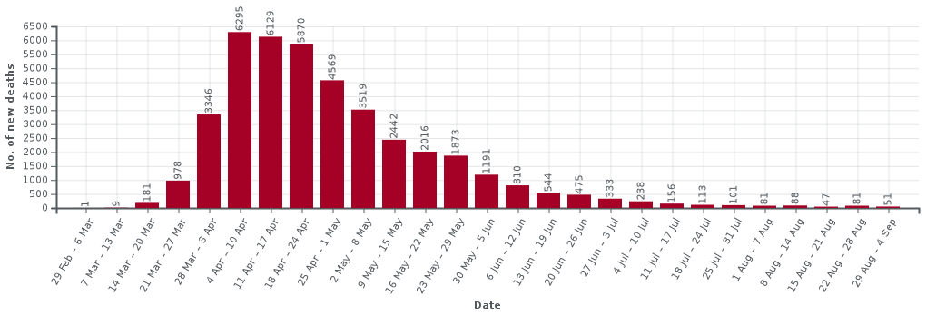
I’m focusing on the early days of both sets of data.  Note that both new cases and deaths ‘lag’ behind actual infections, hence the peaks after lockdown had been imposed. New cases at that point typically meant people showing serious enough symptoms to be admitted to hospital, so lags from infection by say a week or more. Deaths lag by around 2-3 weeks (indeed not included after 28 days to avoid over-counting).

The two data sets are quite similar during the first month or so of the crisis as at that point testing was only being done for very severe cases that were being identified as potential Covid. So, Iet’s just look at the death figures (most reliable) in detail for the first few weeks until the lockdown kicks in and the numbers peek.

week deaths growth (rounded)
29 Feb — 6 March 1
7–13 March 8 x8
14–20 March 181 x22
21–27 March 978 x5
28 March — 3 April 3346 x3.5
4–10 April 6295 x2

Note how there is an initial very fast growth, followed by pre-lockdown slowing as people became aware of the virus and started to take additional voluntary precautions, and then peeking due to lockdown.  The numbers for initial fast phase are small, but this pattern reflects the early stages in Wuhan with initial, doubling approximately every two days before the public became aware of the virus, followed by slow down to around 3 day doubling followed by lockdown.

Indeed in the early stages of the pandemic it was common to see country-vs-country graphs of early growth with straight lines for 2 and 3 day doubling drawn on log-log axes. Countries varied on where they started on this graph, but typically lay between the two lines.  The UK effectively started at the higher end and rapidly dropped to the lower one, before more dramatic reduction post-lockdown.

It may be that Kit recalled the x5 figure (3 day doubling) is it was the figure once the case numbers became larger and hence more reliable.  However, there is also an additional reason, which I think might be why early growth was often underestimated.  In some of the first countries infected outside China their initial growth rate was closer to the 3 day doubling line. However this was before community infection and when cases were driven by international travellers from China.  These early international growths reflected post-public-precautions, but pre-lockdown growth rates in China, not community transmission within the relevant countries.

This last point is educated guesswork, and the only reason I am aware of it is because early on a colleague asked me to look at data as he thought China might be underreporting cases due to the drop in growth rate there.  The international figures were the way it was possible to confirm the overall growth figures in China were reasonably accurate.

References

[AMS] Preparing for a challenging winter 2020-21. The Academy of Medical Sciences. 14th July 2020. https://acmedsci.ac.uk/policy/policy-projects/coronavirus-preparing-for-challenges-this-winter

[BBC1] Schools and coronavirus, test and trace, maths and reality. More or Less, BBC Radio 4. 2nd September 2020.  https://www.bbc.co.uk/programmes/m000m5j9

[BBC2] Coronavirus: ‘Critical moment’ as students return to university.  BBC News.  5 September 2020.  https://www.bbc.co.uk/news/uk-54040421

[BPG] Are we underestimating seroprevalence of SARS-CoV-2? Burgess Stephen, Ponsford Mark J, Gill Dipender. BMJ 2020; 370 :m3364  https://www.bmj.com/content/370/bmj.m3364

[DW] Would student social bubbles cut deaths from Covid-19?  Jim Dickinson on Wonkhe.  28 July 2020.  https://wonkhe.com/wonk-corner/would-student-social-bubbles-cut-deaths-from-covid-19/

[DW1] Could higher education ruin the UK’s Christmas?  Jim Dickinson on Wonkhe.  4 Sept 2020.  https://wonkhe.com/blogs/could-higher-education-ruin-the-uks-christmas/

[Dx1] Working paper: Covid-19 – Impact of a small number of large bubbles on University return. Working Paper, Alan Dix. created 10 July 2020. arXiv:2008.08147 stable version at arXiv |additional information

[Dx2] Why pandemics and climate change are hard to understand, and can we help?  Alan Dix. North Lab Talks, 22nd April 2020 and Why It Matters, 30 April 2020.  http://alandix.com/academic/talks/Covid-April-2020/

[Dx3] Covid-19, the impact of university return.  Alan Dix. 9th August 2020. https://alandix.com/blog/2020/08/09/covid-19-the-impact-of-university-return/

[Dx4] More than R – how we underestimate the impact of Covid-19 infection. Alan Dix.  2nd August 2020. https://alandix.com/blog/2020/08/02/more-than-r-how-we-underestimate-the-impact-of-covid-19-infection/

[LP] Why are US coronavirus deaths going down as covid-19 cases soar? Michael Le Page. New Scientist.  14 July 2020. https://www.newscientist.com/article/2248813-why-are-us-coronavirus-deaths-going-down-as-covid-19-cases-soar/

[MOH] Declining death rate from COVID-19 in hospitals in England
Mahon J, Oke J, Heneghan C.. The Centre for Evidence-Based Medicine. June 24, 2020. https://www.cebm.net/covid-19/declining-death-rate-from-covid-19-in-hospitals-in-england/

[SAGEPrinciples for managing SARS-CoV-2 transmission associated with higher education, 3 September 2020.  Task and Finish Group on Higher Education/Further Education. Scientific Advisory Group for Emergencies. 4 September 2020. https://www.gov.uk/government/publications/principles-for-managing-sars-cov-2-transmission-associated-with-higher-education-3-september-2020


How much does herd immunity help?

I was asked in a recent email about the potential contribution of (partial) herd immunity to controlling Covid-19.  This seemed a question that many may be asking, so here is the original question and my reply (expanded slightly).

We know that the virus burns itself out if R remains < 1.

There are 2 processes that reduce R, both operating simultaneously:

1) Containment which limits the spread of the virus.

2) Inoculation due to infection which builds herd immunity.

Why do we never hear of the second process, even though we know that both processes act together? What would your estimate be of the relative contribution of each process to reduction of R at the current state of the pandemic in Wales?

One of the UK government’s early options was (2) developing herd immunity1.  That is you let the disease play out until enough people have had it.
For Covid the natural (raw) R number is about 3 without additional voluntary or mandated measures (depends on lots of factors).   However, over time as people build immunity, some of those 3 people who would have been infected already have been.  Once about 2/3 of the community are immune the effective R number drops below 1.  That corresponds to a herd immunity level (in the UK) of about 60-70% of the population having been infected.  Of course, we do not yet know how long this immunity will last, but let’s be optimistic and assume it does.
The reason this policy was (happily) dropped in the UK was the realisation that this would need about 40 million people to catch the virus, with about 4% of these needing intensive care.  That is many, many times the normal ICU capacity, leading to (on the optimistic side) around half a million deaths, but if the health service broke under the strain many times that number!
In Spain (with one of the larger per capita outbreaks) they ran an extensive antibody testing study (that is randomly testing a large number of people whether or not they had had any clear symptoms), and found only about 5% of people showed signs of having had the virus overall, with Madrid closer to 10%.  In the UK estimates are of a similar average level (but without as good data), rising to maybe as high as 17% in London.
Nationally these figures (~5%) do make it slightly easier to control, but this is far below the reduction needed for relatively unrestricted living (as possible in New Zealand, which chose a near eradication strategy)   In London the higher level may help a little more (if it proves to offer long-term protection).  However, it is still well away from the levels needed for normal day-to-day life without still being very careful (masks, social distancing, limited social gatherings), however it does offer just a little ‘headroom’ for flexibility.  In Wales the average level is not far from the UK average, albeit higher in the hardest hit areas, so again well away from anything that would make a substantial difference.
So, as you see it is not that (2) is ignored, but, until we have an artificial vaccine to boost immunity levels, relying on herd immunity is a very high risk or high cost strategy.  Even as part of a mixed strategy, it is a fairly small effect as yet.
In the UK and Wales, to obtain even partial herd immunity we would need an outbreak ten times as large as we saw in the Spring, not a scenario I would like to contemplate 🙁
This said there are two caveats that could make things (a little) easier going forward:
1)  The figures above are largely averages, so there could be sub-communities that do get to a higher level.  By definition, the communities that have been hardest hit are those with factors (crowded accommodation, high-risk jobs, etc.) that amplify spread, so it could be that these sub-groups, whilst not getting to full herd-immunity levels, do see closer to population spread rates in future hence contributing to a lower average spread rate across society as a whole.  We would still be a long way from herd immunity, but slower spread makes test, track and trace easier, reduces local demand on health service, etc.
2)  The (relatively) low rates of spread in Africa have led to speculation (still very tentative) that there may be some levels of natural immunity from those exposed to high levels of similar viruses in the past.  However, this is still very speculative and does not seem to accord with experience from other areas of the world (e.g. Brazilian favelas), so it looks as though this is at most part of a more complex picture.
I wouldn’t hold my breath for (1) or (2), but it may be that as things develop we do see different strategies in different parts of the world depending on local conditions of housing, climate, social relationships, etc.

Update

Having written the above, I’ve just heard about the following that came out end of last week in BMJ, which suggests that there could be a significant number of mild cases that are not
detected on standard blood test as having been infected.
Burgess StephenPonsford Mark JGill DipenderAre we underestimating seroprevalence of SARS-CoV-2? https://www.bmj.com/content/370/bmj.m3364
  1. I should say the UK government now say that herd immunity was never part of their planning, but for a while they kept using the term! Here’s a BBC article about the way herd immunity influenced early UK decisions, a Guardian report that summarises some of the government documents that reveal this strategy, and a Politco article that reports on the Chief Scientific Adviser Patrick Vallance ‘s statement that he never really meant this was part of government planning.  His actual words on 12th March were “Our aim is not to stop everyone getting it, you can’t do that. And it’s not desirable, because you want to get some immunity in the population. We need to have immunity to protect ourselves from this in the future.”  Feel free to decide for yourself what ‘desirable‘ might have meant.[back]