Last Wednesday morning I had mail from a colleague to say that my paper on student bubble modelling had just been mentioned on Radio 4 ‘More or Less’ [BBC1]. This was because UCU (the University and Colleges Union) had tweeted the headline figure of 50,000 deaths from my paper “Impact of a small number of large bubbles on Covid-19 transmission within universities” [Dx1] after it had been reviewed by Jim Dickinson on Wonkhe [DW]. The issue is continuing to run: on Friday a SAGE report [SAGE] was published also highlighting the need for vigilance around University reopening and a Today interview with Dame Anne Johnson this morning [BBC2], who warned of “a ‘critical moment’ in the coronavirus pandemic, as students prepare to return to universities.”

I’m very happy that these issues are being discussed widely; that is the most important thing. Unfortunately I was never contacted by the programme before transmission, so I am writing this to fill in details and correct misunderstandings.
I should first note that the 50,000 figure was a conditional one:
without strong controls, the return to universities would cause a minimum of 50,000 deaths
The SAGE report [SAGE] avoids putting any sort of estimate on the impact. I can understand why! Like climate change one of the clear lessons of the Covid crisis is how difficult it is to frame arguments involving uncertainty and ranges of outcomes in ways that allow meaningful discussion but also avoid ‘Swiss cheese’ counter-arguments that seek the one set of options that all together might give rise to a wildly unlikely outcome. Elsewhere I’ve written about some of the psychological reasons and human biases that make it hard to think clearly about such issues [Dx2].
The figure of 50,000 deaths at first appears sensationalist, but in fact the reason I used this as a headline figure was precisely because it was on the lower end of many scenarios where attempts to control spread between students fail. This was explicitly a ‘best case worst case’ estimate: that is worst case for containment within campus and best case for everything else – emphasising the need for action to ensure that the former does not happen.
Do I really believe this figure? Well in reality, of course, if there are major campus outbreaks local lockdowns or campus quarantine would come into place before the full level of community infection took hold. If this reaction is fast enough this would limit wider community impact, although we would never know how much as many of the knock-on infections would be untraceable to the original cause. It is conditional – we can do things ahead of time to prevent it, or later to ameliorate the worst impacts.
However, it is a robust figure in terms of order of magnitude. In a different blog I used minimal figures for small university outbreaks (5% of students) combined with lower end winter population R and this still gives to tens of thousands of knock-on community infections for every university [Dx3].
More or less?
Returning to “More or Less”, Dr Kit Yates, who was interviewed for the programme, quite rightly examined the assumptions behind the figure, exactly what I would would do myself. However, I would imagine he had to do so quite quickly and so in the interview there was confusion between (i) the particular scenario that gives rise the the 50,000 figure and the general assumptions of the paper as a whole and (ii) the sensitivity of the figure to the particular values of various parameters in the scenario.
The last of these, the sensitivity, is most critical: some parameters make little difference to the eventual result and others make a huge difference. Dr Yates suggested that some of the values (each of which have low sensitivity) could be on the high side but also one (the most sensitive) that is low. If you adjust for all of these factors the community deaths figure ends up near 100,000 (see below). As I noted, the 50,000 figure was towards the lower end of potential scenarios.
The modelling in my paper deliberately uses a wide range of values for various parameters reflecting uncertainty and the need to avoid reliance on particular assumptions about these. It also uses three different modelling approaches, one mathematical and two computational in order to increase reliability. That is, the aim is to minimise the sensitivity to particular assumptions by basing results on overall patterns in a variety of potential scenarios and modelling techniques.
The detailed models need some mathematical knowledge, but the calculations behind the 50,000 figure are straightforward:
Total mortality = number of students infected
                  x  knock-on growth factor due to general population R
                  x  general population mortality
So if you wish it is easy to plug in different estimates for each of these values and see for yourself how this impacts the final figure. To calculate the ‘knock-on growth factor due to general population R’, see “More than R – how we underestimate the impact of Covid-19 infection” [Dx4], which explains the formula (R/(1-R)) and how it comes about.
The programme discussed several assumptions in the above calculation:
- Rate of growth within campus: R=3 and 3.5 days inter-infection period. – These are not assumptions of the modelling paper as a whole, which only assumes rapid spread within student bubbles and no direct spread between bubbles. However, these are the values used in the scenario that gives rise to the 50,000 figure, because they seemed the best accepted estimate at the time. However, the calculations only depend on these being high enough to cause widespread outbreak across the student population. Using more conservative figures of (student) R=2 and 5-6 day inter-infection period, which I believe Dr Yates would be happy with, still means all susceptible students get infected before the end of a term The recent SAGE report [SAGE] describes models that have peak infection in November, consonant with these values. (see also addendum 2)
- Proportion of students infected. – Again this is not an assumption but instead a consequence of the overall modelling in the paper. My own initial expectation was that student outbreaks would limit at 60-70%, the herd immunity level, but it was only as the models ran that it became apparent that cross infections out to the wider population and then back ‘reseeded’ student growth because of clumpy social relationships. However, this is only apparent at a more detailed reading, so it was not unreasonable for More or Less to think that this figure should be smaller. Indeed in the later blog about the issue [Dx3] I use a very conservative 5% figure for student infections, but with a realistic winter population R and get a similar overall total.
- General population mortality rate of 1%. – In early days data for this ranged between 1% and 5% in different countries depending, it was believed, on the resilience of their health service and other factors. I chose the lowest figure. However, recently there has been some discussion about whether the mortality figure is falling [MOH,LP,BPG]. Explanations include temporary effects (younger demographics of infections, summer conditions) and some that could be long term (better treatment, better testing, viral mutation). This is still very speculative with suggestions this could now be closer to 07% or (very, very speculative) even around 0.5%. Note too that in my calculations this is about the general population, not the student body itself where mortality is assumed to be negligible.
- General population R=0.7. – This is a very low figure as if the rest of society is in full lockdown and only the universities open. It is the ‘best case’ part of the ‘best case worst case’ scenario. The Academy of Medical Science report “Coronavirus: preparing for challenges this winter” in July [AMS] suggests winter figures of R=1.2 (low) 1.5 (mid) and 1.8 (high). In the modelling, which was done before this report, I used a range of R values between 0.7 and 3; that is including the current best estimates. The modelling suggested that the worst effects in terms of excess deaths due to universities occurred for R in the low ‘ones’ that is precisely the expected winter figures.
In summary, let’s look at how the above affects the 50,000 figure:
- 1. Rate of growth within campus – The calculation is not sensitive to this and hence not affected at all.
- 2 and 3. Proportion of students infected and general population mortality rate – These have a linear effect on the final calculation (some sensitivity). If we take a reduction of 0.7 for each (using the very speculative rather than the very, very speculative figure for reduced mortality), this halves the estimated impact.
- 4. General population R. This an exponential factor and hence the final result is very sensitive to this. It was unreasonably low, but reasonable figures tend to lead to frighteningly high impacts. So let’s still use a very conservative figure of 0.9 (light lockdown), which multiplies the total by just under 4 (9/2.3).
The overall result of this is 100,000 rather than 50,000 deaths.
In the end you can play with the figures, and, unless you pull all of the estimates to their lowest credible figure, you will get results that are in the same range or a lot higher.
If you are the sort of person who bets on an accumulator at the Grand National, then maybe you are happy to assume everything will be the best possible outcome.
Personally, I am not a betting man.
Addendum 1: Key factors in assessing modelling assumptions and sensitivity
More or Less was absolutely right to question assumptions, but this is just one of a number of issues that are all critical to consider when assessing mathematical or computational modelling:
- assumptions – values, processes, etc, implicitly or explicitly taken as given
- sensitivity – how reliant a particular result is on the values used to create it
- scenarios – particular sets of values that give rise to a result
- purpose – what you are trying to achieve
I’ve mentioned the first three of these in the discussion above. However, understanding the purpose of a model is also critical particularly when so many factors are uncertain. Sometimes a prediction has to be very accurate, for example the time when a Mars exploration rocket ‘missed’ because of a very small error in calculations.
For the work described here my own purpose was: (i) to assess how effective student bubbles need to be, a comparative judgement and (ii) to assess whether it matters or not, that is an order of magnitude judgement. The 50K figure was part of (ii). If this figure had been in the 10s or 100s even it could be seen to be fairly minor compared with the overall Covid picture, but 10,000, 50,000 or 100,000 are all bad enough to be worth worrying about. For this purpose fine details are not important, but being broadly robust is.
Addendum 2: Early Covid growth in the UK
The scenario used to calculate the 50K figure used the precise values of R=3 and a 3.5 day inter-infection period, which means that cases can increase by 10 times each week.. As noted the results are not sensitive to these figures and much smaller values still lead the the same overall answer.
The main reason for using this scenario is that it felt relatively conservative to assume that students post lockdown might have rates similar to overall population before awareness of Covid precautions – they would be more careful in terms of their overall hygiene, but would also have the higher risk social situations associated with being a student.
I was a little surprised therefore that, on ‘More or Less’, Kit Yates suggested that this was an unreasonably high figure because the week-on-week growth had never been more than 5 times. I did wonder whether I had misremembered the 10x figure, from the early days of the crisis unfolding in February and March.
In fact, having rechecked the figures, they are as I remember. I’ll refer to the data and graphs on the Wikipedia page for UK Covid data. These use the official UK government data, but are visualised better than on Gov.UK.
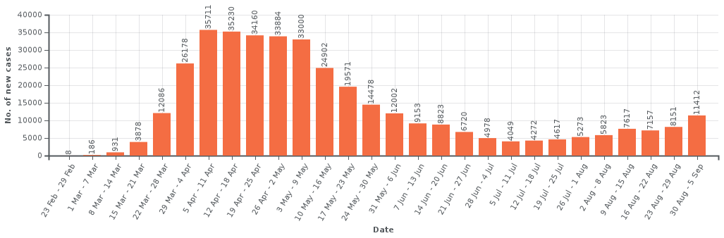
UK Cases: https://en.wikipedia.org/
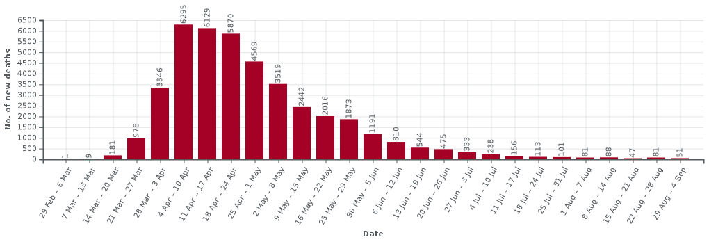
UK Deaths: https://en.wikipedia.org/
The two data sets are quite similar during the first month or so of the crisis as at that point testing was only being done for very severe cases that were being identified as potential Covid. So, Iet’s just look at the death figures (most reliable) in detail for the first few weeks until the lockdown kicks in and the numbers peek.
| week | deaths | growth (rounded) |
|---|---|---|
| 29 Feb — 6 March | 1 | — |
| 7–13 March | 8 | x8 |
| 14–20 March | 181 | x22 |
| 21–27 March | 978 | x5 |
| 28 March — 3 April | 3346 | x3.5 |
| 4–10 April | 6295 | x2 |
Note how there is an initial very fast growth, followed by pre-lockdown slowing as people became aware of the virus and started to take additional voluntary precautions, and then peeking due to lockdown. The numbers for initial fast phase are small, but this pattern reflects the early stages in Wuhan with initial, doubling approximately every two days before the public became aware of the virus, followed by slow down to around 3 day doubling followed by lockdown.
Indeed in the early stages of the pandemic it was common to see country-vs-country graphs of early growth with straight lines for 2 and 3 day doubling drawn on log-log axes. Countries varied on where they started on this graph, but typically lay between the two lines. The UK effectively started at the higher end and rapidly dropped to the lower one, before more dramatic reduction post-lockdown.
It may be that Kit recalled the x5 figure (3 day doubling) is it was the figure once the case numbers became larger and hence more reliable. However, there is also an additional reason, which I think might be why early growth was often underestimated. In some of the first countries infected outside China their initial growth rate was closer to the 3 day doubling line. However this was before community infection and when cases were driven by international travellers from China. These early international growths reflected post-public-precautions, but pre-lockdown growth rates in China, not community transmission within the relevant countries.
This last point is educated guesswork, and the only reason I am aware of it is because early on a colleague asked me to look at data as he thought China might be underreporting cases due to the drop in growth rate there. The international figures were the way it was possible to confirm the overall growth figures in China were reasonably accurate.
References
[AMS] Preparing for a challenging winter 2020-21. The Academy of Medical Sciences. 14th July 2020. https://acmedsci.ac.uk/policy/policy-projects/coronavirus-preparing-for-challenges-this-winter
[BBC1] Schools and coronavirus, test and trace, maths and reality. More or Less, BBC Radio 4. 2nd September 2020. https://www.bbc.co.uk/programmes/m000m5j9
[BBC2] Coronavirus: ‘Critical moment’ as students return to university. BBC News. 5 September 2020. https://www.bbc.co.uk/news/uk-54040421
[BPG] Are we underestimating seroprevalence of SARS-CoV-2? Burgess Stephen, Ponsford Mark J, Gill Dipender. BMJ 2020; 370 :m3364 https://www.bmj.com/content/370/bmj.m3364
[DW] Would student social bubbles cut deaths from Covid-19? Jim Dickinson on Wonkhe. 28 July 2020. https://wonkhe.com/wonk-corner/would-student-social-bubbles-cut-deaths-from-covid-19/
[DW1] Could higher education ruin the UK’s Christmas? Jim Dickinson on Wonkhe. 4 Sept 2020. https://wonkhe.com/blogs/could-higher-education-ruin-the-uks-christmas/
[Dx1] Working paper: Covid-19 – Impact of a small number of large bubbles on University return. Working Paper, Alan Dix. created 10 July 2020. arXiv:2008.08147 stable version at arXiv || additional information
[Dx2] Why pandemics and climate change are hard to understand, and can we help? Alan Dix. North Lab Talks, 22nd April 2020 and Why It Matters, 30 April 2020. http://alandix.com/academic/talks/Covid-April-2020/
[Dx3] Covid-19, the impact of university return. Alan Dix. 9th August 2020. https://alandix.com/blog/2020/08/09/covid-19-the-impact-of-university-return/
[Dx4] More than R – how we underestimate the impact of Covid-19 infection. Alan Dix. 2nd August 2020. https://alandix.com/blog/2020/08/02/more-than-r-how-we-underestimate-the-impact-of-covid-19-infection/
[LP] Why are US coronavirus deaths going down as covid-19 cases soar? Michael Le Page. New Scientist. 14 July 2020. https://www.newscientist.com/article/2248813-why-are-us-coronavirus-deaths-going-down-as-covid-19-cases-soar/
[MOH] Declining death rate from COVID-19 in hospitals in England
Mahon J, Oke J, Heneghan C.. The Centre for Evidence-Based Medicine. June 24, 2020. https://www.cebm.net/covid-19/declining-death-rate-from-covid-19-in-hospitals-in-england/
[SAGE] Principles for managing SARS-CoV-2 transmission associated with higher education, 3 September 2020. Task and Finish Group on Higher Education/Further Education. Scientific Advisory Group for Emergencies. 4 September 2020. https://www.gov.uk/government/publications/principles-for-managing-sars-cov-2-transmission-associated-with-higher-education-3-september-2020
Pingback: Fact checking Full Fact | Alan Dix