REF Redux 6 — Reasons and Remedies

This, the last of my series of posts on post-REF analysis, asks what went wrong and what could be done to improve things in future.

Spoiler: a classic socio-technical failure story: compromising the quality of human processes in order to feed an algorithm

As I’ve noted multiple times, the whole REF process and every panel member was focused around fairness and transparency, and yet still the evidence is that quite massive bias emerged. This is evident in my own analysis of sub-area and institutional differences, and also in HEFCE’s own report, which highlighted gender differences.

Summarising some of the effects we have seen in previous posts:

  1. sub-areas: When you rank outputs within their own areas worldwide: theoretical papers ranked in the top 5% (top 1 in 20) worldwide get a 4* of whereas those in more applied human/centric papers need to be in the top 0.5% (top 1 in 200) – a ten-fold difference (REF Redux 2)
  2. institutions: Outputs that appear equivalent in terms of citation are ranked more highly in Russell Group universities compared with other old (pre-1992) universities, and both higher than new (post-1992) universities.  If two institutions have similar citation profiles, the Russell Group one, on average, would receive 2-3 times more money per member of staff than the equivalent new university (REF Redux 4)
  3. gender: A male academic in computing is 33% more likely to get a 4* then a female academic, and this effect persists even when other factors considered (HEFCE report “The Metric Tide”). Rather than explicit bias, I believe this is likely to be an implicit bias due to the higher proportions of women in sub-areas disadvantaged by REF (REF Redux 5)

These are all quite shocking results, not so much that the differences are there, but because of the size.

Before being a computer scientist I was trained as a statistician.  In all my years both as a professional statistician, and subsequently as a HCI academic engaged in or reviewing empirical work, I have never seen effect sizes this vast.

What went wrong?

Note that this analysis is all for sub-panel 11 Computer Science and Informatics. Some of the effects (in particular institutional bias) are probably not confined to this panel; however, there are special factors in the processes we used in computing which are likely to have exacerbated latent bias in general and sub-area bias in particular.

As a computing panel, we of course used algorithms!

The original reason for asking submissions to include an ACM sub-area code was to automate reviewer allocation. This meant that while other panel chairs were still starting their allocation process, SP11 members already had their full allocations of a thousand or so outputs a piece. Something like 21,000 output allocations at the press of a button. Understandably this was the envy of other panels!

We also used algorithms for normalisation of panel members’ scores. Some people score high, some score low, some bunch towards the middle with few high and few low scores, and some score too much to the extremes.

This is also the envy of many other panel members. While we did discuss scores on outputs where we varied substantially, we did not spend the many hours debating whether a particular paper was 3* or 4*, or trying to calibrate ourselves precisely — the algorithm does the work. Furthermore the process is transparent (we could even open source the code) and defensible — it is all in the algorithm, no potentially partisan decisions.

Of course such an algorithm cannot simply compare each panel member with the average as some panel members might have happened to have better or worse set of outputs to review than others. In order to work there has to be sufficient overlap between panel members’ assessments so that they can be robustly compared. In order to achieve this overlap we needed to ‘spread our expertise’ for the assignment process, so that we reviewed more papers slightly further from our core area of competence.

Panels varies substantially in the way they allocated outputs to reviewers. In STEM areas the typical output was an article of, say, 8–10 pages; whereas in the humanities often books or portfolios; in performing arts there might even be a recording of a performance taking hours. Clearly the style of reviewing varied. However most panels tried to assign two expert panelists to each output. In computing we had three assessors per output, compared to two in many areas (and in one sub-panel a single assessor per output). However, because of the expertise spreading this meant typically one expert and two more broad assessors per output.

For example, my own areas of core competence (Human-centered computing / Visualization and Collaborative and social computing) had between them 700 outputs, and were two others assessors with strong knowledge in these areas. However, of over 1000 outputs I assessed, barely one in six (170) were in these areas, that is only 2/3 more than if the allocation had been entirely random.

Assessing a broad range of computer science was certainly interesting, and I feel I came away with an understanding of the current state of UK computing that I certainly did not have before. Also having a perspective from outside a core area is very valuable especially in assessing the significance of work more broadly within the discipline.

This said the downside is that the vast majority of assessments were outside our core areas, and it is thus not so surprising that default assessments (aka bias) become a larger aspect of the assessment. This is particularly problematic when there are differences in methodology; whereas it is easy to look at a paper with mathematical proofs in it and think “that looks rigorous”, it is hard for someone not used to interpretative methodologies to assess, for example, ethnography.

If the effects were not so important, it is amusing to imagine the mathematics panel with statisticians, applied and pure mathematicians assessing each others work, or indeed, if formal computer science were assessed by a pure mathematicians.

Note that the intentions were for the best trying to make the algorithm work as well as possible; but the side effect was to reduce the quality of the human process that fed the algorithm. I recall the first thing I ever learnt in computing was the mantra, “garbage in — garbage out”.

Furthermore, the assumption underlying the algorithm was that while assessors differed in their severity/generosity of marking and their ‘accuracy’ of marking, they were all equally good at all assessments. While this might be reasonable if we all were mainly marking within our own competence zone, this is clearly not valid given the breadth of assessment.  That is the fundamental assumptions of the algorithm were broken.

This is a classic socio-technical failure story: in an effort to ‘optimise’ the computational part of the system, the overall human–computer system was compromised. It is reasonable for those working in more purely computational areas to have missed this; however, in retrospect, those of us with a background in this sort of issue should have foreseen problems (John 9:41), mea culpa.  Indeed, I recall that I did have reservations, but had hoped that any bad effects would average out given so many points of assessment.  It was only seeing first Morris Sloman’s analysis and then the results of my own that I realised quite how bad the distortions had been.

I guess we fell prey to another classic systems failure: not trialling, testing or prototyping a critical system before using it live.

What could be done better?

Few academics are in favour of metrics-only systems for research assessment, and, rather like democracy, it may be that the human-focused processes of REF are the worst possible solution apart from all the alternatives.

I would certainly have been of that view until seeing in detail the results outlined in this series. However, knowing what I do now, if there were a simple choice for the next REF of what we did and a purely metrics-based approach, I would vote for the latter. In every way that a pure metrics based approach would be bad for the discipline, our actual process was worse.

However, the choice is not simply metrics vs human assessment.

In computing we used a particular combination of algorithm and human processes that amplified rather than diminished the effects of latent bias. This will have been particularly bad for sub-areas where differences in methodology lead to asymmetric biases. However, it is also likely to have amplified institution bias effects as when assessing areas far from one’s own expertise it is more likely that default cues, such as the ‘known’ quality of the institution, will weigh strongly.

Clearly we need to do this differently next time, and other panels definitely ought not to borrow SP11’s algorithms without substantial modification.

Maybe it is possible to use metrics-based approaches to feed into a human process in a way that is complimentary. A few ideas could be:

  1. metrics for some outputs — for example we could assess older journal and conference outputs using metrics, combined with human assessment for newer or non-standard outputs
  2. metrics as under-girding – we could give outputs an initial grade based on metrics, which is then altered after reading, but where there is a differential burden of proof — easy to raise a grade (e.g. because of badly chosen venue for strong paper), but hard to bring it down (more exceptional reasons such as citations saying “this paper is wrong”)
  3. metrics for in-process feedback — a purely human process as we had, but part way through calculate the kinds of profiles for sub-areas and institutions that I calculated in REF Redux 2, 3 and 4. At this point the panel would be able to decide what to do about anomalous trends, for example, individually examine examples of outputs.

There are almost certainly other approaches, the critical thing is that we must do better than last time.

level of detail – scale matters

We get used to being able to zoom into every document picture and map, but part of the cartographer’s skill is putting the right information at the right level of detail.  If you took area maps and then scaled them down, they would not make a good road atlas, the main motorways would hardly be visible, and the rest would look like a spider had walked all over it.  Similarly if you zoom into a road atlas you would discover the narrow blue line of each motorway is in fact half a mile wide on the ground.

Nowadays we all use online maps that try to do this automatically.  Sometimes this works … and sometimes it doesn’t.

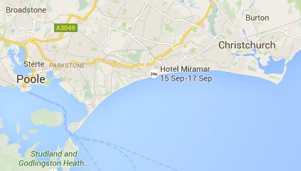
Here are three successive views of Google maps focused on Bournemouth on the south coast of England.

On the first view we see Bournemouth clearly marked, and on the next, zooming in a little Poole, Christchurch and some smaller places also appear.  So far, so good, as we zoom in more local names are shown as well as the larger place.

bournemouth-1  bournemouth-2

However, zoom in one more level and something weird happens, Bournemouth disappears.  Poole and Christchurch are there, but no  Bournemouth.

bournemouth-3

However, looking at the same level scale on another browser, Bournemouth is there still:

bournemouth-4

The difference between the two is the Hotel Miramar.  On the first browser I am logged into Google mail, and so Google ‘knows’ I am booked to stay in the Hotel Miramar (presumably by scanning my email), and decides to display this also.   The labels for Bournemouth and the hotel label overlap, so Google simply omitted the Bournemouth one as less important than the hotel I am due to stay in.

A human map maker would undoubtedly have simply shifted the name ‘Bournemouth’ up a bit, knowing that it refers to the whole town.  In principle, Google maps could do the same, but typically geocoding (e.g. Geonames) simply gives a point for each location rather than an area, so it is not easy for the software to make adjustments … except Google clearly knows it is ‘big’ as it is displayed on the first, zoomed out, view; so maybe it could have done better.

This problem of overlapping legends will be familiar to anyone involved in visualisation whether map based or more abstract.

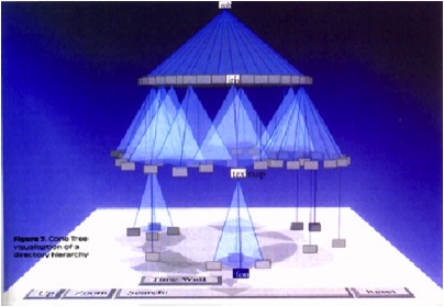
cone-trees

The image above is the original Cone Tree hierarchy browser developed by Xerox PARC in the early 1990s1.  This was the early days of interactive 3D visualisation, and the Cone Tree exploited many of the advantages such as a larger effective ‘space’ to place objects, and shadows giving both depth perception, but also a level of overview.  However, there was no room for text labels without them all running over each other.

Enter the Cam Tree:

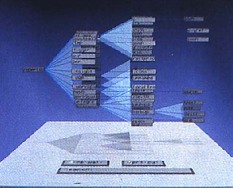
cam-tree

The Cam Tree is identical to the cone tree, except because it is on its side it is easier to place labels without them overlapping 🙂

Of course, with the Cam Tree the regularity of the layout makes it easy to have a single solution.  The problem with maps is that labels can appear anywhere.

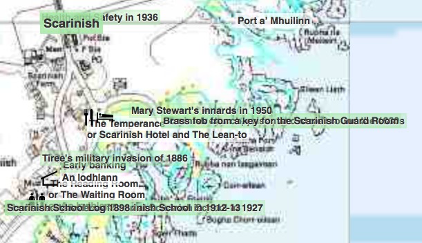
This is an image of a particularly cluttered part of the Frasan mobile heritage app developed for the An Iodhlann archive on Tiree.  Multiple labels overlap making them unreadable.  I should note that the large number of names only appear when the map is zoomed in, but when they do appear, there are clearly too many.

frasan-overlap

It is far from clear how to deal with this best.  The Google solution was simply to not show some things, but as we’ve seen that can be confusing.

Another option would be to make the level of detail that appears depend not just on the zoom, but also the local density.  In the Frasan map the locations of artefacts are not shown when zoomed out and only appear when zoomed in; it would be possible for them to appear, at first, only in the less cluttered areas, and appear in more busy areas only when the map is zoomed in sufficiently for them to space out.   This would trade clutter for inconsistency, but might be worthwhile.  The bigger problem would be knowing whether there were more things to see.

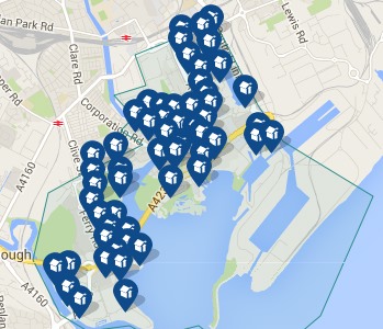
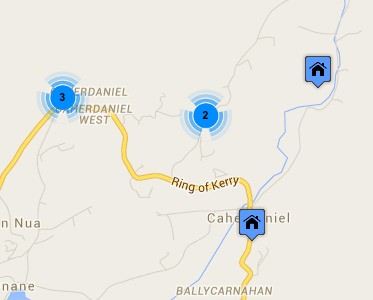
Another solution is to group things in busy areas.  The two maps below are from house listing sites.  The first is Rightmove which uses a Google map in its map view.  Note how the house icons all overlap one another.  Of course, the nature of houses means that if you zoom in sufficiently they start to separate, but the initial view is very cluttered.  The second is daft.ie; note how some houses are shown individually, but when they get too close they are grouped together and just the number of houses in the group shown.

rightmove-houses  daft-ie-house-site

A few years ago, Geoff Ellis and I reviewed a number of clutter reduction techniques2, each with advantages and disadvantages, there is no single ‘best’ answer. The daft.ie grouping solution is for icons, which are fixed size and small, the text label layout problem is far harder!

Maybe someday these automatic tools will be able to cope with the full variety of layout problems that arise, but for the time being this is one area where human cartographers still know best.

  1. Robertson, G. G. ; Mackinlay, J. D. ; Card, S. K. Cone Trees: animated 3D visualizations of hierarchical informationProceedings of the ACM Conference on Human Factors in Computing Systems (CHI ’91); 1991 April 27 – May 2; New Orleans; LA. NY: ACM; 1991; 189-194.[back]
  2. Geoffrey Ellis and Alan Dix. 2007. A Taxonomy of Clutter Reduction for Information VisualisationIEEE Transactions on Visualization and Computer Graphics 13, 6 (November 2007), 1216-1223. DOI=10.1109/TVCG.2007.70535[back]

REF Redux 5 – growing the gender gap

This fifth post in the REF Redux series looks at gender issue, in particular the likelihood that the apparent bias in computing REF results will disproportionately affect women in computing. While it is harder to find full data for this, a HEFCE post-REF report has already done a lot of the work.

Spoiler:   REF results are exacerbating implicit gender bias in computing

A few weeks ago a female computing academic shared how she had been rejected for a job; in informal feedback she heard that her research area was ‘shrinking’.  This seemed likely to be due to the REF sub-area profiles described in the first post of this series.

While this is a single example, I am aware that recruitment and investment decisions are already adjusting widely due to the REF results, so that any bias or unfairness in the results will have an impact ‘on the ground’.

Google image search for "computing professor"

Google image search “computing professor”

In fact gender and other equality issues were explicitly addressed in the REF process, with submissions explicitly asked what equality processes, such as Athena Swan, they had in place.

This is set in the context of a large gender gap in computing. Despite there being more women undergraduate entrants than men overall, only 17.4% of computing first degree graduates are female and this has declined since 2005 (Guardian datablog based on HESA data).  Similarly only about 20% of computing academics are female (“Equality in higher education: statistical report 2014“), and again this appears to be declining:

academic-CS-staff-female

from “Equality in higher education: statistical report 2014”, table 1.6 “SET academic staff by subject area and age group”

The misbalance in terms of application rates for research funding has also been issue that the European Commission has investigated in “The gender challenge in research funding: Assessing the European national scenes“.

HEFCE commissioned a post-REF report “The Metric Tide: Report of the Independent Review of the Role of Metrics in Research Assessment and Management“, which includes substantial statistics concerning the REF results and models of fit to various metrics (not just citations). Helpfully, Fran AmeryStephen Bates and Steve McKay used these to create a summary of “Gender & Early Career Researcher REF Gaps” in different academic areas.  While far from the largest, Computer Science and Informatics is in joint third place in terms of the gender gap as measured by the 4* outputs.

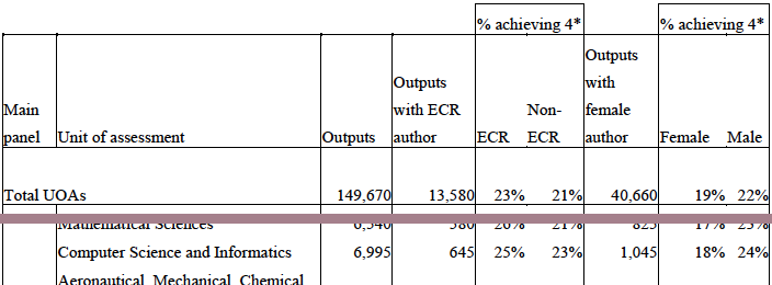
Their data comes from the HEFCE report’s supplement on “Correlation analysis of REF2014 scores and metrics“, and in particular table B4 (page 75):

table-b4-no-legend

Extract of “Table B4 Summary of submitting authors by UOA and additional characteristics” from “The Metric Tide : Correlation analysis of REF2014 scores and metrics”

This shows that while 24% of outputs submitted by males were ranked 4*, only 18% of those submitted by females received a 4*.  That is a male member of staff in computing is 33% more likely to get a 4* than a female.

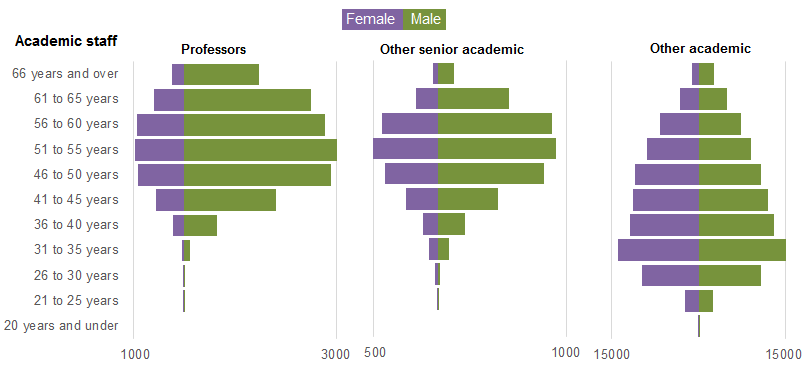
Now this could be due to many factors, not least the relative dearth of female senior academics reported by HESA.(“Age and gender statistics for HE staff“).

HESA academic staff gender balance: profs vs senior vs other academic

extract of HESA graphic “Staff at UK HE providers by occupation, age and sex 2013/14” from “Age and gender statistics for HE staff”

However, the HEFCE report goes on to compare this result with metrics, in a similar way to my own analysis of subareas and institutional effects.  The report states (my emphasis) that:

Female authors in main panel B were significantly less likely to achieve a 4* output than male authors with the same metrics ratings. When considered in the UOA models, women were significantly less likely to have 4* outputs than men whilst controlling for metric scores in the following UOAs: Psychology, Psychiatry and Neuroscience; Computer Science and Informatics; Architecture, Built Environment and Planning; Economics and Econometrics.

That is, for outputs that look equally good from metrics, those submitted by men are more likely to obtain a 4* than the by women.

Having been on the computing panel, I never encountered any incidents that would suggest any explicit gender bias.  Personally speaking, although outputs were not anonymous, the only time I was aware of the gender of authors was when I already knew them professionally.

My belief is that these differences are more likely to have arisen from implicit bias, in terms of what is valued.  The The Royal Society of Edinburgh report “Tapping our Talents” warns of the danger that “concepts of what constitutes ‘merit’ are socially constructed” and the EU report “Structural change in research institutions” talks of “Unconscious bias in assessing excellence“.  In both cases the context is recruitment and promotion procedures, but the same may well be true of the way we asses the results of research.,

In previous posts I have outlined the way that the REF output ratings appear to selectively benefit theoretical areas compared with more applied and human-oriented ones, and old universities compared with new universities.

While I’ve not yet been able obtain numbers to estimate the effects, in my experience the areas disadvantaged by REF are precisely those which have a larger number of women.  Also, again based on personal experience, I believe there are more women in new university computing departments than old university departments.

It is possible that these factors alone may account for the male–female differences, although this does not preclude an additional gender bias.

Furthermore, if, as seems the be the case, the REF sub-area profiles are being used to skew recruiting and investment decisions, then this means that women will be selectively disadvantaged in future, exacerbating the existing gender divide.

Note that this is not suggesting that recruitment decisions will be explicitly biased against women, but by unfairly favouring traditionally more male-dominated sub-areas of computing this will create or exacerbate an implicit gender bias.