book: The Laws of Simplicty, Maeda

Yesterday I started to read John Maeda’s “The Laws of Simplicty” whilst  sitting by Fiona’s stall at the annual Tiree agricultural show, then finished before breakfast today.  Maeda describes his decision to cap at 100 pages1 as something that could be read during a lunch break. To be honest 30,000 words sounds like a very long lunch break or a very fast reader, but true to his third law, “savings in time feel like simplicity”2, it is a short read.

The shortness is a boon that I wish many writers would follow (including me). As with so many single issue books (e.g. Blink), there is s slight tendency to over-sell the main argument, but this is forgiveable in a short delightful book, in a way that it isn’t in 350 pages of less graceful prose.

I know I have a tendency, which can be confusing or annoying, to give, paradoxically for fear of misunderstanding, the caveat before the main point. Still, despite knowing this, in the early chapters I did find myself occasionally bristling at Maeda’s occasional overstatement (although in accordance with simplicity, never hyperbole).

One that particularly caught my eye was Maeda’s contrast of the MIT engineer’s RFTM (Read The F*cking Manual) with the “designer’s approach” to:

marry function with form to create intuitive experiences that we understand immediately.

Although in principle I agree with the overall spirit, and am constantly chided by Fiona for not reading instructions3, the misguided idea that everything ought to ‘pick up and use’ has bedeviled HCI and user interface design for at least the past 20 years. Indeed this is the core misconception about Heidegger’s hammer example that I argued against in a previous post “Struggling with Heidegger“. In my own reading notes, my comment is “simple or simplistic!” … and I meant here the statement not the resulting interfaces, although it could apply to both.

It has always been hard to get well written documentation, and the combination of single page ‘getting started’ guides with web-based help, which often disappears when the web site organisation changes, is an abrogation of responsibility by many designers. Not that I am good at this myself. Good documentation is hard work. It used to be the coders who failed to produce documentation, but now the designers also fall into this trap of laziness, which might be euphemistically labelled ‘simplicity’4.

Personally, I have found that the discipline of documenting (in the few times I have observed it!) is in fact a great driver of simple design. Indeed I recall a colleague, maybe Harold Thimbleby5, once suggested that documentation ought to be written before any code is written, precisely to ensure simple use.

Some years ago I was reading a manual (for a Unix workstation, so quite a few years ago!) that described a potentially disastrous shortcoming of a the disk sync command (which could have corrupted the disk). Helpfully the manual page included a suggestion of how to wrap sync in scripts that prevented the problem. This seemed to add insult to injury; they knew there was a serious problem, they knew how to fix it … and they didn’t do it. Of course, the reason is that manuals are written by technical writers after the code is frozen.

In contrast, I was recently documenting an experimental API6 so that a colleague could use it. As I wrote the documentation I found parts hard to explain. “It would be easier to change the code”, I thought, so I did so. The API, whilst still experimental, is now a lot cleaner and simpler.

Coming back to Maena after a somewhat long digression (what was that about simplicity and brevity?). While I prickled slightly at a few statements, in fact he very clearly says that the first few concrete ‘laws’ are the simpler (and if taken in their own simplistic), the later laws are far more nuanced and suggest deeper principles. This includes law 5 “differences: simplicity and complexity need each other”, which suggest that one should strive for a dynamic between simplicity and complexity. This echoes the emphasis on texture I often advocate when talking with students; whether in writing, presenting or in experience design it is often the changes in voice, visual appearance, or style which give life.

Unix command line prompt

the simplest interface?

I wasn’t convinced by Maeda’s early claim that simple designs were simpler and cheaper to construct.  Possibly true for physical prodcuts, but rarely so for digital interfaces, where more effort is typically needed in code to create simpler user interfaces.  However, again this was something that was revisited later, especially in the context of more computationally active systems (“law 8, in simplicity we trust”), where he contrasts “how much do you need to know about a system?” with “how much does the system know about you?”.  The former is the case of more traditional passive systems, whereas more ‘intelligent’ systems such as Amazon recommendations (or even Facebook news feed) favour the latter.  This is very similar to the principles for incidental and low-intention interaction that I have discussed in the past7.

Finally “The Laws of Simplicity” is beautifully designed in itself.  It includes  many gems not least those arising from Maeda’s roots in Japanese design culture, including aichaku, the “sense of attachment one can feel for an artefact” (p.69) and omakase meaning “I leave it to you”, which asks the sushi chef to create a meal especially for you (p.76).  I am perhaps too much of a controller to feel totally comfortable with the latter, but Maeda’s book certainly inspires the former.

  1. In fact there are 108 pages in the main text, but 9 of these are full page ‘law/chapter’ frontispieces, so 99 real pages.  However, if you include the 8 page introduction that gives 107 … so even the 100 page cap is perhaps a more subtle concept than a strict count.[back]
  2. See his full 10 laws of simplicity at lawsofsimplicity.com[back]
  3. My guess is that the MIT engineers didn’t read the manuals either.[back]
  4. Apple is a great — read poor — example here as it relies on keen technofreaks to tell others about the various hidden ways to do things — I guess creating a Gnostic air to the devices.[back]
  5. Certainly Harold was a great proponent of ‘live’ documentation, both Knuth’s literate programming and also documentation that incorporated calculated input and output, rather like dexy, which I reported after last autumn’s Web Art/Science camp.[back]
  6. In fairness, the API had been thrown together in haste for my own use.[back]
  7. See ‘incidental interaction” and HCI book chapter 18.[back]

Six weeks on the road

I’ve been at home for the last week after six weeks travelling around the UK and elsewhere.  I’ve not kept up while on the road so doing a retrospective post on it all and need to try to catch on other half written posts.

As well as time at Talis offices in B’ham and at Lancs (including exam board week), travels have taken me to Pisa for a workshop on ‘Supportive User Interfaces’, to Koblenz for Web Science conference giving a talk on embodiment issues and a poster on web-scale reasoning , to Newcastle for British HCI conference doing a talk on fridge, to Nottingham to give a talk on extended episodic experience, and back to Lancs for a session on creativity! Why can’t I be like sensible folks and talk on one topic!

Supportive User Interfaces

Monday 13th June I attended a workshop in Pisa on “Supportive User Interfaces“, which includes interfaces that adapt in various ways to users.  The majority of people there were involved in various forms of model-based user interfaces in which various models of the task, application and interaction are used to generate user interfaces on the fly. W3C have had a previous group in this area; Dave Raggett from w3c was at the workshop and it sounds like there will be a new working group soon.  This clearly has strong links to various forms of ‘meta-level’ representations of data, tasks, etc..  My own contribution started the day, framing the area, focusing partly on reasons for having more ‘meta-level’ interfaces including social empowerment, and partly on the principles/techniques that need to be considered at a human level.

Also on Monday was a meeting of IFIP Working Group 2.7/13.4. IFIP is the UNESCO founded pan-national agency that national computer societies such as as the BCS in the UK and ACM and IEEE Computer in the US belong to.  Working Group 2.7/13.4 is focused on the engineering of user interfaces.  I had been actively involved in the past, but have had many years’ lapse.  However, this seemed a good thing to re-engage with with my new Talis hat on!

SUI: paper:

Web Science Conference in Koblenz

Jaime Teevan from Microsoft gave the opening keynote at WebSci 2011.  I know her from her earlier work on personal information management, but her recent work and keynote was about work on analysing and visualising changes in web pages.  Web page changes are also analysed alongside users re-visitation patterns; by looking at the frequency of re-visitation Jaime and her colleagues are able to identify the parts of pages that change with similar frequency, helping them, inter alia, to improve search ranking.

Had many great conversations, some with people I know previously (e.g. the Southampton folks), but also new, including the group at Troy that do lots of work with data.gov.  I was particularly interested in some work using content matching to look for links between otherwise unlinked (or only partly inter-linked) datasets.  Also lots of good presentations including one on trust prediction and a fantastic talk by Mark Bernstein from Eastgate, which he delivered in blank verse!

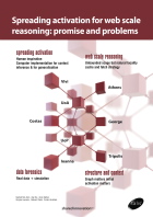
My own contribution included the poster that Dave@Talis prepared, which was on the web-scale spreading activation work in collaboration with Univ. Athens.  Quite a niche area in a multi-disciplinary conference, so didn’t elicit quite the interest of the social networking posters, but did lead to a small number of in depth discussions.

In addition I gave talk on the more cognitive/philosophical issues when we start to use the web as an external extension to / replacement of memory, including its impact on education.  Got some good feedback from this.

Closing keynote was from Barry Wellman, the guy who started social network analysis way before they were on computers.  At one point he challenged the Dunbar number1. I wondered whether this was due to cognitive extension with address books etc., but he didn’t seem to think so; there is evidence that some large circles predate web (although maybe not physical address books).  Made me wonder about itinerant tradesmen, tinkers, etc., even with no prostheses. Maybe the numbers sort of apply to any single content, but are repeated for each new context?

WebSci papers:

The HCI Conference – Newcastle

I attended the British HCI conference in Newcastle. This was the 25th conference, and as my very first academic paper in computing2 was at the first BHCI in 1984, I was pleased to be there at this anniversary.  The paper I was presenting was a retrospective on vfridge, a social networking site dating back to 1999/2000, it seemed an historic occasion!

As is always the case presentations were all interesting. Strictly BHCI is a ‘second tier’ conference compared with CHI, but why is it that the papers are always more interesting, that I learn more?  It is likely that a fair number of papers were CHI rejects, so it should be the other way round – is it that selectivity and ‘quality’ inevitably become conservative and boring?

Gregory Abowd gave the closing keynote. It was great to see Gregory again, we meet too rarely.  The main focus of his keynote was on three aspects of research: novelty, value and reliability and how his own work had moved within this space over the years.  In particular having two autistic sons has led him in directions he would never have considered, and this immediately valuable work has also created highly novel research. Novelty and value can coexist.

Gregory also reflected on the BHCI conference as it was his early academic ‘home’ when he did his PhD and postdoctoral here in the late 1980’s.  He thought that it could be rather than, as with many conferences, a second best to getting a CHI paper, instead a place for (not getting the quote quite perfect) “papers that should get into CHI”, by which he meant a proving ground for new ideas that would then go on to be in CHI.

Alan at conference dinnerHowever I initially read the quote differently. BHCI always had a broader concept of HCI compare with CHI’s quite limited scope. That is BHCI as a place that points the way for the future of HCI, just as it was the early nurturing place of MobileHCI.  However CHI has now become much broader in it’s own conception, so maybe this is no longer necessary. Indeed at the althci session the organisers said that their only complaint was that the papers were not ‘alt’ enough – that maybe ‘alt’ had become mainstream. This prompted Russell Beale to suggest that maybe althci should now be real science such as replication!

Gregory also noted the power of the conference as a meeting ground. It has always been proud of the breadth of international attendance, but perhaps it is UK saturation that should be it’s real measure of success.  Of course the conference agenda has become so full and international travel so much cheaper than it was, so there is a tendency to  go to the more topic specific international conferences and neglect the UK scene.  This is compounded by the relative dearth of small UK day workshops that used to be so useful in nurturing new researchers.

Tom at conference dinnerI feel a little guilty here as this was the first BHCI I had been to since it was in Lancaster in 2007 … as Tom McEwan pointed out I always apologise but never come! However, to be fair I have also only been twice to CHI in the last 10 years, and then when it was in Vienna and Florence. I have just felt too busy, so avoiding conferences that I did not absolutely have to attend.

In response to Gregory’s comments, someone, maybe Tom, mentioned that in days of metrics-based research assessment there was a tendency to submit one’s best work to those venues likely to achieve highest impact, hence the draw of CHI. However, I have hardly ever published in CHI and I think only once in TOCHI, yet, according to Microsoft Research, I am currently the most highly cited HCI researcher over the last 5 years … So you don’t have to publish in CHI to get impact!

And incidentally, the vfridge paper had NOT been submitted to CHI, but was specially written for BHCI as it seemed the fitting place to discuss a thoroughly British product 🙂

vfridge paper:

Nottingham MRL

I was at Mixed Reality Lab in Nottingham for Joel Fischer‘s PhD viva and while there did a seminar the afternoon on “extended episodic experience” based on Haliyana Khalid‘s PhD work and ideas that arose from it. Basically, whereas ‘user experience’ has become a big issue most of the work is focused on individual ‘experiences’ whereas much of life consists of ongoing series of experiences (episodes) which together make up the whole experience of interacting with a person or place, following a band, etc.

I had obviously not done a good enough job at wearing Joel down with difficult questions in the PhD viva in the morning as he was there in the afternoon to ask difficult questions back of his own 😉

Docfest – Digital Economy Summer School

The last major event was Docfest, which brought together the PhD students from the digital economy centres from around the country. Not sure of the exact count but just short of 150 participants I think. They come from a wide variety of backgrounds, business, design, computing, engineering, and many are mature students with years of professional experience behind them.

This looked like being a super event, unfortunately I was only able to attend for a day 🙁  However, I had a great evening at the welcome event talking with many of the students and even got to ride in Steve Forshaw‘s Sinclair C5!

My contribution to the event was running the first morning session on ‘creativity’. Surprise, surprise this started with a bad ideas session, but new for me too as the largest group I’ve run in the past has been around 30.  There were a number of local Highwire students acting as facilitators for the groups, so I had only to set them off and observe results :-). At the end of the morning I gave some the theoretical background to bad ideas as a method and in understanding (aspects of) creativity more widely.

Other speakers at the event included Jane Prophet, Chris Csikszentmihalyi and Chris Bonnington, so was sad to miss them; although I did get a fascinating chat with Jane over breakfast in the hotel hearing about her new projects on arts and neural imaging, and on how repetitious writing induces temporary psychosis … That is why the teachers give lines, to send the pupils bonkers!

  1. The idea that there are fundamental cognitive limits on social groups with different sized circles family~6, extended family~20, village~60, large village~200[back]
  2. I had published previously in agricultural engineering.[back]

hyperreal tactile iPad keyboard

The soft keyboards on iPhone and iPad are surprisingly good.  On the iPad I am finding my 3 finger typing almost as fast as on a physical keyboard … although a little more error prone as I keep mis-hitting the space bar and getting ‘n’ or ‘b’ instead (as inmthis shortbphrasemi am typing now), which the poor spell corrector can’t manage at all.

Of course if ou are a touch typist things may be different.

I was especially struck by the image of the keyboard on the iPad, which on the ‘F’ and ‘J’ keys has an image of the tiny tactile bar that allows easy finger positioning by touch alone.  However, this is of course a flat screen and I am feeling I am in some sort of surreal world.

F key on iPad showing 'tactile' image