 Thanks to Marcin Wichary for letting me know that my 1997/1998 Interfaces article “Hands across the Screen” was just named in “Best Tech Writing of the Week” at The Verge. Some years ago Marcin reprinted the article in his GUIdebook: Graphical User Interface gallery, and The Verge picked it up from there.
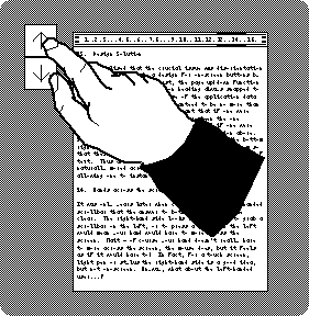
Hands across the screen is about why we have scroll bars on the right-hand side, even though it makes more sense to have them on the left, close to our visual attention for text. The answer, I suggested, was that we mentally ‘imagine’ our hand crossing the screen, so a left-hand scroll-bar seems ‘wrong’, even though it is better (more on this later).
Any appreciation is obviously gratifying, but this is particularly so because it is a 15 year old article being picked up as ‘breaking’ technology news.
Interestingly, but perhaps not inconsequentially, the article was itself both addressing an issue current in 1997 and also looking back more than 15 years to the design of the Xerox Star and other early Xerox GUI in the late 1970s early 1980s as well as work at York in the mid 1980s.
Of course this should always be the case in academic writing: if the horizon is (only) 3-5 years leave it to industry. Academic research certainly can be relevant today (and the article in question was in 1997), but if it does not have the likelihood of being useful in 10–20 years, then it is not research.
At the turn of the Millenium I wrote in my regular HCI Education column for SIGCHI Bulletin:
“Pick up a recent CHI conference proceedings and turn to a paper at random. Now look at its bibliography – how many references are there to papers or books written before 1990 (or even before 1995)? Where there are older references, look where they come from — you’ll probably find most are in other disciplines: experimental psychology, physiology, education. If our research papers find no value in the HCI literature more than 5 years ago, then what value has today’s HCI got in 5 years time? Without enduring principles we ought to be teaching vocational training courses not academic college degrees.”
(“the past, the future, and the wisdom of fools“, SIGCHI Bulletin, April 2000)
At the time about 90% of CHI citations were either to work in the last 5 years, or to the authors’ own work, to me that indicated a discipline in trouble — I wonder if it is any better today?
When revising the HCI textbook I am always pleased at the things that do not need revising — indeed some parts have hardly needed revising since the first edition in 1992. These parts seem particularly important in education – if something has remained valuable for 10, 15, 20 years, then it is likely to still be valuable to your students in a further 10, 15, 20 years. Likewise the things that are out of date after 5 years, even when revised, are also likely to be useless to your students even before they have graduated.
 In fact, I have always been pleased with Hands across the Screen, even though it was short, and not published in a major conference or journal. It had its roots in an experiment in my first every academic job at York in the mid-1980s, when we struggled to understand why the ‘obvious’ position for scroll arrows (bottom right) turned out to not work well. After a detailed analysis, we worked out that in fact the top-left was the best place (with some other manipulations), and this analysis was verified in use.
As an important meta-lesson what looked right turned out not to be right. User studies showed that it was wrong, but not how to put it right, and it was detailed analysis that filled the vital design gap. However, even when we knew what was right it still looked wrong. It was only years later (in 1997) that I realised that the discrepancy was because one mentally imagined a hand reaching across the screen, even though really one was using a mouse on the desk surface.
Visual (and other) impressions of designers and users can be wrong; as in any mature field, quite formal, detailed analysis is necessary to compliment even the most experienced designer’s intuitions.
The original interfaces article was followed by an even shorter subsidiary article “Sinister Scrollbar in the Xerox Star Xplained“, that delved into the history of the direction of scroll arrows on a scrollbar, and how they arose partly from a mistake when Apple took over the Star designs! This is particularly interesting today given Apple’s perverse decision to remove scroll arrows completely — scrolling now feels like a Monti Carlo exercise, hoping you end up in the right place!
However, while it is important to find underlying principles, theories and explanations that stand the test of time, the application of these will certainly change. Whilst, for an old mouse + screen PC, the visual ‘hands across the screen’ impression was ‘wrong’ in terms of real use experience, now touch devices such as the iPad have changed this. It really is a good idea to have the scrollbar on the left right so that you don’t cover up the screen as you scroll. Or to be precise it is good if you are right handed. But look hard, there are never options to change this for left-handed users — is this not a discrimination issue? To be fair tabs and menu items are normally found at the top of the screen equally bad for all. As with the scroll arrows, it seems that Apple long ago gave up any pretense of caring for basic usability of ergonomics (one day those class actions will come from a crippled generation!) — if people buy because of visual and tactile design, why bother? And where Apple lead the rest of the market follows 🙁
Actually it is not as easy as simply moving buttons around the screen; we have expectations from large screen GUI interfaces that we bring to the small screen, so any non-standard positioning needs to be particularly clear graphically. However, the diverse location of items on web pages and often bespoke design of mobile apps, whilst bringing their own problems of inconsistency, do give a little more flexibility.
So today, as you design, do think “hands”, and left hands as well as right hands!
And in 15 years time, who knows what we’ll have in our hands, but let’s see if the same deep principles still remain.
> “It really is a good idea to have the scrollbar on the left so that you don’t cover up the screen as you scroll.”
Shouldn’t that be “right” instead of “left”? 🙂
Interesting article. I find the technical evolution of input devices justifying an “illogical” decision tens of years later particularly amusing.
absolutely – fixed it!
Pingback: details matter: infinite scrolling and feature interaction | Alan Dix