 Unfortunately only fixing Mac OS X backup, not the Tardis 🙁 … but, nonetheless, critical.
What bit of software do you really need to be reliable? If anything else goes really wrong you have the backup — but if the backup fails you really are lost.
And Mac OS X Time Machine, while it does have a very pretty interface, is inclined to get stuck sometimes.
This is my own story of how it goes wrong … and how to put it right.
… and throughout I’ve dropped in a few lessons for anyone implementing critical system software — maybe the odd Apple engineer is reading
how to tell when things are wrong
Occasionally Time Machine seems to be stuck, but isn’t really. When you first do a backup, or when you haven’t backed up to a particular disk for ages (perhaps if you have been away on a trip), it can spend several hours ‘preparing’. You can tell it is ‘preparing’ because when you open the Time Machine preferences there is the little barbers pole saying ‘preparing’ 😉

This is when it is running over the disk working out what it needs to backup, and always seems to be the lengthiest operation, actually backing up the disk is often quite fast, and yet, for some reason there is no indication of how far through the ‘preparing’ process it has got.
Lesson 1: make sure you include progress indicators for anything that can take a while, not just the obvious ‘slow’ things.
So, when you see ‘preparing’, just be patient!
However, at least half-a-dozen times over the last year, my Time Machine has got completely stuck. I have seen this happen in three ways:
(i) it is still saying ‘preparing’ after leaving it overnight!
(ii) it starts to transfer to disk, but then gets stuck part way:

(iii) if you look in the Time Machine preferences it says the backup has failed
This last time in fact the first sign was (iii), but it doesn’t actually tell you (if you don’t look) until it has failed for ten days, by which time I was travelling. In the days before Time Machine I always did a manual backup before travelling as I knew that was when things were most likely to go wrong, but now-a-days I have got used to relying on it and forget to check it is working OK … so if you are paranoid about your data, do peek occasionally at Time Machine to check it is still working!
When I got home and told Time Machine to backup to the Time Capsule here rather than my office disk (why can’t it remember that I have two backup disks??). Then (after being very very patient while to was ‘preparing’ for four hours), I saw it got stuck in step (ii) at 1.4 GB or 4.2 GB. Of course progress indicators are never very good for very slow operations, when transferring several GB of data there may be several minutes before the bar even moves a pixel … but I was very very patient and it definitely did not move!
Lesson 2: for very long processes supplement the progress indicator with some other indicator to show things are still working, in this case perhaps amount transferred in last minute
At this point I did the normal things, turn Time Machine On/Off, restart machine a couple of times, etc., but when it persists then you know something is deeply wrong.
so why does it go wrong?
In fact Fiona@lovefibre has found Time Machine flawless for her desktop machine backing up to exactly the same Time Capsule. I am guessing the problem I have is because I use a laptop so possible reasons:
- it may go to sleep occasionally, breaking connection to the Time Capsule
- maybe the WiFi aerial on a laptop is not as good as the desktop
However, if every laptop failed as often surely Apple would have fixed it by now. So guessing there is an additional factor:
- my disk has 196 Gb of data, much of it in smaller document files (word docs, code files, etc.), not just a few giant movies.
The software will be designed to withstand a certain amount of external failure, especially when connecting to disks over WiFi as the Time Capsule is designed to do. However, I imagine that there are places in the code where there are race conditions, or critical portions where external failure really makes a difference. If the external connections are reliable and the backup is quite fast the likelihood of hitting one of the nasty spots in the code is low. However, if you have a lot of data to check and then transfer and the external failures more frequent, then the likelihood of hitting one increases and things start to go wrong.
I see similar problems with other software, Dreamweaver in particular, which has got better, but still can crash if the Internet connection is poor (see also “Why software need never hang“). What happens is that during testing, the test machines often have minimal data, little software (maybe just the operating system and what is being tested), and operate in perfect situations. In such circumstances these hidden flaws never become apparent.
Lesson 3: make sure your test machine is fully loaded with data and applications, and operates in an unreliable environment, so that testing is realistic
However, this is not like Word crashing and losing your most recent edits to one document. When Time Machine fails it seems to occasionally leave something corrupt in the backup disk so that subsequent attempts to backup also fail. There is no excuse for this, the techniques for dealing with potential disk-writing failures are well established in both databases and low-level disk management. For example, one can save a timestamp file at the end of successful operations so that, when returning to the data, if the timestamp file is not there the software knows something went wrong last time.
Maybe Time Machine is trying to be too clever, picking up where it left off when, for example, connection to the disk is broken. If so it clearly needs some additional mechanism to notice “I’ve tried this several times and it keeps going wrong, maybe I need to back off to the last successful state”. Perhaps not something to worry about in less critical software, but not difficult to get right when it is really needed … as in backups!
Lesson 4: build critical software defensively in layers so that errors in one part do not affect the whole; and if saving to disk ensure there is some sort of atomic transaction
The aim during testing should be what I call “fail-fast programming” trying to make sure that failures happen during testing not real use!
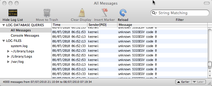
One thing I found particularly disturbing about my most recent Time Machine hang is that when I looked at the system console it had regular spats of “unknown SIGSEGV” several times a minute … in the kernel! If you don’t know UNIX internals the ‘kernel’ is the heart of the operating system of the Mac, where all the lowest level work is done and where if something goes wrong everything fails. SIGSEGV means that some bit of software is trying to access a memory location that doesn’t exist. In fact while this is caught it is not so bad, the greater worry is that if it is trying to access non-existent memory, then it may corrupt other memory … and the kernel has access to everything – not good.

Please, please Apple if you cannot get Time Machine to work properly, do not let it affect the kernel!
how to put it right
One might hope that even if Time Machine cannot notice itself there is something wrong at least there would be an option to say “restart yourself”. One might hope, but there is not. However, you can do it yourself by digging a little into the backup disk itself.
First problem is to stop the Time Machine backup if it has hung.
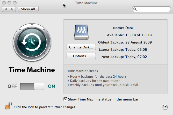
In the Time Machine control panel, you can simply slide the OFF-ON button to OFF. The status should change to ‘stopping’ and after a while stop. Then you can restart the machine and try to fix things.

This is the ideal thing to do, but I find that when Time Machine is really hung this rarely works. I do turn it to OFF, but either it never changes to ‘stopping’ and stays ‘preparing’, or it changes to ‘stopping’, but never does. If this happens the system restart typically doesn’t restart the system as Time Machine won’t stop running. Then, always with much trepidation, I reach for the on/off button on the Mac itself :-/

After doing a hard on/off like this, I usually do anther restart from the Apple menu … not sure if this is necessary, but just to be on the safe side!
Occasionally I skip to the next step before the hard restart.
Then you can start to fix the problem properly.
Find the backup disk. If it is not obvious in the Finder use the ‘Go’ menu and select “Computer”; it shows all the locally connected disks (or it may simply appear in the left hand favourites pane in each Finder window).
If you skipped the restart stage (or of you just peek now to see what it is like when it hasn’t gone wrong), you will see something like “Backup of Alan Dix’s MacBook Pro” (obviously for you it will not be “Alan Dix’s MacBook Pro”!). This is the Time Machine backup. However, if you have restarted the machine with Time Machine off you will have to find the actual disk that you chose as your backup disk and on it look for a file called something like “Alan Dix’s MacBook Pro_0039fc56f8a2.sparsebundle”. This is some form of compressed disk image. In the older versions of Time Machine there was simply a folder with all the backups in it — I felt much more secure. Now this is a single opaque file and I worry that if one day it gets corrupted :-/
Having found the ‘sparsebundle’ double click it and it will display a little pop-up window that says ‘checking volumes’. I keep meaning to see if this ever stops, but I am not patient enough and press the button that says to skip this state and then (after a while) it mounts the disk image and the disk “Backup of Alan Dix’s MacBook Pro” appears.
Double click “Backup of Alan Dix’s MacBook Pro” and look inside and then inside the folder “Backups_backupd” and you find loads of dated folders, which are the actual backups of your system that you can browse if you prefer instead of using the Time Machine interface. In addition there may be one file ending “.inProgress”, which is some sort of internal file created while it is in the middle of doing the backup.

Delete the “.inProgress” file.
In addition, I usually delete the last of the dated folders (sort by “Date Modified” to get the last one). However, if you don’t want to lose the last backup you can try just deleting the “inProgress” file and only delete the last dated backup if Time Machine still gets stuck.
Important: only delete the latest of the dated backup folders (e.g. “2010-06-09-225547” in the screen shot above), NOT the entire “Alan Dix’s Macbook Pro” folder. If you do that you lose all your backups!
I recall doing this all with extreme trepidation the first time, but had got to the point when I couldn’t do backups or access them anyway so had nothing to lose. Actually it seems pretty OK getting in here and doing this sort of thing, the nice thing about Time Machine is that it uses ordinary folder structures that you can peek around in and see are there all secure. I am much happier with this than the kind of backup where you only know if it is working the day you try to restore something! At least half the times I have used such backups over the years I’ve found the backup is in some way corrupt or incomplete. So actually one up for Time Machine 🙂
Now reboot again (for luck). Turn Time Machine back on in the control panel and wait … a long time … it will start ‘preparing’ as if for the first backup … and several hours later hopefully all will be well.
But do remember to set the power save options not to go to sleep in the middle!
In fact the above has always worked for me except for this last time when, for some reason (maybe I missed something on the way?), it hung again and I had to go through the whole process again. This time I waited until yesterday evening before turning Time Machine back on so that I could leave it to do the long 4 hour ‘preparing’ stage without me doing anything else.
And then:

Joy!
 A recent example was when I visited the SimoleonSense blog in order to find an article corresponding to an image about human sensory illusions. The image had been shared in Facebook, and I found, when I tried to search for it, also widely pinned in Pinterst, but the Facebook shares only linked back to the image url and Pinterst to the overall site (why some artists hate Pintrest). However, I wanted to find the actual post on the site that mentioned the image.
 It took me a while to realise that the problem was that the scrollbar had been ‘enhanced’ by the website (using the WordPress infinite scroll plugin), which not only added infinite scrolling, but also ‘smart scrolling’, where a click on the scrollbar makes an animated jump to that location on the scrollbar. Now many early scrollbars worked in this way, and the ‘smart scroll’ options is inspired by the fact that Apple rediscovered this in iOS for touch screen interaction. The method gives rapid interaction, especially if the scrollbar is augmented by ‘tips’ on the scrollbar (see the jQuery smartscroll demo page).
