While putting away the cutlery I noticed that I always do it one kind at a time: all the knives, then all the forks, etc. While this may simply be a sign of an obsessive personality, I realised there was a general psychological principle at work here.
We often make the distinction between recognition and recall and know, as interface designers, that the former is easier, especially for infrequently used features, e.g. menus rather than commands.
In the cutlery tray task the trade-off is between a classification task “here is an item what kind is it?” versus a visual recognition one “where is the next knife”. The former requires a level of mental processing and is subject to Hick’s law, whereas the latter depends purely on lower level visual processing, a pop-out effect.
I am wondering whether this has user interface equivalents. I am thinking about times when one is sorting things: bookmarks, photos, even my own snip!t. Sometimes you work by classification: select an item, then choose where to put it; for others you choose a category (or an album) and then select what to put in it. Here the ‘recognition’ task is more complex and not just visual, but I wonder if the same principle applies?
Sounds like a good dissertation project!
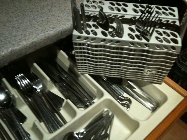
I classify the cutlery when putting it into the dishwasher basket and hence can remove all the knives/spoons etc. together to put in the cutlery drawer. As I have been using the cutlery, then I would be familiar with it and therefore the classification (before putting in dishwasher) would take less time, although there is the time to recognise where to put it in the cutlery basket (keeping the same arrangement speeds this up) rather then just finding an empty slot. Is there such a pre-sorting interface activity? I suppose tagging photos is similar or assigning coloured labels on the Mac. These are certainly easier to do when one has just been looking at (and familiar) with the artefact. Yes, a dissertation project!
This reminds me of the Dufflepuds in Voyage of the Dawn Treader, they cooked potatoes before planting them to save time after the harvest :-/
… Maybe you need to get out more, Alan LOL
Hick’s law crossed my mind a while ago when I came across Tantek’s post on ‘three hypotheses of human interface design’ – all about other more proportional hypotheses for UIs. (http://bit.ly/ifFj).
Then, I wanted to improve findability on several rather large and complicated sites. I looked up the psychology of menu design for trade offs between flat structures with long menus vs deep structures with short menus. Logarithmic Hick’s law helped me explain how organising principles can speed up menu decisions, as people don’t have to put the effort into processing every item that makes up a set; if the set is well organised and usefully ordered.
Tantek’s post is interesting to review now, especially as the conclusions (minimise text fields, minimise gestures, increase responsiveness) are indicative of how some popular parts of the Web have changed between Zero 7 and now.
These 3 hypotheses suggested a trend towards more useful, simple ‘ronseal’ applications over the more extensive, multifaceted information portals. The hypotheses don’t cover social and contexual enablers though and I think these have had more impact on how user interfaces ‘do things with media’ than anything else. Browsing libraries and collections is still invaluable but getting to the right resources in these is more likely than not to involve a combination of search and browse rather than just one of these strategies.
For the site problem I was working on back in 2007, the design solution was about making content and menu items work better together within groups – enabling better visual recognition and also easy ‘verbal scanning’ – to help people get the gist without having to interpret everything.
On my Mac, applications now take care of sorting and organising tasks for me – ace 🙂
All I really need to do is peruse, choose or enhance applications’ abilities to understand things for me.
IPhoto groups my digital photos by event for me and in Finder I can choose one of four great pattern matching strategies (list, grid, carousel, nested lists) to pick up & manipulate whatever I need. The grid is quickest for visual pattern matching whilst sortable lists are invaluable for finding latest versions. I think there are four levels of engagement in sorting activities and that people trend towards using the most effortless but benefit from the more creative activities. Facilitating how people add ‘meta’ or ‘stories’ that tie their collections together will most likely enhance the UI.
Tasks for sorting collections:
1 Search – derive a relevant set from a seed
2 Recognition – match patterns to memories (can be visual or verbal scanning)
3 Classification – tagging, autotagging, asset descriptions (says what it is on the tin)
4 Stories or Meta (says why it’s valuable and what it’s connected to)
‘Stories or Meta’ covers: story telling, categorisation, folders, meta descriptions, schemas, contexts, linkages and plans. These activities all have one thing in common – they shape what media in a collection means and they help define why it’s relevant to you or others. Meta activities need to happen in a way that’s both top down or bottom up.
You can collect things first then tie them together through meta activities or you can create meta containers and a plan; then fill it up and watch it evolve. Administrative user interfaces for collections must now support both directions of architectural practice 🙂
Hello Alan, very interesting article. The topic happens to be my masters thesis which I’m supposed to be submitting soon. 😉 cheers.