September has been a full month!
During the last two weeks things have started to kick back into action, with the normal rounds of meetings and induction week for new students. For the latter I’d pre-recorded a video welcome, so my involvement during the week was negligible. However, in addition I delivered a “Statistics for HCI” day course organised by the BCS Interaction Group with PhD students from across the globe and also a talk “Designing User Interactions with AI: Servant, Master or Symbiosis” at the AI Summit London. I was also very pleased to be part of the “60 faces of IFIP” campaign by the International Federation for Information Processing.
It was the first two weeks that stood out though, as I was back on Tiree for two whole weeks. Not 100% holiday as during the stay I gave two virtual keynotes: “Qualitative–Quantitative Reasoning: thinking informally about formal things” at the International Colloquium on Theoretical Aspects of Computing (ICTAC) in Kazakhstan and “Acting out of the Box” at the University of Wales Trinity St David (UWTSD) Postgraduate Summer School. I also gave a couple of lectures on “Modelling interactions: digital and physical” at the ICTAC School which ran just before the conference and presented a paper on “Interface Engineering for UX Professionals” in the Workshop on HCI Engineering Education (HCI-E2) at INTERACT 2021 in Bari. Amazing how easy it is to tour the world from a little glamping pod on a remote Scottish Island.
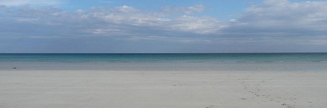
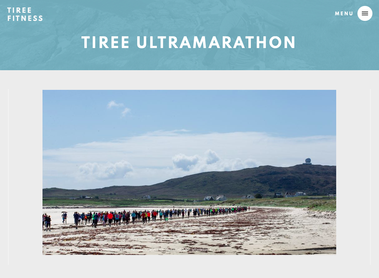
Of course the high point was not the talks and meetings, but the annual Tiree Ultra-marathon. I’d missed last year, so especially wonderful to be back: thirty five miles of coastline, fourteen beaches, not to mention so many friendly faces, old friends and new. Odd of course with Covid zero-contact and social distancing – the usual excited press of bodies at the pre-race briefing in An Talla, the Tiree community hall, replaced with a video webinar and all a little more widely spaced for the start on the beach too.
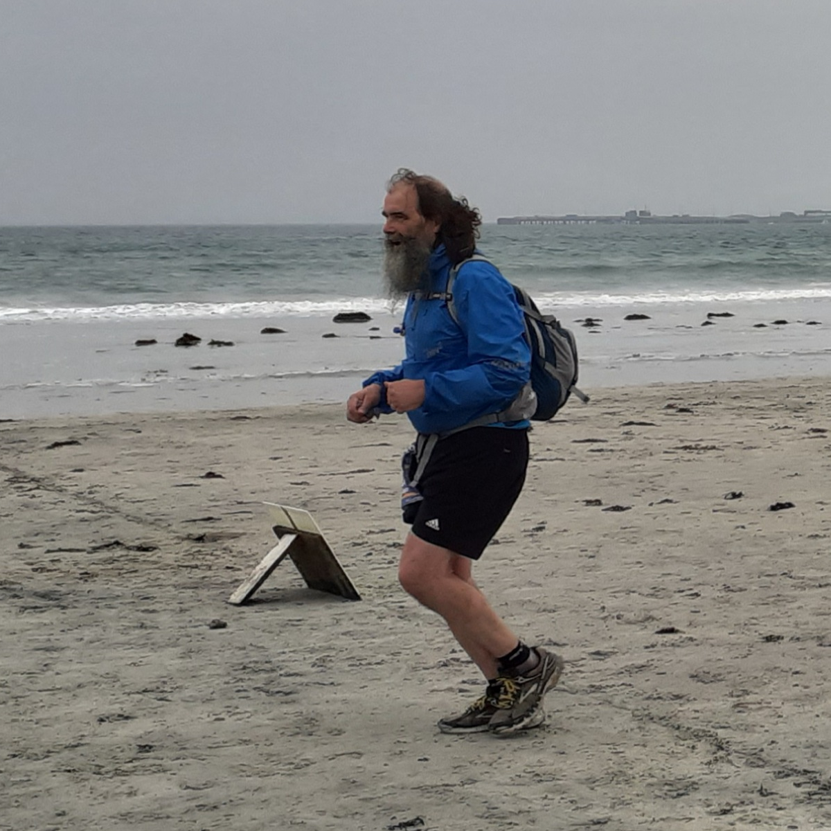
The course was slightly different too, anti-clockwise and starting half way along Gott Bay, the longest beach. Gott Bay is usually towards the end of the race, about 28 miles in, so the long run, often into the wind is one of the challenges of the race. I recall in 2017 running the beach with 40 mile an hour head wind and stinging rain – I knew I’d be faster walking, but was determined to run every yard of beach.. Another runner came up behind me and walked in my shelter. However, this year had its own sting in the tail with Ben Hynish, the highest point, at 26 miles in.
The first person was across the line in about four-and-a-quarter hours, the fastest time yet. I was about five hours later!
This was my fifth time doing the ultra, but the hardest yet, maybe in part due to lockdown couch-potato-ness! My normal training pattern is that about a month before the ultra I think, “yikes, I’ve not run for a year” and then rapidly build up the miles – not the recommended training regime! This year I knew I wasn’t as fit as usual, so I did start in May … but then got a knee injury, then had to self-isolate … and then it was into the second-half of July; so about a month again.
Next year it will be different, I will keep running through the winter … hmm … well, time will tell!
The different September things all sound very disparate – and they are, but there are some threads and connections.
The first thread is largely motivational.
The UWTSD keynote was about the way we are not defined by the “kind of people” we think of ourselves as being, but by the things we do. The talk used my walk around Wales in 2013 as the central example, but the ultra would have been just as pertinent. Someone with my waistline is not who one would naturally think as being an ultramarathon runner – not that kind of person, but I did it.
However, I was not alone. The ‘winners’ of the ultra are typically the rangy build one would expect of a long-distance runner, but beyond the front runners, there is something about the long distance that attracts a vast range of people of all ages, and all body shapes imaginable. For many there are physical or mental health stories: relationship breakdowns, illnesses, that led them to running and through it they have found ways to believe in themselves again. Post Covid this was even more marked: Will, who organises the ultra, said that many people burst into tears as they crossed the finish line, something he’d never seen before.
The other thread is about the mental tools we need to be a 21st century citizen.
The ICTAC keynote was about “Qualitative–Quantitative Reasoning”, which is my term for the largely informal understanding of numbers that is so important for both day-to-day and professional life, but is not part of formal education. The big issues of our lives from Covid to Brexit to climate change need us to make sense of large-scale numerical or data-rich phenomena. These often seem too complex to make sense of, yet are ones where we need to make appropriate choices in both our individual lives and political voices. It is essential that we find ways to aid understanding in the public, press and politicians – including both educational resources and support tools.
The statistics course and my “Statistics for HCI” book are about precisely this issue – offering ways to make sense of often complex results of statistical analysis and obtain some of the ‘gut’ understanding that professional statisticians develop over many years.
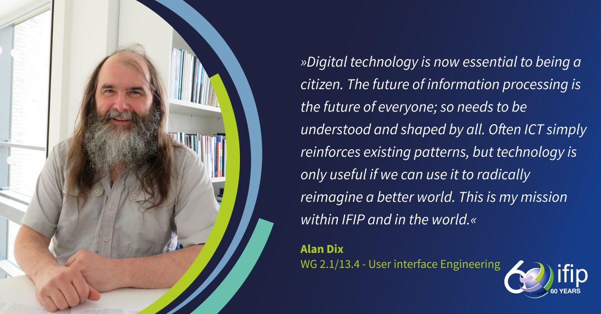
My 60 faces of IFIP statement also follows this broad thread:
“Digital techology is now essential to being a citizen. The future of information processing is the future of everyone; so needs to be understood and shaped by all. Often ICT simply reinforces existing patterns, but technology is only useful if we can use it to radically reimagine a better world.”
More information on different events
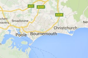
Tiree Ultra
Tiree Ultramarathon web page and Facebook Group
Paper: Interface Engineering for UX Professionals
HCI-E2: Workshop on HCI Engineering Education – for developers, designers and more, INTERACT 2021, Bari, Italy – August 31st, 2021. See more – paper and links
Summer School Lecturea: Modelling interactions: digital and physical
Lecture at ICTAC School 2021: 18th International Colloquium on Theoretical Aspects of Computing, Nazarbayev University, Nur-Sultan, Kazakhstan, 1st September 2021. See more – abstract and links
Talk: Designing User Interactions with AI: Servant, Master or Symbiosis
The AI Summit London, 22nd Sept. 2021. See more – abstract and links
Day Course: Statistics for HCI
BCS Interaction Group One Day Course for PhD Students, 21st Sept. 2021.
See my Statistics for HCI Micro-site.
Keynote: Acting out of the Box
Rhaglen Ysgol Haf 2021 PCYDDS / UWTSD Postgraduate Summer School 2021, 10th Sept. 2021. See more – abstract and links
Keynote: Qualitative–Quantitative Reasoning: thinking informally about formal things
18th International Colloquium on Theoretical Aspects of Computing, Nazarbayev University, Nur-Sultan, Kazakhstan, 10th Sept. 2021. See more – full paper and links
Induction week greeting