mooHCIc – a massive open online HCI course

Would you like to know more about human–computer interaction, or would you like free additional resources for your students?

Hardly a week goes by without some story about the changing face of online open education: from Khan Academy to Apple’s iTunes U and a growing number of large-scale open online courses from leading academics such as Thrun‘s AI course at Stanford.

Talis is interested in the software needed to support these new forms of large-scale open learning.  So, partly because it seems a good idea, and partly to be a willing guinea pig, I am going to run a massive online open HCI course in the autumn.

This type of course is either aimed exclusively at people outside a traditional education setting; or else, in the case of some of the university based courses, the professor/tutor is teaching their own class and then making some of the materials connected with it available on the web.
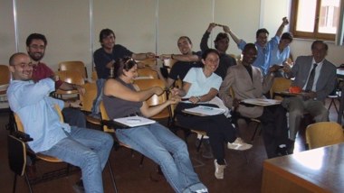
While similarly aiming to cater for those outside mainstream education, I would like also to make it easy for those in traditional university settings to use this as part of their own courses, maybe suggesting it as additional material to recommend to their students.  Even more interesting will be if the online material is incorporated more deeply into your courses, perhaps using it instead of some of the lectures/labs you would normally give.

If you are teaching a HCI course and would be interested in me being a ‘virtual guest lecturer’ by using this material (free!) please let me know.

I don’t intend to do a broad introductory HCI ‘101’ (although I may start with a short ‘laying out the area’ component), but more a series of components on particular sub-topics.  These will themselves be split into small units of perhaps 10-15 minutes ‘lecture style’ material (Khan-style voice over, or maybe mix of voice-over and head-and-shoulders).  Each sub-topic will have its own exercises, discussion areas, etc.  So, tutors intending to use this as part of their own courses can choose a sub-topic that fits into their curriculum, and likewise individuals not part of a formal course can pick appropriate topics for themselves.   I may also think of some integrative exercises for those doing more than one component.
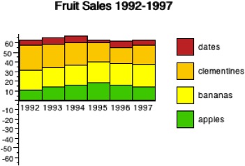
I have yet to decide the final topics, but the following are things for which I have given some sort of tutorial or produced fresh materials recently:

  • introduction to information visualisation — using materials created for IR+InfoVis winter school in Zinal last January
  • emotion and experience — using new chapter written for next edition of HCI book, and tutorial I did at iUSEr last December
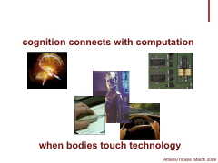
  • physicality — looking at the interactions between digital and physical product design — based on forthcoming TouchIT book
  • formal methods in HCI — as I have just written a chapter for Mads’ interaction-design.org open encyclopaedia of HCI
  • user interface software architecture — based on heavily updated chapter for next edition of HCI book
  • creativity and innovation — (wider than pure HCI audience) — drawing on experience of teaching technical creativity using ‘Bad Ideas’ and other methods, with both practical (doing it) and theoretical (understanding it) aspects
  • designing for use (adoption and appropriation) — understanding the factors that lead to products being adopted including the rich interplay between design and marketing; and then, the factors that can allow users to appropriate products to their own purposes.

I will not do all these, but if some seem particularly interesting to you or your students, let me know and I’ll make final decisions soon based on a balance between popularity and ease of production!
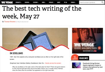
not forgotten! 1997 scrollbars paper – best tech writing of the week at The Verge

Thanks to Marcin Wichary for letting me know that my 1997/1998 Interfaces article “Hands across the Screen” was just named in “Best Tech Writing of the Week” at The Verge.  Some years ago Marcin reprinted the article in his GUIdebook: Graphical User Interface gallery, and The Verge picked it up from there.

Hands across the screen is about why we have scroll bars on the right-hand side, even though it makes more sense to have them on the left, close to our visual attention for text.  The answer, I suggested, was that we mentally ‘imagine’ our hand crossing the screen, so a left-hand scroll-bar seems ‘wrong’, even though it is better (more on this later).

Any appreciation is obviously gratifying, but this is particularly so because it is a 15 year old article being picked up as ‘breaking’ technology news.

Interestingly, but perhaps not inconsequentially, the article was itself both addressing an issue current in 1997 and also looking back more than 15 years to the design of the Xerox Star and other early Xerox GUI in the late 1970s early 1980s as well as work at York in the mid 1980s.

Of course this should always be the case in academic writing: if the horizon is (only) 3-5 years leave it to industry.   Academic research certainly can be relevant today (and the article in question was in 1997), but if it does not have the likelihood of being useful in 10–20 years, then it is not research.

At the turn of the Millenium I wrote in my regular HCI Education column for SIGCHI Bulletin:

Pick up a recent CHI conference proceedings and turn to a paper at random. Now look at its bibliography – how many references are there to papers or books written before 1990 (or even before 1995)? Where there are older references, look where they come from — you’ll probably find most are in other disciplines: experimental psychology, physiology, education. If our research papers find no value in the HCI literature more than 5 years ago, then what value has today’s HCI got in 5 years time? Without enduring principles we ought to be teaching vocational training courses not academic college degrees.
(“the past, the future, and the wisdom of fools“, SIGCHI Bulletin, April 2000)

At the time about 90% of CHI citations were either to work in the last 5 years, or to the authors’ own work, to me that indicated a discipline in trouble — I wonder if it is any better today?

When revising the HCI textbook I am always pleased at the things that do not need revising — indeed some parts have hardly needed revising since the first edition in 1992.  These parts seem particularly important in education – if something has remained valuable for 10, 15, 20 years, then it is likely to still be valuable to your students in a further 10, 15, 20 years.  Likewise the things that are out of date after 5 years, even when revised, are also likely to be useless to your students even before they have graduated.

In fact, I have always been pleased with Hands across the Screen, even though it was short, and not published in a major conference or journal.  It had its roots in an experiment in my first every academic job at York in the mid-1980s, when we struggled to understand why the ‘obvious’ position for scroll arrows (bottom right) turned out to not work well.  After a detailed analysis, we worked out that in fact the top-left was the best place (with some other manipulations), and this analysis was verified in use.

As an important meta-lesson what looked right turned out not to be right.  User studies showed that it was wrong, but not how to put it right, and it was detailed analysis that filled the vital design gap.  However, even when we knew what was right it still looked wrong.  It was only years later (in 1997) that I realised that the discrepancy was because one mentally imagined a hand reaching across the screen, even though really one was using a mouse on the desk surface.

Visual (and other) impressions of designers and users can be wrong; as in any mature field, quite formal, detailed analysis is necessary to compliment even the most experienced designer’s intuitions.

The original interfaces article was followed by an even shorter subsidiary article “Sinister Scrollbar in the Xerox Star Xplained“, that delved into the history of the direction of scroll arrows on a scrollbar, and how they arose partly from a mistake when Apple took over the Star designs!  This is particularly interesting today given Apple’s perverse decision to remove scroll arrows completely — scrolling now feels like a Monti Carlo exercise, hoping you end up in the right place!

However, while it is important to find underlying principles, theories and explanations that stand the test of time, the application of these will certainly change.  Whilst, for an old mouse + screen PC,  the visual ‘hands across the screen’ impression was ‘wrong’ in terms of real use experience, now touch devices such as the iPad have changed this.  It really is a good idea to have the scrollbar on the left right so that you don’t cover up the screen as you scroll.  Or to be precise it is good if you are right handed.  But look hard, there are never options to change this for left-handed users — is this not a discrimination issue?  To be fair tabs and menu items are normally found at the top of the screen equally bad for all.  As with the scroll arrows, it seems that Apple long ago gave up any pretense of caring for basic usability of ergonomics (one day those class actions will come from a crippled generation!) — if  people buy because of visual and tactile design, why bother?  And where Apple lead the rest of the market follows 🙁

Actually it is not as easy as simply moving buttons around the screen; we have expectations from large screen GUI interfaces that we bring to the small screen, so any non-standard positioning needs to be particularly clear graphically.  However, the diverse location of items on web pages and often bespoke design of mobile apps, whilst bringing their own problems of inconsistency, do give a little more flexibility.

So today, as you design, do think “hands”, and left hands as well as right hands!

And in 15 years time, who knows what we’ll have in our hands, but let’s see if the same deep principles still remain.

September beckons: calls for Physicality and Alt-HCI

I’m co-chairing a couple of events, both with calls due in mid June: Physicality 2012, and Alt-HCI.   Both are associated with HCI 2012  in Birmingham in September, so you don’t have to chose!

Physicality 2012 – 4th International Workshop on Physicality

(Sept.11, co-located with HCI 2012)

Long awaited, the 4th in the Physicality workshop series exploring design challenges, theories and experiences in developing new forms of interactions that exploit human physical interaction with digital technology.

Position papers and research papers due 18th June.

see:

Alt-HCI

(track of HCI 2012, 12-15 Sept 2012)

A chance to present and engage with work that pushes the boundaries of HCI.  Do you investigate methods for inducing negative user experience, or for not getting things done (or is that Facebook?).  Maybe you would like to argue for the importance of Taylorism within HCI, or explore user interfaces for the neonate.

Papers due 15th June with an open review process in the weeks following.

see: HCI 2012 call for participation  (also HCI short papers and work-in-progress due 15th June: )

CSS considered harmful (the curse of floats and other scary stories)

CSS and JavaScript based sites have undoubtedly enabled experiences far richer than the grey-backgrounded days of the early web in the 1990s (and recall, the backgrounds really were grey!). However, the power and flexibility of CSS, in particular the use of floats, has led to a whole new set of usability problems on what appear to be beautifully designed sites.

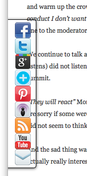
I was reading a quite disturbing article on a misogynistic Dell event by Sophie Catherina Løhr at elektronista.dk.  However, I was finding it frustrating as a line of media icons on the left of the page meant only the top few lines were unobstructed.
I was clearly not the only one with this problem as one of the comments on the page read:

That social media widget on the left made me stop reading an otherwise interesting article. Very irritating.

To be fair on the page designer,  it was just on Firefox that the page rendered like this, on other browsers the left-hand page margin was wider.  Probably Firefox is strictly ‘right’ in a sense as it sticks very close to standards, but whoever is to blame, it is not helpful to readers of the blog.

For those wishing to make cross-browser styles, it is usually possible now-a-days, but you often have to reset everything at the beginning of your style files — even if CSS is standard, default styles are not:

body {
    margin: 0;
    padding 0;
    /*  etc. */
}

Sadly this is just one example of an increasingly common problem.

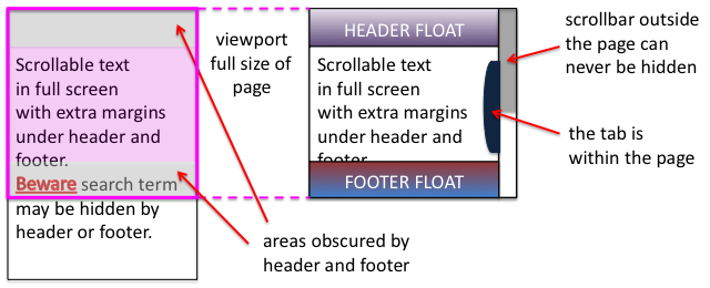
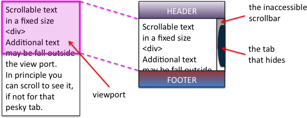
A short while ago I was on a site that had a large right-hand side tab.  I forget the function, maybe for comments, or a table of contents.  The problem was the tab obscured and prevented access to most of the scroll bar making navigation of the middle portion of the page virtually impossible.  Normally it is not possible to obscure the scroll bar as it is ‘outside’ the page. However this site, like many, had chosen to put the main content of the site in a fixed size scrolling <div>.  This meant that the header and footer were always visible, and the content scrolled in the middle.  Of course the scroll bar of the <div> is then part of the page and could be obscured.  I assume it was another cross-browser formatting difference that meant the designer did not notice the problem, or perhaps (not unlikely), only ever tested the style of pages with small amounts of non-scrolling text.

Some sites adopt a different strategy for providing fixed headers.  Rather than putting the main content in a fixed <div>, instead the header and footer are set to float above the main content and margins added to it to mean that the page renders correctly at top and bottom.  This means that the scrollbar for the content is the main scroll bar, and therefore cannot be hidden or otherwise mangled 🙂

Unfortunately, the web page search function does not ‘know’ about these floating elements and so when you type in a search term, will happily scroll the page to ”reveal’ the searched for word, but may do so in a way that it is underneath either header or footer and so invisible.

This is not made easier to deal with in the new MacOS Lion were the line up/down scroll arrows have been removed.  Not only can you not fine-adjust the page to reveal those hidden searched-for terms, but also, whilst reading the page, the page-up/page-down scroll does not ‘know’ about the hidden parts and so scrolls a full screen-sized page missing half the text 🙁

Visibility problems are not confined to the web, there has been a long history of modal dialogue boxes being lost behind other windows (which then often refuse to interact due to the modal dialogue box), windows happily resizing themselves to be partly obscured by the Apple Dock, or even disappearing onto non-existent secondary displays.

It may be that some better model of visibility could be built into both CSS/DOM/JavaScript and desktop window managers.  And it may even be that CSS will fix it’s slightly odd model of floats and layout.  However, I would not want to discourage the use of overlays, transparencies, and other floating elements until this happens.

In the mean time, some thoughts:

  1. restraint — Recall the early days of DTP when every newsletter sported 20 fonts. No self respecting designer would do this now-a-days, so use floats, lightboxes and the like with consideration … and if you must have popups or tabs that open on hover rather than when clicked, do make sure it is possible to move your mouse across the page without it feeling like walking a minefield.
  2. resizing — Do check your page with different window sizes, although desktop screens are now almost all at least 1024 x 768, think laptops and pads, as this is increasingly the major form of access.
  3. defaults — Be aware that, W3C not withstanding, browsers are different.  At very minimum reset all the margins and padding as a first step, so that you are not relying on browser defaults.
  4. testing — Do test (and here I mean technical testing, do user test as well!) with realistic pages, not just a paragraph of lorem ipsum.

And do my sites do this well … ?

With CSS as in all things, with great power …

P.S. Computer scientists will recognise the pun on Dijkstra’s “go to statement considered harmful“, the manifesto of structured programming.  The use of gotos in early programming langauges was incredibly flexible and powerful, but just like CSS with many concomitant potential dangers for the careless or unwary.  Strangely computer scientists have had little worry about other equally powerful yet dangerous techniques, not least macro languages (anyone for a spot of TeX debugging?), and Scheme programmers throw around continuations as if they were tennis balls.  It seemed as though the humble goto became the scapegoat for a discipline’s sins. It was interesting when the goto statement was introduced as a ‘new’ feature in PHP5.3, an otherwise post-goto C-style language; very retro.


image  xkcd.com

The value of networks: mining and building

The value of networks or graphs underlies many of the internet (and for that read global corporate) giants.  Two of the biggest: Google and Facebook harness this in very different ways — mining and building.

Years ago, when I was part of the dot.com startup aQtive, we found there was no effective understanding of internet marketing, and so had to create our own.  Part of this we called ‘market ecology‘.  This basically involved mapping out the relationships of influence between different kinds of people within some domain, and then designing families of products that exploited that structure.

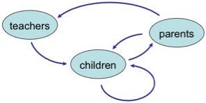
The networks we were looking at were about human relationships: for example teachers who teach children, who have other children as friends and siblings, and who go home to parents.  Effectively we were into (too) early social networking1!

The first element of this was about mining — exploiting the existing network of relationships.

However in our early white papers on the topic, we also noted that the power of internet products was that it was also possible to create new relationships, for example, adding ‘share’ links.  That is building the graph.

The two are not distinct, if one is not able to exploit new relationships within a product it will die, and the mining of existing networks can establish new links (e.g. Twitter suggesting who to follow).  Furthermore, creating of links is rarely ex nihilo, an email ‘share’ link uses an existing relationships (contact in address book), but brings it into a potentially different domain (e.g. bookmarking a web page).

It is interesting to see Google and Facebook against this backdrop.  Their core strengths are in different domains (web information and social relationships), but moreover they focus differently on mining and building.

Google is, par excellence, about mining graphs (the web).  While it has been augmented and modified over the years, the link structure used in PageRank is what made Google great.  Google also mine tacit relationships, for example the use of word collocation to understand concepts and relationships, so in a sense build from what they mine.

Facebook’s power, in contrast, is in the way it is building the social graph as hundreds of millions of people tell it about their own social relationships.  As noted, this is not ex nihilo, the social relationships exist in the real word, but Facebook captures them digitally.  Of course, then Facebook mines this graph in order to derive revenue form advertisements, and (although people debate this) attempt to improve the user experience by ranking posts.

Perhaps the greatest power comes in marrying the two.   Amazon does this to great effect within the world of books and products.

As well as a long-standing academic interest, these issues are particularly germane to my research at Talis where the Education Graph is a core element.  However, they apply equally whether the core network is kite surfers, chess or bio-technology.

Between the two it is probably building that is ultimately most critical.  When one has a graph or network it is possible to find ways to exploit it, but without the network there is nothing to mine. Page and Brin knew this in the early days of their pre-Google project at Stanford, and a major effort was focused on simply gathering the crawl of the web on which they built their algorithms2.  Now Google is aware that, in principle, others can exploit the open resources on which much of its business depends; its strength lies in its intellectual capital. In contrast, with a few geographical exceptions, Facebook is the social graph, far more defensible as Google has discovered as it struggles with Google Plus.

  1. See our retrospective about vfridge  at  last year’s HCI conference and our original web sharer vision.[back]
  2. See the description of this in “In The Plex: How Google Thinks, Works and Shapes Our Lives“.[back]