This third post in my series on the results of REF 2014, the UK periodic research assessment exercise, is still looking at subarea differences. Following posts will look at institutional (new vs old universities) and gender issues.
The last post looked at world rankings based on citations normalised using the REF ‘contextual data’. In this post we’ll look at plain unnormalised data. To some extent this should be ‘unfair’ to more applied areas as citation counts tend to be lower, as one mechanical engineer put it, “applied work doesn’t gather citations, it builds bridges”. However, it is a very direct measure.
The shocking things is that while raw citation measures are likely to bias against applied work, the REF results turn out to be worse.
There were a number of factors that pushed me towards analysing REF results using bibliometrics. One was the fact that HEFCE were using this for comparison between sub-panels, another was that Morris Sloman’s analysis of the computing sub-panel results, used Scopos and Google Scholar citations.
We’ll first look at the two relevant tables in Morris’ slides, one based on Scopos citations:
and one based on Google Scholar citations:
Both tables rank all outputs based on citations, divide these into quartiles, and then look at the percentage of 1*/2*/3*/4* outputs in each quartile. For example, looking at the Scopos table, 53.3% of 4* outputs have citation counts in the top (4th) quartile.
Both tables are roughy clustered towards the diagonal; that is there is an overall correlation between citation and REF score, apparently validating the REF process.
There are, however, also off-diagonal counts. At the top left are outputs that score well in REF, but have low citations. This is be expected; non-article outputs such as books, software, patents may be important but typically attract fewer citations, also good papers may have been published in a poor choice of venue leading to low citations.
More problematic is the lower right, outputs that have high citations, but low REF score. There are occasional reasons why this might be the case, for example, papers that are widely cited for being wrong, however, these cases are rare (I do not recall any in those I assessed). In general this areas represent outputs that the respective communities have judged strong, but the REF panel regard as weak. The numbers need care in interpreting as only there are only around 30% of outputs were scored 1* and 2* combined; however, it still means that around 10% of outputs in the top quartile were scored in the lower two categories and thus would not attract funding.
We cannot produce a table like the above for each sub-area as the individual scores for each output are not available in the public domain, and have been destroyed by HEFCE (for privacy reasons).
However, we can create quartile profiles for each area based on citations, which can then be compared with the REF 1*/2*/3*/4* profiles. These can be found on the results page of my REF analysis micro-site. Like the world rank lists in the previous post, there is a marked difference between the citation quartile profiles for each area and the REF star profiles.
One way to get a handle on the scale of the differences, is to divide the proportion of REF 4* by the proportion of top quartile outputs for each area. Given the proportion of 4* outputs is just over 22% overall, the top quartile results in an area should be a good predictor of the proportion of 4* results in that area.
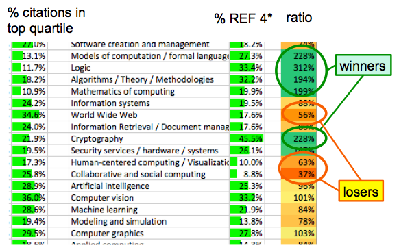
The following shows an extract of the full results spreadsheet:
The left hand column shows the percentage of outputs in the top quartile of citations; the column to the right of the area title is the proportion of REF 4*; and the right hand column is the ratio. The green entries are those where the REF 4* results exceed those you would expect based on citations; the red those that get less REF 4* than would be expected.
While there’re some areas (AI, Vision) for which the citations are an almost perfect predictor, there are others which obtain two to three times more 4*s under REF than one would expect based on their citation scores, ‘the winners’, and some where REF gives two to three times fewer 4*s that would be expected, ‘the losers’. As is evident, the winners are the more formal areas, the losers the more applied and human centric areas. Remember again that if anything one would expect the citation measures to favour more theoretical areas, which makes this difference more shocking.
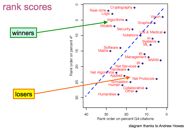
Andrew Howes replicated the citation analysis independently using R and produced the following graphic, which makes the differences very clear.
The vertical axis has areas ranked by proportion of REF 4*, higher up means more highly rated by REF. the horizontal axis shows areas ranked by proportion of citations in top quartile. If REF scores were roughly in line with citation measures, one would expect the points to lie close to the line of equal ranks; instead the areas are scattered widely.
That is, there seems little if any relation between quality as measured externally by citations and the quality measures of REF.
The contrast with the tables at the top of this post is dramatic. If you look at outputs as a whole, there is a reasonable correspondence, outputs that rank higher in terms officiations, rank higher in REF star score, apparently validating the REF results. However, when we compare areas, this correspondence disappears. This apparent contradiction is probably due to the correlation being very strong within area, just that the areas themselves are scattered.
Looking at Andrew’s graph, it is clear that it is not a random scatter, but systematic; the winners are precisely the theoretical areas, and the losers the applied and human centred areas.
Not only is the bias against applied areas critical for the individuals and research groups affected, but it has the potential to skew the future of UK computing. Institutions with more applied work will be disadvantaged, and based on the REF results it is clear that institutions are already skewing their recruitment policies to match the areas which are likely to give them better scores in the next exercise.
The economic future of the country is likely to become increasingly interwoven with digital developments and related creative industries and computing research is funded more generously than areas such as mathematics, precisely because it is expected to contribute to this development — or as a buzzword ‘impact’. However, the funding under REF within computing is precisely weighted against the very areas that are likely to contribute to digital and creative industries.
Unless there is rapid action the impact of REF2014 may well be to destroy the UK’s research base in the areas essential for its digital future, and ultimately weaken the economic life of the country as a whole.


Pingback: REF Redux 6 — Reasons and Remedies | Alan Dix