The seeing coat – y gôt gwylio

(N.B. strictly the ‘watching coat’)

Dw i’n dysgu Cymraeg …
I am learning Welsh …
felly, dw i’n gwneud llawer o camsyniad.
so I make lots of mistakes.

Neithiwr, ro’n i eisiau dweud “côt gwisgo” …
Last night I wanted to say “dressing gown” …
ond yn wir,  dwedais i “côt gwylio”.
but really, I said “watching coat”.

Yn fy nghwrs creadigrwydd, dw I’n dweud …
In my creativity course I say …
“camsyniad yw cyfle”
“a mistake is an opportunity”

Felly, y bore ‘ma ro’n i’n meddwl ..
So, this morning I thought …
‘Sai côt gwylio gyda fi …
If I had a seeing coat …

Taswn i’n edrych ar y coed,
If I were to look at the trees,
Baswn i’n gweld pob un goeden, pob boncyff, cangen, brigyn, a dailen,
I would see each tree, each trunk, branch, twig and leaf.

Taswn i’n edrych ar blodyn,
If I were to look at a flower,
Baswn i’n gweld petlau ac llwch pail, un gwenyn yn yfed.
I would see petals and pollen dust, a single bee drinking.

Taswn i’n edrych ar y pobl yn y stryd,
If I were to look at the people in the street,
Baswn i’n gweld tad, merch, ffrind a diethryn, yn hapus a thrist, yn gyffrous, yn hiraethu
I would see father, daughter, friend and stranger, happy and sad, excited, longing
Dim pobl, ond pob un ohonynt yn berson unigryw.
Not people, but each one of them a person, unique.

Taswn i’n edrych i’r awyr,
If I were to look to the sky,
Baswn i’n gweld pob un gwmwl ac aderyn, ac y tu hwnt i’r awyr
I would see each cloud and bird, and beyond the sky
Yr wybren wedi’i phaentio i mewn mil o liwiau o glas.
The firmament painted in a thousand colours of blue.

Ond yn wir, nid oes eisiau “cot gwylio” arnaf i,
But really, I do not need a “seeing coat”
y cyfan sydd ei angen yw edrych.
all that is needed is to look.

Free AI book and a new one coming …

Yes a new AI book is coming … but until then you can download the first edition for FREE 🙂

Many years ago Janet Finlay and I wrote a small introduction to artificial intelligence.  At the time there were several Bible-sized tomes … some of which are still the standard textbooks today.  However, Janet was teaching a masters conversion course and found that none of these books were suitable for taking the first steps on an AI journey, especially for those coming from non-computing disciplines.
Over the years it faded to the back of our memories, with the brief exception of the time when, after we’d nearly forgotten it, CRC Press issued a Japanese translation.  Once or twice the thought of doing an update arose, but quickly passed.  This was partly because our main foci were elsewhere, but also, at the danger of insulting all my core-AI friends, not much changed in core AI for many years!

Coming soon … Second Edition

Of course over recent years things have changed dramatically, hence my decision, nearly 25 years on, to create a new edition maintaining the aim to give a rich but accessible introduction, but capturing some of the recent trends and giving these a practical and human edge.  Following the T-model of teaching, I’d like to help both newcomer and expert gain a broad perspective of the issues and landscape, whilst giving enough detail for those that want to delve into a more specific area.

A Free Book and New Resources

In the mean time the publisher, Taylor & Francis/CRC has agreed to make the PDF of the first edition available free of charge  I have updated some of the code examples from the first edition and will be incrementally adding new material to the second edition micro-site including slides, cases studies, video and interactive materials.  If you’d like to teach using this please let me know your views on the topics and also if there are areas where you’d like me to create preliminary material with greater urgency.  I won’t promise to be able to satisfy everyone, but can use this to adjust my priorities.

Why now?

The first phase of change in AI was driven by the rise of big data and the increasing use of forms of machine learning to drive adverts, search results and social media.  Within user interface design, many of the fine details of colour choices and screen layout are now performed using A–B testing …sight variants of interfaces delivered to millions of people – shallow, without understanding and arguably little more than bean counting, but in numerous areas vast data volume has been found to be ‘unreasonably effective‘ at solving problems that were previously seen to be the remit of deep AI.

In the last few years deep learning has taken over as the driver of AI research and often also media hype.  Here it has been the sheer power of computation, partly due to Moores’ Law with computation nearly a million times faster than it was when that first edition was written nearly 25 years ago.  However, it has also been enabled by cloud computing allowing large numbers of computers ti efficiently attack a single problem.  Algorithms that might have been conceived of but dismissed as impractical in the past have become commonplace.

Alongside this has been a dark side of AI, from automated weapons and mass surveillance, to election rigging and the insidious knowledge that large corporations have gathered through our day-to-day web interactions.  In the early 1990s I warned of the potential danger of ethnic and gender bias in black-box machine learning and I’ve returned to this issue more recently as those early predictions have come to pass.

Across the world there are new courses running or being planned and people who want to know more.  In Swansea we have a PhD programme on people-first AI/big data, and there is currently a SIGCHIItaly workshop call out for Teaching HCI for AI: Co-design of a Syllabus. There are several substantial textbooks that offer copious technical detail, but can be inaccessible for the newcomer or those coming from other disciplines.  There are also a number of excellent books that deal with the social and human impact of AI, but without talking about how it works.

I hope to be able to build upon the foundations that Janet and I established all those years ago to create something that fills a crucial gap: giving a human-edge to those learning artificial intelligence from a computing background and offering an accessible technical introduction for those approaching the topic from other disciplines.


Meta-tags made easy

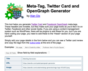
I wanted to add OpenGraph/Twitter Card meta-tags to a few static web pages.  It would have easily taken 5-10 minutes each, which seemed tedious, so I took … well let’s say a little longer (!) … and made a general purpose online tool for creating the markup.

If you want your web pages to look good when shared on Twitter and Facebook, it is important to have the right meta tags in the <head> section of the page.  However, as these are invisible it is easy to forget.

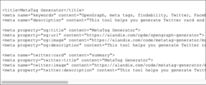
It is not that complicated to do, copying your page title and description into a few different meta tags.  The bit I find hardest is remembering (well looking up, no way I’d remember), which of the meta tags are name–content ones and which are property–content ones … I’m sure there is a logical explanation …

The tool allows you to enter the details of your page in a web form and then dynamically creates a preview of the Twitter Card and, most important, generates the meta tags to copy into your web page <head> section.

I’d come across JsViews/JsRender recently, which is used in several Microsoft products.  It is similar to Angular (from Google stable) in that it allows you to create two-way templates, dynamically binding data to HTML content.  My colleagues when i was at Talis used Angular and I’ve used it myself for one project, but I found it hard to adapt when what I wanted didn’t quite fit its model … although, to be fair, I do tend to use everything to breaking point!

JsViews is closely aligned to jQuery, which I use pretty much everywhere, so it seemed sensible to have a go at using JsViews for this micro-project as this was essentially a single page web page with no backend.  So far so good with JsViews; although, again to be fair, this was a lot easier than what I’d been doing with Angular.

I provided a few click-to-see examples using my own pages and of course an obvious example was the page of the online tool itself … only no image. I did emphasise in the tool how useful it is to have a good image for social media sharing, and the Twitter Card looked a bit boring.

So the fastest logo ever (thanks to Wikimedia and OpenGraph for the building blocks!