A story, a bit of a moan … and then I hope some constructive ideas .
It is time for the University annual report, which includes a list of all publications across the University. In previous years this was an easy job. I keep an up-to-date web page with all my publications for each year, so I simply gave our secretaries a link to the web publication list, they cut and paste it into Word, tidied the format a little … and job done. However, this year things are different … a short while ago the department installed an EPrints server. This year the department is making its submission to the University by downloading from the EPrints server, which means we have to upload to it :-/
The citation adding page runs to several screen fulls including breaking author names down into surname forename … the thought of that was somewhat daunting.
Fortunately you can import into EPrints from BibTeX and EndNote bibliographies … unfortunately mine is in plain HTML 🙁
Now the 10 million AKT project that Southampton was a lead partner in developed a free text bibliography server … but, unfortunately, not included in EPrints 🙁
So a few regular expression substitutions and a lot of hand edits later and I convert my 2007 pub list into BibTeX (actually couple of hours in total including ‘bug fixing’ syntax errors in the BibTeX).
Then upload the clean .bib file … beautiful – I get a list of all the uploaded items … but they are my ‘user workspace’ and not properly deposited. This I have to do one-by-one and not allowed to do so until I have filled in various additional fields, scattered liberally over several forms including one form for adding subjects that requires several clicks to open up a lovely tree browser that in the end has only 2 leaves.
Now after grouching the lessons.
There seems to be a few key problems:
(1) First the standard usability issues: the inclusion pages are oriented around the data in the system not the user, there are no shortcuts for previously entered authors, etc.
(2) The system will not allow data to be entered if it is not complete. Of course the institution wants full data (e.g. whether it is refereed, etc.), but making it difficult to enter data makes it likely that user will not bother. That is the alternative to perfect data may be no data!
(3) The interface to enter and edit is fine for a small number of entries, but becomes a pain when processing a complete publication list. Contrarily, the page for setting the subject categories is designed for handling large trees of categories but does not gracefully handle a small number.
Both (2) and (3) are also common problems, but not so well considred in usability iterature.
A useful inofmration systems heuristic that I often advocate is
“don’t enforce consistency, but highlight inconsistency”
In this case why not allow me to deposit incomplete records and then leave me a ‘to do list’ page … yes and maybe even badger me periodically with automatic emails to check it.
Anther maxim that applies to (2) is:
“Make it easy for the user to do what you want”
If you want people to upload references make it as easy as possible to do so. Now I’m sure the designers intend this to be the case, but it is easy sometimes to focus on usability of individual screens and interactions rather than the wider context.
In fact, this was the second time that I was faced with problem (3) today. Fiona had accidentally double clicked a large number of archived files when she was trying to drag them to Trash. She had to kill the application as it blindly started to open dozens of files (why not ask?). However, it was clearly coded resiliently and kept backup copies of the files it had started to open, so, when she tried to re-open it, InDesign started to ask her whether she wanted to recover the files … but did so one-by-one and wouldn’t let her do anything else until she had laboriously answered every dialogue box.
In this case the solution is fairly obvious, if there are many (or even ore than one) files to be recovered why not list them and aks about them all, perhaps with check boxes so you can recover some but not others. In general tabular or list-style views tend to work better with large numbers of items, allowing you to perform edits to many items in a single transaction.
Similarly in EPrints, after the import there were just a few fields required for each entry, some form of tabular view would have allowed me to scan down the link and select ‘refereed/not refereed’ for each entry.
With the subject categories, it was in a sense the opposite problem, but a symptom of the way we, as designers, often have some idea in out heads about how large a particular set is likely to be and then design around that idea. However, if you can notice this tendency one can often produce variant interaction styles depending on the size of the set. For example, in web-based systems to browse hierarchies I have often (but not always!) added code that effectively says, “if the number of entries at this level is not to great, then show this level as headings with the next level as well.”
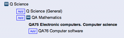
fully expanded EPrints subjects menu
The EPrints server clearly expects that the subject tree will be far bigger, as it would be on a University-wide installation. Although even if the list is very large the number of items used by an individual would be small.
So as general design advice, if there is some form of collection:
- are there any absolute lower or upper bounds on the size?
- check, within these absolute bounds, what the interface would be like with 1, 3, 10, 100, 1000 in the collection
- if the potential collection is large, is the likely size needed for a particular usre, situation, smaller?
To be fair I am an unusual user with my pretty complete HTML publication lists, if I had no systematic way of keeping my own publications then I would appreciate EPrints more. However, there will be many with word processor lists, so maybe I’m not so unusual. I assume other people just knuckle down and get on with it. So the real problem is that I am impatient user!
Which brings us to the last and most valuable piece of advice. When it comes to ussr testing cussed users are worth their weight in gold. Users that are too nice are useless,; they cope, they manage and would hate to hurt your feelings by telling you your system is not perfect. So find the nasty users, the impatient users, the ones who complain at the slightest things … they are true treasure.