Language and Action: sequential associative parsing

In explaining how to make sentences more readable (I know I am one to talk!), I frequently explain to students that language understanding is a combination of a schema-based syntactic structure with more sequential associative reading.  Only recently I realised this was also the way we had been addressing the issue of task sequence inference in the TIM project. and is related also to the way we interpret action in the real world.

Continue reading

tech talks: brains, time and no time

Just scanning a few Google Tech Talks on YouTube.  I don’t visit it often, but followed a link from Rob Style‘s twitter.  I find the video’s a bit slow, so tend to flick through with the sound off, really wishing they had fast forward buttons like a DVD as quite hard to pull the little slider back and forth.

One talk was by Stuart Hameroff on A New Marriage of Brain and Computer.  He is the guy that works with Penrose on the possibility that quantum effects in microtubules may be the source of consciousness.  I notice that he used calculations for computational capacity based on traditional neuron-based models that are very similar to my own calculations some years ago in “the brain and the web” when I worked out that the memory and computational capacity of a single human brain is very similar to those of the entire web. Hameroff then went on to say that there are an order of magnitude more microtubules (sub-cellular structures, with many per neuron), so the traditional calculations do not hold!

Microtubules are fascinating things, they are like little mechano sets inside each cell.  It is these microtubules that during cell division stretch out straight the chromosomes, which are normally tangled up the nucleus.  Even stranger those fluid  movements of amoeba gradually pushing out pseudopodia, are actually made by mechanical structures composed of microtubules, only looking so organic because of the cell membrane – rather like a robot covered in latex.

pictire of amoeba

The main reason for going to the text talks was one by Steve Souders “Life’s Too Short – Write Fast Code” that has lots of tips for on speeding up web pages including allowing Javascript files to download in parallel.  I was particularly impressed by the quantification of costs of delays on web pages down to 100ms!

This is great.  Partly because of my long interest in time and delays in HCI. Partly because I want my own web scripts to be faster and I’ve already downloaded the Yahoo! YSlow plugin for FireFox that helps diagnose causes of slow pages.  And partly  because I get so frustrated waiting for things to happen, both on the web and on the desktop … and why oh why does it take a good minute to get a WiFi connection ….  and why doesn’t YouTube introduce better controls for skimming videos.

… and finally, because I’d already spent too much time skimming the tech talks, I looked at one last talk: David Levy, “No Time To Think” … how we are all so rushed that we have no time to really think about problems, not to mention life1.  At least that’s what I think it said, because I skimmed it rather fast.

  1. see also my own discussion of Slow Time[back]

the ordinary and the normal

I am reading Michel de Certeau’s “The Practice of Everyday Life“.  The first chapter begins:

The Practice of Everyday Life (cover image)The erosion and denigration of the singular or the extraordinary was announced by The Man Without Qualities1: “…a heroism but enormous and collective, in the model of ants” And indeed the advent of the anthill society began with the masses, … The tide rose. Next it reached the managers … and finally it invaded the liberal professions that thought themselves protected against it, including even men of letters and artists.”

Now I have always hated the word ‘normal’, although loved the ‘ordinary’.  This sounds contradictory as they mean almost the same, but the words carry such different connotations. If you are not normal you are ‘subnormal’ or ‘abnormal’, either lacking in something or perverted.  To be normal is to be normalised, to be part of the crowd, to obey the norms, but to be distinctive or different is wrong.  Normal is fundamentally fascist.

In contrast the ordinary does not carry the same value judgement.  To be different from ordinary is to be extra-ordinary2, not sub-ordinary or ab-ordinary.  Ordinariness does not condemn otherness.

Certeau is studying the everyday.  The quote is ultimately about the apparently relentless rise of the normal over the ordinary, whereas Certeau revels in  the small ways ordinary people subvert norms and create places within the interstices of the normal.

The more I study the ordinary, the mundane, the quotidian, the more I discover how extraordinary is the everyday3. Both the ethnographer and the comedian are expert at making strange, taking up the things that are taken for granted and holding them for us to see, as if for the first time. Walk down an anodyne (normalised) shopping street, and then look up from the facsimile store fronts and suddenly cloned city centres become architecturally unique.  Then look through the crowd and amongst the myriad incidents and lives around, see one at a time, each different.

Sometimes it seems as if the world conspires to remove this individuality. The InfoLab21 building that houses the Computing Dept. at Lancaster was sort listed for a people-centric design award of ‘best corporate workspace‘.  Before the judging we had to remove any notices from doors or any other sign that the building was occupied, nothing individual, nothing ordinary, sanitised, normalised.

However, all is not lost.  I was really pleased the other day to see a paper  “Making Place for Clutter and Other Ideas of Home4. Laural, Alex and Richard are looking at the way people manage the clutter in their homes: keys in bowls to keep them safe, or bowls on a worktop ready to be used.  They are looking at the real lives of ordinary people, not the normalised homes of design magazines, where no half-drunk coffee cup graces the coffee table, nor the high-tech smart homes where misplaced papers will confuse the sensors.

Like Fariza’s work on designing for one person5, “Making a Place for Clutter” is focused on single case studies not broad surveys.  It is not that the data one gets from broader surveys and statistics is not important (I am a mathematician and a statistician!), but read without care the numbers can obscure the individual and devalue the unique.  I heard once that Stalin said, “a million dead in Siberia is a statistic, but one old woman killed crossing the road is a national disaster”. The problem is that he could not see that each of the million was one person too. “Aren’t two sparrows sold for only a penny? But your Father knows when any one of them falls to the ground.”6.

We are ordinary and we are special.

  1. The Man without Qualities, Robert Musil, 1930-42, originally: Der Mann ohne Eigenschafte. Picador Edition 1997, Trans.  Sophie Wilkins and  Burton Pike: Amazon | Wikipedia[back]
  2. Sometimes ‘extraordinary’ may be ‘better than’, but more often simply ‘different from’, literally the Latin ‘extra’ = ‘outside of’[back]
  3. as in my post about the dinosaur joke![back]
  4. Swan, L., Taylor, A. S., and Harper, R. 2008. Making place for clutter and other ideas of home. ACM Trans. Comput.-Hum. Interact. 15, 2 (Jul. 2008), 1-24. DOI= http://doi.acm.org/10.1145/1375761.1375764[back]
  5. Described in Fariza’s thesis: Single Person Study: Methodological Issues and in the notes of my SIGCHI Ireland Inaugural Lecture Human-Computer Interaction in the early 21st century: a stable discipline, a nascent science, and the growth of the long tail.[back]
  6. Matthew 10:29[back]

Touching Technology

I’ve given a number of talks over recent months on aspects of physicality, twice during winter schools in Switzerland and India that I blogged about (From Anzere in the Alps to the Taj Bangelore in two weeks) a month or so back, and twice during my visit to Athens and Tripolis a few weeks ago.

I have finished writing up the notes of the talks as “Touching Technology: taking the physical world seriously in digital design“.  The notes  are partly a summary of material presented in previous papers and also some new material.  Here is the abstract:

Although we live in an increasingly digital world, our bodies and minds are designed to interact with the physical. When designing purely physical artefacts we do not need to understand how their physicality makes them work – they simply have it. However, as we design hybrid physical/digital products, we must now understand what we lose or confuse by the added digitality. With two and half millennia of philosophical ponderings since Plato and Aristotle, several hundred years of modern science, and perhaps one hundred and fifty years of near modern engineering – surely we know sufficient about the physical for ordinary product design? While this may be true of the physical properties themselves, it is not the fact for the way people interact with and rely on those properties. It is only when the nature of physicality is perturbed by the unusual and, in particular the digital, that it becomes clear what is and is not central to our understanding of the world. This talk discusses some of the obvious and not so obvious properties that make physical objects different from digital ones. We see how we can model the physical aspects of devices and how these interact with digital functionality.

After finishing typing up the notes I realised I have become worryingly scholarly – 59 references and it is just notes of the talk!

Alan looking scholarly

Alan looking scholarly

Some lessons in extended interaction, courtesy Adobe

I use various Adobe products, especially Dreamweaver and want to get the newest version of Creative Suite.  This is not cheap, even at academic prices, so you might think Adobe would want to make it easy to buy their products, but life on the web is never that simple!

As you can guess a number of problems ensued, some easily fixable, some demonstrating why effective interaction design is not trivial and apparently good choices can lead to disaster.

There is a common thread.  Most usability is focused on the time we are actively using a system – yes obvious – however, most of the problems I faced were about the extended use of the system, the way individual periods of use link together.  Issues of long-term interaction have been an interest of mine for many years1 and have recently come to the fore in work with Haliyana, Corina and others on social networking sites and the nature of ‘extended episodic experience’.  However, there is relatively little in the research literature or practical guidelines on such extended interaction, so problems are perhaps to be expected.

First the good bit – the Creative ‘Suite’  includes various individual Adobe products and there are several variants Design/Web, Standard/Premium, however there is a great page comparing them all … I was able to choose which version I needed, go to the academic purchase page, and then send a link to the research administrator at Lancaster so she could order it.  So far so good, 10 out of 10 for Adobe …

To purchase as an academic you quite reasonably have to send proof of academic status.  In the past a letter from the dept. on headed paper was deemed sufficient, but now they ask for a photo ID.  I am still not sure why this is need, I wasn’t going in in person, so how could a photo ID help?  My only photo ID is my passport and with security issues and identity theft constantly in the news, I was reluctant to send a fax of that (do US homeland security know that Adobe, a US company, are demanding this and thus weakening border controls?).

After double checking all the information and FAQs in the site, I decided to contact customer support …

Phase 1 customer support

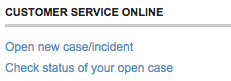
The site had a “contact us” page and under “Customer service online”, there is an option “Open new case/incident”:

… not exactly everyday language, but I guessed this meant “send us a message” and proceeded. After a few more steps, I got to the enquiry web form and asked whether there was an alternative, or if I sent fax of the passport whether I could blot out the passport number and submitted the form.

Problem 1: The confirmation page did not say what would happen next.  In fact they send an email when the query is answered, but as I did not know that, so I had to periodically check the site during the rest of the day and the following morning.

Lesson 1: Interactions often include ‘breaks’, when things happen over a longer period.  When there is a ‘beak’ in interaction, explain the process.

Lesson 1 can be seen as a long-term equivalent of standard usability principles to offer feedback, or in Nielsen’s Heuristics “Visibility of system status”, but this design advice is normally taken to refer to immediate interactions and what has already happened, not about what will happen in the longer term.  Even principles of ‘predictability’ are normally phrased in knowing what I can do to the system and how it will respond to my actions, but not formulated clearly for when the system takes autonomous action.

In terms of status-event analysis, they quite correctly gave me an generated an interaction event for me (the mail arriving) to notify me of the change of status of my ‘case’.  It was just that the hadn’t explained that is what they were going to do.

Anyway the next day the email arrived …

Problem 2: The mail’s subject was “Your customer support case has been closed”.  Within the mail there was no indication that the enquiry had actually been answered (it had), nor a link to the the location on the site to view the ‘case’ (I had to login and navigate to it by hand), just a general link to the customer ‘support’ portal and a survey to convey my satisfaction with the service (!).

Lesson 2.1: The email is part of the interaction. So apply ‘normal’ interaction design principles, such as Nielsen’s “speak the users’ language” – in this case “case has been closed” does not convey that it has been dealt with, but sounds more like it has been ignored.

Lesson 2.2: Give clear information in the email – don’t demand a visit to the site. The eventual response to my ‘case’ on the web site was entirely textual, so why not simply include it in the email?  In fact, the email included a PDF attachment, that started off identical to the email body and so I assumed was a copy of the same information … but turned out to have the response in it.  So they had given the information, just not told me they had!

Lesson 2.3: Except where there is a security risk – give direct links not generic ones. The email could easily have included a direct link to my ‘case’ on the web site, instead I had to navigate to it.  Furthermore the link could have included an authentication key so that I wouldn’t have to look up my Adobe user name and password (I of course needed to create a web site login in order to do a query).

In fact there are sometimes genuine security reasons for sometimes NOT doing this.  One is if you are uncertain of the security of the email system or recipient address, but in this case Adobe are happy to send login details by email, so clearly trust the recipient. Another is to avoid establishing user behaviours that are vulnerable to ‘fishing’ attacks.  In fact I get annoyed when banks send me emails with direct links to their site (some still do!), rather than asking you to visit the site and navigate, if users get used to navigating using email links then entering login credentials this is an easy way for malicious emails to harvest personal details. Again in this case Adobe had other URLs in the email, so this was not their reason.  However, if they had been …

Lesson 2.4: If you are worried about security of the channel, give clear instructions on how to navigate the site instead of a link.

Lesson 2.5: If you wish to avoid behaviour liable to fishing, do not include direct links to your site in emails.  However, do give the user a fast-access reference number to cut-and-paste into the site once they have navigated to the site manually.

Lesson 2.6: As a more general lesson understand security and privacy risks.  Often systems demand security procedures that are unnecessary (forcing me to re-authenticate), but omit the ones that are really important (making me send a fax of my passport).

Eventually I re-navigate the Adobe site and find the details of my ‘case’ (which was also in the PDF in the email if I had realised).

Problem 3: The ‘answer’ to my query was a few sections cut-and-pasted from the academic purchase FAQ … which I had already read before making the enquiry.  In particular it did not answer my specific question even to say “no”.

Lesson 3.1: The FAQ sections could easily have been identified automatically the day before. If there is going to be  delay in human response, where possible offer an immediate automatic response. If this includes a means to say whether this has answered the query, then human response may not be needed (saving money!) or at least take into account what the user already knows.

Lesson 3.2: For human interactions – read what the user has said. Seems like basic customer service … This is a training issue for human operators, but reminds us that:

Lesson 3.3: People are part of the system too.

Lesson 3.4: Do not ‘close down’ an interaction until the user says they are satisfied. Again basic customer service, but whereas 3.2 is a human training issue, this is about the design of the information system: the user needs some way to say whether or not the answer is sufficient.  In this case, the only way to re-open the case is to ring a full-cost telephone support line.

Phase 2 customer feedback survey

As I mentioned, the email also had a link to a web survey:

In an effort to constantly improve service to our customers, we would be very
interested in hearing from you regarding our performance.  Would you be so
kind to take a few minutes to complete our survey?   If so, please click here:

Yes I did want to give Adobe feedback on their customer service! So I clicked the link and was taken to a personalised web survey.  I say ‘personalised’ in that the link included a reference to the customer support case number, but thereafter the form was completely standard  and had numerous multi-choice questions completely irrelevant to an academic order.  I lost count of the pages, each with dozens of tick boxes, I think around 10, but may have been more … and certainly felt like more.  Only on the last page was there a free-text area where I could say what was the real problem. I only persevered because I was already so frustrated … and was more so by the time I got to the end of the survey.

Problem 4: Lengthy and largely irrelevant feedback form.

Lesson 4.1: Adapt surveys to the user, don’t expect the user to adapt to the survey! The ‘case’ originated in the education part of the web site, the selections I made when creating the ‘case’ narrowed this down further to a purchasing enquiry; it would be so easy to remove many of the questions based on this. Actually if the form had even said in text “if your support query was about X, please answer …” I could then have known what to skip!

Lesson 4.2: Make surveys easy for the user to complete: limit length and offer fast paths. If a student came to me with a questionnaire or survey that long I would tell them to think again.  If you want someone to complete a form it has to be easy to do so – by all means have longer sections so long as the user can skip them and get to the core issues. I guess cynically making customer surveys difficult may reduce the number of recorded complaints 😉

Phase 3 the order arrives

Back to the story: the customer support answer told me no more than I knew before, but I decided to risk faxing the passport (with the passport number obscured) as my photo ID, and (after some additional phone calls by the research administrator at Lancaster!), the order was placed and accepted.

When I got back home on Friday, the box from Adobe was waiting 🙂

I opened the plastic shrink-wrap … and only then noticed that on the box it said “Windows” 🙁

I had sent the research adminstrator a link to the product, so had I accidentally sent a link to the Windows version rather than the Mac one?  Or was there a point later in the purchasing dialogue where she had had to say which OS was required and not realised I used a Mac?

I went back to my mail to her and clicked the link:

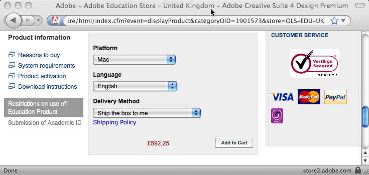
The “Platform” field clearly says “Mac”, but it is actually a selection field:

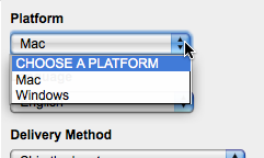
It seemed odd that the default value was “Mac” … why not “CHOOSE A PLATFORM”, I wondered if it was remembering a previous selection I had made, so tried the URL in Safari … and it looked the same.

… then I realised!

The web form was being ‘intelligent’ and had detected that I was on a Mac and so set the field to “Mac”.  I then sent the URL to the research administrator and on her Windows machine it will have defaulted to “Windows”.  She quite sensibly assumed that the URL I sent her was for the product I wanted and ordered it.

In fact offering smart defaults is  good web design advice, so what went wrong here?

Problem 5: What I saw and what the research administrator saw were different, leading to ordering the wrong product.

Lesson 5.1: Defaults are also dangerous. If there are defaults the user will probably agree to them without realising there was a choice.  We are talking about a £600 product here, that is a lot of room for error.  For very costly decisions, this may mean not having defaults and forcing the user to choose, but maybe making it easy to choose the default (e.g. putting default at top of a menu).

Lesson 5.2: If we decide the advantages of the default outweigh the disadvantages then we need to make defaulted information obvious (e.g. highlight, special colour) and possibly warn the user (one of those annoying “did you really mean” dialogue boxes! … but hey for £600 may be worth it).  In the case of an e-commerce system we could even track this through the system and keep inferred information highlighted (unless explicitly confirmed) all the way through to the final order form. Leading to …

Lesson 5.3: Retain provenance.  Automatic defaults are relatively simple ‘intelligence’, but as more forms of intelligent interaction emerge it will become more and more important to retain the provenance of information – what came explicitly from the user, what was inferred and how.  Neither current database systems nor emerging semantic web infrastructure make this easy to achieve internally, so new information architectures are essential.  Even if we retain this information, we do not yet fully understand the interaction and presentation mechanisms needed for effective user interaction with inferred information, as this story demonstrates!

Lesson 5.4: The URL is part of the interaction2.  I mailed a URL believing it would be interpreted the same everywhere, but in fact its meaning was relative to context.  This can be problematic even for ‘obviously’ personalised pages like a Facebook home page which always comes out as your own home page, so looks different.  However, it is essential when someone might want to bookmark, or mail the link.

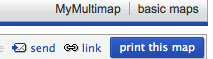
This last point has always been one of the problems with framed sites and is getting more problematic with AJAX.  Ideally when dynamic content changes on the web page the URL should change to reflect it.  I had mistakenly thought this impossible without forcing a page reload, until I noticed that the multimap site does this.

The map location at the end of the URL changes as you move around the map.  It took me still longer to work out that this is accomplished because changing the part of the URL after the hash (sometimes called the ‘fragment’ and accessed in Javascript via location.hash) does not force a page reload.

If this is too complicated then it is relatively easy to use Javascript to update some sort of “use this link” or “link to this page” both for frame-based sites or those using web form elements or even AJAX. In fact, multimap does this as well!

Lesson 5.5: When you have dynamic page content update the URL or provide a “link to this page” URL.

Extended interaction

Some of these problems should have been picked up by normal usability testing. It is reasonable to expect problems with individual web sites or low-budget sites of small companies or charities.  However, large corporate sites like Adobe or central government have large budgets and a major impact on many people.  It amazes and appals me how often even the simplest things are done so sloppily.

However, as mentioned at the beginning, many of the problems and lessons above are about extended interaction: multiple visits to the site, emails between the site and the customer, and emails between individuals.  None of my interactions with the site were unusual or complex, and yet there seems to be a systematic lack of comprehension of this longer-term picture of usability.

As noted also at the beginning, this is partly because there is scant design advice on such interactions.  Norman has discussed “activity centred design“, but he still focuses on the multiple interactions within a single session with an application.  Activity theory takes a broader and longer-term view, but tends to focus more on the social and organisational context whereas the story here shows there is also a need for detailed interaction design advice.  The work I mentioned with Haliyana and Corina has been about the experiential aspects of extended interaction, but the problems on the Adobe were largely at a functional level (I never got so far as appreciating an ‘experience’ except a bad one!). So there is clearly much more work to be done here … any budding PhD students looking for a topic?

However, as with many things, once one thinks about the issue, some strategies for effective design start to become obvious.

So as a last lesson:

Overall Lesson: Think about extended interaction.

[ See HCI Book site for other ‘War Stories‘ of problems with popular products. ]

  1. My earliest substantive work on long-term interaction was papers at HCI 1992 and 1994 on”Pace and interaction” and “Que sera sera – The problem of the future perfect in open and cooperative systems“, mostly focused on communication and work flows.  The best summative work on this strand is in a 1998  journal paper “Interaction in the Large” and a more recent book chapter “Trigger Analysis – understanding broken tasks“[back]
  2. This is of course hardly new, although neither address the particular problems here, see Nielsen’s “URL as UI” and James Gardner’s “Best Practice for Good URL Structures” for expostions of the general principle. Many sites still violate even simple design advice like W3C’s “Cool URIs don’t change“.  For example, even the BCS’ eWIC series of electronic proceedings, have URLs of the form “www.bcs.org/server.php?show=nav.10270“; it is hard to believe that “show=nav.10270” will persist beyond the next web site upgrade 🙁 [back]

persistent URLs … pleeeease

I was just clicking through a link from my own 2000 publication list to an ACM paper1, and the link is broken!  So what is new, the web is full of broken links … but I hate to find one on my own site.  The URL appears to be one that is semantic (not one of those CMS “?nodeid=3179” web pages):

http://www.acm.org/pubs/citations/journals/tochi/2000-7-3/p285-dix/

At the time I used the link it was valid;  however, the ACM have clearly changed their structure, as this kind of material is all now in the ACM digital library, but they did not leave permanent redirects in place.  This would be forgiveable if the URL were for a transient news item, but TOCHI is intended to be an archival publication … and yet the URL is not regarded as persistent!  If ACM, probably the largest professional computing organisation in the world, cannot get this right, what hope for any of us.

I will fix the link, and now-a-days tend to use ACM’s DOI link as this is likely to be more persistent, however I can do this only because it is my own site.

So, if you are updating a site structure yourself ..  please, Please, PLeeeeEASE make sure you keep all those old links alive2!

  1. BTW the paper is:

    Dix, A., Rodden, T., Davies, N., Trevor, J., Friday, A., and Palfreyman, K. 2000. Exploiting space and location as a design framework for interactive mobile systems. ACM Trans. Comput.-Hum. Interact. 7, 3 (Sep. 2000), 285-321. DOI= http://doi.acm.org/10.1145/355324.355325

    and it is all about physical and virtual location … hmmm[back]

  2. For the ACM or other large sites this would be done using some data-driven approach, but if you are simply restructring your own site and you are using an Apache web server, just add a .htaccess file to your web and add Redirect directives in it mapping old URls to new ones. For example, for the paper on the ACM site:

    Redirect /pubs/citations/journals/tochi/2000-7-3/p285-dix/ http://doi.acm.org/10.1145/355324.355325

    [back]

making life easier – quick filing in visible folders

It is one of those things that has bugged me for years … and if it was right I would probably not even notice it was there – such is the nature of good design, but …  when I am saving a file from an application and I already have a folder window open, why is it not easier to select the open folder as the destination.

A scenario: I have just been writing a reference for a student and have a folder for the references open on my desktop. I select “Save As …” from the Word menu and get a file selection dialogue, but I have to navigate through my hard disk to find the folder even though I can see it right in front of me (and I have over 11000 folders, so it does get annoying).

The solution to this is easy, some sort of virtual folder at the top level of the file tree labelled “Open Folders …” that contains a list of the curently open folder windows in the finder.  Indeed for years I instinctively clicked on the ‘Desktop’ folder expecting this to contain the open windows, but of course this just refers to the various aliases and files permamently on the desktop background, not the open windows I can see in front of me.

In fact as Mac OSX is built on top of UNIX there is an easy very UNIX-ish fix (or maybe hack), the Finder could simply maintain an actual folder (probably on the desktop) called “Finder Folders” and add aliases to folders as you navigate.  Although less in the spirit of Windows, this would certainly be possible there too and of course any of the LINUX based systems.  … so OS developers out there “fix it”, it is easy.

So why is it that this is a persistent and annoying problem and has an easy fix, and yet is still there in every system I have used after 30 years of windowing systems?

First, it is annoying and persistent, but does not stop you getting things done, it is about efficiency but not a ‘bug’ … and system designers love to say, “but it can do X”, and then send flying fingers over the keyboard to show you just how.  So it gets overshadowed by bigger issues and never appears in bug lists – and even though it has annoyed me for years, no, I have never sent a bug report to Apple either.

Second it is only a problem when you have sufficient files.  This means it is unlikely to be encountered during normal user testing.  There are a class of problems like this and ‘expert slips’1, that require very long term use before they become apparent.  Rigorous user testing is not sufficient to produse usable systems. To be fair many people have a relatively small number of files and folders (often just one enormous “My Documents” folder!), but at a time when PCs ship with hundreds of giga-bytes of disk it does seem slighty odd that so much software fails either in terms of user interface (as in this case) or in terms of functionality (Spotlight is seriously challenged by my disk) when you actually use the space!

Finally, and I think the real reason, is in the implementation architecture.  For all sorts of good software engineering reasons, the functional separation between applications is very strong.  Typically the only way they ‘talk’ is through cut-and-paste or drag-and-drop, with occasional scripting for real experts. In most windowing environments the ‘application’ that lets you navigate files (Finder on the Mac, File Explorer in Windows) is just another application like all the rest.  From a system point of view, the file selection dialogue is part of the lower level toolkit and has no link to the particular application called ‘Finder’.  However, to me as a user, the Finder is special; it appears to me (and I am sure most) as ‘the computer’ and certainly part of the ‘desktop’.  Implementation architecture has a major interface effect.

But even if the Finder is ‘just another application’, the same holds for all applications.  As a user I see them all and if I have selected a font in one application why is it not easier to select the same font in another?  In the semantic web world there is an increasing move towards open data / linked data / web of data2, all about moving data out of application silos.  However, this usually refers to persistent data more like the file system of the PC … which actually is shared, at least physically, between applications; what is also needed is that some of the ephemeral state of interaction is also shared on a moment-to-moment basis.

Maybe this will emerge anyway with increasing numbers of micro-applications such as widgets … although if anything they often sit in silos as much as larger applications, just smaller silos.  In fact, I think the opposite is true, micro-applications and desktop mash-ups require us to understand better and develop just these ways to allow applications to ‘open up’, so that they can see what the user sees.

  1. see “Causing Trouble with Buttons” for how Steve Brewster and I once forced infrequent expert slips to happen often enough to be user testable[back]
  2. For example the Web of Data Practitioners Days I blogged about a couple of months back and the core vision of Talis Platform that I’m on the advisory board of.[back]

Dublin, Guiness and the future of HCI

I wrote the title of this post on 5th December just after I got back from Dublin.  I had been in Dublin for the SIGCHI Ireland Inaugural LectureHuman–Computer Interaction in the early 21st century: a stable discipline, a nascent science, and the growth of the long tail” and was going to write a bit about it (including my first flight on and off Tiree) … then thought I’d write a short synopsis of the talk … so parked this post until the synopsis was written.

One month and 8000 words later – the ‘synopsis’ sort of grew … but just finished and now it is on the web as either HTML version or PDF. Basically a sort of ‘state of the nation’ about the current state and challenges for HCI as a discipline …

And although it now fades a little I had great time in Dublin meeting, talking research, good company, good food … and yes … the odd pint of Guiness too.

From raw experience to personal reflection

Just a week to go for deadline for this workshop on the Designing for Reflection on Experience that Corina and I are organising at CHI. Much of the time discussions of user experience are focused on trivia and even social networking often appears to stop at superficial levels.  While throwing a virtual banana at a friend may serve to maintain relationships and is perhaps less trivial than it at first appears; still there is little support for deeper reflection on life, with the possible exception of the many topic-focused chat groups.  However, in researching social networks we have found, amongst the flotsam, clear moments of poinency and conflict, traces of major life events … even divorce by Facebook. Too much navel gazing would not be a good thing, but some attention to expressing  deeper issues to others and to ourselves seems overdue.