a radical design for mobile telephony

We are all aware of the phenomenal growth in smartphone and tablet use.  However, these are often designed with the needs of media and internet access above plain telephony.  Touch screens do not have tactile feedback leading to mistyping, especially problematic when using touchtone-based phone services, for tablets especially, the form factor is far from optimal, … and try answering your phone call quickly by sliding your finger across the screen!

There are solutions.  A recent gigaom post “Here’s why tablets (yes, tablets!) will replace the smartphone” suggested that hands-free headsets were already common, hence reducing the brick-to-the-ear effect.  This of course does not deal with the key pad, but there are some solutions to this using the vibrator motor to give simulated tactile feedback, and various technologies are in development that will (in time) allow tactile features to be programmed onto the screen (e.g. see “Mobile tactile tech gets physical“).

Over a slightly longer time frame we can expect smart materials to develop to the point that concept pieces such as Fabian Hemmert’s Shape-Changing Mobiles will become possible.  Instead of being a fixed shape not only will your tablet screen be able to develop solid buttons of all shapes on demand, but will potentially become travel mug, long-haul flight pillow or angle grinder.

The trouble is that not only are such technologies some years off, they are also tinkering at the edges, attempting to fix piecemeal some of the fundamental flaws of smartphone and tablet technology when it comes to telephony.  Clearly a more radical approach is required.

While Bluetooth headsets are effective, they tend to suggest call centre rather than cool, a single device would be preferable.  In addition this should ideally include some form of miniature key pad to facilitate typing telephone numbers (more extensive tasks such as address book management can be performed on the full-size tablet screen, especially if this is augmented with tactile feedback). Furthermore, for times when it is inconvenient to carry your full size tablet and it is in your handbag, rucksack or its custom wheelie bag, the perfect telephony attachment should also have a small additional screen to view the number you are dialing.

As a result of extensive research into user needs and in the spirit of the information appliance, the single purpose device optimised for a a single purpose, I have devised the perfect device: small, yet not too small to be lost, pocket sized so that it can be easily accessed when you receive a call, tactile, exploiting the deep understanding of the physicality community and knowledge from writing TouchIT. It will connect via Bluetooth to your existing smartphone/tablet and of course via WiFi or (in premium models) using 3G/GSM direct to mobile networks if you accidentally leave your smartphone at home.

I plan to demonstrate my early prototype at the forthcoming Physicality 2012 workshop, where Fabian will be giving a keynote.

Alt-HCI open reviews – please join in

Papers are online for the Alt-HCI trcak of British HCI conference in September.

These are papers that are trying in various ways to push the limits of HCI, and we would like as many people as possible to join in discussion around them … and this discussion will be part of process for deciding which papers are presented at the conference, and possibly how long we give them!

Here are the papers  — please visit the site, comment, discuss, Tweet/Facebook about them.

paper #154 — How good is this conference? Evaluating conference reviewing and selectivity
        do conference reviews get it right? is it possible to measure this?

paper #165 — Hackinars: tinkering with academic practice
        doing vs talking – would you swop seminars for hack days?

paper #170 — Deriving Global Navigation from Taxonomic Lexical Relations
        website design – can you find perfect words and structure for everyone?

paper #181 — User Experience Study of Multiple Photo Streams Visualization
        lots of photos, devices, people – how to see them all?

paper #186 — You Only Live Twice or The Years We Wasted Caring about Shoulder-Surfing
        are people peeking at your passwords? what’s the real security problem?

paper #191 — Constructing the Cool Wall: A Tool to Explore Teen Meanings of Cool
        do you want to make thing teens think cool?  find out how!

paper #201 — A computer for the mature: what might it look like, and can we get there from here?
        over 50s have 80% of wealth, do you design well for them?

paper #222 — Remediation of the wearable space at the intersection of wearable technologies and interactive architecture
        wearable technology meets interactive architecture

paper #223 — Designing Blended Spaces
        where real and digital worlds collide

Open HCI course website live

The website, HCIcourse.com, went live last week for the (free!) open online HCI course I posted about a few weeks ago (“mooHCIc – a massive open online HCI course“).  Over the summer we will be adding more detailed content and taster material, however, crucially, it already has a form to register interest.  Full registration for the course will open in September ready for tyhe course start in October, but if you register at the site now we will be able to let you know when this is available, and any other major developments (like when taster videos go online :-))  Even if you have already emailed, Twitter messaged or Facebook-ed me to say you are interested, do add yourself online in case the combination of my memory and organisation fails :-/

mooHCIc – a massive open online HCI course

Would you like to know more about human–computer interaction, or would you like free additional resources for your students?

Hardly a week goes by without some story about the changing face of online open education: from Khan Academy to Apple’s iTunes U and a growing number of large-scale open online courses from leading academics such as Thrun‘s AI course at Stanford.

Talis is interested in the software needed to support these new forms of large-scale open learning.  So, partly because it seems a good idea, and partly to be a willing guinea pig, I am going to run a massive online open HCI course in the autumn.

This type of course is either aimed exclusively at people outside a traditional education setting; or else, in the case of some of the university based courses, the professor/tutor is teaching their own class and then making some of the materials connected with it available on the web.

While similarly aiming to cater for those outside mainstream education, I would like also to make it easy for those in traditional university settings to use this as part of their own courses, maybe suggesting it as additional material to recommend to their students.  Even more interesting will be if the online material is incorporated more deeply into your courses, perhaps using it instead of some of the lectures/labs you would normally give.

If you are teaching a HCI course and would be interested in me being a ‘virtual guest lecturer’ by using this material (free!) please let me know.

I don’t intend to do a broad introductory HCI ‘101’ (although I may start with a short ‘laying out the area’ component), but more a series of components on particular sub-topics.  These will themselves be split into small units of perhaps 10-15 minutes ‘lecture style’ material (Khan-style voice over, or maybe mix of voice-over and head-and-shoulders).  Each sub-topic will have its own exercises, discussion areas, etc.  So, tutors intending to use this as part of their own courses can choose a sub-topic that fits into their curriculum, and likewise individuals not part of a formal course can pick appropriate topics for themselves.   I may also think of some integrative exercises for those doing more than one component.

I have yet to decide the final topics, but the following are things for which I have given some sort of tutorial or produced fresh materials recently:

  • introduction to information visualisation — using materials created for IR+InfoVis winter school in Zinal last January
  • emotion and experience — using new chapter written for next edition of HCI book, and tutorial I did at iUSEr last December
  • physicality — looking at the interactions between digital and physical product design — based on forthcoming TouchIT book
  • formal methods in HCI — as I have just written a chapter for Mads’ interaction-design.org open encyclopaedia of HCI
  • user interface software architecture — based on heavily updated chapter for next edition of HCI book
  • creativity and innovation — (wider than pure HCI audience) — drawing on experience of teaching technical creativity using ‘Bad Ideas’ and other methods, with both practical (doing it) and theoretical (understanding it) aspects
  • designing for use (adoption and appropriation) — understanding the factors that lead to products being adopted including the rich interplay between design and marketing; and then, the factors that can allow users to appropriate products to their own purposes.

I will not do all these, but if some seem particularly interesting to you or your students, let me know and I’ll make final decisions soon based on a balance between popularity and ease of production!

not forgotten! 1997 scrollbars paper – best tech writing of the week at The Verge

Thanks to Marcin Wichary for letting me know that my 1997/1998 Interfaces article “Hands across the Screen” was just named in “Best Tech Writing of the Week” at The Verge.  Some years ago Marcin reprinted the article in his GUIdebook: Graphical User Interface gallery, and The Verge picked it up from there.

Hands across the screen is about why we have scroll bars on the right-hand side, even though it makes more sense to have them on the left, close to our visual attention for text.  The answer, I suggested, was that we mentally ‘imagine’ our hand crossing the screen, so a left-hand scroll-bar seems ‘wrong’, even though it is better (more on this later).

Any appreciation is obviously gratifying, but this is particularly so because it is a 15 year old article being picked up as ‘breaking’ technology news.

Interestingly, but perhaps not inconsequentially, the article was itself both addressing an issue current in 1997 and also looking back more than 15 years to the design of the Xerox Star and other early Xerox GUI in the late 1970s early 1980s as well as work at York in the mid 1980s.

Of course this should always be the case in academic writing: if the horizon is (only) 3-5 years leave it to industry.   Academic research certainly can be relevant today (and the article in question was in 1997), but if it does not have the likelihood of being useful in 10–20 years, then it is not research.

At the turn of the Millenium I wrote in my regular HCI Education column for SIGCHI Bulletin:

Pick up a recent CHI conference proceedings and turn to a paper at random. Now look at its bibliography – how many references are there to papers or books written before 1990 (or even before 1995)? Where there are older references, look where they come from — you’ll probably find most are in other disciplines: experimental psychology, physiology, education. If our research papers find no value in the HCI literature more than 5 years ago, then what value has today’s HCI got in 5 years time? Without enduring principles we ought to be teaching vocational training courses not academic college degrees.
(“the past, the future, and the wisdom of fools“, SIGCHI Bulletin, April 2000)

At the time about 90% of CHI citations were either to work in the last 5 years, or to the authors’ own work, to me that indicated a discipline in trouble — I wonder if it is any better today?

When revising the HCI textbook I am always pleased at the things that do not need revising — indeed some parts have hardly needed revising since the first edition in 1992.  These parts seem particularly important in education – if something has remained valuable for 10, 15, 20 years, then it is likely to still be valuable to your students in a further 10, 15, 20 years.  Likewise the things that are out of date after 5 years, even when revised, are also likely to be useless to your students even before they have graduated.

In fact, I have always been pleased with Hands across the Screen, even though it was short, and not published in a major conference or journal.  It had its roots in an experiment in my first every academic job at York in the mid-1980s, when we struggled to understand why the ‘obvious’ position for scroll arrows (bottom right) turned out to not work well.  After a detailed analysis, we worked out that in fact the top-left was the best place (with some other manipulations), and this analysis was verified in use.

As an important meta-lesson what looked right turned out not to be right.  User studies showed that it was wrong, but not how to put it right, and it was detailed analysis that filled the vital design gap.  However, even when we knew what was right it still looked wrong.  It was only years later (in 1997) that I realised that the discrepancy was because one mentally imagined a hand reaching across the screen, even though really one was using a mouse on the desk surface.

Visual (and other) impressions of designers and users can be wrong; as in any mature field, quite formal, detailed analysis is necessary to compliment even the most experienced designer’s intuitions.

The original interfaces article was followed by an even shorter subsidiary article “Sinister Scrollbar in the Xerox Star Xplained“, that delved into the history of the direction of scroll arrows on a scrollbar, and how they arose partly from a mistake when Apple took over the Star designs!  This is particularly interesting today given Apple’s perverse decision to remove scroll arrows completely — scrolling now feels like a Monti Carlo exercise, hoping you end up in the right place!

However, while it is important to find underlying principles, theories and explanations that stand the test of time, the application of these will certainly change.  Whilst, for an old mouse + screen PC,  the visual ‘hands across the screen’ impression was ‘wrong’ in terms of real use experience, now touch devices such as the iPad have changed this.  It really is a good idea to have the scrollbar on the left right so that you don’t cover up the screen as you scroll.  Or to be precise it is good if you are right handed.  But look hard, there are never options to change this for left-handed users — is this not a discrimination issue?  To be fair tabs and menu items are normally found at the top of the screen equally bad for all.  As with the scroll arrows, it seems that Apple long ago gave up any pretense of caring for basic usability of ergonomics (one day those class actions will come from a crippled generation!) — if  people buy because of visual and tactile design, why bother?  And where Apple lead the rest of the market follows 🙁

Actually it is not as easy as simply moving buttons around the screen; we have expectations from large screen GUI interfaces that we bring to the small screen, so any non-standard positioning needs to be particularly clear graphically.  However, the diverse location of items on web pages and often bespoke design of mobile apps, whilst bringing their own problems of inconsistency, do give a little more flexibility.

So today, as you design, do think “hands”, and left hands as well as right hands!

And in 15 years time, who knows what we’ll have in our hands, but let’s see if the same deep principles still remain.

CSS considered harmful (the curse of floats and other scary stories)

CSS and JavaScript based sites have undoubtedly enabled experiences far richer than the grey-backgrounded days of the early web in the 1990s (and recall, the backgrounds really were grey!). However, the power and flexibility of CSS, in particular the use of floats, has led to a whole new set of usability problems on what appear to be beautifully designed sites.

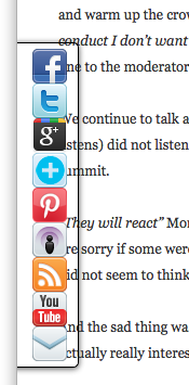
I was reading a quite disturbing article on a misogynistic Dell event by Sophie Catherina Løhr at elektronista.dk.  However, I was finding it frustrating as a line of media icons on the left of the page meant only the top few lines were unobstructed.

I was clearly not the only one with this problem as one of the comments on the page read:

That social media widget on the left made me stop reading an otherwise interesting article. Very irritating.

To be fair on the page designer,  it was just on Firefox that the page rendered like this, on other browsers the left-hand page margin was wider.  Probably Firefox is strictly ‘right’ in a sense as it sticks very close to standards, but whoever is to blame, it is not helpful to readers of the blog.

For those wishing to make cross-browser styles, it is usually possible now-a-days, but you often have to reset everything at the beginning of your style files — even if CSS is standard, default styles are not:

body {
    margin: 0;
    padding 0;
    /*  etc. */
}

Sadly this is just one example of an increasingly common problem.

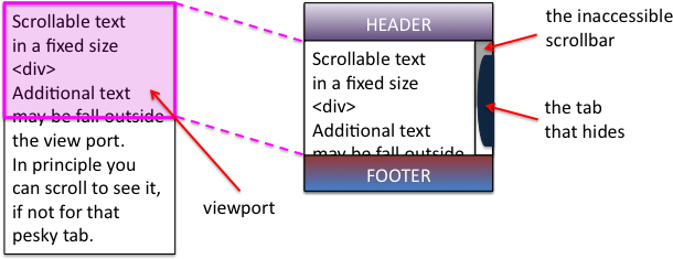
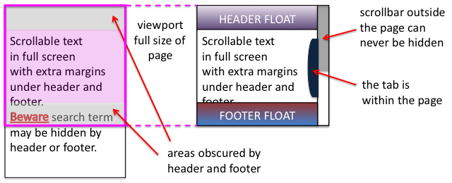
A short while ago I was on a site that had a large right-hand side tab.  I forget the function, maybe for comments, or a table of contents.  The problem was the tab obscured and prevented access to most of the scroll bar making navigation of the middle portion of the page virtually impossible.  Normally it is not possible to obscure the scroll bar as it is ‘outside’ the page. However this site, like many, had chosen to put the main content of the site in a fixed size scrolling <div>.  This meant that the header and footer were always visible, and the content scrolled in the middle.  Of course the scroll bar of the <div> is then part of the page and could be obscured.  I assume it was another cross-browser formatting difference that meant the designer did not notice the problem, or perhaps (not unlikely), only ever tested the style of pages with small amounts of non-scrolling text.

Some sites adopt a different strategy for providing fixed headers.  Rather than putting the main content in a fixed <div>, instead the header and footer are set to float above the main content and margins added to it to mean that the page renders correctly at top and bottom.  This means that the scrollbar for the content is the main scroll bar, and therefore cannot be hidden or otherwise mangled 🙂

Unfortunately, the web page search function does not ‘know’ about these floating elements and so when you type in a search term, will happily scroll the page to ”reveal’ the searched for word, but may do so in a way that it is underneath either header or footer and so invisible.

This is not made easier to deal with in the new MacOS Lion were the line up/down scroll arrows have been removed.  Not only can you not fine-adjust the page to reveal those hidden searched-for terms, but also, whilst reading the page, the page-up/page-down scroll does not ‘know’ about the hidden parts and so scrolls a full screen-sized page missing half the text 🙁

Visibility problems are not confined to the web, there has been a long history of modal dialogue boxes being lost behind other windows (which then often refuse to interact due to the modal dialogue box), windows happily resizing themselves to be partly obscured by the Apple Dock, or even disappearing onto non-existent secondary displays.

It may be that some better model of visibility could be built into both CSS/DOM/JavaScript and desktop window managers.  And it may even be that CSS will fix it’s slightly odd model of floats and layout.  However, I would not want to discourage the use of overlays, transparencies, and other floating elements until this happens.

In the mean time, some thoughts:

  1. restraint — Recall the early days of DTP when every newsletter sported 20 fonts. No self respecting designer would do this now-a-days, so use floats, lightboxes and the like with consideration … and if you must have popups or tabs that open on hover rather than when clicked, do make sure it is possible to move your mouse across the page without it feeling like walking a minefield.
  2. resizing — Do check your page with different window sizes, although desktop screens are now almost all at least 1024 x 768, think laptops and pads, as this is increasingly the major form of access.
  3. defaults — Be aware that, W3C not withstanding, browsers are different.  At very minimum reset all the margins and padding as a first step, so that you are not relying on browser defaults.
  4. testing — Do test (and here I mean technical testing, do user test as well!) with realistic pages, not just a paragraph of lorem ipsum.

And do my sites do this well … ?

With CSS as in all things, with great power …

P.S. Computer scientists will recognise the pun on Dijkstra’s “go to statement considered harmful“, the manifesto of structured programming.  The use of gotos in early programming langauges was incredibly flexible and powerful, but just like CSS with many concomitant potential dangers for the careless or unwary.  Strangely computer scientists have had little worry about other equally powerful yet dangerous techniques, not least macro languages (anyone for a spot of TeX debugging?), and Scheme programmers throw around continuations as if they were tennis balls.  It seemed as though the humble goto became the scapegoat for a discipline’s sins. It was interesting when the goto statement was introduced as a ‘new’ feature in PHP5.3, an otherwise post-goto C-style language; very retro.


image  xkcd.com

tread lightly — controlling user experience pollution

When thinking about usability or user experience, it is easy to focus on the application in front of us, but the way it impacts its environment may sometimes be far more critical. However, designing applications that are friendly to their environment (digital and physical) may require deep changes to the low-level operating systems.

I’m writing this post effectively ‘offline’ into a word processor for later upload. I sometimes do this as I find it easier to write without the distractions of editing within a web browser, or because I am physically disconnected from the Internet. However, now I am connected, and indeed I can see I am connected as a FTP file upload is progressing, it is just that anything else network-related is stalled.

The reason that the FTP upload is ‘hogging’ the network is, I believe, due to a quirk in the UNIX scheduling system, which was, paradoxically, originally intended to improve interactivity.

UNIX, which sits underneath Mac OS, is a multiprocessing operating system running many programs at once. Each process has a priority, called its ‘niceness‘, which can be set explicitly, but is also tweaked from moment to moment by the operating system. One of the rules for ‘tweaking’ it is that if a process is IO-bound, that is if it is constantly waiting for input or output, then its niceness is decreased, meaning that it is given higher priority.

The reason for this rule is partly to enhance interactive performance in the old days of command line interfaces; an interactive program would spend lots of time waiting for the user to enter something, and so its priority would increase meaning it would respond quickly as soon as the user entered anything. The other reason is that CPU time was seen as the scarce resource, so that processes that were IO bound were effectively being ‘nicer’ to other processes as they let them get a share of the precious CPU.

The FTP program is simply sitting there shunting out data to the network, so is almost permanently blocked waiting for the network as it can read from the disk faster than the network can transmit data. This means UNIX regards it as ‘nice’ and ups its priority. As soon as the network clears sufficiently, the FTP program is rescheduled and it puts more into the network queue, reads the next chunk from disk until the network is again full to capacity. Nothing else gets a chance, no web, no email, not even a network trace utility.

I’ve seen the same before with a database server on one of Fiona’s machines — all my fault. In the MySQL manual it suggested that you disable indices before large bulk updates (e.g. ingesting a file of data) and then re-enable them once the update is finished as indexing is more efficient on lots of data than one at a time. I duly did this and forgot about it until Fiona noticed something was wrong on the server and web traffic had ground to a near halt. When she opened a console on the server, she found that it seemed quiet, very little CPU load at all, and was puzzled until I realised it was my indexing. Indexing requires a lot of reading and writing data to and from disk, so MySQL became IO-bound, was given higher priority, as soon as the disk was free it was rescheduled, hit the disk once more … just as FTP is now hogging the network, MySQL hogged the disk and nothing else could read or write. Of course MySQL’s own performance was fine as it internally interleaved queries with indexing, it is just everything else on the system that failed.

These are hard scenarios to design for. I have written before (“why software need never hang“) about the way application designers do not think sufficiently about potential delays due to slow networks, or broken connections. However, that was about the applications that are suffering. Here the issue is not that the FTP program is badly designed for its delays, it is still responding very happily, just that it has had a knock on effect on the rest of the system. It is like cleaning your sink with industrial bleach — you have a clean house within, but pollute the watercourse without.

These kind of issues are not related solely to network and disk, any kind of resource is limited and profligacy causes damage in the digital world as much as in the physical environment.

Some years ago I had a Symbian smartphone, but it proved unusable as its battery life rarely exceeded 40 minutes from full charge. I thought I had a duff battery, but later realised it was because I was leaving applications on the phone ‘open’. For me I went to the address book, looked up a number, and that was that, I then maybe turned the phone off or switched  to something else without ‘exiting’ the address book. I was treating the phone like every previous phone I had used, but this one was different, it had a ‘real’ operating system, opening the address book launched the address book application, which then kept on running — and using power — until it was explicitly closed, a model that is maybe fine for permanently plugged in computers, but disastrous for a moble phone.

When early iPhones came out iOS was criticised for being single threaded, that is not having lots of things running in the ‘background’. However, this undoubtedly helped its battery life. Now, with newer versions of iOS, it has changed and there are lots of apps running at once, and I have noticed the battery life reducing, is that simply the battery wearing out with age or the effect of all those apps running?

Power is of course not just a problem for smartphones, but for any laptop. I try to closedown applications on my Mac when I am working without power as I know some programs just eat CPU when they are apparently idle (yes, Firefox, it’s you I’m talking about). And from an environmental point of view, lower power consumption when connected would also be good. My hope was that Apple would take the lessons learnt in the early iOS to change the nature of their mainstream OS, but sadly they succumbed to the pressure to make iOS a ‘proper’ OS!

Of course the FTP program could try to be friendly, perhaps when it is not the selected window deliberately throttle its network activity. But then the 4 hour upload would take 8 hours, instead of 20 minutes left at this point, I’d be looking forward to another 4 hours and 20 minutes, and I’d be complaining about that.

The trouble is that there needs to be better communication, more knowledge shared, between application and operating system. I would like FTP to use all the network capacity that it can, except when I am interacting with some other program. Either FTP needs to say to the OS “hey here’s a packet, send it when there’s a gap”1, or the OS needs some way for applications to determine current network state and make decisions based on that. Sometimes this sort of information is easily available, more often it is either very hard to get at or not available at all.

I recall years ago when internet was still mainly through pay-per-minute dial-up connections. You could set your PC to automatically dial when the internet was needed. However, some programs, such as chat, would periodically check with a central server to see if there was activity, this would cause the PC to dial-up the ISP. If you were lucky the PC also had an auto-disconnect after a period of inactivity, if you were not lucky the PC would connect at 2am and by the morning you’d find yourself with a phone bill more than your weeks’ wages.

When we were designing onCue at aQtive, we wanted to be able to connect to the Internet when it was available, but avoid bankrupting our users. Clearly somewhere in the TCP/IP stack, the layers of code over the network, at some level deep down it knew whether we were connected. I recall we found a very helpful function in the Windows API called something like “isConnected”2. Unfortunately, it worked by attempting to send a network packet and returning true if it succeeded and false if it failed. Of course sending the test packet caused the PC to auto-dial …

And now there is just 1 minute and 53 seconds left on the upload, so time to finish this post before I get on to garbage collection.

  1. This form of “send when you can” would also be useful in cellular networks, for example when syncing photos.[back]
  2. I had a quick peek, and fund that Windows CE has a function called InternetGetConnectedState.  I don’t know if this works better now.[back]

book: The Laws of Simplicty, Maeda

Yesterday I started to read John Maeda’s “The Laws of Simplicty” whilst  sitting by Fiona’s stall at the annual Tiree agricultural show, then finished before breakfast today.  Maeda describes his decision to cap at 100 pages1 as something that could be read during a lunch break. To be honest 30,000 words sounds like a very long lunch break or a very fast reader, but true to his third law, “savings in time feel like simplicity”2, it is a short read.

The shortness is a boon that I wish many writers would follow (including me). As with so many single issue books (e.g. Blink), there is s slight tendency to over-sell the main argument, but this is forgiveable in a short delightful book, in a way that it isn’t in 350 pages of less graceful prose.

I know I have a tendency, which can be confusing or annoying, to give, paradoxically for fear of misunderstanding, the caveat before the main point. Still, despite knowing this, in the early chapters I did find myself occasionally bristling at Maeda’s occasional overstatement (although in accordance with simplicity, never hyperbole).

One that particularly caught my eye was Maeda’s contrast of the MIT engineer’s RFTM (Read The F*cking Manual) with the “designer’s approach” to:

marry function with form to create intuitive experiences that we understand immediately.

Although in principle I agree with the overall spirit, and am constantly chided by Fiona for not reading instructions3, the misguided idea that everything ought to ‘pick up and use’ has bedeviled HCI and user interface design for at least the past 20 years. Indeed this is the core misconception about Heidegger’s hammer example that I argued against in a previous post “Struggling with Heidegger“. In my own reading notes, my comment is “simple or simplistic!” … and I meant here the statement not the resulting interfaces, although it could apply to both.

It has always been hard to get well written documentation, and the combination of single page ‘getting started’ guides with web-based help, which often disappears when the web site organisation changes, is an abrogation of responsibility by many designers. Not that I am good at this myself. Good documentation is hard work. It used to be the coders who failed to produce documentation, but now the designers also fall into this trap of laziness, which might be euphemistically labelled ‘simplicity’4.

Personally, I have found that the discipline of documenting (in the few times I have observed it!) is in fact a great driver of simple design. Indeed I recall a colleague, maybe Harold Thimbleby5, once suggested that documentation ought to be written before any code is written, precisely to ensure simple use.

Some years ago I was reading a manual (for a Unix workstation, so quite a few years ago!) that described a potentially disastrous shortcoming of a the disk sync command (which could have corrupted the disk). Helpfully the manual page included a suggestion of how to wrap sync in scripts that prevented the problem. This seemed to add insult to injury; they knew there was a serious problem, they knew how to fix it … and they didn’t do it. Of course, the reason is that manuals are written by technical writers after the code is frozen.

In contrast, I was recently documenting an experimental API6 so that a colleague could use it. As I wrote the documentation I found parts hard to explain. “It would be easier to change the code”, I thought, so I did so. The API, whilst still experimental, is now a lot cleaner and simpler.

Coming back to Maena after a somewhat long digression (what was that about simplicity and brevity?). While I prickled slightly at a few statements, in fact he very clearly says that the first few concrete ‘laws’ are the simpler (and if taken in their own simplistic), the later laws are far more nuanced and suggest deeper principles. This includes law 5 “differences: simplicity and complexity need each other”, which suggest that one should strive for a dynamic between simplicity and complexity. This echoes the emphasis on texture I often advocate when talking with students; whether in writing, presenting or in experience design it is often the changes in voice, visual appearance, or style which give life.

Unix command line prompt

the simplest interface?

I wasn’t convinced by Maeda’s early claim that simple designs were simpler and cheaper to construct.  Possibly true for physical prodcuts, but rarely so for digital interfaces, where more effort is typically needed in code to create simpler user interfaces.  However, again this was something that was revisited later, especially in the context of more computationally active systems (“law 8, in simplicity we trust”), where he contrasts “how much do you need to know about a system?” with “how much does the system know about you?”.  The former is the case of more traditional passive systems, whereas more ‘intelligent’ systems such as Amazon recommendations (or even Facebook news feed) favour the latter.  This is very similar to the principles for incidental and low-intention interaction that I have discussed in the past7.

Finally “The Laws of Simplicity” is beautifully designed in itself.  It includes  many gems not least those arising from Maeda’s roots in Japanese design culture, including aichaku, the “sense of attachment one can feel for an artefact” (p.69) and omakase meaning “I leave it to you”, which asks the sushi chef to create a meal especially for you (p.76).  I am perhaps too much of a controller to feel totally comfortable with the latter, but Maeda’s book certainly inspires the former.

  1. In fact there are 108 pages in the main text, but 9 of these are full page ‘law/chapter’ frontispieces, so 99 real pages.  However, if you include the 8 page introduction that gives 107 … so even the 100 page cap is perhaps a more subtle concept than a strict count.[back]
  2. See his full 10 laws of simplicity at lawsofsimplicity.com[back]
  3. My guess is that the MIT engineers didn’t read the manuals either.[back]
  4. Apple is a great — read poor — example here as it relies on keen technofreaks to tell others about the various hidden ways to do things — I guess creating a Gnostic air to the devices.[back]
  5. Certainly Harold was a great proponent of ‘live’ documentation, both Knuth’s literate programming and also documentation that incorporated calculated input and output, rather like dexy, which I reported after last autumn’s Web Art/Science camp.[back]
  6. In fairness, the API had been thrown together in haste for my own use.[back]
  7. See ‘incidental interaction” and HCI book chapter 18.[back]

Are five users enough?

[An edited version of this post is reproduced at HCIbook online!]

I recently got a Facebook message from a researcher about to do a study who asked, “Do you think 5 (users) is enough?”

Along with Fitts’ Law and Miller’s 7+/-2 this “five is enough” must be among the most widely cited, and most widely misunderstood and misused aphorisms of HCI and usability. Indeed, I feel that this post belongs more in ‘Myth Busters” than in my blog.

So, do I think five is enough? Of course, the answer is (annoyingly), “it depends”, sometimes, yes, five is enough, but sometimes, fewer: one appropriate user, or maybe no users at all, and sometimes you need more, maybe many more: 20, 100, 1000. But even when five is enough, the reasons are usually not directly related to Nielsen and Landauer’s original paper, which people often cite (although rarely read) and Nielsen’s “Why You Only Need to Test With 5 Users” alert box (probably more often actually read … well at least the title).

The “it depends” is partly dependent on the particular circumstances of the situation (types of people involved, kind of phenomenon, etc.), and partly on the kind of question you want to ask. The latter is the most critical issue, as if you don’t know what you want to know, how can you know how many users you need?

There are several sorts of reasons for doing some sort of user study/experiment, several of which may apply:

1. To improve a user interface (formative evaluation)

2. To assess whether it is good enough (summative evaluation)

3. To answer some quantitative question such as “what % of users are able to successfully complete this task”

4. To verify or refute some hypothesis such as “does eye gaze follow Fitts’ Law”

5. To perform a broad qualitative investigation of an area

6. To explore some domain or the use of a product in order to gain insight

It is common to see HCI researchers very confused about these distinctions, and effectively perform formative/summative evaluation in research papers (1 or 2) where in fact one of 3-6 is what is really needed.

I’ll look at each in turn, but first to note that, to the extent there is empirical evidence for ‘five is enough”, it applies to the first of these only.

I dealt with this briefly in my paper “Human–Computer Interaction: a stable discipline, a nascent science, and the growth of the long tail” in the John Long Festschrift edition of IwC, and quote here:

In the case of the figure of five users, this was developed based on a combination of a mathematical model and empirical results (Nielsen and Landauer 1993). The figure of five users is:

(i) about the optimal cost/benefit point within an iterative development cycle, considerably more users are required for summative evaluation or where there is only the opportunity for a single formative evaluation stage;

(ii) an average over a number of projects and needs to be assessed on a system by system basis; and

(iii) based on a number of assumptions, in particular, independence of faults, that are more reasonable for more fully developed systems than for early prototypes, where one fault may mask another.

We’ll look at this in more detail below, but critically, the number ‘5’ is not a panacea, even for formative evaluation.

As important as the kind of question you are asking, are the kind of users you are using. So much of modern psychology is effectively the psychology of first year psychology undergraduates (in the in 1950s it was male prisoners). Is this representative? Does this matter? I’ll return to this at the end, but first of all look briefly at each kind of question.

Finally, there is perhaps the real question “will the reviewers of my work think five users is enough” — good publications vs. good science. The answer is that they will certainly be as influenced by the Myth of Five Users as you are, so do good science … but be prepared to need to educate your reviewers too!

formative evaluation – prototyping cycle

As noted formative evaluation was the scope of Nielsen and Landauer’s early work in 1993 that was then cited by Nielsen in his Alert Box in 2000, and which has now developed mythic status in the field.

The 1993 paper was assuming a context of iterative development where there would be many iterations, and asking how many users should be used per iteration, that is how many users should you test before fixing the problems found by those users, and then performing another cycle of user testing, and another. That is, in all cases they considered, the total number of users involved would be far more than five, it is just the number used in each iteration that was lower.

In order to calculate the optimal number of subjects to use per iteration, they looked at:

(i) the cost of performing a user evaluation

(ii) the number of new faults found (additional users will see many of the same faults, so there are diminishing returns)

(iii) the cost of a redevelopment cycle

All of these differ depending on the kind of project, so Nielsen and Landauer looked at a range of projects of differing levels of complexity. By putting them together, and combining with simple probabilistic models of bug finding in software, you can calculate an optimal number of users per experiment.

They found that, depending on the project, the statistics and costs varied and hence the optimal number of users/evaluators (between 7 and 21), with, on the whole, more complex projects (with more different kinds of bugs and more costly redevelopment cycles) having a higher optimal number than simpler projects. In fact all the numbers are larger than five, but five was the number in Nielsen’s earlier discount engineering paper, so the paper did some additional calculations that yielded a different kind of (lower) optimum (3.2 users — pity the last 0.2 user), with five somewhere between 7 and 3 … and a myth was born!

Today, with Web 2.0 and ‘perpetual beta’, agile methods and continuous deployment reduce redevelopment costs to near zero, and so Twidale and Marty argue for ‘extreme evaluation‘ where often one user may be enough (see also my IwC  paper).

The number also varies through the development process; early on, one user (indeed using it yourself) will find many, many faults that need to be fixed. Later faults become more obscure, or maybe only surface after long-term use.

Of course, if you use some sort of expert or heuristic evaluation, then the answer may be no real users at all!

And anyway all of this is about ‘fault finding’, usability is not about bug fixing but making things better, it is not at all clear how useful, if at all, literature on bug fixing is for creating positive experiences.

summative evaluation – is it good enough to release

If you are faced with a product and want to ask “is it good enough?” (which can mean, “are there any usability ‘faults’?”, or, “do people want to use it?”), then five users is almost certainly not enough. To give yourself any confidence of coverage of the kinds of users and kinds of use situations, you may need tens or hundreds of users, very like hypothesis testing (below).

However, the answer here may also be zero users. If the end product is the result of a continuous evaluation process with one, five or some other number of users per iteration, then the number of users who have seen the product during this process may be sufficient, especially if you are effectively iterating towards a steady state where few or no new faults are found per iteration.

In fact, even when there has been a continuous process, the need for long-term evaluation becomes more critical as the development progresses, and maybe the distinction between summative and late-stage formative is moot.

But in the end there is only one user you need to satisfy — the CEO … ask Apple.

quantitative questions and hypothesis testing

(Note, there are real numbers here, but if you are a numerophobe never fear, the next part will go back to qualitative issues, so bear with it!)

Most researchers know that “five is enough” does not apply in experimental or quantitative studies … but that doesn’t always stop them quoting numbers back!

Happily in dealing with more quantitative questions or precise yes/no ones, we can look to some fairly solid statistical rules for the appropriate number of users for assessing different kinds of effects (but do note “the right kind of users” below). And yes, very, very occasionally five may be enough!

Let’s imagine that our hypothesis is that a behaviour will occur in 50% of users doing an experiment. With five users, the probability that we will see this behaviour in at least one user is 1 in 32, which is approximately 3%. That is if we do not observe the behaviour at all, then we have a statistically significant result at 5% level (p<0.05) and can reject the hypothesis.

Note that there is a crucial difference between a phenomenon that we expect to see in about 50% of user iterations (i.e. the same user will do it about 50% of the time) and one where we expect 50% of people to do it all of the time. The former we can deal with using a small number of users and maybe longer or repeated experiments, the latter needs more users.

If instead, we wanted to show that a behaviour happens less than 25% of the time, then we need at least 11 users, for 10% 29 users. On the other hand, if we hypothesised that a behaviour happens 90% of the time and didn’t see it in just two users we can reject the hypothesis at significance level of 1%. In the extreme if our hypothesis is that something never happens and we see it with just one user, or if the hypothesis is that it always happens and we fail to see it with one user, in both cases we can reject our hypothesis.

The above only pertains when you see samples where either none or all of the users do something. More often we are trying to assess some number. Rather than “does this behaviour occur 50% of the time”, we are asking “how often does this behaviour occur”.

Imagine we have 100 users (a lot more than five!), and notice that 60% do one thing and 40% do the opposite. Can we conclude that in general the first thing is more prevalent? The answer is yes, but only just. Where something is a simple yes/no or either/or choice and we have counted the replies, we have a binomial distribution. If we have n (100) users and the probability of them answering ‘yes’ is p (50% if there is no real preference), then the maths says that the average number of times we expect to see a ‘yes’ response is n x p = 100 x 0.5 = 50 people — fairly obvious. It also says that the standard deviation of this count is sqrt(n x p x (1-p ) ) = sqrt(25) = 5. As a rule of thumb if answers differ by more than 2 standard deviations from the expected value, then this is statistically significant; so 60 ‘yes’ answers vs. the expected 50 is significant at 5%, but 55 would have just been ‘in the noise’.

Now drop this down to 10 users and imagine you have 7 ‘yes’s and 3 ‘no’s. For these users, in this experiment, they answer ‘yes’ more than twice as often as ‘no’, but here this difference is still no more than we might expect by chance. You need at least 8 to 2 before you can say anything more. For five users even 4 to 1 is quite normal (try tossing five coins and see how many come up heads); only if all or none do something can you start to think you are onto something!

For more complex kinds of questions such as “how fast”, rather than “how often”, the statistics becomes a little more complex, and typically more users are needed to gain any level of confidence.

As a rule of thumb some psychologists talk of 20 users per condition, so if you are comparing 4 things then you need 80 users. However,  this is just a rule of thumb and some phenomena have very high variability (e.g. problem solving) whereas others (such as low-level motor actions) are more repeatable for an individual and have more consistency between users. For phenomena with very high variability even 20 users per condition may be too few, although within subjects designs may help if possible. Pilot experiments or previous experiments concerning the same phenomenon are important, but this is probably the time to consult a statistician who can assess the statistical ‘power’ of a suggested design (the likelihood that it will reveal the issue of interest).

qualitative study

Here none of the above applies and … so … well … hmm how do you decide how many users? Often people rely on ‘professional judgement’, which is a posh way of saying “finger in the air”.

In fact, some of the numerical arguments above do still apply (sorry numerophobes). If as part of your qualitative study you are interested in a behaviour that you believe happens about half the time, then with five users you would be very unlucky not to observe it (3% of the time). Or put it another way, if you observe five users you will see around 97% of behaviours that at least half of all users have (with loads and loads of assumptions!).

If you are interested in rarer phenomena, then you need either lots more users (for behaviour that you only see in 1 in 10 users, then you have only a 40% chance of observing it with 5 users, and perhaps more surprisingly, only 65% chance of seeing it with 10 users).

However, if you are interested in a particular phenomenon, then randomly choosing people is not the way to go anyway, you are obviously going to select people who you feel are most likely to exhibit it; the aim is not to assess its prevalence in the world, but to find a few and see what happens.

Crucially when you generalise from qualitative results you do it differently.

Now in fact you will see many qualitative papers that add caveats to say “our results only apply to the group studied …”. This may be necessary to satisfy certain reviewers, but is at best disingenuous – if you really believe the results of your qualitative work do not generalise at all, then why are you publishing it – telling me things that I cannot use?

In fact, we do generalise from qualitative work, with care, noting the particular limitations of the groups studied, but still assume that the results are of use beyond the five, ten or one hundred people that we observed. However, we do not generalise through statistics, or from the raw data, but through reasoning that certain phenomena, even if only observed once, are likely to be ones that will be seen again, even if differing in details. We always generalise from our heads, not from data.

Whether it is one, five or more, by its nature deep qualitative data will involve fewer users than more shallow methods such as large scale experiments or surveys. I often find that the value of this kind of deep interpretative data is enhanced by seeing it alongside large-scale shallow data. For example, if survey or log data reveals that 70% of users have a particular problem and you observe two users having the same problem, then it is not unreasonable to assume that the reasons for the problem are similar to those of the large sample — yes you can generalise from two!

Indeed one user may be sufficient (as often happens with medical case histories, or business case studies), but often it is about getting enough users so that interesting things turn up.

exploratory study

This looking for interesting things is often the purpose of research: finding a problem to tackle. Once we have found an interesting issue, we may address it in many ways: formal experiments, design solutions, qualitative studies; but none of these are possible without something interesting to look at.

In such situations, as we saw with qualitative studies in general, the sole criteria for “is N enough” is whether you have learnt something.

If you want to see all, or most of the common phenomena, then you need lots of users. However, if you just want to find one interesting one, then you only need as many as gets you there. Furthermore whilst you often choose ‘representative or ‘typical’ users (what is a typical user!) for most kinds of study and evaluation, for exploratory analysis, often extreme users are most insightful; of course you have to work out whether your user or users are so unusual that the things you observe are unique to them … but again real research comes from the head, you have to think about it and make an assessment.

In the IwC paper I discuss some of the issues of single person studies in more detail and Fariza Razak’s thesis is all about this.

the right kind of users

If you have five, fifty or five hundred users, but they are all psychology undergraduates, they are not going to tell you much about usage by elderly users, or by young unemployed people who have left school without qualifications.

Again the results of research ultimately come from the head not the data: you will never get a complete typical, or representative sample of users; the crucial thing is to understand the nature of the users you are studying, and to make an assessment of whether the effects you see in them are relevant, and interesting more widely. If you are measuring reaction times, then education may not be a significant factor, but Game Boy use may be.

Many years ago I was approached by a political science PhD student. He had survey data from over 200 people (not just five!), and wanted to know how to calculate error bars to go on his graphs. This was easily done and I explained the procedure (a more systematic version of the short account given earlier). However, I was more interested in the selection of those 200 people. They were Members of Parliament; he had sent the survey to every MP (all 650 of them) and got over 200 replies, a 30% return rate, which is excellent for any survey. However, this was a self-selected group and so I was more interested in whether the grounds for self-selection influenced the answers than in how many of them there were. It is often the case that those with strong views on a topic are more likely to answer surveys on it. The procedure he had used was as good as possible, but, in order to be able to make any sort of statement about the interpretation of the data, he needed to make a judgement. Yet again knowledge is ultimately from the head not the data.

For small numbers of users these choices are far more critical. Do you try and choose a number of similar people, so you can contrast them, or very different so that you get a spread? There is no right answer, but if you imagine having done the study and interpreting the results this can often help you to see the best choice for your circumstances.

being practical

In reality whether choosing how many, or who, to study, we are driven by availability. It is nice to imagine that we make objective selections based on some optimal criteria — but life is not like that. In reality, the number and kind of users we study is determined by the number and kind of users we can recruit. The key thing is to understand the implications of these ‘choices’ and use these in your interpretation.

As a reviewer I would prefer honesty here, to know how and why users were selected so that I can assess the impact of this on the results. But that is a counsel of perfection, and again good science and getting published are not the same thing! Happily there are lovely euphemisms such as ‘convenience sample’ (who I could find) and ‘snowball sample’ (friends of friends, and friends of friends of friends), which allow honesty without insulting reviewers’ academic sensibilities.

in the end

Is five users enough? It depends: one, five, fifty or one thousand (Google test live with millions!). Think about what you want out of the study: numbers, ideas, faults to fix, and the confidence and coverage of issues you are interested in, and let that determine the number.

And, if I’ve not said it enough already, in the end good research comes from your head, from thinking and understanding the users, the questions you are posing, not from the fact that you had five users.

references

A. Dix (2010)  Human-Computer Interaction: a stable discipline, a nascent science, and the growth of the long tail. Interacting with Computers, 22(1) pp. 13-27. http://www.hcibook.com/alan/papers/IwC-LongFsch-HCI-2010/

Nielsen, J. (1989). Usability engineering at a discount. In Salvendy, G., and Smith, M.J. (Eds.), Designing and Using Human–Computer Interfaces and Knowledge Based Systems, Elsevier Science Publishers, Amsterdam. 394-401.

Nielsen, J. and Landauer, T. K. 1993. A mathematical model of the finding of usability problems. In Proceedings of the INTERACT ’93 and CHI ’93 Conference on Human Factors in Computing Systems (Amsterdam, The Netherlands, April 24 ? 29, 1993). CHI ’93. ACM, New York, NY, 206?213. http://doi.acm.org/10.1145/169059.169166

Jakob Nielsen’s Alertbox, March 19, 2000: Why You Only Need to Test With 5 Users. http://www.useit.com/alertbox/20000319.html

Fariza Razak (2008). Single Person Study: Methodological Issues. PhD Thesis. Computing Department, Lancaster University, UK. February 2008. http://www.hcibook.net/people/Fariza/

Michael Twidale and Paul Marty (2004-) Extreme Evaluation.  http://people.lis.uiuc.edu/~twidale/research/xe/

Struggling with Heidegger

Heidegger and hammers have been part of HCI’s conceptualisation from pretty much as long as I can recall.  Although maybe I first heard the words at some sort of day workshop in the late 1980s as the hammer example as used in HCI annoyed me even then, so let’s start with hammers.

hammers

I should explain that problems with the hammer example are not my current struggles with Heidegger!  For the hammer it is just that Heidegger’s ‘ready at hand’ is often confused with ‘walk up and use’.  In  Heidegger ready-at-hand refers to the way one is focused on the nail, or wood to be joined, not the hammer itself:

“The work to be produced is the “towards which” of such things as the hammer, the plane, and the needle” (Being and Time1, p.70/99)

To be ‘ready to hand’ like this typically requires familiarity with the equipment (another big Heidegger word!), and is very different from the way a cash machine or tourist information systems should be in some ways accessible independent of prior knowledge (or at least only generic knowledge and skills).

My especial annoyance with the hammer example stems from the fact that my father was a carpenter and I reckon it took me around 10 years to learn how to use a hammer properly2!  Even holding it properly is not obvious, look at the picture.

There is a hand sized depression in the middle.  If you have read Norman’s POET you will think, “ah yes perceptual affordance’, and grasp it like this:

But no that is not the way to hold it!  If try to use it like this you end up using the strength of your arm to knock in the nail and not the weight of the hammer.

Give it to a child, surely the ultimate test of ‘walk up and use’, and they often grasp the head like this.

In fact this is quite sensible for a child as a ‘proper’ grip would put too much strain on their wrist.  Recall  Gibson’s definition of affordance was relational3, about the ecological fit between the object and the potential actions, and the actions depends on who is doing the acting.  For a small child with weaker arms the hammer probably only affords use at all with this grip.

In fact the ‘proper’ grip is to hold it quite near the end where you can use the maximum swing of the hammer to make most use of the weight of the hammer and its angular momentum:

Anyway, I think maybe Heidegger knew this even if many who quote him don’t!

Heidegger

OK, so its alright me complaining about other people mis-using Heidegger, but I am in the middle of writing one of the chapters for TouchIT and so need to make sure I don’t get it wrong myself … and there my struggles begin.  I need to write about ready-to-hand and present-to-hand.   I thought I understood them, but always it has been from secondary sources and as I sat with Being and Time in one hand, my Oxford Companion to Philosophy in another and various other books in my teeth … I began to doubt.

First of all what I thought the distinction was:

  • ready at hand — when you are using the tool and it is invisible to you, you just focus on the work to be done with it
  • present at hand — when there is some sort of breakdown, the hammer head is loose or you don’t have the right tool to hand and so start to focus on the tools themsleves rather than on the job at hand

Scanning the internet this is certainly what others think, for example blog posts at 251 philosophy and Matt Webb at Berg4.  Koschmann, Kuutti and Hickman produced an excellent comparison of breakdown in Heidegger, Leont’ev and Dewey5, and from this it looks as though the above distinction maybe comes Dreyfus summary of Heidegger — but again I don’t have a copy of Dreyfus’ “Being-in-the-World“, so not certain.

Now this is an important distinction, and one that Heidegger certainly makes.  The first part is very clearly what Heidegger means by ready-to-hand:

“The peculiarity of what is proximally to hand is that, in its readiness-to-hand, it must, as it were, withdraw … that with which we concern ourselves primarily is the work …” (B&T, p.69/99)

The second point Heidegger also makes at length distinguishing at least three kinds of breakdown situation.  It just seems a lot less clear whether ‘present-at-hand’ is really the right term for it.  Certainly the ‘present-at-hand’ quality of an artefact becomes foregrounded during breakdown:

“Pure presence at hand announces itself in such equipment, but only to withdraw to the readiness-in-hand with which one concerns oneself — that is to say, of the sort of thing we find when we put it back into repair.” (B&T, p.73/103)

But the preceeding sentance says

“it shows itself as an equipmental Thing which looks so and so, and which, in its readiness-to-hand as looking that way, has constantly been present-at-hand too.” (B&T, p.73/103)

That is present-at-hand is not so much in contrast to ready-at-hand, but in a sense ‘there all along’; the difference is that during breakdown the presence-at-hand becomes foregrounded. Indeed when ‘present-at-hand’ is first introduced Heidegger appears to be using it as a binary distinction between Dasein, (human) entities that exist and ponder their existence, and other entities such as a table, rock or tree (p. 42/67).  The contrast is not so much between ready-to-hand and present-to-hand, but between ready-to-hand and ‘just present-at-hand’ (p.71/101) or ‘Being-just-present-at-hand-and-no-more’ (p.73/103). For Heidegger to seems not so much that ‘ready-to-hand’ stands in in opposition to ‘present-to-hand’; it is just more significant.

To put this in context, traditional philosophy had focused exclusively on the more categorically defined aspects of things as they are in the world (‘existentia’/present-at-hand), whilst ignoring the primary way they are encountered by us (Dasein, real knowing existence) as ready-to-hand, invisible in their purposefulness.  Heidegger seeks to redress this.

“If we look at Things just ‘theoretically’, we can get along without understanding readiness-to-hand.” (B&T p.69/98)

Heidegger wants to avoid the speculation of previous science and philosophy. Although it is not a Heidegger word, I use ‘speculation’ here with all of its connotations, pondering at a distance, but without commitment, or like spectators at a sports stadium looking in at something distant and other.  In contrast, ready-to-hand suggests commitment, being actively ‘in the world’ and even when Heidegger talks about those moments when an entity ceases to be ready-to-hand and is seen as present-to-hand, he uses the term circumspection — a casting of the eye around, so that the Dasein, the person, is in the centre.

So present-at-hand is simply the mode of being of the entities that are not Dasein (aware of their own existence), but our primary mode of experience of them and thus in a sense the essence of their real existence is when they are ready-to-hand.  I note Roderick Munday’s useful “Glossary of Terms in Being and Time” highlights just this broader sense of present-at-hand.

Maybe the confusion arises because Heidegger’s concern is phenomenological and so when an artefact is ready-to-hand and its presence-to-hand ‘withdraws’, in a sense it is no longer present-to-hand as this is no longer a phenomenon; and yet he also seems to hold a foot in realism and so in another sense it is still present-to-hand.  In discussing this tension between realism and idealism in Heidegger, Stepanich6 distinguishes present-at-hand and ready-to-hand, from presence-to-hand and readiness-to-hand — however no-one else does this so maybe that is a little too subtle!

To end this section (almost) with Heidegger’s words, a key statement, often quoted, seems to say precisely what I have argued above, or maybe precisely the opposite:

“Yet only by reason of something present-at-hand ‘is there’ anything ready-to-hand.  Does it follow, however, granting this thesis for the nonce, that readiness-to-hand is ontologically founded upon presence-at-hand?” (B&T, p.71/101)

What sort of philosopher makes a key point through a rhetorical question?

So, for TouchIT, maybe my safest course is to follow the example of the Oxford Companion to Philosophy, which describes ready-to-hand, but circumspectly never mentions present-to-hand at all?

and anyway what’s wrong with …

On a last note there is another confusion, or maybe mistaken attitude, that seems to be common when referring to ready-to-hand.  Heidegger’s concern was in ontology, understanding the nature of being, and so he asserted the ontological primacy of the ready-to-hand, especially in light of the previous dominant concerns of philosophy.  However, in HCI, where we are interested not in the philosophical question, but the pragmatic one of utility, usability, and experience, Heidegger is often misapplied as a kind of fetishism of engagement, as if everything should be ready-to-hand all the time.

Of course for many purposes this is correct, as I type I do not want to be aware of the keys I press, not even of the pages of the book that I turn.

Yet there is also a merit in breaking this engagement, to encourage reflection and indeed the circumspection that Heidegger discusses.  Indeed Gaver et al.’s focus on ambiguity in design7 is often just to encourage that reflection and questioning, bringing things to the foreground that were once background.

Furthermore as HCI practitioners and academics we need to both take seriously the ready-to-hand-ness of effective design, but also (just as Heidegger is doing) actually look at the ready-to-hand-ness of things seeing them and their use not taking them for granted.  I constantly strive to find ways to become aware of the mundane, and offer students tools for estrangement to look at the world askance8.

“To lay bare what is  just present-at-hand and no more, cognition must first penetrate beyond what is ready-to-hand in our concern.” (B&T, p.71/101)

This ability to step out and be aware of what we are doing is precisely the quality that Schon recognises as being critical for the ‘Reflective Practioner‘.  Indeed, my practical advice on using the hammer in the footnotes below comes precisely through reflection on hammering, and breakdowns in hammering, not through the times when the hammer was ready-to-hand..

Heidegger is indeed right that our primary existence is being in the world, not abstractly viewing it from afar.  And yet, sometimes also, just as Heidegger himself did as he pondered and wrote about these issues, one of our crowning glories as human beings is precisely that we are able also in a sense to step outside ourselves and look in wonder.

  1. In common with much of the literature the page references to Being and Time are all of the form p.70/99 where the first number refers to the page numbers in the original German (which I have not read!) and the second number to the page in Macquarrie and Robinson’s translation of Being and Time published by Blackwell.[back]
  2. Practical hammering – a few tips: The key thing is to focus on making sure the face of the hammer is perpendicular to the nail, if there is a slight angle the nail will bend.  For thin oval wire nails, if one does bend do not knock the nail back upright, most likely it will simply bend again and just snap.  Instead, simply hit the head of the nail while still bent, but keeping the hammer face perpendicular to the nail not the hole.  So long as the nail has cut any depth of hole it will simply follow its own path and straighten of its own accord.[back]
  3. James Gibson. The Ecological Approach to Visual Perception[back]
  4. Matt Webb’s post appears to be quoting Paul Dourish’ “Where the Action Is”, but I must have lent my copy to someone, so not sure of this is really what Paul thinks.[back]
  5. Koschmann, T., Kuutti, K. & Hickman, L. (1998). The Concept of Breakdown in Heidegger, Leont’ev, and Dewey and Its Implications for Education. Mind, Culture, and Activity, 5(1), 25-41. doi:10.1207/s15327884mca0501_3[back]
  6. Lambert Stepanich. “Heidegger: Between Idealism and Realism“, The Harvard Review of Philosophy, Vol 1. Spring 1991.[back]
  7. Bill Gaver, Jacob Beaver, and Steve Benford, 2003. Ambiguity as a resource for design. CHI ’03.[back]
  8. see previous posts on “mirrors and estrangement” and “the ordinary and the normal“[back]