more on disappearing scrollbars

I recently wrote about problems with a slightly too smart scroll bar, and Google periodically change something in Gmail which means you have to horizontally scroll the page to get hook of the vertical scroll bar.

I just came across another beautiful (read terrible) example today.

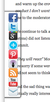
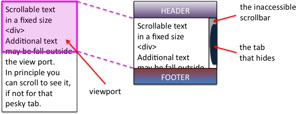
I was looking at the “Learning Curve“, a bogspot blog, so presumably using a blogspot theme option.  On the right hand side was funky pull-out navigation (below left), but unfortunately, look what it does to the scroll bar (below right)!


This is an example of the ‘inaccessible scrollbar’ that I mention in “CSS considered harmful“, and I explain there the reason it arises.

The amazing thing is that this fails equally across all (MacOS) browsers: Safari, Firefox, Chrome, yet must be a standard blogspot feature.

One last vignette: as I looked at the above screen shots I realised that in fact there is a 1 pixel part of the scroll handle still visible to the left of the pull-out navigation.  I went back to the web page and tried to select it … unfortunately, I guess to make a larger and easier to select the ‘hot area’, as you move your mouse towards the scroll bar, the pull-out pops out … so that the one pixel of scrollbar tantalises, but is unselectable 🙁

First version of Tiree Mobile Archive app goes live at Wave Classic

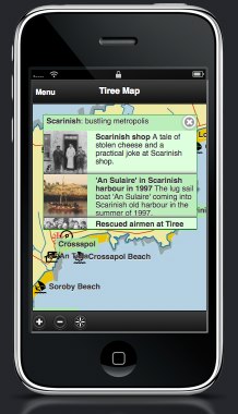
The first release version of the Tiree Mobile Archive app (see “Tiree Going Mobile“) is seeing real use this coming week at the Tiree Wave Classic. As well as historical information, and parts customised for the wind-surfers, it already embodies some interesting design features including the use of a local map  There’s a lot of work to do before the full launch next March, but it is an important step.

The mini-site for this Wave Classic version has a simulator, so you can see what it is like online, or download to your mobile … although GPS tracking only works when you are on Tiree 😉

Currently it still has only a small proportion of the archive material from An Iodhlann so still to come are some of the issues of volume that will surely emerge as more of the data comes into the app.

Of course those coming for the Wave Classic will be more interested in the sea than local history, so we have deliberately included features relevant to them, Twitter and news feeds from the Wave Classic site and also pertinent tourist info (beaches, campsites and places to eat … and drink!).  This will still be true for the final version of the app when it is released in the sprint — visitors come for a variety of reasons, so we need to offer a broad experience, without overlapping too much with a more tourism focused app that is due to be created for the island in another project.

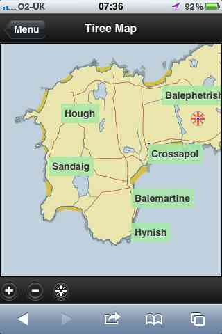
One crucial feature of the app is the use of local maps.  The booklet for the wave classic (below left) uses the Discover Tiree tourist map, designed by Colin Woodcock and used on the island community website and various island information leaflets.  The online map (below right) uses the same base layer.  The map deliberately uses this rather than the OS or Google maps (although final version will swop to OS for most detailed views) as this wll be familiar as they move between paper leaflets and the interactive map.


In “from place to PLACE“, a collection developed as part of Common Ground‘s ‘Parish Maps‘ project in the 1990s, Barbara Bender writes about the way:

“Post-Renaissance maps cover the surface of the world with an homogeneous Cartesian grip”

Local maps have their own logic not driven by satellite imagery, or military cartography1; they emphasise certain features, de-emphasise others, and are driven spatially less by the compass and ruler and more by the way things feel ‘on the ground’.  These issues of space and mapping have been an interest for many years2, so both here and in my walk around Wales next year I will be aiming to ‘reclaim the local map within technological space’.

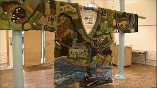
In fact, the Discover Tiree map, while stylised and deliberately not including roads that are not suitable for tourists, is very close to a ‘standard map’ in shape, albeit at a slightly different angle to OS maps as it is oriented3 to true North whereas OS maps are oriented to ‘Grid North’ (the problems of representing a round earth on flat sheets!).  In the future I’d like us to be able to deal with more interpretative maps, such as the mural map found on the outside of MacLeod’s shop. Or even the map of Cardigan knitted onto a Cardigan knitted as part of the 900 year anniversary of the town.


Technically this is put together as an HTML5 site to be cross-platform,, but … well let’s say some tweaks needed4.  Later on we’ll look to wrapping this in PhoneGap or one of the other HTML5-to-native frameworks, but for the time being once you have bookmarked to the home page on iOS looks pretty much like an app – on Android a little less so, but still easy access … and crucially works off-line — Tiree not known for high availability of mobile signal!

  1. The ‘ordnance‘ in ‘Ordnance Survey‘ was originally about things that go bang![back]
  2. For example, see “Welsh Mathematician walks in Cyberspace” and  “Paths and Patches – patterns of geognosy and gnosis”.[back]
  3. A lovely word, originally means to face East as early Mappa Mundi were all arranged with the East at the top.[back]
  4. There’s a story, going cross browser on mobile platform reminds me so much of desktop web design 10 years ago, on the whole iOS Safari behave pretty much like desktop ones, but Android is a law unto itself!.[back]

Offline HTML5, Chrome, and infinite regress

I am using HTML5’s offline mode as part of the Tiree Mobile Archive project.

This is, in principle, a lovely way of creating web sites that behave pretty much like native apps on mobile devices.  However, things, as you can guess, do not always go as smoothly as the press releases and blogs suggest!

PhotobucketSome time I must write at length on various useful lessons, but, for now, just one – the potential for an endless cycle of caches, rather like Jörmungandr, the Norse world serpent, that wraps around the world swallowing its own tail.

My problem started when I had a file (which I will call ‘shared.prob’ below, but was actually ‘place_data.js’), which I had updated on the web server, but kept showing an old version on Chrome no matter how many times I hit refresh and even after I went to the history settings and asked chrome to empty its cache.

I eventually got to the bottom of this and it turned out to be this Jörmungandr, cache-eats-cache, problem (browser bug!), but I should start at the beginning …

To make a web site work off-line in HTML5 you simply include a link to an application cache manifest file in the main file’s <html> tag.  The browser then pre-loads all of the files mentioned in the manifest to create the application cache (appCache for short). The site is then viewable off-line.  If this is combined with off-line storage using the built-in SQLite database, you can have highly functional applications, which can sync to central services using AJAX when connected.

Of course sometimes you have updated files in the site and you would like browsers to pick up the new version.  To do this you simply update the files, but then also update the manifest file in some way (often updating a version number or date in a comment).  The browser periodically checks the manifest file when it is next connected (or at least some browsers check themselves, for some you need to add Javascript code to do it), and then when it notices the manifest has changed it invalidates the appCache and rechecks all the files mentioned in the manifest, downloading the new versions.

Great, your web site becomes an off-line app and gets automatically updated 🙂

Of course as you work on your site you are likely to end up with different versions of it.  Each version has its own main html file and manifest giving a different appCache for each.  This is fine, you can update the versions separately, and then invalidate just the one you updated – particularly useful if you want a frozen release version and a development version.

Of course there may be some files, for example icons and images, that are relatively static between versions, so you end up having both manifest files mentioning the same file.  This is fine so long as the file never changes, but, if you ever do update that shared file, things get very odd indeed!

I will describe Chrome’s behaviour as it seems particularly ‘aggressive’ at caching, maybe because Google are trying to make their own web apps more efficient.

First you update the shared file (let’s call it shared.prob), then invalidate the two manifest files by updating them.

Next time you visit the site for appCache_1 Chrome notices that manifest_1 has been invalidated, so decides to check whether the files in the manifest need updating. When it gets to shared.prob it is about to go to the web to check it, then notices it is in appCache_2 – so uses that (old version).

Now it has the old version in appCache_1, but thinks it is up-to-date.

Next you visit the site associated with appCache_2, it notices manifest_2 is invalidated, checks files … and, you guessed it, when it gets to shared.prob, it takes the same old version from appCacche_1 🙁 🙁

They seem to keep playing catch like that for ever!

The only way out is to navigate to the pseudo-url ‘chrome://appcache-internals/’, which lets you remove caches entirely … wonderful.

But don’t know if there is an equivalent to this on Android browser as it certainly seems to have odd caching behaviour, but does seem to ‘sort itself out’ after a time!  Other browsers seem to temporarily have problems like this, but a few forced refreshes seems to work!

For future versions I plan to use some Apache ‘Rewrite’ rules to make it look to the browser that the shared files are in fact to completely different files:

RewriteRule  ^version_3/shared/(.*)$   /shared_place/$1 [L]

To be fair the cache cycle more of a problem during development rather than deployment, but still … so confusing.

Useful sites:

These are some sites I found useful for the application cache, but none sorted everything … and none mentioned Chrome’s infinite cache cycle!

  • http://www.w3.org/TR/2008/WD-html5-20080122/#appcache
    The W3C specification – of course this tell you how appCache is supposed to work, not necessarily what it does on actual browsers!
  • http://www.html5rocks.com/en/tutorials/appcache/beginner/
    It is called “A Beginner’s Guide to using the Application Cache”, but is actually pretty complete.
  • http://appcachefacts.info
    Really useful quick reference, but:  “FACT: Any changes made to the manifest file will cause the browser to update the application cache.” – don’t you believe it!  For some browsers (Chrome, Android) you have to add your own checks in the code (See “Updating the cache” section in “A Beginner’s Guide …”).).
  • http://manifest-validator.com/
    Wonderful on-line manifest file validator checks both syntax and also whether all the referenced files download OK.  Of course it cannot tell whether you have included all the files you need to.

“lost in hyperspace” – do we care?

I have rarely heard the phrase “lost in hyperspace” in the last 10 years, although it used to be a recurrent theme in hypertext and HCI literature.  For some time this has bothered me.  We don’t seem less lost, so maybe we are just more laid back about control, or maybe we are simply relinquishing it?

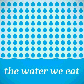
Recently Lisa Tweedie posted a Pintrest link on Facebook to Angela Morelli‘s dynamic infographic on water.  This is a lovely vertically scrolling page showing how the majority of the water we use is indirectly consumed via the food we eat … especially if you are a meat eater (1 kilo beef = 15,400 litres of water!).  The graphic was great, except it took me ages to actually get to it.  In fact the first time I found a single large graphic produced by Angela as a download, it was only when I returned to it that I found the full dynamic info graphic.

Every time I go to Pintrest I feel like I’ve been dropped into a random part of Hampton Court Maze, so hard to find the actual source … this is why a lot of artists get annoyed at Pintrest!  Now for Pintrest this is probably part of their design philosophy … after all they want people to stay on their site.  What is amazing is that this kind of design is so acceptable to users … Facebook is slightly less random, but still it takes me ages to find pages I’ve liked, each time I start the search through my profile afresh.

In the early days of hypertext everyone used to talk about the “lost in hyperspace” problem … now we are more lost … but don’t care anymore.  In the Mediaeval world you put your trust in your ‘betters’ lords, kings, and priests and assumed they knew best … now we put our trust in Pintrest and Facebook.

Walking Wales

As some of you already know, next year I will be walking all around Wales: from May to July covering just over 1000 miles in total.

Earlier this year the Welsh Government announced the opening of the Wales Coastal Path a new long distance footpath around the whole coast of Wales. There were several existing long distance paths covering parts of the coastline, as well as numerous stretches of public footpaths at or near the coast. However, these have now been linked, mapped and waymarked creating for the first time, a continuous single route. In addition, the existing Offa’s Dyke long distance path cuts very closely along the Welsh–English border, so that it is possible to make a complete circuit of Wales on the two paths combined.

As soon as I heard the announcement, I knew it was something I had to do, and gradually, as I discussed it with more and more people, the idea has become solid.

This will not be the first complete periplus along these paths; this summer there have been at least two sponsored walkers taking on the route. However, I will be doing the walk with a technology focus, which will, I believe, be unique.

The walk has four main aspects:

personal — I am Welsh, was born and brought up in Cardiff, but have not lived in Wales for over 30 years. The walk will be a form of homecoming, reconnecting with the land and its people that I have been away from for so long. The act of encircling can symbolically ‘encompass’ a thing, as if knowing the periphery one knows the whole. Of course life is not like this, the edge is just that, not the core, not the heart. As a long term ex-pat, a foreigner in my own land, maybe all I can hope to do is scratch the surface, nibble at the edges. However, also I always feel most comfortable as an outsider, as one at the margins, so in some ways I am going to the places where I most feel at home. I will blog, audio blog, tweet and generally share this experience to the extent the tenuous mobile signal allows, but also looking forward to periods of solitude between sea and mountain.

practical — As I walk I will be looking at the IT experience of the walker and also discuss with local communities the IT needs and problems for those at the edges, at the margins. Not least will be issues due to the paucity of network access both patchy mobile signal whilst walking and low-capacity ‘broadband’ at the limits of wind-beaten copper telephone wires — none of the mega-capacity fibre optic of the cities. This will not simply be fact-finding, but actively building prototypes and solutions, both myself (in evenings and ‘days off’) and with others who are part of the project remotely or joining me for legs of the journey1. Geolocation and mobile based applications will be a core part of this, particularly for the walkers experience, but local community needs likely to be far more diverse.

philosophical — Mixed with personal reflections will be an exploration of the meanings of place, of path, of walking, of nomadicity and of locality. Aristotle’s school of philosophy was called the Peripatetic School because discussion took place while walking; over two thousand years later Wordsworth’s poetry was nearly all composed while walking; and for time immemorial routes of pilgrimage have been a focus of both spiritual service and personal enlightenment. This will build on some of my own previous writings in particular past keynotes2 on human understanding of space, and also wider literature such as Rebecca Solnit’s wonderful “Wanderlust“.  This reflection will inform the personal blogging, and after I finish I will edit this into a book or account of the journey.

research3 — the practical outcomes will intersect with various personal research interests including social empowerment, interaction design and algorithmics4.  For the walker’s experience, I will be effectively doing a form of action research!.  This will certainly include how to incorporate local maps (such as tourists town plans) effectively into more large-scale experiences, how ‘crowdsourced’ route knowledge can augment more formal digital and paper resources, data synchonisation to deal with disconnection, and data integration between diverse sources.  In addition I am offering myself as a living lab so that others can use my trip as a place to try out their own sensors and instrumentation5, information systems, content authoring, ethnographic practices, community workshops, etc.  This may involve simply asking me to use things, coming for a single meeting or day, or joining me for parts of the walk.

If any of this interests you, do get in touch.  As well as research collaborations (living lab or supporting direct IT goals) any help in managing logistics, PR, or finding sources of funding/sponsorship for basic costs, most welcome.

I’ll get a dedicated website, Facebook page, twitter account, and charity sponsorship set up soon … watch this space!

  1. Coding whilst walking is something I have thought about (but not done!) for many years, but definitely inspired more recently by Nick the amazing cycling programmer who came to the Spring Tiree Tech Wave.[back]
  2. Welsh Mathematician Walks in Cyberspace“, and “Paths and Patches: patterns of geognosy and gnosis“.[back]
  3. I tried to think of a word beginning with ‘p’ for research, but failed![back]
  4. As I tagged this post I found I was using nearly all my my most common tags — I hadn’t realised quite how much this project cuts across so many areas of interest.[back]
  5. But with the “no blood rule”: if I get sensor sores, the sensors go in the bin 😉 [back]

CSS considered harmful (the curse of floats and other scary stories)

CSS and JavaScript based sites have undoubtedly enabled experiences far richer than the grey-backgrounded days of the early web in the 1990s (and recall, the backgrounds really were grey!). However, the power and flexibility of CSS, in particular the use of floats, has led to a whole new set of usability problems on what appear to be beautifully designed sites.

I was reading a quite disturbing article on a misogynistic Dell event by Sophie Catherina Løhr at elektronista.dk.  However, I was finding it frustrating as a line of media icons on the left of the page meant only the top few lines were unobstructed.
I was clearly not the only one with this problem as one of the comments on the page read:

That social media widget on the left made me stop reading an otherwise interesting article. Very irritating.

To be fair on the page designer,  it was just on Firefox that the page rendered like this, on other browsers the left-hand page margin was wider.  Probably Firefox is strictly ‘right’ in a sense as it sticks very close to standards, but whoever is to blame, it is not helpful to readers of the blog.

For those wishing to make cross-browser styles, it is usually possible now-a-days, but you often have to reset everything at the beginning of your style files — even if CSS is standard, default styles are not:

body {
    margin: 0;
    padding 0;
    /*  etc. */
}

Sadly this is just one example of an increasingly common problem.

A short while ago I was on a site that had a large right-hand side tab.  I forget the function, maybe for comments, or a table of contents.  The problem was the tab obscured and prevented access to most of the scroll bar making navigation of the middle portion of the page virtually impossible.  Normally it is not possible to obscure the scroll bar as it is ‘outside’ the page. However this site, like many, had chosen to put the main content of the site in a fixed size scrolling <div>.  This meant that the header and footer were always visible, and the content scrolled in the middle.  Of course the scroll bar of the <div> is then part of the page and could be obscured.  I assume it was another cross-browser formatting difference that meant the designer did not notice the problem, or perhaps (not unlikely), only ever tested the style of pages with small amounts of non-scrolling text.

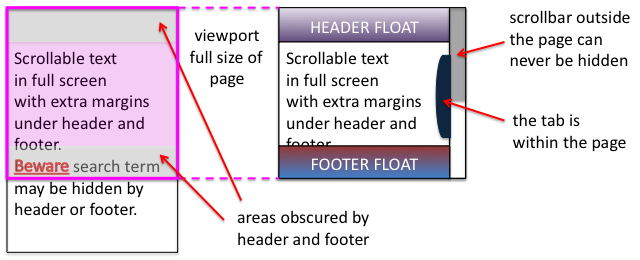
Some sites adopt a different strategy for providing fixed headers.  Rather than putting the main content in a fixed <div>, instead the header and footer are set to float above the main content and margins added to it to mean that the page renders correctly at top and bottom.  This means that the scrollbar for the content is the main scroll bar, and therefore cannot be hidden or otherwise mangled 🙂

Unfortunately, the web page search function does not ‘know’ about these floating elements and so when you type in a search term, will happily scroll the page to ”reveal’ the searched for word, but may do so in a way that it is underneath either header or footer and so invisible.

This is not made easier to deal with in the new MacOS Lion were the line up/down scroll arrows have been removed.  Not only can you not fine-adjust the page to reveal those hidden searched-for terms, but also, whilst reading the page, the page-up/page-down scroll does not ‘know’ about the hidden parts and so scrolls a full screen-sized page missing half the text 🙁

Visibility problems are not confined to the web, there has been a long history of modal dialogue boxes being lost behind other windows (which then often refuse to interact due to the modal dialogue box), windows happily resizing themselves to be partly obscured by the Apple Dock, or even disappearing onto non-existent secondary displays.

It may be that some better model of visibility could be built into both CSS/DOM/JavaScript and desktop window managers.  And it may even be that CSS will fix it’s slightly odd model of floats and layout.  However, I would not want to discourage the use of overlays, transparencies, and other floating elements until this happens.

In the mean time, some thoughts:

  1. restraint — Recall the early days of DTP when every newsletter sported 20 fonts. No self respecting designer would do this now-a-days, so use floats, lightboxes and the like with consideration … and if you must have popups or tabs that open on hover rather than when clicked, do make sure it is possible to move your mouse across the page without it feeling like walking a minefield.
  2. resizing — Do check your page with different window sizes, although desktop screens are now almost all at least 1024 x 768, think laptops and pads, as this is increasingly the major form of access.
  3. defaults — Be aware that, W3C not withstanding, browsers are different.  At very minimum reset all the margins and padding as a first step, so that you are not relying on browser defaults.
  4. testing — Do test (and here I mean technical testing, do user test as well!) with realistic pages, not just a paragraph of lorem ipsum.

And do my sites do this well … ?

With CSS as in all things, with great power …

P.S. Computer scientists will recognise the pun on Dijkstra’s “go to statement considered harmful“, the manifesto of structured programming.  The use of gotos in early programming langauges was incredibly flexible and powerful, but just like CSS with many concomitant potential dangers for the careless or unwary.  Strangely computer scientists have had little worry about other equally powerful yet dangerous techniques, not least macro languages (anyone for a spot of TeX debugging?), and Scheme programmers throw around continuations as if they were tennis balls.  It seemed as though the humble goto became the scapegoat for a discipline’s sins. It was interesting when the goto statement was introduced as a ‘new’ feature in PHP5.3, an otherwise post-goto C-style language; very retro.


image  xkcd.com

spice up boring lists of web links – add favicons using jQuery

Earlier today I was laying out lists of links to web resources, initially as simple links:

However, this looked a little boring and so thought it would be good to add each site’s favicon (the little icon it shows to the left on a web browser), and have a list like this:

  jQuery home page

  Wikipedia page on favicons

  my academic home page

The pages with the lists were being generated, and the icons could have been inserted using a server-side script, but to simplify the server-side code (for speed and maintainability) I put the fetching of favicons into a small JavaScript function using jQuery.  The page is initially written (or generated) with default images, and the script simply fills in the favicons when the page is loaded.

The list above is made by hand, but look at this example page to see the script in action.

You can use this in your own web pages and applications by simply including a few JavaScript files and adding classes to certain HTML elements.

See the favicon code page for a more detailed explanation of how it works and how to use it in your own pages.

UK internet far from ubiquitous

On the last page of the Guardian on Saturday (13th Oct) in a sort of ‘interesting numbers’ section, they say that:

“30% of the UK population have no internet access at home”

I couldn’t find the exact source of this, however, another  guardian article “UK internet audience rises by 1.9 million over last year” dated Wednesday 30 June 2010 has a similar figure.  This says that Internet use  has grown to 38.8 million. The National Statistics office say the overall UK population is 61,792,000 with 1/5 under 16, so call that 2 in 16 under 10 or around 8 million. That gives an overall population of a little under 54 million over 10 years old, that is still only 70% actually using the web at all.

My guess is that some of the people with internet at home do not use it, and some of the ones without home connections use it using other means (mobile, use at school, cyber cafe’s), but by both measures we are hardly a society where the web is as ubiquitous as one might have imagined.

Phoenix rises – vfridge online again

vfridge is back!

I mentioned ‘Project Phoenix’ in my last previous post, and this was it – getting vfridge up and running again.

Ten years ago I was part of a dot.com company aQtive1 with Russell Beale, Andy Wood and others.  Just before it folded in the aftermath of the dot.com crash, aQtive spawned a small spin-off vfridge.com.  The virtual fridge was a social networking web site before the term existed, and while vfridge the company went the way of most dot.coms, for some time after I kept the vfridge web site running on Fiona’s servers until it gradually ‘decayed’ partly due to Javascript/DOM changes and partly due to Java’s interactions with mysql becoming unstable (note very, very old Java code!).  But it is now back online 🙂

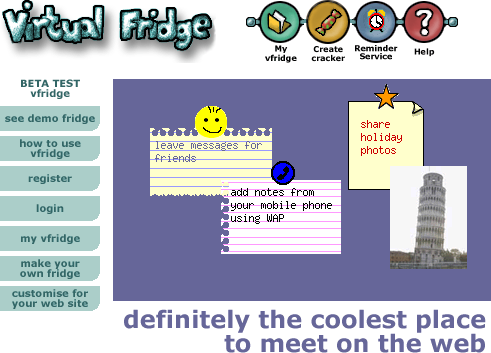
The core idea of vfridge is placing small notes, photos and ‘magnets’ in a shareable web area that can be moved around and arranged like you might with notes held by magnets to a fridge door.
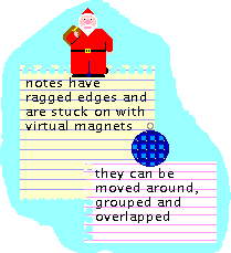
Underlying vfridge was what we called the websharer vision, which looked towards a web of user-generated content.  Now this is passé, but at the time  was directly counter to accepted wisdom and looking back seem prescient – remember this was written in 1999:

Although everyone isn’t a web developer, it is likely that soon everyone will become an Internet communicator — email, PC-voice-comms, bulletin boards, etc. For some this will be via a PC, for others using a web-phone, set-top box or Internet-enabled games console.

The web/Internet is not just a medium for publishing, but a potential shared place.

Everyone may be a web sharer — not a publisher of formal public ‘content’, but personal or semi-private sharing of informal ‘bits and pieces’ with family, friends, local community and virtual communities such as fan clubs.

This is not just a future for the cognoscenti, but for anyone who chats in the pub or wants to show granny in Scunthorpe the baby’s first photos.

Just over a year ago I thought it would be good to write a retrospective about vfridge in the light of the social networking revolution.  We did a poster “Designing a virtual fridge” about vfridge years ago at a Computers and Fun workshop, but have never written at length abut its design and development.  In particular it would be good to analyse the reasons, technical, social and commercial, why it did not ‘take off’ the time.  However, it is hard to do write about it without good screen shots, and could I find any? (Although now I have)  So I thought it would be good to revive it and now you can try it out again. I started with a few days effort last year at Christmas and Easter time (leisure activity), but now over the last week have at last used the fact that I have half my time unpaid and so free for my own activities … and it is done 🙂

The original vfridge was implemented using Java Servlets, but I have rebuilt it in PHP.  While the original development took over a year (starting down in Coornwall while on holiday watching the solar eclipse), this re-build took about 10 days effort, although of course with no design decisions needed.  The reason it took so much development back then is one of the things I want to consider when I write the retrospective.

As far as possible the actual behaviour and design is exactly as it was back in 2000 … and yes it does feel clunky, with lots of refreshing (remember no AJAX or web2.0 in those days) and of course loads of frames!  In fact there is a little cleverness that allowed some client-end processing pre-AJAX2.    Also the new implementation uses the same templates as the original one, although the expansion engine had to be rewritten in PHP.  In fact this template engine was one of our most re-used bits of Java code, although now of course many alternatives.  Maybe I will return to a discussion of that in another post.

I have even resurrected the old mobile interface.  Yes there were WAP phones even in 2000, albeit with tiny green and black screens.  I still recall the excitement I felt the first time I entered a note on the phone and saw it appear on a web page 🙂  However, this was one place I had to extensively edit the page templates as nothing seems to process WML anymore, so the WML had to be converted to plain-text-ish HTML, as close as possible to those old phones!  Looks rather odd on the iPhone :-/

So, if you were one of those who had an account back in 2000 (Panos Markopoulos used it to share his baby photos 🙂 ), then everything is still there just as you left it!

If not, then you can register now and play.

  1. The old aQtive website is still viewable at aqtive.org, but don’t try to install onCue, it was developed in the days of Windows NT.[back]
  2. One trick used the fact that you can get Javascript to pre-load images.  When the front-end Javascript code wanted to send information back to the server it preloaded an image URL that was really just to activate a back-end script.  The frames  used a change-propagation system, so that only those frames that were dependent on particular user actions were refreshed.  All of this is preserved in the current system, peek at the Javascript on the pages.    Maybe I’ll write about the details of these another time.[back]

not quite everywhere

I’ve been (belatedly) reading Adam Greenfield‘s Everyware: The Dawning Age of Ubiquitous Computing. By ‘everywhere’ he means the pervasive insinuation of inter-connected computation into all aspects of our lives — ubiquitous/pervasive computing but seen in terms of lives not artefacts. Published in 2006, and so I guess written in 2004 or 2005, Adam confidently predicts that everywhere technology will have  “significant and meaningful impact on the way you live your life and will do so before the first decade of the twenty-first century is out“, but one month into 2010 and I’ve not really noticed yet. I am not one of those people who fill their house with gadgets, so I guess unlikely to be an early adopter of ‘everywhere’, but even in the most techno-loving house at best I’ve seen the HiFi controlled through an iPhone.

Devices are clearly everywhere, but the connections between them seem infrequent and poor.

Why is ubiquitous technology still so … well un-ubiquitous?

Continue reading