bookshelf in Rome

I posted a few weeks ago about books I had got to bring to Rome.  Since then I got another small collection because I had done some reviewing for Routledge.

Mostly philosophy of the mind and materiality … the latter to help as we work on the DEPtH book on Physicality, TouchIT

  • Shaun Gallagher, Dan Zahavi. The Phenomenological Mind: An Introduction to Philosophy of Mind and Cognitive Science, Routledge, 2007.
  • John Lechte. Fifty Key Contemporary Thinkers: From Structuralism to Post-Humanism, 2nd Edition, Routledge, 2007.
  • Jean-Paul Sartre.  Being and Nothingnes: An Essay on Phenomenological Ontology, 1943.  Routledge Classics, , 2nd Edition, 2003.
  • Jay Friedenberg. Artificial Psychology, Routledge , 2008.
  • Max Velmans.  Understanding Consciousness, Routledge, 2009.
  • Peter Carruthers. The Nature of the Mind, Routledge, 2003.

In fact, with these and the previous  set I had far too many even for a month of evenings, and below you can see the books I actually brought.

As well as a selection from the academic books also some fiction/leisure reading, some old favourites and some new ones:

  • How Green was My Valley, Richard Llewellyn – a Welshman has to read this :-/
  • The Catcher in the Rye, J.D. Salinger – a classic I’ve never read
  • More of the Good Life – the TV series was formative for me as a child, but 40 seemed so far away
  • Lark Rise to Candleford, Flora Thompson – some years since I’ve read it last, and have been loving the TV series, but I don’t think it has stayed very close to the book!
  • Nella Last’s War – this is the book that was the basis for the TV drama Housewife 49 and part of the Mass Observation that collected diaries from ordinary people across Britain during the Second World War.
  • Ruth, Elizabeth Gaskill – another classic that I’ve not read yet!
  • As I Walked Out One Midsummer Morning.  Laurie Lee’s account of travelling in Spain in the run up to the Civel War.  I read it in school for O’level.
  • Swallowdale, Arthur Ransome – Couldn’t find Swallow’s an Amazons, I think one of the girls might have it on their shelves!
  • The Shining Company, Rosemary Sutcliff – we have loads of her histroical novels for children.  I find that good children’s writing is so much better than most adult books, which often feel they need to be incomprehensible to be good.
  • The Growing Summer, Noel Streatfield – lovely story, children visiting a quirky old lady in west coast of Ireland.
  • Hovel in the Hills, Elizabeth West  – another book I’ve read many times, but not for many years.  True story about a couple who buy an old house on a Welsh hillside.

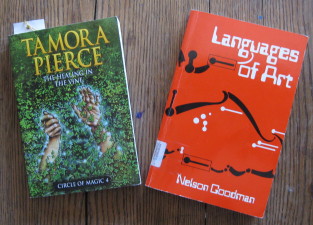
In addition, but missing from the picture, is one I borrowed from my daughter, Tamara Pierce’s  The Healing in the Vine, and one I’ve borrowed from Tiziana Catarci during my visit the Languages of Art.

So, two weeks in and how far have I got …

Well, been a little busy, two journal papers, a book chapter, an interfaces article, two 3 hour lectures to the masters students here, a seminar, reading thesis chapters and helping with two grant proposals … so not got very far through the bookshelf.

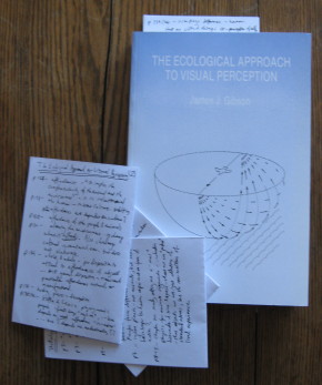
In fact, to be brutally honest, so far only finished the Tamora Pierce and nearly finished Gibson (just conclusions to go):

As you can see LOTS of notes on Gibson, I will write a very long blog sometime about this, but several others in line first!

But next week several train journeys, so may get through a few more books 🙂

RDF sequences … could they be more semantic?

Although triples can in principle express anything (well anything computational), this does not mean they are particularly appropriate for everything1.

RDF sequences are one of the most basic structured types and I have always found the use of rdf:_1, rdf:_2 at best clunky.  In particular I don’t like the fact that the textual form embodies the meaning.

In the RDF schema, rdf:_1, rdf:_2, etc are all instances of the class rdfs:ContainerMembershipProperty and sub-properties of rdfs:member.  However, I was also looking to see if there was some (implicitly defined) property of each of them that said which index they represented.  For example:

<rdf:_3> <rdf:isSequenceNumber> “3”

This would mean that the fact that rdf:_3 corresponded to the third element in a sequence was expressed semantically by rdf:isSequenceNumber as well as lexically in the label “_3”.

Sadly I could find no mention of this or any alternative technique to give the rdf:_nnn properties explicit semantics 🙁

This is not just me being a purist,  having explicit semantics makes it possible to express queries such as gathering together contiguous pairs in a sequence:

<ex:a> ?r1 ?a.
<ex:a> ?r2 ?b.
?r1 <rdf:hasSequenceNumber> ?index.
?r2 <rdf:hasSequenceNumber> ?index + 1.

Without explicit semantics, this would need to be expressed using string concatenation to create the labels for the relations – yuck!

Have I missed something? Is there an alternative mechanism in the RDF world that is like this or better?

Mind you I don’t see what’s wrong with a[index] … but may be that is just too simple?

  1. see also previous posts on “It-ness and identity: FOAF, RDF and RDMS” and “digging ourselves back from the Semantic Web mire“[back]

tech talks: brains, time and no time

Just scanning a few Google Tech Talks on YouTube.  I don’t visit it often, but followed a link from Rob Style‘s twitter.  I find the video’s a bit slow, so tend to flick through with the sound off, really wishing they had fast forward buttons like a DVD as quite hard to pull the little slider back and forth.

One talk was by Stuart Hameroff on A New Marriage of Brain and Computer.  He is the guy that works with Penrose on the possibility that quantum effects in microtubules may be the source of consciousness.  I notice that he used calculations for computational capacity based on traditional neuron-based models that are very similar to my own calculations some years ago in “the brain and the web” when I worked out that the memory and computational capacity of a single human brain is very similar to those of the entire web. Hameroff then went on to say that there are an order of magnitude more microtubules (sub-cellular structures, with many per neuron), so the traditional calculations do not hold!

Microtubules are fascinating things, they are like little mechano sets inside each cell.  It is these microtubules that during cell division stretch out straight the chromosomes, which are normally tangled up the nucleus.  Even stranger those fluid  movements of amoeba gradually pushing out pseudopodia, are actually made by mechanical structures composed of microtubules, only looking so organic because of the cell membrane – rather like a robot covered in latex.

pictire of amoeba

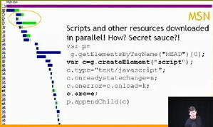
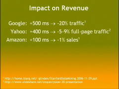
The main reason for going to the text talks was one by Steve Souders “Life’s Too Short – Write Fast Code” that has lots of tips for on speeding up web pages including allowing Javascript files to download in parallel.  I was particularly impressed by the quantification of costs of delays on web pages down to 100ms!

This is great.  Partly because of my long interest in time and delays in HCI. Partly because I want my own web scripts to be faster and I’ve already downloaded the Yahoo! YSlow plugin for FireFox that helps diagnose causes of slow pages.  And partly  because I get so frustrated waiting for things to happen, both on the web and on the desktop … and why oh why does it take a good minute to get a WiFi connection ….  and why doesn’t YouTube introduce better controls for skimming videos.

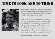
… and finally, because I’d already spent too much time skimming the tech talks, I looked at one last talk: David Levy, “No Time To Think” … how we are all so rushed that we have no time to really think about problems, not to mention life1.  At least that’s what I think it said, because I skimmed it rather fast.

  1. see also my own discussion of Slow Time[back]

French subvert democatic process to pass draconian internet laws

Just saw on Rob @ dynamicorange, that the French have passed a law forcing ISPs to withdraw access based on accusations of IP infringement. Whether one agrees or disagrees  or even understands the issues involved, it appear this was forced through by a vote of 16 (out of 577) members of the French parliament at a time when the vote was not expected.  This reminds me of the notorious Shetland Times case back in the late 1990s, where the judgement  implied that simply, linking to another site infringed copyright and caused some sites to stop interlinking for fear of prosecution1, not to mention some early US patents that were granted because patent officers simply did not understand the technology and its implications2.

It would be nice to think that the UK had learnt from the Shetland case, but sadly not.  Earler this year the Government released its interim Digital Britain report. This starts well declaring “The success of our manufacturing and services industries will increasingly be defined by their ability to use and develop digital technologies“; however the sum total of its action plan to promote ‘Digital Content’ is to strengthen IP protection.  Whatever one’s views on copyright, file sharing etc., the fact that a digital economy is a global economy seems to have somehow been missed on the way; and this is the UK’s “action plan to secure the UK’s place at the forefront of innovation, investment and quality in the digital and communications industries3.

  1. See “Copyright battles: The Shetlands” @ Ariadne and “Scottish Court Orders Online Newspaper to Remove Links to Competitor’s Web Site” @ Harvard’s Berkman Center for Internet & Society.[back]
  2. and for that matter, more recent cases like the ‘wish list’ patent[back]
  3. UK Department for Culture, Media and Sport Press Release 106/08 “Digital Britain – the future of communications” 17th October 2008[back]

the ordinary and the normal

I am reading Michel de Certeau’s “The Practice of Everyday Life“.  The first chapter begins:

The Practice of Everyday Life (cover image)The erosion and denigration of the singular or the extraordinary was announced by The Man Without Qualities1: “…a heroism but enormous and collective, in the model of ants” And indeed the advent of the anthill society began with the masses, … The tide rose. Next it reached the managers … and finally it invaded the liberal professions that thought themselves protected against it, including even men of letters and artists.”

Now I have always hated the word ‘normal’, although loved the ‘ordinary’.  This sounds contradictory as they mean almost the same, but the words carry such different connotations. If you are not normal you are ‘subnormal’ or ‘abnormal’, either lacking in something or perverted.  To be normal is to be normalised, to be part of the crowd, to obey the norms, but to be distinctive or different is wrong.  Normal is fundamentally fascist.

In contrast the ordinary does not carry the same value judgement.  To be different from ordinary is to be extra-ordinary2, not sub-ordinary or ab-ordinary.  Ordinariness does not condemn otherness.

Certeau is studying the everyday.  The quote is ultimately about the apparently relentless rise of the normal over the ordinary, whereas Certeau revels in  the small ways ordinary people subvert norms and create places within the interstices of the normal.

The more I study the ordinary, the mundane, the quotidian, the more I discover how extraordinary is the everyday3. Both the ethnographer and the comedian are expert at making strange, taking up the things that are taken for granted and holding them for us to see, as if for the first time. Walk down an anodyne (normalised) shopping street, and then look up from the facsimile store fronts and suddenly cloned city centres become architecturally unique.  Then look through the crowd and amongst the myriad incidents and lives around, see one at a time, each different.

Sometimes it seems as if the world conspires to remove this individuality. The InfoLab21 building that houses the Computing Dept. at Lancaster was sort listed for a people-centric design award of ‘best corporate workspace‘.  Before the judging we had to remove any notices from doors or any other sign that the building was occupied, nothing individual, nothing ordinary, sanitised, normalised.

However, all is not lost.  I was really pleased the other day to see a paper  “Making Place for Clutter and Other Ideas of Home4. Laural, Alex and Richard are looking at the way people manage the clutter in their homes: keys in bowls to keep them safe, or bowls on a worktop ready to be used.  They are looking at the real lives of ordinary people, not the normalised homes of design magazines, where no half-drunk coffee cup graces the coffee table, nor the high-tech smart homes where misplaced papers will confuse the sensors.

Like Fariza’s work on designing for one person5, “Making a Place for Clutter” is focused on single case studies not broad surveys.  It is not that the data one gets from broader surveys and statistics is not important (I am a mathematician and a statistician!), but read without care the numbers can obscure the individual and devalue the unique.  I heard once that Stalin said, “a million dead in Siberia is a statistic, but one old woman killed crossing the road is a national disaster”. The problem is that he could not see that each of the million was one person too. “Aren’t two sparrows sold for only a penny? But your Father knows when any one of them falls to the ground.”6.

We are ordinary and we are special.

  1. The Man without Qualities, Robert Musil, 1930-42, originally: Der Mann ohne Eigenschafte. Picador Edition 1997, Trans.  Sophie Wilkins and  Burton Pike: Amazon | Wikipedia[back]
  2. Sometimes ‘extraordinary’ may be ‘better than’, but more often simply ‘different from’, literally the Latin ‘extra’ = ‘outside of’[back]
  3. as in my post about the dinosaur joke![back]
  4. Swan, L., Taylor, A. S., and Harper, R. 2008. Making place for clutter and other ideas of home. ACM Trans. Comput.-Hum. Interact. 15, 2 (Jul. 2008), 1-24. DOI= http://doi.acm.org/10.1145/1375761.1375764[back]
  5. Described in Fariza’s thesis: Single Person Study: Methodological Issues and in the notes of my SIGCHI Ireland Inaugural Lecture Human-Computer Interaction in the early 21st century: a stable discipline, a nascent science, and the growth of the long tail.[back]
  6. Matthew 10:29[back]

Touching Technology

I’ve given a number of talks over recent months on aspects of physicality, twice during winter schools in Switzerland and India that I blogged about (From Anzere in the Alps to the Taj Bangelore in two weeks) a month or so back, and twice during my visit to Athens and Tripolis a few weeks ago.

I have finished writing up the notes of the talks as “Touching Technology: taking the physical world seriously in digital design“.  The notes  are partly a summary of material presented in previous papers and also some new material.  Here is the abstract:

Although we live in an increasingly digital world, our bodies and minds are designed to interact with the physical. When designing purely physical artefacts we do not need to understand how their physicality makes them work – they simply have it. However, as we design hybrid physical/digital products, we must now understand what we lose or confuse by the added digitality. With two and half millennia of philosophical ponderings since Plato and Aristotle, several hundred years of modern science, and perhaps one hundred and fifty years of near modern engineering – surely we know sufficient about the physical for ordinary product design? While this may be true of the physical properties themselves, it is not the fact for the way people interact with and rely on those properties. It is only when the nature of physicality is perturbed by the unusual and, in particular the digital, that it becomes clear what is and is not central to our understanding of the world. This talk discusses some of the obvious and not so obvious properties that make physical objects different from digital ones. We see how we can model the physical aspects of devices and how these interact with digital functionality.

After finishing typing up the notes I realised I have become worryingly scholarly – 59 references and it is just notes of the talk!

Alan looking scholarly

Alan looking scholarly

bookshelf

Got some books to fill my evenings when I’m in Rome during May, mostly about physicality and relating to DEPtH project.

Several classics about the nature of action in the physical world:

  • James Gibson,. The Ecological Approach to Visual Perception. New Jersey, USA, Lawrence Erlbaum Associates, 1979
    Actually a bit embarrassing as I have written about affordance and cited Gibson many times, but never read the original!
  • Martin Heidegger.  Being and Time. Harper Perennial Modern Classics; Reprint edition, 2008
    Similarly how many times have I cited ‘ready to hand’!  But then again how many people have read Heidegger?
  • Martin Heidegger.  Basic Writings. Harper Perennial Modern Classics, 2008
    This is a ‘best bits’ for Heidegger!
  • Maurice Merleau-Ponty.  Phenomenology of Perception. London, England, Routledge, 1958
    Everybody seems to cite Merleau-Ponty, but don’t know much about him … except all that French philosophy is bound to be heavy!

A couple more with a human as action system perspective, that seem to be well reviewed (and I’m guessing easier reads!):

Finally three about memories: linking generally to memories for life and also designing for reflection, but looking at them more specifically in relation to Haliyana‘s photologing studies.

  • Paul Ricoeur.  Memory, History, Forgetting. Chicago University Press; New edition,  2006
  • Paul Ricoeur.  Time and Narrative, Volume 1, Chicago University Press; New edition,  1990
    More classics … and I suspect heavy reads, got another Rocoeur already, but it is still on my “to read” pile.
  • Svetlana Boym.  The Future of Nostalgia. Basic Books, 2008
    Just sounded good.

Will report on them as I go 🙂

IE in second place!

Looked at web stats for this blog for first time in ages.  IE is still top browser in raw hits, but between them Firefox and Mozilla  family have 39% above IE at 36%.  Is this just that there are more Mac users amongst HCI people and academics, or is Mozilla winning the browser wars?

Some lessons in extended interaction, courtesy Adobe

I use various Adobe products, especially Dreamweaver and want to get the newest version of Creative Suite.  This is not cheap, even at academic prices, so you might think Adobe would want to make it easy to buy their products, but life on the web is never that simple!

As you can guess a number of problems ensued, some easily fixable, some demonstrating why effective interaction design is not trivial and apparently good choices can lead to disaster.

There is a common thread.  Most usability is focused on the time we are actively using a system – yes obvious – however, most of the problems I faced were about the extended use of the system, the way individual periods of use link together.  Issues of long-term interaction have been an interest of mine for many years1 and have recently come to the fore in work with Haliyana, Corina and others on social networking sites and the nature of ‘extended episodic experience’.  However, there is relatively little in the research literature or practical guidelines on such extended interaction, so problems are perhaps to be expected.

First the good bit – the Creative ‘Suite’  includes various individual Adobe products and there are several variants Design/Web, Standard/Premium, however there is a great page comparing them all … I was able to choose which version I needed, go to the academic purchase page, and then send a link to the research administrator at Lancaster so she could order it.  So far so good, 10 out of 10 for Adobe …

To purchase as an academic you quite reasonably have to send proof of academic status.  In the past a letter from the dept. on headed paper was deemed sufficient, but now they ask for a photo ID.  I am still not sure why this is need, I wasn’t going in in person, so how could a photo ID help?  My only photo ID is my passport and with security issues and identity theft constantly in the news, I was reluctant to send a fax of that (do US homeland security know that Adobe, a US company, are demanding this and thus weakening border controls?).

After double checking all the information and FAQs in the site, I decided to contact customer support …

Phase 1 customer support

The site had a “contact us” page and under “Customer service online”, there is an option “Open new case/incident”:

… not exactly everyday language, but I guessed this meant “send us a message” and proceeded. After a few more steps, I got to the enquiry web form and asked whether there was an alternative, or if I sent fax of the passport whether I could blot out the passport number and submitted the form.

Problem 1: The confirmation page did not say what would happen next.  In fact they send an email when the query is answered, but as I did not know that, so I had to periodically check the site during the rest of the day and the following morning.

Lesson 1: Interactions often include ‘breaks’, when things happen over a longer period.  When there is a ‘beak’ in interaction, explain the process.

Lesson 1 can be seen as a long-term equivalent of standard usability principles to offer feedback, or in Nielsen’s Heuristics “Visibility of system status”, but this design advice is normally taken to refer to immediate interactions and what has already happened, not about what will happen in the longer term.  Even principles of ‘predictability’ are normally phrased in knowing what I can do to the system and how it will respond to my actions, but not formulated clearly for when the system takes autonomous action.

In terms of status-event analysis, they quite correctly gave me an generated an interaction event for me (the mail arriving) to notify me of the change of status of my ‘case’.  It was just that the hadn’t explained that is what they were going to do.

Anyway the next day the email arrived …

Problem 2: The mail’s subject was “Your customer support case has been closed”.  Within the mail there was no indication that the enquiry had actually been answered (it had), nor a link to the the location on the site to view the ‘case’ (I had to login and navigate to it by hand), just a general link to the customer ‘support’ portal and a survey to convey my satisfaction with the service (!).

Lesson 2.1: The email is part of the interaction. So apply ‘normal’ interaction design principles, such as Nielsen’s “speak the users’ language” – in this case “case has been closed” does not convey that it has been dealt with, but sounds more like it has been ignored.

Lesson 2.2: Give clear information in the email – don’t demand a visit to the site. The eventual response to my ‘case’ on the web site was entirely textual, so why not simply include it in the email?  In fact, the email included a PDF attachment, that started off identical to the email body and so I assumed was a copy of the same information … but turned out to have the response in it.  So they had given the information, just not told me they had!

Lesson 2.3: Except where there is a security risk – give direct links not generic ones. The email could easily have included a direct link to my ‘case’ on the web site, instead I had to navigate to it.  Furthermore the link could have included an authentication key so that I wouldn’t have to look up my Adobe user name and password (I of course needed to create a web site login in order to do a query).

In fact there are sometimes genuine security reasons for sometimes NOT doing this.  One is if you are uncertain of the security of the email system or recipient address, but in this case Adobe are happy to send login details by email, so clearly trust the recipient. Another is to avoid establishing user behaviours that are vulnerable to ‘fishing’ attacks.  In fact I get annoyed when banks send me emails with direct links to their site (some still do!), rather than asking you to visit the site and navigate, if users get used to navigating using email links then entering login credentials this is an easy way for malicious emails to harvest personal details. Again in this case Adobe had other URLs in the email, so this was not their reason.  However, if they had been …

Lesson 2.4: If you are worried about security of the channel, give clear instructions on how to navigate the site instead of a link.

Lesson 2.5: If you wish to avoid behaviour liable to fishing, do not include direct links to your site in emails.  However, do give the user a fast-access reference number to cut-and-paste into the site once they have navigated to the site manually.

Lesson 2.6: As a more general lesson understand security and privacy risks.  Often systems demand security procedures that are unnecessary (forcing me to re-authenticate), but omit the ones that are really important (making me send a fax of my passport).

Eventually I re-navigate the Adobe site and find the details of my ‘case’ (which was also in the PDF in the email if I had realised).

Problem 3: The ‘answer’ to my query was a few sections cut-and-pasted from the academic purchase FAQ … which I had already read before making the enquiry.  In particular it did not answer my specific question even to say “no”.

Lesson 3.1: The FAQ sections could easily have been identified automatically the day before. If there is going to be  delay in human response, where possible offer an immediate automatic response. If this includes a means to say whether this has answered the query, then human response may not be needed (saving money!) or at least take into account what the user already knows.

Lesson 3.2: For human interactions – read what the user has said. Seems like basic customer service … This is a training issue for human operators, but reminds us that:

Lesson 3.3: People are part of the system too.

Lesson 3.4: Do not ‘close down’ an interaction until the user says they are satisfied. Again basic customer service, but whereas 3.2 is a human training issue, this is about the design of the information system: the user needs some way to say whether or not the answer is sufficient.  In this case, the only way to re-open the case is to ring a full-cost telephone support line.

Phase 2 customer feedback survey

As I mentioned, the email also had a link to a web survey:

In an effort to constantly improve service to our customers, we would be very
interested in hearing from you regarding our performance.  Would you be so
kind to take a few minutes to complete our survey?   If so, please click here:

Yes I did want to give Adobe feedback on their customer service! So I clicked the link and was taken to a personalised web survey.  I say ‘personalised’ in that the link included a reference to the customer support case number, but thereafter the form was completely standard  and had numerous multi-choice questions completely irrelevant to an academic order.  I lost count of the pages, each with dozens of tick boxes, I think around 10, but may have been more … and certainly felt like more.  Only on the last page was there a free-text area where I could say what was the real problem. I only persevered because I was already so frustrated … and was more so by the time I got to the end of the survey.

Problem 4: Lengthy and largely irrelevant feedback form.

Lesson 4.1: Adapt surveys to the user, don’t expect the user to adapt to the survey! The ‘case’ originated in the education part of the web site, the selections I made when creating the ‘case’ narrowed this down further to a purchasing enquiry; it would be so easy to remove many of the questions based on this. Actually if the form had even said in text “if your support query was about X, please answer …” I could then have known what to skip!

Lesson 4.2: Make surveys easy for the user to complete: limit length and offer fast paths. If a student came to me with a questionnaire or survey that long I would tell them to think again.  If you want someone to complete a form it has to be easy to do so – by all means have longer sections so long as the user can skip them and get to the core issues. I guess cynically making customer surveys difficult may reduce the number of recorded complaints 😉

Phase 3 the order arrives

Back to the story: the customer support answer told me no more than I knew before, but I decided to risk faxing the passport (with the passport number obscured) as my photo ID, and (after some additional phone calls by the research administrator at Lancaster!), the order was placed and accepted.

When I got back home on Friday, the box from Adobe was waiting 🙂

I opened the plastic shrink-wrap … and only then noticed that on the box it said “Windows” 🙁

I had sent the research adminstrator a link to the product, so had I accidentally sent a link to the Windows version rather than the Mac one?  Or was there a point later in the purchasing dialogue where she had had to say which OS was required and not realised I used a Mac?

I went back to my mail to her and clicked the link:

The “Platform” field clearly says “Mac”, but it is actually a selection field:

It seemed odd that the default value was “Mac” … why not “CHOOSE A PLATFORM”, I wondered if it was remembering a previous selection I had made, so tried the URL in Safari … and it looked the same.

… then I realised!

The web form was being ‘intelligent’ and had detected that I was on a Mac and so set the field to “Mac”.  I then sent the URL to the research administrator and on her Windows machine it will have defaulted to “Windows”.  She quite sensibly assumed that the URL I sent her was for the product I wanted and ordered it.

In fact offering smart defaults is  good web design advice, so what went wrong here?

Problem 5: What I saw and what the research administrator saw were different, leading to ordering the wrong product.

Lesson 5.1: Defaults are also dangerous. If there are defaults the user will probably agree to them without realising there was a choice.  We are talking about a £600 product here, that is a lot of room for error.  For very costly decisions, this may mean not having defaults and forcing the user to choose, but maybe making it easy to choose the default (e.g. putting default at top of a menu).

Lesson 5.2: If we decide the advantages of the default outweigh the disadvantages then we need to make defaulted information obvious (e.g. highlight, special colour) and possibly warn the user (one of those annoying “did you really mean” dialogue boxes! … but hey for £600 may be worth it).  In the case of an e-commerce system we could even track this through the system and keep inferred information highlighted (unless explicitly confirmed) all the way through to the final order form. Leading to …

Lesson 5.3: Retain provenance.  Automatic defaults are relatively simple ‘intelligence’, but as more forms of intelligent interaction emerge it will become more and more important to retain the provenance of information – what came explicitly from the user, what was inferred and how.  Neither current database systems nor emerging semantic web infrastructure make this easy to achieve internally, so new information architectures are essential.  Even if we retain this information, we do not yet fully understand the interaction and presentation mechanisms needed for effective user interaction with inferred information, as this story demonstrates!

Lesson 5.4: The URL is part of the interaction2.  I mailed a URL believing it would be interpreted the same everywhere, but in fact its meaning was relative to context.  This can be problematic even for ‘obviously’ personalised pages like a Facebook home page which always comes out as your own home page, so looks different.  However, it is essential when someone might want to bookmark, or mail the link.

This last point has always been one of the problems with framed sites and is getting more problematic with AJAX.  Ideally when dynamic content changes on the web page the URL should change to reflect it.  I had mistakenly thought this impossible without forcing a page reload, until I noticed that the multimap site does this.

The map location at the end of the URL changes as you move around the map.  It took me still longer to work out that this is accomplished because changing the part of the URL after the hash (sometimes called the ‘fragment’ and accessed in Javascript via location.hash) does not force a page reload.

If this is too complicated then it is relatively easy to use Javascript to update some sort of “use this link” or “link to this page” both for frame-based sites or those using web form elements or even AJAX. In fact, multimap does this as well!

Lesson 5.5: When you have dynamic page content update the URL or provide a “link to this page” URL.

Extended interaction

Some of these problems should have been picked up by normal usability testing. It is reasonable to expect problems with individual web sites or low-budget sites of small companies or charities.  However, large corporate sites like Adobe or central government have large budgets and a major impact on many people.  It amazes and appals me how often even the simplest things are done so sloppily.

However, as mentioned at the beginning, many of the problems and lessons above are about extended interaction: multiple visits to the site, emails between the site and the customer, and emails between individuals.  None of my interactions with the site were unusual or complex, and yet there seems to be a systematic lack of comprehension of this longer-term picture of usability.

As noted also at the beginning, this is partly because there is scant design advice on such interactions.  Norman has discussed “activity centred design“, but he still focuses on the multiple interactions within a single session with an application.  Activity theory takes a broader and longer-term view, but tends to focus more on the social and organisational context whereas the story here shows there is also a need for detailed interaction design advice.  The work I mentioned with Haliyana and Corina has been about the experiential aspects of extended interaction, but the problems on the Adobe were largely at a functional level (I never got so far as appreciating an ‘experience’ except a bad one!). So there is clearly much more work to be done here … any budding PhD students looking for a topic?

However, as with many things, once one thinks about the issue, some strategies for effective design start to become obvious.

So as a last lesson:

Overall Lesson: Think about extended interaction.

[ See HCI Book site for other ‘War Stories‘ of problems with popular products. ]

  1. My earliest substantive work on long-term interaction was papers at HCI 1992 and 1994 on”Pace and interaction” and “Que sera sera – The problem of the future perfect in open and cooperative systems“, mostly focused on communication and work flows.  The best summative work on this strand is in a 1998  journal paper “Interaction in the Large” and a more recent book chapter “Trigger Analysis – understanding broken tasks“[back]
  2. This is of course hardly new, although neither address the particular problems here, see Nielsen’s “URL as UI” and James Gardner’s “Best Practice for Good URL Structures” for expostions of the general principle. Many sites still violate even simple design advice like W3C’s “Cool URIs don’t change“.  For example, even the BCS’ eWIC series of electronic proceedings, have URLs of the form “www.bcs.org/server.php?show=nav.10270“; it is hard to believe that “show=nav.10270” will persist beyond the next web site upgrade 🙁 [back]

Why did the dinosaur cross the road?

A few days ago our neighbour told us this joke:

“Why did the dinosaur cross the road?”

It reminded me yet again of the incredible richness of apparently trivial day-to-day thought.  Not the stuff of Wittgenstein or Einstein, but the ordinary things we think as we make our breakfast or chat to a friend.

There is a whole field of study looking at computational humour, including its use in user interfaces1, and also on the psychology of humour dating back certainly as far as Freud, often focusing on the way humour involves breaking the rules of internal  ‘censors’ (logical, social or sexual) but in a way that is somehow safe.

Of course, breaking things is often the best way to understand them, Graeme Ritchie wrote2:

“If we could develop a full and detailed theory of how humour works, it is highly likely that this would yield interesting insights into human behaviour and thinking.”

In this case the joke starts to work, even before you hear the answer, because of the associations with its obvious antecessor3 as well as a whole genre of question/answer jokes: “how did the elephant get up the tree?”4, “how did the elephant get down from the tree?”5.  We recall past humour (and so neurochemically are set in a humourous mood), we know it is a joke (so socially prepared to laugh), and we know it will be silly in a perverse way (so cognitively prepared).

The actual response was, however, far more complex and rich than is typical for such jokes.  In fact so complex I felt an almost a palpable delay before recognising its funniness; the incongruity of the logic is close to the edge of what we can recognise without the aid of formal ‘reasoned’ arguments.  And perhaps more interesting, the ‘logic’ of the joke (and most jokes) and the way that logic ‘fails’, is not recognised in calm reflection, but in an instant, revealing complexity below the level of immediate conscious thought.

Indeed in listening to any language, not just jokes, we are constantly involved in incredibly rich, multi-layered and typically modal thinking6. Modal thinking is at the heart of simple planning and decision making “if I have another cake I will have a stomach ache”, and when I have studied and modelled regret7 the interaction of complex “what if” thinking with emotion is central … just as in much humour.  In this case we have to do an extraordinary piece of counterfactual thought even to hear the question, positing a state of the world where a dinosaur could be right there, crossing the road before our eyes.  Instead of asking the question “how on earth could a dinosaur be alive today?”, we are instead asked to ponder the relatively trivial question as to why it is doing, what would be in the situation, a perfectly ordinary act.  We are drawn into a set of incongruous assumptions before we even hear the punch line … just like the way an experienced orator will draw you along to the point where you forget how you got there and accept conclusions that would be otherwise unthinkable.

In fact, in this case the punch line draws some if its strength from forcing us to rethink even this counterfactual assumption of the dinosaur now and reframe it into a road then … and once it has done so, simply stating the obvious.

But the most marvellous and complex part of the joke is its reliance on perverse causality at two levels:

temporal – things in the past being in some sense explained by things in the future8.

reflexive – the explanation being based on the need to fill roles in another joke9.

… and all of this multi-level, modal and counterfactual cognitive richness in 30 seconds chatting over the garden gate.

So, why did the dinosaur cross the road?

“Because there weren’t any chickens yet.”

  1. Anton Nijholt in Twente has studied this extensively and I was on the PC for a workshop he organised on “Humor modeling in the interface” some years ago, but in the end I wasn’t able to attend :-([back]
  2. Graeme Ritchie (2001) “Current Directions in Computer Humor”, Artificial Intelligence Review. 16(2): pages 119-135[back]
  3. … and in case you haven’t ever heard it: “why did the chicken cross the road?” – “because it wanted to get to the other side”[back]
  4. “Sit on an acorn and wait for it to grow”[back]
  5. “Stand on a leaf and wait until autumn”[back]
  6. Modal logic is any form of reasoning that includes thinking about other possible worlds, including the way the world is at different times, beliefs about the world, or things that might be or might have been.  For further discussion of the modal complexity of speech and writing, see my Interfaces article about “writing as third order experience“[back]
  7. See “the adaptive significance of regret” in my essays and working papers[back]
  8. The absence of chickens in prehistoric times is sensible logic, but the dinosaur’s action is ‘because ‘ they aren’t there – not just violating causality, but based on the absence.  However, writing about history, we might happily say that Roman cavalry was limited because they hadn’t invented the stirrup. Why isn’t that a ridiculous sentence?[back]
  9. In this case the dinosaur is in some way taking the role of the absent chicken … and crossing the Jurassic road ‘because’ of the need to fill the role in the joke.  Our world of the joke has to invade the dinosaur’s word within the joke.  So complex as modal thinking … yet so everyday.[back]