Action Research in HCI

Recently Daniel Tetteroo asked if I knew about publications in HCI, prompted partly by the fact that I have described my Wales walk next year as a form of action research.

I realised that all my associations with the term were in information science rather than HCI, and other non-computer disciplines such as education and medicine. I also realised that the “don’t design for yourself” guidance, which was originally about taking a user-centred rather than technologist-centred approach, makes action research ideologically inimical to many.

I posted a question to Twitter, Facebook and the exec mailing list of Interaction yesterday and got a wonderful set of responses.

Here are some of the pointers in the replies (and no, I have not read them all overnight!):

Many thanks to the following for responses, suggestions and comments: Michael Massimi, Nathan Matias, Charlie DeTar, Gilbert Cockton, Russell Beale, David England, Dianne Murray, Jon Rogers, Ramesh Ramloll, Maria Wolters, Alan Chamberlain, Beki Grinter, Susan Dray, Daniel Cunliffe, and any others if I have missed you!

details matter: infinite scrolling and feature interaction

Many sites now dynamically add content to a page as you scroll down; this includes both Facebook and Twitter feeds, which add content as you get near the bottom.  In many ways this is a good thing, if users have to click to get to another page, they often never bother1.  However there can be unfortunate side effects … sometimes making sites un-navigable on certain devices.  There are particular problems on MacOS, due to the removal of scrollbar arrows, a usability disaster anyway, but confounded by feature interactions with other effects.

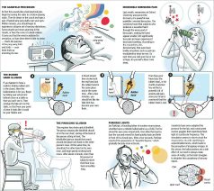
A recent example was when I visited the SimoleonSense blog in order to find an article corresponding to an image about human sensory illusions.  The image had been shared in Facebook, and I found, when I tried to search for it, also widely pinned in Pinterst, but the Facebook shares only linked back to the image url and Pinterst to the overall site (why some artists hate Pintrest).  However, I wanted to find the actual post on the site that mentioned the image.

Happily, the image url, http://www.simoleonsense.com/wp-content/uploads/2009/02/hacking-your-brain1.jpg, made it clear that it was a WordPress blog and the image had been uploaded in February 2009, so I edited the url to http://www.simoleonsense.com/2009/02/ and started to browse.  The site is a basically a weekly digest and so the page returned was already long.  I must have missed it on my first scan down, so I hit the bottom of the page, it dynamically added more content, and I continued to scroll.  Before long the scrollbar handle looked very small, and the page very big and every time I tried to scroll up and down the page appeared to go crazy, randomly scrolling anywhere, but not where I wanted.

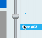
It took me a while to realise that the problem was that the scrollbar had been ‘enhanced’ by the website (using the WordPress infinite scroll plugin), which not only added infinite scrolling, but also ‘smart scrolling’, where a click on the scrollbar makes an animated jump to that location on the scrollbar.  Now many early scrollbars worked in this way, and the ‘smart scroll’ options is inspired by the fact that Apple rediscovered this in iOS for touch screen interaction.  The method gives rapid interaction, especially if the scrollbar is augmented by ‘tips’ on the scrollbar (see the jQuery smartscroll demo page).

Unfortunately, this is different from the Mac normal behaviour when you click above or below the handle on a scrollbar, which effectively does screen up/down.  So, I was trying to navigate up/down the web page a screen at a time to find the relevant post, and not caring where I clicked above the scroll handle, hence the apparently random movements.

This was compounded by two things.  The first is a slight bug in the scrolling extension which means that sometimes it doesn’t notice your mouse release and starts scrolling the page as you move your mouse around.  This is a bug I’ve seen in scrolling systems for many years, not taking into account all the combinations of mouse down/up, enter/leave region etc., and is present even in Google maps.

The second compounding factor is that since MacOS got rid of the scrollbar arrows (why? Why? WHY?!!), this is now the only way to reliably do small up/down movements if you don’t have a scroll wheel mouse or similar.

Now, in fact, my Air has a trackpad and I think Apple assumes you will use this for scrolling, but I have single-finger ‘Tap to click’ turned off to prevent accidental selections, and (I assume due to a persistent bug) this turns off the two finger scrolling gesture as well (even though it is shown as on in the preferences), so no scrolling from the touchpad.

Since near the beginning of my career I have been fascinated by these fine design decisions and have written previously about scrollbars, buttons, etc.  They are often overlooked as they form part of the backdrop to more significant applications and information.  However, the very fact that they are the persistent backdrop of interaction makes their fluid usability crucial, like the many mundane services, buses, rubbish collection, etc., that make cities work, but are often unseen and unnoticed until they fail.

Also note that this failure was not due to any single feature or bug, but the way these work together what the telephony industry originally named ‘feature interaction‘, but common across all technological systems  There is no easy fix, apart from (i) thinking of all possible scenarios (reach for your formal methods in HCI!) and (ii) testing across different devices.  And certainly (Apple please listen!) if it ain’t broke, don’t fix it.

Happily, I did manage to find the post in the end (I forget how, maybe random clicking) and it is “5 Ways To Hack Your Brain“.  The individual post page has no dynamic additions, so is only two screens big on my display (phew), but still scrolled all over the place as I tried to select the page title to paste above!

  1. To my mind, early web guidance, was always wrong about this as it usually suggested making pages fit a screen to improve download speed, whereas my feeling, when using a slow connection, was it was usually better to wait a little longer for one big screen (you were going to have to wait anyway!) and then be able to scroll up and down quickly.[back]

get fit on Tiree

Today is the winter 10K run on Tiree.  It has been organised by Craig Watson, one of the airport firefighters on Tiree, in aid of the “Michelle Henderson Cervical Cancer Trust”.  It is looking a lovely day for it, although there will be a chill in the air under the clear blue winter skies.  I saw the plane land earlier and I know there are folks coming over both on the plane and the ferry to take part.  Personally I have trained with my usual level of foresight doing my first run for 6 months last Tuesday :-/

Of course this is not the only event of its kind on Tiree there is the annual 10k, which I sadly missed this year as I pulled my Achilles tendon :-(, a round island sponsored cycle in March this year, and ‘Team Tiree‘ get off island for various events through the year.

Although this winter 10K is organised by Craig, many of the island fitness activities are due to Will, runner of ironman races and organiser of the Costa del Muscle training week I took part in in August and other regular island fitness activities (from 9 to 90s!).

Next year Will is branching out and organising residential training camps, one in Majorca (for the warm weather wimps) and one in Tiree next March. The latter starts the week after the next Tiree Tech Wave, so you could come for a weekend of sitting around hacking technology followed by another of shedding flab and toning muscle!

The war in the west

Just got back from the book launch for “Tiree: War among the Barley and Brine“.  Organised by An Iodhlann and the Islands Book Trust.

Mike Hughes, one of the authors, gave a talk and there were ex-service men connected with Tiree and their families present.  One man was the son of the pilot of one of the two Halifaxes which crashed into each other over the airfield on a cloudy day – a father he had never met as his mother was only 4 months pregnant at the time.

I hadn’t realised that it was from Tiree that the weather reports came in that set the timetable for D-Day.  The meteorological squadrons are unsung heroes of the war, flying far out into the Atlantic, in conditions where all other planes were grounded, to get the long-range weather data that is so easy to gather now-a-days from satellites.  Sadly the airman who had made the crucial weather observations for D-Day did not survive the war dying in that same Halifax accident over Tiree.

Neither had I known that Tiree was to be the staging post for the withdrawal of Winston Churchill and the Royal Family had the worst happened and the the German’s invaded Britain.  So, before it withdrew to a government in exile in Saskatchewan, the last outpost of British sovereignty would have been … Tiree.

First version of Tiree Mobile Archive app goes live at Wave Classic

The first release version of the Tiree Mobile Archive app (see “Tiree Going Mobile“) is seeing real use this coming week at the Tiree Wave Classic. As well as historical information, and parts customised for the wind-surfers, it already embodies some interesting design features including the use of a local map  There’s a lot of work to do before the full launch next March, but it is an important step.

The mini-site for this Wave Classic version has a simulator, so you can see what it is like online, or download to your mobile … although GPS tracking only works when you are on Tiree 😉

Currently it still has only a small proportion of the archive material from An Iodhlann so still to come are some of the issues of volume that will surely emerge as more of the data comes into the app.

Of course those coming for the Wave Classic will be more interested in the sea than local history, so we have deliberately included features relevant to them, Twitter and news feeds from the Wave Classic site and also pertinent tourist info (beaches, campsites and places to eat … and drink!).  This will still be true for the final version of the app when it is released in the sprint — visitors come for a variety of reasons, so we need to offer a broad experience, without overlapping too much with a more tourism focused app that is due to be created for the island in another project.

One crucial feature of the app is the use of local maps.  The booklet for the wave classic (below left) uses the Discover Tiree tourist map, designed by Colin Woodcock and used on the island community website and various island information leaflets.  The online map (below right) uses the same base layer.  The map deliberately uses this rather than the OS or Google maps (although final version will swop to OS for most detailed views) as this wll be familiar as they move between paper leaflets and the interactive map.


In “from place to PLACE“, a collection developed as part of Common Ground‘s ‘Parish Maps‘ project in the 1990s, Barbara Bender writes about the way:

“Post-Renaissance maps cover the surface of the world with an homogeneous Cartesian grip”

Local maps have their own logic not driven by satellite imagery, or military cartography1; they emphasise certain features, de-emphasise others, and are driven spatially less by the compass and ruler and more by the way things feel ‘on the ground’.  These issues of space and mapping have been an interest for many years2, so both here and in my walk around Wales next year I will be aiming to ‘reclaim the local map within technological space’.

In fact, the Discover Tiree map, while stylised and deliberately not including roads that are not suitable for tourists, is very close to a ‘standard map’ in shape, albeit at a slightly different angle to OS maps as it is oriented3 to true North whereas OS maps are oriented to ‘Grid North’ (the problems of representing a round earth on flat sheets!).  In the future I’d like us to be able to deal with more interpretative maps, such as the mural map found on the outside of MacLeod’s shop. Or even the map of Cardigan knitted onto a Cardigan knitted as part of the 900 year anniversary of the town.


Technically this is put together as an HTML5 site to be cross-platform,, but … well let’s say some tweaks needed4.  Later on we’ll look to wrapping this in PhoneGap or one of the other HTML5-to-native frameworks, but for the time being once you have bookmarked to the home page on iOS looks pretty much like an app – on Android a little less so, but still easy access … and crucially works off-line — Tiree not known for high availability of mobile signal!

  1. The ‘ordnance‘ in ‘Ordnance Survey‘ was originally about things that go bang![back]
  2. For example, see “Welsh Mathematician walks in Cyberspace” and  “Paths and Patches – patterns of geognosy and gnosis”.[back]
  3. A lovely word, originally means to face East as early Mappa Mundi were all arranged with the East at the top.[back]
  4. There’s a story, going cross browser on mobile platform reminds me so much of desktop web design 10 years ago, on the whole iOS Safari behave pretty much like desktop ones, but Android is a law unto itself!.[back]

Death by design

Wonderful image and set of slides describing some of the reasons multitasking is a myth and how the interfaces we design may be literally killing people (during a mobile outage in Dubai cat accidents dropped by 20%).

Thanks to Ian Sommervile for sharing this on twitter.

Offline HTML5, Chrome, and infinite regress

I am using HTML5’s offline mode as part of the Tiree Mobile Archive project.

This is, in principle, a lovely way of creating web sites that behave pretty much like native apps on mobile devices.  However, things, as you can guess, do not always go as smoothly as the press releases and blogs suggest!

PhotobucketSome time I must write at length on various useful lessons, but, for now, just one – the potential for an endless cycle of caches, rather like Jörmungandr, the Norse world serpent, that wraps around the world swallowing its own tail.

My problem started when I had a file (which I will call ‘shared.prob’ below, but was actually ‘place_data.js’), which I had updated on the web server, but kept showing an old version on Chrome no matter how many times I hit refresh and even after I went to the history settings and asked chrome to empty its cache.

I eventually got to the bottom of this and it turned out to be this Jörmungandr, cache-eats-cache, problem (browser bug!), but I should start at the beginning …

To make a web site work off-line in HTML5 you simply include a link to an application cache manifest file in the main file’s <html> tag.  The browser then pre-loads all of the files mentioned in the manifest to create the application cache (appCache for short). The site is then viewable off-line.  If this is combined with off-line storage using the built-in SQLite database, you can have highly functional applications, which can sync to central services using AJAX when connected.

Of course sometimes you have updated files in the site and you would like browsers to pick up the new version.  To do this you simply update the files, but then also update the manifest file in some way (often updating a version number or date in a comment).  The browser periodically checks the manifest file when it is next connected (or at least some browsers check themselves, for some you need to add Javascript code to do it), and then when it notices the manifest has changed it invalidates the appCache and rechecks all the files mentioned in the manifest, downloading the new versions.

Great, your web site becomes an off-line app and gets automatically updated 🙂

Of course as you work on your site you are likely to end up with different versions of it.  Each version has its own main html file and manifest giving a different appCache for each.  This is fine, you can update the versions separately, and then invalidate just the one you updated – particularly useful if you want a frozen release version and a development version.

Of course there may be some files, for example icons and images, that are relatively static between versions, so you end up having both manifest files mentioning the same file.  This is fine so long as the file never changes, but, if you ever do update that shared file, things get very odd indeed!

I will describe Chrome’s behaviour as it seems particularly ‘aggressive’ at caching, maybe because Google are trying to make their own web apps more efficient.

First you update the shared file (let’s call it shared.prob), then invalidate the two manifest files by updating them.

Next time you visit the site for appCache_1 Chrome notices that manifest_1 has been invalidated, so decides to check whether the files in the manifest need updating. When it gets to shared.prob it is about to go to the web to check it, then notices it is in appCache_2 – so uses that (old version).

Now it has the old version in appCache_1, but thinks it is up-to-date.

Next you visit the site associated with appCache_2, it notices manifest_2 is invalidated, checks files … and, you guessed it, when it gets to shared.prob, it takes the same old version from appCacche_1 🙁 🙁

They seem to keep playing catch like that for ever!

The only way out is to navigate to the pseudo-url ‘chrome://appcache-internals/’, which lets you remove caches entirely … wonderful.

But don’t know if there is an equivalent to this on Android browser as it certainly seems to have odd caching behaviour, but does seem to ‘sort itself out’ after a time!  Other browsers seem to temporarily have problems like this, but a few forced refreshes seems to work!

For future versions I plan to use some Apache ‘Rewrite’ rules to make it look to the browser that the shared files are in fact to completely different files:

RewriteRule  ^version_3/shared/(.*)$   /shared_place/$1 [L]

To be fair the cache cycle more of a problem during development rather than deployment, but still … so confusing.

Useful sites:

These are some sites I found useful for the application cache, but none sorted everything … and none mentioned Chrome’s infinite cache cycle!

  • http://www.w3.org/TR/2008/WD-html5-20080122/#appcache
    The W3C specification – of course this tell you how appCache is supposed to work, not necessarily what it does on actual browsers!
  • http://www.html5rocks.com/en/tutorials/appcache/beginner/
    It is called “A Beginner’s Guide to using the Application Cache”, but is actually pretty complete.
  • http://appcachefacts.info
    Really useful quick reference, but:  “FACT: Any changes made to the manifest file will cause the browser to update the application cache.” – don’t you believe it!  For some browsers (Chrome, Android) you have to add your own checks in the code (See “Updating the cache” section in “A Beginner’s Guide …”).).
  • http://manifest-validator.com/
    Wonderful on-line manifest file validator checks both syntax and also whether all the referenced files download OK.  Of course it cannot tell whether you have included all the files you need to.

“lost in hyperspace” – do we care?

I have rarely heard the phrase “lost in hyperspace” in the last 10 years, although it used to be a recurrent theme in hypertext and HCI literature.  For some time this has bothered me.  We don’t seem less lost, so maybe we are just more laid back about control, or maybe we are simply relinquishing it?

Recently Lisa Tweedie posted a Pintrest link on Facebook to Angela Morelli‘s dynamic infographic on water.  This is a lovely vertically scrolling page showing how the majority of the water we use is indirectly consumed via the food we eat … especially if you are a meat eater (1 kilo beef = 15,400 litres of water!).  The graphic was great, except it took me ages to actually get to it.  In fact the first time I found a single large graphic produced by Angela as a download, it was only when I returned to it that I found the full dynamic info graphic.

Every time I go to Pintrest I feel like I’ve been dropped into a random part of Hampton Court Maze, so hard to find the actual source … this is why a lot of artists get annoyed at Pintrest!  Now for Pintrest this is probably part of their design philosophy … after all they want people to stay on their site.  What is amazing is that this kind of design is so acceptable to users … Facebook is slightly less random, but still it takes me ages to find pages I’ve liked, each time I start the search through my profile afresh.

In the early days of hypertext everyone used to talk about the “lost in hyperspace” problem … now we are more lost … but don’t care anymore.  In the Mediaeval world you put your trust in your ‘betters’ lords, kings, and priests and assumed they knew best … now we put our trust in Pintrest and Facebook.

Walking Wales

As some of you already know, next year I will be walking all around Wales: from May to July covering just over 1000 miles in total.

Earlier this year the Welsh Government announced the opening of the Wales Coastal Path a new long distance footpath around the whole coast of Wales. There were several existing long distance paths covering parts of the coastline, as well as numerous stretches of public footpaths at or near the coast. However, these have now been linked, mapped and waymarked creating for the first time, a continuous single route. In addition, the existing Offa’s Dyke long distance path cuts very closely along the Welsh–English border, so that it is possible to make a complete circuit of Wales on the two paths combined.

As soon as I heard the announcement, I knew it was something I had to do, and gradually, as I discussed it with more and more people, the idea has become solid.

This will not be the first complete periplus along these paths; this summer there have been at least two sponsored walkers taking on the route. However, I will be doing the walk with a technology focus, which will, I believe, be unique.

The walk has four main aspects:

personal — I am Welsh, was born and brought up in Cardiff, but have not lived in Wales for over 30 years. The walk will be a form of homecoming, reconnecting with the land and its people that I have been away from for so long. The act of encircling can symbolically ‘encompass’ a thing, as if knowing the periphery one knows the whole. Of course life is not like this, the edge is just that, not the core, not the heart. As a long term ex-pat, a foreigner in my own land, maybe all I can hope to do is scratch the surface, nibble at the edges. However, also I always feel most comfortable as an outsider, as one at the margins, so in some ways I am going to the places where I most feel at home. I will blog, audio blog, tweet and generally share this experience to the extent the tenuous mobile signal allows, but also looking forward to periods of solitude between sea and mountain.

practical — As I walk I will be looking at the IT experience of the walker and also discuss with local communities the IT needs and problems for those at the edges, at the margins. Not least will be issues due to the paucity of network access both patchy mobile signal whilst walking and low-capacity ‘broadband’ at the limits of wind-beaten copper telephone wires — none of the mega-capacity fibre optic of the cities. This will not simply be fact-finding, but actively building prototypes and solutions, both myself (in evenings and ‘days off’) and with others who are part of the project remotely or joining me for legs of the journey1. Geolocation and mobile based applications will be a core part of this, particularly for the walkers experience, but local community needs likely to be far more diverse.

philosophical — Mixed with personal reflections will be an exploration of the meanings of place, of path, of walking, of nomadicity and of locality. Aristotle’s school of philosophy was called the Peripatetic School because discussion took place while walking; over two thousand years later Wordsworth’s poetry was nearly all composed while walking; and for time immemorial routes of pilgrimage have been a focus of both spiritual service and personal enlightenment. This will build on some of my own previous writings in particular past keynotes2 on human understanding of space, and also wider literature such as Rebecca Solnit’s wonderful “Wanderlust“.  This reflection will inform the personal blogging, and after I finish I will edit this into a book or account of the journey.

research3 — the practical outcomes will intersect with various personal research interests including social empowerment, interaction design and algorithmics4.  For the walker’s experience, I will be effectively doing a form of action research!.  This will certainly include how to incorporate local maps (such as tourists town plans) effectively into more large-scale experiences, how ‘crowdsourced’ route knowledge can augment more formal digital and paper resources, data synchonisation to deal with disconnection, and data integration between diverse sources.  In addition I am offering myself as a living lab so that others can use my trip as a place to try out their own sensors and instrumentation5, information systems, content authoring, ethnographic practices, community workshops, etc.  This may involve simply asking me to use things, coming for a single meeting or day, or joining me for parts of the walk.

If any of this interests you, do get in touch.  As well as research collaborations (living lab or supporting direct IT goals) any help in managing logistics, PR, or finding sources of funding/sponsorship for basic costs, most welcome.

I’ll get a dedicated website, Facebook page, twitter account, and charity sponsorship set up soon … watch this space!

  1. Coding whilst walking is something I have thought about (but not done!) for many years, but definitely inspired more recently by Nick the amazing cycling programmer who came to the Spring Tiree Tech Wave.[back]
  2. Welsh Mathematician Walks in Cyberspace“, and “Paths and Patches: patterns of geognosy and gnosis“.[back]
  3. I tried to think of a word beginning with ‘p’ for research, but failed![back]
  4. As I tagged this post I found I was using nearly all my my most common tags — I hadn’t realised quite how much this project cuts across so many areas of interest.[back]
  5. But with the “no blood rule”: if I get sensor sores, the sensors go in the bin 😉 [back]

logo design competition – final days

The first entries are in for the logo design competition for the open HCI course I’m presenting in the autumn.  Arunn @ Talis has posted them on the wall in the office.  One is a very good cartoon style illustration, but I’m sure I don’t really look like that :-/

Final entries due by tomorrow midnight … and then Arunn is going to post them up for popular vote … and whichever gets most votes I end up wearing on a T-shirt at the HCI conference in a few weeks time.  There are times when democracy just feels wrong!