Status Code 451- and the burning of books

I was really pleased to see that Alessio Malizia has just started to blog.  An early entry is a link to a Guardian article about Tim Bray‘s suggestion for a new status code of 451 when a site is blocked for legal reasons.

Bray’s tongue-in-cheek suggestion is both honouring Ray Bradbury, the author of Faranheit 451, and also satirising the censorship implicit in IP blocking such as the UK High Court decision in April to force ISPs to block Pirate Bay.

However, I have a feeling that perhaps the satire could be seen, so to speak, as on the other foot.

Faranheit 451 is about a future where books are burnt because they have increasingly been regarded as meaningless by a public focused on quick fix entertainment and mindless media: censorship more the result than the cause of societal malaise.

Just as Huxley’s Brave New World seemed to sneak up upon us until science fiction was everyday life, maybe Bradbury’s world is here with the web itself not the least force in the dissolution of intellectual life.

Bradbury foresaw ‘firemen’ who burnt the forbidden books, following in a long history of biblioclasts from the destruction of the Royal Library of Ashurbanipal at Ninevah to Nazi book burnings in the 1930s.  However, today it is the availability of information on the internet which is often used as an excuse for the closure of libraries, and publishers foresee the end of paper publication in the next five years.

Paradoxically it is the rearguard actions of publishers (albeit largely to protect profit not principle) that is one of the drivers behind IP blocking and ‘censorship’ of copyright piracy sites.  If I were to assign roles from Faranheit 451 to the current day protagonists it would be hard to decide which is more like the book-burning firemen.

Maybe Faranheit 451 has happened and we never noticed.

Open HCI course website live

The website, HCIcourse.com, went live last week for the (free!) open online HCI course I posted about a few weeks ago (“mooHCIc – a massive open online HCI course“).  Over the summer we will be adding more detailed content and taster material, however, crucially, it already has a form to register interest.  Full registration for the course will open in September ready for tyhe course start in October, but if you register at the site now we will be able to let you know when this is available, and any other major developments (like when taster videos go online :-))  Even if you have already emailed, Twitter messaged or Facebook-ed me to say you are interested, do add yourself online in case the combination of my memory and organisation fails :-/

Tiree going mobile

Tiree’s Historical Centre An Iodhlann has just been awarded funding by the Scottish Digital Research and Development Fund for Arts and Culture to make historic archive material available through a mobile application whilst ‘on the ground’ walking, cycling or driving around the island.

I’ve been involved in bigger projects, but I can’t recall being more excited than this one: I think partly because it brings together academic interests and local community.

the project

An Iodhlann (Gaelic for a stackyard) is the historical centre on the island of Tiree.  Tiree has a rich history from the Mesolithic period to the Second World war base. The archive was established in 1998, and its collection of old letters, emigrant lists, maps, photographs, stories and songs now extends to 12 000 items.  500 items are available online, but the rest of the primary data is only available at the centre itself.  A database of 3200 island place names collated by Dr Holliday, the chair of An Iodhlann, has recently been made available on the web at tireeplacenames.org.  Given the size of the island (~750 permanent residents) this is a remarkable asset.


To date, the online access at An Iodhlann is mainly targeted at archival / historical use, although the centre itself has a more visitor-centred exhibition.  However, the existing digital content has the potential to be used for a wider range of applications, particularly to enhance the island experience for visitors.
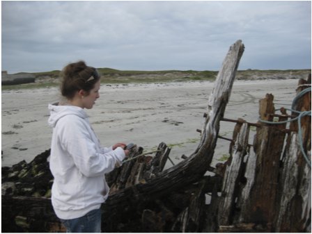
Over the next nine months we will create a mobile application allowing visitors and local historians to access geographically pertinent information, including old photographs, and interpretative maps/diagrams, while actually at sites of interest.  This will largely use visitors’ own devices such as smart phones and tablets.  Maps will be central to the application, using both OS OpenData and bespoke local maps and sketches of historical sites.

As well as adding an extra service for those who already visit An Iodhlann, we hope that this will attract new users, especially younger tourists.  In addition a ‘data layer’ using elements of semantic web technology will mean that the raw geo-coded information is available for third parties to mash-up and for digital humanities research.

the mouse that roars

The Scottish Digital Research and Development Fund for Arts and Culture is run by Nesta, Creative Scotland and the Arts and Humanities Research Council (AHRC).

This was a highly competitive process with 52 applications of which just 6 were funded.  The other successful organisations are: The National Piping Centre, Lyceum Theatre Company and the Edinburgh Cultural Quarter, Dundee Contemporary Arts, National Galleries of Scotland, Glasgow Film Theatre and Edinburgh Filmhouse.  These are all big city organisations as were the projects funded by an earlier similar programme run by Nesta England.

As the only rural-based project, this is a great achievement for Tiree and a great challenge for us over the next nine months!

challenges

In areas of denser population or high overall tourist numbers, historical or natural sites attract sufficient visitors to justify full time (volunteer or paid) staff.  In more remote rural locations or small islands there are neither sufficient people for volunteers to cover all, or even a significant number, of sites, nor have they sufficient tourist volume to justify commercial visitor centres.

A recent example of this on Tiree is the closing of the Thatched Cottage Museum.  This is one of the few remaining thatched houses on the island, and housed a collection of everyday historical artefacts.  This was owned by the Hebridean Trust, and staffed by local volunteers, but was recently closed and the building sold, as it proved difficult to keep it staffed sufficiently given the visitor numbers.

At some remote sites such as the Tiree chapels, dating back to the 10th century, or Iron Age hill forts, there are simple information boards and at a few locations there are also fixed indoor displays, including at An Iodhlann itself.  However, there are practical and aesthetic limits on the amount of large-scale external signage and limits on the ongoing running and maintenance of indoor exhibits.  Furthermore, limited mobile signals mean that any mobile-based solutions cannot assume continuous access.
from challenge to experience

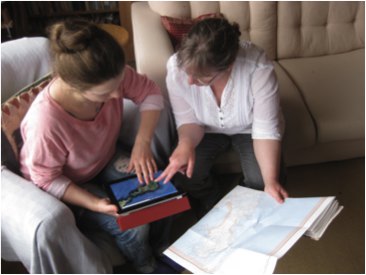
Providing information on visitors’ own phones or tablets will address some of the problems of lack of signage and human guides.  However, achieving this without effective mobile coverage means that simple web-based solutions will not work.

The application used whilst on the ground will need to be downloaded, but then this limits the total amount of information that is available whilst mobile; our first app will be built using HTML5 to ensure it will be available on the widest range of mobile devices (iOS, Android, Windows Mobile, ordinary laptops), but using HTML5  further reduces the local storage available1.

In order to deal with this, the on-the-ground experience will be combined with a web site allowing pre-trip planning and post-trip reminiscence.  This will also be map focused, allowing visitors to see where they have been or are about to go, access additional resources, such as photos and audio files that are too large to be available when on the ground (remembering poor mobile coverage). This may also offer an opportunity to view social content including comments or photographs of previous visitors and then to associate one’s own photographs taken during the day with the different sites and create a personal diary, which can be shared with others.
On reflection, this focus on preparation and reminiscence will create a richer and more extended experience than simply providing information on demand.  Rather than reading reams of on-screen text whilst looking at a  monument or attempting to hear an audio recording in the Tiree wind, instead visitors will have some information available in the field and more when they return to their holiday base, or home2.


  1. For some reason HTML5 applications are restricted to a maximum of 5Mb![back]
  2. This is another example of a lesson I have seen so many times before: the power of constraints to force more innovative and better designs. So many times I have heard people say about their own designs “I wanted to make X, but couldn’t for some reason so did Y instead” and almost every time it is the latter, the resource-constrained design, that is clearly so much better.[back]

mooHCIc – a massive open online HCI course

Would you like to know more about human–computer interaction, or would you like free additional resources for your students?

Hardly a week goes by without some story about the changing face of online open education: from Khan Academy to Apple’s iTunes U and a growing number of large-scale open online courses from leading academics such as Thrun‘s AI course at Stanford.

Talis is interested in the software needed to support these new forms of large-scale open learning.  So, partly because it seems a good idea, and partly to be a willing guinea pig, I am going to run a massive online open HCI course in the autumn.

This type of course is either aimed exclusively at people outside a traditional education setting; or else, in the case of some of the university based courses, the professor/tutor is teaching their own class and then making some of the materials connected with it available on the web.

While similarly aiming to cater for those outside mainstream education, I would like also to make it easy for those in traditional university settings to use this as part of their own courses, maybe suggesting it as additional material to recommend to their students.  Even more interesting will be if the online material is incorporated more deeply into your courses, perhaps using it instead of some of the lectures/labs you would normally give.

If you are teaching a HCI course and would be interested in me being a ‘virtual guest lecturer’ by using this material (free!) please let me know.

I don’t intend to do a broad introductory HCI ‘101’ (although I may start with a short ‘laying out the area’ component), but more a series of components on particular sub-topics.  These will themselves be split into small units of perhaps 10-15 minutes ‘lecture style’ material (Khan-style voice over, or maybe mix of voice-over and head-and-shoulders).  Each sub-topic will have its own exercises, discussion areas, etc.  So, tutors intending to use this as part of their own courses can choose a sub-topic that fits into their curriculum, and likewise individuals not part of a formal course can pick appropriate topics for themselves.   I may also think of some integrative exercises for those doing more than one component.

I have yet to decide the final topics, but the following are things for which I have given some sort of tutorial or produced fresh materials recently:

  • introduction to information visualisation — using materials created for IR+InfoVis winter school in Zinal last January
  • emotion and experience — using new chapter written for next edition of HCI book, and tutorial I did at iUSEr last December
  • physicality — looking at the interactions between digital and physical product design — based on forthcoming TouchIT book
  • formal methods in HCI — as I have just written a chapter for Mads’ interaction-design.org open encyclopaedia of HCI
  • user interface software architecture — based on heavily updated chapter for next edition of HCI book
  • creativity and innovation — (wider than pure HCI audience) — drawing on experience of teaching technical creativity using ‘Bad Ideas’ and other methods, with both practical (doing it) and theoretical (understanding it) aspects
  • designing for use (adoption and appropriation) — understanding the factors that lead to products being adopted including the rich interplay between design and marketing; and then, the factors that can allow users to appropriate products to their own purposes.

I will not do all these, but if some seem particularly interesting to you or your students, let me know and I’ll make final decisions soon based on a balance between popularity and ease of production!

not forgotten! 1997 scrollbars paper – best tech writing of the week at The Verge

Thanks to Marcin Wichary for letting me know that my 1997/1998 Interfaces article “Hands across the Screen” was just named in “Best Tech Writing of the Week” at The Verge.  Some years ago Marcin reprinted the article in his GUIdebook: Graphical User Interface gallery, and The Verge picked it up from there.

Hands across the screen is about why we have scroll bars on the right-hand side, even though it makes more sense to have them on the left, close to our visual attention for text.  The answer, I suggested, was that we mentally ‘imagine’ our hand crossing the screen, so a left-hand scroll-bar seems ‘wrong’, even though it is better (more on this later).

Any appreciation is obviously gratifying, but this is particularly so because it is a 15 year old article being picked up as ‘breaking’ technology news.

Interestingly, but perhaps not inconsequentially, the article was itself both addressing an issue current in 1997 and also looking back more than 15 years to the design of the Xerox Star and other early Xerox GUI in the late 1970s early 1980s as well as work at York in the mid 1980s.

Of course this should always be the case in academic writing: if the horizon is (only) 3-5 years leave it to industry.   Academic research certainly can be relevant today (and the article in question was in 1997), but if it does not have the likelihood of being useful in 10–20 years, then it is not research.

At the turn of the Millenium I wrote in my regular HCI Education column for SIGCHI Bulletin:

Pick up a recent CHI conference proceedings and turn to a paper at random. Now look at its bibliography – how many references are there to papers or books written before 1990 (or even before 1995)? Where there are older references, look where they come from — you’ll probably find most are in other disciplines: experimental psychology, physiology, education. If our research papers find no value in the HCI literature more than 5 years ago, then what value has today’s HCI got in 5 years time? Without enduring principles we ought to be teaching vocational training courses not academic college degrees.
(“the past, the future, and the wisdom of fools“, SIGCHI Bulletin, April 2000)

At the time about 90% of CHI citations were either to work in the last 5 years, or to the authors’ own work, to me that indicated a discipline in trouble — I wonder if it is any better today?

When revising the HCI textbook I am always pleased at the things that do not need revising — indeed some parts have hardly needed revising since the first edition in 1992.  These parts seem particularly important in education – if something has remained valuable for 10, 15, 20 years, then it is likely to still be valuable to your students in a further 10, 15, 20 years.  Likewise the things that are out of date after 5 years, even when revised, are also likely to be useless to your students even before they have graduated.

In fact, I have always been pleased with Hands across the Screen, even though it was short, and not published in a major conference or journal.  It had its roots in an experiment in my first every academic job at York in the mid-1980s, when we struggled to understand why the ‘obvious’ position for scroll arrows (bottom right) turned out to not work well.  After a detailed analysis, we worked out that in fact the top-left was the best place (with some other manipulations), and this analysis was verified in use.

As an important meta-lesson what looked right turned out not to be right.  User studies showed that it was wrong, but not how to put it right, and it was detailed analysis that filled the vital design gap.  However, even when we knew what was right it still looked wrong.  It was only years later (in 1997) that I realised that the discrepancy was because one mentally imagined a hand reaching across the screen, even though really one was using a mouse on the desk surface.

Visual (and other) impressions of designers and users can be wrong; as in any mature field, quite formal, detailed analysis is necessary to compliment even the most experienced designer’s intuitions.

The original interfaces article was followed by an even shorter subsidiary article “Sinister Scrollbar in the Xerox Star Xplained“, that delved into the history of the direction of scroll arrows on a scrollbar, and how they arose partly from a mistake when Apple took over the Star designs!  This is particularly interesting today given Apple’s perverse decision to remove scroll arrows completely — scrolling now feels like a Monti Carlo exercise, hoping you end up in the right place!

However, while it is important to find underlying principles, theories and explanations that stand the test of time, the application of these will certainly change.  Whilst, for an old mouse + screen PC,  the visual ‘hands across the screen’ impression was ‘wrong’ in terms of real use experience, now touch devices such as the iPad have changed this.  It really is a good idea to have the scrollbar on the left right so that you don’t cover up the screen as you scroll.  Or to be precise it is good if you are right handed.  But look hard, there are never options to change this for left-handed users — is this not a discrimination issue?  To be fair tabs and menu items are normally found at the top of the screen equally bad for all.  As with the scroll arrows, it seems that Apple long ago gave up any pretense of caring for basic usability of ergonomics (one day those class actions will come from a crippled generation!) — if  people buy because of visual and tactile design, why bother?  And where Apple lead the rest of the market follows 🙁

Actually it is not as easy as simply moving buttons around the screen; we have expectations from large screen GUI interfaces that we bring to the small screen, so any non-standard positioning needs to be particularly clear graphically.  However, the diverse location of items on web pages and often bespoke design of mobile apps, whilst bringing their own problems of inconsistency, do give a little more flexibility.

So today, as you design, do think “hands”, and left hands as well as right hands!

And in 15 years time, who knows what we’ll have in our hands, but let’s see if the same deep principles still remain.

September beckons: calls for Physicality and Alt-HCI

I’m co-chairing a couple of events, both with calls due in mid June: Physicality 2012, and Alt-HCI.   Both are associated with HCI 2012  in Birmingham in September, so you don’t have to chose!

Physicality 2012 – 4th International Workshop on Physicality

(Sept.11, co-located with HCI 2012)

Long awaited, the 4th in the Physicality workshop series exploring design challenges, theories and experiences in developing new forms of interactions that exploit human physical interaction with digital technology.

Position papers and research papers due 18th June.

see:

Alt-HCI

(track of HCI 2012, 12-15 Sept 2012)

A chance to present and engage with work that pushes the boundaries of HCI.  Do you investigate methods for inducing negative user experience, or for not getting things done (or is that Facebook?).  Maybe you would like to argue for the importance of Taylorism within HCI, or explore user interfaces for the neonate.

Papers due 15th June with an open review process in the weeks following.

see: HCI 2012 call for participation  (also HCI short papers and work-in-progress due 15th June: )

CSS considered harmful (the curse of floats and other scary stories)

CSS and JavaScript based sites have undoubtedly enabled experiences far richer than the grey-backgrounded days of the early web in the 1990s (and recall, the backgrounds really were grey!). However, the power and flexibility of CSS, in particular the use of floats, has led to a whole new set of usability problems on what appear to be beautifully designed sites.

I was reading a quite disturbing article on a misogynistic Dell event by Sophie Catherina Løhr at elektronista.dk.  However, I was finding it frustrating as a line of media icons on the left of the page meant only the top few lines were unobstructed.

I was clearly not the only one with this problem as one of the comments on the page read:

That social media widget on the left made me stop reading an otherwise interesting article. Very irritating.

To be fair on the page designer,  it was just on Firefox that the page rendered like this, on other browsers the left-hand page margin was wider.  Probably Firefox is strictly ‘right’ in a sense as it sticks very close to standards, but whoever is to blame, it is not helpful to readers of the blog.

For those wishing to make cross-browser styles, it is usually possible now-a-days, but you often have to reset everything at the beginning of your style files — even if CSS is standard, default styles are not:

body {
    margin: 0;
    padding 0;
    /*  etc. */
}

Sadly this is just one example of an increasingly common problem.

A short while ago I was on a site that had a large right-hand side tab.  I forget the function, maybe for comments, or a table of contents.  The problem was the tab obscured and prevented access to most of the scroll bar making navigation of the middle portion of the page virtually impossible.  Normally it is not possible to obscure the scroll bar as it is ‘outside’ the page. However this site, like many, had chosen to put the main content of the site in a fixed size scrolling <div>.  This meant that the header and footer were always visible, and the content scrolled in the middle.  Of course the scroll bar of the <div> is then part of the page and could be obscured.  I assume it was another cross-browser formatting difference that meant the designer did not notice the problem, or perhaps (not unlikely), only ever tested the style of pages with small amounts of non-scrolling text.

Some sites adopt a different strategy for providing fixed headers.  Rather than putting the main content in a fixed <div>, instead the header and footer are set to float above the main content and margins added to it to mean that the page renders correctly at top and bottom.  This means that the scrollbar for the content is the main scroll bar, and therefore cannot be hidden or otherwise mangled 🙂

Unfortunately, the web page search function does not ‘know’ about these floating elements and so when you type in a search term, will happily scroll the page to ”reveal’ the searched for word, but may do so in a way that it is underneath either header or footer and so invisible.

This is not made easier to deal with in the new MacOS Lion were the line up/down scroll arrows have been removed.  Not only can you not fine-adjust the page to reveal those hidden searched-for terms, but also, whilst reading the page, the page-up/page-down scroll does not ‘know’ about the hidden parts and so scrolls a full screen-sized page missing half the text 🙁

Visibility problems are not confined to the web, there has been a long history of modal dialogue boxes being lost behind other windows (which then often refuse to interact due to the modal dialogue box), windows happily resizing themselves to be partly obscured by the Apple Dock, or even disappearing onto non-existent secondary displays.

It may be that some better model of visibility could be built into both CSS/DOM/JavaScript and desktop window managers.  And it may even be that CSS will fix it’s slightly odd model of floats and layout.  However, I would not want to discourage the use of overlays, transparencies, and other floating elements until this happens.

In the mean time, some thoughts:

  1. restraint — Recall the early days of DTP when every newsletter sported 20 fonts. No self respecting designer would do this now-a-days, so use floats, lightboxes and the like with consideration … and if you must have popups or tabs that open on hover rather than when clicked, do make sure it is possible to move your mouse across the page without it feeling like walking a minefield.
  2. resizing — Do check your page with different window sizes, although desktop screens are now almost all at least 1024 x 768, think laptops and pads, as this is increasingly the major form of access.
  3. defaults — Be aware that, W3C not withstanding, browsers are different.  At very minimum reset all the margins and padding as a first step, so that you are not relying on browser defaults.
  4. testing — Do test (and here I mean technical testing, do user test as well!) with realistic pages, not just a paragraph of lorem ipsum.

And do my sites do this well … ?

With CSS as in all things, with great power …

P.S. Computer scientists will recognise the pun on Dijkstra’s “go to statement considered harmful“, the manifesto of structured programming.  The use of gotos in early programming langauges was incredibly flexible and powerful, but just like CSS with many concomitant potential dangers for the careless or unwary.  Strangely computer scientists have had little worry about other equally powerful yet dangerous techniques, not least macro languages (anyone for a spot of TeX debugging?), and Scheme programmers throw around continuations as if they were tennis balls.  It seemed as though the humble goto became the scapegoat for a discipline’s sins. It was interesting when the goto statement was introduced as a ‘new’ feature in PHP5.3, an otherwise post-goto C-style language; very retro.


image  xkcd.com

The value of networks: mining and building

The value of networks or graphs underlies many of the internet (and for that read global corporate) giants.  Two of the biggest: Google and Facebook harness this in very different ways — mining and building.

Years ago, when I was part of the dot.com startup aQtive, we found there was no effective understanding of internet marketing, and so had to create our own.  Part of this we called ‘market ecology‘.  This basically involved mapping out the relationships of influence between different kinds of people within some domain, and then designing families of products that exploited that structure.

The networks we were looking at were about human relationships: for example teachers who teach children, who have other children as friends and siblings, and who go home to parents.  Effectively we were into (too) early social networking1!

The first element of this was about mining — exploiting the existing network of relationships.

However in our early white papers on the topic, we also noted that the power of internet products was that it was also possible to create new relationships, for example, adding ‘share’ links.  That is building the graph.

The two are not distinct, if one is not able to exploit new relationships within a product it will die, and the mining of existing networks can establish new links (e.g. Twitter suggesting who to follow).  Furthermore, creating of links is rarely ex nihilo, an email ‘share’ link uses an existing relationships (contact in address book), but brings it into a potentially different domain (e.g. bookmarking a web page).

It is interesting to see Google and Facebook against this backdrop.  Their core strengths are in different domains (web information and social relationships), but moreover they focus differently on mining and building.

Google is, par excellence, about mining graphs (the web).  While it has been augmented and modified over the years, the link structure used in PageRank is what made Google great.  Google also mine tacit relationships, for example the use of word collocation to understand concepts and relationships, so in a sense build from what they mine.

Facebook’s power, in contrast, is in the way it is building the social graph as hundreds of millions of people tell it about their own social relationships.  As noted, this is not ex nihilo, the social relationships exist in the real word, but Facebook captures them digitally.  Of course, then Facebook mines this graph in order to derive revenue form advertisements, and (although people debate this) attempt to improve the user experience by ranking posts.

Perhaps the greatest power comes in marrying the two.   Amazon does this to great effect within the world of books and products.

As well as a long-standing academic interest, these issues are particularly germane to my research at Talis where the Education Graph is a core element.  However, they apply equally whether the core network is kite surfers, chess or bio-technology.

Between the two it is probably building that is ultimately most critical.  When one has a graph or network it is possible to find ways to exploit it, but without the network there is nothing to mine. Page and Brin knew this in the early days of their pre-Google project at Stanford, and a major effort was focused on simply gathering the crawl of the web on which they built their algorithms2.  Now Google is aware that, in principle, others can exploit the open resources on which much of its business depends; its strength lies in its intellectual capital. In contrast, with a few geographical exceptions, Facebook is the social graph, far more defensible as Google has discovered as it struggles with Google Plus.

  1. See our retrospective about vfridge  at  last year’s HCI conference and our original web sharer vision.[back]
  2. See the description of this in “In The Plex: How Google Thinks, Works and Shapes Our Lives“.[back]

books: The Nature of Technology (Arthur) and The Evolution of Technology (Basalla)

I have just finished reading “The Nature of Technology” (NoT) by W. Brian Arthur and some time ago read “The Evolution of Technology” (EoT) by George Basalla, both covering a similar topic, the way technology has developed from the earliest technology (stone axes and the wheel), to current digital technology.  Indeed, I’m sure Arthur would have liked to call his book “The Evolution of Technology” if Basalla had not already taken that title!

We all live in a world dominated by technology and so the issue of how technology develops is critical to us all.   Does technology ultimately serve human needs or does it have its own dynamics independent of us except maybe as cogs in its wheels?  Is the arc of technology inevitable or does human creativity and invention drive it in new directions? Is the development of technology now similar (albeit a bit faster) than previous generations, or does digital technology fundamentally alter things?

Basalla was  published in 1988, while Arthur is 2009, so Arthur has 20 years more to work on, not much compared to 2 million years for the stone axe and 5000 years for the wheel, but 20 years that has included the dot.com boom (and bust!), and the growth of the internet.  In a footnote (NoT,p.17), Arthur describes Basalla as “the most complete theory to date“, although then does not appear to directly reference Basalla again in the text – maybe because they have different styles.  Basalla (a historian of technology) offering a more descriptive narrative  whilst Arthur (and engineer and economist) seeks a more analytically complete account. However I also suspect that Arthur discovered Basella’s work late and included a ‘token’ reference; he says that a “theory of technology — an “ology” of technology” is missing (NoT,p.14), but, however partial, Basella’s account cannot be seen as other than part of such a theory.

Both authors draw heavily, both explicitly and implicitly, on Darwinian analogies, but both also emphasise the differences between biological and technological evolution. Neither is happy with, what Basella calls the “heroic theory of invention” where “inventions emerge in a fully developed state from the minds of gifted inventors” (EoT,p.20).  In both there are numerous case studies which refute these more ‘heroic’ accounts, for example Watts’ invention of the steam engine after seeing a kettle lid rattling on the fire, and show how these are always built on earlier technologies and knowledge.  Arthur is more complete in eschewing explanations that depend on human ingenuity, and therein, to my mind, lies the weakness of his account.  However, Arthur does take into account, as central mechanism,  the accretion of technological complexity through the assembly of components, al but absent from Basella’s account — indeed in my notes as I read Basella I wrote “B is focused on components in isolation, forgets implication of combinations“.

I’ll describe the main arguments of each book, then look at what a more complete picture might look like.

(Note, very long post!)

Basella: the evolution of technology

Basella’s describes his theory of technological evolution in terms of  four concepts:

  1. diversity of artefacts — acknowledging the wide variety both of different kinds of things, but also variations of the same thing — one example, dear to my heart, is his images of different kinds of hammers 🙂
  2. continuity of development — new artefacts are based on existing artefacts with small variations, there is rarely sudden change
  3. novelty — introduced by people and influenced by a wide variety of psychological, social and economic factors … not least playfulness!
  4. selection — winnowing out the less useful/efficient artefacts, and again influenced by a wide variety of human and technological factors

Basella sets himself apart both from earlier historians of technology (Gilfillan and Ogburn) who took an entirely continuous view of development and also the “myths of the heroic inventors” which saw technological change as dominated by discontinuous change.

He is a historian and his accounts of the development of artefacts are detailed and beautifully crafted.  He takes great efforts to show how standard stories of heric invention, such as the steam engine, can be seen much more sensibly in terms of slower evolution.  In the case of steam, the basic principles had given rise to Newcomen’s  steam pump some 60 years prior to Watt’s first steam engine.  However, whilst each of these stories emphasised the role of continuity, as I read them I was struck also by the role of human ingenuity.  If Newcomen’s engine had been around since 1712 years, what made the development to a new and far more successful form take 60 years to develop? The answer is surely the ingenuity of James Watt.  Newton said he saw further only because he stood on the shoulders of giants, and yet is no less a genius for that.  Similaly the tales of invention seem to be both ones of continuity, but also often enabled by insights.

In fact, Basella does take this human role on board, building on Usher’s earlier work, which paced insight centrally in accounts of continuous change.  This is particularly central in his account of the origins of novelty where he considers a rich set of factors that influence the creation of true novelty.  This includes both individual factors such as playfulness and fantasy, and also social/cultural factors such as migration and the patent system.  It is interesting however that when he turns to selection, it is lumpen factors that are dominant: economic, military, social and cultural.  This brings to mind Margaret Bowden’s H-creativity and also Csikszentmihalyi’s cultural views of creativity — basically something is only truly creative (or maybe innovative) when it is recognised as such by society (discuss!).

Arthur: the nature of technology

Basella ends his book confessing that he is not happy with the account of novelty as provided from historical, psychological and social perspectives.  Arthur’s single reference to Basella (endnote, NoT, p.17) picks up precisely this gap, quoting Basella’s “inability to account fully for the emergence of novel artefacts” (EoT,p.210).  Arthur seeks to fill this gap in previous work by focusing on the way artefacts are made of components, novelty arising through the hierarchical organisation and reorganisation of these components, ultimately built upon natural phenomena.  In language reminiscent of proponents of ‘computational thinking‘, Arthur talks of a technology being the “programming of phenomena for our purposes” (NoT,p.51). Although, not directly on this point, I should particularly liked Arthur’s quotation from Charles Babbage “I wish to God this calculation had been executed by steam” (NoT,p.74), but did wonder whether Arthur’s computational analogy for technology was as constrained by the current digital perspective as Babbage’s was by the age of steam.

Although I’m not entirely convinced at the completeness of hierarchical composition as an explanation, it is certainly a powerful mechanism.  Indeed Arthur views this ‘combinatorial evolution’ as the key difference between biological and technological evolution. This assertion of the importance of components is supported by computer simulation studies as well as historical analysis. However, this is not the only key insight in Arthur’s work.

Arthur emphasises the role of what he calls ‘domains’, in his words a “constellation of technologies” forming a “mutually supporting set” (NoT,p.71).  These are clusters of technologies/ideas/knowledge that share some common principle, such as ‘radio electronics’ or ‘steam power’.  The importance of these are such that he asserts that “design in engineering begins by choosing a domain” and that the “domain forms a language” within which a particular design is an ‘utterance’.  However, domains themselves evolve, spawned from existing domains or natural phenomena, maturing, and sometimes dying away (like steam power).

The mutual dependence of technology can lead to these domains suddenly developing very rapidly, and this is one of the key mechanisms to which Arthur attributes more revolutionary change in technology.  Positive feedback effects are well studied in cybernetics and is one of the key mechanisms in chaos and catastrophe theory which became popularised in the late 1970s.  However, Arthur is rare in fully appreciating the potential for these effects to give rise to sudden and apparently random changes.  It is often assumed that evolutionary mechanisms give rise to ‘optimal’ or well-fitted results.  In other areas too, you see what I have called the ‘fallacy of optimality’1; for example, in cognitive psychology it is often assumed that given sufficient practice people will learn to do things ‘optimally’ in terms of mental and physical effort.

human creativity and ingenuity

Arthur’s account is clearly more advanced than the early more gradualists, but I feel that in pursuing the evolution of technology based on its own internal dynamics, he underplays the human element of the story.   Arthur even goes so far as to describe technology using Maturna’s term autopoetic (NoT,p.170) — something that is self-(re)producing, self-sustaining … indeed, in some sense with a life of its own.

However, he struggles with the implications of this.  If, technology responds to “its own needs” rather than human needs, “instead of fitting itself to the world, fits the world to itself” (NoT,p.214), does that mean we live with, or even within, a Frankenstein’s monster, that cares as little for the individuals of humanity as we do for our individual shedding skin cells?  Because of positive feedback effects, technology is not deterministic; however, it is rudderless, cutting its own wake, not ours.

In fact, Arthur ends his book on a positive note:

Where technology separates us from these (challenge, meaning, purpose, nature) it brings a type of death. But where it affirms these, it affirms life. It affirms our humanness.” (NoT,p.216)

However, there is nothing in his argument to admit any of this hope, it is more a forlorn hope against hope.

Maybe Arthur should have ended his account at its logical end.  If we should expect nothing from technology, then maybe it is better to know it.  I recall as a ten-year old child wondering just these same things about the arc of history: do individuals matter?  Would the Third Reich have grown anyway without Hitler and Britain survived without Churchill?  Did I have any place in shaping the world in which I was to live?  Many years later as I began to read philosophy, I discovered these were questions that had been asked before, with opposing views, but no definitive empirical answer.

In fact, for technological development, just as for political development, things are probably far more mixed, and reconciling Basella and Arthur’s accounts might suggest that there is space both for Arthur’s hope and human input into technological evolution.

Recall there were two main places where Basella placed human input (individual and special/cultural): novelty and selection.

The crucial role of selection in Darwinian theory is evident in its eponymous role: “Natural Selection”.    In Darwinian accounts, this is driven by the breeding success of individuals in their niche, and certainly the internal dynamics of technology (efficiency, reliability, cost effectiveness, etc.) are one aspect of technological selection.  However, as Basella describes in greater detail, there are many human aspects to this as well from the multiple individual consumer choices within a free market to government legislation, for example regulating genome research or establishing emissions limits for cars. This suggest a relationship with technology les like that with an independently evolving wild beast and more like that of the farmer artificially selecting the best specimens.

Returning to the issue of novelty.  As I’ve noted even Basella seems to underplay human ingenuity in the stories of particular technologies, and Arthur even more so.  Arthur attempts account for “the appearance of radically novel technologies” (NoT,p.17) though composition of components.

One example of this is the ‘invention’ of the cyclotron by Ernest Lawrence (Not,p.114).  Lawrence knew of two pieces of previous work: (i) Rolf Wideröe’s idea to accelerate particles using AC current down a series of (very) long tubes, and (ii) the fact that magnetic fields can make charged particles swing round in circles.  He put the two together and thereby made the cyclotron, AC currents sending particles ever faster round a circular tube.  Lawrence’s  first cyclotron was just a few feet across; now, in CERN and elsewhere, they are many miles in diameter, but the principle is the same.

Arthur’s take-home message from this is that the cyclotron did not spring ready-formed and whole from Lawrence’s imagination, like Athena from Zeus’ head.  Instead, it was the composition of existing parts.  However, the way in which these individual concepts or components fitted together was far from obvious.  In many of the case studies the component technology or basic natural phenomena had been around and understood for many years before they were linked together.  In each case study it seems to be the vital key in putting together the disparate elements is the human one — heroic inventors after all 🙂

Some aspects of this invention not specifically linked to composition: experimentation and trial-and-error, which effectively try out things in the lab rather than in the market place; the inventor’s imagination of fresh possibilities and their likely success, effectively trail-and-error in the head; and certainly the body of knowledge (the domains in Arthur’s terms) on which the inventor can draw.

However, the focus on components and composition does offer additional understanding of how these ‘breakthroughs’ take place.  Randomly mixing components is unlikely to yield effective solutions.  Human inventors’ understanding of the existing component technologies allows them to spot potentially viable combinations and perhaps even more important their ability to analyse the problems that arise allow them to ‘fix’ the design.

In my own work in creativity I often talk about crocophants, the fact that arbitrarily putting two things together, even if each is good in its own right, is unlikely to lead to a good combination.  However, by deeply understanding each, and why they fit their respective environments, one is able to intelligently combine things to create novelty.

Darwinism and technology

Both Arthur and Basalla are looking for modified version of Darwinism to understand technological evolution.  For Arthur it is the way in which technology builds upon components with ‘combinatorial evolution’.  While pointing to examples in biology he remarks that “the creation of these larger combined structures is rarer in biological evolution — much rarer — than in technological evolution” (NoT,p.188).  Strangely, it is precisely the power of sexual reproduction over simpler mutation, that it allows the ‘construction’ and  ‘swopping’ of components; this is why artificial evolutionary algorithms often outperform simple mutation (a form of stochastic hill-climbing algorithm, itself usually better than deterministic hill climbing). However, technological component combination is not the same as biological components.

A core ‘problem’ for biological evolution is the complexity of the genotype–phenotype mapping.  Indeed in “The Selfish Gene” Dawkins attacks Lamarckism precisely on the grounds that the mapping is impossibly complex hence cannot be inverted2.  In fact, Dawkins arguments would also ‘disprove’ Darwinian natural selection as it also depends on the mapping not being too complex.  If the mapping between genotype–phenotype were as complex as Dawkins suggested, then small changes to genotypes as gene patterns would lead to arbitrary phenotypes and so fitness of parents would not be a predictor of fitness of offspring. In fact while not simple to invert (as is necessary for Lamarckian inheritance) the mapping is simple enough for natural selection to work!

One of the complexities of the genotype–phenotype mapping in biology is that the genotype (our chromosomes) is far simpler (less information) than our phenotype (body shape, abilities etc.).  Also the complexity of the production mechanism (a mothers womb) is no more complex than the final product (the baby).  In contrast for technology the genotype (plans, specifications, models, sketches), is of comparable complexity to the final product.  Furthermore the production means (factory, workshop) is often far more complex than the finished item (but not always, the skilled woodsman can make a huge variety of things using a simple machete, and there is interesting work on self-fabricating machines).

The complexity of the biological mapping is particularly problematic for the kind of combinatorial evolution that Arthur argues is so important for technological development.  In the world of technology, the schematic of a component is a component of the schematic of the whole — hierarchies of organisation are largely preserved between phenotype and geneotype.  In contrast, genes that code for finger length are also likely to affect to length, and maybe other characteristics as well.

As noted sexual reproduction does help to some extent as chromosome crossovers mean that some combinations of genes tend to be preserved through breeding, so ‘parts’ of the whole can develop and then be passed together to future generations.  If genes are on different chromosomes, this process is a bit hit-and-miss, but there is evidence that genes that code for functionally related things (and therefore good to breed together), end up close on the same chromosome, hence more likely to be passed as a unit.

In contrast, there is little hit-and-miss about technological ‘breeding’ if you want component A from machine X and component B from machine Y, you just take the relevant parts of the plans and put them together.

Of course, getting component A and component B to work together is anther matter, typically some sort of adaptation or interfacing is needed.  In biological evolution this is extremely problematic, as Arthur says “the structures of genetic evolution” mean that each step “must produce something viable” NoT,p.188).  In contrast, the ability to ‘fix’ the details composition in technology means that combinations that are initially not viable, can become so.

However, as noted at the end of the last section, this is due not just to the nature of technology, but also human ingenuity.

The crucial difference between biology and technology is human design.

technological context and infrastructure

A factor that seems to be weak or missing in both Basella and Arthur’s theories, is the role of infrastructure and general technological and environmental context3. This is highlighted by the development of the wheel.

The wheel and fire are often regarded as core human technologies, but whereas the fire is near universal (indeed predates modern humans), the wheel was only developed in some cultures.  It has long annoyed me when the fact that South American civilisations did not develop the wheel is seen as some kind of lack or failure of the civilisation.  It has always seemed evident that the wheel was not developed everywhere simply because it is not always useful.

I was wonderful therefore to read Basella’s detailed case study of the wheel (EoT,p.7–11) where he backs up what for me had always been a hunch, with hard evidence.  I was aware that the Aztecs had wheeled toys even though they never used wheels for transport. Basella quite sensibly points out that this is reasonable given the terrain and the lack of suitable draught animals. He also notes that between 300–700 AD wheels were abandoned in the Near East and North Africa — wheels are great if you have flat hard natural surfaces, or roads, but not so useful on steep broken hillsides, thick forest, or soft sandy deserts.

In some ways these combinations: wheels and roads, trains and rails, electrical goods and electricity generation can be seen as a form of domain in Arthur’s sense, a “mutually supporting set” of technologies (NoT,p.71), indeed he does talk abut the “canal world” (NoT,p82).  However, he is clearly thinking more about the component technologies that make up a new artefact, and less about the set of technologies that need to surround new technology it make it viable.

The mutual interdependence of infrastructure and related artefacts forms another positive feedback loop. In fact, in his discussion of ‘lock-in’, Arthur does talk about the importance of “surrounding structures and organisations”, as a constraint often blocking novel technology, and the way some technologies are only possible because of others (e.g. complex financial derivatives only possible because of computation).  However, the best example is Basalla’s description of the of the development of the railroad vs. canal in the American Mid-West (EoT,p.195–197).  This is often seen as simply the result of the superiority of the railway, but in the 1960s, Robert Fogel, a historian, made a detailed economic comparison and found that there was no clear financial advantage; it is just that once one began to become dominant the positive feedback effects made it the sole winner.

Arthur’s compositional approach focuses particularly on hierarchical composition, but these infrastructures often cut across components: the hydraulics in a plane, electrical system in a car, or Facebook ‘Open Graph’. And of course one of the additional complexities of biology is that we have many such infrastructure systems in our own bodies blood stream, nervous system, food and waste management.

It is interesting that the growth of the web was possible by a technological context of the existing internet and home PC sales (which initially were not about internet use, even though now this is often the major reason for buying computational devices).  However, maybe the key technological context for the modern web is the credit card, it is online payments and shopping, or the potential for them, that has financed the spectacular growth of the area. There would be no web without Berners Lee, but equally without Barclay Card.

  1. see my WebSci’11 paper for more on the ‘fallacy of optimality’[back]
  2. Why Dawkins chose to make such an attack on Lamarckism I’ve never understood, as no-one had believed in it as an explanation for nearly 100 years.  Strangely, it was very soon after “The Selfish Gene” was published that examples of Lamarckian evolution were discovered in simple organisms, and recently in higher animals, although in the latter through epigenetic (non-DNA) means.[back]
  3. Basalla does describes the importance of “environmental influences”, but is referring principally to the natural envronment.[back]

One week to the next Tech Wave

Just a week to go now before the next Tiree Tech Wave starts, although the first person is coming on Sunday and one person is going to hang on for a while after getting some surfing in.

Still plenty of room for anyone who decides to come at the last minute.

Things have been a little hectic, as having to do more of the local organisation this time, so running round the island a bit, but really looking forward to when people get here 🙂  Last two times I’ve felt a bit of tension leading up to the event as I feel responsible.  It is difficult planning an event and not having a schedule “person A giving talk at 9:30, person B at 10:45”; strangely much harder having nothing, simply trusting that good things will happen.  Hopefully this time I now have had enough experience to know that if I just hang back and resist the urge to ‘do something’, then people will start to talk together, work together, make together — I just need to have the confidence to do nothing1.

At previous TTW we have had open evenings when people from the local community have come in to see what is being done.  This time, as well as having a general welcome to people to come and see,  Jonnet from HighWire at Lancaster is going to run a community workshop on mending based on her personal and PhD work on ‘Futuremenders‘. Central to this is Jonnet’s pledge to not acquire any more clothes, ever, but instead to mend and remake. This picks up on textile themes on the island especially the ‘Rags to Riches Eco-Chic‘ fashion award and community tapestry group, but also Tech Wave themes of making, repurposing and generally taking things to pieces.   Jonnet’s work is not techno-fashion (no electroluminescent skirts, or LEDs stitched into your wooly hat), but does use social connections both physical and through the web to create mass participation, including mass panda knitting and an attempt on the world mass darning record.

For the past few weeks I have had an unusual (although I hope to become usual) period of relative stability on the island after a previous period of 8 months almost constantly on the move.  This has included some data hacking and learning HTML5 for mobile devices (hence some hacker-ish blog posts recently) I hope to finish off one mini-project during the TTW that will be particularly pertinent the weekend the clocks ‘go forward’ an hour for British Summer Time.  Will blog if I do.

I hit the road last November almost immediately the Tech Wave finished, so never got time to tidy things up.  So, before this one starts, I really should try to write a up a couple of activities from last time as I’m sure there will plenty more this time round…

  1. Strange I always give people the same advice we they take on management roles, “the brave manager does nothing”.  How rare that is.  In a university, new Vice Chancellor starts and feels he/she has to change things — new faculty structure, new committees. “In the long run, will be better”, everyone says, but I’ve always found such re-organisation is itself re-organised before we ever get to t “the long run”.[back]