Walking Wales

As some of you already know, next year I will be walking all around Wales: from May to July covering just over 1000 miles in total.

Earlier this year the Welsh Government announced the opening of the Wales Coastal Path a new long distance footpath around the whole coast of Wales. There were several existing long distance paths covering parts of the coastline, as well as numerous stretches of public footpaths at or near the coast. However, these have now been linked, mapped and waymarked creating for the first time, a continuous single route. In addition, the existing Offa’s Dyke long distance path cuts very closely along the Welsh–English border, so that it is possible to make a complete circuit of Wales on the two paths combined.

As soon as I heard the announcement, I knew it was something I had to do, and gradually, as I discussed it with more and more people, the idea has become solid.

This will not be the first complete periplus along these paths; this summer there have been at least two sponsored walkers taking on the route. However, I will be doing the walk with a technology focus, which will, I believe, be unique.

The walk has four main aspects:

personal — I am Welsh, was born and brought up in Cardiff, but have not lived in Wales for over 30 years. The walk will be a form of homecoming, reconnecting with the land and its people that I have been away from for so long. The act of encircling can symbolically ‘encompass’ a thing, as if knowing the periphery one knows the whole. Of course life is not like this, the edge is just that, not the core, not the heart. As a long term ex-pat, a foreigner in my own land, maybe all I can hope to do is scratch the surface, nibble at the edges. However, also I always feel most comfortable as an outsider, as one at the margins, so in some ways I am going to the places where I most feel at home. I will blog, audio blog, tweet and generally share this experience to the extent the tenuous mobile signal allows, but also looking forward to periods of solitude between sea and mountain.

practical — As I walk I will be looking at the IT experience of the walker and also discuss with local communities the IT needs and problems for those at the edges, at the margins. Not least will be issues due to the paucity of network access both patchy mobile signal whilst walking and low-capacity ‘broadband’ at the limits of wind-beaten copper telephone wires — none of the mega-capacity fibre optic of the cities. This will not simply be fact-finding, but actively building prototypes and solutions, both myself (in evenings and ‘days off’) and with others who are part of the project remotely or joining me for legs of the journey1. Geolocation and mobile based applications will be a core part of this, particularly for the walkers experience, but local community needs likely to be far more diverse.

philosophical — Mixed with personal reflections will be an exploration of the meanings of place, of path, of walking, of nomadicity and of locality. Aristotle’s school of philosophy was called the Peripatetic School because discussion took place while walking; over two thousand years later Wordsworth’s poetry was nearly all composed while walking; and for time immemorial routes of pilgrimage have been a focus of both spiritual service and personal enlightenment. This will build on some of my own previous writings in particular past keynotes2 on human understanding of space, and also wider literature such as Rebecca Solnit’s wonderful “Wanderlust“.  This reflection will inform the personal blogging, and after I finish I will edit this into a book or account of the journey.

research3 — the practical outcomes will intersect with various personal research interests including social empowerment, interaction design and algorithmics4.  For the walker’s experience, I will be effectively doing a form of action research!.  This will certainly include how to incorporate local maps (such as tourists town plans) effectively into more large-scale experiences, how ‘crowdsourced’ route knowledge can augment more formal digital and paper resources, data synchonisation to deal with disconnection, and data integration between diverse sources.  In addition I am offering myself as a living lab so that others can use my trip as a place to try out their own sensors and instrumentation5, information systems, content authoring, ethnographic practices, community workshops, etc.  This may involve simply asking me to use things, coming for a single meeting or day, or joining me for parts of the walk.

If any of this interests you, do get in touch.  As well as research collaborations (living lab or supporting direct IT goals) any help in managing logistics, PR, or finding sources of funding/sponsorship for basic costs, most welcome.

I’ll get a dedicated website, Facebook page, twitter account, and charity sponsorship set up soon … watch this space!

  1. Coding whilst walking is something I have thought about (but not done!) for many years, but definitely inspired more recently by Nick the amazing cycling programmer who came to the Spring Tiree Tech Wave.[back]
  2. Welsh Mathematician Walks in Cyberspace“, and “Paths and Patches: patterns of geognosy and gnosis“.[back]
  3. I tried to think of a word beginning with ‘p’ for research, but failed![back]
  4. As I tagged this post I found I was using nearly all my my most common tags — I hadn’t realised quite how much this project cuts across so many areas of interest.[back]
  5. But with the “no blood rule”: if I get sensor sores, the sensors go in the bin 😉 [back]

logo design competition – final days

The first entries are in for the logo design competition for the open HCI course I’m presenting in the autumn.  Arunn @ Talis has posted them on the wall in the office.  One is a very good cartoon style illustration, but I’m sure I don’t really look like that :-/

Final entries due by tomorrow midnight … and then Arunn is going to post them up for popular vote … and whichever gets most votes I end up wearing on a T-shirt at the HCI conference in a few weeks time.  There are times when democracy just feels wrong!

a radical design for mobile telephony

We are all aware of the phenomenal growth in smartphone and tablet use.  However, these are often designed with the needs of media and internet access above plain telephony.  Touch screens do not have tactile feedback leading to mistyping, especially problematic when using touchtone-based phone services, for tablets especially, the form factor is far from optimal, … and try answering your phone call quickly by sliding your finger across the screen!

There are solutions.  A recent gigaom post “Here’s why tablets (yes, tablets!) will replace the smartphone” suggested that hands-free headsets were already common, hence reducing the brick-to-the-ear effect.  This of course does not deal with the key pad, but there are some solutions to this using the vibrator motor to give simulated tactile feedback, and various technologies are in development that will (in time) allow tactile features to be programmed onto the screen (e.g. see “Mobile tactile tech gets physical“).

Over a slightly longer time frame we can expect smart materials to develop to the point that concept pieces such as Fabian Hemmert’s Shape-Changing Mobiles will become possible.  Instead of being a fixed shape not only will your tablet screen be able to develop solid buttons of all shapes on demand, but will potentially become travel mug, long-haul flight pillow or angle grinder.

The trouble is that not only are such technologies some years off, they are also tinkering at the edges, attempting to fix piecemeal some of the fundamental flaws of smartphone and tablet technology when it comes to telephony.  Clearly a more radical approach is required.

While Bluetooth headsets are effective, they tend to suggest call centre rather than cool, a single device would be preferable.  In addition this should ideally include some form of miniature key pad to facilitate typing telephone numbers (more extensive tasks such as address book management can be performed on the full-size tablet screen, especially if this is augmented with tactile feedback). Furthermore, for times when it is inconvenient to carry your full size tablet and it is in your handbag, rucksack or its custom wheelie bag, the perfect telephony attachment should also have a small additional screen to view the number you are dialing.

As a result of extensive research into user needs and in the spirit of the information appliance, the single purpose device optimised for a a single purpose, I have devised the perfect device: small, yet not too small to be lost, pocket sized so that it can be easily accessed when you receive a call, tactile, exploiting the deep understanding of the physicality community and knowledge from writing TouchIT. It will connect via Bluetooth to your existing smartphone/tablet and of course via WiFi or (in premium models) using 3G/GSM direct to mobile networks if you accidentally leave your smartphone at home.

I plan to demonstrate my early prototype at the forthcoming Physicality 2012 workshop, where Fabian will be giving a keynote.

Alt-HCI open reviews – please join in

Papers are online for the Alt-HCI trcak of British HCI conference in September.

These are papers that are trying in various ways to push the limits of HCI, and we would like as many people as possible to join in discussion around them … and this discussion will be part of process for deciding which papers are presented at the conference, and possibly how long we give them!

Here are the papers  — please visit the site, comment, discuss, Tweet/Facebook about them.

paper #154 — How good is this conference? Evaluating conference reviewing and selectivity
        do conference reviews get it right? is it possible to measure this?

paper #165 — Hackinars: tinkering with academic practice
        doing vs talking – would you swop seminars for hack days?

paper #170 — Deriving Global Navigation from Taxonomic Lexical Relations
        website design – can you find perfect words and structure for everyone?

paper #181 — User Experience Study of Multiple Photo Streams Visualization
        lots of photos, devices, people – how to see them all?

paper #186 — You Only Live Twice or The Years We Wasted Caring about Shoulder-Surfing
        are people peeking at your passwords? what’s the real security problem?

paper #191 — Constructing the Cool Wall: A Tool to Explore Teen Meanings of Cool
        do you want to make thing teens think cool?  find out how!

paper #201 — A computer for the mature: what might it look like, and can we get there from here?
        over 50s have 80% of wealth, do you design well for them?

paper #222 — Remediation of the wearable space at the intersection of wearable technologies and interactive architecture
        wearable technology meets interactive architecture

paper #223 — Designing Blended Spaces
        where real and digital worlds collide

Open HCI course website live

The website, HCIcourse.com, went live last week for the (free!) open online HCI course I posted about a few weeks ago (“mooHCIc – a massive open online HCI course“).  Over the summer we will be adding more detailed content and taster material, however, crucially, it already has a form to register interest.  Full registration for the course will open in September ready for tyhe course start in October, but if you register at the site now we will be able to let you know when this is available, and any other major developments (like when taster videos go online :-))  Even if you have already emailed, Twitter messaged or Facebook-ed me to say you are interested, do add yourself online in case the combination of my memory and organisation fails :-/

Tiree going mobile

Tiree’s Historical Centre An Iodhlann has just been awarded funding by the Scottish Digital Research and Development Fund for Arts and Culture to make historic archive material available through a mobile application whilst ‘on the ground’ walking, cycling or driving around the island.

I’ve been involved in bigger projects, but I can’t recall being more excited than this one: I think partly because it brings together academic interests and local community.

the project

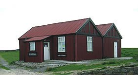
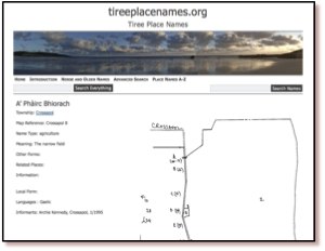
An Iodhlann (Gaelic for a stackyard) is the historical centre on the island of Tiree.  Tiree has a rich history from the Mesolithic period to the Second World war base. The archive was established in 1998, and its collection of old letters, emigrant lists, maps, photographs, stories and songs now extends to 12 000 items.  500 items are available online, but the rest of the primary data is only available at the centre itself.  A database of 3200 island place names collated by Dr Holliday, the chair of An Iodhlann, has recently been made available on the web at tireeplacenames.org.  Given the size of the island (~750 permanent residents) this is a remarkable asset.


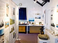
To date, the online access at An Iodhlann is mainly targeted at archival / historical use, although the centre itself has a more visitor-centred exhibition.  However, the existing digital content has the potential to be used for a wider range of applications, particularly to enhance the island experience for visitors.

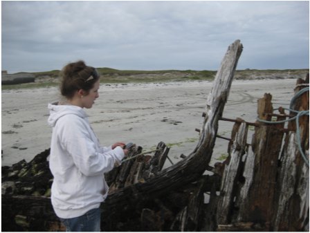
Over the next nine months we will create a mobile application allowing visitors and local historians to access geographically pertinent information, including old photographs, and interpretative maps/diagrams, while actually at sites of interest.  This will largely use visitors’ own devices such as smart phones and tablets.  Maps will be central to the application, using both OS OpenData and bespoke local maps and sketches of historical sites.

As well as adding an extra service for those who already visit An Iodhlann, we hope that this will attract new users, especially younger tourists.  In addition a ‘data layer’ using elements of semantic web technology will mean that the raw geo-coded information is available for third parties to mash-up and for digital humanities research.

the mouse that roars

The Scottish Digital Research and Development Fund for Arts and Culture is run by Nesta, Creative Scotland and the Arts and Humanities Research Council (AHRC).

This was a highly competitive process with 52 applications of which just 6 were funded.  The other successful organisations are: The National Piping Centre, Lyceum Theatre Company and the Edinburgh Cultural Quarter, Dundee Contemporary Arts, National Galleries of Scotland, Glasgow Film Theatre and Edinburgh Filmhouse.  These are all big city organisations as were the projects funded by an earlier similar programme run by Nesta England.

As the only rural-based project, this is a great achievement for Tiree and a great challenge for us over the next nine months!

challenges

In areas of denser population or high overall tourist numbers, historical or natural sites attract sufficient visitors to justify full time (volunteer or paid) staff.  In more remote rural locations or small islands there are neither sufficient people for volunteers to cover all, or even a significant number, of sites, nor have they sufficient tourist volume to justify commercial visitor centres.

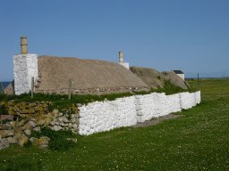
A recent example of this on Tiree is the closing of the Thatched Cottage Museum.  This is one of the few remaining thatched houses on the island, and housed a collection of everyday historical artefacts.  This was owned by the Hebridean Trust, and staffed by local volunteers, but was recently closed and the building sold, as it proved difficult to keep it staffed sufficiently given the visitor numbers.

At some remote sites such as the Tiree chapels, dating back to the 10th century, or Iron Age hill forts, there are simple information boards and at a few locations there are also fixed indoor displays, including at An Iodhlann itself.  However, there are practical and aesthetic limits on the amount of large-scale external signage and limits on the ongoing running and maintenance of indoor exhibits.  Furthermore, limited mobile signals mean that any mobile-based solutions cannot assume continuous access.

from challenge to experience

Providing information on visitors’ own phones or tablets will address some of the problems of lack of signage and human guides.  However, achieving this without effective mobile coverage means that simple web-based solutions will not work.

The application used whilst on the ground will need to be downloaded, but then this limits the total amount of information that is available whilst mobile; our first app will be built using HTML5 to ensure it will be available on the widest range of mobile devices (iOS, Android, Windows Mobile, ordinary laptops), but using HTML5  further reduces the local storage available1.

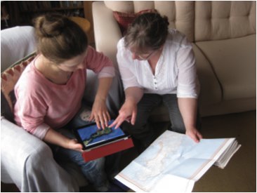
In order to deal with this, the on-the-ground experience will be combined with a web site allowing pre-trip planning and post-trip reminiscence.  This will also be map focused, allowing visitors to see where they have been or are about to go, access additional resources, such as photos and audio files that are too large to be available when on the ground (remembering poor mobile coverage). This may also offer an opportunity to view social content including comments or photographs of previous visitors and then to associate one’s own photographs taken during the day with the different sites and create a personal diary, which can be shared with others.

On reflection, this focus on preparation and reminiscence will create a richer and more extended experience than simply providing information on demand.  Rather than reading reams of on-screen text whilst looking at a  monument or attempting to hear an audio recording in the Tiree wind, instead visitors will have some information available in the field and more when they return to their holiday base, or home2.


  1. For some reason HTML5 applications are restricted to a maximum of 5Mb![back]
  2. This is another example of a lesson I have seen so many times before: the power of constraints to force more innovative and better designs. So many times I have heard people say about their own designs “I wanted to make X, but couldn’t for some reason so did Y instead” and almost every time it is the latter, the resource-constrained design, that is clearly so much better.[back]

mooHCIc – a massive open online HCI course

Would you like to know more about human–computer interaction, or would you like free additional resources for your students?

Hardly a week goes by without some story about the changing face of online open education: from Khan Academy to Apple’s iTunes U and a growing number of large-scale open online courses from leading academics such as Thrun‘s AI course at Stanford.

Talis is interested in the software needed to support these new forms of large-scale open learning.  So, partly because it seems a good idea, and partly to be a willing guinea pig, I am going to run a massive online open HCI course in the autumn.

This type of course is either aimed exclusively at people outside a traditional education setting; or else, in the case of some of the university based courses, the professor/tutor is teaching their own class and then making some of the materials connected with it available on the web.

While similarly aiming to cater for those outside mainstream education, I would like also to make it easy for those in traditional university settings to use this as part of their own courses, maybe suggesting it as additional material to recommend to their students.  Even more interesting will be if the online material is incorporated more deeply into your courses, perhaps using it instead of some of the lectures/labs you would normally give.

If you are teaching a HCI course and would be interested in me being a ‘virtual guest lecturer’ by using this material (free!) please let me know.

I don’t intend to do a broad introductory HCI ‘101’ (although I may start with a short ‘laying out the area’ component), but more a series of components on particular sub-topics.  These will themselves be split into small units of perhaps 10-15 minutes ‘lecture style’ material (Khan-style voice over, or maybe mix of voice-over and head-and-shoulders).  Each sub-topic will have its own exercises, discussion areas, etc.  So, tutors intending to use this as part of their own courses can choose a sub-topic that fits into their curriculum, and likewise individuals not part of a formal course can pick appropriate topics for themselves.   I may also think of some integrative exercises for those doing more than one component.

I have yet to decide the final topics, but the following are things for which I have given some sort of tutorial or produced fresh materials recently:

  • introduction to information visualisation — using materials created for IR+InfoVis winter school in Zinal last January
  • emotion and experience — using new chapter written for next edition of HCI book, and tutorial I did at iUSEr last December
  • physicality — looking at the interactions between digital and physical product design — based on forthcoming TouchIT book
  • formal methods in HCI — as I have just written a chapter for Mads’ interaction-design.org open encyclopaedia of HCI
  • user interface software architecture — based on heavily updated chapter for next edition of HCI book
  • creativity and innovation — (wider than pure HCI audience) — drawing on experience of teaching technical creativity using ‘Bad Ideas’ and other methods, with both practical (doing it) and theoretical (understanding it) aspects
  • designing for use (adoption and appropriation) — understanding the factors that lead to products being adopted including the rich interplay between design and marketing; and then, the factors that can allow users to appropriate products to their own purposes.

I will not do all these, but if some seem particularly interesting to you or your students, let me know and I’ll make final decisions soon based on a balance between popularity and ease of production!

not forgotten! 1997 scrollbars paper – best tech writing of the week at The Verge

Thanks to Marcin Wichary for letting me know that my 1997/1998 Interfaces article “Hands across the Screen” was just named in “Best Tech Writing of the Week” at The Verge.  Some years ago Marcin reprinted the article in his GUIdebook: Graphical User Interface gallery, and The Verge picked it up from there.

Hands across the screen is about why we have scroll bars on the right-hand side, even though it makes more sense to have them on the left, close to our visual attention for text.  The answer, I suggested, was that we mentally ‘imagine’ our hand crossing the screen, so a left-hand scroll-bar seems ‘wrong’, even though it is better (more on this later).

Any appreciation is obviously gratifying, but this is particularly so because it is a 15 year old article being picked up as ‘breaking’ technology news.

Interestingly, but perhaps not inconsequentially, the article was itself both addressing an issue current in 1997 and also looking back more than 15 years to the design of the Xerox Star and other early Xerox GUI in the late 1970s early 1980s as well as work at York in the mid 1980s.

Of course this should always be the case in academic writing: if the horizon is (only) 3-5 years leave it to industry.   Academic research certainly can be relevant today (and the article in question was in 1997), but if it does not have the likelihood of being useful in 10–20 years, then it is not research.

At the turn of the Millenium I wrote in my regular HCI Education column for SIGCHI Bulletin:

Pick up a recent CHI conference proceedings and turn to a paper at random. Now look at its bibliography – how many references are there to papers or books written before 1990 (or even before 1995)? Where there are older references, look where they come from — you’ll probably find most are in other disciplines: experimental psychology, physiology, education. If our research papers find no value in the HCI literature more than 5 years ago, then what value has today’s HCI got in 5 years time? Without enduring principles we ought to be teaching vocational training courses not academic college degrees.
(“the past, the future, and the wisdom of fools“, SIGCHI Bulletin, April 2000)

At the time about 90% of CHI citations were either to work in the last 5 years, or to the authors’ own work, to me that indicated a discipline in trouble — I wonder if it is any better today?

When revising the HCI textbook I am always pleased at the things that do not need revising — indeed some parts have hardly needed revising since the first edition in 1992.  These parts seem particularly important in education – if something has remained valuable for 10, 15, 20 years, then it is likely to still be valuable to your students in a further 10, 15, 20 years.  Likewise the things that are out of date after 5 years, even when revised, are also likely to be useless to your students even before they have graduated.

In fact, I have always been pleased with Hands across the Screen, even though it was short, and not published in a major conference or journal.  It had its roots in an experiment in my first every academic job at York in the mid-1980s, when we struggled to understand why the ‘obvious’ position for scroll arrows (bottom right) turned out to not work well.  After a detailed analysis, we worked out that in fact the top-left was the best place (with some other manipulations), and this analysis was verified in use.

As an important meta-lesson what looked right turned out not to be right.  User studies showed that it was wrong, but not how to put it right, and it was detailed analysis that filled the vital design gap.  However, even when we knew what was right it still looked wrong.  It was only years later (in 1997) that I realised that the discrepancy was because one mentally imagined a hand reaching across the screen, even though really one was using a mouse on the desk surface.

Visual (and other) impressions of designers and users can be wrong; as in any mature field, quite formal, detailed analysis is necessary to compliment even the most experienced designer’s intuitions.

The original interfaces article was followed by an even shorter subsidiary article “Sinister Scrollbar in the Xerox Star Xplained“, that delved into the history of the direction of scroll arrows on a scrollbar, and how they arose partly from a mistake when Apple took over the Star designs!  This is particularly interesting today given Apple’s perverse decision to remove scroll arrows completely — scrolling now feels like a Monti Carlo exercise, hoping you end up in the right place!

However, while it is important to find underlying principles, theories and explanations that stand the test of time, the application of these will certainly change.  Whilst, for an old mouse + screen PC,  the visual ‘hands across the screen’ impression was ‘wrong’ in terms of real use experience, now touch devices such as the iPad have changed this.  It really is a good idea to have the scrollbar on the left right so that you don’t cover up the screen as you scroll.  Or to be precise it is good if you are right handed.  But look hard, there are never options to change this for left-handed users — is this not a discrimination issue?  To be fair tabs and menu items are normally found at the top of the screen equally bad for all.  As with the scroll arrows, it seems that Apple long ago gave up any pretense of caring for basic usability of ergonomics (one day those class actions will come from a crippled generation!) — if  people buy because of visual and tactile design, why bother?  And where Apple lead the rest of the market follows 🙁

Actually it is not as easy as simply moving buttons around the screen; we have expectations from large screen GUI interfaces that we bring to the small screen, so any non-standard positioning needs to be particularly clear graphically.  However, the diverse location of items on web pages and often bespoke design of mobile apps, whilst bringing their own problems of inconsistency, do give a little more flexibility.

So today, as you design, do think “hands”, and left hands as well as right hands!

And in 15 years time, who knows what we’ll have in our hands, but let’s see if the same deep principles still remain.

September beckons: calls for Physicality and Alt-HCI

I’m co-chairing a couple of events, both with calls due in mid June: Physicality 2012, and Alt-HCI.   Both are associated with HCI 2012  in Birmingham in September, so you don’t have to chose!

Physicality 2012 – 4th International Workshop on Physicality

(Sept.11, co-located with HCI 2012)

Long awaited, the 4th in the Physicality workshop series exploring design challenges, theories and experiences in developing new forms of interactions that exploit human physical interaction with digital technology.

Position papers and research papers due 18th June.

see:

Alt-HCI

(track of HCI 2012, 12-15 Sept 2012)

A chance to present and engage with work that pushes the boundaries of HCI.  Do you investigate methods for inducing negative user experience, or for not getting things done (or is that Facebook?).  Maybe you would like to argue for the importance of Taylorism within HCI, or explore user interfaces for the neonate.

Papers due 15th June with an open review process in the weeks following.

see: HCI 2012 call for participation  (also HCI short papers and work-in-progress due 15th June: )

CSS considered harmful (the curse of floats and other scary stories)

CSS and JavaScript based sites have undoubtedly enabled experiences far richer than the grey-backgrounded days of the early web in the 1990s (and recall, the backgrounds really were grey!). However, the power and flexibility of CSS, in particular the use of floats, has led to a whole new set of usability problems on what appear to be beautifully designed sites.

I was reading a quite disturbing article on a misogynistic Dell event by Sophie Catherina Løhr at elektronista.dk.  However, I was finding it frustrating as a line of media icons on the left of the page meant only the top few lines were unobstructed.

I was clearly not the only one with this problem as one of the comments on the page read:

That social media widget on the left made me stop reading an otherwise interesting article. Very irritating.

To be fair on the page designer,  it was just on Firefox that the page rendered like this, on other browsers the left-hand page margin was wider.  Probably Firefox is strictly ‘right’ in a sense as it sticks very close to standards, but whoever is to blame, it is not helpful to readers of the blog.

For those wishing to make cross-browser styles, it is usually possible now-a-days, but you often have to reset everything at the beginning of your style files — even if CSS is standard, default styles are not:

body {
    margin: 0;
    padding 0;
    /*  etc. */
}

Sadly this is just one example of an increasingly common problem.

A short while ago I was on a site that had a large right-hand side tab.  I forget the function, maybe for comments, or a table of contents.  The problem was the tab obscured and prevented access to most of the scroll bar making navigation of the middle portion of the page virtually impossible.  Normally it is not possible to obscure the scroll bar as it is ‘outside’ the page. However this site, like many, had chosen to put the main content of the site in a fixed size scrolling <div>.  This meant that the header and footer were always visible, and the content scrolled in the middle.  Of course the scroll bar of the <div> is then part of the page and could be obscured.  I assume it was another cross-browser formatting difference that meant the designer did not notice the problem, or perhaps (not unlikely), only ever tested the style of pages with small amounts of non-scrolling text.

Some sites adopt a different strategy for providing fixed headers.  Rather than putting the main content in a fixed <div>, instead the header and footer are set to float above the main content and margins added to it to mean that the page renders correctly at top and bottom.  This means that the scrollbar for the content is the main scroll bar, and therefore cannot be hidden or otherwise mangled 🙂

Unfortunately, the web page search function does not ‘know’ about these floating elements and so when you type in a search term, will happily scroll the page to ”reveal’ the searched for word, but may do so in a way that it is underneath either header or footer and so invisible.

This is not made easier to deal with in the new MacOS Lion were the line up/down scroll arrows have been removed.  Not only can you not fine-adjust the page to reveal those hidden searched-for terms, but also, whilst reading the page, the page-up/page-down scroll does not ‘know’ about the hidden parts and so scrolls a full screen-sized page missing half the text 🙁

Visibility problems are not confined to the web, there has been a long history of modal dialogue boxes being lost behind other windows (which then often refuse to interact due to the modal dialogue box), windows happily resizing themselves to be partly obscured by the Apple Dock, or even disappearing onto non-existent secondary displays.

It may be that some better model of visibility could be built into both CSS/DOM/JavaScript and desktop window managers.  And it may even be that CSS will fix it’s slightly odd model of floats and layout.  However, I would not want to discourage the use of overlays, transparencies, and other floating elements until this happens.

In the mean time, some thoughts:

  1. restraint — Recall the early days of DTP when every newsletter sported 20 fonts. No self respecting designer would do this now-a-days, so use floats, lightboxes and the like with consideration … and if you must have popups or tabs that open on hover rather than when clicked, do make sure it is possible to move your mouse across the page without it feeling like walking a minefield.
  2. resizing — Do check your page with different window sizes, although desktop screens are now almost all at least 1024 x 768, think laptops and pads, as this is increasingly the major form of access.
  3. defaults — Be aware that, W3C not withstanding, browsers are different.  At very minimum reset all the margins and padding as a first step, so that you are not relying on browser defaults.
  4. testing — Do test (and here I mean technical testing, do user test as well!) with realistic pages, not just a paragraph of lorem ipsum.

And do my sites do this well … ?

With CSS as in all things, with great power …

P.S. Computer scientists will recognise the pun on Dijkstra’s “go to statement considered harmful“, the manifesto of structured programming.  The use of gotos in early programming langauges was incredibly flexible and powerful, but just like CSS with many concomitant potential dangers for the careless or unwary.  Strangely computer scientists have had little worry about other equally powerful yet dangerous techniques, not least macro languages (anyone for a spot of TeX debugging?), and Scheme programmers throw around continuations as if they were tennis balls.  It seemed as though the humble goto became the scapegoat for a discipline’s sins. It was interesting when the goto statement was introduced as a ‘new’ feature in PHP5.3, an otherwise post-goto C-style language; very retro.


image  xkcd.com