We get used to being able to zoom into every document picture and map, but part of the cartographer’s skill is putting the right information at the right level of detail. If you took area maps and then scaled them down, they would not make a good road atlas, the main motorways would hardly be visible, and the rest would look like a spider had walked all over it. Similarly if you zoom into a road atlas you would discover the narrow blue line of each motorway is in fact half a mile wide on the ground.
Nowadays we all use online maps that try to do this automatically. Sometimes this works … and sometimes it doesn’t.
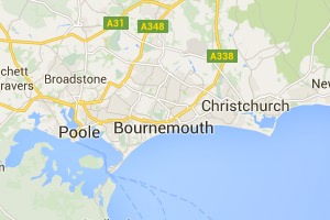
Here are three successive views of Google maps focused on Bournemouth on the south coast of England.
On the first view we see Bournemouth clearly marked, and on the next, zooming in a little Poole, Christchurch and some smaller places also appear. So far, so good, as we zoom in more local names are shown as well as the larger place.

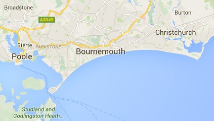
However, zoom in one more level and something weird happens, Bournemouth disappears. Poole and Christchurch are there, but no Bournemouth.
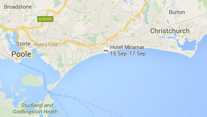
However, looking at the same level scale on another browser, Bournemouth is there still:
The difference between the two is the Hotel Miramar. On the first browser I am logged into Google mail, and so Google ‘knows’ I am booked to stay in the Hotel Miramar (presumably by scanning my email), and decides to display this also. The labels for Bournemouth and the hotel label overlap, so Google simply omitted the Bournemouth one as less important than the hotel I am due to stay in.
A human map maker would undoubtedly have simply shifted the name ‘Bournemouth’ up a bit, knowing that it refers to the whole town. In principle, Google maps could do the same, but typically geocoding (e.g. Geonames) simply gives a point for each location rather than an area, so it is not easy for the software to make adjustments … except Google clearly knows it is ‘big’ as it is displayed on the first, zoomed out, view; so maybe it could have done better.
This problem of overlapping legends will be familiar to anyone involved in visualisation whether map based or more abstract.
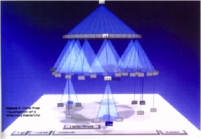
The image above is the original Cone Tree hierarchy browser developed by Xerox PARC in the early 1990s1. This was the early days of interactive 3D visualisation, and the Cone Tree exploited many of the advantages such as a larger effective ‘space’ to place objects, and shadows giving both depth perception, but also a level of overview. However, there was no room for text labels without them all running over each other.
Enter the Cam Tree:
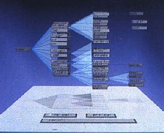
The Cam Tree is identical to the cone tree, except because it is on its side it is easier to place labels without them overlapping 🙂
Of course, with the Cam Tree the regularity of the layout makes it easy to have a single solution. The problem with maps is that labels can appear anywhere.
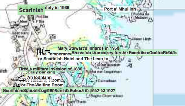
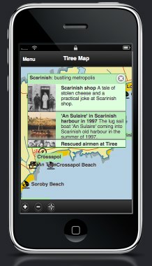
This is an image of a particularly cluttered part of the Frasan mobile heritage app developed for the An Iodhlann archive on Tiree. Multiple labels overlap making them unreadable. I should note that the large number of names only appear when the map is zoomed in, but when they do appear, there are clearly too many.
It is far from clear how to deal with this best. The Google solution was simply to not show some things, but as we’ve seen that can be confusing.
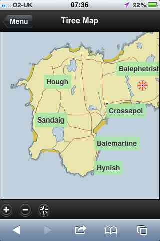
Another option would be to make the level of detail that appears depend not just on the zoom, but also the local density. In the Frasan map the locations of artefacts are not shown when zoomed out and only appear when zoomed in; it would be possible for them to appear, at first, only in the less cluttered areas, and appear in more busy areas only when the map is zoomed in sufficiently for them to space out. This would trade clutter for inconsistency, but might be worthwhile. The bigger problem would be knowing whether there were more things to see.
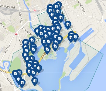
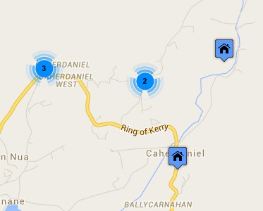
Another solution is to group things in busy areas. The two maps below are from house listing sites. The first is Rightmove which uses a Google map in its map view. Note how the house icons all overlap one another. Of course, the nature of houses means that if you zoom in sufficiently they start to separate, but the initial view is very cluttered. The second is daft.ie; note how some houses are shown individually, but when they get too close they are grouped together and just the number of houses in the group shown.
A few years ago, Geoff Ellis and I reviewed a number of clutter reduction techniques2, each with advantages and disadvantages, there is no single ‘best’ answer. The daft.ie grouping solution is for icons, which are fixed size and small, the text label layout problem is far harder!
Maybe someday these automatic tools will be able to cope with the full variety of layout problems that arise, but for the time being this is one area where human cartographers still know best.
- Robertson, G. G. ; Mackinlay, J. D. ; Card, S. K. Cone Trees: animated 3D visualizations of hierarchical information. Proceedings of the ACM Conference on Human Factors in Computing Systems (CHI ’91); 1991 April 27 – May 2; New Orleans; LA. NY: ACM; 1991; 189-194.[back]
- Geoffrey Ellis and Alan Dix. 2007. A Taxonomy of Clutter Reduction for Information Visualisation. IEEE Transactions on Visualization and Computer Graphics 13, 6 (November 2007), 1216-1223. DOI=10.1109/TVCG.2007.70535[back]


 The
The 

