Wild and wide (making sense of statistics) – 7 – Normal or not

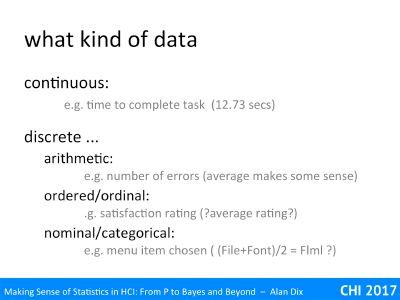
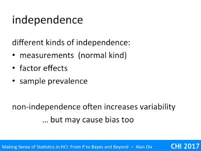
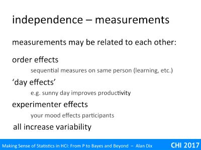
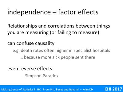
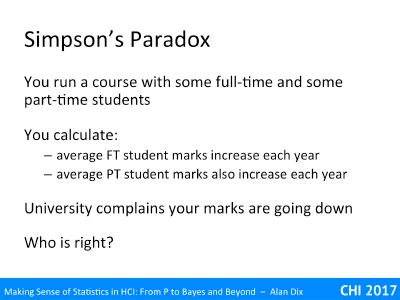
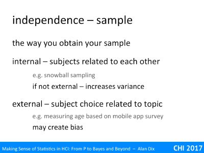
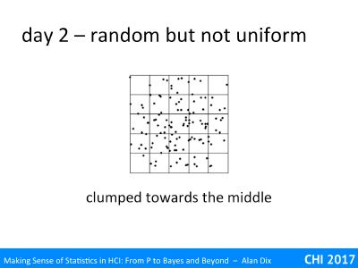
approximations, central limit theorem and power laws

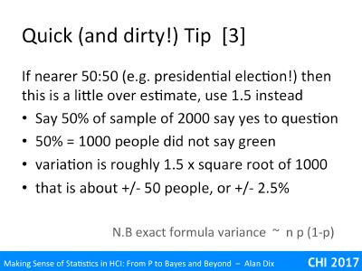
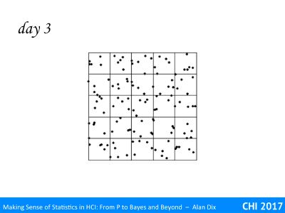
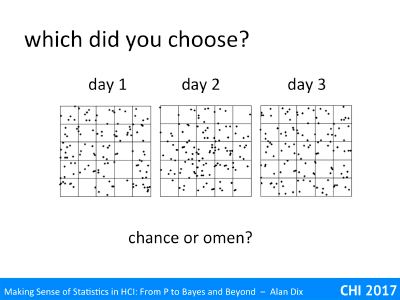
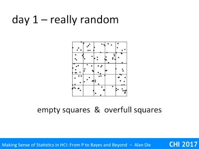
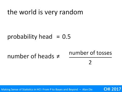
Some phenomena, such as tossing coins, have well understood distributions – in the case of coin tossing the Binomial distribution. This means one can work out precisely how likely every outcome is. At other times we need to use an approximate distribution that is close enough.

A special case is the Normal Distribution, the well-known bell-shaped curve. Some phenomena such as heights seem to naturally follow this distribution, whist others, such as coin-toss scores, end up looking approximately Normal for sufficiently many tosses.

However, there are special reasons why this works and some phenomena, in particular income distributions and social network data, are definitely NOT Normal!

Often in statistics, and also in engineering and forms of applied mathematics, one approximates one thing with another. For example, when working out the deflection of a beam under small loads, it is common to assume it takes on a circular arc shape, when in fact the actual shape is a somewhat more complex.

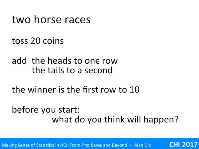
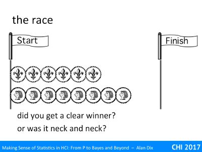
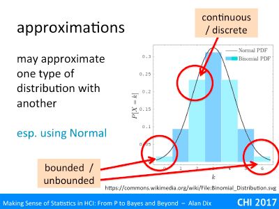
The slide shows a histogram. It is a theoretical distribution, the Binomial Distribution for n=6. This is what you’d expect for the number of heads if you tossed a fair coin six times. The histogram has been worked out from the maths: for n=1 (one toss) it would have been 50:50 for 0 and 1. If it was n=2 (two tosses), the histogram would have been ¼, ½, ¼ for 0,1,2,. For n=6, the probabilities are 1/64, 6/64, 15/64, 20/64, 15/64, 6/64, 1/64 for 0–6. However, if you tossed six coins, then did it again and again and again, thousands of times and kept tally of the number you got, you would end up getting closer and closer to this theoretical distribution.

It is discrete and bounded, but overlaid on it is a line representing the Normal distribution with mean and standard deviation chosen to match the binomial. The Normal distribution is a continuous distribution and unbounded (the tails go on for ever), but actually is not a bad fit, and for some purposes may be good enough.

In fact, if you looked at the same curves against a binomial for 20, 50 or 100 tosses, the match gets better and better.   As many statistical tests (such as Students t-test, linear regression, and ANOVA) are based around the Normal, this is good as it means that you can often use these even with something such as coin tossing data!

Although doing statistics on coin tosses is not that helpful except in exercises, it is not the only thing that comes out approximately normal, so many things from people’s heights to exam results seem to follow the Normal curve.

Why is that?

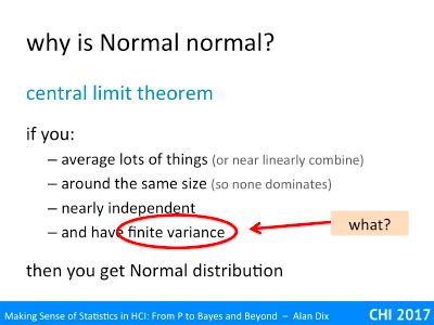
A mathematical result, the central limit theorem explains why this is the case. This says that if you take lots of things and:

  1. average them or add them up (or do something close to linear)
  2. they are around the same size (so no single value dominates)
  3. they are nearly independent
  4. they have finite variance (we’ll come back to this!)

Then the average (or sum of lots of very small things) behaves more and more like a Normal distribution as the number of small items gets larger.

Your height is based on many genes and many environmental factors. Occasionally, for some individuals, there may be single rare gene condition, traumatic event, or illness that stunts growth or cause gigantism. However, for the majority of the population it is the cumulative effect (near sum) of all those small effects that lead to our ultimate height, and hence why height is Normally distributed.

Indeed this pattern of large numbers of small things is so common that we find Normal distributions everywhere.

So if this set of conditions is so common, is everything Normal so long as you average enough of them?

Well if you look through the conditions various things can go wrong.

Condition (2), not having a single overwhelming value, is fairly obvious, and you can see when it is likely to fail.

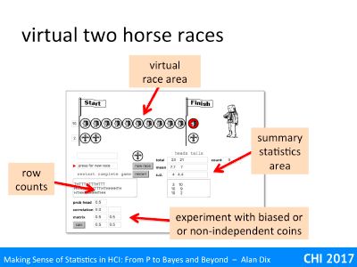
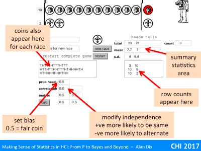
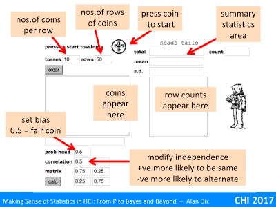
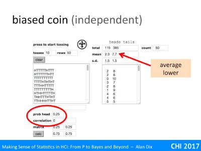
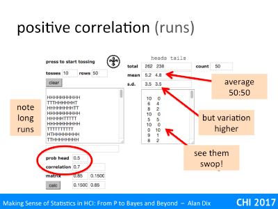
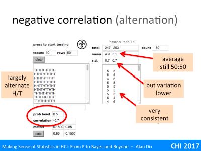
The independence condition (3) is actually not as demanding as first appears. In the virtual coin demonstrator, setting a high correlation between coin tosses meant you got long runs of heads or tails, but eventually you get a swop and then a run of the other side. Although ‘enough of them’ ends up being even more, you still get Normal distributions. Here the non-independence is local and fades; all that matters is that there are not long distance effects so that one value does not affect so many of the others to dominate.

The linearity condition (1) is more interesting. There are various things that can cause non-linearity. One is some sort of threshold effect, for example, if plants are growing near an electric fence, those that reach certain height may simply be electrocuted leading to a chopped off Normal distribution!

Feedback effects also cause non-linearity as some initial change can make huge differences, the well-known butterfly effect. Snowflake growth is a good example of positive feedback, ice forms more easily on sharp tips, so any small growth grows further and ends up being a long spike. In contrast kids-picture-book bumpy clouds suggest a negative feedback process that smoothens out any protuberance.

In education in some subjects, particularly mathematical or more theoretical computer science, the results end up not as a Normal-like bell curve, but bi-modal as if there were two groups of students. There are various reasons for this, not least the tendency for many subjects like this to have questions with an ‘easy bit’ and then a ‘sting in the tail’! However, this also may well represent a true split in the student population. In the humanities if you have trouble with one week’s lectures, you can still understand the next week. With mathematical topics, often once you lose track everything else seems incomprehensible – that is a positive feedback process, one small failure leads to a bigger failure, and so on.

However, condition (4), the finite variance is oddest. Variance is a measure of the spread of a distribution. You find the variance by first finding the arithmetic mean of your data, then working out the differences from this (called the residuals), square those differences and then find the average of those squares.

For any real set of data this is bound to be a finite number, so what does it mean to not have a finite variance?

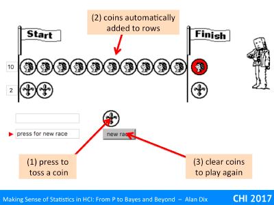
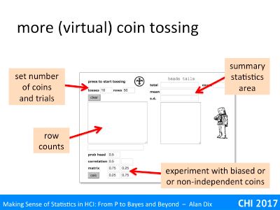
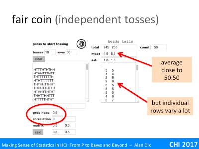
Normally, if you take larger and larger samples, this variance figure settles down and gets closer and closer to a single value. Try this with the virtual coin tossing application, increase the number of rows and watch the figure for the standard deviation (square root of variance) gradually settle down to a stable (and finite) value.

However, there are some phenomena where if you did this, took larger and larger samples, the standard deviation wouldn’t settle down to a final value, but in fact typically get larger and larger as the sample size grows (although as it is random sometimes larger samples might have small spread). Although the variance and standard deviation are finite for any single finite sample, they are unboundedly large as samples get larger.

Whether this happens or not is all about the tail. It is only possible at all with an unbounded tail, where there are occasional very large values, but on its own this is not sufficient.

Take the example of the number of heads before you get a tail (called a Negative Binomial). This is unbounded, you could get any number of heads, but the likelihood of getting lots of heads falls off very rapidly (one in a million for 20 heads), which leads to a finite mean of 1 and a finite variance of exactly 2.

Similarly the Normal distribution itself has potentially unbounded values, arbitrarily large in positive and or negative directions, but they are very unlikely resulting in a finite variance.

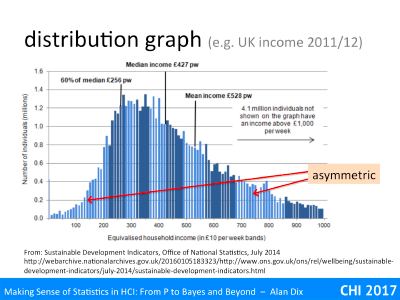
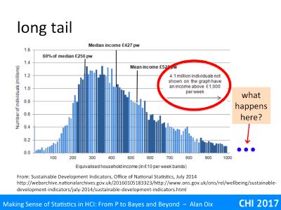
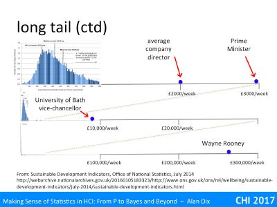
Indeed, in my early career, distributions without finite variance seemed relatively rare, a curiosity. One of the few common examples were income distributions in economics. For income he few super rich are often not enough to skew the arithmetic average income; Wayne Rooney’s wages averaged over the entire UK working population is less than a penny each. However, these few very well paid are enough to affect variance. Of course, for any set of people at any time, the variance is still finite, but the shape of it means that in practice if you take, say, lots of samples of first 100, then 1000, and so on larger and larger, the variance would keep on going up.   For wealth (rather than income) this is also true for the average!

I said ‘in my early career’, as this was before the realisation of how common power law distributions were in human and natural phenomena.

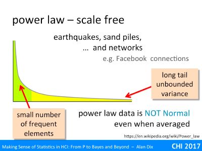
You may have heard of the phrase ‘power law’ or maybe ‘scale free’ distributions, particularly related to web phenomena. Do note that the use of the term ‘power’ here is different from statistical ‘power’, and for that matter the Power Rangers.

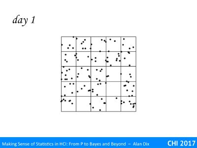
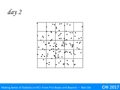
Some years ago it became clear that number of physical phenomena, for example earthquakes, have behaviours that are very different from the normal distribution or other distributions that were commonly dealt with in statistics at that time.

An example that you can observe for yourself is in a simple egg timer. Watch the sand grains as they dribble through the hole and land in a pile below. The pile initially grows, the little pile gets steeper and steeper, and then there is a little landslide and the top of the pile levels a little, then grows again, another little landslide. If you kept track of the landslides, some would be small, just levelling off the very tip of the pile, some larger, and sometimes the whole side of the pile cleaves away.

There is a largest size for the biggest landslide due to small size of the egg timer, but if you imagine the same slow stream of sand falling onto a larger pile, you can imagine even larger landslides.

If you keep track of the size of landslides, there are fewer large landslides than smaller ones, but the fall off is not nearly as dramatic as, say, the likelihood of getting lots and lots of heads in a row when tossing a coin. Like the income distribution, the distribution is ‘tail heavy’; there are enough low frequency but very high value events to effect the variance.

For sand piles and for earthquakes, this is due to positive feedback effects. Think of dropping a single grain of sand on the pile. Sometimes it just lands and stays. The sand pile is quite shallow this happens most of the time and the pile gets higher … and steeper. However, when the pile is of a size and steepens, when the slope is only just stable, sometimes the single grain knocks another out of place, these may both roll a little and then stop, but they may knock another, the little landslide has enough speed to create a larger one.

Earthquakes are just the same. Tension builds up in the rocks, and at some stage a part of the fault that is either a little loose, or under slightly more tension gives – a minor quake. However, sometimes that small amount of release means the bit of fault next to it is also pushed over its limit and also gives, the quake gets bigger, and so on.

Well, user interface and user experience testing doesn’t often involve earthquakes, nor for that matter sand piles. However, network phenomena such as web page links, paper citations and social media connections follow a very similar pattern. The reason for this is again positive feedback effects; if a web page has lots of links to it or a paper is heavily cited, others are more likely to find it and so link to it or cite it further. Small differences in the engagement or quality of the source, or simply some random initial spark of interest, leads to large differences in the final link/cite count. Similarly if you have lots of Twitter followers, more people see your tweets and choose to follow you.

Crucially this means that of you take the number of cites of a paper, the number of social media connections of a person, these do NOT behave like a Normal distribution even when averaged.

If you use statistical test and tools, such as t-tests, ANOVA or linear regression that assume Normal data, your analysis will be utterly meaningless and quite likely misleading.

As this sort of data becomes more common this of growing importance to know.

This does not mean you cannot use this sort of data, you can use special tests for it, or process the data to make it amenable to standard tests.

For example, you can take citation or social network connection data and code each as ‘low’ (bottom quartile of cites/connections) medium (middle 50%) or high (top quartile of cites/connections). If you turn these into a 0, 1, 2 scale, these have relative probability 0.25, 0.5, 0.25 – just like the number of heads when tossing two coins. This transformation of the data means that it is now suitable for use with standard tests so long as you have sufficient measurements – which is usually not a problem with this kind of data!


Wild and wide (making sense of statistics) – 6 – distributions

discrete or continuous, bounds and tails

We now look at some of the different properties of data and ‘distributions’, another key word of statistics.

We discuss the different kinds of continuous and discrete data and the way they may be bounded within some finite range, or be unbounded.

In particular we’ll see how some kinds of data, such as income distributions, may have a very long tail, small number of very large values (yep that 1%!).

Some of this is a brief reprise if you have previously done some sort of statistics course.

One of the first things to consider, before you start any statistical analysis, is the kind of data you are dealing with.

A key difference is between continuous and discrete data. Think about an experiment where you have measured time to compete a particular sub- task and also the number of errors during the session. The first of these, completion time, is continuous, it might be 12 seconds or 13 seconds, but could also be 12.73 seconds or anything in between. However, while a single user might have 12 or13 errors, they cannot have 12.5 errors.

Discrete values also come in a number of flavours.

The number of errors is arithmetic. Although a single user cannot get 12.5 errors, it makes sense to average them, so you could find that the average error rate is 12.73 errors per user. Although one often jokes about the mythical family with 2.2 children, it is meaningful, if you have 100 families you expect, on average 220 children.

In contrast nominal or categorical data has discrete values that cannot easily be compared, added or averaged. For example, if when presented with a menu half your users choose ‘File’ and half choose ‘Font’, it does not make sense to say that they have on average selected ‘Flml’!

In between are ordinal values, such as the degrees of agreement or satisfaction in a Likert scale. To add a little confusion these are often coded as numbers, so that 1 might be the left-most point and 5 the right-most point in a simple five point Likert scale. While 5 may be represent better than 4 and 3 better than 1, it is not necessarily the case that 4 is twice as good as 2. The points are ordered, but do not represent any precise values. Strictly you cannot simply add up and average ordinal values … however, in practice and if you have enough data, you can sometimes ‘get away’ with it, especially if you just want an indicative idea or quick overview of data … but don’t tell any purists I said so 😉

A special case of discrete data is binary data such as yes/no answers, or present/not present. Indeed one way of dealing with ordinal data, that avoids frowned upon averaging, is to choose some critical value and turn the values into simple big/small. For example, you might say that 4 and 5 are generally ‘satisfied’, so you convert 4 and 5 into ‘Yes’ and 1, 2 and 3 into ‘No’. The downside of this is that it loses information, but can be an easy way to present data.

Another question about data is whether the values are finite or potentially unbounded.

Let’s look at some examples.

number of heads in 6 tosses – This is a discrete value and bounded. The valid responses can only be 0, 1, 2, 3, 4, 5 or 6. You cannot have 3.5 heads, nor can you have -3 heads, nor 7 heads.

number of heads until first tail – still discrete, and still bounded below, but this time unbounded above. Although unlikely you could have to wait for a hundred or a thousand heads before you get a tail, there is no absolute maximum. Although, once I got to 20 heads I might start to believe I’m in the Matrix.

wait before next bus – This is now a continuous value, it could be 1 minute, 20 minutes, or 12 minutes 17.36 seconds. It is bounded below (no negative wait times), but not above, you could wait an hour, or even forever if they have cancelled the service.

difference between heights – say if you had two buildings the Abbot Tower (lets say height A) and Burton Heights (height B), you could subtract A-B. If Abbot Tower is taller, then this would be positive, if Burton Height is taller, the difference would be negative. There are probably some physical limits on building height (if it were too tall the top part might be essentially in orbit and float away!). However, for most purposes the difference is effectively unbounded, either building could be arbitrarily bigger than the other.

Now for our first distribution.

The histogram is taken from UK Office for National Statistics data on weekly income during 2012. This is continuous data, but to plot it the ONS has put people into £10 ‘bins’: 0-£9.99 in the first bin, £10–£29.9 in the next bin, etc., and then the histogram height is the number of people who earn in that range.

Note that this is an empirical distribution, it is the actual number of people in each category, rather than a theoretical distribution based on mathematical calculations of probabilities.

You can easily see that mid-range weekly wages are around £300–£400, but with a lot of spread. Each bar in this mid-range represents a million people or so. Remembering my quick and dirty rule for count data, the variability of each column is probably only +/-2000, that is 0.2% of the column height. The little sticky-out columns are probably a real effect, not just random noise (yes really an omen, at this scale, things should be more uniform and smooth). I don’t know the explanation, but I wonder if it is a small tendency for jobs to have weekly, monthly or annual salaries that are round numbers.

You can also see that tis is not a symmetric distribution, it rises quite rapidly from zero, but then tails off a lot more slowly.

In fact, the rate of tailing off is so slow that then ONS have decided to cut it off at £1000 per week, even though it says that 4.1 million people earn more than this. In plotting the data they have chosen a cut off that avoids making the lower part getting too squashed.

But how far out does the ‘tail’ go?

I’ve not got the full data, but assume the tail, the long spread of low frequency values, decays reasonably smoothly at first.

However, I have found a few examples to populate a zoomed out view.

At the top is the range expanded by 3 to go up to £3000 a week. On this I’ve put the average UK company director’s salary of £2000 a week (£100K per annum) and the Prime Minister at about £3000 a week (£150K pa). UK professorial salaries fall roughly in the middle of this range.

Now lets zoom out by a factor of ten. The range is now up to £30,000 a week. About 1/3 of the way along is the vice-chancellor of the University of Bath (effectively CEO), who is currently the highest paid university vice-chancellor in the UK at £450K pa, around three times that of the Prime Minister.

However, we can’t stop here, we haven’t got everyone yet, let’s zoom out by another factor of ten and now we can see Wayne Rooney, who is one of the highest paid footballers in the UK at £260,000 per week. Of course this is before we even get to the tech and property company super-rich who can earn (or at least amass) millions per week.

At this scale, now look at the far left, can you just see a very thin spike of the mass of ordinary wage earners? This is why the ONS did not draw their histogram at this scale. This is a long-tail distribution, one where there are very high values but with very low frequency.

N.B. I got this slide wrong in the video because I lost a whole ‘order of magnitude’ between the vice-chancellor of Bath and Wayne Rooney!

There is another use of the term ‘tail’ in statistics – you may have seen mention of one- or two-tailed tests. This is referring to the same thing, the ‘tail’ of values at either end of a distribution, but in a slightly different way.

For a moment forget the distribution of the values, and think about the question you want to ask. Crucially do you care about direction?

Imagine you are about to introduce a new system that has some additional functionality. However, you are worried that its additional complexity will make it more error prone. Before you deploy it you want to check this.

Here your question is, “is the error rate higher?”.

If it is actually lower that is nice, but you don’t really care so long as it hasn’t made things worse.

This is a one-tailed test; you only care about one direction.

In contrast, imagine you are trying to decode between two systems, A and B. Before you make your decision you want to know whether the choice will effect performance. So you do a user test and measure completion times.

This time your question is, “are the completion times different?”.

This is a two-tailed test; you care in both directions, if A is better than B or if B is better than A.

Wild and wide (making sense of statistics) – 5 – play

experiment with bias and independence

This section will talk you through two small web demonstrators that allow you to experiment with virtual coins.

Because the coins are digital you can alter their properties, make them not be 50:50 or make successive coin tosses not be independent of one another. Add positive correlation and see the long lines of heads or tails, or put in negative correlation and see the heads and tails swop nearly every toss.

Links to the demonstrators can be found at statistics for HCI resources.

Incidentally, the demos were originally created in 1998; my very first interactive web pages. It is amazing how much you could do even with 1998 web technology!

The first application automates the two-horse races that you have done by hand with real coins in the “unexpected wildness of random” exercises. This happens in the ‘virtual race area’ marked in the slide.

So far this doesn’t give you any advantage over physical coin tossing unless you find tossing coins very hard. However, because the coins are virtual, the application is able to automatically keep a tally of all the coin tosses (in the “row counts” area), and then gather statistics about them (in the “summary statistics area”).

Perhaps most interesting is the area marked “experiment with biased or non-independent coins” as this allows you to create virtual coins that would be very hard to replicate physically.

We’ll start with the virtual race area.

It should initially be empty. Press the marked coin to toss a coin. It will spin and when it stops the coin will be added to the top row for heads or the lower row for tails. Press the coin again for the next toss until one side or other wins.

If you would like another go, just press the ‘new race’ button.

As you do each race you will see the coins also appear as ‘H’ and ‘T’ in the text area on the left below the coin toss button and the counts for each completed race appear in the text box to the right of that.

The area above that box on the right keeps a tally of the total number of heads and tails, the mean (arithmetic average) if heads and tails per race, and the standard of each. We’ll look at these in more detail in ‘more coin tossing’ below.

Finally the area at the bottom left allows you to create unreal coins!

Adjusting the “prob head” allows you to create biased coins (valid values between 0 and 1). For example, setting ‘prob head” to 0.2 makes a coin that will fall heads 20% of the time and tails 80% of the time (both on average of course!).

Adjusting the ‘correlation’ figure allows you to create coins that depend on the previous coin toss (valid values -1 to +1). A positive figure means that each coin is more likely to be the same as the previous one – that is if the previous coin was a head toy are more likely to also get a head on the next toss. This is a bit like a learning effect in . Putting a negative value does the opposite, if the previous toss was a head the next one is more likely to be tail.

Play with these values to get a feel for how it affects the coin tossing. However, do remember to do plenty of coin tosses for each setting otherwise all you will see is the randomness!   Play first with quite extreme values, as this will be more evident.

The second application is very similar, except no race track!

This does not do a two-horse race, but instead will toss a given number of coins, and then repeat this. You don’t have to press the toss button for each cpin toss, just once and it does as many as you ask.

Instead of the virtual race area, there is just an area to put the number or coins you want it to toss, and then the number of rows of coins you want it to produce.

Let’s look in more detail.

At the top right are text areas to enter the number of coins to toss (here 10 coins at a time) and the number of rows of coins (here ste to 50 times). You press the coin to start, just as in the two-horse race, except now it will toss the coin 10 times and the Hs and Ts will appear in the tally box below. Once it has tossed the first 10 it will toss 10 more, and then 10 more until it has 50 rows of coins – 500 in total … all just for one press.

The area for setting bias and correlation is the same as in the two-horse race, as is the statistics area.

Here is a set of tosses where the coin was set to be fair (prob head=0.5) with completely independent tosses (correlation=0) – that is just like a real coin (only faster).

You can see the first 9 rows and first 9 row counts in the left and right text areas. Note how the individual rows vary quite a lot, as we have seen in the physical coin tossing experiments. However, the average (over 50 sets of 10 coin tosses) is quite close to 50:50. Note also the standard deviation

The standard deviation is 1.8, but note this is the standard deviation of the sample. Because this is a completely random coin toss, with well understood probabilistic properties, it is possible to calculate the ‘real’ standard deviation – this is the value you would expect to see if you repeated this thousands and thousands of times. This value is the square root of 2.5, which is just under 1.6. This measured standard deviation is an estimate of the ‘real’ value, and hence not the ‘real’ value, just like the measured proportion of heads has tuned out at 0.49, not exactly a half. This estimate of the standard deviation itself varies a lot … indeed estimates of variation of often very variable themselves!

Here’s another set of tosses, this time with the probability of a head set to 0,25. That is a (virtual!) coin that falls heads about a quarter of the time. So a bit like having a four sided spinner with heads on one side and tails on the other three.

The correlation has been set to zero still so that the tosses are independent.

You can see how the proportion of heads is now smaller, on average 2.3 heads to 7.7 tails in each run of 10 coins. This is not exactly 2.5, but if you repeated this sometimes it would be less, sometimes more. On average, over 1000s of tosses it would end up close to 2.5.

Now we’re going to play with very unreal non-independent coins.

The probability of being a head is set to 0.5 so it is a fair coin, but the correlation is positive (0.7) meaning heads are more likely to follow heads and vice versa.

If you look at the left hand text area you can see the long runs of heads and tails. Sometimes they do alternate, but then sty the same for long periods.

Looking up to the summary statistics area the average numbers of heads and tails is near 50:50 – the coin was fair, but the standard deviation is a lot higher than in the independent case. This is very evident if you look at the right-hand text area with the totals as they swing between extreme values much more than the independent coin did (even more that its quite wild randomness!).

If we put a negative value for the correlation we see the opposite effect.

Now the rows of Hs and Ts alternate a lot of time, far more than a normal coin.

The average is still close tot 50:50, but this time the variation is lower and you can see this in the row totals, which are typically much closer to five heads and five tails than the ordinary coin.

Recall the gambler’s fallacy that if a coin has fallen heads lots of times it is more likely to be a tail next. In some way this coin is a bit like that, effectively evening out the odds, hence the lower variation.


Wild and wide (making sense of statistics) – 4 – independence and non-independence

‘Independence’ is another key term in statistics. We will see several different kinds of independence, but in general it is about whether one measurement, or factor gives information about another.

Non-independence may increase variability, lead to misattribution of effects or even suggest completely the wrong effect.

Simpson’s paradox is an example of the latter where, for example, you might see on year on year improvement in the performance of each kind of student you teach and yet the university tells you that you are doing worse!

Imagine you have tossed a coin ten times and it has come up heads each time. You know it is a fair coin, not a trick one. What is the probability it will be a tail next?

Of course, the answer is 50:50, but we often have a gut feeling that it should be more likely to be a tail to even things out.   This is the uniformity fallacy that leads people to choose the pattern with uniformly dispersed drops in the Gheisra story. It is exactly the same feeling that a gambler has putting in a big bet after a losing streak, “surely my luck must change”.

In fact with the coin tosses, each is independent: there is no relationship between one coin toss and the next. However, there can be circumstances (for example looking out of the window to see it is raining), where successive measurements are not independent.

This is the first of three kinds of independence we will look at :

  • measurements
  • factor effects
  • sample prevalence

These each have slightly different causes and effects. In general the main effect of non-independence is to increase variability, however sometimes it can also induce bias. Critically, if one is unaware of the issues it is easy to make false inferences: I have looked out of the window 100 times and it was raining each time, should I therefore conclude that it is always raining?

We have already seen an example of where successive measurements are independent (coin tosses) and when they are not (looking out at the weather). In the latter case, if it is raining now it is likely to be if I look again in two minutes, the second observation adds little information.

Many statistical tests assume that measurements are independent and need some sort of correction to be applied or care in interpreting results when this is not the case. However there are a number of ways in which measurements may be related to one another:

order effects – This is one of the most common in experiments with users. A ‘measurement’ in user testing involves the user doing something, perhaps using a particular interface for 10 minutes. You then ask the same user to try a different interface and compare the two. There are advantages of having the same user perform on different systems (reduces the effect of individual differences); however, there are also potential problems.

You may get positive learning effects – the user is better at the second interface because they have already got used to the general ideas of the application in the first. Alternatively there may be interference effects, the user does less well in the second interface because they have got used to the detailed way things were done in the first.

One way this can be partially ameliorated is to alternate the orders, for half the users they see system A first followed by system B, the other half sees them the other way round.   You may even do lots of swops in the hope that the later ones have less order effects: ABABABABAB for some users and BABABABABA for others.

These techniques work best if any order effects are symmetric, if, for example, there is a positive learning effects between A and B, but a negative interference effect between B and A, alternating the order does not help! Typically you cannot tell this from the raw data, although comments made during talk-aloud or post study interviews can help. In the end you often have to make a professional judgment based on experience as to whether you believe this kind of asymmetry is likely, or indeed if order effects happen at all

context or ‘day’ effects – Successively looking out of the window does not give a good estimate of the overall weather in the area because they are effectively about the particular weather today. I fact the weather is not immaterial to user testing, especially user experience evaluation, as bad weather often effects people’s moods, and if people are less happy walking in to your study they are likely to perform less well and record lower satisfaction!

If you are performing a controlled experiment, you might try to do things strictly to protocol, but there may be slight differences in the way you do things that push the experiment in one direction or another.

Some years ago I was working on hydraulic sprays, as used in farming. We had a laser-based drop sizing machine and I ran a series of experiments varying things such as water temperature and surfactants added to the spray fluid, in order to ascertain whether these had any effect on the size of drops produced. The experiments were conducted in a sealed laboratory and were carefully controlled. When we analysed the results there were some odd effects that did not seem to make sense. After puzzling over this for some while one of my colleagues remembered that the experiments had occurred over two days and suggested we add a ‘day effect’ to the analysis. Sure enough this came out as a major factor and once it was included all the odd effects disappeared.

Now this was a physical system and I had tried to control the situation as well as possible, and yet still there was something, we never worked out what, that was different between the two days. Now think about a user test! You cannot predict every odd effect, but as far as you can make sure you mix your conditions as much as possible so that they are ‘balanced’ with respect to other factors can help – for example if you are doing two sessions of experimentation try to have a mix of two systems you are comparing in each session (although I know not always possible).

experimenter effects – A particular example of a contextual factor that may affect users performance and attitude is you! You may have prepared a script so that you greet each user the same and present the tasks they have to do in the same way, but if you have had a bad day your mood may well come through.

Using pre-recorded or textual instructions can help, but it would be rude to not at least say “hello” when they come in, and often you want to set users at ease so that more personal contact is needed.   As with other kinds of context effect, anything that can help balance out these effects is helpful. It may take a lot of effort to set up different testing systems, so you may have to have a long run of one system testing and then a long run of another, but if this is the case you might consider one day testing system A in the morning and system B in the afternoon and then another day doing the opposite.  If you do this, then, even if you have an off day, you affect both systems fairly.  Similarly if you are a morning person, or get tired in the afternoons, this will again affect both fairly. You can never remove these effects, but you can be aware of them.

The second kind of independence is between the various causal factors that you are measuring things about. For example, if you sampled LinkedIn and WhatsApp users and found that 5% of LinkedIn users were Justin Beiber fans compared with 50% of WhatsApp users, you might believe that there was something about LinkedIn that put people off Justin Beiber. However, of course, age will be a strong predictor of Justin Beiber fandom and is also related to the choice of social network platform. In this case social media use and age are called confounding variables.

As you can see it is easy for these effects to confuse causality.

A similar, and real, example of this is that when you measure the death rate amongst patients in specialist hospitals it is often higher than in general hospitals. At first sight this makes it seem that patients do not get as good care in specialist hospitals leading to lower safety, but in fact this is due to the fact that patients admitted to specialist hospitals are usually more ill to start with.

This kind of effect can sometimes entirely reverse effects leading to Simpson’s Paradox.

Imagine you are teaching a course on UX design. You teach a mix of full-time and part-time students and you have noticed that the performance of both groups has been improving year on year. You pat yourself on the back, happy that you are clearly finding better ways to teach as you grow more experienced.

However, one day you get an email from the university teaching committee noting that your performance seems to be diminishing. According to the university your grades are dropping.

Who is right?

In fact you may both be.

In your figures you have the average full-time student marks in 2015 and 2016 as 75% and 80%, an increase of 5%. In the same two years the average part-time student mark increased from 55% to 60%.

Yes both full-time and part-time students have improved their marks.

The university figures however show an average overall mark of 70% in 2015 dropping to 65% in 2016 – they are right too!

Looking more closely whilst there were 30 full-time students in both years the number of part-time students had increased form 10 in 2015 to 90 in 2016, maybe due to a university marketing drive or change in government funding patterns. Looking at the figures, the part-time students score substantially lower than the full-time students, not uncommon as part-time students are often juggling study with a job and may have been out of education for some years. The lower overall average the university reports entirely due to there being more low-scoring part-time students.

Although this seems like a contrived example see [BH75] for a real example of Simpson’s Paradox. Berkeley appeared to have gender bias in admission because (at the time, 1973) women had only 35% acceptance rate compared with 44% for men. However, deeper analysis found that in individual departments the bias was, if anything, slightly towards female candidates, it was just that females tended to apply for more competitive courses with lower admission rates (possibly revealing discrimination earlier in the education process).

Finally the way you obtain your sample may create lack of independence between your subjects.

This itself happens in two ways:

internal non-independence – This is when subjects are likely to be similar to one another, but in no particular direction with regard to your question. A simple example of this would be if you did a survey of people waiting in the queue to enter a football match. The fact that they are next to each other in the queue might mean they all came off the same coach and so more likely to supporting the same team.

Snowball samples are common in some areas. This is when you have an initial set of contacts, often friends or colleagues, use them as your first set of subjects and then ask them to suggest any of their own contacts who might take part in your survey.

Imagine you do this to get political opinions in the US and choose your first person to contact randomly from the electoral register. Let’s say the first person is a Democrat. That person’s friends are likely to likely to share political beliefs and also be Democrat, and then their contacts also. Your Snowball sample is likely to give you the impression that nearly everyone is a Democrat!

Typically this form of internal non-independence increases variability, but does not create bias.

Imagine continuing to survey people in the football queue, eventually you will get to a group of people from a different coach. Eventually after interviewing 500 people you might have thought you had pretty reliable statistics, but in fact that corresponds to about 10 coaches, so will have variability closer to a sample size of ten. Alternatively if you sample 20, and colleagues also do samples of 20 each, some of you will think nearly everyone are supporters of one team, some will get data that suggest the same is true for the other team, but if you average your results you will get something that is unbiased.

A similar thing happens with the snowball sample, if you had instead started with a Republican you would likely to have had a large sample almost all of whom would have been Republican. If you repeat the process each sample may be overwhelmingly one party or the other, but the long term-average of doing lots of Snowball samples would be correct. In fact, just like doing a bigger sample on the football queue, if you keep on the Snowball process on the sample starting with the Democrat, you are likely to eventually find someone who is friends with a Republican and then hit a big pocket of Republicans. However, again just like the football queue, while you might have surveyed hundreds of people, you may have only sampled a handful of pockets, the lack of internal independence means the effective sample size is a lot smaller than you think.

external non-independence – This is when the choice of subjects is actually connected with the topic being studied. For example, asking visiting an Apple Store and doing a survey about preferences between MacOs and Windows, or iPhone and Android. However, the effect may not be so immediately obvious, for example, using a mobile app-based survey on a topic which is likely to be age related.

The problem with this kind of non-independence is that it may lead to unintentional bias in your results. Unlike the football or snowball sample examples, doing another 20 users in the Apple Store, and then another 20 and then another 20 is not going to average out the fact that it is an Apple Store.

The crucial question to ask yourself is whether the way you have organised your sample likely to be independent of the thing you want to measure.

In the snowball sample example, it is clearly problematic for sampling political opinions, but may me acceptable for favourite colour or shoe size. The argument for this may be based on previous data, on pilot experiments, or on professional knowledge or common sense reasoning. While there may be some cliques, such as members of a basketball team, with similar shoe size, I am making a judgement based on my own life experience that common shoe size is not closely related to friendship whereas shared political belief is.

The decision may not be so obvious, for example, if you run a Fitts’ Law experiment and all the distant targets are coloured red and the close ones blue.  Maybe this doesn’t matter, or maybe there are odd peripheral vision reasons why it might skew the results. In this case, and assuming the colours are important, my first choice would be to include all conditions (including red close and blue distant targets) as well as the ones I’m interested in, or if not run and alternative experiment or spend a lot of time checking out the vision literature.

Perhaps the most significant potential biasing effect is that we will almost always get subjects from the same society as ourselves. In particular, for university research this tends to mean undergraduate students. However, even the most basic cognitive traits are not necessarily representative of the world at large [bibref name=”HH10″ /], let along more obviously culturally related attitudes.

References

[BH75] Bickel, P., Hammel, E., & O’Connell, J. (1975). Sex Bias in Graduate Admissions: Data from Berkeley. Science, 187(4175), 398-404. Retrieved from http://www.jstor.org/stable/1739581

[HH10] Henrich J, Heine S, Norenzayan A. (2010). The weirdest people in the world? Behav Brain Sci. 2010 Jun;33(2-3):61-83; discussion 83-135. doi: 10.1017/S0140525X0999152X. Epub 2010 Jun 15.


Wild and wide (making sense of statistics) – 3 – bias and variability

When you take a measurement, whether it is the time for someone to complete a task using some software, or a preferred way of doing something, you are using that measurement to find out something about the ‘real’ world – the average time for completion, or the overall level of preference amongst you users.

Two of the core things you need to know is about bias (is it a fair estimate of the real value) and variability (how likely is it to be close to the real value).

The word ‘bias’ in statistics has a precise meaning, but it is very close to its day-to-day meaning.

Bias is about systematic effects that skew your results in one way or another. In particular, if you use your measurements to predict some real world effect, is that effect likely to over or under estimate the true value; in other words, is it a fair estimate.

Say you take 20 users, and measure their average time to complete some task. You then use that as an estimate of the ‘true’ value, the average time to completion of all your users. Your particular estimate may be low or high (as we saw with the coin tossing experiments). However, if you repeated that experiment very many times would the average of your estimates end up being the true average?

If the complete user base were employees of a large company, and the company forced them to work with you, you could randomly select your 20 users, and in that case, yes, the estimate based on the users would be unbiased1.

However, imagine you are interested in popularity of Justin Bieber and issued a survey on a social network as a way to determine this. The effects would be very different if you chose to use LinkedIn or WhatsApp. No matter how randomly you selected users from LinkedIn, they are probably not representative of the population as a whole and so you would end up with a biased estimate of his popularity.

Crucially, the typical way to improve an estimate in statistics is to take a bigger sample: more users, more tasks, more tests on each user. Typically, bias persists no matter the sample size2.

However, the good news is that sometimes it is possible to model bias and correct for it. For example, you might ask questions about age or other demographics’ and then use known population demographics to add weight to groups under-represented in your sample … although I doubt this would work for the Justin Beiber example: if there are 15 year-old members of linked in, they are unlikely to be typical 15-year olds!

If you have done an introductory statistics course you might have wondered about the ‘n-1’ that occurs in calculations of standard deviation or variance. In fact this is precisely a correction of bias, the raw standard deviation of a sample slightly underestimates the real standard deviation of the overall population. This is pretty obvious in the case n=1 – imagine grabbing someone from the street and measuring their height. Using that height as an average height for everyone, would be pretty unreliable, but it is unbiased. However, the standard deviation of that sample of 1 is zero, it is one number, there is no spread. This underestimation is less clear for 2 or more, but in larger samples it persists. Happily, in this case you can precisely model the underestimation and the use of n-1 rather than n in the formulae for estimated standard deviation and variance precisely corrects for the underestimation.

If you toss 10 coins, there is only a one in five hundred chance of getting either all heads or all tails, about a one in fifty chance of getting only one head or one tails, the really extreme values are relatively unlikely. However, there about a one in ten chance of getting either just two heads or two tails. However, if you kept tossing the coins again and again, the times you got 2 heads and 8 tails would approximately balance the opposite and overall you would find that the average proportion of heads and tails would come out 50:50.

That is the proportion you estimate by tossing just 10 coins has a high variability, but is unbiased. It is a poor estimate of the right thing.

Often the answer is to just take a larger sample – toss 100 coins or 1000 coins, not just 10. Indeed when looking for infrequent events, physicists may leave equipment running for months on end taking thousands of samples per second.

You can sample yourself out of high variability!

Think now about studies with real users – if tossing ten coins can lead to such high variability; what about those measurements on ten users?

In fact for there may be time, cost and practicality limits on how many users you can involve, so there are times when you can’t just have more users. My ‘gaining power’ series of videos includes strategies including reducing variability for being able to obtain more traction form the users and time you have available.

In contrast, let’s imagine you have performed a random survey of 10,000 LinkedIn users and obtained data on their attitudes to Justin Beiber. Let’s say you found 5% liked Justin Beiber’s music. Remembering the quick and dirty rule3, the variability on this figure is about +/- 0.5%. If you repeated the survey, you would be likely to get a similar answer.

That’s is you have a very reliable estimate of his popularity amongst all LinkedIn users, but if you are interested in overall popularity, then is this any use?

You have a good estimate of the wrong thing.

As we’ve discussed you cannot simply sample your way out of this situation, if your process is biased it is likely to stay so. In this case you have two main options. You may try to eliminate the bias – maybe sample over a wide range of social network that between them offer a more representative view of society as whole.   Alternatively, you might try to model the bias, and correct for it.

On the whole high variability is a problem, but has relatively straightforward strategies for dealing with. Bias is your real enemy!

  1. Assuming they behaved as normal in the test and weren’t annoyed at being told to be ‘volunteers’. []
  2. Actually there are some forms of bias that do go away with large samples, called asymptotically unbiased estimators, but this does not apply in the cases where the way you choose your sample has created an unrepresentative sample, or the way you have set up your study favours one outcome. []
  3. 5% of 10,000 represents 500 users.  The square root of 500 is around 22, twice that a bit under 50, so our estimate of variability is 500+/–50, or, as a percentage of users,  5% +/– 0.5% []

Wild and wide (making sense of statistics) – 2 – quick (and dirty!) tip

We often deal with survey or count data. This might come in public forms such as opinion poll data preceding an election, or from your own data when you email out a survey, or count kinds of errors in a user study.

So when you find that 27% of the users in your study had a problem, how confident do you feel in using this to estimate the level of prevalence amongst users in general? If you did a bigger study wit more users would you be surprised if the figure you got was actually 17%, 37% or 77%?

You can work out precise numbers of this, but in this video I’ll give a simple rule of thumb method for doing a quick estimate.

We’re going to deal with this by looking at three separate cases.

First when the number you are dealing with is a comparatively small proportion of the overall sample.

For example, assume you want to know about people’s favourite colours. You do a survey of 1000 people at 10% say their favourite colour is blue. The question is how reliable this figure is. If you had done a larger survey, would the answer be close to 10% or could it be very different?

The simple rule is that the variation is 2 x the square root number of people who chose blue.

To work this out first calculate how many people the 10% represents. Given the sample was 1000, this is 100 people. The square root of 100 is 10, so 2 times this is 20 people. You can be reasonably confident (about 95%) that the number of people choosing blue in your sample is within +/- 20 of the proportion you’d expect from the population as a whole. Dividing that +/-20 people by the 1000 sample, the % of people for whom blue is their favourite colour is likely to be within +/- 2% of the measured 10%.

The second case is when you have a large majority who have selected a particular option.

For example, let’s say in another survey, this time of 200 people, 85% said green was their favourite colour.

This time you still apply the “2 x square root” rule, but instead focus on the smaller number, those who didn’t choose green. The 15% who didn’t choose green is 15% of 200 that is 30 people. The square root of 30 is about 5.5, so the expected variability is about +-11, or in percentage terms about +/- 5.5%.

That is the real proportion over the population as a whole could be anywhere between 80% and 90%.

Notice how the variability of the proportion estimate from the sample increases as the sample size gets smaller.

Finally if the numbers are near the middle, just take the square root, but this time multiply by 1.5.

For example, if you took a survey of 2000 people and 50% answered yes to a question, this represents 1000 people. The square toot of 1000 is a bit over 30, so 1.5 times this is around 50 people, so you expect a variation of about +/- 50 people, or about +/- 2.5%.

Opinion polls for elections often have samples of around 2000, so if the parties are within a few points of each other you really have no idea who will win.

For those who’d like to understand the detailed stats for this (skip if you don’t!) …

These three cases are simplified forms of the precise mathematical formula for the variance of a Binomial distribution np(1-p), where n is the number in the sample and p the true population proportion for the thing you are measuring. When you are dealing with fairly small proportions the 1-p term is close to 1, so the whole variance is close to np, that is the number with the given value. You then take the square root to give the standard deviation. The factor of 2 is because about 95% of measurements fall within 2 standard deviations. The reason this becomes 1.5 in the middle is that you can no longer treat (1-p) as nearly 1, and for p =0.5, this makes things smaller by square root of 0,5, which is about 0.7. Two times 0,7 is (about) one and half (I did say quick and dirty!).

However, for survey data, or indeed any kind of data, these calculations of variability are in the end far less critical than ensuring that the sample really does adequately measure the thing you are after.

Is it fair? – Has the way you have selected people made one outcome more likely. For example, if you do an election opinion poll of your Facebook friends, this may not be indicative of the country at large!

For surveys, has there been self-selection? – Maybe you asked a representative sample, but who actually answered. Often you get more responses from those who have strong feelings about the issue. For usability of software, this probably means those who have had a problem with it!

Have you phrased the question fairly? – For example, people are far more likely to answer “Yes” to a question, so if you ask “do you want to leave?” you might get 60% saying “yes” and 40% saying no, but if you asked the question in the opposite way “do you want to stay?”, you might still get 60% saying “yes”.

Wild and wide (making sense of statistics) – 1 – unexpected wildness of random

This part will begin with some exercises and demonstrations of the unexpected wildness of random phenomena including the effects of bias and non-independence (when one result effects others).

We will discuss different kinds of distribution and the reasons why the normal distribution (classic hat shape), on which so many statistical tests are based, is so common. In particular we will look at some of the ways in which the effects we see in HCI may not satisfy the assumptions behind the normal distribution.

Most will be aware of the use of non-parametric statistics for discrete data such as Likert scales, but there are other ways in which non-normal distributions arise. Positive feedback effects, which give rise to the beauty of a snowflake, also create effects such as the bi-modal distribution of student marks in certain kinds of university courses (don’t believe those who say marks should be normally distributed!). This can become more complex if feedback processes include some form of threshold or other non-linear effect (e.g. when the rate of a task just gets too much for a user).
All of these effects are found in the processes that give rise to social networks both online and offline and other forms of network phenomena, which are often far better described by a long-tailed ‘power law’.

Just how random is the world?

We often underestimate just how wild random phenomena are – we expect to see patterns and reasons for what is sometimes entirely arbitrary.

Through a story and some exercises, I hope that you will get a better feel for how wild randomness is. We sometimes expect random things to end up close to their average behaviour, but we’ll see that variability is often large.

When you have real data you have a combination of some real effect and random ‘noise’. However, by doing some coin tossing experiments you know that the coins you are dealing with are near enough fair – everything you see will be sheer randomness.

We’ll start with a story:

In the far off land of Gheisra there lies the plain of Nali. For one hundred miles in each direction it spreads, featureless and flat, no vegetation, no habitation; except, at its very centre, a pavement of 25 tiles of stone, each perfectly level with the others and with the surrounding land.

The origins of this pavement are unknown – whether it was set there by some ancient race for its own purposes, or whether it was there from the beginning of the world.

Rain falls but rarely on that barren plain, but when clouds are seen gathering over the plain of Nali, the monks of Gheisra journey on pilgrimage to this shrine of the ancients, to watch for the patterns of the raindrops on the tiles. Oftentimes the rain falls by chance, but sometimes the raindrops form patterns, giving omens of events afar off.

Some of the patterns recorded by the monks are shown on the following slides. Which are mere chance and which foretell great omens?

Before reading on make your choices and record why you made your decision.

Just a reminder choose first and then read one 😉

Before, revealing the true omens, you might like to know how you fare alongside three and seven year olds.

When very young children are presented with this choice they give very mixed answers, but have a small tendency to think that distributions like day 1 are real rainfall, whereas those like day 3 are an omen.

In contrast, once children are older, seven or so, they are more consistent and tended to plump for day 3 as the random rainfall.

Were you more like the three year old and thought day 1 was random rainfall, or more like the seven year old and thought day 1 was an omen and day 3 random. Or perhaps you were like neither of them and thought day 2 was true random rainfall.

Let’s see who is right.

When you looked at day 1 you might have seen a slight diagonal tendency with the lower right corner less dense then the upper left. Or you may have noted the suspiciously collinear three dots in the second tile on the top row.

However, this pattern, the preferred choice f the three year od, is in fact the random rainfall – or at least as random as a computer random number generator can manage!

In true random phenomena you often do get gaps, dense spots or apparent patterns, but this is just pure chance.

In day 2 you might have thought it looked a little clumped towards the middle.

In fact this is perfectly right, it is exactly the same tiles as in day 1, but re-ordered so that the fuller tiles are towards the centre, and the part-empty ones to the edges.

This is an omen!

Finally, day 3 is also an omen.

This is the preferred choice of seven year olds as being random rainfalls and also, I have found, the preferred choice of 27, 37 and 47 year olds.

However it is too uniform. The drops on each tile are distributed randomly, but there are precisely five drops on each tile.

At some point during our early education we ‘learn’ (wrongly!) that random phenomena are uniform. Although this is nearly true when there are very large numbers involved (maybe 12,500 drops rather than 125), wth smaller numbers the effects are far more wacky than one might imagine.

Now for a different exercise, and this time you don’t just have to choose, you have to do something.

Find a coin, or even better if you have 20, get them.

Toss the coins one by one and put the heads into one row and the tails into another.

Keep on tossing until one line of coins has ten coins in it … you could even mark a finish line 10 coins away from the start.

If you only have one coin you’ll have to just toss it and keep tally!

If you are on your own repeat this several times.

However, before you start think about what you expect to see.

So what happened?

Did you get a clear winner, or were they neck and neck?

And what did you expect to happen?

I had a go and did five races. In one case they were nearly neck-and-neck at 9 heads to 10 tails, but the other four races were won by heads with some quite large margins: 10 to 7, 10 to 6, 10 to 5 and 10 to 4.

Often people are surprised because they are expecting a near neck and neck race every time. As the coins are all fair, they expect approximately equal numbers of heads and tails. However, just like the rainfall in Gheisra, it is very common to have one quite far ahead of the other.

In your head you might think that because the probability of it being a head is a half, the number of heads will be near enough half. Indeed, this is the case if you average over lots and lots of tosses. However, with just 20 coins in a race, the variability is large.

The probability of getting an outright winner all heads or all tails is low, only about one in five hundred. However, the probability of getting a near wipe-out with one head and ten tails or vice versa is around one in fifty – in a large class one person is likely to have this.

I hope these two activities begin to give some idea of the wild nature of random phenomena. We can see a few general lessons.

First apparent patterns or differences may just be pure chance. For example, if you had found heads winning by 10 to 2, you might have thought this meant that your coin was in some way biased t heads, or you might have thought that the nearly straight line of three drops on day 1 had to mean something. But random things are so wild that sometimes apparently systematic effects happen by chance.

It is also remembering that this wildness may lead to what appear to be ‘bad values’. If you had got 10 tails and just 1 head, you might have thought “but coins are fair, so I must have done something wrong”.

Famous scientists have fallen for this fallacy!

Mendel’s experiment on inheritance of sweet pea characteristics laid the foundations for modern genetics. However, his results are a little too good. If you cross-pollinate two plants one pure bred to have a recessive characteristic and one purely dominant, you expect to see the second generation to have observable characteristics that are dominant and recessive in the ration 3:1. In Mendel’s data the ratios are just a little too close to this figure. It seems likely that he rejected ‘bad values’ assuming he had done something wrong when in fact they were just the results of chance.

The same thing can happen in Physics. In 1909 Millikan and Harvey Fletcher did an experiment that showed that each electron has an identical charge and measure it (also known as the ‘Millikan can experiment’). To do this they created charged oil drops and suspended them using their electrical charge. The relationship between the field needed and size (and hence weight) of the drop enabled them to calculate the charge on each oil drop. These always came in multiples of a single value – the electron charge. Only there are sources of error in all the measurements and yet the reported charges are a little too close to multiples of the same number. Again it looks like ‘bad’ results were ignored as some form of mistake during the setup of the experiment.


the job of statistics

from the real world to measurement and back again

If you want to use statistics you need to learn how to do statistics, in the sense of working out what tests to use, maybe a stats package such as SPSS or R.

But why do this at all? What does statistics actually do?

Fundamentally statistics is about trying to learn dependable things about the real world based on measurements of it.

However, what we mean by ‘real’ is itself a little complicated, from the actual users you have tested to the hypothetical idea of a ‘typical user’ of your system.

We’ll start with the real world, but what is it?

the sample – First of all there is the actual data you have: results from an experiment, responses from a survey, log data form a deployed application. This is the real world. The user you tested at 3pm on a rainy day in March, after a slightly overfilling lunch, did make precisely three errors and finished the task in 17 mins and 23 seconds. However, while this measured data is real, it is typically not what you meant to know. Would the same user on a different day, under different conditions have made the same errors? What about other users?

the population – Another idea of real, and one that may be what you really want to know, is when there is a larger group of people you want to now about, say all the people in your company, or all users of product A. What would be the average (and variation in) error arte if all of them sat down and used the software you are testing. Or as a more concrete kind of measurement, what is their average height?

The sample that you actually look at measure the heights of is real data, but yu are using to find out about the population as a whole.

the ideal – However, while this idea of the actual population is very concrete, often the real word you actually are interested in is slightly more nebulous. Even for the current uses of product A, you are not interested in the error rate if they tried your new software today, but if they did multiple times (maybe with the occasional memory wiping pill administered occasionally) over a period – that is a sort of ‘typical’ error rate when each uses the software.

Furthermore, it is not so much the actual set of users (not that you don’t care about them), but perhaps the typical user, especially for a new piece of software where you have no ‘real’ users yet.

Similarly, when you toss a coin you have an idea of the behaviour fair coin, that s not simply the complete collection of every coin in circulation. Even when you have tossed the coin, you can still think about the different ways it could have fallen, somehow reasoning about all possible past and present for an unrepeatable event.

Finally, this hypothetical ‘real’ event may be represented in a mathematically in a theoretical distribution such as the Normal distribution (for heights) or Binomial distribution (for coin tosses).

In practice you rarely need to voice these things explicitly, but occasionally you do need to think carefully about it. If you have done a series of consistent blood tests you may know something very important about a particular individual, but not patients in general. If you are analysing big data you may know something very precise about your current users, and how they behave given a particular social context, and particular algorithms in your system, but not necessarily about potential users and how they may behave if your algorithms and environment change.

Once you know what the ‘real’ world you want to know about is, the job of statistics becomes clear.

You have taken some measurement, often of some sample of people and situations, and you want to use the measurements to understand the real world.

Given a sample of 20 heights of random people from your organisation, what can you infer about the heights of everyone? Given the error rates of 20 people on an artificial task in a lab, what can you tell about the behaviour of a typical user in their everyday situation?

As is evident, answering these questions requires a combination of probability and common sense – and this is the job of statistics.

why are probability and statistics so hard?

Do you find probability and statistics hard? If so, don’t worry, it’s not just you; it’s basic human psychology.

We have two systems of thought (i) subconscious reactions that are based on semi-probabilistic associations, and (ii) conscious thinking that likes to have one model of the world and is really bad at probability. This is why we need to use mathematics and other explicit techniques to help us deal with probabilities.

Statistics both needs this mathematics of probability and an understanding of what it means in the real world. Understanding this means you don’t have to feel bad about finding stats hard (!), but also helps to find ways to make it easier.

Skinner’s famous experiments with pigeons showed how certain kinds of learning could be studied in terms of associations between stimuli and rewards. If you present a reward enough times with the behaviour you want, the pigeon will learn to do it even when the original reward no longer happens.

This low-level learning is semi-probabilistic in the sense that if rewards are more common the learning is faster or if rewards and penalties both happen at different frequencies, then you get a level of trade-off in the learning. At a cognitive level one can think of strengths of association being built up with rewards strengthening them and penalties inhibiting them.

This kind of learning is not quite a weighted sum of past experience: for example negative experiences typically count more than positive ones, and once a pattern is established it takes a lot to shift it. However, it is not so far from a probability estimate.

We humans share this subconscious learning processes with other animals, and at some periods this has been used explicitly in education. It is powerful and leads to very rapid reactions, but needs very large numbers of exposures to similar situations to establish memories.

Of course we are not just our subconscious! In addition we have conscious thinking and reasoning. This is powerful in that, amongst other things, we are able to learn from a single experience. Retrospectively we are able to retrieve even a single relevant past experience, compare it to what we are encountering now, and work what to do based on it.

This is very powerful, but unlike our more unconscious sea of overlapping memories and associations, our conscious mind is linear and is normally locked into a single model of the world1.

Because of this single model of the world this form of thinking is not so good at intuitively grasping probabilities, as is repeatedly evidenced by gambling behaviour and more broadly our assessment of risk.

One experiment uses cards with different coloured backs, red and blue2.  In the experiment the cards are initially dealt to the subject face down and then turned over. Some cards have a rewards, “you have won £5”, other a penalty, “sorry you’ve lost half your winnings”. The cards differ in that one colour, let’s say blue, has more penalties, and the other a better balance of rewards.

After playing a while the subjects realise that the packs are different and can tell you which s better.

However, the subjects are also wired up to a skin conductivity sensor as used in a lie detector. Well before they are able to say that one of the card colours is worse then the other they show a response on the sensor – that is subconsciously they know it is a bad card.

Although our conscious mind is not naturally good at dealing with probabilities , we are able to reason explicitly about them using mathematics. For example, if the subjects in the experiment had kept a tally of good and bad cards, they would have seen, in the numbers, that the red cards were better.

Some years ago, when I first was doing some statistical teaching I remember learning that statistics teaching was known to be particularly difficult. This is in part because it requires a combination of maths and real world thinking.

In statistics we use the explicit tallying of data and mathematical reasoning about probabilities to let is do quite complex reasoning from effects (measurements) back to causes (the real word phenomena that are being measured).

So you do need to feel reasonably comfortable with this mathematics.

However, even if you are a whizz at maths, if you can’t relate this back to understanding about the real world, you are also stuck. It is a bit like the applied maths problems where people get so lost in the maths that they forget the units: “the answer is 42” – but 42 what? 42 degrees centigrade, 42 metres, or 42 bananas?

On the whole those good at mathematics are not always good at relating their thinking back to the real world, and those of a more practical disposition not always best at maths – no wonder statistics is hard!

However, knowing this we can try to make things better.

In the “making sense of statistics” I am focusing more on those who have a reasonable sense of the practical issues and will try to explain some of the concepts that necessary without getting deep into the mathematics of how they are calculated … leave that to the computer!


  1. There are exceptions to the conscious mind’s single model of the world including when we tell each other stories or write; see my essay “writing as third order experience“. []
  2. Malcolm Gladwell describes this experiment in ‘The Second Mind‘, an online excerpt of his book Blink []

So What (making sense of statistics) – 7 – Building for the future

adding to the discipline

  • repeatability/replication – comparisons more robust than measures
  • meta analysis – reporting the details
  • data publishing – enabling open science

The touchstone of valuable research is the extent to which it builds the discipline, so that sum of knowledge after you have done your work is greater than it was before. How can you ensure this happens?

One part of this is repeatability, ensuring that you or others could replicate your study or experiment and get the same, or at least similar, results. At the CHI conference the RepliCHI initiative had a series of workshops and led to the addition of a “Validation and refutation” category in some subsequent conferences.

However, true replication is hard in HCI as it is difficult to precisely replicate the full context of even the most controlled experimental studies. The pool of subjects will differ even if university students, but form different institutions. The experimenter usually reads some sort of protocol, or greets subjects, so slight differences in the behavior could alter the mood of subjects. Similarly, the decoration of the room or lack of it , light levels, etc. all may alter behaviour.

Replication can even difficult even in apparently ‘physical’ situations. Many years ago I worked on agricultural sprayer research. We often used a apparatus that used a laser beam to measure the sizes of spray droplets. In one two-day series of experiments we carefully varied water temperature, quantity of surfactant, and variety of other factors, largely to see how carefully these needed to be controlled in other kinds of experiments. When we analysed the results there were some small but statistically significant effects that were surprising. After some time one of my colleagues suggested that as we had run the experiments over two days we should try adding a ‘dy effect’. We did this and sure enough all the anomalous effects disappeared, it just seemed that the runs one day were in some way different form the other, despite all out efforts to control the situation. Maybe this was some atmospheric effect, or slight difference in the equipment, we never knew.

Replication is, of course, even harder in more ecologically valid or in-the-wild studies.

This does not mean one should not try to replicate, just one should have an awareness of the difficulties.   There are things that can improve this situation.

  • First is to ensure that you are careful to fully describe your methods including, for example, any instructions given to participants, or data used in trials, as well as the tests used, numbers of participants etc.
  • The second is to focus on differences or comparisons more than absolute values. The fact that one condition is 10% faster than another in one experiment is more likely to be replicable than the exact speed of the base condition.

Understanding mechanism will help with both of these.

Meta-analysis is about using multiple studies by different groups in order to cross-validate and find emerging patterns. Like replication, ensuring your work is amenable to meta-analysis requires you to be careful to report method and results clearly and completely.

One way to achieve this is to simply put everything into the public domain: making all materials you used, instructions, software (if applicable), and of course the raw study data whether survey reports, video, or keystroke logging as well as derived data all the way to the data that lies behind the graphs in your published papers.

Having this data available means that those seeking to replicate can compare different points in their process, and those seeking to do meta-analysis can calculate common statistics across different data sets, or combine the datasets as a whole. However, making your data open also means that other people can analysis it in totally unexpected ways, testing alternative models or theories, or mining it for emergent patterns.

There are ethical problems in HCI at very least you will usually need to anonymise the data. However, crucially you need to ensure that participants are fully aware that data may be sued for purposes other than your own experiments. Often, by the time researchers come to consider publishing their data it is too late to obtain these permissions, so openness needs to be a consideration form the very start of your research design processes.

There are also practical problems to document your data well enough. During my 1000 mile walk around Wales in 2013 I collected copious data from bio-data to blogs. When I had finished the walk and wanted make this data available as a public open science resource I found I had to learn a whole new skill of documenting the data: ensuring that those using it could do so without necessarily consulting me. Part of this is technical documentation: each field had to be described carefully, and part is about making sure that the user of the data knows exactly how it was collected. Happily, the care has paid off and I often get to ear of people using the data who have never been in touch with me to ask questions abut it.

There are also broader cultural issues. The UK has a periodic research assessment exercise, which graded every subject and institution’s research. During the last such exercise, REF2014, the humanities panel included curated datasets as one of their categories of research output, but the science and engineering panel did not. It is not that STEM researchers do not think that data is valuable, but it is not valued, in the sense that careers, promotion andf esteem are attached to the analysis and implications of data, not the meticulous work of data collection itself.

Happily this is changing, many journals now mandate that data be provided for any publication and many universities are establishing data repositories alongside those for publications themselves.

However, despite these barriers, making your data available to the world is of immense value. You have often expended great effort in gathering it, it is surely worthwhile to see it reused by others … and, of course, by doing so you are doing your small part in building a stronger, greater and more robust discipline.