Query-by-Browsing has user explanations

Query-by-Browsing now has ‘user explanations’, ways for users to tell the machine learning component which features are significant in the user provided examples.  As promised in my blog about local AI explanations in QbB a few weeks ago, this version of QbB is released to coincide with our paper “Talking Back: human input and explanations to interactive AI systems” that Tommaso Turchi is presenting at the Workshop on Adaptive eXplainable AI (AXAI) at IUI 2025 in Cagliari, Italy,

As part of the EU Horizon Tango project, on hybrid human–AI decision making, we have been thinking about what it would mean for users to provide the AI with explanations of their human reasoning in order to guide machine learning and improve the AI’s explanations of its outputs.

As an exemplar of this I have modified QbB to include forms of user explanation.  These are of two kinds, global user explanations to guide the overall machine learning and local user explanations focused on individual examples.

Play with this version of QbB or see the QbB documentation in Alan Labs.
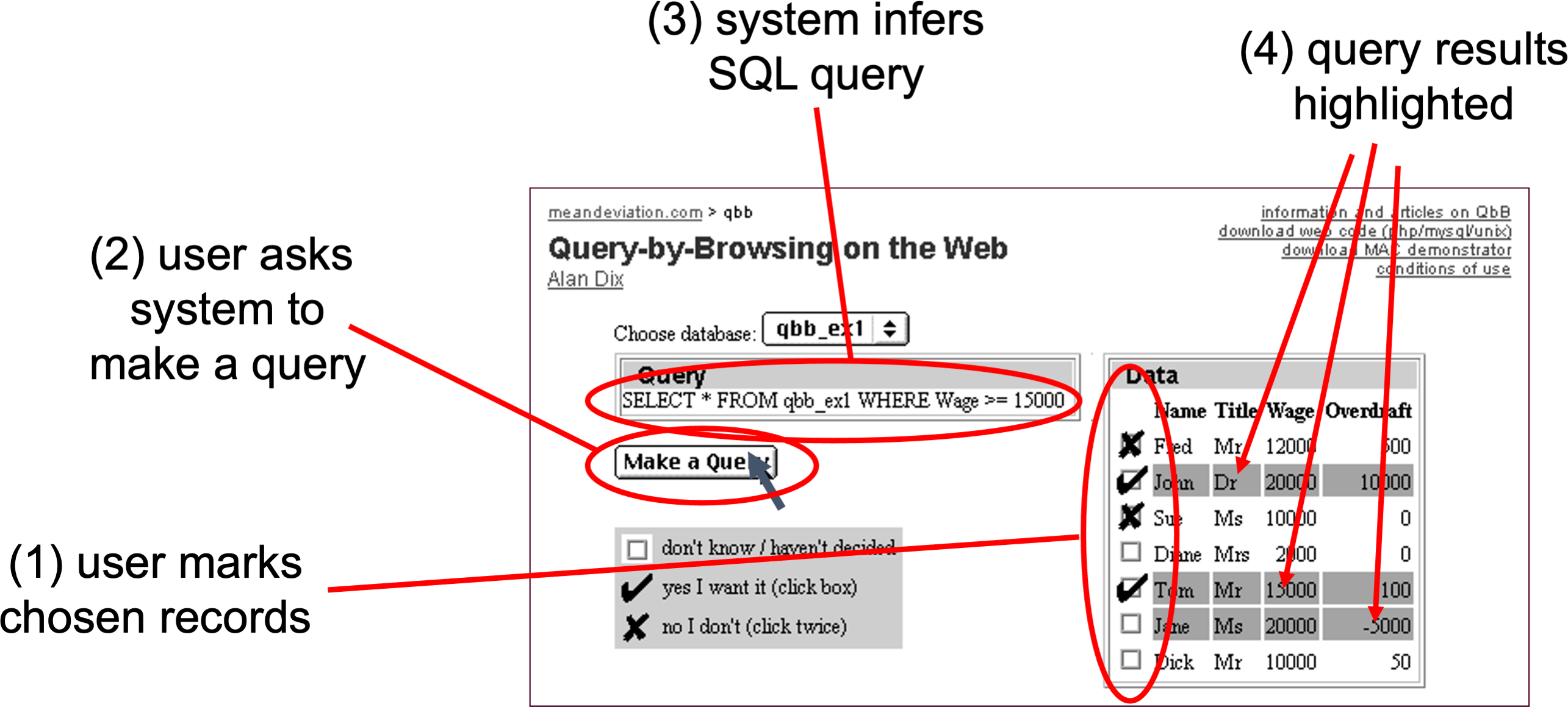
Basic operation

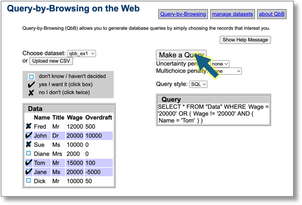
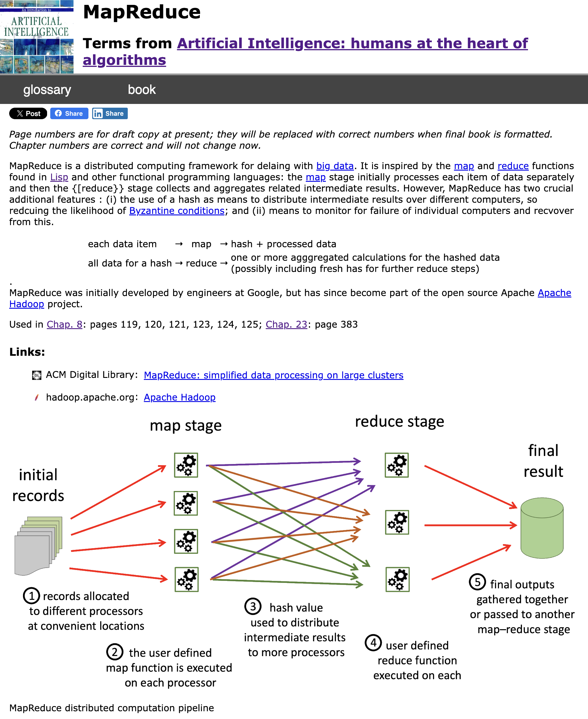
Initially you use QbB as normal: you select examples of records you do and don’t want included and the system infers a query using a variant of ID3 that can be presented as a decision tree or an SQL query.

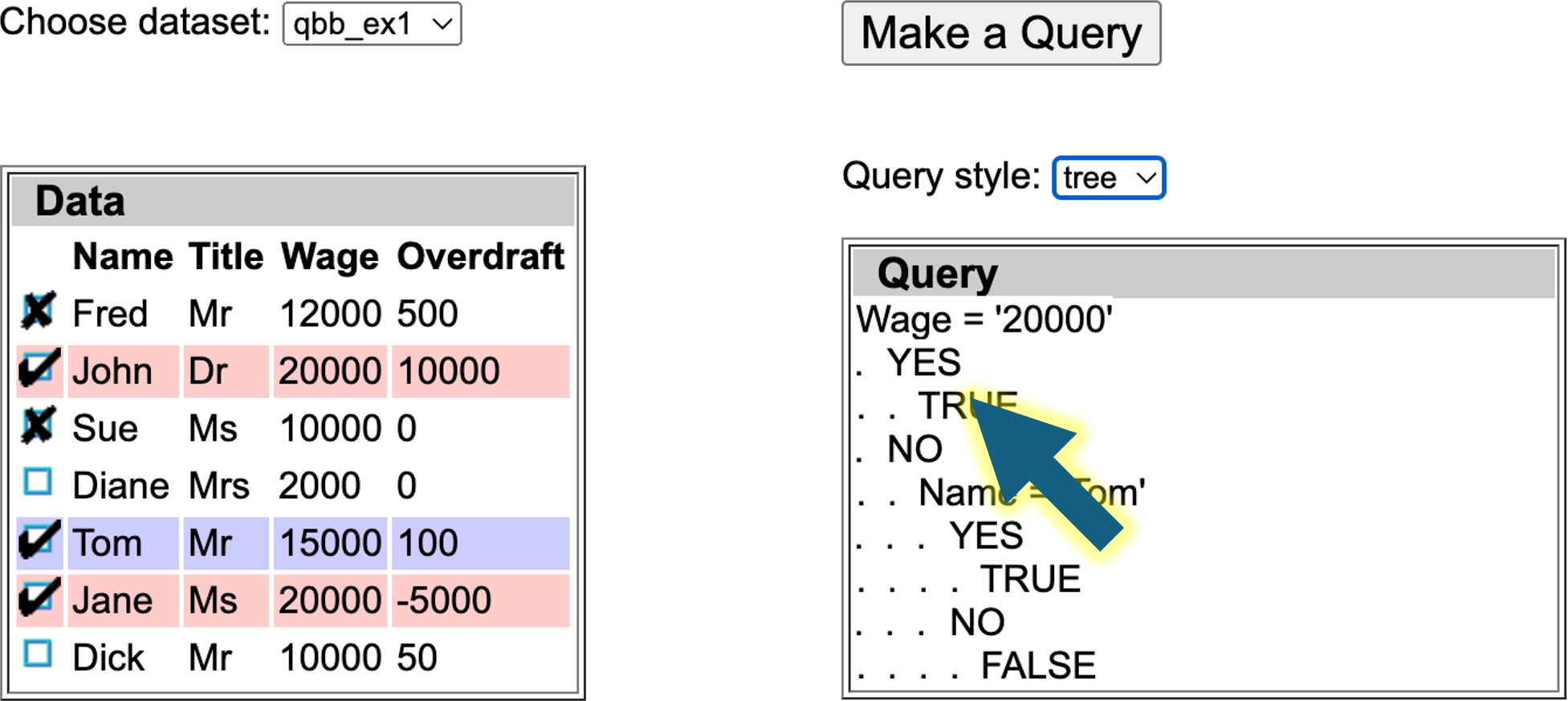
Global user guidance

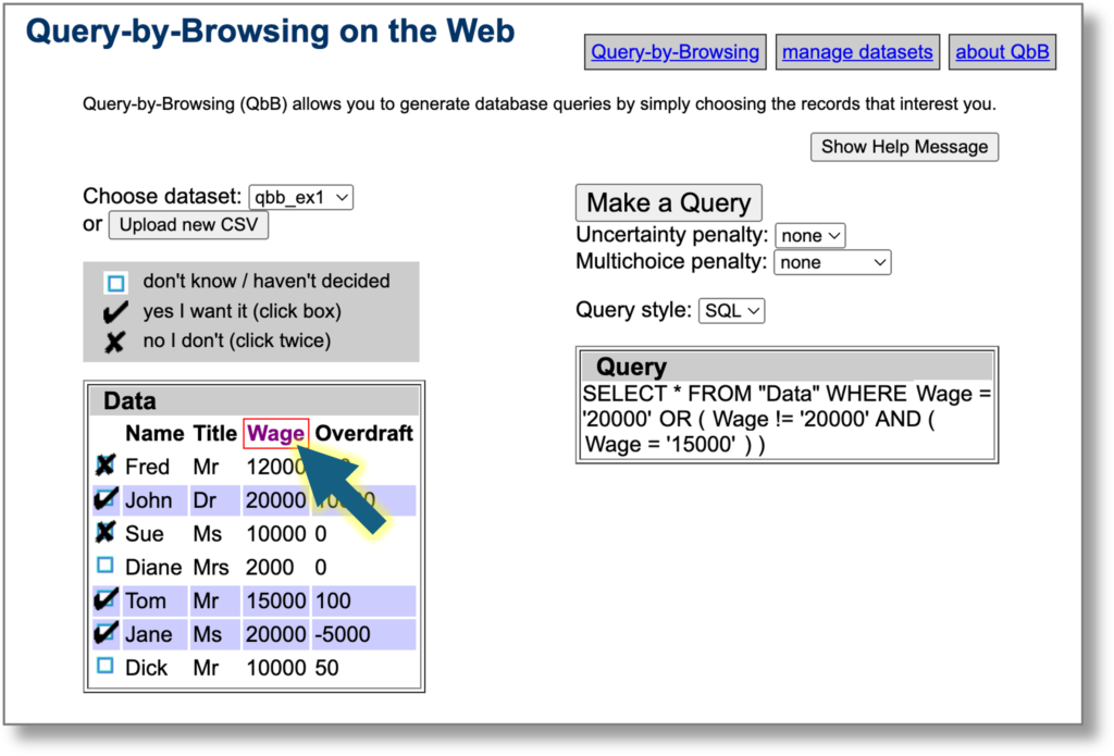
At any point you can click row headers to toggle between important (red border), ignore (grey) or standard.  The query refreshes taking into account these preferences .  Columns marked ‘ignore’ are not used at all by the machine learning, whereas those marked as ‘important’ are given preference when it creates the query.

In the screenshot below the Wage column is marked as important.  Compare this to the previous image where the name ‘Tom’ was used in the query.


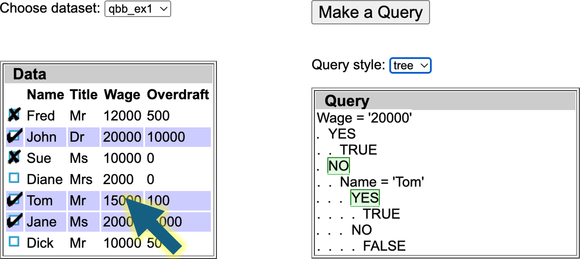
Local user explanations

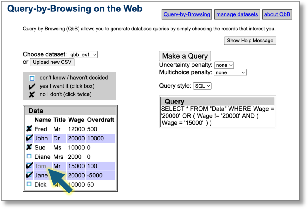
In addition you can click data cells in individual rows to toggle between important (red border), not important (grey) or standard.  This means that for this particular example the relevant field is more or less important.  Note that is a local explanation, just because a field is important for this record selection, it does not mean it is important for them all.

See below the same example with the column headers all equally important, but the cell with contents ‘Tom’ annotated as unimportant (grey).  The generated query does not use this value.  However, note that while the algorithm does its best to follow the preferences, it may not always be able to do so.


Under the hood

Query-by-Browsing uses a modified version of Quinlan’s ID3 decision tree induction algorithm, which has been one of the early and enduring examples of practical machine learning.  The variant used in previous versoins of QbB includes cross-column comparisons (such as ‘outgoings>income‘), but otherwise use the same information-entropy-based procedure to build the decision tree top down.

The modified version to take into account global user guidances and local user explanations still follows the top-down approach.

For the global column-based selections, the ‘ignore’ columns are not included at all and the entropy-score of the ‘important’ columns are multiplied by a weighting to make the algorithm more likely to select decisions based on these columns.  Currently this is a fixed scaling factor, but could be made variable to allow levels of importance to be added to columns.

For the local user explanations, a similar process is used except: (a) the columns for unimportant cells are scaled-down to make them less likely to be chosen rather than forbidden entirely; (b) the scaling up/down for the columns of important/unimportant cells depends on the proportion of labelled cells below the current node.  This means that the local explanation makes little difference in the higher-level nodes, where an individual cell is one amongst many unless several have similar cell-level labels, however, as one comes closer to the nodes that drive the decision for a particular annotated record its cell labelings become more significant.

Note that this is a relatively simple modification of the current algorithm.  One of the things we point out in the ‘talking back‘ paper is that user explanations open up a wide range of challenges in both user interfaces and fundamental algorithms.


AI Book glossary complete!

The glossary is complete –1229 entries in all.  All ready for the publication of the AI book in June.  The AI glossary is a resource in its own right and interlinks with the book as a hybrid digital/physical media. Read on to find more about the glossary and how it was made.

When I wrote my earlier book Statistics for HCI: Making Sense of Quantitative Data back in 2000, I created an online statistics glossary for that with 357 entries … maybe the result of too much time during lockdown?  In the paper version each term was formatted with a subtle highlight colour and in the PDF version they are all live links to the glossary.

So, when I started this second edition of Artificial Intelligence: Humans at the Heart of Algorithms I thought I should do the same, but the scale is somewhat different with more than three times as many entries.  The book is due to be published in June and you can preorder at the publisher’s site, but the glossary is live now for you to use.

What’s in the AI Glossary

The current AI Book glossary front page is a simple alphabetical list

Some entries are quite short: a couple of sentences and references to the chapters and pages in the book where it is used.  However many include examples, links to external resources and images.  Some of the images are figures from the book, others created specially for the glossary.  In addition keywords in the entry link to other entries ‘wiki-style.

In addition the chapter pages on the AI Book web site each include references to all of the glossary items mentioned as well as a detailed table of contents and links to code examples.


Note that while all the entries are complete, there are currently many typos and before the book is published in June I need to do another pass to fix these!  The page numbers will also update once the final production-ready proof is complete, but the chapter links are correct.

How it is made

I had already created a workflow for the HCI Stats glossary, and so was able to reuse and update that.  Both books are produced using LaTeX and in the text critical terms are marked using a number of macros, for example:

The same information is then shown (ii) with the \term{microdata} added that says that the paragraph is talking about a book, that the author is Alan Dix and that he was born in Cardiff. Finally, the extracted information is shown as \term{JSON} data in (iii).

The \term macro (and related ones such as \termdef) expand to: (a) add an entry to the index file for the term;  (b) format the text with slight highlight; and (c) add a hyperlink to the glossary.  The index items can be gathered and were used to initially populate the first column of a Google Spreadsheet:

Over many months this was gradually updated.  In the final spreadsheet today (I will probably add to it over time) there are 1846 raw entries with 1229 definitions.  This includes a few items that are not explicitly mentioned in the book, but were useful for defining other entries, or new things that are emerging in the field.

On the left are two columns ‘canonical’ and ‘see also’ linking to other entries; these are used to structure the index.  Both lead to immediate redirects in the web glossary and page references in the text to the raw entry are amalgamated into the referenced entry.  However, they have slightly different behaviour in the web and book index.  If an entry has a canonical form it is usually a very close variant spelling (e.g. ise/ize endings , hyphens or plurals) and does not appear in the index at all as the referenced item will be recognisable.  The ‘see also’ links create “See …” cross references in the book and web index.

The ‘latex’ and ‘html’ show how the term should be formatted with correct capitalisation, special characters, etc.

The spreadsheet entries above are formatted on the web as follows (the book version similar):

On the right of the spreadsheet are the definition and urls of links to images or related web resources.  The definitions can include cross references to other entries using a wiki-style markup, for example the reference to {{microformats}} in the definition of microdata above.  They can also include raw html.

Just before these content entries are a few columns that kept track of which entries needed attention so that I could easily scan for entries with a highlighted ‘TBD’ or ‘CHK’.

The definition of microdata selected in the above spreadsheet fragment is shown as follows:

Gamification

Working one’s way through 1846 raw entries, writing 1229 definitions comprising more than 90,000 words can be tedious!   Happily I quite accidentally gamified the experience.

Part way through doing the HCI statistics glossary, I created a summary worksheet that kept track of the number of entries that needed to be processed and a %complete indicator.  I found it useful for that, but invaluable for the AI book glossary as it was so daunting.

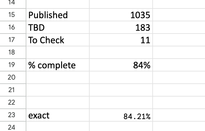
The headline summary has raw counts and a rounded %complete.  Seeing this notch up one percent was a major buzz corresponding to about a dozen entries.  Below that is a more precise percentage, which I normally kept below the bottom of the window so I had to scroll to see it.  I could take a peek and think “nearly at a the next percent mark, I’ll just do a few more”.


Query-by-Browsing gets local explanations

Query-by-Browsing (QbB) now includes local explanations so that you can explore in detail how the AI generated query relates to dataset items.

Query-by-Browsing is the system envisaged in my 1992 paper that first explored the dangers of social, ethnic and gender bias in machine-learning algorithms.  QbB generates queries, in SQL or decision tree form based on examples of records that the user does or does not want. A core feature has always been the dual intensional (query) and extensional (selected data) to aid transparency.

QbB has gone through various iterations and a simple web version has been available for twenty years, and was updated last year to allow you to use your own data (uploaded as CSV files) as well as the demo datasets.

The latest iteration also includes a form of local explanation.  If you hover over a row in the data table it shows which branch of the query meant that the row was either selected or not.

Similarly hovering over the query shows you which data rows were selected by the query branch.

However, this is not the end of the story!

In about two weeks Tommaso will be presenting our paper “Talking Back: human input and explanations to interactive AI systems” at the Workshop on Adaptive eXplainable AI (AXAI) at IUI 2025 in Cagliari, Italy,  A new version of QbB will be released to coincide with this.  This will include ‘user explanations’, allowing the user to tell the system why certain records are important to help the machine learning make better decisions.

Watch this space …