Making the most of stakeholder interviews

Recently, I was asked for any tips or suggestions for stakeholder interviews.   I realised it was going to be more than would fit in the response to an IM message!

I’ll assume that this is purely for requirements gathering. For participatory or co-design, many of the same things hold, but there would be additional activities.

See also HCI book chapter 5: interaction design basics and chapter 13: socio-organizational issues and stakeholder requirements.

Kinds of knowing

First remember:

  • what they know – Whether the cleaner of a public lavatory or the CEO of a multi-national, they have rich experience in their area. Respect even the most apparently trivial comments.
  • what they don’t know they know – Much of our knowledge is tacit, things they know in the sense that they apply in their day to day activities, but are not explicitly aware of knowing. Part of your job as interviewer is to bring this latent knowledge to the surface.
  • what they don’t know – You are there because you bring expertise and knowledge, most critically in what is possible; it is often hard for someone who has spent years in a job to see that it could be different.

People also find it easier to articulate ‘what’ compared with ‘why’ knowledge:

  • whatobjects, things, and people involved in their job, also the actions they perform, but even the latter can be difficult if they are too familiar
  • why – the underlying criteria, motivations and values that underpin their everyday activities

Be concrete

Most of us think best when we have concrete examples or situations to draw on, even if we are using these to describe more abstract concepts.

  • in their natural situation – People often find it easier to remember things if they are in the place and amongst the tools where they normally do them.
  • printer-detailshow you what they do – Being in their workplace also makes it easy for them to show you what they do – see “case study: Pensions printout“, for an example of this, the pensions manager was only able to articulate how a computer listing was used when he could demonstrate using the card files in his office. Note this applies to physical things, and also digital ones (e.g. talking through files on computer desktop)
  • watch what they do – If circumstances allow directly observe – often people omit the most obvious things, either because they assume it is known, or because it is too familiar and hence tacit. In “Early lessons – It’s not all about technology“, the (1960s!) system analyst realised that it was the operators’ fear of getting their clothes dirty that was slowing down the printing machine; this was not because of anything any of the operators said, but what they were observed doing.
  • seek stories of past incidents – Humans are born story tellers (listen to a toddler). If asked to give abstract instructions or information we often struggle.
  • normal and exceptional storiesboth are important. Often if asked about a process or procedure the interviewee will give the normative or official version of what they do. This may be because they don’t want to admit to unofficial methods, or maybe that they think of the task in normative terms even though they actually never do it that way. Ask for ‘war stories’ of unusual, exceptional or problematic situations.
  • technology probes or envisioned scenarios – Although it may be hard to envisage new situations, if potential futures are presented in an engaging and concrete manner, then we are much more able to see ourselves in them, maybe using a new system, and say “but no that wouldn’t work.”  (see more at hcibook online! “technology probes“)

Estrangement

As noted the stakeholder’s tacit knowledge may be the most important. By seeking out or deliberately creating odd or unusual situations, we may be able to break out of this blindness to the normal.

  • ask about other people’s jobs – As well as asking a stakeholder about what they do, ask them about other people; they may notice things about others better then the other person does themselves.
  • strangers / new folk / outsiders – Seek out the new person, the temporary visitor from another site, or even the cleaner; all see the situation with fresh eyes.
  • technology probes or envisioned scenarios (again!) – As well as being able to say “but no that wouldn’t work”, we can sometimes say “but no that wouldn’t work, because …”
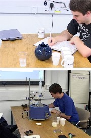
  • making-teafantasy – When the aim is to establish requirements and gain understanding, there is no reason why an envisaged scenario need be realistic or even possible. Think SciFi and magic 🙂 For an extended example of this look at ‘Making Tea‘, which asked chemists to make tea as if it were a laboratory procedure!

Of course some of these, notably fantasy scenarios, may work better in some organisations than others!

Analyse

You need to make sense of all that interview data!

  • the big picture – Much of what you learn will be about what happens to individuals. You need to see how this all fits together (e.g. Checkland/ Soft System Methodology ‘Rich Picture’, or process diagrams). Dig beyond the surface to make sense of the underlying organisational goals … and how they may conflict with those of individuals or other organisations.
  • the details – Look for inconsistencies, gaps, etc. both within an individual’s own accounts and between different people’s viewpoints. This may highlight the differences between what people believe happens and what actually happens, or part of that uncovering the tacit
  • the deep values – As noted it is often hard for people to articulate the criteria and motivations that determine their actions. You could look for ‘why’ vocabulary in what they say or written documentation, or attempt to ‘reverse engineer’ process to find purposes. Unearthing values helps to uncover potential conflicts (above), but also is important when considering radical changes. New processes, methods or systems might completely change existing practices, but should still be consonant with the underlying drivers for those original practices. See work on transforming musicological archival practice in the InConcert project for an example.

If possible you may wish to present these back to those involved, even if people are unaware of certain things they do or think, once presented to them, the flood gates open!   If your stakeholders are hard to interview, maybe because they are senior, or far away, or because you only have limited access, then if possible do some level of analysis mid-way so that you can adjust future interviews based on past ones.

Prioritise

Neither you nor your interviewees have unlimited time; you need to have a clear idea of the most important things to learn – whilst of course keeping an open ear for things that are unexpected!

If possible plan time for a second round of some or all the interviewees after you have had a chance to analyse the first round. This is especially important as you may not know what is important until this stage!

Privacy, respect and honesty

You may not have total freedom in who you see, what you ask or how it is reported, but in so far as is possible (and maybe refuse unless it is) respect the privacy and personhood of those with whom you interact.

This is partly about good professional practice, but also efficacy – if interviewees know that what they say will only be reported anonymously they are more likely to tell you about the unofficial as well as the official practices! If you need to argue for good practice, the latter argument may hold more sway than the former!

In your reporting, do try to make sure that any accounts you give of individuals are ones they would be happy to hear. There may be humorous or strange stories, but make sure you laugh with not at your subjects. Even if no one else recognises them, they may well recognise themselves.

Of course do ensure that you are totally honest before you start in explaining what will and will not be related to management, colleagues, external publication, etc. Depending on the circumstances, you may allow interviewees to redact parts of an interview transcript, and/or to review and approve parts of a report pertaining to them.

If you do accessibility, please do it properly

I was looking at Coke Cola’s Rugby World Cup site1,

On the all-red web page the tooltip stood out, with the uninformative text, “headimg”.

coke-rugby-web-site-zoom

Peeking in the HTML, this is in both the title and alt attributes of the image.

<img title="headimg" alt="headimg" class="cq-dd-image" 
     src="/content/promotions/nwen/....png">

I am guessing that the web designer was aware of the need for an alt tag for accessibility, and may even have had been prompted to fill in the alt tag by the design software (Dreamweaver does this).  However, perhaps they just couldn’t think of an alternative text and so put anything in (although as the image consists of text, this does betray a certain lack of imagination!); they probably planned to come back later to do it properly.

As the micro-site is predominantly targeted at the UK, Coke Cola are legally bound to make it accessible and so may well have run it through WCAG accessibility checking software.  As the alt tag was present it will have passed W3C validation, even though the text is meaningless.  Indeed the web designer might have added the unhelpful text just to get the page to validate.

The eventual page is worse than useless, a blank alt tag would have meant it was just skipped, and at least the text “header image” would have been read as words, whereas “headimg” will be spelt out letter by letter.

Perhaps I am being unfair,  I’m sure many of my own pages are worse than this … but then again I don’t have the budget of Coke Cola!

More seriously there are important lessons for process.  In particular it is very likely that at the point the designer uploads an image they are prompted for the alt tag — this certainly happens with Dreamweaver.  However, at this point your focus is in getting the page looking right as the client looking at the initial designs is unlikely to be using a screen reader.

Good design software should not just prompt for the right information, but at the right time.  It would be far better to make it easy to say “ask me later” and build up a to do list, rather than demand the information when the system wants it, and risk the user entering anything to ‘keep the system quiet’.

I call this the Micawber principle2 and it is a good general principle for any notifications requiring user action.  Always allow the user to put things off, but also have the application keep track of pending work, and then make it easy for the user see what needs to be done at a more suitable time.

  1. Largely because I was fascinated by the semantically questionable statement “Win one of up to 1 million exclusive Gilbert rugby balls.” (my emphasis).[back]
  2. From Dicken’s Mr Micawber, who was an arch procrastinator.  See Learning Analytics for the Academic:
    An Action Perspective where I discuss this principle in the context of academic use of learning analytics.[back]

A week in Athens

Last week I visited Athens again to give keynote “Long-Term Engagement” at Usability And Accessibility Days 2014.  The rest of the event was in Greek, so I got excused to wander across to see the exhibition of contemporary icons by Helena Krystalli in the adjoining room.

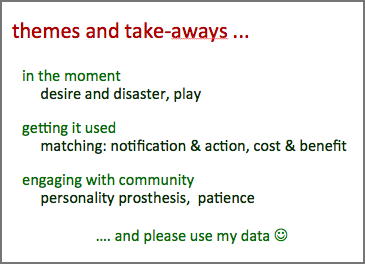
The talks included vignettes about Walking Wales, Tiree Tech Wave and other technology projects on Tiree, the InConcert musicology data project, and Talis software for learning analytics.  the linking theme was the different time frames for engagement and key properties/heuristics at each level including ‘desire and disaster‘, matching cost–benefit, and ‘Micawber management’.

talk-themes

As well as the talk I got to see old friends in Athens, many of whom I’d not seen for five years since my last visit for the 2009 SIGCHI Greece event when I was talking about ‘Touching Technology‘.  Despite the years it seemed like just yesterday when we’d last talked together.

Although there was some evidence of change (Angela who I stayed with now has two daughters instead of one), much was the same (George’s house is still waiting to get its central, hearing working).

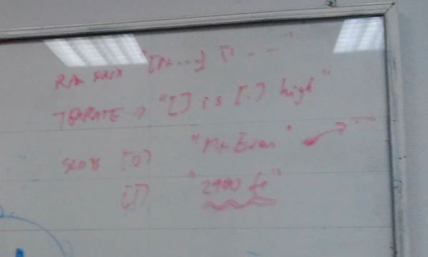
However, when I was in the research office the day after the talk I decided that Athens definitely is in stasis when I am not there.  We were sitting talking and I happened to look up at the board and saw writing there.  It was a little obscure, and intriguing, but as I examined it I realised t was in fact my own handwriting, written there 5 years ago during a discussion in the same office.

athens-stasis-cropped


To be fair there was some additional evidence of change beside Angela’s child; the new Acropolis Museum has opened, a wonderful building of glass and steel built to display the many treasures found by archaeologists, and most especially the whole of the upper floor laid out to recreate the frieze around the top of the Pantheon.  There are some gaps, but much of the sculpture is either there, or, where the original is elsewhere, in plaster cast.

The plaster cast sections all say where they come from, except the vast majority simply say ‘BM’ … it took a few before this sunk in, the British Museum … the Elgin Marbles – too sore a point even to write the words in full.  Indeed the whole museum is partly a statement to show just how much is in London not Athens, and also that Greece is now quite capable of preserving them.

It is a complex question undoubtedly much more would be missing, eroded or damaged if Elgin had not shipped them to Britain in the 19th century, and clearly not every work originating in a country should be returned … I imagine all the obelisks around Rome being sent back to Egypt!   However, seeing the museum and vast proportion saying ‘BM’ brings home that this is not simply a small amount elsewhere, but a large proportion, and in many ways the ‘best bits’.

There is also something different about the iconic monuments of any nation: it is as if parts of the Tower of Pisa were in Germany or London Bridge in Arizona …

To take our minds off such heady matters Angela and her family took me swimming in a volcano.  Christmas music playing in the background while bathing in water at 22° C.

Lake3

CHI Academy … a Faustian bargain?

I am on a short excursion from walking Wales to CHI 2013 in Paris.

Last night I was inducted into the SIGCHI Academy. No great fanfares or anything, just a select dinner and a short ceremony. I thought Gerrit, who is current SIGCHI chair would look good with a sword dubbing each person, but instead just a plaque, a handshake and a photo or two by Ben Shniederman, amanuensis of CHI.

I feel in two minds. On the one hand there are many lovely people in CHI community, and I spent a great afternoon and evening chatting to folk including Phillipe Palanque, Mary Czerwinsky and Hiroshi Ishii over dinner. However, ACM and to some extent SIGCHI often appear like the Star Wars imperial forces, intent on global domination.

The CEO of ACM did little to dispel this at the opening ceremony this morning.  He spoke of ACM’s international aspirations and praised CHI for regularly having its conferences outside of the US.

Now ACM is the de facto international computing organisation and CHI is the de facto international conference in human–computer interaction, but by virtue of the fact that they are the US ones.  In principle, IFIP and Interact are the international computing organisation and HCI conference respectively, as IFIP is the UNESCO founded body of which ACM and other national computing bodies, such as the BCS in the UK, are members.  Interact, the HCI conference sponsored by IFIP is truly international being held in numerous countries over the years (but I think never yet the US!); in contrast having approximately two out of three conferences in the US is laudable, but hardly the sign of a truly international organisation.

So, is the ACM an originally US organisation that is in the process of slowly becoming truly international, or is it part of more general US cultural domination?  Although probably neither are completely accurate, at present there seems to be significant aspects of the latter under the guise of the former.  In a way this is, in microcosm, an image of the same difficult relationship between USA and UN in other areas of international affairs.

And by joining the SIGCI Academy am I increasing the European presence in CHI and thus part of the process to make it truly international, or selling my academic soul in a Faustian bargain?

more on disappearing scrollbars

I recently wrote about problems with a slightly too smart scroll bar, and Google periodically change something in Gmail which means you have to horizontally scroll the page to get hook of the vertical scroll bar.

I just came across another beautiful (read terrible) example today.

I was looking at the “Learning Curve“, a bogspot blog, so presumably using a blogspot theme option.  On the right hand side was funky pull-out navigation (below left), but unfortunately, look what it does to the scroll bar (below right)!


This is an example of the ‘inaccessible scrollbar’ that I mention in “CSS considered harmful“, and I explain there the reason it arises.

The amazing thing is that this fails equally across all (MacOS) browsers: Safari, Firefox, Chrome, yet must be a standard blogspot feature.

One last vignette: as I looked at the above screen shots I realised that in fact there is a 1 pixel part of the scroll handle still visible to the left of the pull-out navigation.  I went back to the web page and tried to select it … unfortunately, I guess to make a larger and easier to select the ‘hot area’, as you move your mouse towards the scroll bar, the pull-out pops out … so that the one pixel of scrollbar tantalises, but is unselectable 🙁

Action Research in HCI

Recently Daniel Tetteroo asked if I knew about publications in HCI, prompted partly by the fact that I have described my Wales walk next year as a form of action research.

I realised that all my associations with the term were in information science rather than HCI, and other non-computer disciplines such as education and medicine. I also realised that the “don’t design for yourself” guidance, which was originally about taking a user-centred rather than technologist-centred approach, makes action research ideologically inimical to many.

I posted a question to Twitter, Facebook and the exec mailing list of Interaction yesterday and got a wonderful set of responses.

Here are some of the pointers in the replies (and no, I have not read them all overnight!):

Many thanks to the following for responses, suggestions and comments: Michael Massimi, Nathan Matias, Charlie DeTar, Gilbert Cockton, Russell Beale, David England, Dianne Murray, Jon Rogers, Ramesh Ramloll, Maria Wolters, Alan Chamberlain, Beki Grinter, Susan Dray, Daniel Cunliffe, and any others if I have missed you!

details matter: infinite scrolling and feature interaction

Many sites now dynamically add content to a page as you scroll down; this includes both Facebook and Twitter feeds, which add content as you get near the bottom.  In many ways this is a good thing, if users have to click to get to another page, they often never bother1.  However there can be unfortunate side effects … sometimes making sites un-navigable on certain devices.  There are particular problems on MacOS, due to the removal of scrollbar arrows, a usability disaster anyway, but confounded by feature interactions with other effects.

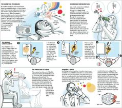
A recent example was when I visited the SimoleonSense blog in order to find an article corresponding to an image about human sensory illusions.  The image had been shared in Facebook, and I found, when I tried to search for it, also widely pinned in Pinterst, but the Facebook shares only linked back to the image url and Pinterst to the overall site (why some artists hate Pintrest).  However, I wanted to find the actual post on the site that mentioned the image.

Happily, the image url, http://www.simoleonsense.com/wp-content/uploads/2009/02/hacking-your-brain1.jpg, made it clear that it was a WordPress blog and the image had been uploaded in February 2009, so I edited the url to http://www.simoleonsense.com/2009/02/ and started to browse.  The site is a basically a weekly digest and so the page returned was already long.  I must have missed it on my first scan down, so I hit the bottom of the page, it dynamically added more content, and I continued to scroll.  Before long the scrollbar handle looked very small, and the page very big and every time I tried to scroll up and down the page appeared to go crazy, randomly scrolling anywhere, but not where I wanted.

It took me a while to realise that the problem was that the scrollbar had been ‘enhanced’ by the website (using the WordPress infinite scroll plugin), which not only added infinite scrolling, but also ‘smart scrolling’, where a click on the scrollbar makes an animated jump to that location on the scrollbar.  Now many early scrollbars worked in this way, and the ‘smart scroll’ options is inspired by the fact that Apple rediscovered this in iOS for touch screen interaction.  The method gives rapid interaction, especially if the scrollbar is augmented by ‘tips’ on the scrollbar (see the jQuery smartscroll demo page).

Unfortunately, this is different from the Mac normal behaviour when you click above or below the handle on a scrollbar, which effectively does screen up/down.  So, I was trying to navigate up/down the web page a screen at a time to find the relevant post, and not caring where I clicked above the scroll handle, hence the apparently random movements.

This was compounded by two things.  The first is a slight bug in the scrolling extension which means that sometimes it doesn’t notice your mouse release and starts scrolling the page as you move your mouse around.  This is a bug I’ve seen in scrolling systems for many years, not taking into account all the combinations of mouse down/up, enter/leave region etc., and is present even in Google maps.

The second compounding factor is that since MacOS got rid of the scrollbar arrows (why? Why? WHY?!!), this is now the only way to reliably do small up/down movements if you don’t have a scroll wheel mouse or similar.

Now, in fact, my Air has a trackpad and I think Apple assumes you will use this for scrolling, but I have single-finger ‘Tap to click’ turned off to prevent accidental selections, and (I assume due to a persistent bug) this turns off the two finger scrolling gesture as well (even though it is shown as on in the preferences), so no scrolling from the touchpad.

Since near the beginning of my career I have been fascinated by these fine design decisions and have written previously about scrollbars, buttons, etc.  They are often overlooked as they form part of the backdrop to more significant applications and information.  However, the very fact that they are the persistent backdrop of interaction makes their fluid usability crucial, like the many mundane services, buses, rubbish collection, etc., that make cities work, but are often unseen and unnoticed until they fail.

Also note that this failure was not due to any single feature or bug, but the way these work together what the telephony industry originally named ‘feature interaction‘, but common across all technological systems  There is no easy fix, apart from (i) thinking of all possible scenarios (reach for your formal methods in HCI!) and (ii) testing across different devices.  And certainly (Apple please listen!) if it ain’t broke, don’t fix it.

Happily, I did manage to find the post in the end (I forget how, maybe random clicking) and it is “5 Ways To Hack Your Brain“.  The individual post page has no dynamic additions, so is only two screens big on my display (phew), but still scrolled all over the place as I tried to select the page title to paste above!

  1. To my mind, early web guidance, was always wrong about this as it usually suggested making pages fit a screen to improve download speed, whereas my feeling, when using a slow connection, was it was usually better to wait a little longer for one big screen (you were going to have to wait anyway!) and then be able to scroll up and down quickly.[back]

First version of Tiree Mobile Archive app goes live at Wave Classic

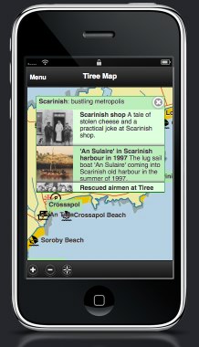
The first release version of the Tiree Mobile Archive app (see “Tiree Going Mobile“) is seeing real use this coming week at the Tiree Wave Classic. As well as historical information, and parts customised for the wind-surfers, it already embodies some interesting design features including the use of a local map  There’s a lot of work to do before the full launch next March, but it is an important step.

The mini-site for this Wave Classic version has a simulator, so you can see what it is like online, or download to your mobile … although GPS tracking only works when you are on Tiree 😉

Currently it still has only a small proportion of the archive material from An Iodhlann so still to come are some of the issues of volume that will surely emerge as more of the data comes into the app.

Of course those coming for the Wave Classic will be more interested in the sea than local history, so we have deliberately included features relevant to them, Twitter and news feeds from the Wave Classic site and also pertinent tourist info (beaches, campsites and places to eat … and drink!).  This will still be true for the final version of the app when it is released in the sprint — visitors come for a variety of reasons, so we need to offer a broad experience, without overlapping too much with a more tourism focused app that is due to be created for the island in another project.

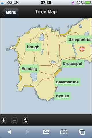
One crucial feature of the app is the use of local maps.  The booklet for the wave classic (below left) uses the Discover Tiree tourist map, designed by Colin Woodcock and used on the island community website and various island information leaflets.  The online map (below right) uses the same base layer.  The map deliberately uses this rather than the OS or Google maps (although final version will swop to OS for most detailed views) as this wll be familiar as they move between paper leaflets and the interactive map.


In “from place to PLACE“, a collection developed as part of Common Ground‘s ‘Parish Maps‘ project in the 1990s, Barbara Bender writes about the way:

“Post-Renaissance maps cover the surface of the world with an homogeneous Cartesian grip”

Local maps have their own logic not driven by satellite imagery, or military cartography1; they emphasise certain features, de-emphasise others, and are driven spatially less by the compass and ruler and more by the way things feel ‘on the ground’.  These issues of space and mapping have been an interest for many years2, so both here and in my walk around Wales next year I will be aiming to ‘reclaim the local map within technological space’.

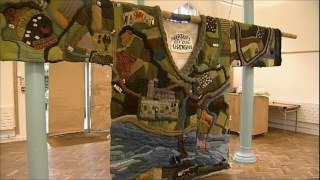
In fact, the Discover Tiree map, while stylised and deliberately not including roads that are not suitable for tourists, is very close to a ‘standard map’ in shape, albeit at a slightly different angle to OS maps as it is oriented3 to true North whereas OS maps are oriented to ‘Grid North’ (the problems of representing a round earth on flat sheets!).  In the future I’d like us to be able to deal with more interpretative maps, such as the mural map found on the outside of MacLeod’s shop. Or even the map of Cardigan knitted onto a Cardigan knitted as part of the 900 year anniversary of the town.


Technically this is put together as an HTML5 site to be cross-platform,, but … well let’s say some tweaks needed4.  Later on we’ll look to wrapping this in PhoneGap or one of the other HTML5-to-native frameworks, but for the time being once you have bookmarked to the home page on iOS looks pretty much like an app – on Android a little less so, but still easy access … and crucially works off-line — Tiree not known for high availability of mobile signal!

  1. The ‘ordnance‘ in ‘Ordnance Survey‘ was originally about things that go bang![back]
  2. For example, see “Welsh Mathematician walks in Cyberspace” and  “Paths and Patches – patterns of geognosy and gnosis”.[back]
  3. A lovely word, originally means to face East as early Mappa Mundi were all arranged with the East at the top.[back]
  4. There’s a story, going cross browser on mobile platform reminds me so much of desktop web design 10 years ago, on the whole iOS Safari behave pretty much like desktop ones, but Android is a law unto itself!.[back]

Death by design

Wonderful image and set of slides describing some of the reasons multitasking is a myth and how the interfaces we design may be literally killing people (during a mobile outage in Dubai cat accidents dropped by 20%).

Thanks to Ian Sommervile for sharing this on twitter.

“lost in hyperspace” – do we care?

I have rarely heard the phrase “lost in hyperspace” in the last 10 years, although it used to be a recurrent theme in hypertext and HCI literature.  For some time this has bothered me.  We don’t seem less lost, so maybe we are just more laid back about control, or maybe we are simply relinquishing it?

Recently Lisa Tweedie posted a Pintrest link on Facebook to Angela Morelli‘s dynamic infographic on water.  This is a lovely vertically scrolling page showing how the majority of the water we use is indirectly consumed via the food we eat … especially if you are a meat eater (1 kilo beef = 15,400 litres of water!).  The graphic was great, except it took me ages to actually get to it.  In fact the first time I found a single large graphic produced by Angela as a download, it was only when I returned to it that I found the full dynamic info graphic.

Every time I go to Pintrest I feel like I’ve been dropped into a random part of Hampton Court Maze, so hard to find the actual source … this is why a lot of artists get annoyed at Pintrest!  Now for Pintrest this is probably part of their design philosophy … after all they want people to stay on their site.  What is amazing is that this kind of design is so acceptable to users … Facebook is slightly less random, but still it takes me ages to find pages I’ve liked, each time I start the search through my profile afresh.

In the early days of hypertext everyone used to talk about the “lost in hyperspace” problem … now we are more lost … but don’t care anymore.  In the Mediaeval world you put your trust in your ‘betters’ lords, kings, and priests and assumed they knew best … now we put our trust in Pintrest and Facebook.