The first release version of the Tiree Mobile Archive app (see “Tiree Going Mobile“) is seeing real use this coming week at the Tiree Wave Classic. As well as historical information, and parts customised for the wind-surfers, it already embodies some interesting design features including the use of a local map There’s a lot of work to do before the full launch next March, but it is an important step.
 The mini-site for this Wave Classic version has a simulator, so you can see what it is like online, or download to your mobile … although GPS tracking only works when you are on Tiree 😉
Currently it still has only a small proportion of the archive material from An Iodhlann so still to come are some of the issues of volume that will surely emerge as more of the data comes into the app.
Of course those coming for the Wave Classic will be more interested in the sea than local history, so we have deliberately included features relevant to them, Twitter and news feeds from the Wave Classic site and also pertinent tourist info (beaches, campsites and places to eat … and drink!). This will still be true for the final version of the app when it is released in the sprint — visitors come for a variety of reasons, so we need to offer a broad experience, without overlapping too much with a more tourism focused app that is due to be created for the island in another project.
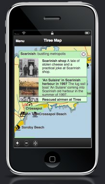
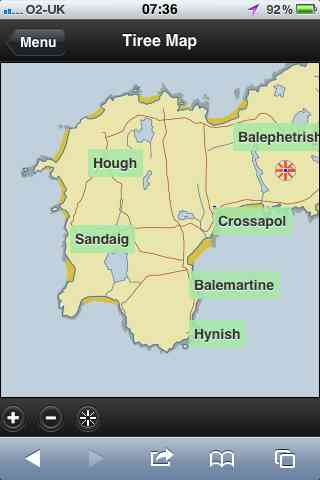
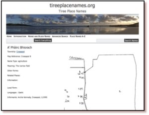
One crucial feature of the app is the use of local maps. The booklet for the wave classic (below left) uses the Discover Tiree tourist map, designed by Colin Woodcock and used on the island community website and various island information leaflets. The online map (below right) uses the same base layer. The map deliberately uses this rather than the OS or Google maps (although final version will swop to OS for most detailed views) as this wll be familiar as they move between paper leaflets and the interactive map.

In “from place to PLACE“, a collection developed as part of Common Ground‘s ‘Parish Maps‘ project in the 1990s, Barbara Bender writes about the way:
“Post-Renaissance maps cover the surface of the world with an homogeneous Cartesian grip”
Local maps have their own logic not driven by satellite imagery, or military cartography1; they emphasise certain features, de-emphasise others, and are driven spatially less by the compass and ruler and more by the way things feel ‘on the ground’. These issues of space and mapping have been an interest for many years2, so both here and in my walk around Wales next year I will be aiming to ‘reclaim the local map within technological space’.
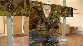
In fact, the Discover Tiree map, while stylised and deliberately not including roads that are not suitable for tourists, is very close to a ‘standard map’ in shape, albeit at a slightly different angle to OS maps as it is oriented3 to true North whereas OS maps are oriented to ‘Grid North’ (the problems of representing a round earth on flat sheets!). In the future I’d like us to be able to deal with more interpretative maps, such as the mural map found on the outside of MacLeod’s shop. Or even the map of Cardigan knitted onto a Cardigan knitted as part of the 900 year anniversary of the town.

Technically this is put together as an HTML5 site to be cross-platform,, but … well let’s say some tweaks needed4. Later on we’ll look to wrapping this in PhoneGap or one of the other HTML5-to-native frameworks, but for the time being once you have bookmarked to the home page on iOS looks pretty much like an app – on Android a little less so, but still easy access … and crucially works off-line — Tiree not known for high availability of mobile signal!
- The ‘ordnance‘ in ‘Ordnance Survey‘ was originally about things that go bang![back]
- For example, see “Welsh Mathematician walks in Cyberspace” and “Paths and Patches – patterns of geognosy and gnosis”.[back]
- A lovely word, originally means to face East as early Mappa Mundi were all arranged with the East at the top.[back]
- There’s a story, going cross browser on mobile platform reminds me so much of desktop web design 10 years ago, on the whole iOS Safari behave pretty much like desktop ones, but Android is a law unto itself!.[back]


 Over the next nine months we will create a mobile application allowing visitors and local historians to access geographically pertinent information, including old photographs, and interpretative maps/diagrams, while actually at sites of interest. This will largely use visitors’ own devices such as smart phones and tablets. Maps will be central to the application, using both OS OpenData and bespoke local maps and sketches of historical sites.
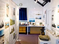
 At some remote sites such as the Tiree chapels, dating back to the 10th century, or Iron Age hill forts, there are simple information boards and at a few locations there are also fixed indoor displays, including at An Iodhlann itself. However, there are practical and aesthetic limits on the amount of large-scale external signage and limits on the ongoing running and maintenance of indoor exhibits. Furthermore, limited mobile signals mean that any mobile-based solutions cannot assume continuous access.
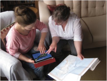 In order to deal with this, the on-the-ground experience will be combined with a web site allowing pre-trip planning and post-trip reminiscence. This will also be map focused, allowing visitors to see where they have been or are about to go, access additional resources, such as photos and audio files that are too large to be available when on the ground (remembering poor mobile coverage). This may also offer an opportunity to view social content including comments or photographs of previous visitors and then to associate one’s own photographs taken during the day with the different sites and create a personal diary, which can be shared with others.