slaughter of the innocents – human shields or collateral damage?

By Huynh Cong Ut (also known as Nick Ut), image from Wikipedia

From the ‘Napalm Girl‘ in Vietnam, to Alan Kurdi’s body on a Turkish beach in 2015 and endless images of White Hat’s pulling children from the rubble in Aleppo, it is easy to become inured to the death of innocent children around the world.

In the church calendar, December 28th1 is the Feast of the Innocents or Childermas, a day to remember the children killed by King Herod as he sought the baby Jesus.

In Matthew’s Gospel we read:

 When Herod realized that he had been outwitted by the Magi, he was furious, and he gave orders to kill all the boys in Bethlehem and its vicinity who were two years old and under (Matt. 2:16, NIV).

However, for many it is the words in the Christmas carol, “Unto us a boy is born“, which is most familiar:

All the little boys he killed at Bethlehem in his fury.

Mary and Joseph had already fled, refugees to Egypt, so the babies were not simply slaughtered, but slaughtered in vain, an action missing its true target, like the bombs that killed Gaddaffi’s children and grandchildren in 1986 and 2011.

I’ve been reading Simon Garfield’s “Timekeepers‘ (a Christmas gift).  Garfield describes a meeting with Nick Ut, the photographer of ‘Napalm Girl’2.  The common story is that the US attack on the village from which Phan Thi Kim Phuc was running was a mistake, but Ut describes how in the village there were many dead Viet Cong, so that the mistake was more likely inadequate intelligence that the villagers had fled (Timekeepers, p.168).

A few weeks ago a BBC reporter in Yemen was visiting a school, which Saudi air strikes had repeatedly hit.  This was one example of many such incidents targeting schools during this conflict3. The reporter talked of how the school kept on working and pupils kept attending, despite the damage and the danger.  However, the report also showed the Houthi rebel arms dump next to the school.  “Can’t you move the school away from this?”, asked the reporter. “They would simply move the dump to follow us”, replied the headmaster.

Again this is a story we have heard so many times before: missiles fired from hospital grounds in Gaza, Ukraine keeping its air corridors open whilst in the midst of its air campaign against separatists4, ISIS preventing civilian evacuation from Mosul, or the South Korean artillery firing into disputed areas from a populated island.

In some cases civilians are deliberately put in the way of danger (as with ISIS); in others fighting in built up areas makes civilian presence inevitable (Aleppo, Gaza).  In some cases terror is the main aim of an attack or the civilians are seen as legitimate targets (as with ISIS attacks in Europe); in others terror is a deliberate secondary war aim (as with Dresden or Nagasaki). In some cases attackers seem to show flagrant disregard for civilian life (as in Gaza), and in others all care is take, but (often substantial) civilian deaths are accepted as collateral damage (probably the case with US drone extrajudicial killings).

Whether you blame those on the ground for using human shields or those attacking for disregarding human like, often depends on which side you are on5.

In most conflicts the truth is complex, especially where there are mismatches of firepower: Hamas in Gaza, anti-Assad rebel groups in Syria, or ISIS in Iraq would all have been slaughtered if they fought in the open.  And for the attacking side, where does the responsibility lie between callous disregard for human life and justifiable retaliation?  How do we place the death of children by bombs against those of starvation and illness caused by displaced populations, siege or international sanctions?

If the events in Bethlehem were to happen today, how would we view Herod?

Was he despotic dictator killing his own people?

Was the baby Jesus a ‘clear and present danger’, to the stability the state and thus the children of Bethlehem merely collateral damage?

Or were Mary, Joseph and God to blame for using human shields, placing this infant of mass disruption in the midst of a small town?

It is worryingly easy to justify the slaughter of a child.


Some organisations that are making a difference:

  1. The date varies in different churches, it is 28th December in most Western churches, but 27th, 29th Dec, or 10th January elsewhere[back]
  2. The ‘Napalm Girl’ recent obtained fresh notoriety when Facebook temporarily censored it because it showed nudity.[back]
  3. Another BBC report,amongst many, “Yemen crisis: Saudi-led coalition ‘targeting’ schools” documents this.[back]
  4. Before MH17 was shot down a Ukrainian military transport and other military planes had been shot down, and the first messages following the destruction of MH17 suggest the rebels thought they had downed another military aircraft.  Instead of re-routing flights the flying ceiling was raised, but still within distance of ground-to-air missiles, and carriers made their own choices as to whether to overfly.  Some newspapers suggest that the motives were mainly financial both for Malaysian Airways, and for the Ukrainian government decisions, rather than Ukraine using civilian flights as a deliberate human shield.[back]
  5. Patrick Cockburn’s comparison of Aleppo and Mosul in The Independent argues this is the case for the current conflicts in Syrian and Iraq.[back]

the educational divide – do numbers matter?

If a news article is all about numbers, why is the media shy about providing the actual data?

On the BBC News website this morning James McIvor‘s article “Clash over ‘rich v poor’ university student numbers” describes differences between Scottish Government (SNP) and Scottish Labour in the wake of Professor Peter Scott appointment as commissioner for fair access to higher education in Scotland.

Scottish Labour claim that while access to university by the most deprived has increased, the educational divide is growing, with the most deprived increasing by 0.8% since 2014, but those in the least deprived (most well off) growing at nearly three times that figure.  In contrast, the Sottish Government claims that in 2006 those from the least deprived areas were 5.8 times more likely to enter university than those in the most deprived areas, whereas now the difference is only 3.9 times, a substantial decrease in educational inequality..

The article is all about numbers, but the two parties seem to be saying contradictory things, one saying inequality is increasing, one saying it is decreasing!

Surely enough to make the average reader give up on experts, just like Michael Gove!

Of course, if you can read through the confusing array of leasts and mosts, the difference seems to be that the two parties are taking different base years: 2014 vs 2006, and that both can be true: a long term improvement with decreasing inequality, but a short term increase in inequality since 2014.  The former is good news, but the latter may be bad news, a change in direction that needs addressing, or simply ‘noise’ as we are taking about small changes on big numbers.

I looked in vain for a link to the data, web sites or reports n which this was based, after all this is an article where the numbers are the story, but there are none.

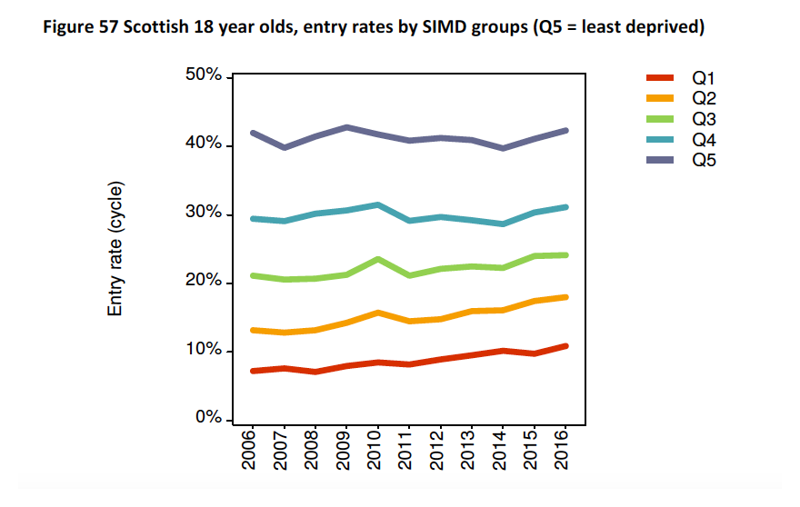
After a bit of digging, I found that the data that both are using is from the UCAS Undergraduate 2016 End of Cycle Report (the numerical data for this figure and links to CSV files are below).

Figure from UCAS 2016 End of Cycle Report

Looking at these it is clear that the university participation rate for the least deprived quintile (Q5, blue line at top) has stayed around 40% with odd ups and downs over the last ten years, whereas the participation of the most deprived quintile has been gradually increasing, again with year-by-year wiggles.  That is the ratio between least and most deprived used to be about 40:7 and now about 40:10, less inequality as the SNP say.

For some reason 2014 was a dip year for the Q5.  There is no real sign of a change in the long-term trend, but if you take 2014 to 2016, the increase in Q5 is larger than the increase in Q1, just as Scottish Labour say.  However, any other year would not give this picture.

In this case it looks like Scottish Labour either cherry picked a year that made the story they wanted, or simply accidentally chose it.

The issue for me though, is not so much who was right or wrong, but why the BBC didn’t present this data to make it possible to make this judgement?

I can understand the argument that people do not like, or understand numbers at all, but where, as in this case, the story is all about the numbers, why not at least present the raw data and ideally discuss why there is an apparent contradiction!


Numerical from figure 57 of UCAS  2016 End of Cycle Report

2006 2007 2008 2009 2010 2011 2012 2013 2014 2015 2016
Q1 7.21 7.58 7.09 7.95 8.47 8.14 8.91 9.52 10.10 9.72 10.90
Q2 13.20 12.80 13.20 14.30 15.70 14.40 14.80 15.90 16.10 17.40 18.00
Q3 21.10 20.60 20.70 21.30 23.60 21.10 22.10 22.50 22.30 24.00 24.10
Q4 29.40 29.10 30.20 30.70 31.50 29.10 29.70 29.20 28.70 30.30 31.10
Q5 42.00 39.80 41.40 42.80 41.70 40.80 41.20 40.90 39.70 41.10 42.30

UCAS provide the data in CSV form.  I converted this to the above tabular form and this is available in CSV or XLSX.

the rise of the new liberal facism

Across Europe the ultra-right wing raise again the ugly head of racism in scenes shockingly reminiscent of the late-1930s; while in America white supremacists throw stiff-armed salutes and shout “Heil Trump!”  It has become so common that reporters no longer even remark on the swastikas daubed as part of neo-Nazi graffiti.

Yet against this we are beginning to see a counter movement, spoken in the soft language of liberalism, often well  intentioned, but creating its own brand of facism.  The extremes of the right become the means to label whole classes of people as ‘deplorable’, too ignorant, stupid or evil to be taken seriously, in just the same way as the Paris terrorist attacks or Cologne sexual assaults were used by the ultra-right to label all Muslims and migrants.

Hilary Clinton quickly recanted her “basket of depolarables”.  However, it is shocking that this was said at all, especially by a politician who made a point of preparedness, in contrast to Trump’s off-the-cuff remarks.  In a speech, which will have been past Democrat PR experts as well as Clinton herself, to label half of Trump supporters, at that stage possibly 20% of the US electorate, as ‘deplorable’ says something about the common assumptions that are taken for granted, and worrying because of that.

My concern has been growing for a long time, but I’m prompted to write now having read  ‘s “Welcome to the age of anger” in the Guardian.  Mishra’s article builds on previous work including Steven Levitt’s Freakonomics and the growing discourse on post-truth politics.  He gives us a long and scholarly view from the Enlightenment, utopian visions of the 19th century, and models of economic self interest through to the fall of the Berlin Wall, the rise of Islamic extremism and ultimately Brexit and Trump.

The toxicity of debate in both the British EU Referendum and US Presidential Election is beyond doubt.  In both debates both sides frequently showed a disregard for truth and taste, but there is little equivalence between the tenor of the Trump and Clinton campaign, and, in the UK, the Leave campaign’s flagrant disregard for fact made even Remain’s claims of imminent third world war seem tame.

Indeed, to call either debate a ‘debate’ is perhaps misleading as rancour, distrust and vitriol dominated both, so much so that Jo Cox viscous murder, even though the work of a single new-Nazi individual, was almost unsurprising in the growing paranoia.

Mishra tries to interpret the frightening tide of anger sweeping the world, which seems to stand in such sharp contrast to rational enlightened self-interest and the inevitable rise of western democracy, which was the dominant narrative of the second half of the 20th century.  It is well argued, well sourced, the epitome of the very rationalism that it sees fading in the world.

It is not the argument itself that worries me, which is both illuminating and informing, but the tacit assumptions that lie behind it: the “age of anger” in the title itself and the belief throughout that those who disagree must be driven by crude emotions: angry, subject to malign ‘ressentiment‘, irrational … or to quote Lord Kerr (who to be fair was referring to ‘native Britains’ in general) just too “bloody stupid“.

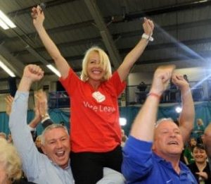
Even the carefully chosen images portray the Leave campaigner and Trump supporter as almost bestial, rather than, say, the images of exultant joy at the announcement of the first Leave success in Sunderland, or even in the article’s own Trump campaign image, if you look from the central emotion filled face to those around.

guardian-leaver  telegraph-sunderland-win
guardian-trump-1  guardian-trump-2

The article does not condemn those that follow the “venomous campaign for Brexit” or the “rancorous Twitter troll”, instead they are treated, if not compassionately, impassionately: studied as you would a colony of ants or herd of wildebeest.

If those we disagree with are lesser beings, we can ignore them, not address their real concerns.

We would not treat them with the accidental cruelty that Dickens describes in pre-revolutionary Paris, but rather the paternalistic regard for the lower orders of pre-War Britain, or even the kindness of the more benign slave owner; folk not fully human, but worthy of care as you would a favourite dog.

Once we see our enemy as animal, or the populous as cattle, then, however well intentioned, there are few limits.

The 1930s should have taught us that.


the internet laws of the jungle

firefox-copyright-1Where are the boundaries between freedom, license and exploitation, between fair use and theft?

I found myself getting increasingly angry today as Mozilla Foundation stepped firmly beyond those limits, and moreover with Trump-esque rhetoric attempts to dupe others into following them.

It all started with a small text add below the Firefox default screen search box:

firefox-copyright-2

Partly because of my ignorance of web-speak ‘TFW‘ (I know showing my age!), I clicked through to a petition page on Mozilla Foundation (PDF archive copy here).

It starts off fine, with stories of some of the silliness of current copyright law across Europe (can’t share photos of the Eiffel tower at night) and problems for use in education (which does in fact have quite a lot of copyright exemptions in many countries).  It offers a petition to sign.

This sounds all good, partly due to rapid change, partly due to knee jerk reactions, internet law does seem to be a bit of a mess.

If you blink you might miss one or two odd parts:

“This means that if you live in or visit a country like Italy or France, you’re not permitted to take pictures of certain buildings, cityscapes, graffiti, and art, and share them online through Instagram, Twitter, or Facebook.”

Read this carefully, a tourist forbidden from photographing cityscapes – silly!  But a few words on “… and art” …  So if I visit an exhibition of an artist or maybe even photographer, and share a high definition (Nokia Lumia 1020 has 40 Mega pixel camera) is that OK? Perhaps a thumbnail in the background of a selfie, but does Mozilla object to any rules to prevent copying of artworks?

mozilla-dont-break-the-internet

However, it is at the end, in a section labelled “don’t break the internet”, the cyber fundamentalism really starts.

“A key part of what makes the internet awesome is the principle of innovation without permission — that anyone, anywhere, can create and reach an audience without anyone standing in the way.”

Again at first this sounds like a cry for self expression, except if you happen to be an artist or writer and would like to make a living from that self-expression?

Again, it is clear that current laws have not kept up with change and in areas are unreasonably restrictive.  We need to be ale to distinguish between a fair reference to something and seriously infringing its IP.  Likewise, we could distinguish the aspects of social media that are more like looking at holiday snaps over a coffee, compared to pirate copies for commercial profit.

However, in so many areas it is the other way round, our laws are struggling to restrict the excesses of the internet.

Just a few weeks ago a 14 year old girl was given permission to sue Facebook.  Multiple times over a 2 year period nude pictures of her were posted and reposted.  Facebook hides behind the argument that it is user content, it takes down the images when they are pointed out, and yet a massive technology company, which is able to recognise faces is not able to identify the same photo being repeatedly posted. Back to Mozilla: “anyone, anywhere, can create and reach an audience without anyone standing in the way” – really?

Of course this vision of the internet without boundaries is not just about self expression, but freedom of speech:

“We need to defend the principle of innovation without permission in copyright law. Abandoning it by holding platforms liable for everything that happens online would have an immense chilling effect on speech, and would take away one of the best parts of the internet — the ability to innovate and breathe new meaning into old content.”

Of course, the petition is signalling out EU law, which inconveniently includes various provisions to protect the privacy and rights of individuals, not dictatorships or centrally controlled countries.

So, who benefits from such an open and unlicensed world?  Clearly not the small artist or the victim of cyber-bullying.

Laissez-faire has always been an aim for big business, but without constraint it is the law of the jungle and always ends up benefiting the powerful.

In the 19th century it was child labour in the mills only curtailed after long battles.

In the age of the internet, it is the vast US social media giants who hold sway, and of course the search engines, who just happen to account for $300 million of revenue for Mozilla Foundation annually, 90% of its income.


lies, damned lies and obesity

2016-07-15 11.02.43 - inews-obesityFacts are facts, but the facts you choose to tell change the story, and, in the case of perceptions of the ‘ideal body’, can fuel physical and mental health problems, with consequent costs to society and damage to individual lives.

Today’s i newspaper includes an article entitled “Overweight and obese men ‘have higher risk of premature death’“.  An online version of the same article “Obese men three times more likely to die early” appeared online yesterday on the iNews website.  A similar article “Obesity is three times as deadly for men than women” reporting the same Lancet article appeared in yesterday’s Telegraph.

The text describes how moderately obese men die up to three years earlier than those of ‘normal’ weight1; clearly a serious issue in the UK given growing levels of child obesity and the fact that the UK has the highest levels of obesity in Europe.  The i quotes professors from Oxford and the British Heart Foundation, and the Telegraph report says that the Lancet article’s authors suggest their results refute other recent research which found that being slightly heavier than ‘normal’ could be protective and extend lifespan.

The things in the reports are all true. However, to quote the Witness Oath of British courts, it is not sufficient to tell “the truth”, but also “the whole truth”.

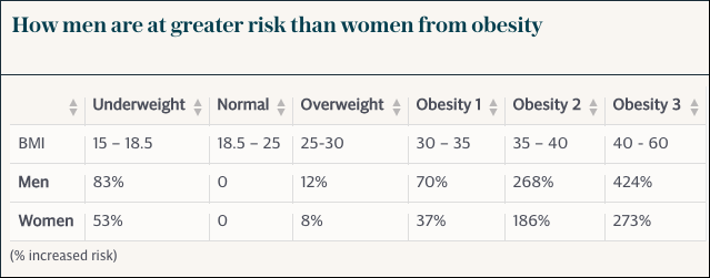
The Telegraph article also helpfully includes a summary of the actual data in which the reports are based.

obesity-table

As the articles say, this does indeed show substantial risk for both men and women who are mildly obese (BMI>30) and extreme risk for those more severely obese (BMI>35). However, look to the left of the table and the column for those underweight (BMI<18.5).  The risks of being underweight exceed those of being mildly overweight, by a small amount for men and a substantial amount for women.

While obesity is major issue, so is the obsession with dieting and the ‘ideal figure’, often driven by dangerously skinny fashion models.  The resulting problems of unrealistic and unhealthy body image, especially for the young, have knock-on impacts on self-confidence and mental health. This may then lead to weight problems, paradoxically including obesity.

The original Lancet academic article is low key and balanced, but, if reported accurately, the comments of at least one of the (large number of) article co-authors less so.  However, the eventual news reports, from ‘serious’ papers at both ends of the political spectrum, while making good headlines, are not just misleading but potentially damaging to people’s lives.


  1. I’ve put ‘normal’ in scare quotes, as this is the term used in many medical charts and language, but means something closer to ‘medically recommended’, and is far from ‘normal’ on society today.[back]

REF Redux 6 — Reasons and Remedies

This, the last of my series of posts on post-REF analysis, asks what went wrong and what could be done to improve things in future.

Spoiler: a classic socio-technical failure story: compromising the quality of human processes in order to feed an algorithm

As I’ve noted multiple times, the whole REF process and every panel member was focused around fairness and transparency, and yet still the evidence is that quite massive bias emerged. This is evident in my own analysis of sub-area and institutional differences, and also in HEFCE’s own report, which highlighted gender differences.

Summarising some of the effects we have seen in previous posts:

  1. sub-areas: When you rank outputs within their own areas worldwide: theoretical papers ranked in the top 5% (top 1 in 20) worldwide get a 4* of whereas those in more applied human/centric papers need to be in the top 0.5% (top 1 in 200) – a ten-fold difference (REF Redux 2)
  2. institutions: Outputs that appear equivalent in terms of citation are ranked more highly in Russell Group universities compared with other old (pre-1992) universities, and both higher than new (post-1992) universities.  If two institutions have similar citation profiles, the Russell Group one, on average, would receive 2-3 times more money per member of staff than the equivalent new university (REF Redux 4)
  3. gender: A male academic in computing is 33% more likely to get a 4* then a female academic, and this effect persists even when other factors considered (HEFCE report “The Metric Tide”). Rather than explicit bias, I believe this is likely to be an implicit bias due to the higher proportions of women in sub-areas disadvantaged by REF (REF Redux 5)

These are all quite shocking results, not so much that the differences are there, but because of the size.

Before being a computer scientist I was trained as a statistician.  In all my years both as a professional statistician, and subsequently as a HCI academic engaged in or reviewing empirical work, I have never seen effect sizes this vast.

What went wrong?

Note that this analysis is all for sub-panel 11 Computer Science and Informatics. Some of the effects (in particular institutional bias) are probably not confined to this panel; however, there are special factors in the processes we used in computing which are likely to have exacerbated latent bias in general and sub-area bias in particular.

As a computing panel, we of course used algorithms!

The original reason for asking submissions to include an ACM sub-area code was to automate reviewer allocation. This meant that while other panel chairs were still starting their allocation process, SP11 members already had their full allocations of a thousand or so outputs a piece. Something like 21,000 output allocations at the press of a button. Understandably this was the envy of other panels!

We also used algorithms for normalisation of panel members’ scores. Some people score high, some score low, some bunch towards the middle with few high and few low scores, and some score too much to the extremes.

This is also the envy of many other panel members. While we did discuss scores on outputs where we varied substantially, we did not spend the many hours debating whether a particular paper was 3* or 4*, or trying to calibrate ourselves precisely — the algorithm does the work. Furthermore the process is transparent (we could even open source the code) and defensible — it is all in the algorithm, no potentially partisan decisions.

Of course such an algorithm cannot simply compare each panel member with the average as some panel members might have happened to have better or worse set of outputs to review than others. In order to work there has to be sufficient overlap between panel members’ assessments so that they can be robustly compared. In order to achieve this overlap we needed to ‘spread our expertise’ for the assignment process, so that we reviewed more papers slightly further from our core area of competence.

Panels varies substantially in the way they allocated outputs to reviewers. In STEM areas the typical output was an article of, say, 8–10 pages; whereas in the humanities often books or portfolios; in performing arts there might even be a recording of a performance taking hours. Clearly the style of reviewing varied. However most panels tried to assign two expert panelists to each output. In computing we had three assessors per output, compared to two in many areas (and in one sub-panel a single assessor per output). However, because of the expertise spreading this meant typically one expert and two more broad assessors per output.

For example, my own areas of core competence (Human-centered computing / Visualization and Collaborative and social computing) had between them 700 outputs, and were two others assessors with strong knowledge in these areas. However, of over 1000 outputs I assessed, barely one in six (170) were in these areas, that is only 2/3 more than if the allocation had been entirely random.

Assessing a broad range of computer science was certainly interesting, and I feel I came away with an understanding of the current state of UK computing that I certainly did not have before. Also having a perspective from outside a core area is very valuable especially in assessing the significance of work more broadly within the discipline.

This said the downside is that the vast majority of assessments were outside our core areas, and it is thus not so surprising that default assessments (aka bias) become a larger aspect of the assessment. This is particularly problematic when there are differences in methodology; whereas it is easy to look at a paper with mathematical proofs in it and think “that looks rigorous”, it is hard for someone not used to interpretative methodologies to assess, for example, ethnography.

If the effects were not so important, it is amusing to imagine the mathematics panel with statisticians, applied and pure mathematicians assessing each others work, or indeed, if formal computer science were assessed by a pure mathematicians.

Note that the intentions were for the best trying to make the algorithm work as well as possible; but the side effect was to reduce the quality of the human process that fed the algorithm. I recall the first thing I ever learnt in computing was the mantra, “garbage in — garbage out”.

Furthermore, the assumption underlying the algorithm was that while assessors differed in their severity/generosity of marking and their ‘accuracy’ of marking, they were all equally good at all assessments. While this might be reasonable if we all were mainly marking within our own competence zone, this is clearly not valid given the breadth of assessment.  That is the fundamental assumptions of the algorithm were broken.

This is a classic socio-technical failure story: in an effort to ‘optimise’ the computational part of the system, the overall human–computer system was compromised. It is reasonable for those working in more purely computational areas to have missed this; however, in retrospect, those of us with a background in this sort of issue should have foreseen problems (John 9:41), mea culpa.  Indeed, I recall that I did have reservations, but had hoped that any bad effects would average out given so many points of assessment.  It was only seeing first Morris Sloman’s analysis and then the results of my own that I realised quite how bad the distortions had been.

I guess we fell prey to another classic systems failure: not trialling, testing or prototyping a critical system before using it live.

What could be done better?

Few academics are in favour of metrics-only systems for research assessment, and, rather like democracy, it may be that the human-focused processes of REF are the worst possible solution apart from all the alternatives.

I would certainly have been of that view until seeing in detail the results outlined in this series. However, knowing what I do now, if there were a simple choice for the next REF of what we did and a purely metrics-based approach, I would vote for the latter. In every way that a pure metrics based approach would be bad for the discipline, our actual process was worse.

However, the choice is not simply metrics vs human assessment.

In computing we used a particular combination of algorithm and human processes that amplified rather than diminished the effects of latent bias. This will have been particularly bad for sub-areas where differences in methodology lead to asymmetric biases. However, it is also likely to have amplified institution bias effects as when assessing areas far from one’s own expertise it is more likely that default cues, such as the ‘known’ quality of the institution, will weigh strongly.

Clearly we need to do this differently next time, and other panels definitely ought not to borrow SP11’s algorithms without substantial modification.

Maybe it is possible to use metrics-based approaches to feed into a human process in a way that is complimentary. A few ideas could be:

  1. metrics for some outputs — for example we could assess older journal and conference outputs using metrics, combined with human assessment for newer or non-standard outputs
  2. metrics as under-girding – we could give outputs an initial grade based on metrics, which is then altered after reading, but where there is a differential burden of proof — easy to raise a grade (e.g. because of badly chosen venue for strong paper), but hard to bring it down (more exceptional reasons such as citations saying “this paper is wrong”)
  3. metrics for in-process feedback — a purely human process as we had, but part way through calculate the kinds of profiles for sub-areas and institutions that I calculated in REF Redux 2, 3 and 4. At this point the panel would be able to decide what to do about anomalous trends, for example, individually examine examples of outputs.

There are almost certainly other approaches, the critical thing is that we must do better than last time.

REF Redux 5 – growing the gender gap

This fifth post in the REF Redux series looks at gender issue, in particular the likelihood that the apparent bias in computing REF results will disproportionately affect women in computing. While it is harder to find full data for this, a HEFCE post-REF report has already done a lot of the work.

Spoiler:   REF results are exacerbating implicit gender bias in computing

A few weeks ago a female computing academic shared how she had been rejected for a job; in informal feedback she heard that her research area was ‘shrinking’.  This seemed likely to be due to the REF sub-area profiles described in the first post of this series.

While this is a single example, I am aware that recruitment and investment decisions are already adjusting widely due to the REF results, so that any bias or unfairness in the results will have an impact ‘on the ground’.

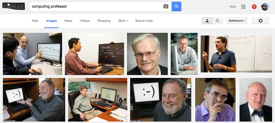
Google image search for "computing professor"

Google image search “computing professor”

In fact gender and other equality issues were explicitly addressed in the REF process, with submissions explicitly asked what equality processes, such as Athena Swan, they had in place.

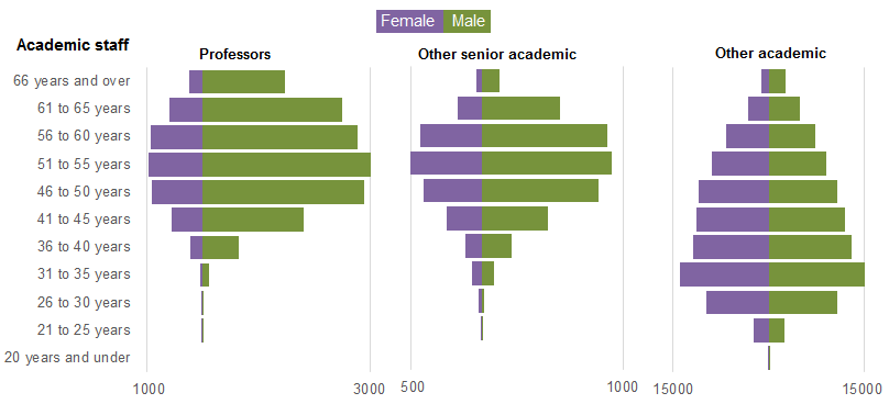
This is set in the context of a large gender gap in computing. Despite there being more women undergraduate entrants than men overall, only 17.4% of computing first degree graduates are female and this has declined since 2005 (Guardian datablog based on HESA data).  Similarly only about 20% of computing academics are female (“Equality in higher education: statistical report 2014“), and again this appears to be declining:

academic-CS-staff-female

from “Equality in higher education: statistical report 2014”, table 1.6 “SET academic staff by subject area and age group”

The misbalance in terms of application rates for research funding has also been issue that the European Commission has investigated in “The gender challenge in research funding: Assessing the European national scenes“.

HEFCE commissioned a post-REF report “The Metric Tide: Report of the Independent Review of the Role of Metrics in Research Assessment and Management“, which includes substantial statistics concerning the REF results and models of fit to various metrics (not just citations). Helpfully, Fran AmeryStephen Bates and Steve McKay used these to create a summary of “Gender & Early Career Researcher REF Gaps” in different academic areas.  While far from the largest, Computer Science and Informatics is in joint third place in terms of the gender gap as measured by the 4* outputs.

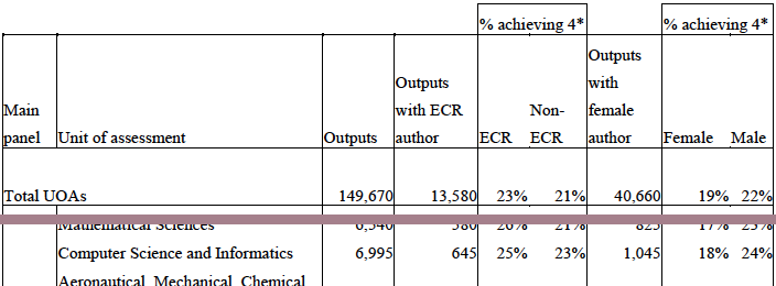
Their data comes from the HEFCE report’s supplement on “Correlation analysis of REF2014 scores and metrics“, and in particular table B4 (page 75):

table-b4-no-legend

Extract of “Table B4 Summary of submitting authors by UOA and additional characteristics” from “The Metric Tide : Correlation analysis of REF2014 scores and metrics”

This shows that while 24% of outputs submitted by males were ranked 4*, only 18% of those submitted by females received a 4*.  That is a male member of staff in computing is 33% more likely to get a 4* than a female.

Now this could be due to many factors, not least the relative dearth of female senior academics reported by HESA.(“Age and gender statistics for HE staff“).

HESA academic staff gender balance: profs vs senior vs other academic

extract of HESA graphic “Staff at UK HE providers by occupation, age and sex 2013/14” from “Age and gender statistics for HE staff”

However, the HEFCE report goes on to compare this result with metrics, in a similar way to my own analysis of subareas and institutional effects.  The report states (my emphasis) that:

Female authors in main panel B were significantly less likely to achieve a 4* output than male authors with the same metrics ratings. When considered in the UOA models, women were significantly less likely to have 4* outputs than men whilst controlling for metric scores in the following UOAs: Psychology, Psychiatry and Neuroscience; Computer Science and Informatics; Architecture, Built Environment and Planning; Economics and Econometrics.

That is, for outputs that look equally good from metrics, those submitted by men are more likely to obtain a 4* than the by women.

Having been on the computing panel, I never encountered any incidents that would suggest any explicit gender bias.  Personally speaking, although outputs were not anonymous, the only time I was aware of the gender of authors was when I already knew them professionally.

My belief is that these differences are more likely to have arisen from implicit bias, in terms of what is valued.  The The Royal Society of Edinburgh report “Tapping our Talents” warns of the danger that “concepts of what constitutes ‘merit’ are socially constructed” and the EU report “Structural change in research institutions” talks of “Unconscious bias in assessing excellence“.  In both cases the context is recruitment and promotion procedures, but the same may well be true of the way we asses the results of research.,

In previous posts I have outlined the way that the REF output ratings appear to selectively benefit theoretical areas compared with more applied and human-oriented ones, and old universities compared with new universities.

While I’ve not yet been able obtain numbers to estimate the effects, in my experience the areas disadvantaged by REF are precisely those which have a larger number of women.  Also, again based on personal experience, I believe there are more women in new university computing departments than old university departments.

It is possible that these factors alone may account for the male–female differences, although this does not preclude an additional gender bias.

Furthermore, if, as seems the be the case, the REF sub-area profiles are being used to skew recruiting and investment decisions, then this means that women will be selectively disadvantaged in future, exacerbating the existing gender divide.

Note that this is not suggesting that recruitment decisions will be explicitly biased against women, but by unfairly favouring traditionally more male-dominated sub-areas of computing this will create or exacerbate an implicit gender bias.

WebSci 2015 – WebSci and IoT panel

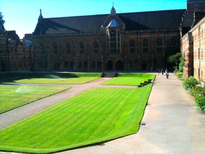
Sunshine on Keble quad, brings back memories of undergraduate days at Trinity, looking out toward the Wren Library.

Yesterday was first day of WebSci 2015.  I’m here largely as I’m giving my work on comparing REF outcomes with citation measures, “Citations and Sub-Area Bias in the UK Research Assessment Process”, at the workshop on “Quantifying and Analysing Scholarly Communication on the Web” on Tuesday.

However, yesterday I was also on a panel on “Web Science & the Internet of Things”.

These are some of the points I made in my initial positioning remarks.  I talked partly about a few things sorting round the edge of Internet of Things (IoT) and then some concerts examples of IoT related rings I;ve been involved with personally and use these to mention  few themes that emerge.

Not quite IoT

Talis

Many at WebSci will remember Talis from its SemWeb work.  The SemWeb side of the business has now closed, but the education side, particularly Reading List software with relationships between who read what and how they are related definitely still clear WebSci.  However, the URIs (still RDF) of reading items are often books, items in libraries each marked with bar codes.

Years ago I wrote about barcodes as one of the earliest and most pervasive CSCW technologies (“CSCW — a framework“), the same could be said for IoT.  It is interesting to look at the continuities and discontinuities between current IoT and these older computer-connected things.

The Walk

In 2013 I walked all around Wales, over 1000 miles.  I would *love* to talk about the IoT aspects of this, especially as I was wired up with biosensors the whole way.  I would love to do this, but can’t , because the idea of the Internet in West Wales and many rural areas is a bad joke.  I could not even Tweet.  When we talk about the IoT currently, and indeed anything with ‘Web’ or ‘Internet’ in its name, we have just excluded a substantial part of the UK population, let alone the world.

REF

Last year I was on the UK REF Computer Science and Informatics Sub-Panel.  This is part of the UK process for assessing university research.  According to the results it appears that web research in the UK is pretty poor.   In the case of the computing sub-panel, the final result was the outcome of a mixed human and automated process, certainly interesting HCI case study of socio-technical systems and not far from WeSci concerns.

This has very real effects on departmental funding and on hiring and investment decisions within universities. From the first printed cheque, computer systems have affected the real world, while there are differences in granularity and scale, some aspects of IoT are not new.

Later in the conference I will talk about citation-based analysis of the results, so you can see if web science really is weak science 😉

Clearly IoT

Three concrete IoT things I’ve been involved with:

Firefly

While at Lancaster Jo Finney and I developed tiny intelligent lights. After more than ten years these are coming into commercial production.

Imagine a Christmas tree, and put a computer behind each and every light – that is Firefly.  Each light becomes a single-pixel network computer, which seems like technological overkill, but because the digital technology is commoditised, suddenly the physical structures of wires and switches is simplified – saving money and time and allowing flexible and integrated lighting.

Even early prototypes had thousands of computers in a few square metres.  Crucially too the higher level networking is all IP.  This is solid IoT territory.  However, like a lot of smart-dust, and sensing technology based around homogeneous devices and still, despite computational autonomy, largely centrally controlled.

While it may be another 10 years before it makes the transition from large-scale display lighting to domestic scale; we always imagined domestic scenarios.  Picture the road, each house with a Christmas tree in its window, all Firefly and all connected to the internet, light patterns more form house to hose in waves, coordinate twinkling from window to window glistening in the snow.  Even in tis technology issues of social interaction and trust begin to emerge.

FitBit

My wife has a FitBit.  Clearly both and IoT technology and WebSci phenomena with millions of people connecting their devices into FitBit’s data sharing and social connection platform.

The week before WebSci we were on holiday, and we were struggling to get her iPad’s mobile data working.  The Vodafone website is designed around phones, and still (how many iPads!) misses crucial information essential for data-only devices.

The FitBit’s alarm had been set for an early hour to wake us ready to catch the ferry.  However, while the FitBit app on the iPad and the FitBit talk to one another via Bluetooth, the app will not control the alarm unless it is Internet connected.  For the first few mornings of our holiday at 6am each morning …

Like my experience on the Wales walk the software assumes constant access to the web and fails when this is not present.

Tiree Tech Wave

I run a twice a year making, talking and thinking event, Tiree Tech Wave, on the Isle of Tiree.  A wide range of things happen, but some are connected with the island itself and a number of island/rural based projects have emerged.

One of these projects, OnSupply looked at awareness of renewable power as the island has a community wind turbine, Tilly, and the emergence of SmartGrid technology.  A large proportion of the houses on the island are not on modern SmartGrid technology, but do have storage heating controlled remotely, for power demand balancing.  However, this is controlled using radio signals, and switched as large areas.  So at 4am each morning all the storage heating goes on and there is a peak.  When, as happens occasionally, there are problems with the cable between the island and the mainland, the Island’s backup generator has to deal with this surge, it cannot be controlled locally.  Again issuss of connectivity deeply embedded in the system design.

We also have a small but growing infrastructure of displays and sensing.

We have, I believe, the worlds first internet-enabled shop open sign.  When the café is open, the sign is on, this is broadcast to a web service, which can then be displayed in various ways.  It is very important in a rural area to know what is open, as you might have to drive many miles to get to a café or shop.

We also use various data feeds from the ferry company, weather station, etc., to feed into public and web displays (e.g. TireeDashboard).  That is we have heterogeneous networks of devices and displays communicating through web apis and services – good Iot and WebSCi!

This is part of a broader vision of Open Data Islands and Communities, exploring how open data can be of value to small communities.  On their own open environments tend to be most easily used by the knowledgeable, wealthy and powerful, reinforcing rather than challenging existing power structures.  We have to work explicitly to create structures and methods that make both IoT and the potential of the web truly of benefit to all.


If the light is on, they can hear (and now see) you

hello-barbie-matel-from-guardianFollowing Samsung’s warning that its television sets can listen into your conversations1, and Barbie’s, even more scary, doll that listens to children in their homes and broadcasts this to the internet2, the latest ‘advances’ make it possible to be seen even when the curtains are closed and you thought you were private.

For many years it has been possible for security services, or for that matter sophisticated industrial espionage, to pick up sounds based on incandescent light bulbs.

The technology itself is not that complicated, vibrations in the room are transmitted to the filament, which minutely changes its electrical characteristics. The only complication is extracting the high-frequency signal from the power line.

040426-N-7949W-007However, this is a fairly normal challenge for high-end listening devices. Years ago when I was working with submarine designers at Slingsby, we were using the magnetic signature of power running through undersea cables to detect where they were for repair. The magnetic signatures were up to 10,000 times weaker than the ‘noise’ from the Earth’s own magnetic field, but we were able to detect the cables with pin-point accuracy3. Military technology for this is far more advanced.

The main problem is the raw computational power needed to process the mass of data coming from even a single lightbulb, but that has never been a barrier for GCHQ or the NSA, and indeed, with cheap RaspberryPi-based super-computers, now not far from the hobbyist’s budget4.

Using the fact that each lightbulb reacts slightly differently to sound, means that it is, in principle, possible to not only listen into conversations, but work out which house and room they come from by simply adding listening equipment at a neighbourhood sub-station.

The benefits of this to security services are obvious. Whereas planting bugs involves access to a building, and all other techniques involve at least some level of targeting, lightbulb-based monitoring could simply be installed, for example, in a neighbourhood known for extremist views and programmed to listen for key words such as ‘explosive’.

For a while, it seemed that the increasing popularity of LED lightbulbs might end this. This is not because LEDs do not have an electrical response to vibrations, but because of the 12V step down transformers between the light and the mains.

Of course, there are plenty of other ways to listen into someone in their home, from obvious bugs to laser-beams bounced of glass (you can even get plans to build one of your own at Instructables), or even, as MIT researchers recently demonstrated at SIGGRAPH, picking up the images of vibrations on video of a glass of water, a crisp packet, and even the leaves of a potted plant5. However, these are all much more active and involve having an explicit suspect.

Similarly blanket internet and telephone monitoring have applications, as was used for a period to track Osama bin Laden’s movements6, but net-savvy terrorists and criminals are able to use encryption or bypass the net entirely by exchanging USB sticks.

However, while the transformer attenuates the acoustic back-signal from LEDs, this only takes more sensitive listening equipment and more computation, a lot easier than a vibrating pot-plant on video!

So you might just think to turn up the radio, or talk in a whisper. Of course, as you’ve guessed by now, and, as with all these surveillance techniques, simply yet more computation.

Once the barriers of LEDs are overcome, they hold another surprise. Every LED not only emits light, but acts as a tiny, albeit inefficient, light detector (there’s even an Arduino project to use this principle).   The output of this is a small change in DC current, which is hard to localise, but ambient sound vibrations act as a modulator, allowing, again in principle, both remote detection and localisation of light.

220px-60_LED_3W_Spot_Light_eq_25WIf you have several LEDs, they can be used to make a rudimentary camera7. Each LED lightbulb uses a small array of LEDs to create a bright enough light. So, this effectively becomes a very-low-resolution video camera, a bit like a fly’s compound eye.

While each image is of very low quality, any movement, either of the light itself (hanging pendant lights are especially good), or of objects in the room, can improve the image. This is rather like the principle we used in FireFly display8, where text mapped onto a very low-resolution LED pixel display is unreadable when stationary, but absolutely clear when moving.

pix-11  pix-21
pix-12  pix-22
LEDs produce multiple very-low-resolution image views due to small vibrations and movement9.

OLYMPUS DIGITAL CAMERA  OLYMPUS DIGITAL CAMERA
Sufficient images and processing can recover an image.

So far MI5 has not commented on whether it uses, or plans to use this technology itself, nor whether it has benefited from information gathered using it by other agencies. Of course its usual response is to ‘neither confirm nor deny’ such things, so without another Edward Snowden, we will probably never know.

So, next time you sit with a coffee in your living room, be careful what you do, the light is watching you.

  1. Not in front of the telly: Warning over ‘listening’ TV. BBC News, 9 Feb 2015. http://www.bbc.co.uk/news/technology-31296188[back]
  2. Privacy fears over ‘smart’ Barbie that can listen to your kids. Samuel Gibbs, The Guardian, 13 March 2015. http://www.theguardian.com/technology/2015/mar/13/smart-barbie-that-can-listen-to-your-kids-privacy-fears-mattel[back]
  3. “Three DSP tricks”, Alan Dix, 1998. https://alandix.com/academic/papers/DSP99/DSP99-full.html[back]
  4. “Raspberry Pi at Southampton: Steps to make a Raspberry Pi Supercomputer”, http://www.southampton.ac.uk/~sjc/raspberrypi/[back]
  5. A. Davis, M. Rubinstein, N. Wadhwa, G. Mysore, F. Durand and W. Freeman (2014). The Visual Microphone: Passive Recovery of Sound from Video. ACM Transactions on Graphics (Proc. SIGGRAPH), 33(4):79:1–79:10 http://people.csail.mit.edu/mrub/VisualMic/[back]
  6. Tracking Use of Bin Laden’s Satellite Phone, all Street Journal, Evan Perez, Wall Street Journal, 28th May, 2008. http://blogs.wsj.com/washwire/2008/05/28/tracking-use-of-bin-ladens-satellite-phone/[back]
  7. Blinkenlight, LED Camera. http://blog.blinkenlight.net/experiments/measurements/led-camera/[back]
  8. Angie Chandler, Joe Finney, Carl Lewis, and Alan Dix. 2009. Toward emergent technology for blended public displays. In Proceedings of the 11th international conference on Ubiquitous computing (UbiComp ’09). ACM, New York, NY, USA, 101-104. DOI=10.1145/1620545.1620562[back]
  9. Note using simulated images; getting some real ones may be my next Tiree Tech Wave project.[back]

lies, damned lies, and the BBC

I have become increasingly annoyed and distressed over the years at the way the media decides a narrative for various news stories and then selectively presents the facts to tell the story, ignoring or suppressing anything that suggests a more nuanced or less one-sided account.

BBC-news-headline-13-Feb-2015-croppedSometimes I agree with the overall narrative, sometimes I don’t.  Either way the B-movie Western accounts, which cannot recognise that the baddies can sometimes do good and the goodies may not be pristine, both distort the public’s view of the world and perhaps more damagingly weaken the critical eye that is so essential for democracy.

For the newspapers, we know that they have an editorial stance and I expect a different view of David Cameron’s welfare policy in The Guardian compared with The Telegraph. Indeed, I often prefer to read a newspaper I disagree with as it is easier to see the distortions when they clash with one’s own preconceptions.  One of the joys of the British broadsheet press is that whatever the persuasion, the underlying facts are usually there, albeit deeply buried towards the end of a long article.

However, maybe unfairly, I have higher expectations of the BBC, which are sadly and persistently dashed.  Here it seems not so much explicit editorial policy (although one hears that they do get leant upon by government occasionally), more that they believe a simplistic narrative is more acceptable to the viewer … and maybe they just begin to believe there own stories.

A typical (in the sense of terrifyingly bad) example of this appeared this morning.

After the wonderful news of a peace agreement in Ukraine yesterday, this morning the report read:

Ukraine crisis: Shelling follows Minsk peace summit

The ceasefire is due to start on Sunday, so one can only hope this is a last violent outburst, although to what avail as the borders are already set by the Minsk agreement.

The first few lines of the article read as follows:

New shelling has been reported in the rebel-held east Ukrainian cities of Donetsk and Luhansk, a day after a peace deal was reached in Minsk.

There are no confirmed reports of casualties. Both cities are near the front line where the pro-Russian rebels face government forces.

The ceasefire agreed in the Belarusian capital is to begin in eastern Ukraine after midnight (22:00 GMT) on Saturday.

The EU has warned Russia of additional sanctions if the deal is not respected.

If you have kept abreast of the ongoing crisis in Ukraine and can remember your geography, then you will know that this means the Ukrainian Army was shelling rebel-held cities.  However, if you are less aware, this is not the immediate impression of the article.

First notice the passive wording of the title.  Imagine if this had been Syria, the headline would have surely been “Assad’s forces bombard Syrian cities” or “Syrian Army shell civilian areas“.  While the BBC may want to avoid flamboyant titles (although do not demure elsewhere) the article itself is no better.

The opening paragraphs mention ‘shelling’, ‘rebels’ and the EU warning Russians to clean up their act.  The emotional and rhetorical impact is that in some way Russians are to blame for the shelling of cities, and indeed when I read the words to Fiona this was precisely what she assumed.

That is, while the facts are there, they are presented in such a way that the casual reader takes away precisely the opposite of the truth.  In other words, the BBC reporting, whether intentionally or unintentionally, systematically misleads the public.

To be fair, in the earliest version of the article its later parts report first Ukrainian army deaths and then civilian casualties in rebel-held areas:

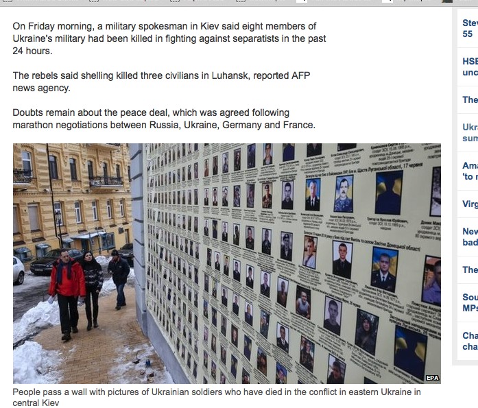
On Friday morning, a military spokesman in Kiev said eight members of Ukraine’s military had been killed in fighting against separatists in the past 24 hours.

The rebels said shelling killed three civilians in Luhansk, reported AFP news agency.

(Although the second sentence is removed from later versions of the article.)

BBC-news-early-13-Feb-2015-cropped BBC-news-later-13-Feb-2015-cropped
early and later version of same BBC story

The early versions of the article also included an image of a wall in Kiev commemorating Ukrainian army deaths, but not the graphic images of civilian casualties that would be used in other conflicts1. This was later changed to a refugee departing on a bus to Russia ((Later still the image of an armoured vehicle was also added.  I’d not realised before just how much these news stories are post-edited)), which better reflects the facet behind the article.

Of course, this is not a one-sided conflict, and later reports from the region during he day include rebel shelling of government held areas as well as government shelling.  Both sides need to be reported, but the reporting practice seems to be to deliberately obfuscate the far more prevalent Ukrainian army attacks on civilian areas.

If this were just a single news item, it could be just the way things turn out, and other news items might be biased in other directions, but the misreporting is systematic and long term.  Many of BBCs online news items include a short potted history of the conflict, which always says that the current conflict started with Russian annexing of Crimea, conveniently ignoring the violent overthrow of the elected government which led to this.  Similarly the BBC timeline for Ukraine starts in 1991 with the Ukrainian referendum to separate from the USSR, conveniently ignoring the similar overwhelming referendum in Crimea earlier in 1991 to separate from Ukraine2.

To be fair on the journalists on the ground, it is frequently clear that their own raw accounts have a different flavour to the commentary added when footage is edited back in London.

In some way Ukraine could be seen as a special case, the Russians are the bogey men of the today, just like Germany was 100 years ago and France was 100 years previously, it is hard for a journalist to say, “actually in this case they have a point“.

Yet, sadly, the above account could be repeated with different details, but the same underlying message in so many conflicts in frequent times.  Will the media, and the BBC, ever trust the public with the truth, or will ‘news’ always be a B movie?

  1. Maybe this is just deemed too horrifying; a recent Times report of Donetsk morgue includes graphic accounts of shrapnel torn babies, but does not include the Getty images of the morgue preferring an image of an unexploded rocket.[back]
  2. While ignoring the history of Crimea. which does seem germane to the current conflict, the BBC timeline is overall relatively fair; for example, making clear that Yanukovych’s election was “judged free and fair by observers“.[back]