A tale of two conferences and the future of learning technology in the UK

Over the past few weeks I’ve been to two conferences focused on different aspects of technology and learning, Talis Insight Europe and ACM Learning at Scale (L@S). This led me to reflect on the potential for and barriers to ground breaking research in these areas in the UK.

The first conference, Talis Insight Europe, grew out of the original Talis User Group, but as well as company updates on existing and new products, also has an extensive line-up of keynotes by major educational visionaries and decision makers (including pretty much the complete line-up of JISC senior staff) and end-user contributed presentations.

hole-in-the-wall-Begin02The second, Learning @ Scale, grew out of the MOOC explosion, and deals with the new technology challenges and opportunities when we are dealing with vast numbers of students. It also had an impressive array of keynote speakers, including Sugata Mitra, famous for the ‘Hole in the Wall‘, which brought technology to street children in India.

Although there were some common elements (big data and dashboards got a mention in both!), the audiences were quite different. For Insight, the large majority were from HE (Higher Education) libraries, followed by learning technologists, industry representatives, and HE decision-makers. In contrast, L@S consisted largely of academics, many from computing or technical backgrounds, with some industry researchers, including, as I was attending largely with my Talis hat on, me.

insight-2016-jisc-keynoteIn a joint keynote at Insight, Paul Fieldman and Phil Richards the CEO and CIO of JISC, described the project to provide a learning analytics service [FR16,JI16] (including student app and, of course, dashboard) for UK institutions. As well as the practical benefits, they outlined a vision where the UK leads the way in educational big data for personalised learning.

Given a long track record of education and educational technology research in the UK, the world-leading distance-learning university provision of the Open University, and recent initiatives both those outlined by JISC and FutureLearn (building on the OUs vast experience), this vision seems not unreasonable.

However, on the ground at Learning @ Scale, there was a very different picture; the vast majority of papers and attendees were from the US, an this despite the conference being held in Edinburgh.

To some extent this is as one might expect. While traditional distance learning, including the OU, has class sizes that for those in face-to-face institutions feel massive; these are dwarfed by those for MOOCs, which started in the US; and it is in the US where the main MOOC players (Coursera, udacity, edX) are based. edX alone had initial funding more than ten times that available to FutureLearn, so in sheer investment terms, the balance at L@S is representative.

FutureLearn-logoHowever, Mike Sharples, long-term educational technology researcher and Academic Lead at FutureLearn, was one of the L@S keynotes [Sh16]. In his presentation it was clear that FutureLearn and UK MOOCs punch well above their weight, with retention statistics several times higher than US counterparts. While this may partly be due to topic areas, it is also a reflection of the development strategy. Mike outlined how empirically founded educational theory has driven the design of the FutureLearn platform, not least the importance of social learning. Perhaps then not surprisingly, one of the areas where FutureLearn substantially led over US counterparts was in social aspects of learning.

So there are positive signs for UK research in these areas. While JISC has had its own austerity-driven funding problems, its role as trusted intermediary and active platform creator offers a voice and forum that few, if any, other countries posses. Similarly, while FutureLearn needs to be sustainable, so has to have a certain inward focus, it does seem to offer a wonderful potential resource for collaborative research. Furthermore the open education resource (OER) community seems strong in the UK.

The Teaching Excellence Framework (TEF) [HC16,TH15] will bring its own problems, more about justifying student fee increases than education, potentially damaging education through yet more ill-informed political interference, and re-establishing class-based educational apartheid. However, it will certainly increase universities’ interest in education technology.

Set against this are challenges.

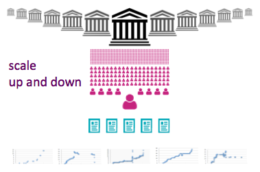
First was the topic of my own L@S work-in-progress paper – Challenge and Potential of Fine Grain, Cross-Institutional Learning Data [Dx16]. At Talis, we manage half a million reading lists, containing over 20 million resources, spread over more than 85 institutions including more than half of UK higher education. However, these institutions are all very different, and the half million courses each only may have only tens or low hundreds of students. That is very large scale in total volume, but highly heterogeneous. The JISC learning analytics repository will have exactly the same issues, and are far more difficult to deal with by machine learning or statistical analysis than the relatively homogeneous data from a single huge MOOC.

scale-up-and-down

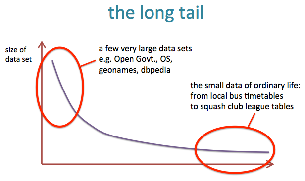
These issues of heterogeneous scale are not unique to education and ones that as a general information systems phenomena, I have been interested in for many years, and call the “long tail of small data” [Dx10,Dx15]. While this kind of data is more complex and difficult to deal with, this is of course a major research challenge, and potentially has greater long-term promise than the study of more homogeneous silos. I am finding this in my own work with musicologist [IC16,DC14], and is emerging as an issue in the natural sciences [Bo13,PC07].

long-tail

Another problem is REF, the UK ‘Research Excellence Framework’. My post-hoc analysis of the REF data revealed the enormous bias in the computing sub-panel against any form of applied and human-oriented work [Dx15b,Dx15c]. Of course, this is not a new issue, just that the available data has made this more obvious and undeniable. This affects my own core research area of human–computer interaction, but also, and probably much more substantially, learning technology research. Indeed, I think most learning technologists had already sussed this out well before REF2014 as there were very few papers submitted in this area to the computing panel. I assume most research on learning technology was submitted to the education panel.

To some extent it does not matter where research is submitted and assessed; however, while in theory the mapping between university departments and submitted units is fluid for REF, in practice submitting to ‘other’ panels is problematic making it difficult to write coherent narratives about the research environment. If learning technology research is not seen as REF-able in computing, computing departments will not recruit in these areas and discourage this kind of research. While my hope is that REF2020 will not re-iterate the mistakes of REF2014, there is no guarantee of this, and anyway the effects on institutional policy will already have been felt.

However, and happily, the kinds of research needed to make sense of this large-scale heterogeneous data may well prove more palatable to a computing REF panel than more traditional small-scale learning technology. It would be wonderful to see research collaborations between those with long-term experience and understanding of educational issues, with hard-core machine learning and statistical analysis – this is BIG DATA and challenging data. Indeed one of the few UK papers at L@S involved Pearson’s London-based data analysis department, and included automatic clustering, hidden Markov models, and regression analysis.

In short, while there are barriers in the UK, there is also great potential for exciting research that is both theoretically challenging and practically useful, bringing the insights available from large-scale educational data to help individual students and academics.

References

[Bo13] Christine L. Borgman. Big data and the long tail: Use and reuse of little data. Oxford eResearch Centre Seminar, 12th March 2013. http://works.bepress.com/borgman/269/

[Dx10] A. Dix (2010). In praise of inconsistency – the long tail of small data. Distinguished Alumnus Seminar, University of York, UK, 26th October 2011.
http://www.hcibook.com/alan/talks/York-Alumnus-2011-inconsistency/

[Dx15] A. Dix (2014/2015). The big story of small data. Talk at Open University, 11th November 2014; Oxford e-Research Centre, 10th July 2015; Mixed Reality Laboratory, Nottingham, 15th December 2015.
http://www.hcibook.com/alan/talks/OU-2014-big-story-small-data/

[DC14] Dix, A., Cowgill, R., Bashford, C., McVeigh, S. and Ridgewell, R. (2014). Authority and Judgement in the Digital Archive. In The 1st International Digital Libraries for Musicology workshop (DLfM 2014), ACM/IEEE Digital Libraries conference 2014, London 12th Sept. 2014. https://alandix.com/academic/papers/DLfM-2014/

[Dx15b] Alan Dix (2015/2016).  REF2014 Citation Analysis. accessed 8/5/2016.  https://alandix.com/ref2014/

[Dx15c] A. Dix (2015). Citations and Sub-Area Bias in the UK Research Assessment Process. In Workshop on Quantifying and Analysing Scholarly Communication on the Web (ASCW’15) at WebSci 2015 on June 30th in Oxford. http://ascw.know-center.tugraz.at/2015/05/26/dix-citations-and-sub-areas-bias-in-the-uk-research-assessment-process/

[Dx16]  Alan Dix (2016). Challenge and Potential of Fine Grain, Cross-Institutional Learning Data. Learning at Scale 2016. ACM. https://alandix.com/academic/papers/LS2016/

[FR16] Paul Feldman and Phil Richards (2016).  JISC – Helping the UK become the most advanced digital teaching and research nation in the world.  Talis Insight Europe 2016. https://talis.com/2016/04/29/jisc-keynote-paul-feldman-phil-richards-talis-insight-europe-2016/

[HC16] The Teaching Excellence Framework: Assessing Quality in Higher Education. House of Commons, Business, Innovation and Skills Committee, Third Report of Session 2015–16. HC 572.  29 February 2016.  http://www.publications.parliament.uk/pa/cm201516/cmselect/cmbis/572/572.pdf

[IC16] In Concert (2014-2016).  accessed 8/5/2016  http://inconcert.datatodata.com

[JI16]  Effective learning analytics. JISC, accessed   8/5/2016.  https://www.jisc.ac.uk/rd/projects/effective-learning-analytics

[PC07] C. L. Palmer, M. H. Cragin, P. B. Heidorn and L.C. Smith. 2007. Data curation for the long tail of science: The Case of environmental sciences. 3rd International Digital Curation Conference, Washington, DC. https://apps.lis.illinois.edu/wiki/ download/attachments/32666/Palmer_DCC2007.pdf

[Sh16]  Mike Sharples (2016).  Effective Pedagogy at Scale, Social Learning and Citizen Inquiry (keynote). Learning at Scale 2016. ACM. http://learningatscale.acm.org/las2016/keynotes/#k2

[TH15] Teaching excellence framework (TEF): everything you need to know.  Times Higher Education, August 4, 2015. https://www.timeshighereducation.com/news/teaching-excellence-framework-tef-everything-you-need-to-know


Of academic communication: overload, homeostatsis and nostalgia

open-mailbox-silhouetteRevisiting on an old paper on early email use and reflecting on scholarly communication now.

About 30 years ago, I was at a meeting in London and heard a presentation about a study of early email use in Xerox and the Open University. At Xerox the use of email was already part of their normal culture, but it was still new at OU. I’d thought they had done a before and after study of one of the departments, but remembered clearly their conclusions: email acted in addition to other forms of communication (face to face, phone, paper), but did not substitute.

Gilbert-Cockton-from-IDFIt was one of those pieces of work that I could recall, but didn’t have a reference too. Facebook to the rescue! I posted about it and in no time had a series of helpful suggestions including Gilbert Cockton who nailed it, finding the meeting, the “IEE Colloquium on Human Factors in Electronic Mail and Conferencing Systems” (3 Feb 1989) and the precise paper:

Fung , T. O’Shea , S. Bly. Electronic mail viewed as a communications catalyst. IEE Colloquium on Human Factors in Electronic Mail and Conferencing Systems, , pp.1/1–1/3. INSPEC: 3381096 http://ieeexplore.ieee.org/xpl/articleDetails.jsp?arnumber=197821

In some extraordinary investigative journalism, Gilbert also noted that the first author, Pat Fung, went on to fresh territory after retirement, qualifying as a scuba-diving instructor at the age of 75.

The details of the paper were not exactly as I remembered. Rather than a before and after study, it was a comparison of computing departments at Xerox (mature use of email) and OU’s (email less ingrained, but already well used). Maybe I had simply embroidered the memory over the years, or maybe they presented newer work at the colloquium, than was in the 3 page extended abstract.   In those days this was common as researchers did not feel they needed to milk every last result in a formal ‘publication’. However, the conclusions were just as I remembered:

“An exciting finding is its indication that the use of sophisticated electronic communications media is not seen by users as replacing existing methods of communicating. On the contrary, the use of such media is seen as a way of establishing new interactions and collaboration whilst catalysing the role of more traditional methods of communication.”

As part of this process following various leads by other Facebook friends, I spent some time looking at early CSCW conference proceedings, some at Saul Greenburg’s early CSCW bibliography [1] and Ducheneaut and Watts (15 years on) review of email research [2] in the 2005 HCI special issue on ‘reinventing email’ [3] (both notably missing the Fung et al. paper). I downloaded and skimmed several early papers including Wendy McKay’s lovely early (1988) study [4] that exposed the wide variety of ways in which people used email over and above simple ‘communication’. So much to learn from this work when the field was still fresh,

This all led me to reflect both on the Fung et al. paper, the process of finding it, and the lessons for email and other ‘communication’ media today.

Communication for new purposes

A key finding was that “the use of such media is seen as a way of establishing new interactions and collaboration“. Of course, the authors and their subjects could not have envisaged current social media, but the finding if this paper was exactly an example of this. In 1989 if I had been trying to find a paper, I would have scoured my own filing cabinet and bookshelves, those of my colleagues, and perhaps asked people when I met them. Nowadays I pop the question into Facebook and within minutes the advice starts to appear, and not long after I have a scanned copy of the paper I was after.

Communication as a good thing

In the paper abstract, the authors say that an “exciting finding” of the paper is that “the use of sophisticated electronic communications media is not seen by users as replacing existing methods of communicating.” Within paper, this is phrased even more strongly:

“The majority of subjects (nineteen) also saw no likelihood of a decrease in personal interactions due to an increase in sophisticated technological communications support and many felt that such a shift in communication patterns would be undesirable.”

Effectively, email was seen as potentially damaging if it replaced other more human means of communication, and the good outcome of this report was that this did not appear to be happening (or strictly subjects believed it was not happening).

However, by the mid-1990s, papers discussing ’email overload’ started to appear [5].

I recall a morning radio discussion of email overload about ten years ago. The presenter asked someone else in the studio if they thought this was a problem. Quite un-ironically, they answered, “no, I only spend a couple of hours a day”. I have found my own pattern of email change when I switched from highly structured Eudora (with over 2000 email folders), to Gmail (mail is like a Facebook feed, if it isn’t on the first page it doesn’t exist). I was recently talking to another academic who explained that two years ago he had deliberately taken “email as stream” as a policy to control unmanageable volumes.

If only they had known …

Communication as substitute

While Fung et al.’s respondents reported that they did not foresee a reduction in other forms of non-electronic communication, in fact even in the paper the signs of this shift to digital are evident.

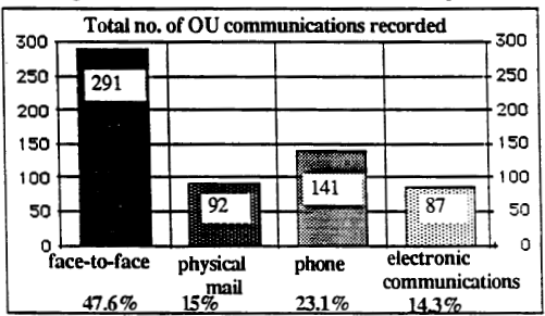
Here are the graphs of communication frequency for the Open University (30 people, more recent use of email) and Xerox (36 people, more established use) respectively.

( from Fung et al., 1989)

( from Fung et al., 1989)

( from Fung et al., 1989)

( from Fung et al., 1989)

It is hard to draw exact comparisons as it appears there may have been a higher overall volume of communication at Xerox (because of email?).  Certainly, at that point, face-to-face communication remains strong at Xerox, but it appears that not only the proportion, but total volume of non-digital non-face-to-face communications is lower than at OU.  That is sub substitution has already happened.

Again, this is obvious nowadays, although the volume of electronic communications would have been untenable in paper (I’ve sometimes imagined printing out a day’s email and trying to cram it in a pigeon-hole), the volume of paper communications has diminished markedly. A report in 2013 for Royal Mail recorded 3-6% pa reduction in letters over recent years and projected a further 4% pa for the foreseeable future [6].

academic communication and national meetungs

However, this also made me think about the IEE Colloquium itself. Back in the late 1980s and 1990s it was common to attend small national or local meetings to meet with others and present work, often early stage, for discussion. In other fields this still happens, but in HCI it has all but disappeared. Maybe I have is a little nostalgia, but this does seem a real loss as it was a great way for new PhD students to present their work and meet with the leaders in their field. Of course, this can happen if you get your CHI paper accepted, but the barriers are higher, particularly for those in smaller and less well-resourced departments.

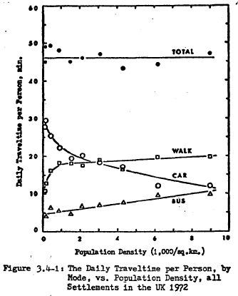
Some of this is because international travel is cheaper and faster, and so national meetings have reduced in importance – everyone goes to the big global (largely US) conferences. Many years ago research on day-to-day time use suggested that we have a travel ‘time budget’ reactively constant across counties and across different kinds of areas within the same country [7]. The same is clearly true of academic travel time; we have a certain budget and if we travel more internationally then we do correspondingly less nationally.

(from Zahavi, 1979)

(from Zahavi, 1979)

However, I wonder if digital communication also had a part to play. I knew about the Fung et al. paper, even though it was not in the large reviews of CSCW and email, because I had been there. Indeed, the reason that the Fung et al.paper was not cited in relevant reviews would have been because it was in a small venue and only available as paper copy, and only if you know it existed. Indeed, it was presumably also below the digital radar until it was, I assume, scanned by IEE archivists and deposited in IEEE digital library.

However, despite the advantages of this easy access to one another and scholarly communication, I wonder if we have also lost something.

In the 1980s, physical presence and co-presence at an event was crucial for academic communication. Proceedings were paper and precious, I would at least skim read all of the proceedings of any event I had been to, even those of large conferences, because they were rare and because they were available. Reference lists at the end of my papers were shorter than now, but possibly more diverse and more in-depth, as compared to more directed ‘search for the relevant terms’ literature reviews of the digital age.

And looking back at some of those early papers, in days when publish-or-perish was not so extreme, when cardiac failure was not an occupational hazard for academics (except maybe due to the Cambridge sherry allowance), at the way this crucial piece of early research was not dressed up with an extra 6000 words of window dressing to make a ‘high impact’ publication, but simply shared. Were things more fun?


[1] Saul Greenberg (1991) “An annotated bibliography of computer supported cooperative work.” ACM SIGCHI Bulletin, 23(3), pp. 29-62. July. Reprinted in Greenberg, S. ed. (1991) “Computer Supported Cooperative Work and Groupware”, pp. 359-413, Academic Press. DOI: http://dx.doi.org/10.1145/126505.126508
https://pdfs.semanticscholar.org/52b4/d0bb76fcd628c00c71e0dfbf511505ae8a30.pdf

[2] Nicolas Ducheneaut and Leon A. Watts (2005). In search of coherence: a review of e-mail research. Hum.-Comput. Interact. 20, 1 (June 2005), 11-48. DOI= 10.1080/07370024.2005.9667360
http://www2.parc.com/csl/members/nicolas/documents/HCIJ-Coherence.pdf

[3] Steve Whittaker, Victoria Bellotti, and Paul Moody (2005). Introduction to this special issue on revisiting and reinventing e-mail. Hum.-Comput. Interact. 20, 1 (June 2005), 1-9.
http://www.tandfonline.com/doi/abs/10.1080/07370024.2005.9667359

[4] Wendy E. Mackay. 1988. More than just a communication system: diversity in the use of electronic mail. In Proceedings of the 1988 ACM conference on Computer-supported cooperative work (CSCW ’88). ACM, New York, NY, USA, 344-353. DOI=http://dx.doi.org/10.1145/62266.62293
https://www.lri.fr/~mackay/pdffiles/TOIS88.Diversity.pdf

[5] Steve Whittaker and Candace Sidner (1996). Email overload: exploring personal information management of email. In Proceedings of the SIGCHI Conference on Human Factors in Computing Systems (CHI ’96), Michael J. Tauber (Ed.). ACM, New York, NY, USA, 276-283. DOI=http://dx.doi.org/10.1145/238386.238530
https://www.ischool.utexas.edu/~i385q/readings/Whittaker_Sidner-1996-Email.pdf

[6] The outlook for UK mail volumes to 2023. PwC prepared for Royal Mail Group, 15 July 2013
http://www.royalmailgroup.com/sites/default/files/ The%20outlook%20for%20UK%20mail%20volumes%20to%202023.pdf

[7] Yacov Zahavi (1979). The ‘UMOT’ Project. Prepared For U.S. Department Of Transportation Ministry Of Transport and Fed. Rep. Of Germany.
http://www.surveyarchive.org/Zahavi/UMOT_79.pdf

principles vs guidelines

I was recently asked to clarify the difference between usability principles and guidelines.  Having written a page-full of answer, I thought it was worth popping on the blog.

As with many things the boundary between the two is not absolute … and also the term ‘guidelines’ tends to get used differently at different times!

However, as a general rule of thumb:

  • Principles tend to be very general and would apply pretty much across different technologies and systems.
  • Guidelines tend to be more specific to a device or system.

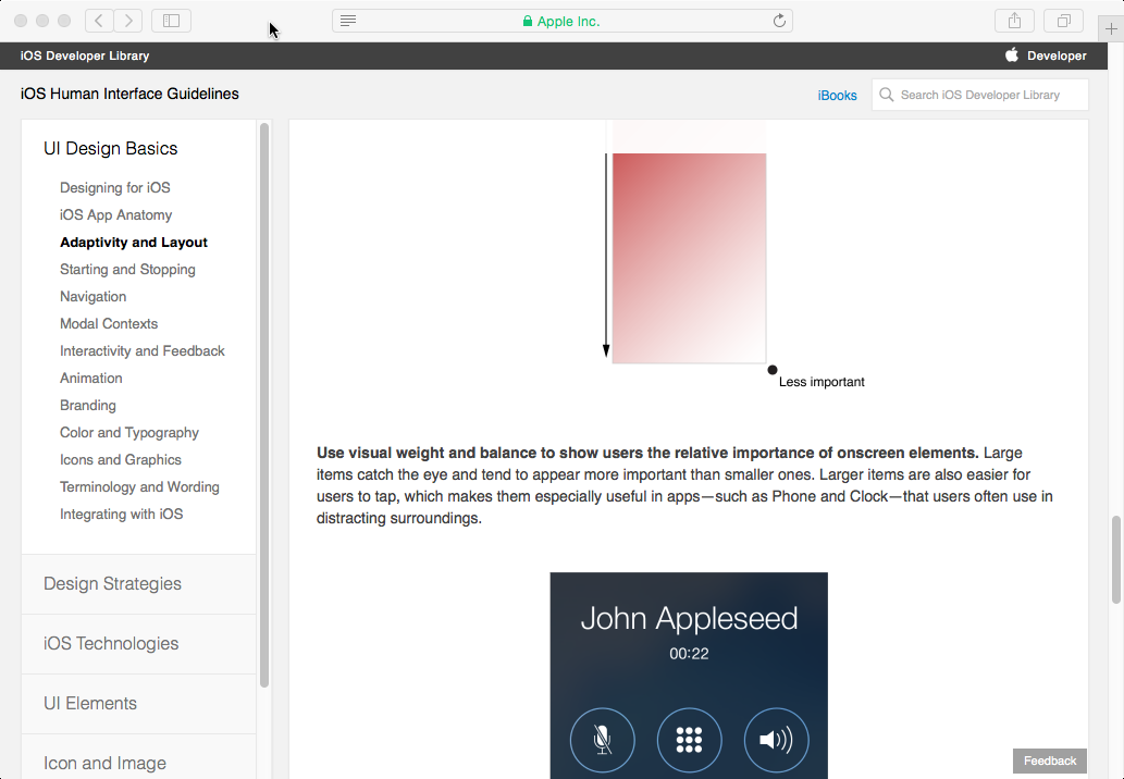
As an example of the latter, look at the iOS Human Interface Guidelines on “Adaptivity and Layout”   It starts with a general principle:

“People generally want to use their favorite apps on all their devices and in multiple contexts”,

but then rapidly turns that into more mobile specific, and then iOS specific guidelines, talking first about different screen orientations, and then about specific iOS screen size classes.

I note that the definition on page 259 of Chapter 7 of the HCI textbook is slightly ambiguous.  When it says that guidelines are less authoritative and more general in application, it means in comparison to standards … although I’d now add a few caveats for the latter too!

Basically in terms of ‘authority’, from low to high:

lowest principles agreed by community, but not mandated
guidelines proposed by manufacture, but rarely enforced
highest standards mandated by standards authority

In terms of general applicability, high to low:

highest principles very broad e.g. ‘observability’
guidelines more specific, but still allowing interpretation
lowest standards very tight

This ‘generality of application’ dimension is a little more complex as guidelines are often manufacturer specific so arguably less ‘generally applicable’ than standards, but the range of situations that standard apply to is usually much tighter.

On the whole the more specific the rules, the easier they are to apply.  For example, the general principle of observability requires that the designer think about how it applies in each new application and situation. In contrast, a more specific rule that says, “always show the current editing state in the top right of the screen” is easy to apply, but tells you nothing about other aspects of system state.

Scopus vs Google Scholar in Computer Science

In response to a Facebook thread about my recent LSE Impact Blog, “Evaluating research assessment: Metrics-based analysis exposes implicit bias in REF2014 results“, Joe Marshall commented,

“Citation databases are a pain, because you can’t standardise across fields. For computer science, Google scholar is the most comprehensive, although you could argue that it overestimates because it uses theses etc as sources. Scopus, web of knowledge etc. all miss out some key publications which is annoying”


My answer was getting a little too complicated for a Facebook reply; hence a short blog post.

While for any individual paper, you get a lot of variation between Scopus and Google Scholar, from my experience with the data, I would say they are not badly correlated if you look at big enough units.  There are a few exceptions, notably bio-tech papers which tend to get more highly placed under Scopus than GS.

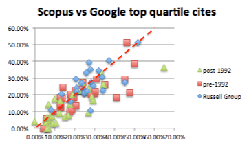
Crucial for REF is how this works at the level of whole institution data.  I took a quick peek at the REF institution data, comparing top quartile counts for Scopus and Google Scholar. That is, the proportion of papers submitted from each institution that were in top 25% of papers when ranked by citation counts.  Top quartile is chosen as it should be a reasonably predictor of 4* (about 22% of papers).

The first of these graphs shows Scopus (x-axis) vs Google Scolar (y-axis) for whole institutions.  The red line is at 45 degree, representing an exact match.  Note that, many institutions are relatively small, so we would expect a level of spread.

inst-scopus-vs-google-top-quartile-with-line

While far from perfect, there is clustering around the line and crucially for all types of institution.  The major outlier (green triangle to the right) is Plymouth which does have a large number of biomed papers. In short, while one citation metric might be better than the other, they do give roughly similar outcomes.

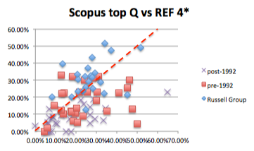
This is very different from what happens in you compare either with actual REF 4* results:

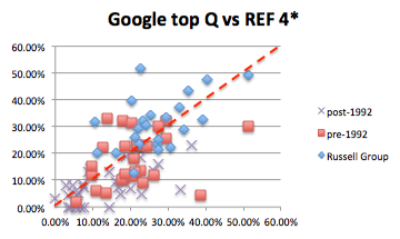
inst-scopus-top-quartile-vs-REF-4star-with-line   inst-google-top-quartile-vs-REF-4star-with-line

In both cases not only is there far less agreement, but also there are systematic effects.  In particular, the post-1992 institutions largely sit below the red line; that is they are scored far less highly by REF panel than by either Scopus or Google Scholar.  This is a slightly different metric, but precisely the result I previously found looking at institutional bias in REF.

Note that all of these graphs look far tighter if you measure GPA rather than 4* results, but of course it is 4* that is largely what is funded.

hope and despair

I have spent a good part of the day drafting my personal response to Lord Stern’s review of the Research Excellence Framework; trying to add some positive suggestions to an otherwise gloomy view of the REF process.

My LSE impact blog “Evaluating research assessment: Metrics-based analysis exposes implicit bias in REF2014 results” also came out today, good to see and important to get the message out, but hardly positive; my final words were:

“despite the best efforts of all involved, the REF output assessment process is not fit for purpose”,

and this on a process that consumed a good part of a year of my life … depressing.

However, then on Facebook I saw the announcement:

Professor Tom Rodden announced as EPSRC's Deputy CEO

Yay, a sensible voice near the heart of UK research … a glimmer of light flicker’s on the horizon.


Human-Like Computing

Last week I attended an EPSRC workshop on “Human-Like Computing“.

The delegate pack offered a tentative definition:

“offering the prospect of computation which is akin to that of humans, where learning and making sense of information about the world around us can match our human performance.” [E16]

However, the purpose of this workshop was to clarify, and expand on this, exploring what it might mean for computers to become more like humans.

It was an interdisciplinary meeting with some participants coming from more technical disciplines such as cognitive science, artificial intelligence, machine learning and Robotics; others from psychology or studying human and animal behaviour; and some, like myself, from HCI or human factors, bridging the two.

Why?

Perhaps the first question is why one might even want more human-like computing.

There are two obvious reasons:

(i) Because it is a good model to emulate — Humans are able to solve some problems, such as visual pattern finding, which computers find hard. If we can understand human perception and cognition, then we may be able to design more effective algorithms. For example, in my own work colleagues and I have used models based on spreading activation and layers of human memory when addressing ‘web scale reasoning’ [K10,D10].
robot-3-clip-sml(ii) For interacting with people — There is considerable work in HCI in making computers easier to use, but there are limitations. Often we are happy for computers to be simply ‘tools’, but at other times, such as when your computer notifies you of an update in the middle of a talk, you wish it had a little more human understanding. One example of this is recent work at Georgia Tech teaching human values to artificial agents by reading them stories! [F16]

To some extent (i) is simply the long-standing area of nature-inspired or biologically-inspired computing. However, the combination of computational power and psychological understanding mean that perhaps we are the point where new strides can be made. Certainly, the success of ‘deep learning’ and the recent computer mastery of Go suggest this. In addition, by my own calculations, for several years the internet as a whole has had more computational power than a single human brain, and we are very near the point when we could simulate a human brain in real time [D05b].

Both goals, but particularly (ii), suggest a further goal:

(iii) new interaction paradigms — We will need to develop new ways to design for interacting with human-like agents and robots, not least how to avoid the ‘uncanny valley’ and how to avoid the appearance of over-competence that has bedevilled much work in this broad area. (see more later)

Both goals also offer the potential for a fourth secondary goal:

(iv) learning about human cognition — In creating practical computational algorithms based in human qualities, we may come to better understand human behaviour, psychology and maybe even society. For example, in my own work on modelling regret (see later), it was aspects of the computational model that highlighted the important role of ‘positive regret’ (“the grass is greener on the other side”) to hep us avoid ‘local minima’, where we stick to the things we know and do not explore new options.

Human or superhuman?

Of course humans are not perfect, do we want to emulate limitations and failings?

For understanding humans (iv), the answer is probably “yes”, and maybe by understanding human fallibility we may be in a better position to predict and prevent failures.

Similarly, for interacting with people (ii), the agents should show at least some level of human limitations (even if ‘put on’); for example, a chess program that always wins would not be much fun!

However, for simply improving algorithms, goal (i), we may want to get the ‘best bits’, from human cognition and merge with the best aspects of artificial computation. Of course it maybe that the frailties are also the strengths, for example, the need to come to decisions and act in relatively short timescales (in terms of brain ‘ticks’) may be one way in which we avoid ‘over learning’, a common problem in machine learning.

In addition, the human mind has developed to work with the nature of neural material as a substrate, and the physical world, both of which have shaped the nature of human cognition.

Very simple animals learn purely by Skinner-like response training, effectively what AI would term sub-symbolic. However, this level of learning require many exposures to similar stimuli. For more rare occurrences, which do not occur frequently within a lifetime, learning must be at the, very slow pace of genetic development of instincts. In contrast, conscious reasoning (symbolic processing) allows us to learn through a single or very small number of exposures; ideal for infrequent events or novel environments.

Big Data means that computers effectively have access to vast amounts of ‘experience’, and researchers at Google have remarked on the ‘Unreasonable Effectiveness of Data’ [H09] that allows problems, such as translation, to be tackled in a statistical or sub-symbolic way which previously would have been regarded as essentially symbolic.

Google are now starting to recombine statistical techniques with more knowledge-rich techniques in order to achieve better results again. As humans we continually employ both types of thinking, so there are clear human-like lessons to be learnt, but the eventual system will not have the same ‘balance’ as a human.

If humans had developed with access to vast amounts of data and maybe other people’s experience directly (rather than through culture, books, etc.), would we have developed differently? Maybe we would do more things unconsciously that we do consciously. Maybe with enough experience we would never need to be conscious at all!

More practically, we need to decide how to make use of this additional data. For example, learning analytics is becoming an important part of educational practice. If we have an automated tutor working with a child, how should we make use of the vast body of data about other tutors interactions with other children?   Should we have a very human-like tutor that effectively ‘reads’ learning analytics just as a human tutor would look at a learning ‘dashboard’? Alternatively, we might have a more loosely human-inspired ‘hive-mind’ tutor that ‘instinctively’ makes pedagogic choices based on the overall experience of all tutors, but maybe in an unexplainable way?

What could go wrong …

There have been a number of high-profile statements in the last year about the potential coming ‘singularity’ (when computers are clever enough to design new computers leading to exponential development), and warnings that computers could become sentient, Terminator-style, and take over.

There was general agreement at the workshop this kind of risk was overblown and that despite breakthroughs, such as the mastery of Go, these are still very domain limited. It is many years before we have to worry about even general intelligence in robots, let alone sentience.

A far more pressing problem is that of incapable computers, which make silly mistakes, and the way in which people, maybe because of the media attention to the success stories, assume that computers are more capable than they are!

Indeed, over confidence in algorithms is not just a problem for the general public, but also among computing academics, as I found in my personal experience on the REF panel.

There are of course many ethical and legal issues raised as we design computer systems that are more autonomous. This is already being played out with driverless cars, with issues of insurance and liability. Some legislators are suggesting allowing driverless cars, but only if there is a drive there to take control … but if the car relinquishes control, how do you safely manage the abrupt change?

Furthermore, while the vision of autonomous robots taking over the world is still far fetched; more surreptitious control is already with us. Whether it is Uber cabs called by algorithm, or simply Google’s ranking of search results prompting particular holiday choices, we all to varying extents doing “what the computer tells us”. I recall in the Dalek Invasion of Earth, the very un-human-like Daleks could not move easily amongst the rubble of war-torn London. Instead they used ‘hypnotised men’ controlled by some form of neural headset. If the Daleks had landed today and simply taken over or digitally infected a few cloud computing services would we know?

Legibility

Sometimes it is sufficient to have a ‘black box’ that makes decisions and acts. So long as it works we are happy. However, a key issue for many ethical and legal issues, but also for practical interaction, is the ability to be able to interrogate a system, so seek explanations of why a decision has been made.

Back in 1992 I wrote about these issues [D92], in the early days when neural networks and other forms of machine learning were being proposed for a variety of tasks form controlling nuclear fusion reactions to credit scoring. One particular scenario, was if an algorithm were used to pre-sort large numbers of job applications. How could you know whether the algorithms were being discriminatory? How could a company using such algorithms defend themselves if such an accusation were brought?

One partial solution then, as now, was to accept underlying learning mechanisms may involve emergent behaviour form statistical, neural network or other forms of opaque reasoning. However, this opaque initial learning process should give rise to an intelligible representation. This is rather akin to a judge who might have a gut feeling that a defendant is guilty or innocent, but needs to explicate that in a reasoned legal judgement.

This approach was exemplified by Query-by-Browsing, a system that creates queries from examples (using a variant of ID3), but then converts this in SQL queries. This was subsequently implemented [D94] , and is still running as a web demonstration.

For many years I have argued that it is likely that our ‘logical’ reasoning arises precisely form this need to explain our own tacit judgement to others. While we simply act individually, or by observing the actions of others, this can be largely tacit, but as soon as we want others to act in planned collaborate ways, for example to kill a large animal, we need to convince them. Once we have the mental mechanisms to create these explanations, these become internalised so that we end up with internal means to question our own thoughts and judgement, and even use them constructively to tackle problems more abstract and complex than found in nature. That is dialogue leads to logic!

Scenarios

We split into groups and discussed scenarios as a means to understand the potential challenges for human-like computing. Over multiple session the group I was in discussed one man scenario and then a variant.

Paramedic for remote medicine

The main scenario consisted of a patient far form a central medical centre, with an intelligent local agent communicating intermittently and remotely with a human doctor. Surprisingly the remote aspect of the scenario was not initially proposed by me thinking of Tiree, but by another member of the group thinking abut some of the remote parts of the Scottish mainland.

The local agent would need to be able communicate with the patient, be able to express a level of empathy, be able to physically examine (needing touch sensing, vision), and discuss symptoms. On some occasions, like a triage nurse, the agent might be sufficiently certain to be able to make a diagnosis and recommend treatment. However, at other times it may need to pass on to the remote doctor, being able to describe what had been done in terms of examination, symptoms observed, information gathered from the patient, in the same way that a paramedic does when handing over a patient to the hospital. However, even after the handover of responsibility, the local agent may still form part of the remote diagnosis, and maybe able to take over again once the doctor has determined an overall course of action.

The scenario embodied many aspects of human-like computing:

  • The agent would require a level of emotional understanding to interact with the patient
  • It would require fine and situation contingent robotic features to allow physical examination
  • Diagnosis and decisions would need to be guided by rich human-inspired algorithms based on large corpora of medical data, case histories and knowledge of the particular patient.
  • The agent would need to be able to explain its actions both to the patient and to the doctor. That is it would not only need to transform its own internal representations into forms intelligible to a human, but do so in multiple ways depending on the inferred knowledge and nature of the person.
  • Ethical and legal responsibility are key issues in medical practice
  • The agent would need to be able manage handovers of control.
  • The agent would need to understand its own competencies in order to know when to call in the remote doctor.

The scenario could be in physical or mental health. The latter is particularly important given recent statistics, which suggested only 10% of people in the UK suffering mental health problems receive suitable help.

Physiotherapist

As a more specific scenario still, one fog the group related how he had been to an experienced physiotherapist after a failed diagnosis by a previous physician. Rather than jumping straight into a physical examination, or even apparently watching the patient’s movement, the physiotherapist proceeded to chat for 15 minutes about aspects of the patient’s life, work and exercise. At the end of this process, the physiotherapist said, “I think I know the problem”, and proceeded to administer a directed test, which correctly diagnosed the problem and led to successful treatment.

Clearly the conversation had given the physiotherapist a lot of information about potential causes of injury, aided by many years observing similar cases.

To do this using an artificial agent would suggest some level of:

  • theory/model of day-to-day life

Thinking about the more conversational aspects of this I was reminded of the PhD work of Ramanee Peiris [P97]. This concerned consultations on sensitive subjects such as sexual health. It was known that when people filled in (initially paper) forms prior to a consultation, they were more forthcoming and truthful than if they had to provide the information face-to-face. This was even if the patient knew that the person they were about to see would read the forms prior to the consultation.

Ramanee’s work extended this first to electronic forms and then to chat-bot style discussions which were semi-scripted, but used simple textual matching to determine which topics had been covered, including those spontaneously introduced by the patient. Interestingly, the more human like the system became the more truthful and forthcoming the patients were, even though they were less so wit a real human.

As well as revealing lessons for human interactions with human-like computers, this also showed that human-like computing may be possible with quite crude technologies. Indeed, even Eliza was treated (to Weizenbaum’s alarm) as if it really were a counsellor, even though people knew it was ‘just a computer’ [W66].

Cognition or Embodiment?

I think it fair to say that the overall balance, certainly in the group I was in, was towards the cognitivist: that is more Cartesian approach starting with understanding and models of internal cognition, and then seeing how these play out with external action. Indeed, the term ‘representation’ used repeatedly as an assumed central aspect of any human-like computing, and there was even talk of resurrecting Newells’s project for a ‘unified theory of cognition’ [N90]

There did not appear to be any hard-core embodiment theorist at the workshops, although several people who had sympathies. This was perhaps as well as we could easily have degenerated into well rehearsed arguments for an against embodiment/cognition centred explanations … not least about the critical word ‘representation’.

However, I did wonder whether a path that deliberately took embodiment centrally would be valuable. How many human-like behaviours could be modelled in this way, taking external perception-action as central and only taking on internal representations when they were absolutely necessary (Alan Clark’s 007 principle) [C98].

Such an approach would meet limits, not least the physiotherapist’s 25 minute chat, but I would guess would be more successful over a wider range of behaviours and scenarios then we would at first think.

Human–Computer Interaction and Human-Like Computing

Both Russell and myself were partly there representing our own research interest, but also more generally as part of the HCI community looking at the way human-like computing would intersect exiting HCI agendas, or maybe create new challenges and opportunities. (see poster) It was certainly clear during the workshop that there is a substantial role for human factors from fine motor interactions, to conversational interfaces and socio-technical systems design.

Russell and I presented a poster, which largely focused on these interactions.
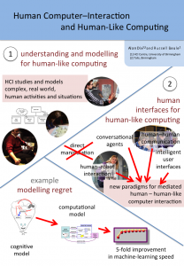
HCI-HLC-poster

There are two sides to this:

  • understanding and modelling for human-like computing — HCI studies and models complex, real world, human activities and situations. Psychological experiments and models tend to be very deep and detailed, but narrowly focused and using controlled, artificial tasks. In contrast HCI’s broader, albeit more shallow, approach and focus on realistic or even ‘in the wild’ tasks and situations may mean that we are in an ideal position to inform human-like computing.

human interfaces for human-like computing — As noted in goal (iii) we will need paradigms for humans to interact with human-like computers.

As an illustration of the first of these, the poster used my work on making sense of the apparently ‘bad’ emotion of regret [D05] .

An initial cognitive model of regret was formulated involving a rich mix of imagination (in order to pull past events and action to mind), counter-factual modal reasoning (in order to work out what would have happened), emption (which is modified to feel better or worse depending on the possible alternative outcomes), and Skinner-like low-level behavioural learning (the eventual purpose of regret).
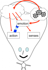
cog-model

This initial descriptive and qualitative cognitive model was then realised in a simplified computational model, which had a separate ‘regret’ module which could be plugged into a basic behavioural learning system.   Both the basic system and the system with regret learnt, but the addition of regret did so with between 5 and 10 times fewer exposures.   That is, the regret made a major improvement to the machine learning.
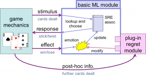
architecture

Turning to the second. Direct manipulation has been at the heart of interaction design since the PC revolution in the 1980s. Prior to that command line interfaces (or worse job control interfaces), suggested a mediated paradigm, where operators ‘asked’ the computer to do things for them. Direct manipulation changed that turning the computer into a passive virtual world of computational objects on which you operated with the aid of tools.

To some extent we need to shift back to the 1970s mediated paradigm, but renewed, where the computer is no longer like an severe bureaucrat demanding the precise grammatical and procedural request; but instead a helpful and understanding aide. For this we can draw upon existing areas of HCI such as human-human communications, intelligent user interfaces, conversational agents and human–robot interaction.

References

[C98] Clark, A. 1998. Being There: Putting Brain, Body and the World Together Again. MIT Press. https://mitpress.mit.edu/books/being-there

[D92] A. Dix (1992). Human issues in the use of pattern recognition techniques. In Neural Networks and Pattern Recognition in Human Computer Interaction Eds. R. Beale and J. Finlay. Ellis Horwood. 429-451. http://www.hcibook.com/alan/papers/neuro92/

[D94] A. Dix and A. Patrick (1994). Query By Browsing. Proceedings of IDS’94: The 2nd International Workshop on User Interfaces to Databases, Ed. P. Sawyer. Lancaster, UK, Springer Verlag. 236-248.

[D05] Dix, A..(2005).  The adaptive significance of regret. (unpublished essay, 2005) https://alandix.com/academic/essays/regret.pdf

[D05b] A. Dix (2005). the brain and the web – a quick backup in case of accidents. Interfaces, 65, pp. 6-7. Winter 2005. https://alandix.com/academic/papers/brain-and-web-2005/

[D10] A. Dix, A. Katifori, G. Lepouras, C. Vassilakis and N. Shabir (2010). Spreading Activation Over Ontology-Based Resources: From Personal Context To Web Scale Reasoning. Internatonal Journal of Semantic Computing, Special Issue on Web Scale Reasoning: scalable, tolerant and dynamic. 4(1) pp.59-102. http://www.hcibook.com/alan/papers/web-scale-reasoning-2010/

[E16] EPSRC (2016). Human Like Computing Hand book. Engineering and Physical Sciences Research Council. 17 – 18 February 2016

[F16] Alison Flood (2016). Robots could learn human values by reading stories, research suggests. The Guardian, Thursday 18 February 2016 http://www.theguardian.com/books/2016/feb/18/robots-could-learn-human-values-by-reading-stories-research-suggests

[H09] Alon Halevy, Peter Norvig, and Fernando Pereira. 2009. The Unreasonable Effectiveness of Data. IEEE Intelligent Systems 24, 2 (March 2009), 8-12. DOI=10.1109/MIS.2009.36

[K10] A. Katifori, C. Vassilakis and A. Dix (2010). Ontologies and the Brain: Using Spreading Activation through Ontologies to Support Personal Interaction. Cognitive Systems Research, 11 (2010) 25–41. https://alandix.com/academic/papers/Ontologies-and-the-Brain-2010/

[N90] Allen Newell. 1990. Unified Theories of Cognition. Harvard University Press, Cambridge, MA, USA. http://www.hup.harvard.edu/catalog.php?isbn=9780674921016

[P97] DR Peiris (1997). Computer interviews: enhancing their effectiveness by simulating interpersonal techniques. PhD Thesis, University of Dundee. http://virtual.inesc.pt/rct/show.php?id=56

[W66] Joseph Weizenbaum. 1966. ELIZA—a computer program for the study of natural language communication between man and machine. Commun. ACM 9, 1 (January 1966), 36-45. DOI=http://dx.doi.org/10.1145/365153.365168

Alan’s Guide to Winter Foot Care

My feet are quite wide and so I prefer to wear sandals.  I wore sandals for over 700 miles of my round Wales walk back in 2013, and wear them throughout the winter.

When the temperature drops below zero, or snow gathers on the ground, I am often asked, “don’t your feet get cold?“.

Having been asked so many times, I have decided to put down in writing my observations about healthy winter feet in the hope it will help others.

Basically, the thing to remember is that it is all about colours, and follows a roughly linear series of stages.  However, do note I am a sallow-skinned Caucasian, so all reference to skin colour should be read in that context.

Look at your toes.

What colour are they?

Stage1.  White

Press the side of your toe with your finger.  Does it change colour?

1.1   Yes, it goes a bit pink and then fades rapidly back to white.

That is normal and healthy, you clearly aren’t taking this whole extreme winter walking thing seriously.

1.2  Yes, it goes deep red and only very slowly back to white.

You have an infection, maybe due to stage 2.2a on a previous walk.  Visit the doctor to avoid stage 3.

1.3 No, it stays white.

Bad news, you are a zombie.

Stage 2. Red

Are your toes painful?

2.1 Yes.

Well at least they are still alive.

2.2. No.

Well at least they don’t hurt.  However numbness means does cause certain dangers.

2.2a – You might prick your toe on a thorns, or rusty wire and not notice, leading to infection.

2.2b – You might step on broken glass and bleed to death.

2.2c – You might step in a fire and burn yourself.

Stage 3.  Yellow

Blood poisoning, you missed warning 2.2a

Stage 4.  Blue.

Your circulation has stopped entirely.  This will lead ultimately to limb death, but at least you won’t bleed to death (warning 2.2b).

Stage 5. Black.

Is that charcoal black?

5.1.  Yes

You forgot warning 2.2c didn’t you?

5.2  no, more dull grey/black.

Frostbite, get to the hospital quick and they may save some of your toes.

Stage 6. Green

Gangrene, no time for the hospital, find a saw or large breadknife.

Stage 7.  What toes?

You missed stages 5 and 6.


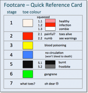
Download and print the Quick Reference Card so that you can conveniently check your foot health at any time.

Quick Reference Card


Last word … on a serious note

My feet are still (despite misuse!) healthy.  However, for many this is a serious issue, not least for those with diabetes.  When I was child my dad, who was diabetic, dropped a table on his foot and had to be constantly monitored to make sure it didn’t develop into gangrene.  Diabetes UK have their own foot care page, and a list of diabetes charities you can support.


REF Redux 6 — Reasons and Remedies

This, the last of my series of posts on post-REF analysis, asks what went wrong and what could be done to improve things in future.

Spoiler: a classic socio-technical failure story: compromising the quality of human processes in order to feed an algorithm

As I’ve noted multiple times, the whole REF process and every panel member was focused around fairness and transparency, and yet still the evidence is that quite massive bias emerged. This is evident in my own analysis of sub-area and institutional differences, and also in HEFCE’s own report, which highlighted gender differences.

Summarising some of the effects we have seen in previous posts:

  1. sub-areas: When you rank outputs within their own areas worldwide: theoretical papers ranked in the top 5% (top 1 in 20) worldwide get a 4* of whereas those in more applied human/centric papers need to be in the top 0.5% (top 1 in 200) – a ten-fold difference (REF Redux 2)
  2. institutions: Outputs that appear equivalent in terms of citation are ranked more highly in Russell Group universities compared with other old (pre-1992) universities, and both higher than new (post-1992) universities.  If two institutions have similar citation profiles, the Russell Group one, on average, would receive 2-3 times more money per member of staff than the equivalent new university (REF Redux 4)
  3. gender: A male academic in computing is 33% more likely to get a 4* then a female academic, and this effect persists even when other factors considered (HEFCE report “The Metric Tide”). Rather than explicit bias, I believe this is likely to be an implicit bias due to the higher proportions of women in sub-areas disadvantaged by REF (REF Redux 5)

These are all quite shocking results, not so much that the differences are there, but because of the size.

Before being a computer scientist I was trained as a statistician.  In all my years both as a professional statistician, and subsequently as a HCI academic engaged in or reviewing empirical work, I have never seen effect sizes this vast.

What went wrong?

Note that this analysis is all for sub-panel 11 Computer Science and Informatics. Some of the effects (in particular institutional bias) are probably not confined to this panel; however, there are special factors in the processes we used in computing which are likely to have exacerbated latent bias in general and sub-area bias in particular.

As a computing panel, we of course used algorithms!

The original reason for asking submissions to include an ACM sub-area code was to automate reviewer allocation. This meant that while other panel chairs were still starting their allocation process, SP11 members already had their full allocations of a thousand or so outputs a piece. Something like 21,000 output allocations at the press of a button. Understandably this was the envy of other panels!

We also used algorithms for normalisation of panel members’ scores. Some people score high, some score low, some bunch towards the middle with few high and few low scores, and some score too much to the extremes.

This is also the envy of many other panel members. While we did discuss scores on outputs where we varied substantially, we did not spend the many hours debating whether a particular paper was 3* or 4*, or trying to calibrate ourselves precisely — the algorithm does the work. Furthermore the process is transparent (we could even open source the code) and defensible — it is all in the algorithm, no potentially partisan decisions.

Of course such an algorithm cannot simply compare each panel member with the average as some panel members might have happened to have better or worse set of outputs to review than others. In order to work there has to be sufficient overlap between panel members’ assessments so that they can be robustly compared. In order to achieve this overlap we needed to ‘spread our expertise’ for the assignment process, so that we reviewed more papers slightly further from our core area of competence.

Panels varies substantially in the way they allocated outputs to reviewers. In STEM areas the typical output was an article of, say, 8–10 pages; whereas in the humanities often books or portfolios; in performing arts there might even be a recording of a performance taking hours. Clearly the style of reviewing varied. However most panels tried to assign two expert panelists to each output. In computing we had three assessors per output, compared to two in many areas (and in one sub-panel a single assessor per output). However, because of the expertise spreading this meant typically one expert and two more broad assessors per output.

For example, my own areas of core competence (Human-centered computing / Visualization and Collaborative and social computing) had between them 700 outputs, and were two others assessors with strong knowledge in these areas. However, of over 1000 outputs I assessed, barely one in six (170) were in these areas, that is only 2/3 more than if the allocation had been entirely random.

Assessing a broad range of computer science was certainly interesting, and I feel I came away with an understanding of the current state of UK computing that I certainly did not have before. Also having a perspective from outside a core area is very valuable especially in assessing the significance of work more broadly within the discipline.

This said the downside is that the vast majority of assessments were outside our core areas, and it is thus not so surprising that default assessments (aka bias) become a larger aspect of the assessment. This is particularly problematic when there are differences in methodology; whereas it is easy to look at a paper with mathematical proofs in it and think “that looks rigorous”, it is hard for someone not used to interpretative methodologies to assess, for example, ethnography.

If the effects were not so important, it is amusing to imagine the mathematics panel with statisticians, applied and pure mathematicians assessing each others work, or indeed, if formal computer science were assessed by a pure mathematicians.

Note that the intentions were for the best trying to make the algorithm work as well as possible; but the side effect was to reduce the quality of the human process that fed the algorithm. I recall the first thing I ever learnt in computing was the mantra, “garbage in — garbage out”.

Furthermore, the assumption underlying the algorithm was that while assessors differed in their severity/generosity of marking and their ‘accuracy’ of marking, they were all equally good at all assessments. While this might be reasonable if we all were mainly marking within our own competence zone, this is clearly not valid given the breadth of assessment.  That is the fundamental assumptions of the algorithm were broken.

This is a classic socio-technical failure story: in an effort to ‘optimise’ the computational part of the system, the overall human–computer system was compromised. It is reasonable for those working in more purely computational areas to have missed this; however, in retrospect, those of us with a background in this sort of issue should have foreseen problems (John 9:41), mea culpa.  Indeed, I recall that I did have reservations, but had hoped that any bad effects would average out given so many points of assessment.  It was only seeing first Morris Sloman’s analysis and then the results of my own that I realised quite how bad the distortions had been.

I guess we fell prey to another classic systems failure: not trialling, testing or prototyping a critical system before using it live.

What could be done better?

Few academics are in favour of metrics-only systems for research assessment, and, rather like democracy, it may be that the human-focused processes of REF are the worst possible solution apart from all the alternatives.

I would certainly have been of that view until seeing in detail the results outlined in this series. However, knowing what I do now, if there were a simple choice for the next REF of what we did and a purely metrics-based approach, I would vote for the latter. In every way that a pure metrics based approach would be bad for the discipline, our actual process was worse.

However, the choice is not simply metrics vs human assessment.

In computing we used a particular combination of algorithm and human processes that amplified rather than diminished the effects of latent bias. This will have been particularly bad for sub-areas where differences in methodology lead to asymmetric biases. However, it is also likely to have amplified institution bias effects as when assessing areas far from one’s own expertise it is more likely that default cues, such as the ‘known’ quality of the institution, will weigh strongly.

Clearly we need to do this differently next time, and other panels definitely ought not to borrow SP11’s algorithms without substantial modification.

Maybe it is possible to use metrics-based approaches to feed into a human process in a way that is complimentary. A few ideas could be:

  1. metrics for some outputs — for example we could assess older journal and conference outputs using metrics, combined with human assessment for newer or non-standard outputs
  2. metrics as under-girding – we could give outputs an initial grade based on metrics, which is then altered after reading, but where there is a differential burden of proof — easy to raise a grade (e.g. because of badly chosen venue for strong paper), but hard to bring it down (more exceptional reasons such as citations saying “this paper is wrong”)
  3. metrics for in-process feedback — a purely human process as we had, but part way through calculate the kinds of profiles for sub-areas and institutions that I calculated in REF Redux 2, 3 and 4. At this point the panel would be able to decide what to do about anomalous trends, for example, individually examine examples of outputs.

There are almost certainly other approaches, the critical thing is that we must do better than last time.

level of detail – scale matters

We get used to being able to zoom into every document picture and map, but part of the cartographer’s skill is putting the right information at the right level of detail.  If you took area maps and then scaled them down, they would not make a good road atlas, the main motorways would hardly be visible, and the rest would look like a spider had walked all over it.  Similarly if you zoom into a road atlas you would discover the narrow blue line of each motorway is in fact half a mile wide on the ground.

Nowadays we all use online maps that try to do this automatically.  Sometimes this works … and sometimes it doesn’t.

Here are three successive views of Google maps focused on Bournemouth on the south coast of England.

On the first view we see Bournemouth clearly marked, and on the next, zooming in a little Poole, Christchurch and some smaller places also appear.  So far, so good, as we zoom in more local names are shown as well as the larger place.

bournemouth-1  bournemouth-2

However, zoom in one more level and something weird happens, Bournemouth disappears.  Poole and Christchurch are there, but no  Bournemouth.

bournemouth-3

However, looking at the same level scale on another browser, Bournemouth is there still:

bournemouth-4

The difference between the two is the Hotel Miramar.  On the first browser I am logged into Google mail, and so Google ‘knows’ I am booked to stay in the Hotel Miramar (presumably by scanning my email), and decides to display this also.   The labels for Bournemouth and the hotel label overlap, so Google simply omitted the Bournemouth one as less important than the hotel I am due to stay in.

A human map maker would undoubtedly have simply shifted the name ‘Bournemouth’ up a bit, knowing that it refers to the whole town.  In principle, Google maps could do the same, but typically geocoding (e.g. Geonames) simply gives a point for each location rather than an area, so it is not easy for the software to make adjustments … except Google clearly knows it is ‘big’ as it is displayed on the first, zoomed out, view; so maybe it could have done better.

This problem of overlapping legends will be familiar to anyone involved in visualisation whether map based or more abstract.

cone-trees

The image above is the original Cone Tree hierarchy browser developed by Xerox PARC in the early 1990s1.  This was the early days of interactive 3D visualisation, and the Cone Tree exploited many of the advantages such as a larger effective ‘space’ to place objects, and shadows giving both depth perception, but also a level of overview.  However, there was no room for text labels without them all running over each other.

Enter the Cam Tree:

cam-tree

The Cam Tree is identical to the cone tree, except because it is on its side it is easier to place labels without them overlapping 🙂

Of course, with the Cam Tree the regularity of the layout makes it easy to have a single solution.  The problem with maps is that labels can appear anywhere.

This is an image of a particularly cluttered part of the Frasan mobile heritage app developed for the An Iodhlann archive on Tiree.  Multiple labels overlap making them unreadable.  I should note that the large number of names only appear when the map is zoomed in, but when they do appear, there are clearly too many.

frasan-overlap

It is far from clear how to deal with this best.  The Google solution was simply to not show some things, but as we’ve seen that can be confusing.

Another option would be to make the level of detail that appears depend not just on the zoom, but also the local density.  In the Frasan map the locations of artefacts are not shown when zoomed out and only appear when zoomed in; it would be possible for them to appear, at first, only in the less cluttered areas, and appear in more busy areas only when the map is zoomed in sufficiently for them to space out.   This would trade clutter for inconsistency, but might be worthwhile.  The bigger problem would be knowing whether there were more things to see.

Another solution is to group things in busy areas.  The two maps below are from house listing sites.  The first is Rightmove which uses a Google map in its map view.  Note how the house icons all overlap one another.  Of course, the nature of houses means that if you zoom in sufficiently they start to separate, but the initial view is very cluttered.  The second is daft.ie; note how some houses are shown individually, but when they get too close they are grouped together and just the number of houses in the group shown.

rightmove-houses  daft-ie-house-site

A few years ago, Geoff Ellis and I reviewed a number of clutter reduction techniques2, each with advantages and disadvantages, there is no single ‘best’ answer. The daft.ie grouping solution is for icons, which are fixed size and small, the text label layout problem is far harder!

Maybe someday these automatic tools will be able to cope with the full variety of layout problems that arise, but for the time being this is one area where human cartographers still know best.

  1. Robertson, G. G. ; Mackinlay, J. D. ; Card, S. K. Cone Trees: animated 3D visualizations of hierarchical informationProceedings of the ACM Conference on Human Factors in Computing Systems (CHI ’91); 1991 April 27 – May 2; New Orleans; LA. NY: ACM; 1991; 189-194.[back]
  2. Geoffrey Ellis and Alan Dix. 2007. A Taxonomy of Clutter Reduction for Information VisualisationIEEE Transactions on Visualization and Computer Graphics 13, 6 (November 2007), 1216-1223. DOI=10.1109/TVCG.2007.70535[back]

REF Redux 5 – growing the gender gap

This fifth post in the REF Redux series looks at gender issue, in particular the likelihood that the apparent bias in computing REF results will disproportionately affect women in computing. While it is harder to find full data for this, a HEFCE post-REF report has already done a lot of the work.

Spoiler:   REF results are exacerbating implicit gender bias in computing

A few weeks ago a female computing academic shared how she had been rejected for a job; in informal feedback she heard that her research area was ‘shrinking’.  This seemed likely to be due to the REF sub-area profiles described in the first post of this series.

While this is a single example, I am aware that recruitment and investment decisions are already adjusting widely due to the REF results, so that any bias or unfairness in the results will have an impact ‘on the ground’.

Google image search for "computing professor"

Google image search “computing professor”

In fact gender and other equality issues were explicitly addressed in the REF process, with submissions explicitly asked what equality processes, such as Athena Swan, they had in place.

This is set in the context of a large gender gap in computing. Despite there being more women undergraduate entrants than men overall, only 17.4% of computing first degree graduates are female and this has declined since 2005 (Guardian datablog based on HESA data).  Similarly only about 20% of computing academics are female (“Equality in higher education: statistical report 2014“), and again this appears to be declining:

academic-CS-staff-female

from “Equality in higher education: statistical report 2014”, table 1.6 “SET academic staff by subject area and age group”

The misbalance in terms of application rates for research funding has also been issue that the European Commission has investigated in “The gender challenge in research funding: Assessing the European national scenes“.

HEFCE commissioned a post-REF report “The Metric Tide: Report of the Independent Review of the Role of Metrics in Research Assessment and Management“, which includes substantial statistics concerning the REF results and models of fit to various metrics (not just citations). Helpfully, Fran AmeryStephen Bates and Steve McKay used these to create a summary of “Gender & Early Career Researcher REF Gaps” in different academic areas.  While far from the largest, Computer Science and Informatics is in joint third place in terms of the gender gap as measured by the 4* outputs.

Their data comes from the HEFCE report’s supplement on “Correlation analysis of REF2014 scores and metrics“, and in particular table B4 (page 75):

table-b4-no-legend

Extract of “Table B4 Summary of submitting authors by UOA and additional characteristics” from “The Metric Tide : Correlation analysis of REF2014 scores and metrics”

This shows that while 24% of outputs submitted by males were ranked 4*, only 18% of those submitted by females received a 4*.  That is a male member of staff in computing is 33% more likely to get a 4* than a female.

Now this could be due to many factors, not least the relative dearth of female senior academics reported by HESA.(“Age and gender statistics for HE staff“).

HESA academic staff gender balance: profs vs senior vs other academic

extract of HESA graphic “Staff at UK HE providers by occupation, age and sex 2013/14” from “Age and gender statistics for HE staff”

However, the HEFCE report goes on to compare this result with metrics, in a similar way to my own analysis of subareas and institutional effects.  The report states (my emphasis) that:

Female authors in main panel B were significantly less likely to achieve a 4* output than male authors with the same metrics ratings. When considered in the UOA models, women were significantly less likely to have 4* outputs than men whilst controlling for metric scores in the following UOAs: Psychology, Psychiatry and Neuroscience; Computer Science and Informatics; Architecture, Built Environment and Planning; Economics and Econometrics.

That is, for outputs that look equally good from metrics, those submitted by men are more likely to obtain a 4* than the by women.

Having been on the computing panel, I never encountered any incidents that would suggest any explicit gender bias.  Personally speaking, although outputs were not anonymous, the only time I was aware of the gender of authors was when I already knew them professionally.

My belief is that these differences are more likely to have arisen from implicit bias, in terms of what is valued.  The The Royal Society of Edinburgh report “Tapping our Talents” warns of the danger that “concepts of what constitutes ‘merit’ are socially constructed” and the EU report “Structural change in research institutions” talks of “Unconscious bias in assessing excellence“.  In both cases the context is recruitment and promotion procedures, but the same may well be true of the way we asses the results of research.,

In previous posts I have outlined the way that the REF output ratings appear to selectively benefit theoretical areas compared with more applied and human-oriented ones, and old universities compared with new universities.

While I’ve not yet been able obtain numbers to estimate the effects, in my experience the areas disadvantaged by REF are precisely those which have a larger number of women.  Also, again based on personal experience, I believe there are more women in new university computing departments than old university departments.

It is possible that these factors alone may account for the male–female differences, although this does not preclude an additional gender bias.

Furthermore, if, as seems the be the case, the REF sub-area profiles are being used to skew recruiting and investment decisions, then this means that women will be selectively disadvantaged in future, exacerbating the existing gender divide.

Note that this is not suggesting that recruitment decisions will be explicitly biased against women, but by unfairly favouring traditionally more male-dominated sub-areas of computing this will create or exacerbate an implicit gender bias.