Today is my last day at Cardiff Met. I retired from Swansea University just over a year ago, and continued my part-time position at Cardiff Met at that point, but now I am completing my retirement. I will continue to be emeritus professor at both Swansea and Cardiff Met, so I’m not turning my back on academia; indeed I’ve got a second edition of “Introduction to Artificial Intelligence” due out in June and I’m part way through several other books, so I won’t be idle. However, it is a change of pace and focus.
To mark my retirement and also turning 65 in July I am running 65 miles in a week in aid of Cancer Research UK. Read more about this at 65 for 65.

It has a been a joy working with everyone at Cardiff Met for the past three years. I’ve been part of the central Research and Innovation Services where I’ve sometimes described myself as a ‘professor without portfolio’ and that my job was to ‘talk to anyone, anywhere, about anything’. Although slightly tongue in cheek, the latter has been largely true, spending time with researchers and academics in areas from creative writing to bacterial infection. So many wonderful people each with a vision to make a difference in the world.
My academic connections with Cardiff Met go back to the mid 2000s when I started to collaborate with Steve Gill and others in product design and I’d been a visiting professor in the Cardiff School of Art and Design since 2013. However, the roots reach much further back.
|
|
|
|
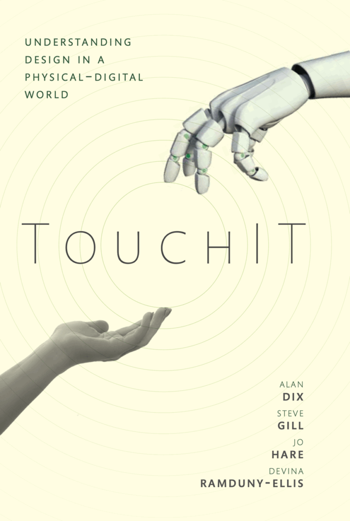
TouchIT: Understanding Design |
Public Lecture. |
When I was in Sixth Form at Howardian Comprehensive School (now closed and demolished), once a week, every Friday afternoon, a friend and I used to walk several miles across Cardiff to the FE college on Western Avenue to study for a computing A Level … the FE College that many years later became the Llandaff Campus of Cardiff Metropolitan University.
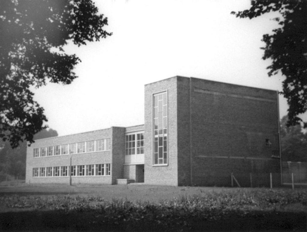
Llandaff Technical College opened in December 1954.
According to a BBC article the first computing A Level exams were in 1971, but even in 1976–78 it was still a new subject and not one the school could teach. I don’t recall the name of the lecturer, who I’m guessing was fresh out of university and found the A Level gave him some creative room compared with the City and Guilds courses that were the staple of the college. This was in the days before the crazy gulf we see now between more theoretical and practical aspects of the subject. Each week was something different, from the innards of machines to application areas, the halting problem and even an afternoon of COBOL programming. Indeed we covered more programming languages in those couple of hours a week than are common in degree courses today. My own coursework project was writing a bootstrap compiler.
Crucially the A Level gave me access to the FE College library and in particular maths books, many of the “X for engineers” style, which are usually so much better written than the equivalent ones aimed at mathematicians! This was invaluable when I later went on to sit the Cambridge maths entrance exam, won a scholarship and was then contacted by the British Maths Olympiad organisers, which led to being part of the UK Team at the International Mathematical Olympiad in Bucharest, my first time out of the country.
And it all started in the buildings that I have been working in for the past few years.

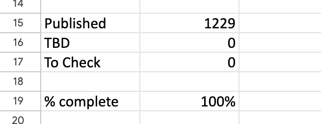
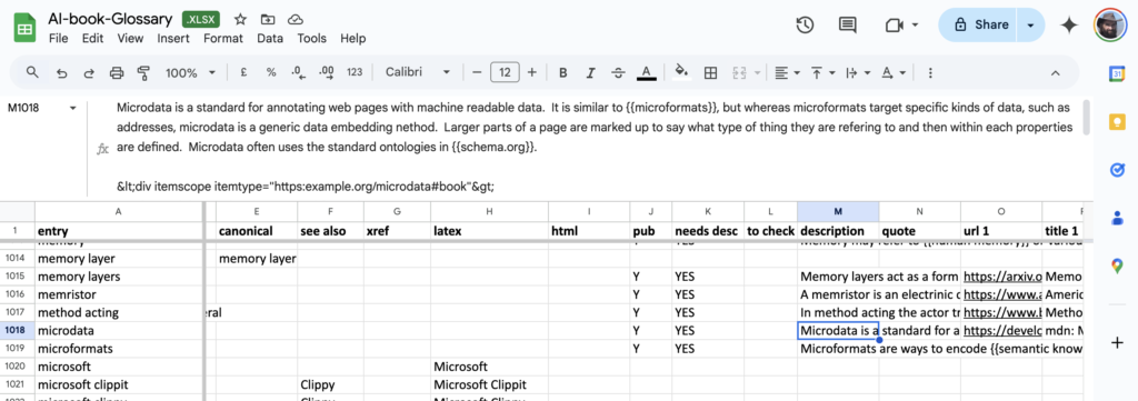
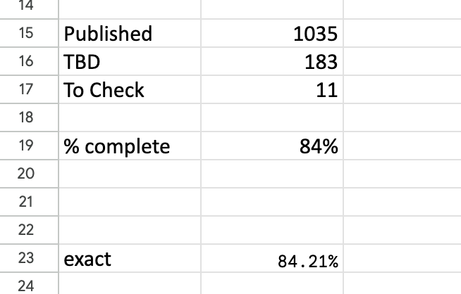 The headline summary has raw counts and a rounded %complete. Seeing this notch up one percent was a major buzz corresponding to about a dozen entries. Below that is a more precise percentage, which I normally kept below the bottom of the window so I had to scroll to see it. I could take a peek and think “nearly at a the next percent mark, I’ll just do a few more”.
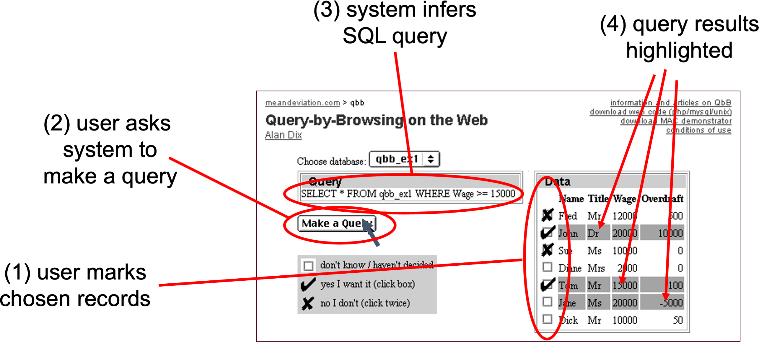

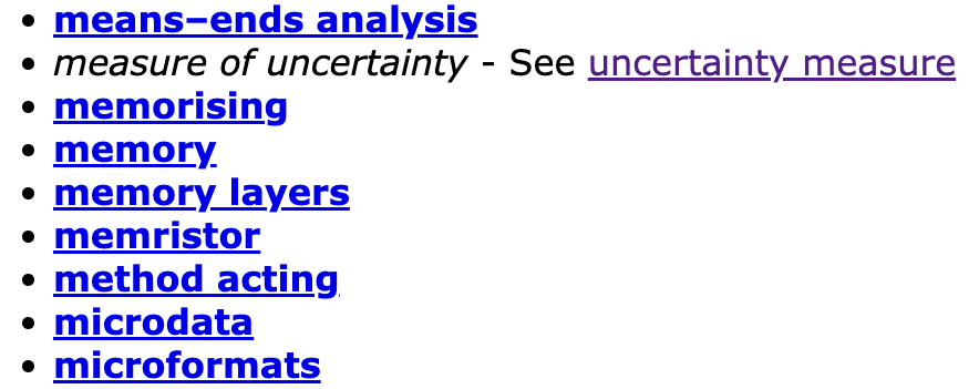
 For those who don’t remember

