The obvious impact of AI is in the things it does directly. Some technologies also change the very nature of society, affecting even those who do not use them. Cars are an obvious example. AI is also such a technology.
This is the second of a series of blogs based on my keynote “The abomination of AI” at ICoSCI 2026. Each has an accompanying segment of the video and slides from the talk as well as detailed notes and references. Section numbers refer to the full report which will be released in the final blog. The slide thumbnails in the text correspond to the slides in the navigation panel below. The presentation can be played below, or opened full screen. The full length video, complete slides and further information can be found at: https://alandix.com/academic/talks/ICOSCI-2026-abomination-of-AI/
Previously …
§1. Every industry is driven by profits and power, but there is something about the nature of AI itself, which interacts with the nature of market forces in the world that is problematic and is different from other technologies.
§2. Can any technology be neutral? AI can be used for good purposes, such as advances in healthcare. It can also have bad outcomes such as bias in the criminal justice system or online exploitative pornography. Perhaps most often it is creating the frivolous or even ugly.
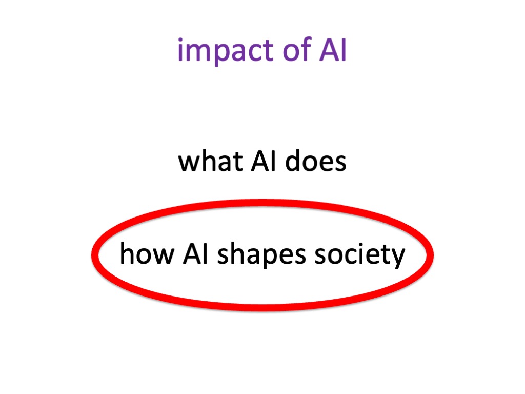
3. The Impact of AI

3.1 What AI does
These good, bad and ugly/frivolous things ar what AI does, the direct application of AI in various areas.
When I design an application using AI, I might use it well or I might use it badly. This is clearly an important issue when we examine our own use of AI and other people’s use of AI, especially if we are involved in developing AI or developing the user interfaces that employ AI or provide AI for other people.
3.2 How AI shapes society
However, with any technology, there’s something that can be more important than what it does.
Some kinds of technology only have an impact where they are used directly. If I use a nail to connect two pieces of wood, it doesn’t really have a great effect beyond the thing I’m actually constructing.
But some kinds of technology fundamentally reshape the nature of society. Not every technology does this, but some do, and when this happens, it has a far greater effect than the direct application of the technology in particular areas.
AI is just such a technology. When you are using AI for a purpose, you might change your mind and choose to use something else. When society has been changed by AI, everybody, even those who do not choose to use AI at all, are affected by it. This is happening now.
3.3 How cars have shaped society

Image: By Remi Jouan – Photo taken by Remi Jouan, CC BY-SA 3.0, https://commons.wikimedia.org/w/index.php?curid=7245143
To help us understand this large-scale process, before examining the societal impact of AI itself, let’s first think about another technology that has fundamentally reshaped society – the car.
There are positive things cars do. It helps you get from A to B, keeps you dry, perhaps gives you a sense of independence.
There are also negative things it does. You might have an accident. If you are not a law-abiding citizen, you might speed, you might, you might drink alcohol or take drugs and then have accidents and injure other people.
These are things we do as an individual with a car. You may also be indirectly affected if you don’t have a car, for example if you are a pedestrian involved in a car accident. However, by and large, these are about things you choose to do.
However, irrespective whether you choose to use cars or not, the whole physical and economic nature of society is shaped by the car and by the internal combustion engine. Cities have road networks that allow people to get in and out. This leads to urban sprawl at the edge of the cities along the lines of connection. Because of this organisation, shops and services are placed at car distances away. So if you don’t have a car (and 84% of the world’s population don’t [MS24].), it becomes difficult to access things. You find yourself poorer in a sense, more disadvantaged than you would have been because of the actions of other people – car poverty.
Economists talk about externalities, the fact that when I do something, it affects others who aren’t directly doing it [LM02]. The emergence of car poverty is one of the externalities of car use. Of course there are other externalities like global warming from the petrol engines themselves and pollution [EP19]. Even electric cars produce all sorts of nasty particles from the wear of tyres on the road.
These things are so woven into the fabric of society that is is very hard to break away from them. For example, there have been amazing advances in autonomous vehicles, but really, trying to design a car that drives itself is a bit of a stupid thing to do. Why not just have, better trains and metros that work far more easily with automation? But of course, our whole infrastructure is organised around roads and cars. Therefore, when you want to do something new, you have to fit within it.
This societal structure affects things profoundly, much more than the direct impact.
Coming next …
Part 3 – a different kind of apocalypse
Doomsayers worry about the point when AI becomes sentient, outgrowing its creators. The real danger is more insidious: the massive financial and human impacts of AI seem almost obscene..
References
[EP19] European Parliament (2019). CO2 emissions from cars: facts and figures (infographics). European Parliament. https://www.europarl.europa.eu/news/en/headlines/society/ 20190313STO31218/co2-emissions-from-cars-facts-and-figures-infographics
[LM02] Stan Liebowitz and Stephen Margolis (2002). Network effects and externalities. In The new Palgrave dictionary of economics and the law. Palgrave Macmillan. pp.1329–1333.
[MS24] Miner, P., Smith, B. M., Jani, A., McNeill, G., & Gathorne-Hardy, A. (2024). Car harm: A global review of automobility’s harm to people and the environment. Journal of Transport Geography, 115, 103817. https://doi.org/10.1016/j.jtrangeo.2024.103817


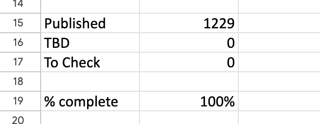
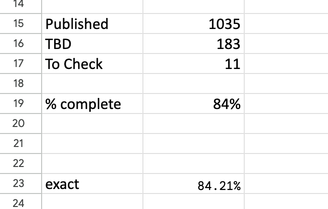 The headline summary has raw counts and a rounded %complete. Seeing this notch up one percent was a major buzz corresponding to about a dozen entries. Below that is a more precise percentage, which I normally kept below the bottom of the window so I had to scroll to see it. I could take a peek and think “nearly at a the next percent mark, I’ll just do a few more”.