It is hard to create accurate stories about numerical data.
Note: Even as I wrote this blog events have overtaken us. The blog is principally about analysing how fact checking can go wrong; this will continue to be an issue, so remains relevant. But it is also about the specific issues with FullFact.org’s discussion of the community deaths that emerged from my own modelling of university returns. Since Full Fact’s report a new Bristol model has been published which confirms the broad patterns of my work and university cases are already growing across the UK (e.g. LIverpool,Edinburgh) with lockdowns in an increasing number of student halls (e.g. Dundee)).
It is of course nice to be able to say “I was right all along“, but in this case I wish I had been wrong.
A problem I’ve been aware of for some time is how difficult many media organisations have in formulating evidence and arguments, especially those involving numerical data. Sometimes this is due to deliberately ‘spinning’ an issue, that is the aim is distortion. However, at other times, in particular fact checking sites, it is clear that the intention is offer the best information, but something goes wrong.
This is an important challenge for my own academic community, we clearly need to create better tools to help media and the general public understand numerical arguments. This is particularly important for Covid and I’ve talked and written elsewhere about this challenge.
Normally I’ve written about this at a distance, looking at news items that concern other people, but over the last month I’ve found myself on the wrong side of media misinterpretation or maybe misinformation. The thing that is both most fascinating (with an academic hat on) and also most concerning is the failure in the fact-checking media’s ability to create reasoned argument.
This would merely be an interesting academic case study, were it not that the actions of the media put lives at risk.
I’ve tried to write succinctly, but what follows is still quite long. To summarise I’m a great fan of fact checking sites such as Full Fact, but I wish that fact checking sites would:
- clearly state what they are intending to check: a fact, data, statement, the implicit implications of the statement, or a particular interpretation of a statement.
- where possible present concrete evidence or explicit arguments, rather than implicit statements or innuendo; or, if it is appropriate to express belief in one source rather than another do this explicitly with reasons.
However, I also realise how I need better ways to communicate my own work both numerical aspects, but also textually. I realise that often behind every sentence, rather like an iceberg, there is substantial additional evidence or discussion points.
Context
I’d been contacted by Fullfact.org at the end of August in relation to the ‘50,000 deaths due to universities’ estimate that was analysed by WonkHE and then tweeted by UCU. This was just before the work was briefly discussed on Radio 4’s More or Less … without any prior consultation or right of reply. So full marks to Full Fact for actually contacting the primary source!
I gave the Full Fact journalist quite extensive answers including additional data. However, he said that assessing the assumptions was “above his pay grade” and so, when I heard no more, I’d assumed that they had decided to abandon writing about it.
Last week on a whim, just before gong on holiday, I thought to check and discovered that Fullfact.org had indeed published the story on 4th September, indeed it still has pride of place on their home page!
Sadly, they had neglected to tell me when it was published.
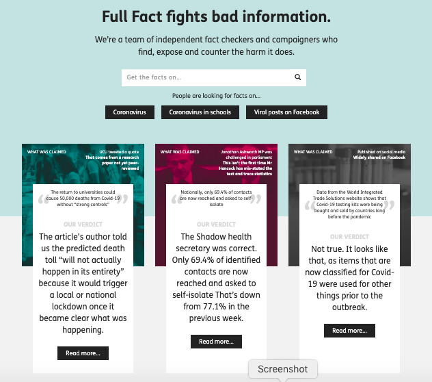
Front page summary – the claim
First of all let’s look at the pull out quote on the home page (as of 22nd Sept).
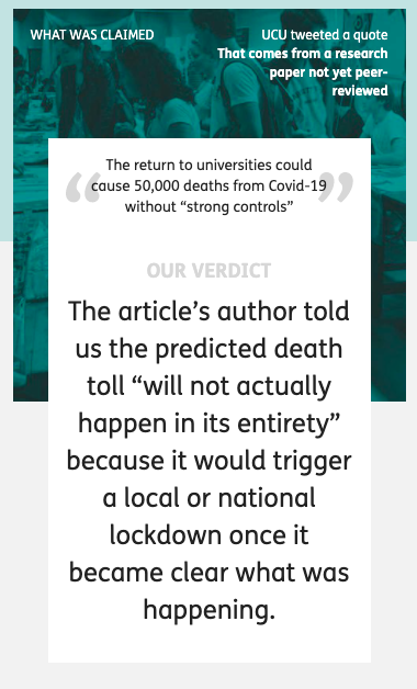
At the top the banner says “What was claimed”, appearing to quote from a UCU tweet and says (in quote marks):
The return to universities could cause 50,000 deaths from Covid-19 without “strong controls”
This is a slight (but critical) paraphrase of the actual UCU tweet which quoted my own paper::
“Without strong controls, the return to universities would cause a minimum of 50,000 deaths.”
The addition of “from Covid-19” is filling in context. Pedantically (but important for a fact checking site), by normal convention this would be set in some way to make clear it is an insertion into the original text, for example [from Covid-19]. More critically, the paraphrase inverts the sentence, thus making the conditional less easy to read, replaces “would cause a minimum” with “could cause”. and sets “strong controls” in scare quotes.
While the inversion does not change the logic, it does change the emphasis. In my own paper and UCU’s tweet the focus on the need for strong controls comes first, followed by the implications if this is not done; whereas in the rewritten quote the conditional “without strong controls” appears more like an afterthought.
On the full page this paraphrase is still set as the claim, but the text also includes the original quote. I have no idea why they chose to rephrase what was a simple statement to start with.
Front page summary – the verdict
It appears that the large text labelled ‘OUR VERDICT’ is intended to be a partial refutation of the original quote:
The article’s author told us the predicted death toll “will not actually happen in its entirety” because it would trigger a local or national lockdown once it became clear what was happening.
This is indeed what I said! But I am still struggling to understand by what stretch of the imagination a national lockdown could be considered anything but “strong controls“. However, while this is not a rational argument, it is a rhetorical one, emotionally what appears to be negative statement “will not actually happen” feels as though it weakens the original statement, even though it is perfectly consonant with it.
One of the things psychologists have known for a long time is that as humans we find it hard to reason with conditional rules (if–then) if they are either abstract or disagree with one’s intuition. This lies at the heart of many classic psychological experiments such as the Wason card test. Fifty thousand deaths solely due to universities is hard to believe, just like the original Covid projections were back in January and February, and so we find it hard to reason clearly.
In a more day-to-day example this is clear.
Imagine a parent says to their child, “if you’re not careful you’ll break half the plates“
The chid replies, “but I am being careful”.
While this is in a way a fair response to the implied rider “... and you’re not being careful enough“, it is not an argument against the parent’s original statement.
When you turn to the actual Full Fact article this difficulty of reasoning becomes even more clear. There are various arguments posed, but none that actually challenge the basic facts, more statements that are of an emotional rhetorical nature … just like the child’s response.
In fact if Full Fact’s conclusion had been “yes this is true, but we believe the current controls are strong enough so it is irrelevant“, then one might disagree with their opinion , but it would be a coherent argument. However, this is NOT what the site claims, certainly in its headline statements.
A lack of alternative facts
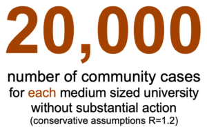
To be fair to Full Fact the most obvious way to check this estimated figure would have been to look at other models of university return and compare it with them. It is clear such models exist as SAGE describes discussions involving such models, but neither SAGE nor indie-Sage‘s reports on university return include any estimated figure for overall impact. My guess is that all such models end up with similar levels to those reported here and that the modellers feel that they are simply too large to be believable … as indeed I did when I first saw the outcomes of my own modelling..
Between my own first modelling in June and writing the preprint article there was a draft report from a three day virtual study group of mathematicians looking at University return, but other than this I was not aware of work in the public domain at the time. For this very reason, my paper ends with a call “for more detailed modelling“.
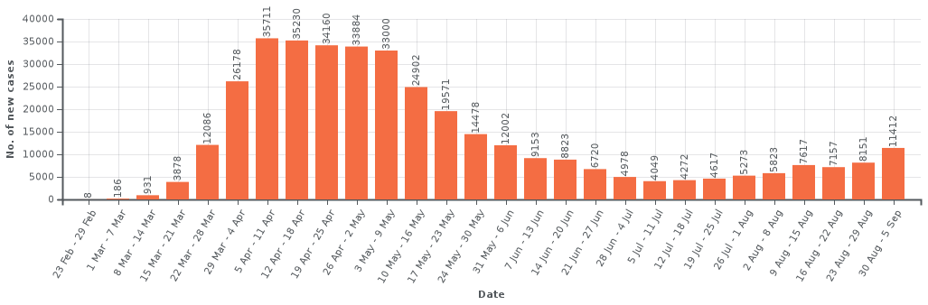
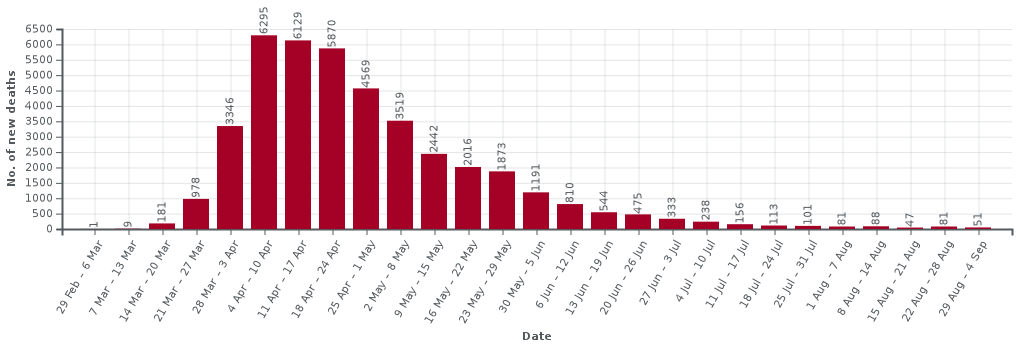
Happily, in the last two weeks two pre-print papers have come from the modelling group at Bristol, one with a rapid review of University Covid models and one on their own model. Jim Dickinson has produced another of his clear summaries of them both. The Bristol model is far more complex than those that I used including multiple types of teaching situation and many different kinds of students based on demographic and real social contact data. It doesn’t include student–non-student infections, which I found critical in spread between households, but does include stronger effects for in-class contagion. While very different types of modelling, the large-scale results of both suggest rapid spread within the student body. The Bristol paper ends with a warning about potential spread to the local community, but does not attempt to quantify this, due the paucity of data on student–non-student interactions.
Crucially, the lack of systematic asymptomatic testing will also make it hard to assess the level of Covid spread within the student population during the coming autumn and also hard to retrospectively assess the extent to which this was a critical factor in the winter Covid spread in the wider population. We may come to this point in January and still not have real data.
Full page headlines
Following through to the full page on Full Fact, the paraphrased ‘claim’ is repeated with Full Fact’s ‘conclusion’ … which is completely different from the front page ‘OUR VERDICT’.
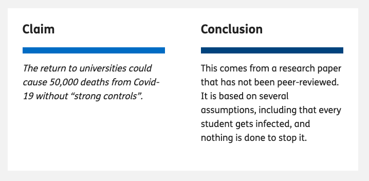
The ‘conclusion’ is carefully stated – rather like Boris Johnson’s careful use of the term ‘controlled by’ when describing the £350 million figure on the Brexit bus. It does not say here whether Full Fact believes the (paraphrased) claim, but they merely make a statement relating to it. In fact at the end of the article there is rather more direct conclusion berating UCU for tweeting the figure. That is Full Fact do have a strong conclusion, and one that is far more directly related to the reason for fact checking this in the first place, but instead of stating this explicitly, the top of page headline ‘conclusion’ in some sense sits on the fence.
However, even this ‘sit on the fence’ statement is at very least grossly misleading and in reality manifestly false.
The first sentence:
This comes from a research paper that has not been peer-reviewed
is correct, and one of the first things I pointed out when Full Fact contacted me. Although the basic mathematics was read by a colleague, the paper itself has not been through formal peer review, and given the pace of change will need to be changed to be retrospective before it will be. This said, in my youth I was a medal winner in the International Mathematical Olympiad and I completed my Cambridge mathematics degree in two years; so I do feel somewhat confident in the mathematics itself! However, one of the reasons for putting the paper on the preprint site arXiv was to make it available for critique and further examination.
The second statement is not correct. The ‘conclusion’ states that
It is based on several assumptions, including that every student gets infected, and nothing is done to stop it.
IF you read the word “it” to refer to the specific calculation of 50,000 deaths then this is perhaps debatable. However, the most natural reading is that “it” refers to the paper itself, and this interpretation is reinforced later in the Full Fact text, which says “the article [as in my paper] assumes …”. This statement is manifestly false.
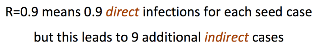
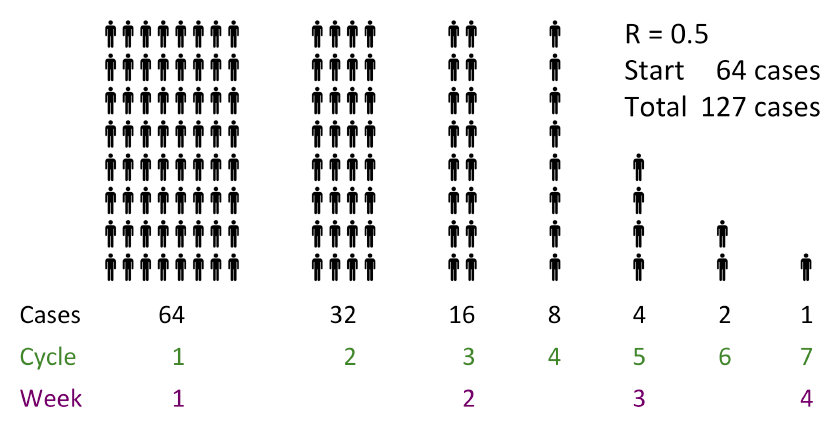
The paper as a whole models student bubbles of different sizes, and assumes precisely the opposite, that is assuming rapid spread only within bubbles. That is it explicitly assumes that something (bubbles) is done to stop it. The outcome of the models, taking a wide range of scenarios, is that in most circumstances indirect infections (to the general population and back) led to all susceptible students being infected. One can debate the utility or accuracy of the models, but crucially “every student gets infected” is a conclusion not an assumption of the models or the paper as a whole.
To be fair on Full Fact this confusion between the fundamental assumptions of the paper and the specific values used for this one calculation is echoing Kit Yates initial statements when he appeared on More or Less. I’m still not sure whether that was a fundamental misunderstanding or a slip of the tongue during the interview and my attempts to obtain clarification have failed. However, I did explicitly point this distinction out to Full Fact.
The argument
The Full Fact text consists of two main parts. One is labelled “Where did “50,000 deaths” come from?”, which is ostensibly a summary of my paper, but in reality seems to be where there are the clearest fact-check style statements. The second is labelled “But will this happen?” which sounds as if this is the critique. However, it is actually three short paragraphs the first two effectively setting me and Kit Yates head-to-head and the third is the real conclusion which says that UCU tweeted the quote without context.
Oddly I was never asked whether I believed that the UCU’s use of the statement was consistent with the way in which it was derived in my work. This does seem a critical question given that Full Fact’s final conclusion is that UCU quoted it out of context. Indeed, while the Full Fact claims that UCU tweeted “the quote without context“, within the length of a tweet the UCU both included the full quote (not paraphrased!) and directly referenced Jim Dickinson’s summary of my paper on WonkHE, which itself links to my paper. That is the UCU tweet backed up the statement with links that lead to primary data and sources.
As noted the actual reasoning is odd as the body of the argument, to the extent it exists, appears to be in the section that summarises the paper.
First section – summary of paper
The first section “Where did “50,000 deaths” come from?”, starts off by summarising the assumptions underlying the 50,000 figure being fact checked and is the only section that links to any additional external sources. Given the slightly askance way it is framed, it is hard to be sure, but it appears that this description is intended to cast doubt on the calculations because of the extent of the assumptions. This is critical as it is the assumptions which Kit Yates challenged.
In several cases the assumptions stated are not what is said in the paper. For example, Full Fact says the paper “assumes no effect from other measures already in place, like the Test and Trace system or local lockdowns” whereas the paragraph directly above the crucial calculation explicitly says that (in order to obtain a conservative estimate) the initial calculation will optimistically assume “social distancing plus track and trace can keep the general population R below 1 during this period“. The 50,000 figure does not include additional more extensive track and trace within the student community, but so far this is no sign of this happening beyond one or two universities adopting their own testing, and this is precisely one of the ‘strong controls’ that the paper explicitly suggests.
Ignoring these clear errors, the summary of assumptions made by the calculation of the 50,000 figure says that I “include the types of hygiene and social distancing measures already being planned, but not stronger controls …” and then goes on to list the things not included. It does seem obvious and is axiomatic that a calculation of what will happen “without strong controls” must assume for the purposes of the calculation that there are no strong controls.
The summary section also spends time on the general population R value of 0.7used in the calculation and the implications of this. The paragraph starts “In addition to this” and quotes that this is my “most optimistic” figure. This is perfectly accurate … but the wording seems to imply this is perhaps (another!) unreasonable assumption … and indeed it is crazily low. At the time (soon after lockdown) it was still hoped that non-draconian measures (such as track and trace) could keep R below 1, but of course we have seen rises far beyond this and the best estimates for coming winter are now more like 1.2 to 1.5.
Note however the statement was “Without strong controls, the return to universities would cause a minimum of 50,000 deaths.” That is the calculation was deliberately taking some mid-range estimates of things and some best case ones in order to yield a lower bound figure. If one takes a more reasonable R the final figure would be a lot larger than 50,000.
Let’s think again of the child, but let’s make the child a stroppy teenager:
Parent, “if you’re not careful you’ll break half the plates“
Child replies, throwing the pile of plates to the floor, “no I’ll break them all.”
The teenager might be making a point, but is not invalidating the parent’s statement.
Maybe I am misinterpreting the intent behind this section, but given the lack of any explicit fact-check evidence elsewhere, it seems reasonable to treat this as at least part of the argument for the final verdict.
Final section – critique of claim
As noted, the second section “But will this happen?”, which one would assume is the actual critique and mustering of evidence, consists of three paragraphs: one quoting me, one quoting Kit Yates of Bath, and one which appears to be the real verdict.
The first paragraph is the original statement that appeared as ‘OUR VERDICT’ on the first page where I say that 50,000 deaths will almost certainly not occur in full because the government will be forced to take some sort of action once general Covid growth and death rates rise. As noted if this is not ‘strong controls‘ what is?
The second paragraph reports Kit Yates as saying there are some mistakes in my model and is quoted as generously saying that he’s “not completely damning the work,”. While grateful for his restraint, some minimal detail or evidence would be useful to assess his assertion. On More or Less he questioned some of the values used and I’ve addressed that previously; it is not clear whether this is what is meant by ‘mistakes’ here. I don’t know if he gave any more information to Full Fact, but if he has I have not seen it and Full Fact have not reported it.
A tale of three verdicts
As noted the ‘verdict’ on the Full Fact home page is different from the ‘conclusion’ at the top of the main fact-check page, and in reality it appears the very final paragraph of the article is the real ‘verdict’.
Given this confusion about what is actually being checked, it is no wonder the argument itself is somewhat confused.
The final paragraph, the Full Fact verdict itself has three elements:
- that UCU did not tweet the quote in context – as noted perhaps a little unfair in a tweeted quote that links to its source
- that the 50,000 “figure comes from a model that is open to question” – well clearly there is question in Kit Yates’ quote, but this would have more force if it were backed by evidence.
- that it is based on “predictions that will almost certainly not play out in the real world“
The last of these is the main thrust of the ‘verdict’ quote on the Full Fact home page. Indeed there is always a counterfactual element to any actionable prediction. Clearly if the action is taken the prediction will change. This is on the one hand deep philosophy, but also common sense.
The Imperial Covid model that prompted (albeit late) action by government in March gave a projection of between a quarter and a half million deaths within the year if the government continued a policy of herd immunity. Clearly any reasonable government that believes this prediction will abandon herd immunity as a policy and indeed this appears to have prompted a radical change of heart. Given this, one could have argued that the Imperial predictions “will almost certainly not play out in the real world“. This is both entirely true and entirely specious.
The calculations in my paper and the quote tweeted by UCU say:
“Without strong controls, the return to universities would cause a minimum of 50,000 deaths.”
That is a conditional statement.
Going back to the child; the reason the parent says ““if you’re not careful you’ll break half the plates“, is not as a prediction that half the plates will break, but an encouragement to the child to be careful so that the plates will not break. If the child is careful and the plates are not broken, that does not invalidate the parent’s warning.
Last words
Finally I want to reiterate how much I appreciate the role of fact checking sites including Full Fact and also fact checking parts of other news sites as as BBC’s Reality Check; and I am sure the journalist here wanted to produce a factual article. However, in order to be effective they need to be reliable. We are all, and journalists especially, aware that an argument needs to be persuasive (rhetoric), but for fact checking and indeed academia, arguments also need to be accurate and analytic (reason).
There are specific issues here and I am angered at some of the misleading aspects of this story because of the importance of the issues; there are literally lives at stake.
However, putting this aside, the story raises the challenge for me as to how we can design tools and methods to help both those working on fact checking sites and the academic community, to create and communicate clear and correct argument.


 Many years ago Janet Finlay and I wrote a small introduction to artificial intelligence. At the time there were several Bible-sized tomes … some of which are still the standard textbooks today. However, Janet was teaching a masters conversion course and found that none of these books were suitable for taking the first steps on an AI journey, especially for those coming from non-computing disciplines.